- React - Home
- React - Introduction
- React - Roadmap
- React - Installation
- React - Features
- React - Advantages & Disadvantages
- React - Architecture
- React - Creating a React Application
- React - JSX
- React - Components
- React - Nested Components
- React - Using Newly Created Components
- React - Component Collection
- React - Styling
- React - Properties (props)
- React - Creating Components using Properties
- React - props Validation
- React - Constructor
- React - Component Life Cycle
- React - Event management
- React - Creating an Event−Aware Component
- React - Introduce Events in Expense Manager APP
- React - State Management
- React - State Management API
- React - Stateless Component
- React - State Management Using React Hooks
- React - Component Life Cycle Using React Hooks
- React - Layout Component
- React - Pagination
- React - Material UI
- React - Http Server
- React - Http client programming
- React - Form Programming
- React - Forms
- React - Controlled Component
- React - Uncontrolled Component
- React - Formik
- React - Conditional Rendering
- React - Lists
- React - Keys
- React - Routing
- React - Redux
- React - Animation
- React - Bootstrap
- React - Map
- React - Table
- React - Managing State Using Flux
- React - Testing
- React - CLI Commands
- React - Building and Deployment
- React - Example
- Hooks
- React - Introduction to Hooks
- React - Using useState
- React - Using useEffect
- React - Using useContext
- React - Using useRef
- React - Using useReducer
- React - Using useCallback
- React - Using useMemo
- React - Custom Hooks
- React Advanced
- React - Accessibility
- React - Code Splitting
- React - Context
- React - Error Boundaries
- React - Forwarding Refs
- React - Fragments
- React - Higher Order Components
- React - Integrating With Other Libraries
- React - Optimizing Performance
- React - Profiler API
- React - Portals
- React - React Without ES6 ECMAScript
- React - React Without JSX
- React - Reconciliation
- React - Refs and the DOM
- React - Render Props
- React - Static Type Checking
- React - Strict Mode
- React - Web Components
- Additional Concepts
- React - Date Picker
- React - Helmet
- React - Inline Style
- React - PropTypes
- React - BrowserRouter
- React - DOM
- React - Carousel
- React - Icons
- React - Form Components
- React - Reference API
- React Useful Resources
- React - Quick Guide
- React - Cheatsheet
- React - Axios CheatSheet
- React - Useful Resources
- React - Discussion
React - Quick Guide
React - Introduction
React is a free and open-source front-end JavaScript library which is used to develop various interactive user-interfaces. It is a simple, feature rich and component based UI library. When we say component based, we mean that React develops applications by creating various reusable and independent codes. This UI library is, thus, widely used in web development.
React can be used to develop small applications as well as big, complex applications. React provides minimal and solid feature set to kick-start a web application. React community compliments React library by providing large set of ready-made components to develop web application in a record time. React community also provides advanced concept like state management, routing, etc., on top of the React library.
React versions
React library was founded by Jordan Walke, a software engineer at Facebook in 2011. Then the initial version, 0.3.0 of React is released on May, 2013 and the latest version, 17.0.1 is released on October, 2020. The major version introduces breaking changes and the minor version introduces new feature without breaking the existing functionality. Bug fixes are released as and when necessary. React follows the Semantic Versioning (semver) principle.
What is the need for React?
Even though there are various libraries that provide a medium to develop user-interfaces, React still stands tall in terms of popularity. Here's why −
Component Based − React makes use of multiple components to build an application. These components are independent and have their own logic which makes them reusable throughout the development process. This will drastically reduce the application's development time.
Better and Faster Performance − React uses Virtual DOM. Virtual DOM compares the previous states of components of an application with the current states and only updates the changes in Real DOM. Whereas, conventional web applications update all components again. This helps React in creating web applications faster.
Extremely Flexible − React allows developers and teams to set their own conventions that they deem are best suited and implement it however they see fit, as there are no strict rules for code conventions in React.
Creates dynamic applications easily − Dynamic web applications require less coding while offering more functionality. Thus, React can create them easily.
Develops Mobile Applications as well − Not only web applications, React can also develop mobile applications using React Native. React Native is an open-source UI software framework that is derived from React itself. It uses React Framework to develop applications for Android, macOS, Web, Windows etc.
Debugging is Easy − The data flow in React is unidirectional, i.e., while designing an app using React, child components are nested within parent components. As the data flows is in a single direction, it gets easier to debug errors and spot the bugs.
Applications
Few popular websites powered by React library are listed below −
Facebook, popular social media application − React was originally developed at Facebook (or Meta), so its only natural that they use it to run their application. As for their mobile application, it uses React Native to display Android and iOS components, instead of DOM. Facebook's codebase now includes over 20,000 components and uses the React version that is public.
Instagram, popular photo sharing application − Instagram is also completely based on React, as it is powered by Meta as well. The main features to show its usage include Geo-locations, Hashtags, Google Maps APIs etc.
Netflix, popular media streaming application − Netflix switched to React in 2015. The factors that mainly influenced this decision are the 1) startup speed to reduce the processing time to render the homepage and enabling dynamic elements in the UI, 2) modularity to allow various features that must coexist with the control experience and 3) runtime performance for efficient UI rendering.
Code Academy, popular online training application − Code Academy uses React as the "script is battle-tested, easy to think about, makes SEO easy and is compatible with legacy code and flexible enough for the future".
Reddit, popular content sharing application − Reddit is also developed using React from the scratch.
As you see, most popular application in every field is being developed by React Library.
React - RoadMap
This Roadmap will guide you to master React. You will learn core concepts, advanced techniques, and best practices by following mentioned topics. This step-by-step path will help you as a beginner.
What is a Tutorial Roadmap?
Tutorial Roadmap typically covers the journey from beginner to advanced user, including key concepts, practical applications, and best practices.
React Roadmap
Master React from beginner to expert with our comprehensive 2024 roadmap. Learn about static typing, interfaces, generics, and advanced type operations. Includes practical examples, learning resources, and a structured timeline for becoming a React expert.
How React Roadmap Can help you?
This React roadmap includes essential programming concepts, hands-on coding exercises, and valuable learning resources. Calculate your learning timeline, implement strategic coding practices, and build a solid foundation in React development with our clear, structured approach.
React - Installation
This chapter explains the installation of React library and its related tools in your machine. Before moving to the installation, let us verify the prerequisite first.
React provides CLI tools for the developer to fast forward the creation, development and deployment of the React based web application. React CLI tools depends on the Node.js and must be installed in your system. Hopefully, you have installed Node.js on your machine. We can check it using the below command −
node --version
You could see the version of Nodejs you might have installed. It is shown as below for me,
v24.11.0
If Nodejs is not installed, you can download and install by visiting https://nodejs.org/en/download/.
Toolchain
To develop lightweight features such as form validation, model dialog, etc., React library can be directly included into the web application through content delivery network (CDN). It is similar to using jQuery library in a web application. For moderate to big application, it is advised to write the application as multiple files and then use bundler such as webpack, parcel, rollup, etc., to compile and bundle the application before deploying the code.
React toolchain helps to create, build, run and deploy the React application. React toolchain basically provides a starter project template with all necessary code to bootstrap the application.
Some of the popular toolchain to develop React applications are −
Create React App − SPA oriented toolchain
Next.js − server-side rendering oriented toolchain
Gatsby − Static content oriented toolchain
Tools required to develop a React application are −
The serve, a static server to serve our application during development
Babel compiler
Create React App CLI
Let us learn the basics of the above mentioned tools and how to install those in this chapter.
The serve static server
The serve is a lightweight web server. It serves static site and single page application. It loads fast and consume minimum memory. It can be used to serve a React application. Let us install the tool using npm package manager in our system.
npm install serve -g
added 86 packages in 6s
Let us create a simple static site and serve the application using serve app.
Open a command prompt and go to your workspace.
cd /go/to/your/workspace
Create a new folder, static_site and change directory to newly created folder.
mkdir static_site
cd static_site
Next, create a simple webpage inside the folder using your favorite html editor.
index.html
<!DOCTYPE html>
<html>
   <head>
      <meta charset="UTF-8" />
      <title>Static website</title>
   </head>
   <body>
      <div><h1>Hello!</h1></div>
   </body>
</html>
Next, run the serve command.
serve .
We can also serve single file, index.html instead of the whole folder.
serve ./index.html
Next, open the browser and enter http://localhost:3000 in the address bar and press enter. serve application will serve our webpage as shown below.

The serve will serve the application using default port, 3000. If it is not available, it will pick up a random port and specify it.
   ┌────────────────────────────────────────────┐
   │                                            │
   │   Serving!                                 │
   │                                            │
   │   - Local:    http://localhost:3000        │
   │   - Network:  http://192.168.28.173:3000   │
   │                                            │
   │   Copied local address to clipboard!       │
   │                                            │
   └────────────────────────────────────────────┘
Babel compiler
Babel is a JavaScript compiler which compiles many variant (es2015, es6, etc.,) of JavaScript into standard JavaScript code supported by all browsers. React uses JSX, an extension of JavaScript to design the user interface code. Babel is used to compile the JSX code into JavaScript code.
To install Babel and it's React companion, run the below command −
npm install babel-cli babel-preset-react-app -g
...
...
added 397 packages in 16s
Babel helps us to write our application in next generation of advanced JavaScript syntax.
Create React App toolchain
Create React App is a modern CLI tool to create single page React application. It is the standard tool supported by React community. It handles babel compiler as well. Let us install Create React App in our local system.
> npm install -g create-react-app
added 64 packages in 3s
Updating the toolchain
React Create App toolchain uses the react-scripts package to build and run the application. Once we started working on the application, we can update the react-script to the latest version at any time using npm package manager.
npm install react-scripts@latest
added 1330 packages in 42s
Advantages of using React toolchain
React toolchain provides lot of features out of the box. Some of the advantages of using React toolchain are −
Predefined and standard structure of the application.
Ready-made project template for different type of application.
Development web server is included.
Easy way to include third party React components.
Default setup to test the application.
React - Features
React slowly becoming one of the best JavaScript framework among web developers. It is playing an essential role in the front-end ecosystem. Following are the important features of React
Virtual DOM
Components
JSX
One way data binding
Scalable
Flexible
Modular
Virtual DOM
Virtual DOM is a special DOM created by React. Virtual DOM represents the real DOM of the current HTML document. Whenever there is a change in the HTML document, React checks the updated virtual DOM with the previous state of the Virtual DOM and update only the different in th actual / real DOM. This improves the performance of the rendering of the HTML document.
For example, if we create a React component to show the current time by periodically updating the time through setInterval() method, then React will update only the current time instead of updating the whole content of the component.
Components
React is build upon the concept of components. All modern front end framework relies on the component architecture. Component architecture enables the developer to break down the large application into smaller components, which can be further break down into even smaller component. Breaking down the application into smaller component simplifies the application and make it more understandable and manageable.
JSX
JSX is a JavaScript extension to create arbitrary HTML element using syntax similar to HTML. This will simplify the HTML document creation as well as easy to understand the document. React will convert the JSX into JavaScript object consisting of React's createElement() function call before executing it. It improves the performance of the application. Also, React allows the HTML document creation using pure createElement() function without JSX as well. This enables the developer to directly create HTML document in a situation where JSX does not fit well.
One way data binding
One way data binding prevents the data in a component to flow backward. A component can pass the data to its child component only. The data cannot be passed by a component to its parent component in any situation. This will simplify the data handling and reduce the complexity. Two way data binding may seems mandatory at first but a closer look suggests that the application can be done with one way data binding only and this simplifies the application concept as well.
Scalable
React can be used to create application of any size. React component architecture, Virtual DOM and one way data binding properly handle large application in a reasonable time frame required for a front end application. These features make React a scalable solution.
Flexible
React only provides only few basic concept to create truly scalable application. React does not restrict the developer in any way to follow a rigid process. This enables the developer to apply their own architecture on top the basic concept and makes it flexible.
Modular
React component can be created in a separate JavaScript file and can be made exportable. This enables the developer to categories and group certain components into a module so that it can be imported and used wherever needed.
React - Advantages & Disadvantages
React is a library for building composable user interfaces. It encourages the creation of reusable UI components, which present data that changes over time. Lots of people use React as the V in MVC.
React abstracts away the DOM from you, offering a simpler programming model and better performance. React can also render on the server using Node, and it can power native apps using React Native. React implements one-way reactive data flow, which reduces the boilerplate and is easier to reason about than traditional data binding.
Advantages of React
Following are the main advantages of React −
Performance
Easy to learn
Huge collection of third party components
Large community
SEO Friendliness
Easy kick-starting of the React project
Rich set of developer tools
Handle large application
Performance
React uses Virtual DOM concept to check and update the HTML document. Virtual DOM is a special DOM created by React. Virtual DOM represents the real DOM of the current document. Whenever there is a change in the document, React checks the updated virtual DOM with the previous state of the Virtual DOM and update only the different in th actual / real DOM. This improves the performance of the rendering of the HTML document.
For example, if we create a React component to show the current time by periodically updating the time through setInterval() method, then React will update only the current time instead of updating the whole content of the component.
Easy to learn
The core concept of React can be learned in less than a day. React can be coded in either Plain Javascript (ES6) or Typescript. To start with React, the basic knowledge of the JavaScript is enough. For advanced developer, Typescript provides type safety and rich language feature. A react component can be created by a developer in few hours by learning JSX (similar to HTML) and properties (props). Learning React state management will enable the developer to create dynamic component, which updates the content whenever the state changes. React provides simple lifecycle for its component, which can be used to properly setup and destroy the component.
Huge collection of third party components
In addition to core react library (which is only a few KB in size), React community provides a large number of component for a wide range of application from simple UI component to full fledged PDF Viewer component. React provides multiple option in each category. For example, the advanced state management can be done using either Redux or MobX library. Redux and Mobx are just two popular library to do state management. React has more than 10 library to archive the same functionality. Similarly, React community provides lot of third party library in each category like routing, data grid, calendar, form programming, etc.,
Large community
React developer community is a huge community with lot of activities. React community is very active that you can get answer for any react related question / doubts in a few minutes through google, stackoverflow, etc.,
SEO friendliness
React is one of the few JavaScript library to support SEO features. Since React components and JSX are similar to HTML elements, SEO can be easily achieved without much code / setup.
Easy kickstart of React project
React provides a CLI application, create-react-app to create a new react application. create-react-app application not only create a new application, it also build and run the application in the local environment without any other dependencies. create-react-app allows the developer to choose a template, which allows the application to include more boilerplate code during initial setup itself. This allows the developer to kickstart small application to large application in few clicks.
In addition to create-react-app, React community additional tools such as nextjs, gatsby, etc., which allows developer to create advanced application in a short period of time.
Rich set of developer tools
React community provides essential developer tools to enhance the developer productivity. React developer tool for chrome, edge and firefox browser enables developer to select a react component and see the current state of the component. Also, it enables the developer to has clear picture of the view of the component hierarchy by show it as a tree of component in the Developer Tab of the browser.
Handle large application
React uses composition to merge multiple component into one bigger component, which in turn allows to create much more larger component. React component can be created in a single JavaScript file and can be set as exportable. This feature allows multiple component to be grouped under a common category as module and can be reused in other places.
Composable and modular features of the React library allows developer to create large application, which is relatively easy to maintain when compared to other front end framework.
Disadvantages of React
Even through React library has lot of positives, it has some of the drawbacks as well. Some of the drawbacks are as follows −
Lack of quality documentation
No standard / recommended way to develop application
Fast development pace
Advanced use of JavaScript
JavaScript extension
Just a UI library
Lack of quality documentation
React library has a decent documentation in its primary website. It covers the basic concept with few examples. Even though, it is a good start to understand the basic of React concept, it does not provides a deep and detailed explanation with multiple examples. React community steps in and provides lot of articles with varying level of complexity and quality. But, they are not organized under one place, where the developer can easily learn.
No or Less standard way to develop application
React is just a UI library with few concept and standard recommendation. Even through React can be use to create large / complex application, there is no standard or recommended way to create a application. As there is no standard way, React community uses multiple architecture to build their application. Developer are free to choose a methodology for their application. A wrong choice at the beginning of the application development complicates the application as well as delay the development of the application.
Fast development pace
React releases new version of the library few times in a year. Each release has few addition feature and few breaking changes. Developer need to learn fast and apply the new concept to stabilize the application.
Advanced use of JavaScript
Even through the core concept of the React library is quite simple and easy to learn, the advanced concept are quite complex as it exploits advanced features of JavaScript. Also, React has lot of advanced concept to address many of the complex scenarios of the HTML / Form programming. The shear number of advanced concept is really quite a challenge for the developer to learn and master it.
JavaScript Extension
JSX is an extension of JavaScript language. JSX is similar to HTML and simplifies the component development. JSX also has few differences with the HTML Programming and need to be careful to apply it correctly. Additionally, JSX needs to be complied to JavaScript before executed in the browser which is addition step / burden for the application.
Just a UI library
As we learned earlier, React is just a UI library and not a framework. Creating a React application with good architecture needs careful selection and application of additional third party react library. A bad design may affect the application in the later / final stage of the application development.
React - Architecture
React library is built on a solid foundation. It is simple, flexible and extensible. As we learned earlier, React is a library to create user interface in a web application. React's primary purpose is to enable the developer to create user interface using pure JavaScript. Normally, every user interface library introduces a new template language (which we need to learn) to design the user interface and provides an option to write logic, either inside the template or separately.
Instead of introducing new template language, React introduces three simple concepts as given below −
React elements
JavaScript representation of HTML DOM. React provides an API, React.createElement to create React Element.
JSX
A JavaScript extension to design user interface. JSX is an XML based, extensible language supporting HTML syntax with little modification. JSX can be compiled to React Elements and used to create user interface.
React component
React component is the primary building block of the React application. It uses React elements and JSX to design its user interface. React component is basically a JavaScript class (extends the React.component class) or pure JavaScript function. React component has properties, state management, life cycle and event handler. React component can be able to do simple as well as advanced logic.
Let us learn more about components in the React Component chapter.
Architecture of the React Application
React library is just UI library and it does not enforce any particular pattern to write a complex application. Developers are free to choose the design pattern of their choice. React community advocates certain design pattern. One of the patterns is Flux pattern. React library also provides lot of concepts like Higher Order component, Context, Render props, Refs etc., to write better code. React Hooks is evolving concept to do state management in big projects. Let us try to understand the high level architecture of a React application.
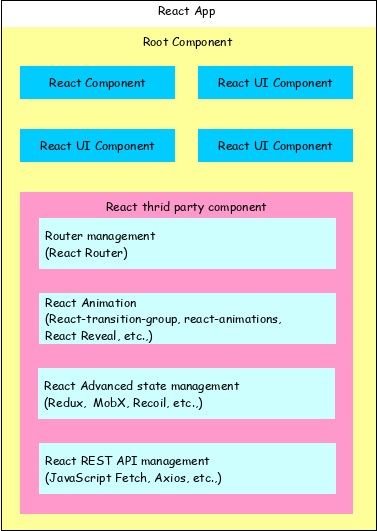
React app starts with a single root component.
Root component is build using one or more component.
Each component can be nested with other component to any level.
Composition is one of the core concepts of React library. So, each component is build by composing smaller components instead of inheriting one component from another component.
Most of the components are user interface components.
React app can include third party component for specific purpose such as routing, animation, state management, etc.
Workflow of a React application
Let us understand the workflow of a React application in this chapter by creating and analyzing a simple React application.
Open a command prompt and go to your workspace.
cd /go/to/your/workspace
Next, create a folder, static_site and change directory to newly created folder.
mkdir static_site
cd static_site
Example
Next, create a file, hello.html and write a simple React application.
<!DOCTYPE html>
<html>
   <head>
      <meta charset="UTF-8" />
      <title>React Application</title>
   </head>
   <body>
  <div id="react-app"></div>
  <script type="module">
     import React from 'https://esm.sh/react';
     import ReactDOM from 'https://esm.sh/react-dom/client';

     function App() {
        return React.createElement('h1', null, 'Hello React!');
     }

     const root = ReactDOM.createRoot(document.getElementById('react-app'));
     root.render(React.createElement(App));
   </script>
</body>
</html>
Next, serve the application using serve web server.
serve ./hello.html
Output
Next, open your favorite browser. Enter http://localhost:3000 in the address bar and then press enter.

Let us analyse the code and do little modification to better understand the React application.
Here, we are using three API provided by the React library.
React.createElement
Used to create React elements. It expects three parameters −
- Element tag
- Element attributes as object
- Element content - It can contain nested React element as well
ReactDOM.createRoot
Used to create main container element.
root.render
Used to render the element into the container. It expects a single parameter −
- React Element OR JSX
Nested React element
As React.createElement allows nested React element, let us add nested element as shown below −
Example
<script type="module">
     const root = ReactDOM.createRoot(document.getElementById('react-app'));
     root.render(React.createElement(App));
</script>
Output
It will generate the below content −
<div><h1> Hello React!</h1></div>
Use JSX
Next, let us remove the React element entirely and introduce JSX syntax as shown below −
<!DOCTYPE html>
<html>
   <head>
      <meta charset="UTF-8" />
      <title>React Application</title>
   </head>
   <body>
      <div id="react-app"></div>
      <script src="https://unpkg.com/react@17/umd/react.development.js" crossorigin></script>
      <script src="https://unpkg.com/react-dom@17/umd/react-dom.development.js" crossorigin></script>
      <script src="https://unpkg.com/@babel/standalone/babel.min.js"></script>
      <script type="text/babel">
         ReactDOM.render(
            <div><h1>Hello JSX!</h1></div>,
            document.getElementById('react-app')
         );
     </script>
   </body>
</html>
Here, we have included babel to convert JSX into JavaScript and added type="text/babel" in the script tag.
<script src="https://unpkg.com/@babel/standalone/babel.min.js"></script>
<script type="text/babel">
   ...
   ...
</script>
Next, run the application and open the browser. The output of the application is as follows −

Next, let us create a new React component, Greeting and then try to use it in the webpage.
<script type="text/babel">
   function Greeting() {
      return <div><h1>Hello JSX!</h1></div>
   }
   ReactDOM.render(<Greeting />, document.getElementById('react-app') );
</script>
The result is same and as shown below −
By analyzing the application, we can visualize the workflow of the React application as shown in the below diagram.
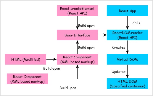
React app calls ReactDOM.render method by passing the user interface created using React component (coded in either JSX or React element format) and the container to render the user interface.
ReactDOM.render processes the JSX or React element and emits Virtual DOM.
Virtual DOM will be merged and rendered into the container.
React - Creating Application
As we learned earlier, React library can be used in both simple and complex application. Simple application normally includes the React library in its script section. In complex application, developers have to split the code into multiple files and organize the code into a standard structure. Here, React toolchain provides pre-defined structure to bootstrap the application. Also, developers are free to use their own project structure to organize the code.
Let us see how to create simple as well as complex React application −
React - Using JSX
As we learned earlier, React JSX is an extension to JavaScript. It allows writing a JavaScript code that looks like an HTML code. For instance, consider the following code:
const element = <h1>Hello React!</h1>
The tag provided in the code above is known as JSX. JSX is mainly used to provide information about the appearance of an interface. However, it is not completely a template language but a syntax extension to JavaScript. JSX produces elements that are rendered into a DOM, in order to specify what the output must look like.
Using JSX in ReactJS
JSX enables the developer to create a virtual DOM using XML syntax. It compiles down to pure JavaScript (React.createElement function calls), therefore, it can be used inside any valid JavaScript code.
- Assign to a variable.
var greeting = <h1>Hello React!</h1>
- Assign to a variable based on a condition.
var canGreet = true;
if(canGreet) {
   greeting = <h1>Hello React!</h1>
}
- Can be used as return value of a function.
function Greeting() {
   return <h1>Hello React!</h1>

}
greeting = Greeting()
- Can be used as argument of a function.
function Greet(message) {
   const root = ReactDOM.createRoot(document.getElementById('react-app'));
   root.render(message);
}
Greet(<h1>Hello React!</h1>)
Why JSX?
Using JSX with React is not mandatory, as there are various options to achieve the same thing as JSX; but it is helpful as a visual aid while working with UI inside a JavaScript code.
JSX performs optimization while translating the code to JavaScript, making it faster than regular JavaScript.
React uses components that contain both markup and logic in a single file, instead of separate files.
Most of the errors can be found at compilation time, as the data flow is unidirectional.
Creating templates becomes easier with JSX.
We can use JSX inside of conditional statements (if−else) and loop statements (for loops), can assign it to variables, accept it as arguments, or return it from functions.
Using JSX can prevent Cross Site Scripting attacks, or injection attacks.
Expressions in JSX
JSX supports expression in pure JavaScript syntax. Expression has to be enclosed inside the curly braces, { }. Expression can contain all variables available in the context, where the JSX is defined. Let us create simple JSX with expression.
Example
<script type="text/babel">
   var cTime = new Date().toTimeString();
   ReactDOM.render(
      <div><p>The current time is {cTime}</p></div>,
      document.getElementById('react-app') );
</script>
Output
Here, cTime used in the JSX using expression. The output of the above code is as follows,
The Current time is 21:19:56 GMT+0530(India Standard Time)
One of the positive side effects of using expression in JSX is that it prevents Injection attacks as it converts any string into html safe string.
Functions in JSX
JSX supports user defined JavaScript function. Function usage is similar to expression. Let us create a simple function and use it inside JSX.
Example
<script type="text/babel">
   var cTime = new Date().toTimeString();
   ReactDOM.render(
      <div><p>The current time is {cTime}</p></div>,
      document.getElementById('react-app')
   );
</script>
Output
Here, getCurrentTime() is used get the current time and the output is similar as specified below −
The Current time is 21:19:56 GMT+0530(India Standard Time)
Attributes in JSX
JSX supports HTML like attributes. All HTML tags and its attributes are supported. Attributes has to be specified using camelCase convention (and it follows JavaScript DOM API) instead of normal HTML attribute name. For example, class attribute in HTML has to be defined as className. The following are few other examples −
- htmlFor instead of for
- tabIndex instead of tabindex
- onClick instead of onclick
Example
<style>
   .red { color: red }
</style>
<script type="text/babel">
   function getCurrentTime() {
      return new Date().toTimeString();
   }
   ReactDOM.render(
      <div>
         <p>The current time is <span className="red">{getCurrentTime()}</span></p>
      </div>,
      document.getElementById('react-app')
   );
</script>
Output
The output is as follows −
The Current time is 22:36:55 GMT+0530(India Standard Time)
Using Expression within Attributes
JSX supports expression to be specified inside the attributes. In attributes, double quote should not be used along with expression. Either expression or string using double quote has to be used. The above example can be changed to use expression in attributes.
<style>
   .red { color: red }
</style>

<script type="text/babel">
   function getCurrentTime() {
      return new Date().toTimeString();
   }
   var class_name = "red";
   ReactDOM.render(
      <div>
         <p>The current time is <span className={class_name}>{getCurrentTime()}</span></p>
      </div>,
      document.getElementById('react-app')
   );
</script>
Nested Elements in JSX
Nested elements in JSX can be used as JSX Children. They are very useful while displaying the nested components. You can use any type of elements together including tags, literals, functions, expressions etc. But false, null, undefined, and true are all valid elements of JSX; they just don't render as these JSX expressions will all render to the same thing. In this case, JSX is similar to HTML.
Following is a simple code to show the usage of nested elements in JSX −
<div>
   This is a list:
   <ul>
      <li>Element 1</li>
      <li>Element 2</li>
   </ul>
</div>
React - Components
React component is the building block of a React application. Let us learn how to create a new React component and the features of React components in this chapter.
A React component represents a small chunk of user interface in a webpage. The primary job of a React component is to render its user interface and update it whenever its internal state is changed. In addition to rendering the UI, it manages the events belongs to its user interface. To summarize, React component provides below functionalities.
- Initial rendering of the user interface.
- Management and handling of events.
- Updating the user interface whenever the internal state is changed.
React component accomplish these feature using three concepts −
Properties − Enables the component to receive input.
Events − Enable the component to manage DOM events and end-user interaction.
State − Enable the component to stay stateful. Stateful component updates its UI with respect to its state.
There are two types of components in React. They are −
Function Components
Class Components
Function Components
A function component is literally defined as JavaScript functions. This React component accepts a single object argument and returns a React element. Note that an element in React is not a component, but a component is comprised of multiple elements. Following is the syntax for the function component in React:
function function_name(argument_name) {
   function_body;
}
Class Components
Similarly, class components are basic classes that are made of multiple functions. All class components of React are subclasses of the React.Component class, hence, a class component must always extend it. Following is the basic syntax −
class class_name extends React.Component {
  render() {
    return <h1>Hello, {this.props.name}</h1>;
  }
}
Let us learn all the concept one-by-one in the upcoming chapters.
Creating a React component
React library has two component types. The types are categorized based on the way it is being created.
- Function component − Uses plain JavaScript function.
- ES6 class component − Uses ES6 class.
The core difference between function and class component are −
Function components are very minimal in nature. Its only requirement is to return a React element.
function Hello() {
   return '<div>Hello</div>'
}
The same functionality can be done using ES6 class component with little extra coding.
class ExpenseEntryItem extends React.Component {
   render() {
      return (
         <div>Hello</div>
      );
   }
}
Class components supports state management out of the box whereas function components does not support state management. But, React provides a hook, useState() for the function components to maintain its state.
Class component have a life cycle and access to each life cycle events through dedicated callback apis. Function component does not have life cycle. Again, React provides a hook, useEffect() for the function component to access different stages of the component.
Creating a class component
Let us create a new React component (in our expense-manager app), ExpenseEntryItem to showcase an expense entry item. Expense entry item consists of name, amount, date and category. The object representation of the expense entry item is −
{
   'name': 'Mango juice',
   'amount': 30.00,
   'spend_date': '2020-10-10'
   'category': 'Food',
}
Open expense-manager application in your favorite editor.
Next, create a file, ExpenseEntryItem.css under src/components folder to style our component.
Next, create a file, ExpenseEntryItem.js under src/components folder by extending React.Component.
import React from 'react';
import './ExpenseEntryItem.css';
class ExpenseEntryItem extends React.Component {
}
Next, create a method render inside the ExpenseEntryItem class.
class ExpenseEntryItem extends React.Component {
   render() {
   }
}
Next, create the user interface using JSX and return it from render method.
class ExpenseEntryItem extends React.Component {
   render() {
      return (
         <div>
            <div><b>Item:</b> <em>Mango Juice</em></div>
            <div><b>Amount:</b> <em>30.00</em></div>
            <div><b>Spend Date:</b> <em>2020-10-10</em></div>
            <div><b>Category:</b> <em>Food</em></div>
         </div>
      );
   }
}
Next, specify the component as default export class.
import React from 'react';
import './ExpenseEntryItem.css';

class ExpenseEntryItem extends React.Component {
   render() {
      return (
         <div>
            <div><b>Item:</b> <em>Mango Juice</em></div>
            <div><b>Amount:</b> <em>30.00</em></div>
            <div><b>Spend Date:</b> <em>2020-10-10</em></div>
            <div><b>Category:</b> <em>Food</em></div>
         </div>
      );
   }
}
export default ExpenseEntryItem;
Now, we successfully created our first React component. Let us use our newly created component in index.js.
import React from 'react';
import { createRoot } from 'react-dom/client';
import ExpenseEntryItem from './components/ExpenseEntryItem'

const container = document.getElementById('root');
const root = createRoot(container);

root.render(<ExpenseEntryItem />);
Example
The same functionality can be done in a webpage using CDN as shown below −
<!DOCTYPE html>
<html>
   <head>
      <meta charset="UTF-8" />
      <title>React application :: ExpenseEntryItem component</title>
   </head>
   <body>
      <div id="react-app"></div>

      <script src="https://unpkg.com/react@17/umd/react.development.js" crossorigin></script>
      <script src="https://unpkg.com/react-dom@17/umd/react-dom.development.js" crossorigin></script>
      <script src="https://unpkg.com/@babel/standalone/babel.min.js"></script>
      <script type="text/babel">
         class ExpenseEntryItem extends React.Component {
            render() {
               return (
                  <div>
                     <div><b>Item:</b> <em>Mango Juice</em></div>
                     <div><b>Amount:</b> <em>30.00</em></div>
                     <div><b>Spend Date:</b> <em>2020-10-10</em></div>
                     <div><b>Category:</b> <em>Food</em></div>
                  </div>
               );
            }
         }
         ReactDOM.render(
            <ExpenseEntryItem />,
            document.getElementById('react-app') );
      </script>
   </body>
</html>
Next, serve the application using npm command.
npm start
Output
Next, open the browser and enter http://localhost:3000 in the address bar and press enter.
Item: Mango Juice
Amount: 30.00
Spend Date: 2020-10-10
Category: Food
Creating a function component
React component can also be created using plain JavaScript function but with limited features. Function based React component does not support state management and other advanced features. It can be used to quickly create a simple component.
The above ExpenseEntryItem can be rewritten in function as specified below −
function ExpenseEntryItem() {
   return (
      <div>
         <div><b>Item:</b> <em>Mango Juice</em></div>
         <div><b>Amount:</b> <em>30.00</em></div>
         <div><b>Spend Date:</b> <em>2020-10-10</em></div>
         <div><b>Category:</b> <em>Food</em></div>
      </div>
   );
}
Here, we just included the render functionality and it is enough to create a simple React component.
Splitting Components
Even if JavaScript is said to be simpler to execute, there are many times where the code gets complex due to large number of classes or dependencies for a relatively simple project. And with larger codes, the loading time in a browser gets longer. As a result, reducing the efficiency of its performance. This is where code-splitting can be used. Code splitting is used to divide components or bundles into smaller chunks to improve the performance.
Code splitting will only load the components that are currently needed by the browser. This process is known as lazy load. This will drastically improve the performance of your application. One must observe that we are not trying to reduce the amount of code with this, but just trying to reduce the burden of browser by loading components that the user might never need. Let us look at an example code.
Example
Let us first see the bundled code of a sample application to perform any operation.
// file name = app.js
import { sub } from './math.js';

console.log(sub(23, 14));
// file name = math.js
export function sub(a, b) {
  return a - b;
}
The Bundle for the application above will look like this −
function sub(a, b) {
  return a - b;
}
console.log(sub(23, 14));
Now, the best way to introduce code splitting in your application is by using dynamic import().
// Before code-splitting
import { sub } from './math';

console.log(add(23, 14));

// After code-splitting
import("./math").then(math => {
  console.log(math.sub(23, 14));
});
When this syntax is used (in bundles like Webpack), code-splitting will automatically begin. But if you are Create React App, the code-splitting is already configured for you and you can start using it immediately.
React - Nested Components
React component is the building block of a React application. Let us learn how to create a new React component and the features of React components in this chapter.
A React component represents a small chunk of user interface in a webpage. The primary job of a React component is to render its user interface and update it whenever its internal state is changed. In addition to rendering the UI, it manages the events belongs to its user interface. To summarize, React component provides below functionalities.
- Initial rendering of the user interface.
- Management and handling of events.
- Updating the user interface whenever the internal state is changed.
React component accomplish these feature using three concepts −
Properties − Enables the component to receive input.
Events − Enable the component to manage DOM events and end-user interaction.
State − Enable the component to stay stateful. Stateful component updates its UI with respect to its state.
There are two types of components in React. They are −
Function Components
Class Components
Function Components
A function component is literally defined as JavaScript functions. This React component accepts a single object argument and returns a React element. Note that an element in React is not a component, but a component is comprised of multiple elements. Following is the syntax for the function component in React:
function function_name(argument_name) {
   function_body;
}
Class Components
Similarly, class components are basic classes that are made of multiple functions. All class components of React are subclasses of the React.Component class, hence, a class component must always extend it. Following is the basic syntax −
class class_name extends React.Component {
  render() {
    return <h1>Hello, {this.props.name}</h1>;
  }
}
Let us learn all the concept one-by-one in the upcoming chapters.
Creating a React component
React library has two component types. The types are categorized based on the way it is being created.
- Function component − Uses plain JavaScript function.
- ES6 class component − Uses ES6 class.
The core difference between function and class component are −
Function components are very minimal in nature. Its only requirement is to return a React element.
function Hello() {
   return '<div>Hello</div>'
}
The same functionality can be done using ES6 class component with little extra coding.
class ExpenseEntryItem extends React.Component {
   render() {
      return (
         <div>Hello</div>
      );
   }
}
Class components supports state management out of the box whereas function components does not support state management. But, React provides a hook, useState() for the function components to maintain its state.
Class component have a life cycle and access to each life cycle events through dedicated callback apis. Function component does not have life cycle. Again, React provides a hook, useEffect() for the function component to access different stages of the component.
Creating a class component
Let us create a new React component (in our expense-manager app), ExpenseEntryItem to showcase an expense entry item. Expense entry item consists of name, amount, date and category. The object representation of the expense entry item is −
{
   'name': 'Mango juice',
   'amount': 30.00,
   'spend_date': '2020-10-10'
   'category': 'Food',
}
Open expense-manager application in your favorite editor.
Next, create a file, ExpenseEntryItem.css under src/components folder to style our component.
Next, create a file, ExpenseEntryItem.js under src/components folder by extending React.Component.
import React from 'react';
import './ExpenseEntryItem.css';
class ExpenseEntryItem extends React.Component {
}
Next, create a method render inside the ExpenseEntryItem class.
class ExpenseEntryItem extends React.Component {
   render() {
   }
}
Next, create the user interface using JSX and return it from render method.
class ExpenseEntryItem extends React.Component {
   render() {
      return (
         <div>
            <div><b>Item:</b> <em>Mango Juice</em></div>
            <div><b>Amount:</b> <em>30.00</em></div>
            <div><b>Spend Date:</b> <em>2020-10-10</em></div>
            <div><b>Category:</b> <em>Food</em></div>
         </div>
      );
   }
}
Next, specify the component as default export class.
import React from 'react';
import './ExpenseEntryItem.css';

class ExpenseEntryItem extends React.Component {
   render() {
      return (
         <div>
            <div><b>Item:</b> <em>Mango Juice</em></div>
            <div><b>Amount:</b> <em>30.00</em></div>
            <div><b>Spend Date:</b> <em>2020-10-10</em></div>
            <div><b>Category:</b> <em>Food</em></div>
         </div>
      );
   }
}
export default ExpenseEntryItem;
Now, we successfully created our first React component. Let us use our newly created component in index.js.
import React from 'react';
import { createRoot } from 'react-dom/client';
import ExpenseEntryItem from './components/ExpenseEntryItem'

const container = document.getElementById('root');
const root = createRoot(container);

root.render(<ExpenseEntryItem />);
Example
The same functionality can be done in a webpage using CDN as shown below −
<!DOCTYPE html>
<html>
   <head>
      <meta charset="UTF-8" />
      <title>React application :: ExpenseEntryItem component</title>
   </head>
   <body>
      <div id="react-app"></div>

      <script src="https://unpkg.com/react@17/umd/react.development.js" crossorigin></script>
      <script src="https://unpkg.com/react-dom@17/umd/react-dom.development.js" crossorigin></script>
      <script src="https://unpkg.com/@babel/standalone/babel.min.js"></script>
      <script type="text/babel">
         class ExpenseEntryItem extends React.Component {
            render() {
               return (
                  <div>
                     <div><b>Item:</b> <em>Mango Juice</em></div>
                     <div><b>Amount:</b> <em>30.00</em></div>
                     <div><b>Spend Date:</b> <em>2020-10-10</em></div>
                     <div><b>Category:</b> <em>Food</em></div>
                  </div>
               );
            }
         }
         ReactDOM.render(
            <ExpenseEntryItem />,
            document.getElementById('react-app') );
      </script>
   </body>
</html>
Next, serve the application using npm command.
npm start
Output
Next, open the browser and enter http://localhost:3000 in the address bar and press enter.
Item: Mango Juice
Amount: 30.00
Spend Date: 2020-10-10
Category: Food
Creating a function component
React component can also be created using plain JavaScript function but with limited features. Function based React component does not support state management and other advanced features. It can be used to quickly create a simple component.
The above ExpenseEntryItem can be rewritten in function as specified below −
function ExpenseEntryItem() {
   return (
      <div>
         <div><b>Item:</b> <em>Mango Juice</em></div>
         <div><b>Amount:</b> <em>30.00</em></div>
         <div><b>Spend Date:</b> <em>2020-10-10</em></div>
         <div><b>Category:</b> <em>Food</em></div>
      </div>
   );
}
Here, we just included the render functionality and it is enough to create a simple React component.
Splitting Components
Even if JavaScript is said to be simpler to execute, there are many times where the code gets complex due to large number of classes or dependencies for a relatively simple project. And with larger codes, the loading time in a browser gets longer. As a result, reducing the efficiency of its performance. This is where code-splitting can be used. Code splitting is used to divide components or bundles into smaller chunks to improve the performance.
Code splitting will only load the components that are currently needed by the browser. This process is known as lazy load. This will drastically improve the performance of your application. One must observe that we are not trying to reduce the amount of code with this, but just trying to reduce the burden of browser by loading components that the user might never need. Let us look at an example code.
Example
Let us first see the bundled code of a sample application to perform any operation.
// file name = app.js
import { sub } from './math.js';

console.log(sub(23, 14));
// file name = math.js
export function sub(a, b) {
  return a - b;
}
The Bundle for the application above will look like this −
function sub(a, b) {
  return a - b;
}
console.log(sub(23, 14));
Now, the best way to introduce code splitting in your application is by using dynamic import().
// Before code-splitting
import { sub } from './math';

console.log(add(23, 14));

// After code-splitting
import("./math").then(math => {
  console.log(math.sub(23, 14));
});
When this syntax is used (in bundles like Webpack), code-splitting will automatically begin. But if you are Create React App, the code-splitting is already configured for you and you can start using it immediately.
React - Using Newly Created Components
A React component represents a small chunk of user interface in a webpage. The primary job of a React component is to render its user interface and update it whenever its internal state is changed. In addition to rendering the UI, it manages the events belongs to its user interface. To summarize, React component provides below functionalities.
Using Components in ReactJS
In this chapter, let us use newly created components and enhance our ExpenseEntryItem component.
Step 1 − Open our expense-manager application in your favorite editor and open the ExpenseEntryItem.js file.
Then, import FormattedMoney and FormattedDate using the following statements.
import FormattedMoney from './FormattedMoney'
import FormattedDate from './FormattedDate'
Step 2 − Next, update the render method by including FormattedMoney and FormattedDater component.
render() {
   return (
      <div>
         <div><b>Item:</b> <em>{this.props.item.name}</em></div>
         <div><b>Amount:</b>
            <em>
               <FormattedMoney value={this.props.item.amount} />
            </em>
         </div>
         <div><b>Spend Date:</b>
            <em>
               <FormattedDate value={this.props.item.spendDate} />
            </em>
         </div>
         <div><b>Category:</b>
            <em>{this.props.item.category}</em></div>
      </div>
   );
}
Here, we have passed the amount and spendDate through value attribute of the components.
The final updated source code of the ExprenseEntryItem component is given below −
import React from 'react'
import FormattedMoney from './FormattedMoney'
import FormattedDate from './FormattedDate'

class ExpenseEntryItem extends React.Component {
   constructor(props) {
      super(props);
   }
   render() {
      return (
         <div>
            <div><b>Item:</b> <em>{this.props.item.name}</em></div>
            <div><b>Amount:</b>
               <em>
                  <FormattedMoney value={this.props.item.amount} />
               </em>
            </div>
            <div><b>Spend Date:</b>
               <em>
                  <FormattedDate value={this.props.item.spendDate} />
               </em>
            </div>
            <div><b>Category:</b>
               <em>{this.props.item.category}</em></div>
         </div>
      );
   }
}
export default ExpenseEntryItem;
index.js
Open index.js and call the ExpenseEntryItem component by passing the item object.
import React from 'react';
import { createRoot } from 'react-dom/client';
import ExpenseEntryItem from './components/ExpenseEntryItem'

const container = document.getElementById('root');
const root = createRoot(container);

const item = {
   id: 1,
   name : "Grape Juice",
   amount : 30.5,
   spendDate: new Date("2025-11-08"),
   category: "Food"
}

root.render(<ExpenseEntryItem item={item}/>);
Next, serve the application using npm command.
npm start
Open the browser and enter http://localhost:3000 in the address bar and press enter.

React - Component Collection
In modern application, developer encounters a lot of situations, where list of item (e.g. todos, orders, invoices, etc.,) has to be rendered in tabular format or gallery format. React provides clear, intuitive and easy technique to create list based user interface. React uses two existing features to accomplish this feature.
- JavaScript's built-in map method.
- React expression in jsx.
Map Method
The map function accepts a collection and a mapping function. The map function will be applied to each and every item in the collection and the results are used to generate a new list.
For instance, declare a JavaScript array with 5 random numbers as shown below −
let list = [10, 30, 45, 12, 24]
Now, apply an anonymous function, which double its input as shown below −
result = list.map((input) => input * 2);
Then, the resulting list is −
[20, 60, 90, 24, 48]
To refresh the React expression, let us create a new variable and assign a React element.
var hello = <h1>Hello!</h1>
var final = <div>{helloElement}</div>
Now, the React expression, hello will get merged with final and generate,
<div><h1>Hello!</h1></div>
Example
Let us apply this concept to create a component to show a collection of expense entry items in a tabular format.
Step 1 − Open our expense-manager application in your favorite editor.
Create a file ExpenseEntryItemList.css in src/components folder to include styles for the component.
Create another file, ExpenseEntryItemList.js in src/components folder to create ExpenseEntryItemList component
Step 2 − Import React library and the stylesheet.
import React from 'react';
import './ExpenseEntryItemList.css';
Step 3 − Create ExpenseEntryItemList class and call constructor function.
class ExpenseEntryItemList extends React.Component {
   constructor(props) {
      super(props);
   }
}
Create a render() function.
render() {
}
Step 4 − Use the map method to generate a collection of HTML table rows each representing a single expense entry item in the list.
render() {
   const lists = this.props.items.map( (item) =>
      <tr key={item.id}>
         <td>{item.name}</td>
         <td>{item.amount}</td>
         <td>{new Date(item.spendDate).toDateString()}</td>
         <td>{item.category}</td>
      </tr>
   );
}
Here, key identifies each row and it has to be unique among the list.
Step 5 − Next, in the render() method, create a HTML table and include the lists expression in the rows section.
return (
   <table>
      <thead>
         <tr>
            <th>Item</th>
            <th>Amount</th>
            <th>Date</th>
            <th>Category</th>
         </tr>
      </thead>
      <tbody>
         {lists}
      </tbody>
   </table>
);
Finally, export the component.
export default ExpenseEntryItemList;
Now, we have successfully created the component to render the expense items into HTML table. The complete code is as follows −
import React from 'react';
import './ExpenseEntryItemList.css'

class ExpenseEntryItemList extends React.Component {
   constructor(props) {
      super(props);
   }
   render() {
      const lists = this.props.items.map( (item) =>
         <tr key={item.id}>
            <td>{item.name}</td>
            <td>{item.amount}</td>
            <td>{new Date(item.spendDate).toDateString()}</td>
            <td>{item.category}</td>
         </tr>
      );
      return (
         <table>
            <thead>
               <tr>
                  <th>Item</th>
                  <th>Amount</th>
                  <th>Date</th>
                  <th>Category</th>
               </tr>
            </thead>
            <tbody>
               {lists}
            </tbody>
         </table>
      );
   }
}
export default ExpenseEntryItemList;
index.js:
Open index.js and import our newly created ExpenseEntryItemList component.
import ExpenseEntryItemList from './components/ExpenseEntryItemList'
Next, declare a list (of expense entry item) and populate it with some random values in index.js file.
const items = [
   { id: 1, name: "Pizza", amount: 80, spendDate: "2025-10-10", category: "Food" },
   { id: 1, name: "Grape Juice", amount: 30, spendDate: "2025-10-12", category: "Food" },
   { id: 1, name: "Cinema", amount: 210, spendDate: "2025-10-16", category: "Entertainment" },
   { id: 1, name: "Java Programming book", amount: 242, spendDate: "2025-10-15", category: "Academic" },
   { id: 1, name: "Mango Juice", amount: 35, spendDate: "2025-10-16", category: "Food" },
   { id: 1, name: "Dress", amount: 2000, spendDate: "2025-10-25", category: "Cloth" },
   { id: 1, name: "Tour", amount: 2555, spendDate: "2025-10-29", category: "Entertainment" },
   { id: 1, name: "Meals", amount: 300, spendDate: "2025-10-30", category: "Food" },
   { id: 1, name: "Mobile", amount: 3500, spendDate: "2025-11-02", category: "Gadgets" },
   { id: 1, name: "Exam Fees", amount: 1245, spendDate: "2025-11-04", category: "Academic" }
]
Use ExpenseEntryItemList component by passing the items through items attributes.
ReactDOM.render(
   <React.StrictMode>
      <ExpenseEntryItemList items={items} />
   </React.StrictMode>,
   document.getElementById('root')
);
The complete code of index.js is as follows −
import React from 'react';
import { createRoot } from 'react-dom/client';
import ExpenseEntryItemList  from './components/ExpenseEntryItemList'

const container = document.getElementById('root');
const root = createRoot(container);

const items = [
   { id: 1, name: "Pizza", amount: 80, spendDate: "2025-10-10", category: "Food" },
   { id: 1, name: "Grape Juice", amount: 30, spendDate: "2025-10-12", category: "Food" },
   { id: 1, name: "Cinema", amount: 210, spendDate: "2025-10-16", category: "Entertainment" },
   { id: 1, name: "Java Programming book", amount: 242, spendDate: "2025-10-15", category: "Academic" },
   { id: 1, name: "Mango Juice", amount: 35, spendDate: "2025-10-16", category: "Food" },
   { id: 1, name: "Dress", amount: 2000, spendDate: "2025-10-25", category: "Cloth" },
   { id: 1, name: "Tour", amount: 2555, spendDate: "2025-10-29", category: "Entertainment" },
   { id: 1, name: "Meals", amount: 300, spendDate: "2025-10-30", category: "Food" },
   { id: 1, name: "Mobile", amount: 3500, spendDate: "2025-11-02", category: "Gadgets" },
   { id: 1, name: "Exam Fees", amount: 1245, spendDate: "2025-11-04", category: "Academic" }
]

root.render(<ExpenseEntryItemList items={items}/>);
ExpenseEntryItemList.css:
Open ExpenseEntryItemList.css and add style for the table.
html {
  font-family: sans-serif;
}
table {
   border-collapse: collapse;
   border: 2px solid rgb(200,200,200);
   letter-spacing: 1px;
   font-size: 0.8rem;
}
td, th {
   border: 1px solid rgb(190,190,190);
   padding: 10px 20px;
}
th {
   background-color: rgb(235,235,235);
}
td, th {
   text-align: left;
}
tr:nth-child(even) td {
   background-color: rgb(250,250,250);
}
tr:nth-child(odd) td {
   background-color: rgb(245,245,245);
}
caption {
   padding: 10px;
}
Start the application using npm command.
npm start
Output
Finally, open the browser and enter http://localhost:3000 in the address bar and press enter.
| Item | Amount | Date | Category |
|---|---|---|---|
| Pizza | 80 | Sat Oct 10 2025 | Food |
| Grape Juice | 30 | Man Oct 12 2025 | Food |
| Cinema | 210 | Fri Oct 16 2025 | Entertainment |
| Java Programming book | 242 | Thu Oct 15 2025 | Academic |
| Mango Juice | 35 | Fri Oct 16 2025 | Food |
| Dress | 2000 | Sun Oct 25 2025 | Cloth |
| Tour | 2555 | Thu Oct 29 2025 | Entertainment |
| Meals | 300 | Fri Oct 30 2025 | Food |
| Mobile | 3500 | Mon Nov 02 2025 | Gadgets |
| Exam Fees | 1245 | Wed Nov 04 2025 | Academic |
React - Styling
In general, React allows component to be styled using CSS class through className attribute. Since, the React JSX supports JavaScript expression, a lot of common CSS methodology can be used. Some of the top options are as follows −
CSS stylesheet − Normal CSS styles along with className
Inline styling − CSS styles as JavaScript objects along with camelCase properties.
CSS Modules − Locally scoped CSS styles.
Styled component − Component level styles.
Sass stylesheet − Supports Sass based CSS styles by converting the styles to normal css at build time.
Post processing stylesheet − Supports Post processing styles by converting the styles to normal css at build time.
Let use learn how to apply the three important methodology to style our component in this chapter.
CSS Stylesheet
Inline Styling
CSS Modules
CSS Stylesheet
CSS stylesheet is usual, common and time-tested methodology. Simply create a CSS stylesheet for a component and enter all your styles for that particular component. Then, in the component, use className to refer the styles.
Let us style our ExpenseEntryItem component.
Open expense-manager application in your favorite editor.
Next, open ExpenseEntryItem.css file and add few styles.
div.itemStyle {
   color: brown;
   font-size: 14px;
}
Next, open ExpenseEntryItem.js and add className to the main container.
import React from 'react';
import './ExpenseEntryItem.css';

class ExpenseEntryItem extends React.Component {
   render() {
      return (
         <div className="itemStyle">
            <div><b>Item:</b> <em>Mango Juice</em></div>
            <div><b>Amount:</b> <em>30.00</em></div>
            <div><b>Spend Date:</b> <em>2020-10-10</em></div>
            <div><b>Category:</b> <em>Food</em></div>
         </div>
      );
   }
}
export default ExpenseEntryItem;
Update index.js to include ExpenseEntryItem.
import React from 'react';
import { createRoot } from 'react-dom/client';
import ExpenseEntryItem  from './components/ExpenseEntryItem'

const container = document.getElementById('root');
const root = createRoot(container);

root.render(<ExpenseEntryItem />);
Next, serve the application using npm command.
npm start
Next, open the browser and enter http://localhost:3000 in the address bar and press enter.

CSS stylesheet is easy to understand and use. But, when the project size increases, CSS styles will also increase and ultimately create lot of conflict in the class name. Moreover, loading the CSS file directly is only supported in Webpack bundler and it may not supported in other tools.
Inline Styling
Inline Styling is one of the safest ways to style the React component. It declares all the styles as JavaScript objects using DOM based css properties and set it to the component through style attributes.
Let us add inline styling in our component.
Open expense-manager application in your favorite editor and modify ExpenseEntryItem.js file in the src folder. Declare a variable of type object and set the styles.
itemStyle = {
   color: 'brown',
   fontSize: '14px'
}
Here, fontSize represent the css property, font-size. All css properties can be used by representing it in camelCase format.
Next, set itemStyle style in the component using curly braces {} −
render() {
   return (
      <div style={ this.itemStyle }>
         <div><b>Item:</b> <em>Mango Juice</em></div>
         <div><b>Amount:</b> <em>30.00</em></div>
         <div><b>Spend Date:</b> <em>2020-10-10</em></div>
         <div><b>Category:</b> <em>Food</em></div>
      </div>
   );
}
Also, style can be directly set inside the component −
render() {
   return (
      <div style={
         {
            color: 'brown',
            fontSize: '14px'
         }
      }>
         <div><b>Item:</b> <em>Mango Juice</em></div>
         <div><b>Amount:</b> <em>30.00</em></div>
         <div><b>Spend Date:</b> <em>2020-10-10</em></div>
         <div><b>Category:</b> <em>Food</em></div>
      </div>
   );
}
Now, we have successfully used the inline styling in our application.
Next, serve the application using npm command.
npm start
Next, open the browser and enter http://localhost:3000 in the address bar and press enter.

CSS Modules
Css Modules provides safest as well as easiest way to define the style. It uses normal css stylesheet with normal syntax. While importing the styles, CSS modules converts all the styles into locally scoped styles so that the name conflicts will not happen. Let us change our component to use CSS modules
Open expense-manager application in your favorite editor.
Next, create a new stylesheet, ExpenseEntryItem.module.css file under src/components folder and write regular css styles.
div.itemStyle {
   color: 'brown';
   font-size: 14px;
}
Here, file naming convention is very important. React toolchain will pre-process the css files ending with .module.css through CSS Module. Otherwise, it will be considered as a normal stylesheet.
Next, open ExpenseEntryItem.js file in the src/component folder and import the styles.
import styles from './ExpenseEntryItem.module.css'
Next, use the styles as JavaScript expression in the component.
<div className={styles.itemStyle}>
Now, we have successfully used the CSS modules in our application.
The final and complete code is −
import React from 'react';
import './ExpenseEntryItem.css';
import styles from './ExpenseEntryItem.module.css'

class ExpenseEntryItem extends React.Component {
   render() {
      return (
         <div className={styles.itemStyle} >
            <div><b>Item:</b> <em>Mango Juice</em></div>
            <div><b>Amount:</b> <em>30.00</em></div>
            <div><b>Spend Date:</b> <em>2020-10-10</em></div>
            <div><b>Category:</b> <em>Food</em></div>
         </div>
      );
   }
}
export default ExpenseEntryItem;
Next, serve the application using npm command.
npm start
Next, open the browser and enter http://localhost:3000 in the address bar and press enter.

React - Props
React enables developers to create dynamic and advanced component using properties. Every component can have attributes similar to HTML attributes and each attribute's value can be accessed inside the component using properties (props).
For example, Hello component with a name attribute can be accessed inside the component through this.props.name variable.
<Hello name="React" />
// value of name will be "Hello* const name = this.props.name
React properties supports attribute's value of different types. They are as follows,
- String
- Number
- Datetime
- Array
- List
- Objects
Using Props
When we need immutable data in our component, we can just add props to reactDOM.render() function in main.js and use it inside our component.
App.jsx
import React from 'react';

class App extends React.Component {
   render() {
      return (
         <div>
            <h1>{this.props.headerProp}</h1>
            <h2>{this.props.contentProp}</h2>
         </div>
      );
   }
}
export default App;
main.js
import React from 'react';
import ReactDOM from 'react-dom';
import App from './App.jsx';

ReactDOM.render(<App headerProp = "Header from props..." contentProp = "Content
   from props..."/>, document.getElementById('app'));

export default App;
This will produce the following result.
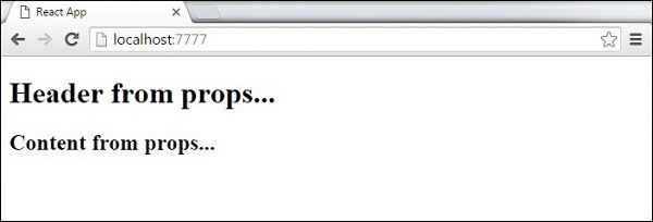
Default Props
You can also set default property values directly on the component constructor instead of adding it to the reactDom.render() element.
App.jsx
import React from 'react';

class App extends React.Component {
   render() {
      return (
         <div>
            <h1>{this.props.headerProp}</h1>
            <h2>{this.props.contentProp}</h2>
         </div>
      );
   }
}
App.defaultProps = {
   headerProp: "Header from props...",
   contentProp:"Content from props..."
}
export default App;
main.js
import React from 'react';
import ReactDOM from 'react-dom';
import App from './App.jsx';

ReactDOM.render(<App/>, document.getElementById('app'));
Output is the same as before.
State vs Props
The following example shows how to combine state and props in your app. We are setting the state in our parent component and passing it down the component tree using props. Inside the render function, we are setting headerProp and contentProp used in child components.
App.jsx
import React from 'react';

class App extends React.Component {
   constructor(props) {
      super(props);
      this.state = {
         header: "Header from props...",
         content: "Content from props..."
      }
   }
   render() {
      return (
         <div>
            <Header headerProp = {this.state.header}/>
            <Content contentProp = {this.state.content}/>
         </div>
      );
   }
}
class Header extends React.Component {
   render() {
      return (
         <div>
            <h1>{this.props.headerProp}</h1>
         </div>
      );
   }
}
class Content extends React.Component {
   render() {
      return (
         <div>
            <h2>{this.props.contentProp}</h2>
         </div>
      );
   }
}
export default App;
main.js
import React from 'react';
import { createRoot } from 'react-dom/client';
import App  from './App.jsx'

const container = document.getElementById('app');
const root = createRoot(container);

root.render(<App />);
The result will again be the same as in the previous two examples, the only thing that is different is the source of our data, which is now originally coming from the state. When we want to update it, we just need to update the state, and all child components will be updated. More on this in the Events chapter.
Let us learn the following concepts one by one in this chapter.
React - Create a Component Using Properties
As we have already learned in this tutorial before, React is a very flexible library with bendable rules, sometimes, but it strictly follows on one rule: if a component is defined as a function or class, it must act like a pure function with respect to their properties. A pure function in React is defined as a function whose input must not be changed so it does not alter its result.
In short, the Props passed to a component are Read-Only. But as the application UIs are dynamic and change their inputs over time, we use "state" concept to handle it.
The concept of state allows React components to change their result as a response to changing user actions, network responses, etc. without violating this rule.
How to create a component using properties?
In this chapter, let us see the steps to create a component using properties −
We will first modify our ExpenseEntryItem component and try to use properties.
Step 1 − Open our expense-manager application in your favorite editor.
Open ExpenseEntryItem file in the src/components folder.
Step 2 − Introduce construction function with argument props.
constructor(props) {
   super(props);
}
Next, change the render method and populate the value from props.
render() {
   return (
      <div>
         <div><b>Item:</b> <em>{this.props.name}</em></div>
         <div><b>Amount:</b> <em>{this.props.amount}</em></div>
         <div><b>Spend date:</b>
            <em>{this.props.spenddate.tostring()}</em></div>
         <div><b>Category:</b> <em>{this.props.category}</em></div>
      </div>
   );
}
Here,
name represents the item's name of type String
amount represents the item's amount of type number
spendDate represents the item's Spend Date of type date
category represents the item's category of type String
Now, we have successfully updated the component using properties.
import React from 'react'
import './ExpenseEntryItem.css';
import styles from './ExpenseEntryItem.module.css'

class ExpenseEntryItem extends React.Component {
   constructor(props) {
      super(props);
   }
   render() {
      return (
         <div>
            <div><b>Item:</b> <em>{this.props.name}</em></div>
            <div><b>Amount:</b> <em>{this.props.amount}</em></div>
            <div><b>Spend Date:</b>
               <em>{this.props.spendDate.toString()}</em></div>
            <div><b>Category:</b> <em>{this.props.category}</em></div>
         </div>
      );
   }
}
export default ExpenseEntryItem;
index.js
Now, we can use the component by passing all the properties through attributes in the index.js.
import React from 'react';
import { createRoot } from 'react-dom/client';
import ExpenseEntryItem  from './components/ExpenseEntryItem'

const name = "Grape Juice"
const amount = 30.00
const spendDate = new Date("2020-10-10")
const category = "Food"

const container = document.getElementById('root');
const root = createRoot(container);
root.render(<ExpenseEntryItem name={name} amount={amount} spendDate={spendDate} category={category}/>);
Serve the application using npm command.
npm start
Open the browser and enter http://localhost:3000 in the address bar and press enter.
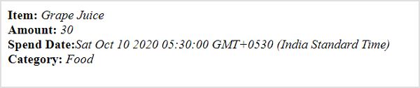
The complete code to do it using CDN in a webpage is as follows −
<!DOCTYPE html>
<html>
   <head>
      <meta charset="UTF-8" />
      <title>React based application</title>
   </head>
   <body>
      <div id="react-app"></div>

      <script src="https://unpkg.com/react@17/umd/react.development.js" crossorigin></script>
      <script src="https://unpkg.com/react-dom@17/umd/react-dom.development.js" crossorigin></script>
      <script src="https://unpkg.com/@babel/standalone/babel.min.js"></script>
      <script type="text/babel">
         class ExpenseEntryItem extends React.Component {
            constructor(props) {
               super(props);
            }
            render() {
               return (
                  <div>
                     <div><b>Item:</b> <em>{this.props.name}</em></div>
                     <div><b>Amount:</b> <em>{this.props.amount}</em></div>
                     <div><b>Spend Date:</b> <em>{this.props.spendDate.toString()}</em></div>
                     <div><b>Category:</b> <em>{this.props.category}</em></div>
                  </div>
               );
            }
         }
         const name = "Grape Juice"
         const amount = 30.00
         const spendDate = new Date("2020-10-10")
         const category = "Food"

         ReactDOM.render(
            <ExpenseEntryItem
               name={name}
               amount={amount}
               spendDate={spendDate}
               category={category} />,
            document.getElementById('react-app') );
      </script>
   </body>
</html>
Objects as properties
Let us learn how to use JavaScript object as attributes in this chapter.
Step 1 − Open our expense-manager application in your favorite editor.
Open ExpenseEntryItem.js file.
Step 2 − Next, change the render() method and access the input object item through this.props.item property.
render() {
   return (
      <div>
         <div><b>Item:</b> <em>{this.props.item.name}</em></div>
         <div><b>Amount:</b> <em>{this.props.item.amount}</em></div>
         <div><b>Spend Date:</b>
            <em>{this.props.item.spendDate.toString()}</em></div>
         <div><b>Category:</b> <em>{this.props.item.category}</em></div>
      </div>
   );
}
Open index.js and represent the expense entry item in JavaScript object.
const item = {
   id: 1,
   name : "Grape Juice",
   amount : 30.5,
   spendDate: new Date("2020-10-10"),
   category: "Food"
}
Pass the object to the component using curly brace ({}) syntax in the component attributes.
<ExpenseEntryItem item={item} />
index.js
The complete code of index.js is as follows −
import React from 'react';
import { createRoot } from 'react-dom/client';
import ExpenseEntryItem  from './components/ExpenseEntryItem'

const item = {
   id: 1,
   name : "Grape Juice",
   amount : 30.5,
   spendDate: new Date("2020-10-10"),
   category: "Food"
}

const container = document.getElementById('root');
const root = createRoot(container);
root.render(<ExpenseEntryItem item={item}/>);
Serve the application using npm command.
npm start
Open the browser and enter http://localhost:3000 in the address bar and press enter.
The complete code to do it using CDN in a webpage is as follows −
<!DOCTYPE html>
<html>
   <head>
      <meta charset="UTF-8" />
      <title>React based application</title>
   </head>
   <body>
      <div id="react-app"></div>

      <script src="https://unpkg.com/react@17/umd/react.development.js" crossorigin></script>
      <script src="https://unpkg.com/react-dom@17/umd/react-dom.development.js" crossorigin></script>
      <script src="https://unpkg.com/@babel/standalone/babel.min.js"></script>
      <script type="text/babel">
         class ExpenseEntryItem extends React.Component {
            constructor(props) {
               super(props);
            }
            render() {
               return (
                  <div>
                     <div><b>Item:</b>
                        <em>{this.props.item.name}</em></div>
                     <div><b>Amount:</b>
                        <em>{this.props.item.amount}</em></div>
                     <div><b>Spend Date:</b>
                        <em>{this.props.item.spendDate.toString()}</em>
                     </div>
                     <div><b>Category:</b>
                        <em>{this.props.item.category}</em>
                     </div>
                  </div>
               );
            }
         }
         const item = {
            id: 1,
            name : "Grape Juice",
            amount : 30.5,
            spendDate: new Date("2020-10-10"),
            category: "Food"
         }
         ReactDOM.render(
            <ExpenseEntryItem item={item} />,
            document.getElementById('react-app')
         );
      </script>
   </body>
</html>
React - props Validation
One of the time consuming process in a program is to find the root cause of a bug. In react, props are used extensively. Props of a component will have different source of origin. Some component will have static props, while some component will have dynamic props coming from immediate parent component. One of the source of bugs is that the value of the props does not match the type of the props designed by the developer. This mismatch create a lot of bugs. React provides a lot of option to fix this and one such feature is PropTypes and its validation.
We will learn what is PropTypes and how to use it to create a bug free react application in this chapter.
PropTypes
React community provides a special package, prop-types to address the properties type mismatch problem. prop-types allows the properties of the component to be specified with type through a custom setting (propTypes) inside the component. For example, properties with number type can specified using PropTypes.number option as shown below.
Sum.propTypes = {
   num1: PropTypes.number,
   num2: PropTypes.number
}
Once the type of the properties is specified, then the React will throw warning during the development phase of the application.
Let us include propTypes in our application and see how it helps to catch properties type mismatch issue.
First of all, create a new react application and start it using below command.
create-react-app myapp
cd myapp
npm start
Next, install prop-types package using node package manager (npm) as shown below −
npm i prop-types --save
Next, open App.css (src/App.css) and remove all the CSS classes. Then, create a simple component, Sum (src/Components/Sum.js) as shown below −
import React from 'react'
import PropTypes from 'prop-types'

class Sum extends React.Component {
   render() {
      return <p>The sum of {this.props.num1} and {this.props.num2}
      is {parseInt(this.props.num1) + parseInt(this.props.num2)}</p>
   }
}
Sum.propTypes = {
   num1: PropTypes.number,
   num2: PropTypes.number
}
export default Sum
Here,
Purpose of the component is to find sum value of the given props (num1 and num2) and show it in the front end.
Set the data type of the num1 and num2 as numbers (PropTypes.number) using propTypes.
Next, open App component (src/App.js), import the bootstrap css and render the date picker as shown below −
import './App.css'
import Sum from './Components/Sum'

function App() {
   return (
      <div className="container">
         <div style={{ padding: "10px" }}>
            <div>
               <Sum num1="10" num2="John" />
            </div>
         </div>
      </div>
   );
}
export default App;
Here, we have rendered the Sum component with 10 and John as props
Finally, open the application in your favorite browser and open the JavaScript console through developer tools. JavaScript throws the warning that the unexpected type is provided as shown below.
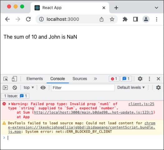
propTypes only works during development phase to nullify the performance reduction of the application due to additional checking of the props types. This will not affect the performance of the application in production / live setup.
Available validators
The prop-types supplies a good collection of ready-made validators. They are as follows −
PropTypes.array
PropTypes.bigint
PropTypes.bool
PropTypes.func
PropTypes.number
PropTypes.object
PropTypes.string
PropTypes.symbol
PropTypes.node - Anything that can be rendered
PropTypes.element - React component
PropTypes.elementType - Type of React component
PropTypes.instanceOf() - instance of the specified class
propTypes.oneOf(['Value1', 'valueN']) - one of Value and ValueN
PropTypes.oneOfType([]) - Example, PropTypes.oneOfType([PropTypes.number, PropTypes.bigint])
PropTypes.arrayOf() - Example, PropTypes.arrayOf(PropTypes.number)
PropTypes.objectOf() - Example, PropTypes.objectOf(PropTypes.number)
PropTypes.func.isRequired
propTypes.element.isRequired
PropTypes.any.isRequired
Custom validator
A custom validator can also be created and used to validate the property's value. Let us consider that the component have a email property and the value should be a valid email address. Then, a validate function can be written and attached to the email property as shown below −
Sum.propTypes = {
   num1: PropTypes.number,
   num2: PropTypes.number,
   email: function(myProps, myPropName, myComponentName) {
      if (!/^[^\s@]+@[^\s@]+\.[^\s@]+$/.test(myProps[myPropName])) {
         return new Error(
            'Invalid prop value `' + myProps[myPropName] + '` supplied to' +
            ' `' + myComponentName + '/' + myPropName + '`. Validation failed.'
         );
      }
   }
}
Here,
/^[^\s@]+@[^\s@]+\.[^\s@]+$/ is a simple regex email pattern.
myProps represents all properties.
myPropName represent the current property being validated.
myComponentName represent the name of the component being validated.
Similarly, custom validator can be created and used for array and object properties using below function signature −
PropTypes.arrayOf(function(propValue, key, componentName, location, propFullName) { ... })
Here,
propValue represents array / object value.
key represents the key of the current item.
componentName represents the name of the component.
propFullName represents the name of the property being validated.
Summary
Props types is one of the good tool for the developer to write bug free software. It will definitely help the developer to code faster and safer.
React - Constructor
In general, constructor method in a class is used to set the initial value of the newly created object. React also use the constructor() for the same initialization purpose. Yet in react, constructor is used for state initialization and event binding purposes as well.
Let us learn how to use constructor in the react component in this chapter.
Initialization of props
As we know, every react component will have props and state. The props should be initialized in the constructor using super keyword. If the props is not properly initialized in a class based react component, then this.props will not work properly and introduce bugs. Let us create a simple component with proper constructor method.
class Welcome extends React.Component {
   constructor(props) {
      super(props);
   }
   render() {
      return (
         <div><h3>Welcome {this.props.name}</h3></div>
      )
   }
}
Here,
super(props) will initialize the props in the Welcome component.
this.props.* will provide access to props details.
The component can be used as shown below −
function App() {
   return (
      <div className="container">
         <div style={{ padding: "10px" }}>
            <div>
               <Welcome name={'John'} />
            </div>
         </div>
      </div>
   );
}
The component will render the welcome message as shown below −
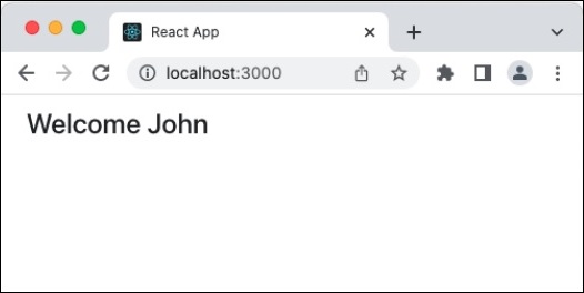
Initialization of the state
Similar to props initialization, initialization of state is very important and can be done in the constructor. In general, React provides different ways to set and get the state information in a component. They are as follows −
Using this.state = obj
This is used to initialize the state using object
this.state = {
   pageSize: 10
}
Using this.state.*
This is used to access the state information. (this.state.pageSize)
Using this.setState()
It is a function accepting either an object or a lambda function. Used to set the state information
this.setState({
   pageSize: 20
})
this.setState((state, props) => ({
   pageSize: state.pageSize + 1
}))
Let us create a simple component with proper state initialization
class Welcome extends React.Component {
   constructor(props) {
      super(props);
      this.state = {
         welcomeMessage: "Hello"
      }
   }
   render() {
      return (
         <div><h3>{this.state.welcomeMessage}, {this.props.name}</h3></div>
      )
   }
}
Here, this.state is used to set the default (initial) value of the welcome message. The component can be used as shown below −
function App() {
   return (
      <div className="container">
         <div style={{ padding: "10px" }}>
            <div>
               <Welcome name={'John'} />
            </div>
         </div>
      </div>
   );
}
The component will render the welcome message as shown below −
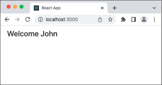
Event binding
Similar to props and state initialization, event handler has to be properly bind so that the this will be correctly accessed in the event handler. Let us create new button in our Welcome component to change the welcome message and add an event handler to handle the onClick event of the button as shown below −
import React from "react";

class Welcome extends React.Component {
   constructor(props) {
      super(props);
      this.state = {
         welcomeMessage: "Hello"
      }
      this.changeMessageHandler = this.changeMessageHandler.bind(this)
   }
   changeMessageHandler() {
      this.setState(prevState => ({
         welcomeMessage: prevState.welcomeMessage == "Hello" ? "Welcome" : "Hello"
      }));
   }
   render() {
      return (
         <div>
            <div><h3>{this.state.welcomeMessage}, {this.props.name}</h3></div>
            <div><button onClick={this.changeMessageHandler}>Change welcome message</button></div>
         </div>
      )
   }
}
export default Welcome;
Here,
Step1 − Add a button with an onClick event
<div><button onClick={this.changeMessageHandler}>Change welcome message</button></div>
Step 2 − Set this.changeMessageHandler method as onClick event handler
Step 3 − Bind the event handler, this.changeMessageHandler in the constructor
this.changeMessageHandler = this.changeMessageHandler.bind(this)
Step 4 − Added the event handler and updated the state using this.setState.
changeMessageHandler() {
   this.setState(prevState => ({
      welcomeMessage: prevState.welcomeMessage == "Hello" ? "Welcome" : "Hello"
   }));
}
The component can be used as shown below −
function App() {
   return (
      <div className="container">
         <div style={{ padding: "10px" }}>
            <div>
               <Welcome name={'John'} />
            </div>
         </div>
      </div>
   );
}
The component will render the welcome message as shown below −
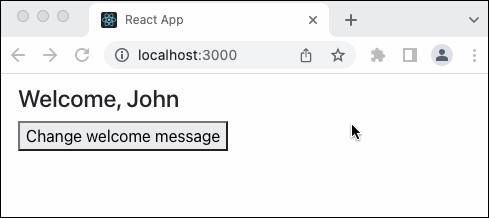
Summary
Constructor is very important in the class based react component. It's main job is to setup the component in such a way that the props, state and events are configured correctly and ready to access by the component events and render methods.
React - Component Life Cycle
In React, Life cycle of a component represents the different stages of the component during its existence. React provides callback function to attach functionality in each and every stages of the React life cycle. Let us learn the life cycle (and the related API) of a React component in this chapter.
Life cycle API
Each React component has three distinct stages.
Mounting − Mounting represents the rendering of the React component in the given DOM node.
Updating − Updating represents the re-rendering of the React component in the given DOM node during state changes / updates.
Unmounting − Unmounting represents the removal of the React component.
React provides a collection of life cycle events (or callback API) to attach functionality, which will to be executed during the various stages of the component. The visualization of life cycle and the sequence in which the life cycle events (APIs) are invoked as shown below.
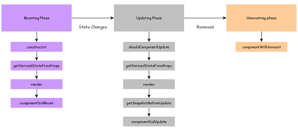
constructor() − Invoked during the initial construction phase of the React component. Used to set initial state and properties of the component.
render() − Invoked after the construction of the component is completed. It renders the component in the virtual DOM instance. This is specified as mounting of the component in the DOM tree.
componentDidMount() − Invoked after the initial mounting of the component in the DOM tree. It is the good place to call API endpoints and to do network requests. In our clock component, setInterval function can be set here to update the state (current date and time) for every second.
componentDidMount() {
   this.timeFn = setInterval( () => this.setTime(), 1000);
}
componentDidUpdate() − Similar to ComponentDidMount() but invoked during the update phase. Network request can be done during this phase but only when there is difference in component's current and previous properties.
The signature of the API is as follows −
componentDidUpdate(prevProps, prevState, snapshot)
prevProps − Previous properties of the component.
prevState − Previous state of the component.
snapshot − Current rendered content.
componentWillUnmount() − Invoked after the component is unmounted from the DOM. This is the good place to clean up the object. In our clock example, we can stop updating the date and time in this phase.
componentDidMount() {
   this.timeFn = setInterval( () => this.setTime(), 1000);
}
shouldComponentUpdate() − Invoked during the update phase. Used to specify whether the component should update or not. If it returns false, then the update will not happen.
The signature is as follows −
shouldComponentUpdate(nextProps, nextState)
nextProps − Upcoming properties of the component
nextState − Upcoming state of the component
getDerivedStateFromProps − Invoked during both initial and update phase and just before the render() method. It returns the new state object. It is rarely used where the changes in properties results in state change. It is mostly used in animation context where the various state of the component is needed to do smooth animation.
The signature of the API is as follows −
static getDerivedStateFromProps(props, state)
props − current properties of the component
state − Current state of the component
This is a static method and does not have access to this object.
getSnapshotBeforeUpdate − Invoked just before the rendered content is commited to DOM tree. It is mainly used to get some information about the new content. The data returned by this method will be passed to ComponentDidUpdate() method. For example, it is used to maintain the user's scroll position in the newly generated content. It returns user's scroll position. This scroll position is used by componentDidUpdate() to set the scroll position of the output in the actual DOM.
The signature of the API is as follows −
getSnapshotBeforeUpdate(prevProps, prevState)
prevProps − Previous properties of the component.
prevState − Previous state of the component.
Working example of life cycle API
Let us use life cycle api in our react-clock-app application.
Step 1 − Open react-clock-hook-app in your favorite editor.
Open src/components/Clock.js file and start editing.
Step 2 − Remove the setInterval() method from the constructor.
constructor(props) {
   super(props);
   this.state = {
      date: new Date()
   }
}
Step 3 − Add componentDidMount() method and call setInterval() to update the date and time every second. Also, store the reference to stop updating the date and time later.
componentDidMount() {
   this.setTimeRef = setInterval(() => this.setTime(), 1000);
}
Add componentWillUnmount() method and call clearInterval() to stop the date and time update calls.
componentWillUnmount() {
   clearInterval(this.setTimeRef)
}
Now, we have updated the Clock component and the complete source code of the component is given below −
import React from 'react';

class Clock extends React.Component {
   constructor(props) {
      super(props);
      this.state = {
         date: new Date()
      }
   }
   componentDidMount() {
      this.setTimeRef = setInterval(() => this.setTime(), 1000);
   }
   componentWillUnmount() {
      clearInterval(this.setTimeRef)
   }
   setTime() {
      this.setState((state, props) => {
         console.log(state.date);
         return {
            date: new Date()
         }
      })
   }
   render() {
      return (
         <div>
            <p>The current time is {this.state.date.toString()}</p>
         </div>
      );
   }
}
export default Clock;
Next, open index.js and use setTimeout to remove the clock from the DOM after 5 seconds.
import React from 'react';
import ReactDOM from 'react-dom';
import Clock from './components/Clock';

ReactDOM.render(
   <React.StrictMode>
      <Clock />
   </React.StrictMode>,
   document.getElementById('root')
);
setTimeout(() => {
   ReactDOM.render(
      <React.StrictMode>
         <div><p>Clock is removed from the DOM.</p></div>
      </React.StrictMode>,
      document.getElementById('root')
   );
}, 5000);
Serve the application using npm command.
npm start
Open the browser and enter http://localhost:3000 in the address bar and press enter.
The clock will be shown for 5 second and then, it will be removed from the DOM. By checking the console log, we can found that the cleanup code is properly executed.
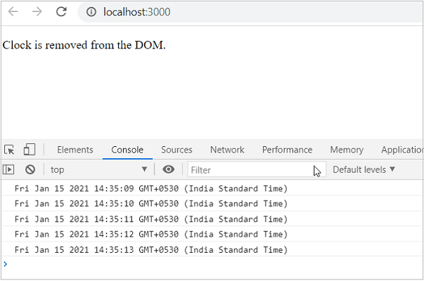
Life cycle API in Expense manager app
Let us add life cycle api in the expense manager and log it whenever the api is called. This will give insight about the life cycle of the component.
Step 1 − Open expense-manager application in your favorite editor.
Next, update ExpenseEntryItemList component with below methods.
componentDidMount() {
   console.log("ExpenseEntryItemList :: Initialize :: componentDidMount :: Component mounted");
}
shouldComponentUpdate(nextProps, nextState) {
   console.log("ExpenseEntryItemList :: Update :: shouldComponentUpdate invoked :: Before update");
   return true;
}
static getDerivedStateFromProps(props, state) {
   console.log("ExpenseEntryItemList :: Initialize / Update :: getDerivedStateFromProps :: Before update");
   return null;
}
getSnapshotBeforeUpdate(prevProps, prevState) {
   console.log("ExpenseEntryItemList :: Update :: getSnapshotBeforeUpdate :: Before update");
   return null;
}
componentDidUpdate(prevProps, prevState, snapshot) {
   console.log("ExpenseEntryItemList :: Update :: componentDidUpdate :: Component updated");
}
componentWillUnmount() {
   console.log("ExpenseEntryItemList :: Remove :: componentWillUnmount :: Component unmounted");
}
Step 2 − Serve the application using npm command.
npm start
Open the browser and enter http://localhost:3000 in the address bar and press enter.
Next, check the console log. It will show the life cycle api during initialization phase as shown below.
ExpenseEntryItemList :: Initialize / Update :: getDerivedStateFromProps :: Before update
ExpenseEntryItemList :: Initialize :: componentDidMount :: Component mounted
Remove an item and then, check the console log. It will show the life cycle api during the update phase as shown below.
ExpenseEntryItemList :: Initialize / Update :: getDerivedStateFromProps :: Before update
ExpenseEntryItemList.js:109 ExpenseEntryItemList :: Update :: shouldComponentUpdate invoked :: Before update
ExpenseEntryItemList.js:121 ExpenseEntryItemList :: Update :: getSnapshotBeforeUpdate :: Before update
ExpenseEntryItemList.js:127 ExpenseEntryItemList :: Update :: componentDidUpdate :: Component updated
Finally, remove all the life cycle api as it may hinder the application performance. Life cycle api should be used only if the situation demands.
React - Event Management
Events are just some actions performed by a user to interact with any application. They can be the smallest of actions, like hovering a mouse pointer on an element that triggers a drop-down menu, resizing an application window, or dragging and dropping elements to upload them etc. Events in React are divided into three categories:
Mouse Events − onClick, onDrag, onDoubleClick
Keyboard Events − onKeyDown, onKeyPress, onKeyUp
Focus Events − onFocus, onBlur
For each of these events, JavaScript provides responses. So, every time an event is performed by the user, it usually requires some type of reaction from the application; and these reactions are defined as some functions or blocks of code, called Event Handlers. This entire process of working with events using Event Handlers is known as Event Management.
Event Management in ReactJS
Event management is one of the important features in a web application. It enables the user to interact with the application. React supports all events available in a web application. React event handling is very similar to DOM events with little changes. Following are some of the common events one can observe in React-based websites −
Clicking on a component.
Scrolling the current page.
Hovering over elements of the current page.
Submitting a form.
Redirecting to another webpage.
Loading images.
Synthetic React Events
In JavaScript, when an event is specified, you will be dealing with a react event type called a synthetic event instead of regular DOM events. SyntheticEvent is a simple cross-browser wrapper for native event instances making the events work identically across all browsers. All event handlers must be passed as instances of this wrapper. However, it is expensive in terms of CPU resources as every synthetic event created needs to be garbage-collected. Every synthetic event object has the following attributes:
boolean bubbles
boolean cancelable
DOMEventTarget currentTarget
boolean defaultPrevented
number eventPhase
boolean isTrusted
DOMEvent nativeEvent
void preventDefault()
boolean isDefaultPrevented()
void stopPropagation()
boolean isPropagationStopped()
void persist()
DOMEventTarget target
number timeStamp
string type
Since synthetic events use a lot of resources, they are usually reused and all its properties will be nullified after invoking the event callback to optimize their performance in the browser. SyntheticEvent has the same interface as the native event. And as the synthetic events are authorized by the document node, native events are triggered first followed by the synthetic events.
Adding an Event
As we have already seen, React has the same events as HTML: click, change, mouseover etc. However, the React events are defined with a camelCase and the reaction is written inside the curly braces instead. The syntax of adding an event differs in a functional component and class component.
Following is the syntax to add an onClick event in a functional component of React:
onClick = {action to be performed}
Following is the syntax to add an onClick event in a class component of React:
onClick = {this.action_to_be_performed}
Handling an Event
Let us now learn how to handle these events in a React application with the help of the following step-by-step process.
Define an event handler method to handle the given event.
log() {
   console.log("Event is fired");
}
React provides an alternative syntax using lambda function to define event handler. The lambda syntax is −
log = () => {
   console.log("Event is fired");
}
Passing Arguments to Event Handler
There are two methods available to pass arguments to an Event Handler:
Arrow Method
Bind Method
Arrow Method
If you want to know the target of the event, then add an argument e in the handler method. React will send the event target details to the handler method.
log(e) {
   console.log("Event is fired");
   console.log(e.target);
}
The alternative lambda syntax is −
log = (e) => {
   console.log("Event is fired");
   console.log(e.target);
}
If you want to send extra details during an event, then add the extra details as initial argument and then add argument (e) for event target.
log(extra, e) {
   console.log("Event is fired");
   console.log(e.target);
   console.log(extra);
   console.log(this);
}
The alternative lambda syntax is as follows −
log = (extra, e) => {
   console.log("Event is fired");
   console.log(e.target);
   console.log(extra);
   console.log(this);
}
Bind Method
We can also bind the event handler method in the constructor of the component. This will ensure the availability of this in the event handler method.
constructor(props) {
   super(props);
   this.logContent = this.logContent.bind(this);
}
If the event handler is defined in alternate lambda syntax, then the binding is not needed. this keyword will be automatically bound to the event handler method.
Set the event handler method for the specific event as specified below −
<div onClick={this.log}> ... </div>
To set extra arguments, bind the event handler method and then pass the extra information as second argument.
<div onClick={this.log.bind(this, extra)}> ... </div>
The alternate lambda syntax is as follows −
<div onClick={this.log(extra, e)}> ... </div>
Here,
React - Create an Event-Aware Component
Event management is one of the important features in a web application. It enables the user to interact with the application. React supports all events available in a web application. React event handling is very similar to DOM events with little changes. For example, clicking on a component is one of the common events one can observe in React-based websites.
An event-aware component in React is nothing but a component that contains an event handler method within it. The component can either be a class component or functional component. In this chapter, we will learn how to create such event-aware components with React.
How to create an Event-Aware Component?
Following are the steps to create a new Event-Aware Component −
Let us create a new component, MessageWithEvent and handle events in the component to better understand event management in React application.
Step 1 − Open expense-manager application in your favorite editor.
Next, create a file, MessageWithEvent.js in src/components folder to create MessageWithEvent component.
Import React library.
import React from 'react';
Step 2 − Create a class, MessageWithEvent and call constructor with props.
class MessageWithEvent extends React.Component {
   constructor(props) {
      super(props);
   }
}
Step 3 − Create an event handler method, logEventToConsole, which will log event details to the console.
logEventToConsole(e) {
   console.log(e.target.innerHTML);
}
Step 4 − Create a render function.
render() {
}
In render() function, create a greeting message and return it.
render() {
   return (
      <div>
         <p>Hello {this.props.name}!</p>
      </div>
   );
}
Step 5 − Then, set logEventToConsole method as the event handler for click event of the root container(div).
render() {
   return (
      <div onClick={this.logEventToConsole}>
         <p>Hello {this.props.name}!</p>
      </div>
   );
}
Step 6 − Update the constructor by binding the event handler.
class MessageWithEvent extends React.Component {
   constructor(props) {
      super(props);
      this.logEventToConsole = this.logEventToConsole.bind();
   }
}
Finally, export the component.
export default MessageWithEvent;
The complete code of the MessageWithEvent component is given below −
import React from 'react';

class MessageWithEvent extends React.Component {
   constructor(props) {
      super(props);
   }
   logEventToConsole(e) {
      console.log(e.target.innerHTML);
   }
   render() {
      return (
         <div onClick={this.logEventToConsole}>
            <p>Hello {this.props.name}!</p>
         </div>
      );
   }
}
export default MessageWithEvent;
index.js
Next, open index.js and import MessageWithEvent.
import MessageWithEvent from './components/MessageWithEvent'
Build the user interface of the application by using MessageWithEvent component.
import React from 'react';
import { createRoot } from 'react-dom/client';
import MessageWithEvent  from './components/MessageWithEvent'

const container = document.getElementById('root');
const root = createRoot(container);
root.render(<MessageWithEvent name="John"/>);
Serve the application using npm command.
npm start
Open the browser and enter http://localhost:3000 in the address bar and press enter.
Now, click both MessageWithEvent component and the application will emit messages in the console as shown below.
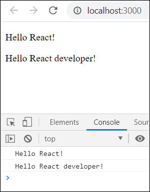
Passing Extra Information to Event Handler
Let us try to pass and an extra information (for example, msgid) to event handler.
Step 1 − First, update the logEventToConsole to accept an extra argument, msgid.
logEventToConsole(msgid, e) {
   console.log(e.target.innerHTML);
   console.log(msgid);
}
Step 2 − Next, pass message id to the event handler by binding the message id in the render method.
render() {
   return (
      <div onClick={this.logEventToConsole.bind(this, Math.floor(Math.random() * 10))}>
         <p>Hello {this.props.name}!</p>
      </div>
   );
}
Step 3 − The complete and updated code is as follows −
import React from 'react';

class MessageWithEvent extends React.Component {
   constructor(props) {
      super(props);

      this.logEventToConsole = this.logEventToConsole.bind();
   }
   logEventToConsole(msgid, e) {
      console.log(e.target.innerHTML);
      console.log(msgid);
   }
   render() {
      return (
         >div onClick={this.logEventToConsole.bind(this, Math.floor(Math.random() * 10))}>
            >p>Hello {this.props.name}!>/p>
         >/div>
      );
   }
}
export default MessageWithEvent;
Run the application and you will find that the event emits message id in the console.
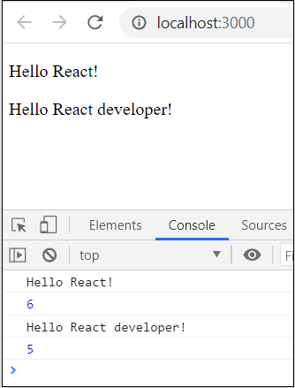
Introduce Events in Expense Manager APP
In the previous chapters, we have learned that events are just some actions performed by a user to interact with any application. They can be the smallest of actions, like hovering a mouse pointer on an element that triggers a drop-down menu, resizing an application window, or dragging and dropping elements to upload them etc.
For each of these events, JavaScript provides responses. So, every time an event is performed by the user, it usually requires some type of reaction from the application; and these reactions are defined as some functions or blocks of code, called Event Handlers.
To understand event handling better, let us try to introduce events into an example application (Expense Manager APP). In this chapter we are trying to handle Mouse Events in the expense manager app. Mouse events are just some actions performed by users using mouse. These include hovering, clicking, dragging or simply any action that can be performed on an application using a mouse.
Handling Events in Expense Manager APP
Let us do some event management in our expense application. We can try to highlight the expense entry item in the table when the user moves the cursor over it.
Step 1 − Open expense-manager application in your favorite editor.
Open ExpenseEntryItemList.js file and add a method handleMouseEnter to handle the event fired (onMouseEnter) when the user moves the mouse pointer into the expense items (td - table cell).
handleMouseEnter(e) {
   e.target.parentNode.classList.add("highlight");
}
Here,
Event handler tries to find the parent node (tr) of the event target (td) node using parentNode method. The parentNode method is the standard DOM method to find the immediate parent the current node.
Once the parent node is found, event handler access the list of the css class attached to the parent node and adds 'highlight' class using add method. classList is the standard DOM property to get list of class attached to the node and it can be used to add / remove class from a DOM node.
Step 2 − Next, add a method, handleMouseLeave() to handle the event fired when the user moves out of the expense item.
handleMouseLeave(e) {
   e.target.parentNode.classList.remove("highlight");
}
Here, Event handler removes the highlight class from the DOM.
Add another method, handleMouseOver() to check where the mouse is currently positioned. It is optional to find the where about of the mouse pointer in the DOM.
handleMouseOver(e) {
   console.log("The mouse is at (" + e.clientX + ", " + e.clientY + ")");
}
Step 3 − Attach the event handlers to the corresponding tag in the render method.
render() {
   const lists = this.props.items.map((item) =>
      <tr key={item.id} onMouseEnter={this.handleMouseEnter} onMouseLeave={this.handleMouseLeave}>
         <td>{item.name}</td>
         <td>{item.amount}</td>
         <td>{new Date(item.spendDate).toDateString()}</td>
         <td>{item.category}</td>
      </tr>
   );
   return (
      <table onMouseOver={this.handleMouseOver}>
         <thead>
            <tr>
               <th>Item</th>
               <th>Amount</th>
               <th>Date</th>
               <th>Category</th>
            </tr>
         </thead>
         <tbody>
            {lists}
         </tbody>
      </table>
   );
}
The final and complete code of the ExpenseEntryItemList is as follows −
import React from 'react';
import './ExpenseEntryItemList.css';

class ExpenseEntryItemList extends React.Component {
   constructor(props) {
      super(props);
   }
   handleMouseEnter(e) {
      e.target.parentNode.classList.add("highlight");
   }
   handleMouseLeave(e) {
      e.target.parentNode.classList.remove("highlight");
   }
   handleMouseOver(e) {
      console.log("The mouse is at (" + e.clientX + ", " + e.clientY + ")");
   }
   render() {
      const lists = this.props.items.map((item) =>
         <tr key={item.id} onMouseEnter={this.handleMouseEnter} onMouseLeave={this.handleMouseLeave}>
            <td>{item.name}</td>
            <td>{item.amount}</td>
            <td>{new Date(item.spendDate).toDateString()}</td>
            <td>{item.category}</td>
         </tr>
      );
      return (
         <table onMouseOver={this.handleMouseOver}>
            <thead>
               <tr>
                  <th>Item</th>
                  <th>Amount</th>
                  <th>Date</th>
                  <th>Category</th>
               </tr>
            </thead>
            <tbody>
               {lists}
            </tbody>
         </table>
      );
   }
}
export default ExpenseEntryItemList;
ExpenseEntryItemList.css:
Next, open the css file, ExpenseEntryItemList.css and add a css class, highlight.
tr.highlight td {
   background-color: #a6a8bd;
}
index.js
Open index.js and use the ExpenseEntryItemList component.
import React from 'react';
import { createRoot } from 'react-dom/client';
import ExpenseEntryItemList from './components/ExpenseEntryItemList'

const items = [
   { id: 1, name: "Pizza", amount: 80, spendDate: "2020-10-10", category: "Food" },
   { id: 2, name: "Grape Juice", amount: 30, spendDate: "2020-10-12", category: "Food" },
   { id: 3, name: "Cinema", amount: 210, spendDate: "2020-10-16", category: "Entertainment" },
   { id: 4, name: "Java Programming book", amount: 242, spendDate: "2020-10-15", category: "Academic" },
   { id: 5, name: "Mango Juice", amount: 35, spendDate: "2020-10-16", category: "Food" },
   { id: 6, name: "Dress", amount: 2000, spendDate: "2020-10-25", category: "Cloth" },
   { id: 7, name: "Tour", amount: 2555, spendDate: "2020-10-29", category: "Entertainment" },
   { id: 8, name: "Meals", amount: 300, spendDate: "2020-10-30", category: "Food" },
   { id: 9, name: "Mobile", amount: 3500, spendDate: "2020-11-02", category: "Gadgets" },
   { id: 10, name: "Exam Fees", amount: 1245, spendDate: "2020-11-04", category: "Academic" }
]

const container = document.getElementById('root');
const root = createRoot(container);
root.render(<ExpenseEntryItemList items={items} />);
Serve the application using npm command.
npm start
Open the browser and enter http://localhost:3000 in the address bar and press enter.
The application will respond to mouse events and highlight the currently selected row.
| Item | Amount | Date | Category |
| Pizza | 80 | Sat Oct 10 2020 | Food |
| Grape Juice | 30 | Man Oct 12 2020 | Food |
| Cinema | 210 | Fri Oct 16 2020 | Entertainment |
| Java Programming book | 242 | Thu Oct 15 2020 | Academic |
| Mango Juice | 35 | Fri Oct 16 2020 | Food |
| Dress | 2000 | Sun Oct 25 2020 | Cloth |
| Tour | 2555 | Thu Oct 29 2020 | Entertainment |
| Meals | 300 | Fri Oct 30 2020 | Food |
| Mobile | 3500 | Mon Nov 02 2020 | Gadgets |
| Exam Fees | 1245 | Wed Nov 04 2020 | Academic |
React - State
State management is one of the important and unavoidable features of any dynamic application. React provides a simple and flexible API to support state management in a React component. Let us understand how to maintain state in React application in this chapter.
What is state?
State represents the value of a dynamic properties of a React component at a given instance. React provides a dynamic data store for each component. The internal data represents the state of a React component and can be accessed using this.state member variable of the component. Whenever the state of the component is changed, the component will re-render itself by calling the render() method along with the new state.
A simple example to better understand the state management is to analyse a real-time clock component. The clock component primary job is to show the date and time of a location at the given instance. As the current time will change every second, the clock component should maintain the current date and time in it's state. As the state of the clock component changes every second, the clock's render() method will be called every second and the render() method show the current time using it's current state.
The simple representation of the state is as follows −
{
   date: '2020-10-10 10:10:10'
}
Let us create a new Clock component in the Stateless Component chapter.
Defining a State
State in React can be used with functional and class components. To work with state in a component, there must exist a starting point, i.e. initial state. This initial state of a component must be defined in the constructor of the component's class. Following is the syntax to define a state of any Class −
state = {attribute: "value"};
Let us look at a sample code for a class component with an initial state −
Class SampleClass extends React.Component
{
    constructor(props)
    {
        super(props);
        this.state = { name : "John Doe" };
    }
}
Creating a state Object
React components have a built-in state object. The state object is used to store all the property values that belong to the component in which this state is defined. When the state object changes, the component re-renders.
Let us look at a sample code to demonstrate how to create a state object in React.
Class BookClass extends React.Component
{
   constructor(props)
   {
      super(props);
      this.state = { name : "John Doe" };
   }
   render() {
      return (
      <div>
         <h1>Name of the Author</h1>
      </div>
      );
   }
}
To understand state management better, check the following chapters.
React - State Management API
As we learned earlier, React component maintains and expose it's state through this.state of the component. React provides a single API to maintain state in the component. The API is this.setState(). It accepts either a JavaScript object or a function that returns a JavaScript object.
setState() is used to update a component's state object. This is done by scheduling an update to that component's state object. So, when the state changes, this component responds by re-rendering.
The signature of the setState API is as follows −
this.setState( { ... object ...} );
A simple example to set / update name is as follows −
this.setState( { name: 'John' } )
setState() with Function
The signature of the setState with function is as follows −
this.setState( (state, props) =>
   ... function returning JavaScript object ... );
Here,
state refers the current state of the React component
props refers the current properties of the React component.
React recommends to use setState API with function as it works correctly in async environment. Instead of lambda function, normal JavaScript function can be used as well.
this.setState( function(state, props) {
   return ... JavaScript object ...
}
Example
A simple example to update the amount using function is as follows −
this.setState( (state, props) => ({
   amount: this.state.amount + this.props.additionaAmount
})
React state should not be modified directly through this.state member variable and updating the state through member variable does not re-render the component.
Special Feature of React State API
A special feature of React state API is that it will be merged with the existing state instead of replacing the state. For example, we can update any one of the state fields at a time instead of updating the whole object. This feature gives the developer the flexibility to easily handle the state data.
For example, let us consider that the internal state contains a student record.
{
   name: 'John', age: 16
}
We can update only the age using setState API, which will automatically merge the new object with the existing student record object.
this.setState( (state, props) => ({
   age: 18
});
React - Stateless Component
React component with internal state is called Stateful component and React component without any internal state management is called Stateless component. React recommends to create and use as many stateless component as possible and create stateful component only when it is absolutely necessary. Also, React does not share the state with child component. The data needs to be passed to the child component through child's properties.
An example to pass date to the FormattedDate component is as follows −
<FormattedDate value={this.state.item.spend_date} />
The general idea is not to overcomplicate the application logic and use advanced features only when necessary.
Create a stateful component
Let us create a React application to show the current date and time.
Step 1 − First, create a new react application, react-clock-app using Create React App or Rollup bundler by following instruction in Creating a React application chapter.
Open the application in your favorite editor.
Step 2 − Create src folder under the root directory of the application.
Create components folder under src folder.
Create a file, Clock.js under src/components folder and start editing.
Import React library.
import React from 'react';
Next, create Clock component.
class Clock extends React.Component {
   constructor(props) {
      super(props);
   }
}
Step 3 − Initialize state with current date and time.
constructor(props) {
   super(props);
   this.state = {
      date: new Date()
   }
}
Step 4 − Add a method, setTime() to update the current time −
setTime() {
   console.log(this.state.date);
   this.setState((state, props) => (
      {
         date: new Date()
      }
   ))
}
Step 5 − Use JavaScript method, setInterval and call setTime() method every second to ensure that the component's state is updated every second.
constructor(props) {
   super(props);
   this.state = {
      date: new Date()
   }
   setInterval( () => this.setTime(), 1000);
}
Step 6 − Create a render function.
render() {
}
Next, update the render() method to show the current time.
render() {
   return (
      <div><p>The current time is {this.state.date.toString()}</p></div>
   );
}
Finally, export the component.
export default Clock;
The complete source code of the Clock component is as follows −
import React from 'react';

class Clock extends React.Component {
   constructor(props) {
      super(props);
      this.state = {
         date: new Date()
      }
      setInterval( () => this.setTime(), 1000);
   }
   setTime() {
      console.log(this.state.date);
      this.setState((state, props) => (
         {
            date: new Date()
         }
      ))
   }
   render() {
      return (
         <div>
            <p>The current time is {this.state.date.toString()}</p>
         </div>
      );
   }
}
export default Clock;
index.js
Next, create a file, index.js under the src folder and use Clock component.
import React from 'react';
import { createRoot } from 'react-dom/client';
import Clock from './components/Clock';

const container = document.getElementById('root');
const root = createRoot(container);
root.render(<Clock />);
index.html
Finally, create a public folder under the root folder and create index.html file.
<!DOCTYPE html>
<html lang="en">
   <head>
      <meta charset="utf-8">
      <title>Clock</title>
   </head>
   <body>
      <div id="root"></div>
      <script type="text/JavaScript" src="./index.js"></script>
   </body>
</html>
Serve the application using npm command.
npm start
Open the browser and enter http://localhost:3000 in the address bar and press enter. The application will show the time and update it every second.
The current time is Sun Nov 09 2025 14:57:51 GMT+0530 (India Standard Time)
The above application works fine but throws an error in the console.
Can't call setState on a component that is not yet mounted.
The error message indicates that the setState has to be called only after the component is mounted.
What is mounting?
React component has a life-cycle and mounting is one of the stages in the life cycle. Let us learn more about the life-cycle in the upcoming chapters.
Introduce state in expense manager app
Let us introduce state management in the expense manager application by adding a simple feature to remove an expenses item.
Step 1 − Open expense-manager application in your favorite editor.
Open ExpenseEntryItemList.js file.
Initialize the state of the component with the expense items passed into the components through properties.
this.state = {
   items: this.props.items
}
Step 2 − Add the Remove label in the render()method.
<thead>
   <tr>
      <th>Item</th>
      <th>Amount</th>
      <th>Date</th>
      <th>Category</th>
      <th>Remove</th>
   </tr>
</thead>
Step 3 − Update the lists in the render() method to include the remove link. Also, use items in the state (this.state.items) instead of items from the properties (this.props.items).
const lists = this.state.items.map((item) =>
   <tr key={item.id} onMouseEnter={this.handleMouseEnter} onMouseLeave={this.handleMouseLeave}>
      <td>{item.name}</td>
      <td>{item.amount}</td>
      <td>{new Date(item.spendDate).toDateString()}</td>
      <td>{item.category}</td>
      <td><a href="#" onClick={(e) =>  this.handleDelete(item.id, e)}>Remove</a></td>
   </tr>
);
Step 4 − Implement handleDelete method, which will remove the relevant expense item from the state.
handleDelete = (id, e) => {
   e.preventDefault();
   console.log(id);

   this.setState((state, props) => {
      let items = [];

      state.items.forEach((item, idx) => {
         if(item.id != id)
            items.push(item)
      })
      let newState = {
         items: items
      }
      return newState;
   })
}
Here,
Expense items are fetched from the current state of the component.
Current expense items are looped over to find the item referred by the user using id of the item.
Create a new item list with all the expense item except the one referred by the user
Step 5 − Add a new row to show the total expense amount.
<tr>
   <td colSpan="1" style={{ textAlign: "right" }}>Total Amount</td>
   <td colSpan="4" style={{ textAlign: "left" }}>
      {this.getTotal()}
   </td>
</tr>
Step 6 − Implement the getTotal() method to calculate the total expense amount.
getTotal() {
   let total = 0;
   for(var i = 0; i < this.state.items.length; i++) {
      total += this.state.items[i].amount
   }
   return total;
}
The complete code of the render() method is as follows −
render() {
   const lists = this.state.items.map((item) =>
      <tr key={item.id} onMouseEnter={this.handleMouseEnter} onMouseLeave={this.handleMouseLeave}>
         <td>{item.name}</td>
         <td>{item.amount}</td>
         <td>{new Date(item.spendDate).toDateString()}</td>
         <td>{item.category}</td>
         <td><a href="#"
            onClick={(e) =>  this.handleDelete(item.id, e)}>Remove</a></td>
      </tr>
   );
   return (
      <table onMouseOver={this.handleMouseOver}>
         <thead>
            <tr>
               <th>Item</th>
               <th>Amount</th>
               <th>Date</th>
               <th>Category</th>
               <th>Remove</th>
            </tr>
         </thead>
         <tbody>
            {lists}
            <tr>
               <td colSpan="1" style={{ textAlign: "right" }}>Total Amount</td>
               <td colSpan="4" style={{ textAlign: "left" }}>
                  {this.getTotal()}
               </td>
            </tr>
         </tbody>
      </table>
   );
}
Finally, the updated code of the ExpenseEntryItemList is as follows −
import React from 'react';
import './ExpenseEntryItemList.css';

class ExpenseEntryItemList extends React.Component {
   constructor(props) {
      super(props);
      this.state = {
         items: this.props.items
      }
   }
   handleMouseEnter(e) {
      e.target.parentNode.classList.add("highlight");
   }
   handleMouseLeave(e) {
      e.target.parentNode.classList.remove("highlight");
   }
   handleMouseOver(e) {
      console.log("The mouse is at (" + e.clientX + ", " + e.clientY + ")");
   }
   handleDelete = (id, e) => {
      e.preventDefault();
      console.log(id);
      this.setState((state, props) => {
         let items = [];
         state.items.forEach((item, idx) => {
            if(item.id != id)
               items.push(item)
         })
         let newState = {
            items: items
         }
         return newState;
      })
   }
   getTotal() {
      let total = 0;
      for(var i = 0; i < this.state.items.length; i++) {
         total += this.state.items[i].amount
      }
      return total;
   }
   render() {
      const lists = this.state.items.map((item) =>
         <tr key={item.id} onMouseEnter={this.handleMouseEnter} onMouseLeave={this.handleMouseLeave}>
            <td>{item.name}</td>
            <td>{item.amount}</td>
            <td>{new Date(item.spendDate).toDateString()}</td>
            <td>{item.category}</td>
            <td><a href="#"
               onClick={(e) =>  this.handleDelete(item.id, e)}>Remove</a></td>
         </tr>
      );
      return (
         <table onMouseOver={this.handleMouseOver}>
            <thead>
               <tr>
                  <th>Item</th>
                  <th>Amount</th>
                  <th>Date</th>
                  <th>Category</th>
                  <th>Remove</th>
               </tr>
            </thead>
            <tbody>
               {lists}
               <tr>
                  <td colSpan="1" style={{ textAlign: "right" }}>Total Amount</td>
                  <td colSpan="4" style={{ textAlign: "left" }}>
                     {this.getTotal()}
                  </td>
               </tr>
            </tbody>
         </table>
      );
   }
}
export default ExpenseEntryItemList;
index.js
Update the index.js and include the ExpenseEntyItemList component.
import React from 'react';
import { createRoot } from 'react-dom/client';
import ExpenseEntryItemList from './components/ExpenseEntryItemList'

const items = [
   { id: 1, name: "Pizza", amount: 80, spendDate: "2020-10-10", category: "Food" },
   { id: 2, name: "Grape Juice", amount: 30, spendDate: "2020-10-12", category: "Food" },
   { id: 3, name: "Cinema", amount: 210, spendDate: "2020-10-16", category: "Entertainment" },
   { id: 4, name: "Java Programming book", amount: 242, spendDate: "2020-10-15", category: "Academic" },
   { id: 5, name: "Mango Juice", amount: 35, spendDate: "2020-10-16", category: "Food" },
   { id: 6, name: "Dress", amount: 2000, spendDate: "2020-10-25", category: "Cloth" },
   { id: 7, name: "Tour", amount: 2555, spendDate: "2020-10-29", category: "Entertainment" },
   { id: 8, name: "Meals", amount: 300, spendDate: "2020-10-30", category: "Food" },
   { id: 9, name: "Mobile", amount: 3500, spendDate: "2020-11-02", category: "Gadgets" },
   { id: 10, name: "Exam Fees", amount: 1245, spendDate: "2020-11-04", category: "Academic" }
]

const container = document.getElementById('root');
const root = createRoot(container);
root.render(<ExpenseEntryItemList items={items} />);
Serve the application using npm command.
npm start
Next, open the browser and enter http://localhost:3000 in the address bar and press enter.
Finally, to remove an expense item, click the corresponding remove link. It will remove the corresponding item and refresh the user interface as shown in animated gif.
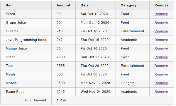
State Management using React Hooks
React introduces an entirely new concepts called React Hooks from React 16.8. Even though, it is a relatively new concept, it enables React functional component to have its own state and life-cycle. Also, React Hooks enables functional component to use many of the feature not available earlier. Let us see how to do state management in a functional component using React Hooks in this chapter.
What is React Hooks?
React Hooks are special functions provided by React to handle a specific functionality inside a React functional component. React provides a Hook function for every supported feature. For example, React provides useState() function to manage state in a functional component. When a React functional component uses React Hooks, React Hooks attach itself into the component and provides additional functionality.
The general signature of useState() Hook is as follows −
const [<state variable>, <state update function>] = useState(<initial value>);
For example, state management in clock component using Hooks can be done as specified below −
const [currentDateTime, setCurrentDateTime] = useState(new Date());
setInterval(() => setCurrentDateTime(new Date()), 1000);
Here,
- currentDateTime − Variable used to hold current date and time (returned by setState()
- setCurrentDateTime() − Function used to set current date and time (returned by setState())
Create a stateful component
Let us recreate our clock component using Hooks in this chapter.
Step 1 − First, create a new react application, react-clock-hook-app using Create React App or Rollup bundler by following instruction in Creating a React application chapter.
Step 2 − Open the application in your favorite editor.
Create src folder under the root directory of the application.
Create components folder under src folder.
Create a file, Clock.js under src/components folder and start editing.
Import React library and React state Hook, setState.
import React, { useState } from 'react';
Step 2 − Create Clock component.
function Clock() {
}
Create state Hooks to maintain date and time.
const [currentDateTime, setCurrentDateTime] = useState(new Date());
Set date and time for every second.
setInterval(() => setCurrentDateTime(new Date()), 1000);
Create the user interface to show the current date and time using currentDateTime and return it.
return ( <div><p>The current time is {currentDateTime.toString()}</p></div> );
Step 3 − Finally, export the component using the code snippet −
export default Clock;
The complete source code of the Clock component is as follows −
import React, { useState } from 'react';

function Clock(props) {
   const [currentDateTime, setCurrentDateTime] = useState(new Date());
   setInterval(() => setCurrentDateTime(new Date()), 1000);
   return (
      <div><p>The current time is {currentDateTime.toString()}</p></div>
   );
}
export default Clock;
index.js:
Next, create a file, index.js under the src folder and use Clock component.
import React from 'react';
import { createRoot } from 'react-dom/client';
import Clock from './components/Clock';

const container = document.getElementById('root');
const root = createRoot(container);
root.render(<Clock />);
Finally, create a public folder under the root folder and create index.html file.
<!DOCTYPE html>
<html lang="en">
   <head>
      <meta charset="utf-8">
      <title>Clock</title>
   </head>
   <body>
      <div id="root"></div>
      <script type="text/JavaScript" src="./index.js"></script>
   </body>
</html>
Then, serve the application using npm command.
npm start
Open the browser and enter http://localhost:3000 in the address bar and press enter. The application will show the time and update it every second.
The current time is Sun Nov 09 2025 14:42:00 GMT+0530 (India Standard Time)
The above application works fine. But, setCurrentDateTime() set to execute every second has to be removed when the application ends. We can do this using another Hook,useEffect provided by React. We will learn it in the upcoming chapter (Component life cycle).
Introducing state in expense manager app
Let us introduce state management in the expense manager application by adding a simple feature to remove an expenses item using Hooks in this chapter.
Step 1 − Open expense-manager application in your favorite editor.
Create a new file, ExpenseEntryItemListFn.js under src/components folder and start editing.
Import React library and React state Hook, setState.
import React, { useState } from 'react';
Import the css, ExpenseEntryItem.css.
import './ExpenseEntryItemList.css'
Step 2 − Create ExpenseEntryItemListFn component.
function ExpenseEntryItemListFn(props) { }
Initialize the state Hooks of the component with the expense items passed into the components through properties.
const [items, setItems] = useState(props.items);
Step 3 − Create event handlers to highlight the rows.
function handleMouseEnter(e) {
   e.target.parentNode.classList.add("highlight");
}
function handleMouseLeave(e) {
   e.target.parentNode.classList.remove("highlight");
}
function handleMouseOver(e) {
   console.log("The mouse is at (" + e.clientX + ", " + e.clientY + ")");
}
Step 4 − Create event handler to remove the selected items using items and setItems().
function handleDelete(id, e) {
   e.preventDefault();
   console.log(id);
   let newItems = [];
   items.forEach((item, idx) => {
      if (item.id != id)
         newItems.push(item)
   })
   setItems(newItems);
}
Step 5 − Create getTotal() method to calculate the total amount.
function getTotal() {
   let total = 0;
   for (var i = 0; i < items.length; i++) {
      total += items[i].amount
   }
   return total;
}
Step 6 − Create user interface to show the expenses by looping over the items.
const lists = items.map((item) =>
   <tr key={item.id} onMouseEnter={handleMouseEnter} onMouseLeave={handleMouseLeave}>
      <td>{item.name}</td>
      <td>{item.amount}</td>
      <td>{new Date(item.spendDate).toDateString()}</td>
      <td>{item.category}</td>
      <td><a href="#" onClick={(e) => handleDelete(item.id, e)}>Remove</a></td>
   </tr>
);
Step 7 − Create the complete UI to show the expenses and return it.
return (
   <table onMouseOver={handleMouseOver}>
      <thead>
         <tr>
            <th>Item</th>
            <th>Amount</th>
            <th>Date</th>
            <th>Category</th>
            <th>Remove</th>
         </tr>
      </thead>
      <tbody>
         {lists}
         <tr>
            <td colSpan="1" style={{ textAlign: "right" }}>Total Amount</td>
            <td colSpan="4" style={{ textAlign: "left" }}>
               {getTotal()}
            </td>
         </tr>
      </tbody>
   </table>
);
Finally, export the function as shown below −
export default ExpenseEntryItemListFn;
The complete code of the ExpenseEntryItemListFn is as follows −
import React, { useState } from 'react';
import './ExpenseEntryItemList.css'

function ExpenseEntryItemListFn(props) {
   const [items, setItems] = useState(props.items);

   function handleMouseEnter(e) {
      e.target.parentNode.classList.add("highlight");
   }
   function handleMouseLeave(e) {
      e.target.parentNode.classList.remove("highlight");
   }
   function handleMouseOver(e) {
      console.log("The mouse is at (" + e.clientX + ", " + e.clientY + ")");
   }
   function handleDelete(id, e) {
      e.preventDefault();
      console.log(id);
      let newItems = [];
      items.forEach((item, idx) => {
         if (item.id != id)
            newItems.push(item)
      })
      setItems(newItems);
   }
   function getTotal() {
      let total = 0;
      for (var i = 0; i < items.length; i++) {
         total += items[i].amount
      }
      return total;
   }
   const lists = items.map((item) =>
      <tr key={item.id} onMouseEnter={handleMouseEnter} onMouseLeave={handleMouseLeave}>
         <td>{item.name}</td>
         <td>{item.amount}</td>
         <td>{new Date(item.spendDate).toDateString()}</td>
         <td>{item.category}</td>
         <td><a href="#"
            onClick={(e) => handleDelete(item.id, e)}>Remove</a></td>
      </tr>
   );
   return (
      <table onMouseOver={handleMouseOver}>
         <thead>
            <tr>
               <th>Item</th>
               <th>Amount</th>
               <th>Date</th>
               <th>Category</th>
               <th>Remove</th>
            </tr>
         </thead>
         <tbody>
            {lists}
            <tr>
               <td colSpan="1" style={{ textAlign: "right" }}>Total Amount</td>
               <td colSpan="4" style={{ textAlign: "left" }}>
                  {getTotal()}
               </td>
            </tr>
         </tbody>
      </table>
   );
}
export default ExpenseEntryItemListFn;
index.js
Update the index.js and include the ExpenseEntyItemListFn component −
import React from 'react';
import { createRoot } from 'react-dom/client';
import ExpenseEntryItemListFn from './components/ExpenseEntryItemListFn'

const items = [
   { id: 1, name: "Pizza", amount: 80, spendDate: "2020-10-10", category: "Food" },
   { id: 2, name: "Grape Juice", amount: 30, spendDate: "2020-10-12", category: "Food" },
   { id: 3, name: "Cinema", amount: 210, spendDate: "2020-10-16", category: "Entertainment" },
   { id: 4, name: "Java Programming book", amount: 242, spendDate: "2020-10-15", category: "Academic" },
   { id: 5, name: "Mango Juice", amount: 35, spendDate: "2020-10-16", category: "Food" },
   { id: 6, name: "Dress", amount: 2000, spendDate: "2020-10-25", category: "Cloth" },
   { id: 7, name: "Tour", amount: 2555, spendDate: "2020-10-29", category: "Entertainment" },
   { id: 8, name: "Meals", amount: 300, spendDate: "2020-10-30", category: "Food" },
   { id: 9, name: "Mobile", amount: 3500, spendDate: "2020-11-02", category: "Gadgets" },
   { id: 10, name: "Exam Fees", amount: 1245, spendDate: "2020-11-04", category: "Academic" }
]

const container = document.getElementById('root');
const root = createRoot(container);
root.render(<ExpenseEntryItemListFn items={items} />);
Next, serve the application using npm command.
npm start
Next, open the browser and enter http://localhost:3000 in the address bar and press enter.
Finally, to remove an expense item, click the corresponding remove link. It will remove the corresponding item and refresh the user interface as shown in animated gif.
Component Life Cycle Using React Hooks
React Hooks provides a special Hook, useEffect() to execute certain functionality during the life cycle of the component. useEffect() combines componentDidMount, componentDidUpdate, and componentWillUnmount life cycle into a single api.
The signature of the useEffect() api is as follows −
useEffect(
   <executeFn>,
   <values>
);
Here,
executeFn − Function to execute when an effect occurs with an optional return function. The return function will be execute when a clean up is required (similar to componentWillUnmount).
values − array of values the effect depends on. React Hooks execute the executeFn only when the values are changed. This will reduce unnecessary calling of the executeFn.
Let us add useEffect() Hooks in our react-clock-hook-app application.
Open react-clock-hook-app in your favorite editor.
Next, open src/components/Clock.js file and start editing.
Next, import useEffect api.
import React, { useState, useEffect } from 'react';
Next, call useEffect with function to set date and time every second using setInterval and return a function to stop updating the date and time using clearInterval.
useEffect(
   () => {
      let setTime = () => {
         console.log("setTime is called");
         setCurrentDateTime(new Date());
      }
      let interval = setInterval(setTime, 1000);
      return () => {
         clearInterval(interval);
      }
   },
   []
);
Here,
Created a function, setTime to set the current time into the state of the component.
Called the setInterval JavaScript api to execute setTime every second and stored the reference of the setInterval in the interval variable.
Created a return function, which calls the clearInterval api to stop executing setTime every second by passing the interval reference.
Now, we have updated the Clock component and the complete source code of the component is as follows −
import React, { useState, useEffect } from 'react';

function Clock() {
   const [currentDateTime, setCurrentDateTime] = useState(new Date());
   useEffect(
      () => {
         let setTime = () => {
            console.log("setTime is called");
            setCurrentDateTime(new Date());
         }
         let interval = setInterval(setTime, 1000);
         return () => {
            clearInterval(interval);
         }
      },
      []
   );
   return (
      <div>
         <p>The current time is {currentDateTime.toString()}</p>
      </div>
   );
}
export default Clock;
Next, open index.js and use setTimeout to remove the clock from the DOM after 5 seconds.
import React from 'react';
import { createRoot } from 'react-dom/client';
import Clock from './components/Clock'


const container = document.getElementById('root');
const root = createRoot(container);
root.render(<Clock />);

setTimeout(() => {
   root.render(<div><p>Clock is removed from the DOM.</p></div>);
}, 5000);
Next, serve the application using npm command.
npm start
Next, open the browser and enter http://localhost:3000 in the address bar and press enter.
The clock will be shown for 5 seconds and then, it will be removed from the DOM. By checking the console log, we can found that the cleanup code is properly executed.
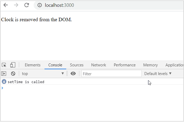
React children property aka Containment
React allows arbitrary children user interface content to be included inside the component. The children of a component can be accessed through this.props.children. Adding children inside the component is called containment. Containment is used in situation where certain section of the component is dynamic in nature.
For example, a rich text message box may not know its content until it is called. Let us create RichTextMessage component to showcase the feature of React children property in this chapter.
First, create a new react application, react-message-app using Create React App or Rollup bundler by following instruction in Creating a React application chapter.
Next, open the application in your favorite editor.
Next, create src folder under the root directory of the application.
Next, create components folder under src folder.
Next, create a file, RichTextMessage.js under src/components folder and start editing.
Next, import React library.
import React from 'react';
Next, create a class, RichTextMessage and call constructor with props.
class RichTextMessage extends React.Component {
   constructor(props) {
      super(props);
   }
}
Next, add render() method and show the user interface of the component along with it's children
render() {
return (
<div>{this.props.children}</div>
)
}
Here,
props.children returns the children of the component.
Wraped the children inside a div tag.
Finally, export the component.
export default RichTextMessage;
The complete source code of the RichTextMessagecomponent is given below −
import React from 'react';
class RichTextMessage extends React.Component {
constructor(props) {
super(props);
}
render() {
return (
<div>{this.props.children}</div>
)
}
}
export default RichTextMessage;
Next, create a file, index.js under the src folder and use RichTextMessage component.
import React from 'react';
import { createRoot } from 'react-dom/client';
import RichTextMessage from './components/RichTextMessage'
const container = document.getElementById('root');
const root = createRoot(container);
root.render(
<RichTextMessage>
<h1>Containment is really a cool feature.</h1>
</RichTextMessage>
);
Finally, create a public folder under the root folder and create index.html file.
<!DOCTYPE html>
<html lang="en">
<head>
<meta charset="utf-8">
<title>React App</title>
</head>
<body>
<div id="root"></div>
<script type="text/JavaScript" src="./index.js"></script>
</body>
</html>
Next, serve the application using npm command.
npm start
Next, open the browser and enter http://localhost:3000 in the address bar and press enter.

Browser emits component's children wrapped in div tag as shown below −
<div id="root">
<div>
<div>
<h1>Containment is really a cool feature.</h1>
</div>
</div>
</div>
Next, change the child property of RichTextMessage component in index.js.
import React from 'react';
import { createRoot } from 'react-dom/client';
import RichTextMessage from './components/RichTextMessage'
const container = document.getElementById('root');
const root = createRoot(container);
root.render(
<RichTextMessage>
<h1>Containment is really an excellent feature.</h1>
</RichTextMessage>
);
Now, browser updates the component's children content and emits as shown below −
<div id="root">
<div>
<div>
<h1>Containment is really an excellent feature.</h1>
</div>
</div>
</div>
In short, containment is an excellent feature to pass arbitrary user interface content to the component.
React - Layout in Component
One of the advanced features of React is that it allows arbitrary user interface (UI) content to be passed into the component using properties. As compared to React's special children property, which allows only a single user interface content to be passed into the component, this option enables multiple UI content to be passed into the component. This option can be seen as an extension of children property. One of the use cases of this option is to layout the user interface of a component.
For example, a component with customizable header and footer can use this option to get the custom header and footer through properties and layout the content.
Example
A quick and simple example with two properties, header and footer is given below
<Layout header={<h1>Header</h1>} footer={<p>footer</p>} />
And the layout render logic is as follows −
return (<div>
<div>
{props.header}
</div>
<div>
Component user interface
</div>
<div>
{props.footer}
</div>
</div>)
Let us add a simple header and footer to our expense entry list (ExpenseEntryItemList) component.
Open expense-manager application in your favorite editor.
Next, open the file, ExpenseEntryItemList.js in src/components folder.
Next, use header and footer props in the render() method.
return (
<div>
<div>{this.props.header}</div>
... existing code ...
<div>{this.props.footer}</div>
</div>
);
Next, open index.js and include header and footer property while using the ExpenseEntryItemList component.
ReactDOM.render(
<React.StrictMode>
<ExpenseEntryItemList items={items}
header={
<div><h1>Expense manager</h1></div>
}
footer={
<div style={{ textAlign: "left" }}>
<p style={{ fontSize: 12 }}>Sample application</p>
</div>
}
/>
</React.StrictMode>,
document.getElementById('root')
);
Next, serve the application using npm command.
npm start
Next, open the browser and enter http://localhost:3000 in the address bar and press enter.
Sharing logic in component aka Render props
Render props is an advanced concept used to share logic between React components. As we learned earlier, a component can receive arbitrary UI content or React elements (objects) through properties. Usually, the component render the React elements it receives as is along with its own user interface as we have seen in children and layout concept. They do not share any logic between them.
Going one step further, React allows a component to take a function which returns user interface instead of plain user interface object through properties. The sole purpose of the function is to render the UI. Then, the component will do advanced computation and will call the passed in function along with computed value to render the UI.
In short, component's property, which accepts a JavaScript function that renders user interface is called Render Props. Component receiving Render Props will do advanced logic and share it with Render Props, which will render the user interface using the shared logic.
Lot of advanced third-party library are based on Render Props. Some of the libraries using Render Props are −
- React Router
- Formik
- Downshift
For example, Formik library component will do the form validation and submission and pass the form design to the calling function aka Render Props. Similarly, React Router do the routing logic while delegating the UI design to other components using Render Props.
React - Pagination
React provides pagination component through third party UI component library. React community provides a large collection of UI / UX components and it is tough to choose the right library for our requirement. Bootstrap UI library is one of the popular choice for the developer and it is extensively used. React Bootstrap (https://react-bootstrap.github.io/) has ported almost all the bootstrap UI components and it has best support for Pagination component as well.
Let us learn how to use Pagination component from react-bootstrap library in this chapter.
Pagination component
Pagination component allows the developer to create simple pagination with bootstrap design in a web application. Pagination component accepts below components.
Pagination.Item
Pagination.First
Pagination.Last
Pagination.Previous
Pagination.Next
Pagination component accepts a small set of props to customize the pagination component and they are as follows −
size (sm | lg)
Set the size of the pagination buttons
bsPrefix (string)
Enables to change the underlying component CSS
Pagination.Item component accepts a small set of props to customize the pagination component and they are as follows −
active (boolean)
Set the item as active one and don't render a tag.
activeLabel (string)
Label to indicate the state of the pagination item
disabled (boolean)
Disable the pagination item
href (string)
Link for the pagination item
onClick (function)
Callback function to be called when onClick event is fired
Applying Pagination component
First of all, create a new react application and start it using below command.
create-react-app myapp cd myapp npm start
Next, install the bootstrap library using below command,
npm install --save bootstrap react-bootstrap
Next, open App.css (src/App.css) and remove all the CSS classes.
// remove the css
Next, create a simple pagination component, SimplePagination (src/Components/SimplePagination.js) as shown below −
import React from 'react';
import { Table, Pagination } from 'react-bootstrap';
class SimplePagination extends React.Component {
render() {
<div>Pagination component</div>
}
}
export default SimplePagination;
Next, create a file, users.json under public folder and populate with below user information,
[
{
"id":1,
"name":"Fowler",
"age":18
},
{
"id":2,
"name":"Donnell",
"age":24
},
{
"id":3,
"name":"Pall",
"age":26
},
{
"id":4,
"name":"Christos",
"age":19
},
{
"id":5,
"name":"Dud",
"age":29
},
{
"id":6,
"name":"Rayner",
"age":22
},
{
"id":7,
"name":"Somerset",
"age":31
},
{
"id":8,
"name":"Stavros",
"age":32
},
{
"id":9,
"name":"Cody",
"age":19
},
{
"id":10,
"name":"Sharai",
"age":19
},
{
"id":11,
"name":"Kristo",
"age":28
},
{
"id":12,
"name":"Harvey",
"age":27
},
{
"id":13,
"name":"Christen",
"age":27
},
{
"id":14,
"name":"Hillard",
"age":19
},
{
"id":15,
"name":"Jaine",
"age":32
},
{
"id":16,
"name":"Annabel",
"age":29
},
{
"id":17,
"name":"Hildagarde",
"age":29
},
{
"id":18,
"name":"Cherlyn",
"age":18
},
{
"id":19,
"name":"Herold",
"age":32
},
{
"id":20,
"name":"Gabriella",
"age":32
},
{
"id":21,
"name":"Jessalyn",
"age":32
},
{
"id":22,
"name":"Opal",
"age":31
},
{
"id":23,
"name":"Westbrooke",
"age":27
},
{
"id":24,
"name":"Morey",
"age":22
},
{
"id":25,
"name":"Carleton",
"age":26
},
{
"id":26,
"name":"Cosimo",
"age":22
},
{
"id":27,
"name":"Petronia",
"age":23
},
{
"id":28,
"name":"Justino",
"age":32
},
{
"id":29,
"name":"Verla",
"age":20
},
{
"id":30,
"name":"Lanita",
"age":18
},
{
"id":31,
"name":"Karlik",
"age":23
},
{
"id":32,
"name":"Emmett",
"age":22
},
{
"id":33,
"name":"Abran",
"age":26
},
{
"id":34,
"name":"Holly",
"age":23
},
{
"id":35,
"name":"Beverie",
"age":23
},
{
"id":36,
"name":"Ingelbert",
"age":27
},
{
"id":37,
"name":"Kailey",
"age":30
},
{
"id":38,
"name":"Ralina",
"age":26
},
{
"id":39,
"name":"Stella",
"age":29
},
{
"id":40,
"name":"Ronnica",
"age":20
},
{
"id":41,
"name":"Brucie",
"age":20
},
{
"id":42,
"name":"Ryan",
"age":22
},
{
"id":43,
"name":"Fredek",
"age":20
},
{
"id":44,
"name":"Corliss",
"age":28
},
{
"id":45,
"name":"Kary",
"age":32
},
{
"id":46,
"name":"Kaylee",
"age":21
},
{
"id":47,
"name":"Haskell",
"age":25
},
{
"id":48,
"name":"Jere",
"age":29
},
{
"id":49,
"name":"Kathryne",
"age":31
},
{
"id":50,
"name":"Linnea",
"age":21
},
{
"id":51,
"name":"Theresina",
"age":24
},
{
"id":52,
"name":"Arabela",
"age":32
},
{
"id":53,
"name":"Howie",
"age":22
},
{
"id":54,
"name":"Merci",
"age":21
},
{
"id":55,
"name":"Mitchel",
"age":30
},
{
"id":56,
"name":"Clari",
"age":18
},
{
"id":57,
"name":"Laurena",
"age":19
},
{
"id":58,
"name":"Odessa",
"age":30
},
{
"id":59,
"name":"Pippy",
"age":25
},
{
"id":60,
"name":"Wilmar",
"age":23
},
{
"id":61,
"name":"Cherianne",
"age":24
},
{
"id":62,
"name":"Huberto",
"age":25
},
{
"id":63,
"name":"Ariella",
"age":26
},
{
"id":64,
"name":"Lorant",
"age":30
},
{
"id":65,
"name":"Francesca",
"age":25
},
{
"id":66,
"name":"Ingamar",
"age":28
},
{
"id":67,
"name":"Myrta",
"age":27
},
{
"id":68,
"name":"Nicolette",
"age":26
},
{
"id":69,
"name":"Petra",
"age":22
},
{
"id":70,
"name":"Cyrill",
"age":27
},
{
"id":71,
"name":"Ad",
"age":23
},
{
"id":72,
"name":"Denys",
"age":22
},
{
"id":73,
"name":"Karilynn",
"age":23
},
{
"id":74,
"name":"Gunner",
"age":30
},
{
"id":75,
"name":"Falkner",
"age":20
},
{
"id":76,
"name":"Thurston",
"age":19
},
{
"id":77,
"name":"Codi",
"age":30
},
{
"id":78,
"name":"Jacob",
"age":31
},
{
"id":79,
"name":"Gasparo",
"age":26
},
{
"id":80,
"name":"Mitzi",
"age":29
},
{
"id":81,
"name":"Rubetta",
"age":21
},
{
"id":82,
"name":"Clary",
"age":20
},
{
"id":83,
"name":"Oliviero",
"age":24
},
{
"id":84,
"name":"Ranique",
"age":21
},
{
"id":85,
"name":"Shae",
"age":24
},
{
"id":86,
"name":"Woodrow",
"age":20
},
{
"id":87,
"name":"Junia",
"age":31
},
{
"id":88,
"name":"Athene",
"age":26
},
{
"id":89,
"name":"Veriee",
"age":18
},
{
"id":90,
"name":"Rickie",
"age":30
},
{
"id":91,
"name":"Carly",
"age":23
},
{
"id":92,
"name":"Vern",
"age":19
},
{
"id":93,
"name":"Trix",
"age":26
},
{
"id":94,
"name":"Lenore",
"age":20
},
{
"id":95,
"name":"Hanna",
"age":30
},
{
"id":96,
"name":"Dominique",
"age":21
},
{
"id":97,
"name":"Karlotta",
"age":22
},
{
"id":98,
"name":"Levey",
"age":20
},
{
"id":99,
"name":"Dalila",
"age":18
},
{
"id":100,
"name":"Launce",
"age":21
}
]
Next, add a constructor in the SimplePagination component and set initial state as shown below −
constructor(props) {
super(props);
this.state = {
users: [],
usersToBeShown: [],
currentPage: 1
}
};
Next, add componentDidMount lifecycle event and add below code to fetch and process the user information.
componentDidMount() {
fetch('users.json')
.then((response) => response.json())
.then((data) => {
// console.log(data);
this.setState({
users: data,
pageSize: 3,
usersToBeShown: [],
pageArray: []
});
this.calculatePaginationDetails(1)
});
}
Next, implement the pagination logic in the calculatePaginationDetails method as shown below −
calculatePaginationDetails = (page) => {
console.log(page)
let users = this.state.users;
let total = users.length;
let pages = Math.floor((users.length / this.state.pageSize) + 1);
let firstPage = 1;
let lastPage = pages;
let pageArray = []
let usersToBeShown = []
let currentPage = 1;
if(page.toString().toLowerCase().indexOf('previous') > 0) {
currentPage = this.state.currentPage - 1;
if(currentPage < 1) {
currentPage = 1
}
} else if(page.toString().toLowerCase().indexOf('next') > 0) {
currentPage = this.state.currentPage + 1;
if(currentPage > pages) {
currentPage = pages;
}
} else if(page.toString().toLowerCase().indexOf('first') > 0) {
currentPage = 1
} else if(page.toString().toLowerCase().indexOf('last') > 0) {
currentPage = pages;
} else {
currentPage = parseInt(page);
}
console.log(parseInt(page))
console.log(currentPage)
for(let i = currentPage; i <= currentPage + 4; i++) {
if(i <= pages)
pageArray.push(i)
}
let currentItemIndex = (currentPage - 1) * this.state.pageSize;
for(let i = currentItemIndex; i < currentItemIndex + 3 && i <= (total - 1); i++) {
usersToBeShown.push(users[i])
}
let updatedState = {
usersToBeShown: usersToBeShown,
pageArray: pageArray,
firstPage: firstPage,
lastPage: lastPage,
currentPage: currentPage
}
console.log(updatedState)
this.setState({
usersToBeShown: usersToBeShown,
pageArray: pageArray,
firstPage: firstPage,
lastPage: lastPage,
currentPage: currentPage
});
}
Next, add an event handler to process the pagination and set the data based on user's selection of page as shown below −
handlePagination = (e) => {
e.preventDefault();
console.log(e.target);
if(e.target.text != undefined) {
this.calculatePaginationDetails(e.target.text);
}
}
Next, render the data using Table component and pagination using Pagination component.
render() {
return (
<>
<Table bordered hover striped>
<thead>
<tr>
<th>#</th>
<th>Name</th>
<th>Age</th>
<th>Email</th>
</tr>
</thead>
<tbody>{
this.state.usersToBeShown && this.state.usersToBeShown.length &&
this.state.usersToBeShown.map(
(item) => (
<tr key={item.id}>
<td>{item.id}</td>
<td>{item.name}</td>
<td>{item.age}</td>
<td>{item.name.toLowerCase()}.example@tutorialspoint.com</td>
</tr>
)
)
}
</tbody>
</Table>
<Pagination>
<Pagination.First onClick={(e) => this.handlePagination(e)} />
<Pagination.Prev onClick={(e) => this.handlePagination(e)} />{
this.state.pageArray && this.state.pageArray.length &&
this.state.pageArray.map(
(item) => (
<Pagination.Item key={item} onClick={(e) => this.handlePagination(e)}
active={this.state.currentPage == item}>{item}</Pagination.Item>
)
)
}
<Pagination.Next onClick={(e) => this.handlePagination(e)} />
<Pagination.Last onClick={(e) => this.handlePagination(e)} />
</Pagination>
</>
);
}
Next, open App component (src/App.js), import the bootstrap css and update the content with SimplePagination component as shown below −
import './App.css'
import "bootstrap/dist/css/bootstrap.min.css";
import SimplePagination from './Components/SimplePagination'
function App() {
return (
<div className="container">
<div style={{ padding: "10px" }}>
<div>
<SimplePagination />
</div>
</div>
</div>
);
}
export default App;
Finally, open the application in the browser and check whether the pagination is working properly as shown below −
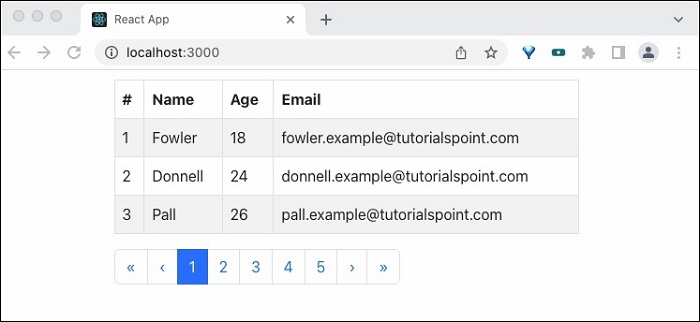
Summary
React Bootstrap pagination component provides necessary component to render simple as well as complex pagination design.
React - Material UI
React community provides a huge collection of advanced UI component framework. Material UI is one of the popular React UI frameworks. Let us learn how to use material UI library in this chapter.
Installation
Material UI can be installed using npm package.
npm install @material-ui/core
Material UI recommends roboto fonts for UI. To use Roboto font, include it using Gooogleapi links.
<link rel="stylesheet" href="https://fonts.googleapis.com/css?family=Roboto:300,400,500,700&display=swap" />
To use font icons, use icon link from googleapis −
<link rel="stylesheet" href="https://fonts.googleapis.com/icon?family=Material+Icons" />
To use SVG icons, install @material-ui/icons package −
npm install @material-ui/icons
Working example
Let us recreate the expense list application and use material ui components instead of html tables.
Step 1 − First, create a new react application, react-materialui-app using Create React App or Rollup bundler by following instruction in Creating a React application chapter.
Step 2 − Install React Transition Group library −
cd /go/to/project npm install @material-ui/core @material-ui/icons --save
Open the application in your favorite editor.
Create src folder under the root directory of the application.
Create components folder under src folder.
Create a file, ExpenseEntryItemList.js in src/components folder to create ExpenseEntryItemList component
Import React library and the stylesheet.
import React from 'react';
Step 2 − Next, import Material-UI library.
import { withStyles } from '@material-ui/core/styles';
import Table from '@material-ui/core/Table';
import TableBody from '@material-ui/core/TableBody';
import TableCell from '@material-ui/core/TableCell';
import TableContainer from '@material-ui/core/TableContainer';
import TableHead from '@material-ui/core/TableHead';
import TableRow from '@material-ui/core/TableRow';
import Paper from '@material-ui/core/Paper';
Create ExpenseEntryItemList class and call constructor function.
class ExpenseEntryItemList extends React.Component {
constructor(props) {
super(props);
}
}
<link rel="stylesheet" href="https://fonts.googleapis.com/css?family=Roboto:300,400,500,700&display=swap" />
Create a render() function.
render() {
}
Apply styles for table rows and table cells in the render method.
const StyledTableCell = withStyles((theme) => ({
head: {
backgroundColor: theme.palette.common.black,
color: theme.palette.common.white,
},
body: {
fontSize: 14,
},
}))(TableCell);
const StyledTableRow = withStyles((theme) => ({
root: {
'&:nth-of-type(odd)': {
backgroundColor: theme.palette.action.hover,
},
},
}))(TableRow);
Use map method to generate a collection of Material UI StyledTableRow each representing a single expense entry item in the list.
const lists = this.props.items.map((item) =>
<StyledTableRow key={item.id}>
<StyledTableCell component="th" scope="row">
{item.name}
</StyledTableCell>
<StyledTableCell align="right">{item.amount}</StyledTableCell>
<StyledTableCell align="right">
{new Date(item.spendDate).toDateString()}
</StyledTableCell>
<StyledTableCell align="right">{item.category}</StyledTableCell>
</StyledTableRow>
);
Here, key identifies each row and it has to be unique among the list.
Step 3 − In the render() method, create a Material UI table and include the lists expression in the rows section and return it.
return (
<TableContainer component={Paper}>
<Table aria-label="customized table">
<TableHead>
<TableRow>
<StyledTableCell>Title</StyledTableCell>
<StyledTableCell align="right">Amount</StyledTableCell>
<StyledTableCell align="right">Spend date</StyledTableCell>
<StyledTableCell align="right">Category</StyledTableCell>
</TableRow>
</TableHead>
<TableBody>
{lists}
</TableBody>
</Table>
</TableContainer> );
Finally, export the component.
export default ExpenseEntryItemList;
Now, we have successfully created the component to render the expense items using material ui components.
The complete source code of the component is as given below −
import React from 'react';
import { withStyles } from '@material-ui/core/styles';
import Table from '@material-ui/core/Table';
import TableBody from '@material-ui/core/TableBody';
import TableCell from '@material-ui/core/TableCell';
import TableContainer from '@material-ui/core/TableContainer';
import TableHead from '@material-ui/core/TableHead';
import TableRow from '@material-ui/core/TableRow';
import Paper from '@material-ui/core/Paper';
class ExpenseEntryItemList extends React.Component {
constructor(props) {
super(props);
}
render() {
const StyledTableCell = withStyles((theme) => ({
head: {
backgroundColor: theme.palette.common.black,
color: theme.palette.common.white,
},
body: {
fontSize: 14,
},
}))(TableCell);
const StyledTableRow = withStyles((theme) => ({
root: {
'&:nth-of-type(odd)': {
backgroundColor: theme.palette.action.hover,
},
},
}))(TableRow);
const lists = this.props.items.map((item) =>
<StyledTableRow key={item.id}>
<StyledTableCell component="th" scope="row">
{item.name}
</StyledTableCell>
<StyledTableCell align="right">{item.amount}</StyledTableCell>
<StyledTableCell align="right">{new Date(item.spendDate).toDateString()}</StyledTableCell>
<StyledTableCell align="right">{item.category}</StyledTableCell>
</StyledTableRow>
);
return (
<TableContainer component={Paper}>
<Table aria-label="customized table">
<TableHead>
<TableRow>
<StyledTableCell>Title</StyledTableCell>
<StyledTableCell align="right">Amount</StyledTableCell>
<StyledTableCell align="right">Spend date</StyledTableCell>
<StyledTableCell align="right">Category</StyledTableCell>
</TableRow>
</TableHead>
<TableBody>
{lists}
</TableBody>
</Table>
</TableContainer> );
}
}
export default ExpenseEntryItemList;
index.js:
Open index.js and import react library and our newly created ExpenseEntryItemList component.
import React from 'react'; import ReactDOM from 'react-dom'; import ExpenseEntryItemList from './components/ExpenseEntryItemList';
Declare a list (of expense entry item) and populate it with some random values in index.js file.
const items = [
{ id: 1, name: "Pizza", amount: 80, spendDate: "2020-10-10", category: "Food" },
{ id: 1, name: "Grape Juice", amount: 30, spendDate: "2020-10-12", category: "Food" },
{ id: 1, name: "Cinema", amount: 210, spendDate: "2020-10-16", category: "Entertainment" },
{ id: 1, name: "Java Programming book", amount: 242, spendDate: "2020-10-15", category: "Academic" },
{ id: 1, name: "Mango Juice", amount: 35, spendDate: "2020-10-16", category: "Food" },
{ id: 1, name: "Dress", amount: 2000, spendDate: "2020-10-25", category: "Cloth" },
{ id: 1, name: "Tour", amount: 2555, spendDate: "2020-10-29", category: "Entertainment" },
{ id: 1, name: "Meals", amount: 300, spendDate: "2020-10-30", category: "Food" },
{ id: 1, name: "Mobile", amount: 3500, spendDate: "2020-11-02", category: "Gadgets" },
{ id: 1, name: "Exam Fees", amount: 1245, spendDate: "2020-11-04", category: "Academic" }
]
Use ExpenseEntryItemList component by passing the items through items attributes.
ReactDOM.render(
<React.StrictMode>
<ExpenseEntryItemList items={items} />
</React.StrictMode>,
document.getElementById('root')
);
The complete code of index.js is as follows −
import React from 'react';
import ReactDOM from 'react-dom';
import ExpenseEntryItemList from './components/ExpenseEntryItemList';
const items = [
{ id: 1, name: "Pizza", amount: 80, spendDate: "2020-10-10", category: "Food" },
{ id: 1, name: "Grape Juice", amount: 30, spendDate: "2020-10-12", category: "Food" },
{ id: 1, name: "Cinema", amount: 210, spendDate: "2020-10-16", category: "Entertainment" },
{ id: 1, name: "Java Programming book", amount: 242, spendDate: "2020-10-15", category: "Academic" },
{ id: 1, name: "Mango Juice", amount: 35, spendDate: "2020-10-16", category: "Food" },
{ id: 1, name: "Dress", amount: 2000, spendDate: "2020-10-25", category: "Cloth" },
{ id: 1, name: "Tour", amount: 2555, spendDate: "2020-10-29", category: "Entertainment" },
{ id: 1, name: "Meals", amount: 300, spendDate: "2020-10-30", category: "Food" },
{ id: 1, name: "Mobile", amount: 3500, spendDate: "2020-11-02", category: "Gadgets" },
{ id: 1, name: "Exam Fees", amount: 1245, spendDate: "2020-11-04", category: "Academic" }
]
ReactDOM.render(
<React.StrictMode>
<ExpenseEntryItemList items={items} />
</React.StrictMode>,
document.getElementById('root')
);
Serve the application using npm command.
npm start
index.html
Open index.html file in the public folder and include the material UI font and icons.
<!DOCTYPE html>
<html lang="en">
<head>
<meta charset="utf-8">
<title>Material UI App</title>
<link rel="stylesheet" href="https://fonts.googleapis.com/css?family=Roboto:300,400,500,700&display=swap" />
<link rel="stylesheet" href="https://fonts.googleapis.com/icon?family=Material+Icons" />
</head>
<body>
<div id="root"></div>
<script type="text/JavaScript" src="./index.js"></script>
</body>
</html>
Open the browser and enter http://localhost:3000 in the address bar and press enter.
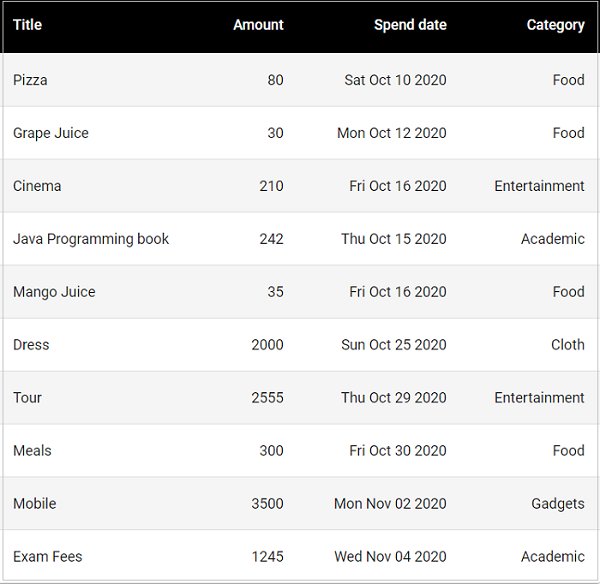
React - HTTP Server
Http client programming enables the application to connect and fetch data from http server through JavaScript. It reduces the data transfer between client and server as it fetches only the required data instead of the whole design and subsequently improves the network speed. It improves the user experience and becomes an indispensable feature of every modern web application.
Nowadays, lot of server side application exposes its functionality through REST API (functionality over HTTP protocol) and allows any client application to consume the functionality.
React does not provide it's own http programming api but it supports browser's built-in fetch() api as well as third party client library like axios to do client side programming. Let us learn how to do http programming in React application in this chapter. Developer should have a basic knowledge in Http programming to understand this chapter.
Expense Rest API Server
The prerequisite to do Http programming is the basic knowledge of Http protocol and REST API technique. Http programming involves two part, server and client. React provides support to create client side application. Express a popular web framework provides support to create server side application.
Let us first create a Expense Rest Api server using express framework and then access it from our ExpenseManager application using browser's built-in fetch api.
Open a command prompt and create a new folder, express-rest-api.
cd /go/to/workspace mkdir apiserver cd apiserver
Initialize a new node application using the below command −
npm init
The npm init will prompt and ask us to enter basic project details. Let us enter apiserver for project name and server.js for entry point. Leave other configuration with default option.
This utility will walk you through creating a package.json file.
It only covers the most common items, and tries to guess sensible defaults.
See `npm help json` for definitive documentation on these fields and exactly what they do.
Use `npm install <pkg>` afterwards to install a package and
save it as a dependency in the package.json file.
Press ^C at any time to quit.
package name: (apiserver)
version: (1.0.0)
description: Rest api for Expense Application
entry point: (index.js) server.js
test command:
git repository:
keywords:
author:
license: (ISC)
About to write to \path\to\workspace\expense-rest-api\package.json:
{
"name": "expense-rest-api",
"version": "1.0.0",
"description": "Rest api for Expense Application",
"main": "server.js",
"scripts": {
"test": "echo \"Error: no test specified\" && exit 1"
},
"author": "",
"license": "ISC"
}
Is this OK? (yes) yes
Next, install express & cors modules using below command −
npm install express cors
express is used to create server side application.
cors is a middleware for express framework to configure the client access details.
Next, let us create a file, data.csv and populate it with initial expense data for testing purposes. The structure of the file is that it contains one expense entry per line.
1,Pizza,80,2025-10-10,Food 2,Grape Juice,30,2025-10-12,Food 3,Cinema,210,2025-10-16,Entertainment 4,Java Programming book,242,2025-10-15,Academic 5,Mango Juice,35,2025-10-16,Food 6,Dress,2000,2025-10-25,Cloth 7,Tour,2555,2025-10-29,Entertainment 8,Meals,300,2025-10-30,Food 9,Mobile,3500,2025-11-02,Gadgets 10,Exam Fees,1245,2025-11-04,Academic
Next, create a file server.js and include code to load the initial expense data into the javascript object to act as in memory database.
let expenses = [];
loadExpenses();
function findExpenses(){
return expenses;
}
function findExpenseById(id){
console.log(id);
return expenses.filter( item => item.id == id);
}
function insert(data){
item = {}
item.id = rec[0]
item.name = rec[1];
item.amount = parseFloat(rec[2]);
item.spend_date = new Date(rec[3]);
item.category = rec[4];
console.log(item);
expenses.push(item);
}
function update(data){
item = {}
item.id = rec[0]
item.name = rec[1];
item.amount = parseFloat(rec[2]);
item.spend_date = new Date(rec[3]);
item.category = rec[4];
const updatedUsers = expenses.map((expense) =>
expense.id === rec[0] ? { item } : expense
);
console.log(data);
}
function remove(id){
console.log(id);
let newExpenses = expenses.filter(item => item.id !== id);
expenses = newExpenses;
}
function loadExpenses() {
readCsv("data.csv", function (data) {
console.log(data);
data.forEach(function (rec, idx) {
item = {}
item.id = rec[0]
item.name = rec[1];
item.amount = parseFloat(rec[2]);
item.spend_date = new Date(rec[3]);
item.category = rec[4];
expenses.push(item);
})
})
}
function readCsv(file, callback) {
fs.readFile(file, 'utf-8', function (err, data) {
if (err) throw err;
var lines = data.split('\r\n');
var result = lines.map(function (line) {
return line.split(',');
});
callback(result);
});
}
Next, update the file, server.js and include the actual code to list, add, update and delete the expense entries.
var express = require("express")
var cors = require('cors')
var app = express()
app.use(cors());
var bodyParser = require("body-parser");
app.use(bodyParser.urlencoded({ extended: false }));
app.use(bodyParser.json());
var HTTP_PORT = 8000
var fs = require('fs');
let expenses = [];
loadExpenses();
function findExpenses(){
// console.log(expenses);
return expenses;
}
function findExpenseById(id){
console.log(id);
return expenses.filter( item => item.id == id);
}
function insert(data){
item = {}
item.id = rec[0]
item.name = rec[1];
item.amount = parseFloat(rec[2]);
item.spend_date = new Date(rec[3]);
item.category = rec[4];
console.log(item);
expenses.push(item);
}
function update(data){
item = {}
item.id = rec[0]
item.name = rec[1];
item.amount = parseFloat(rec[2]);
item.spend_date = new Date(rec[3]);
item.category = rec[4];
const updatedUsers = expenses.map((expense) =>
expense.id === rec[0] ? { item } : expense
);
console.log(data);
}
function remove(id){
console.log(id);
let newExpenses = expenses.filter(item => item.id !== id);
expenses = newExpenses;
}
function loadExpenses() {
readCsv("data.csv", function (data) {
console.log(data);
data.forEach(function (rec, idx) {
item = {}
item.id = rec[0]
item.name = rec[1];
item.amount = parseFloat(rec[2]);
item.spend_date = new Date(rec[3]);
item.category = rec[4];
expenses.push(item);
})
})
}
function readCsv(file, callback) {
fs.readFile(file, 'utf-8', function (err, data) {
if (err) throw err;
var lines = data.split('\r\n');
var result = lines.map(function (line) {
return line.split(',');
});
callback(result);
});
}
app.listen(HTTP_PORT, () => {
console.log("Server running on port %PORT%".replace("%PORT%", HTTP_PORT))
});
app.get("/", (req, res, next) => {
res.json({ "message": "Ok" })
});
app.get("/api/expenses", (req, res, next) => {
res.json(findExpenses());
});
app.get("/api/expense/:id", (req, res, next) => {
var id = req.params.id;
res.json(findExpenseById(id));
});
app.post("/api/expense/", (req, res, next) => {
var errors = []
if (!req.body.item) {
errors.push("No item specified");
}
var data = {
id: req.body.id,
name: req.body.name,
amount: req.body.amount,
category: req.body.category,
spend_date: req.body.spend_date,
}
insert(data);
res.json(findExpenses());
})
app.put("/api/expense/:id", (req, res, next) => {
var id = req.params.id;
var errors = []
if (!req.body.item) {
errors.push("No item specified");
}
var data = {
_id: id,
name: req.body.name,
amount: req.body.amount,
category: req.body.category,
spend_date: req.body.spend_date,
}
update(data);
res.json(findExpenses());
})
app.delete("/api/expense/:id", (req, res, next) => {
var id = req.params.id;
remove(id);
res.json(findExpenses());
})
app.use(function (req, res) {
res.status(404);
});
Now, it is time to run the application.
npm run start
Next, open a browser and enter http://localhost:8000/ in the address bar.
{
"message": "Ok"
}
It confirms that our application is working fine.
Finally, change the url to http://localhost:8000/api/expense and press enter. The browser will show the initial expense entries in JSON format.
[
...
{
"name": "Pizza",
"amount": 80,
"spend_date": "2025-10-10T00:00:00.000Z",
"category": "Food",
"id": "1"
},
...
]
React - HTTP Client Programming
Let us use our newly created expense server in our Expense manager application in chapter React - Http Server through fetch() api.
The fetch() API
Let us create a new application to showcase client side programming in React.
First, create a new react application, react-http-app using Create React App or Rollup bundler by following instruction in Creating a React application chapter.
Next, open the application in your favorite editor.
Next, create src folder under the root directory of the application.
Next, create components folder under src folder.
Next, create a file, ExpenseEntryItemList.css under src/components folder and include generic table styles.
html {
font-family: sans-serif;
}
table {
border-collapse: collapse;
border: 2px solid rgb(200,200,200);
letter-spacing: 1px;
font-size: 0.8rem;
}
td, th {
border: 1px solid rgb(190,190,190);
padding: 10px 20px;
}
th {
background-color: rgb(235,235,235);
}
td, th {
text-align: left;
}
tr:nth-child(even) td {
background-color: rgb(250,250,250);
}
tr:nth-child(odd) td {
background-color: rgb(245,245,245);
}
caption {
padding: 10px;
}
tr.highlight td {
background-color: #a6a8bd;
}
Next, create a file, ExpenseEntryItemList.js under src/components folder and start editing.
Next, import React library.
import React from 'react';
Next, create a class, ExpenseEntryItemList and call constructor with props.
class ExpenseEntryItemList extends React.Component {
constructor(props) {
super(props);
}
}
Next, initialize the state with empty list in the constructor.
this.state = {
isLoaded: false,
items: []
}
Next, create a method, setItems to format the items received from remote server and then set it into the state of the component.
setItems(remoteItems) {
var items = [];
remoteItems.forEach((item) => {
let newItem = {
id: item.id,
name: item.name,
amount: item.amount,
spendDate: item.spend_date,
category: item.category
}
items.push(newItem)
});
this.setState({
isLoaded: true,
items: items
});
}
Next, add a method, fetchRemoteItems to fetch the items from the server.
fetchRemoteItems() {
fetch("http://localhost:8000/api/expenses")
.then(res => res.json())
.then(
(result) => {
this.setItems(result);
},
(error) => {
this.setState({
isLoaded: false,
error
});
}
)
}
Here,
fetch api is used to fetch the item from the remote server.
setItems is used to format and store the items in the state.
Next, add a method, deleteRemoteItem to delete the item from the remote server.
deleteRemoteItem(id) {
fetch('http://localhost:8000/api/expense/' + id, { method: 'DELETE' })
.then(res => res.json())
.then(
() => {
this.fetchRemoteItems()
}
)
}
Here,
fetch api is used to delete and fetch the item from the remote server.
setItems is again used to format and store the items in the state.
Next, call the componentDidMount life cycle api to load the items into the component during its mounting phase.
componentDidMount() {
this.fetchRemoteItems();
}
Next, write an event handler to remove the item from the list.
handleDelete = (id, e) => {
e.preventDefault();
console.log(id);
this.deleteRemoteItem(id);
}
Next, write the render method.
render() {
let lists = [];
if (this.state.isLoaded) {
lists = this.state.items.map((item) =>
<tr key={item.id} onMouseEnter={this.handleMouseEnter} onMouseLeave={this.handleMouseLeave}>
<td>{item.name}</td>
<td>{item.amount}</td>
<td>{new Date(item.spendDate).toDateString()}</td>
<td>{item.category}</td>
<td><a href="#" onClick={(e) => this.handleDelete(item.id, e)}>Remove</a></td>
</tr>
);
}
return (
<div>
<table onMouseOver={this.handleMouseOver}>
<thead>
<tr>
<th>Item</th>
<th>Amount</th>
<th>Date</th>
<th>Category</th>
<th>Remove</th>
</tr>
</thead>
<tbody>
{lists}
</tbody>
</table>
</div>
);
}
Finally, export the component.
export default ExpenseEntryItemList;
Following is the complete code of ExpenseEntryItemList.js
import React from 'react';
import './ExpenseEntryItemList.css';
class ExpenseEntryItemList extends React.Component {
constructor(props) {
super(props);
this.state = {
isLoaded: false,
items: []
}
}
setItems(remoteItems) {
var items = [];
remoteItems.forEach((item) => {
let newItem = {
id: item.id,
name: item.name,
amount: item.amount,
spendDate: item.spend_date,
category: item.category
}
items.push(newItem)
});
this.setState({
isLoaded: true,
items: items
});
}
fetchRemoteItems() {
fetch("http://localhost:8000/api/expenses")
.then(res => res.json())
.then(
(result) => {
this.setItems(result);
},
(error) => {
this.setState({
isLoaded: false,
error
});
}
)
}
deleteRemoteItem(id) {
fetch('http://localhost:8000/api/expense/' + id, { method: 'DELETE' })
.then(res => res.json())
.then(
() => {
this.fetchRemoteItems()
}
)
}
componentDidMount() {
this.fetchRemoteItems();
}
handleDelete = (id, e) => {
e.preventDefault();
console.log(id);
this.deleteRemoteItem(id);
}
render() {
let lists = [];
if (this.state.isLoaded) {
lists = this.state.items.map((item) =>
<tr key={item.id} onMouseEnter={this.handleMouseEnter} onMouseLeave={this.handleMouseLeave}>
<td>{item.name}</td>
<td>{item.amount}</td>
<td>{new Date(item.spendDate).toDateString()}</td>
<td>{item.category}</td>
<td><a href="#" onClick={(e) => this.handleDelete(item.id, e)}>Remove</a></td>
</tr>
);
}
return (
<div>
<table onMouseOver={this.handleMouseOver}>
<thead>
<tr>
<th>Item</th>
<th>Amount</th>
<th>Date</th>
<th>Category</th>
<th>Remove</th>
</tr>
</thead>
<tbody>
{lists}
</tbody>
</table>
</div>
);
}
}
export default ExpenseEntryItemList;
Next, create a file, index.js under the src folder and use ExpenseEntryItemList component.
import React from 'react';
import { createRoot } from 'react-dom/client';
import "bootstrap/dist/css/bootstrap.min.css";
import ExpenseEntryItemList from './components/ExpenseEntryItemList';
const container = document.getElementById('root');
const root = createRoot(container);
root.render(<ExpenseEntryItemList />);
Finally, create a public folder under the root folder and create index.html file.
<!DOCTYPE html>
<html lang="en">
<head>
<meta charset="utf-8">
<title>React App</title>
</head>
<body>
<div id="root"></div>
<script type="text/JavaScript" src="./index.js"></script>
</body>
</html>
Next, open a new terminal window and start our server application.
cd /go/to/server/application npm start
Next, serve the client application using npm command.
npm start
Next, open the browser and enter http://localhost:3000 in the address bar and press enter.
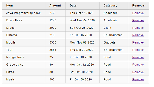
Try to remove the item by clicking the remove link.
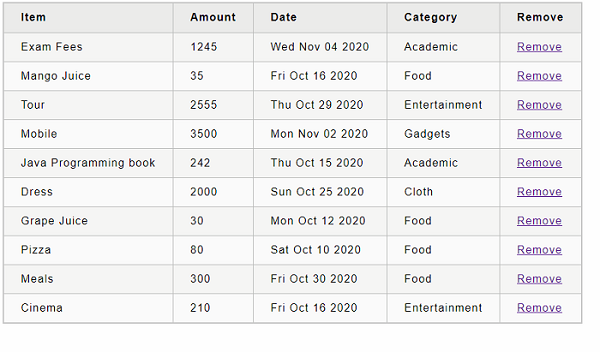
React - Form Programming
Forms are a common part of web applications which are mainly used allow users to interact with the application. These forms maybe included on the web page to gather information of the user, to let the user search a website, to make payments etc. The basic elements a form can contain are input fields, buttons, checklists, drop-down menus and so on. The data obtained from these forms is usually handled by components in React.
To learn how to use forms in React, let us look at some examples.
Form Programming
Unlike HTML where forms get updated based on user input data, React updates the form with the help of its state. The mutable state is typically specified in the state property of components, and is only updated using setState().
The nature of form programming needs the state to be maintained. Because, the input field information will get changed as the user interacts with the form. But as we learned earlier, React library does not store or maintain any state information by itself and component has to use state management API to manage state. Considering this, React provides two types of components to support form programming.
Controlled component − In controlled component, React provides a special attribute, value for all input elements and controls the input elements. The value attribute can be used to get and set the value of the input element. It has to be in sync with state of the component.
Uncontrolled component − In uncontrolled component, React provides minimal support for form programming. It has to use Ref concept (another react concept to get a DOM element in the React component during runtime) to do the form programming.
Let us learn the form programming using controlled as well as uncontrolled component in this chapter.
React - Forms
In this chapter, we will learn how to use forms in React.
Simple Example
In the following example, we will set an input form with value = {this.state.data}. This allows to update the state whenever the input value changes. We are using onChange event that will watch the input changes and update the state accordingly.
App.js
import React from 'react';
class App extends React.Component {
constructor(props) {
super(props);
this.state = {
data: 'Initial data...'
}
};
updateState(e) {
this.setState({data: e.target.value});
}
render() {
return (
<div>
<input type = "text" value = {this.state.data}
onChange = {this.updateState} />
<h4>{this.state.data}</h4>
</div>
);
}
}
export default App;
index.js
import React from 'react';
import { createRoot } from 'react-dom/client';
import "bootstrap/dist/css/bootstrap.min.css";
import App from './components/App';
const container = document.getElementById('root');
const root = createRoot(container);
root.render(<App /gt;);
When the input text value changes, the state will be updated.
Complex Example
In the following example, we will see how to use forms from child component. onChange method will trigger state update that will be passed to the child input value and rendered on the screen. A similar example is used in the Events chapter. Whenever we need to update state from child component, we need to pass the function that will handle updating (updateState) as a prop (updateStateProp).
App.jsx
import React from 'react';
class App extends React.Component {
constructor(props) {
super(props);
this.state = {
data: 'Initial data...'
}
this.updateState = this.updateState.bind(this);
};
updateState(e) {
this.setState({data: e.target.value});
}
render() {
return (
<div>
<Content myDataProp = {this.state.data}
updateStateProp = {this.updateState}></Content>
</div>
);
}
}
class Content extends React.Component {
render() {
return (
<div>
<input type = "text" value = {this.props.myDataProp}
onChange = {this.props.updateStateProp} />
<h3>{this.props.myDataProp}</h3>
</div>
);
}
}
export default App;
index.js
import React from 'react';
import { createRoot } from 'react-dom/client';
import "bootstrap/dist/css/bootstrap.min.css";
import App from './components/App';
const container = document.getElementById('root');
const root = createRoot(container);
root.render(<App /gt;);
This will produce the following result.
React - Controlled Component
In controlled component, React provides a special attribute, value for all input elements and controls the input elements. The value attribute can be used to get and set the value of the input element. It has to be in sync with state of the component.
In other words, a React component that render.s a form also controls what happens in that form on subsequent user input. An input form element whose value is controlled by React in this way is called a "controlled component".
Controlled component has to follow a specific process to do form programming.
Controlled Component With Single Input
Let us check the step by step process to be followed for a single input element.
Step 1 − Create a form element.
<input type="text" name="username" />
Step 2 − Create a state for input element.
this.state = {
username: ''
}
Step 3 − Add a value attribute and assign the value from state.
<input type="text" name="username" value={this.state.username} />
Step 4 − Add a onChange attribute and assign a handler method.
<input type="text" name="username" value={this.state.username} onChange={this.handleUsernameChange} />
Step 5 − Write the handler method and update the state whenever the event is fired.
handleUsernameChange(e) {
this.setState({
username = e.target.value
});
}
Step 6 − Bind the event handler in the constructor of the component.
this.handleUsernameChange = this.handleUsernameChange.bind(this)
Finally, get the input value using username from this.state during validation and submission.
handleSubmit(e) {
e.preventDefault();
alert(this.state.username);
}
Creating a Simple Form
Let us create a simple form to add expense entry using controller component in this chapter.
Step 1 − First, create a new react application, react-form-app using Create React App or Rollup bundler by following instruction in Creating a React application chapter.
Step 2 − Open the application in your favorite editor.
In the next step, create src folder under the root directory of the application.
Further to the above process, create components folder under src folder.
Step 3 − Create a file, ExpenseForm.css under src folder to style the component.
input[type=text], input[type=number], input[type=date], select {
width: 100%;
padding: 12px 20px;
margin: 8px 0;
display: inline-block;
border: 1px solid #ccc;
border-radius: 4px;
box-sizing: border-box;
}
input[type=submit] {
width: 100%;
background-color: #4CAF50;
color: white;
padding: 14px 20px;
margin: 8px 0;
border: none;
border-radius: 4px;
cursor: pointer;
}
input[type=submit]:hover {
background-color: #45a049;
}
input:focus {
border: 1px solid #d9d5e0;
}
#expenseForm div {
border-radius: 5px;
background-color: #f2f2f2;
padding: 20px;
}
Step 4 − Create a file, ExpenseForm.js under src/components folder and start editing.
Step 5 − Import React library.
import React from 'react';
Import ExpenseForm.css file.
import './ExpenseForm.css'
Step 6 − Create a class, ExpenseForm and call constructor with props.
class ExpenseForm extends React.Component {
constructor(props) {
super(props);
}
}
Initialize the state of the component.
this.state = {
item: {}
}
Create render() method and add a form with input fields to add expense items.
render() {
return (
<div id="expenseForm">
<form>
<label for="name">Title</label>
<input type="text" id="name" name="name" placeholder="Enter expense title" />
<label for="amount">Amount</label>
<input type="number" id="amount" name="amount" placeholder="Enter expense amount" />
<label for="date">Spend Date</label>
<input type="date" id="date" name="date" placeholder="Enter date" />
<label for="category">Category</label>
<select id="category" name="category"
<option value="">Select</option>
<option value="Food">Food</option>
<option value="Entertainment">Entertainment</option>
<option value="Academic">Academic</option>
</select>
<input type="submit" value="Submit" />
</form>
</div>
)
}
Create event handler for all the input fields to update the expense detail in the state.
handleNameChange(e) {
this.setState( (state, props) => {
let item = state.item
item.name = e.target.value;
return { item: item }
});
}
handleAmountChange(e) {
this.setState( (state, props) => {
let item = state.item
item.amount = e.target.value;
return { item: item }
});
}
handleDateChange(e) {
this.setState( (state, props) => {
let item = state.item
item.date = e.target.value;
return { item: item }
});
}
handleCategoryChange(e) {
this.setState( (state, props) => {
let item = state.item
item.category = e.target.value;
return { item: item }
});
}
Bind the event handler in the constructor.
this.handleNameChange = this.handleNameChange.bind(this); this.handleAmountChange = this.handleAmountChange.bind(this); this.handleDateChange = this.handleDateChange.bind(this); this.handleCategoryChange = this.handleCategoryChange.bind(this);
Next, add an event handler for the submit action.
onSubmit = (e) => {
e.preventDefault();
alert(JSON.stringify(this.state.item));
}
Attach the event handlers to the form.
render() {
return (
<div id="expenseForm">
<form onSubmit={(e) => this.onSubmit(e)}>
<label for="name">Title</label>
<input type="text" id="name" name="name" placeholder="Enter expense title"
value={this.state.item.name}
onChange={this.handleNameChange} />
<label for="amount">Amount</label>
<input type="number" id="amount" name="amount" placeholder="Enter expense amount"
value={this.state.item.amount}
onChange={this.handleAmountChange} />
<label for="date">Spend Date</label>
<input type="date" id="date" name="date" placeholder="Enter date"
value={this.state.item.date}
onChange={this.handleDateChange} />
<label for="category">Category</label>
<select id="category" name="category"
value={this.state.item.category}
onChange={this.handleCategoryChange} >
<option value="">Select</option>
<option value="Food">Food</option>
<option value="Entertainment">Entertainment</option>
<option value="Academic">Academic</option>
</select>
<input type="submit" value="Submit" />
</form>
</div>
)
}
Finally, export the component.
export default ExpenseForm
The complete code of the ExpenseForm component is as follows −
ExpenseForm.js
import React from 'react';
import './ExpenseForm.css'
class ExpenseForm extends React.Component {
constructor(props) {
super(props);
this.state = {
item: {}
}
this.handleNameChange = this.handleNameChange.bind(this);
this.handleAmountChange = this.handleAmountChange.bind(this);
this.handleDateChange = this.handleDateChange.bind(this);
this.handleCategoryChange = this.handleCategoryChange.bind(this);
}
handleNameChange(e) {
this.setState( (state, props) => {
let item = state.item
item.name = e.target.value;
return { item: item }
});
}
handleAmountChange(e) {
this.setState( (state, props) => {
let item = state.item
item.amount = e.target.value;
return { item: item }
});
}
handleDateChange(e) {
this.setState( (state, props) => {
let item = state.item
item.date = e.target.value;
return { item: item }
});
}
handleCategoryChange(e) {
this.setState( (state, props) => {
let item = state.item
item.category = e.target.value;
return { item: item }
});
}
onSubmit = (e) => {
e.preventDefault();
alert(JSON.stringify(this.state.item));
}
render() {
return (
<div id="expenseForm">
<form onSubmit={(e) => this.onSubmit(e)}>
<label for="name">Title</label>
<input type="text" id="name" name="name" placeholder="Enter expense title"
value={this.state.item.name}
onChange={this.handleNameChange} />
<label for="amount">Amount</label>
<input type="number" id="amount" name="amount" placeholder="Enter expense amount"
value={this.state.item.amount}
onChange={this.handleAmountChange} />
<label for="date">Spend Date</label>
<input type="date" id="date" name="date" placeholder="Enter date"
value={this.state.item.date}
onChange={this.handleDateChange} />
<label for="category">Category</label>
<select id="category" name="category"
value={this.state.item.category}
onChange={this.handleCategoryChange} >
<option value="">Select</option>
<option value="Food">Food</option>
<option value="Entertainment">Entertainment</option>
<option value="Academic">Academic</option>
</select>
<input type="submit" value="Submit" />
</form>
</div>
)
}
}
export default ExpenseForm;
index.js −
Next, create a file, index.js under the src folder and use ExpenseForm component.
import React from 'react';
import ReactDOM from 'react-dom';
import ExpenseForm from './components/ExpenseForm'
ReactDOM.render(
<React.StrictMode>
<ExpenseForm />
</React.StrictMode>,
document.getElementById('root')
);
index.html −
Finally, create a public folder under the root folder and create index.html file.
<!DOCTYPE html>
<html lang="en">
<head>
<meta charset="utf-8">
<title>React App</title>
</head>
<body>
<div id="root"></div>
<script type="text/JavaScript" src="./index.js"></script>
</body>
</html>
Output
Serve the application using npm command.
npm start
Open the browser and enter http://localhost:3000 in the address bar and press enter.
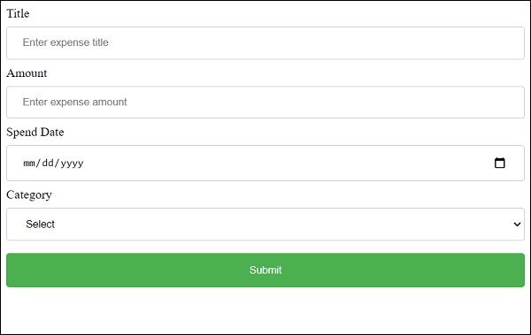
Finally, enter a sample expense detail and click submit. The submitted data will be collected and showed in a pop-up message box.
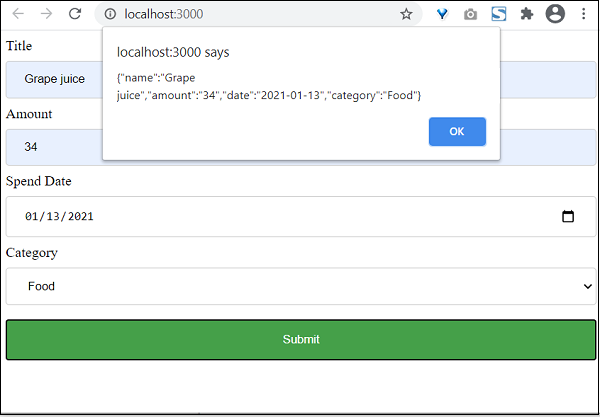
React - Uncontrolled Component
As we learned earlier, uncontrolled component does not support React based form programming. Getting a value of a React DOM element (form element) is not possible without using React api. One way to get the content of the react component is using React ref feature.
React provides a ref attribute for all its DOM element and a corresponding api, React.createRef() to create a new reference (this.ref). The newly created reference can be attached to the form element and the attached form element's value can be accessed using this.ref.current.value whenever necessary (during validation and submission).
Form programming in uncontrolled component
Let us see the step by step process to do form programming in uncontrolled component.
Step 1 − Create a reference.
this.inputRef = React.createRef();
Step 2 − Create a form element.
<input type="text" name="username" />
Step 3 − Attach the already created reference in the form element.
<input type="text" name="username" ref={this.inputRef} />
To set defalut value of an input element, use defaultValue attribute instead of value attribute. If value is used, it will get updated during rendering phase of the component.
<input type="text" name="username" ref={this.inputRef} defaultValue="default value" />
Finally, get the input value using this.inputRef.current.value during validation and submission.
handleSubmit(e) {
e.preventDefault();
alert(this.inputRef.current.value);
}
Creating Simple Form
Let us create a simple form to add expense entry using uncontrolled component in this chapter.
Step 1 − First, create a new react application, react-form-uncontrolled-app using Create React App or Rollup bundler by following instruction in Creating a React application chapter.
Step 2 − Open the application in your favorite editor.
Create src folder under the root directory of the application.
Create components folder under src folder.
Step 3 − Create a file, ExpenseForm.css under src folder to style the component.
input[type=text], input[type=number], input[type=date], select {
width: 100%;
padding: 12px 20px;
margin: 8px 0;
display: inline-block;
border: 1px solid #ccc;
border-radius: 4px;
box-sizing: border-box;
}
input[type=submit] {
width: 100%;
background-color: #4CAF50;
color: white;
padding: 14px 20px;
margin: 8px 0;
border: none;
border-radius: 4px;
cursor: pointer;
}
input[type=submit]:hover {
background-color: #45a049;
}
input:focus {
border: 1px solid #d9d5e0;
}
#expenseForm div {
border-radius: 5px;
background-color: #f2f2f2;
padding: 20px;
}
Step 4 − Create a file, ExpenseForm.js under src/components folder and start editing.
Step 5 − Import React library.
import React from 'react';
Import ExpenseForm.css file.
import './ExpenseForm.css'
Create a class, ExpenseForm and call constructor with props.
class ExpenseForm extends React.Component {
constructor(props) {
super(props);
}
}
Create React reference for all input fields.
this.nameInputRef = React.createRef(); this.amountInputRef = React.createRef(); this.dateInputRef = React.createRef(); this.categoryInputRef = React.createRef();
Create render() method and add a form with input fields to add expense items.
render() {
return (
<div id="expenseForm">
<form>
<label for="name">Title</label>
<input type="text" id="name" name="name" placeholder="Enter expense title" />
<label for="amount">Amount</label>
<input type="number" id="amount" name="amount" placeholder="Enter expense amount" />
<label for="date">Spend Date</label>
<input type="date" id="date" name="date" placeholder="Enter date" />
<label for="category">Category</label>
<select id="category" name="category" >
<option value="">Select</option>
<option value="Food">Food</option>
<option value="Entertainment">Entertainment</option>
<option value="Academic">Academic</option>
</select>
<input type="submit" value="Submit" />
</form>
</div>
)
}
Add an event handler for the submit action.
onSubmit = (e) => {
e.preventDefault();
let item = {};
item.name = this.nameInputRef.current.value;
item.amount = this.amountInputRef.current.value;
item.date = this.dateInputRef.current.value;
item.category = this.categoryInputRef.current.value;
alert(JSON.stringify(item));
}
Attach the event handlers to the form.
render() {
return (
<div id="expenseForm">
<form onSubmit={(e) => this.onSubmit(e)}>
<label for="name">Title</label>
<input type="text" id="name" name="name" placeholder="Enter expense title"
ref={this.nameInputRef} />
<label for="amount">Amount</label>
<input type="number" id="amount" name="amount" placeholder="Enter expense amount"
ref={this.amountInputRef} />
<label for="date">Spend Date</label>
<input type="date" id="date" name="date" placeholder="Enter date"
ref={this.dateInputRef} />
<label for="category">Category</label>
<select id="category" name="category"
ref={this.categoryInputRef} >
<option value="">Select</option>
<option value="Food">Food</option>
<option value="Entertainment">Entertainment</option>
<option value="Academic">Academic</option>
</select>
<input type="submit" value="Submit" />
</form>
</div>
)
}
Finally, export the component.
export default ExpenseForm
The complete code of the ExpenseForm component is given below
ExpenseForm.js
import React from 'react';
import './ExpenseForm.css'
class ExpenseForm extends React.Component {
constructor(props) {
super(props);
this.nameInputRef = React.createRef();
this.amountInputRef = React.createRef();
this.dateInputRef = React.createRef();
this.categoryInputRef = React.createRef();
}
onSubmit = (e) => {
e.preventDefault();
let item = {};
item.name = this.nameInputRef.current.value;
item.amount = this.amountInputRef.current.value;
item.date = this.dateInputRef.current.value;
item.category = this.categoryInputRef.current.value;
alert(JSON.stringify(item));
}
render() {
return (
<div id="expenseForm">
<form onSubmit={(e) => this.onSubmit(e)}>
<label for="name">Title</label>
<input type="text" id="name" name="name" placeholder="Enter expense title"
ref={this.nameInputRef} />
<label for="amount">Amount</label>
<input type="number" id="amount" name="amount" placeholder="Enter expense amount"
ref={this.amountInputRef} />
<label for="date">Spend Date</label>
<input type="date" id="date" name="date" placeholder="Enter date"
ref={this.dateInputRef} />
<label for="category">Category</label>
<select id="category" name="category"
ref={this.categoryInputRef} >
<option value="">Select</option>
<option value="Food">Food</option>
<option value="Entertainment">Entertainment</option>
<option value="Academic">Academic</option>
</select>
<input type="submit" value="Submit" />
</form>
</div>
)
}
}
export default ExpenseForm;
index.js
Next, create a file, index.js under the src folder and use ExpenseForm component.
import React from 'react';
import ReactDOM from 'react-dom';
import ExpenseForm from './components/ExpenseForm'
ReactDOM.render(
<React.StrictMode>
<ExpenseForm />
</React.StrictMode>,
document.getElementById('root')
);
index.html
Finally, create a public folder under the root folder and create index.html file.
<!DOCTYPE html>
<html lang="en">
<head>
<meta charset="utf-8">
<title>React App</title>
</head>
<body>
<div id="root"></div>
<script type="text/JavaScript" src="./index.js"></script>
</body>
</html>
Next, serve the application using npm command.
npm start
Next, open the browser and enter http://localhost:3000 in the address bar and press enter.
Finally, enter a sample expense detail and click submit. The submitted data will be collected and showed in a pop-up message box.

React - Formik
Formik is third party React form library. It provides basic form programming and validation. It is based on controlled component and greatly reduces the time to do form programming.
The nature of form programming needs the state to be maintained. Because, the input field information will get changed as the user interacts with the form. But as we learned earlier, React library does not store or maintain any state information by itself and component has to use state management API to manage state. Considering this, React provides two types of components to support form programming.
Expense Form Using Formik
In this chapter, let us recreate the expense form using Formik library.
Step 1 − First, create a new react application, react-formik-app using Create React App or Rollup bundler by following instruction in Creating a React application chapter.
Step 2 − Install the Formik library.
cd /go/to/workspace npm install formik --save
Step 3 − Open the application in your favorite editor.
Create src folder under the root directory of the application.
Create components folder under src folder.
Step 4 − Create a file, ExpenseForm.css under src folder to style the component.
input[type=text], input[type=number], input[type=date], select {
width: 100%;
padding: 12px 20px;
margin: 8px 0;
display: inline-block;
border: 1px solid #ccc;
border-radius: 4px;
box-sizing: border-box;
}
input[type=submit] {
width: 100%;
background-color: #4CAF50;
color: white;
padding: 14px 20px;
margin: 8px 0;
border: none;
border-radius: 4px;
cursor: pointer;
}
input[type=submit]:hover {
background-color: #45a049;
}
input:focus {
border: 1px solid #d9d5e0;
}
#expenseForm div {
border-radius: 5px;
background-color: #f2f2f2;
padding: 20px;
}
#expenseForm span {
color: red;
}
Step 5 − Create another file, ExpenseForm.js under src/components folder and start editing.
Import React and Formik library.
import React from 'react';
import { Formik } from 'formik';
Next, import ExpenseForm.css file.
import './ExpenseForm.css'
Next, create ExpenseForm class.
class ExpenseForm extends React.Component {
constructor(props) {
super(props);
}
}
Set initial values of the expense item in the constructor.
this.initialValues = { name: '', amount: '', date: '', category: '' }
Next, create a validation method. Formik will send the current values entered by the user.
validate = (values) => {
const errors = {};
if (!values.name) {
errors.name = 'Required';
}
if (!values.amount) {
errors.amount = 'Required';
}
if (!values.date) {
errors.date = 'Required';
}
if (!values.category) {
errors.category = 'Required';
}
return errors;
}
Create a method to submit the form. Formik will send the current values entered by the user.
handleSubmit = (values, setSubmitting) => {
setTimeout(() => {
alert(JSON.stringify(values, null, 2));
setSubmitting(false);
}, 400);
}
Create render() method. Use handleChange, handleBlur and handleSubmit method provided by Formik as input elements event handler.
render() {
return (
<div id="expenseForm">
<Formik
initialValues={this.initialValues}
validate={values => this.validate(values)}
onSubmit={(values, { setSubmitting }) => this.handleSubmit(values, setSubmitting)} >{
({
values,
errors,
touched,
handleChange,
handleBlur,
handleSubmit,
isSubmitting,
/* and other goodies */
})
=> (
<form onSubmit={handleSubmit}>
<label for="name">Title <span>{errors.name && touched.name && errors.name}</span></label>
<input type="text" id="name" name="name" placeholder="Enter expense title"
onChange={handleChange}
onBlur={handleBlur}
value={values.name} />
<label for="amount">Amount <span>{errors.amount && touched.amount && errors.amount}</span></label>
<input type="number" id="amount" name="amount" placeholder="Enter expense amount"
onChange={handleChange}
onBlur={handleBlur}
value={values.amount} />
<label for="date">Spend Date <span>{errors.date && touched.date && errors.date}</span></label>
<input type="date" id="date" name="date" placeholder="Enter date"
onChange={handleChange}
onBlur={handleBlur}
value={values.date} />
<label for="category">Category <span>{errors.category && touched.category && errors.category}</span></label>
<select id="category" name="category"
onChange={handleChange}
onBlur={handleBlur}
value={values.category}>
<option value="">Select</option>
<option value="Food">Food</option>
<option value="Entertainment">Entertainment</option>
<option value="Academic">Academic</option>
</select>
<input type="submit" value="Submit" disabled={isSubmitting} />
</form>
)
}
</Formik>
</div>
)
}
Finally, export the component.
export default ExpenseForm
ExpenseForm.js
The complete code of the ExpenseForm component is given below.
import React from 'react';
import './ExpenseForm.css'
import { Formik } from 'formik';
class ExpenseForm extends React.Component {
constructor(props) {
super(props);
this.initialValues = { name: '', amount: '', date: '', category: '' }
}
validate = (values) => {
const errors = {};
if (!values.name) {
errors.name = 'Required';
}
if (!values.amount) {
errors.amount = 'Required';
}
if (!values.date) {
errors.date = 'Required';
}
if (!values.category) {
errors.category = 'Required';
}
return errors;
}
handleSubmit = (values, setSubmitting) => {
setTimeout(() => {
alert(JSON.stringify(values, null, 2));
setSubmitting(false);
}, 400);
}
render() {
return (
<div id="expenseForm">
<Formik
initialValues={this.initialValues}
validate={values => this.validate(values)}
onSubmit={(values, { setSubmitting }) => this.handleSubmit(values, setSubmitting)} >
{
({
values,
errors,
touched,
handleChange,
handleBlur,
handleSubmit,
isSubmitting,
/* and other goodies */
}) =>
(
<form onSubmit={handleSubmit}>
<label for="name">Title <span>{errors.name && touched.name && errors.name}</span></label>
<input type="text" id="name" name="name" placeholder="Enter expense title"
onChange={handleChange}
onBlur={handleBlur}
value={values.name} />
<label for="amount">Amount <span>{errors.amount && touched.amount && errors.amount}</span></label>
<input type="number" id="amount" name="amount" placeholder="Enter expense amount"
onChange={handleChange}
onBlur={handleBlur}
value={values.amount} />
<label for="date">Spend Date <span>{errors.date && touched.date && errors.date}</span></label>
<input type="date" id="date" name="date" placeholder="Enter date"
onChange={handleChange}
onBlur={handleBlur}
value={values.date} />
<label for="category">Category <span>{errors.category && touched.category && errors.category}</span></label>
<select id="category" name="category"
onChange={handleChange}
onBlur={handleBlur}
value={values.category}>
<option value="">Select</option>
<option value="Food">Food</option>
<option value="Entertainment">Entertainment</option>
<option value="Academic">Academic</option>
</select>
<input type="submit" value="Submit" disabled={isSubmitting} />
</form>
)
}
</Formik>
</div>
)
}
}
export default ExpenseForm;
index.js
Create a file, index.js under the src folder and use ExpenseForm component.
import React from 'react';
import ReactDOM from 'react-dom';
import ExpenseForm from './components/ExpenseForm'
ReactDOM.render(
<React.StrictMode>
<ExpenseForm />
</React.StrictMode>,
document.getElementById('root')
);
index.html
Finally, create a public folder under the root folder and create index.html file.
<!DOCTYPE html>
<html lang="en">
<head>
<meta charset="utf-8">
<title>React App</title>
</head>
<body>
<div id="root"></div>
<script type="text/JavaScript" src="./index.js"></script>
</body>
</html>
Serve the application using npm command.
npm start
Open the browser and enter http://localhost:3000 in the address bar and press enter.
Finally, enter a sample expense detail and click submit. The submitted data will be collected and showed in a popup message box.
The interactive version of the form is as follows −
React - Conditional Rendering
Conditional rendering in React
Conditional rendering is used to show / hide a certain part of the UI to the user depending on the situation. For example, if the user is not logged into a web application, the web application will show the login button. When the user logged into the web application, the same link will be replaced by the welcome message.
Let us learn the options provided by the React to support conditional rendering.
Methods of conditional rendering
React provides multiple ways to do conditional rendering in a web application. They are as follows −
Conditional statement
JSX / UI variable
Logical && operator in JSX
Conditional operator in JSX
null return value
Conditional statement
Conditional statement is simple and straight forward option to render a UI based on a condition. Let us consider that the requirement is to write a component which will show either login link or welcome message based on the user's login status. Below is the implementation of the component using conditional rendering,
function Welcome(props) {
if(props.isLoggedIn) {
return <div>Welcome, {props.userName}</div>
} else {
return <div><a href="/login">Login</a></div>
}
}
Here,
Used isLoggedIn props to check whether the user is already logged in or not.
Returned welcome message, if the user is already logged in.
Returned login link, if the user is not logged in.
The component can be used as shown below C−
function App() {
return (
<div className="container">
<div style={{ padding: "10px" }}>
<div>
<Welcome isLoggedIn={true} userName={'John'} />
</div>
</div>
</div>
);
}
The component will render the welcome message as shown below −
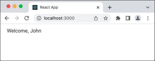
JSX / UI variable
React allows the storing of JSX element into a variable and use it whenever necessary. Developer can create the necessary JSX through conditional statement and store it in a variable. Once the UI is stored in a variable, it can be rendered as shown below −
function Welcome(props) {
let output = null;
if(props.isLoggedIn) {
output = <div>Welcome, {props.userName}</div>
} else {
output = <div><a href="/login">Login</a></div>
}
return output
}
Here, we have used the variable output to hold the UI. The component can be used as shown below −
function App() {
return (
<div className="container">
<div style={{ padding: "10px" }}>
<div>
<Welcome isLoggedIn={true} userName={'John'} />
</div>
</div>
</div>
);
}
The component will render the welcome message as shown below −
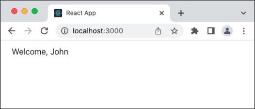
Logical && operator
React allows any expression to be used in the JSX code. In Javascript, condition are applied from left to right. If the left most condition is false, then the next condition will not be processed. Developer can utilize this feature and output the message in the JSX itself as shown below −
function ShowUsers(props) {
return (
<div>
<ul>
{props.users && props.users.length > 0 &&
props.users.map((item) =>
(
<li>{item}</li>
)
)}
</ul>
</div>
);
}
export default ShowUsers;
Here,
First of all, props.users will be checked for availability. If props.users is null, then the condition will not be processed further
Once, props.users is available, then the length of the array will be checked and only if the length is greater then zero, the condition will be processed further
Finally, props.users will be looped over through map function and the users information will be rendered as unordered list.
The component can be used as shown below −
function App() {
const users = ['John', 'Peter']
return (
<div className="container">
<div style={{ padding: "10px" }}>
<div>
<ShowUsers users={users} />
</div>
</div>
</div>
);
}
The component will render the users as shown below −
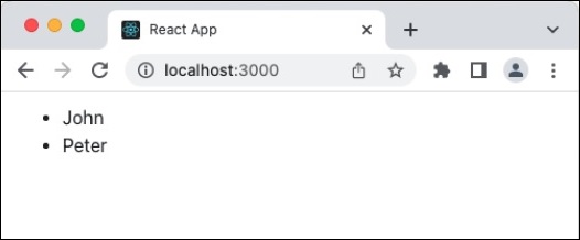
Conditional operator in JSX
Since React allows any javascript expression in JSX, developer can use conditional operator (a =b ? x : y) in the JSX and render the necessary UI element only as shown below −
function Welcome(props) {
if(props.isLoggedIn) {
return props.isLoggedIn ?
<div>Welcome, {props.userName}</div> : <div><a href="/login">Login</a></div>
}
}
Here, we have used the conditional operator to show either welcome message or login link. The component can be used as shown below −
function App() {
return (
<div className="container">
<div style={{ padding: "10px" }}>
<div>
<Welcome isLoggedIn={true} userName={'John'} />
</div>
</div>
</div>
);
}
The component will render the welcome message as shown below −
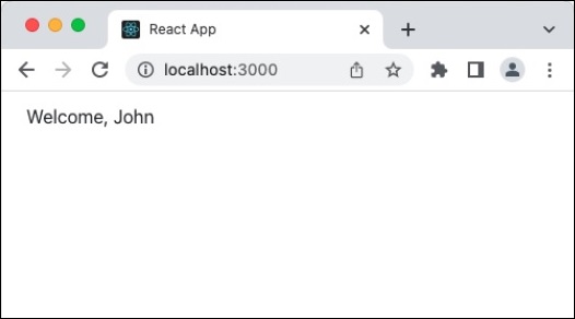
The null return value
React renders a component only when the component returns a UI element. Otherwise, it silently skip the rendering without any error message. Developer can exploit this feature and render certain UI only when a condition is met.
function Welcome(props) {
return props.isLoggedIn ? <div>Welcome, {props.userName}</div> : null
}
Here,
We have used conditional operator to either show / hide the welcome message
null does not render any UI
The component can be used as shown below −
function App() {
return (
<div className="container">
<div style={{ padding: "10px" }}>
<div>
<div>Welcome component will not output any content</div>
<Welcome isLoggedIn={false} />
</div>
</div>
</div>
</div>
);
}
The component will render the welcome message as shown below −
Summary
React provides multiple way to conditionally render a UI element. Method has to be chosen by the developer by analyzing the situation
React - Lists
List and For
The most common pattern in React is to convert a collection of items into to React elements. JavaScript has lot of option to manipulate the collection. Let us see how to use collection using for loop in this chapter.
for loop
The simple and easy solution to use is the time tested for loop to loop over the collection and use JSX expression to create the final React elements. Let us create a React app and try to apply for loop.
Create a new application using create-react-app and start the application.
create-react-app myapp cd myapp npm start
Next, create a component, ExpenseListUsingForLoop under components folder (src/components/ExpenseListUsingForLoop.js)
ExpenseListUsingForLoop.js
import React from 'react'
class ExpenseListUsingForLoop extends React.Component {
render() {
return <table>
<thead>
<tr>
<th>Item</th>
<th>Amount</th>
</tr>
</thead>
<tbody>
</tbody>
<tfoot>
<tr>
<th>Sum</th>
<th></th>
</tr>
</tfoot>
</table>
}
}
export default ExpenseListUsingForLoop
Here, we created a basic table structure with header and footer.
Next, create a function to find the total expense amount. We will use it later in the render() method.
getTotalExpenses() {
var items = this.props['expenses'];
var total = 0;
for(let i = 0; i < items.length; i++) {
total += parseInt(items[i]);
}
return total;
}
Here, getTotalExpenses loop over the expense props and summarize the total expenses. Then, add expense items and total amount in the render method.
render() {
var items = this.props['expenses'];
var expenses = []
for(let i = 0; i < items.length; i++) {
expenses.push(<tr><td>item {i + 1}</td><td>{items[i]}</td></tr>)
}
var total = this.getTotalExpenses();
return <table>
<thead>
<tr>
<th>Item</th>
<th>Amount</th>
</tr>
</thead>
<tbody>
{expenses}
</tbody>
<tfoot>
<tr>
<th>Sum</th>
<th>{total}</th>
</tr>
</tfoot>
</table>
}
Here,
Navigated each item in the expense array using for loop, generated table row (tr) using JSX and finally pushed it into expenses array.
We have used expenses array in the JSX expression to include the generated rows.
The getTotalExpenses method to find the total expense amount and add it into the render method.
ExpenseListUsingForLoop.js
The complete source code of the ExpenseListUsingForLoop component is as follows −
import React from 'react'
class ExpenseListUsingForLoop extends React.Component {
getTotalExpenses() {
var items = this.props['expenses'];
var total = 0;
for(let i = 0; i < items.length; i++) {
total += parseInt(items[i]);
}
return total;
}
render() {
var items = this.props['expenses'];
var expenses = []
for(let i = 0; i < items.length; i++) {
expenses.push(<tr><td>item {i + 1}</td><td>{items[i]}</td></tr>)
}
var total = this.getTotalExpenses();
return <table>
<thead>
<tr>
<th>Item</th>
<th>Amount</th>
</tr>
</thead>
<tbody>
{expenses}
</tbody>
<tfoot>
<tr>
<th>Sum</th>
<th>{total}</th>
</tr>
</tfoot>
</table>
}
}
export default ExpenseListUsingForLoop
App.js
Next, update the App component (App.js) with ExpenseListUsingForLoop component.
import ExpenseListUsingForLoop from './ExpenseListUsingForLoop';
import './App.css';
function App() {
var expenses = [100, 200, 300]
return (
<div>
<ExpenseListUsingForLoop expenses={expenses} />
</div>
);
}
export default App;
App.css
Next, add include a basic styles in App.css
/* Center tables for demo */
table {
margin: 0 auto;
}
div {
padding: 5px;
}
/* Default Table Style */
table {
color: #333;
background: white;
border: 1px solid grey;
font-size: 12pt;
border-collapse: collapse;
}
table thead th,
table tfoot th {
color: #777;
background: rgba(0,0,0,.1);
text-align: left;
}
table caption {
padding:.5em;
}
table th,
table td {
padding: .5em;
border: 1px solid lightgrey;
}
index.js
Next, update the index.js with App component.
import React from 'react';
import { createRoot } from 'react-dom/client';
import "bootstrap/dist/css/bootstrap.min.css";
import App from './components/App';
const container = document.getElementById('root');
const root = createRoot(container);
root.render(<App />);
Finally, check the application in the browser. It will show the expenses as shown below −
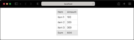
ECMASCript 6 for loop
Let us change the application and use the for .. of loop introduced in ECMAScript 6.
for(const [idx, item] of items.entries()) {
expenses.push(<tr><td>item {idx + 1}</td><td>{item}</td></tr>)
}
Here,
idx refers the index of the array.
item refers expense item in each position of the array.
entries method parses the array and return it as an array of key-value pair. key refers the index of the array and value refers the value of the array in the corresponding key.
If we don't need index, then we can skip entries() method as shown below −
for(const item of items) {
expenses.push(<tr><td></td><td>{item}</td></tr>)
}
React - Keys
List and keys
We learned how to use collections in React using for loop and map function in previous chapters. If we run the application, it output as expected. If we open the developer console in the browser, then it will show a warning as shown below −
Warning: Each child in a list should have a unique "key" prop. Check the render method of `ExpenseListUsingForLoop`. See https://reactjs.org/link/warning-keys for more information. tr ExpenseListUsingForLoop@ div App
So, what does it means and how it affects our React application. As we know, React tries to render only the updated values in DOM through various mechanism. When the React renders a collection, it tries to optimize the rendering by updating only the updated item in the list.
But, there is no hint for the React to find which items are new, updated or removed. To get the information, React allows a key attributes for all components. The only requirement is that the value of the key should be unique among the current collection.
Let us recreate one of our earlier application and apply the key attributes.
create-react-app myapp cd myapp npm start
ExpenseListUsingForLoop.js
Next, create a component, ExpenseListUsingForLoop under components folder (src/components/ExpenseListUsingForLoop.js).
import React from 'react'
class ExpenseListUsingForLoop extends React.Component {
render() {
return <table>
<thead>
<tr>
<th>Item</th>
<th>Amount</th>
</tr>
</thead>
<tbody>
</tbody>
<tfoot>
<tr>
<th>Sum</th>
<th></th>
</tr>
</tfoot>
</table>
}
}
export default ExpenseListUsingForLoop
Here, we created a basic table structure with header and footer. Then, create a function to find the total expense amount. We will use it later in the render method.
getTotalExpenses() {
var items = this.props['expenses'];
var total = 0;
for(let i = 0; i < items.length; i++) {
total += parseInt(items[i]);
}
return total;
}
Here, getTotalExpenses loop over the expense props and summarize the total expenses. Then, add expense items and total amount in the render method.
render() {
var items = this.props['expenses'];
var expenses = []
expenses = items.map((item, idx) => <tr key={idx}><td>item {idx + 1}</td><td>{item}</td></tr>)
var total = this.getTotalExpenses();
return <table>
<thead>
<tr>
<th>Item</th>
<th>Amount</th>
</tr>
</thead>
<tbody>
{expenses}
</tbody>
<tfoot>
<tr>
<th>Sum</th>
<th>{total}</th>
</tr>
</tfoot>
</table>
}
Here,
Navigated each item in the expense array using map function, created table row (tr) for each entry using transform function and finally set the returned array in expenses variable.
Set the key attributes for each row with the index value of the item.
Used expenses array in the JSX expression to include the generated rows.
Used getTotalExpenses method to find the total expense amount and add it into the render method.
ExpenseListUsingForLoop.js
The complete source code of the ExpenseListUsingForLoop component is as follows −
import React from 'react'
class ExpenseListUsingForLoop extends React.Component {
getTotalExpenses() {
var items = this.props['expenses'];
var total = 0;
for(let i = 0; i < items.length; i++) {
total += parseInt(items[i]);
}
return total;
}
render() {
var items = this.props['expenses'];
var expenses = []
expenses = items.map(
(item, idx) => <tr key={idx}><td>item {idx + 1}</td><td>{item}</td></tr>)
var total = this.getTotalExpenses();
return <table>
<thead>
<tr>
<th>Item</th>
<th>Amount</th>
</tr>
</thead>
<tbody>
{expenses}
</tbody>
<tfoot>
<tr>
<th>Sum</th>
<th>{total}</th>
</tr>
</tfoot>
</table>
}
}
export default ExpenseListUsingForLoop
App.js
Next, update the App component (App.js) with ExpenseListUsingForLoop component.
import ExpenseListUsingForLoop from './ExpenseListUsingForLoop';
import './App.css';
function App() {
var expenses = [100, 200, 300]
return (
<div>
<ExpenseListUsingForLoop expenses={expenses} />
</div>
);
}
export default App;
App.css
Next, add include a basic styles in App.css.
/* Center tables for demo */
table {
margin: 0 auto;
}
div {
padding: 5px;
}
/* Default Table Style */
table {
color: #333;
background: white;
border: 1px solid grey;
font-size: 12pt;
border-collapse: collapse;
}
table thead th,
table tfoot th {
color: #777;
background: rgba(0,0,0,.1);
text-align: left;
}
table caption {
padding:.5em;
}
table th,
table td {
padding: .5em;
border: 1px solid lightgrey;
}
index.js
Next, update the index.js with App component.
import React from 'react';
import { createRoot } from 'react-dom/client';
import "bootstrap/dist/css/bootstrap.min.css";
import App from './components/App';
const container = document.getElementById('root');
const root = createRoot(container);
root.render(<App />);
Next, check the application in the browser. It will show the expenses as shown below −
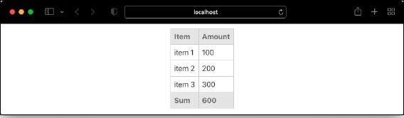
Finally, open the developer console and find that the warning about key is not shown.
Key and index
We learned that the key should be unique to optimize the rendering of the component. We used index value and the error is gone. Is it still correct way to provide value for the list? The answer is Yes and No. Setting the index key will work in most situation but it will behave in unexpected ways if we use uncontrolled component in our application.
Let us update our application and add two new features as specified below −
Add an input element to each row adjacent to expense amount.
Add a button to remove the first element in the list.
First of all, add a constructor and set the initial state of the application. As we are going to remove certain item during runtime of our application, we should use state instead of props.
constructor(props) {
super(props)
this.state = {
expenses: this.props['expenses']
}
}
Next, add a function to remove the first element of the list.
remove() {
var itemToRemove = this.state['expenses'][0]
this.setState((previousState) => ({
expenses: previousState['expenses'].filter((item) => item != itemToRemove)
}))
}
Next, bind the remove function in the constructor as shown below −
constructor(props) {
super(props)
this.state = {
expenses: this.props['expenses']
}
this.remove = this.remove.bind(this)
}
Next, add a button below the table and set remove function in its onClick action.
render() {
var items = this.state['expenses'];
var expenses = []
expenses = items.map(
(item, idx) => <tr key={idx}><td>item {idx + 1}</td><td>{item}</td></tr>)
var total = this.getTotalExpenses();
return (
<div>
<table>
<thead>
<tr>
<th>Item</th>
<th>Amount</th>
</tr>
</thead>
<tbody>
{expenses}
</tbody>
<tfoot>
<tr>
<th>Sum</th>
<th>{total}</th>
</tr>
</tfoot>
</table>
<div>
<button onClick={this.remove}>Remove first item</button>
</div>
</div>
)
}
Next, add an input element in all rows adjacent to amount as shown below −
expenses = items.map((item, idx) => <tr key={idx}><td>item {idx + 1}</td><td>{item} <input /></td></tr>)
Next, open the application in your browser. The application will be render as shown below −
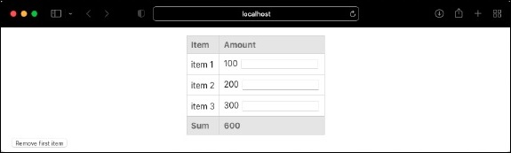
Next, enter an amount (say, 100) in the first input box and then click "Remove first item" button. This will remove the first element but the entered amount will be populated in the input next to second element (amount: 200) as shown below −
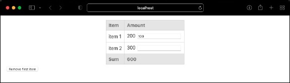
To fix the issue, we should remove the usage of index as key. Instead, we can use unique id representing the item. Let us change the item from number array to object array as shown below (App.js),
import ExpenseListUsingForLoop from './ExpenseListUsingForLoop';
import './App.css';
function App() {
var expenses = [
{
id: 1,
amount: 100
},
{
id: 2,
amount: 200
},
{
id: 3,
amount: 300
}
]
return (
<div>
<ExpenseListUsingForLoop expenses={expenses} />
</div>
);
}
export default App;
Next, update the rendering logic by setting item.id as key as shown below −
expenses = items.map((item, idx) => <tr key={item.id}><td>{item.id}</td><td>{item.amount} <input /></td></tr>)
Next, update the getTotalExpenses logic as shown below −
getTotalExpenses() {
var items = this.props['expenses'];
var total = 0;
for(let i = 0; i < items.length; i++) {
total += parseInt(items[i].amount);
}
return total;
}
Here, we have changed the logic to get amount from object (item[i].amount). Finally, open the application in your browser and try to replicate the earlier issue. Add a number in first input box (say 100) and then click Remove first item. Now, the first element gets removed and also, the input value entered is not retained in next input box as shown below &minuss;
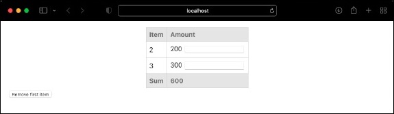
React - Routing
In web application, Routing is a process of binding a web URL to a specific resource in the web application. In React, it is binding an URL to a component. React does not support routing natively as it is basically an user interface library. React community provides many third party component to handle routing in the React application. Let us learn React Router, a top choice routing library for React application.
Install React Router
Let us learn how to install React Router component in our Expense Manager application.
Open a command prompt and go to the root folder of our application.
cd /go/to/expense/manager
Install the react router using below command.
npm install react-router-dom --save
React Router
React router provides four components to manage navigation in React application.
Router − Router is th top level component. It encloses the entire application.
Link − Similar to anchor tag in html. It sets the target url along with reference text.
<Link to="/">Home</Link>
Here, to attribute is used to set the target url.
Route − Maps the target url to the component.
Nested Routing
React router supports nested routing as well. Let us understand nesting routing using the following example to create an application −
Home.jsx
import React from "react";
function Home() {
return (
<div className="Home">
<h1>This is Home</h1>
</div>
);
}
export default Home;
About.jsx
import React from "react";
function About() {
return (
<div className="About">
<h1>AboutUs</h1>
<p>tutorialspoint India</p>
</div>
);
}
export default About;
Contact.jsx
import React from "react";
function Contact() {
return (
<div className="Contact">
<h1>Contact-Us</h1>
<p>
Tutorials Point India Private Limited, 1st Floor, Incor9 Building, Plot
No: 283/A, Kavuri Hills, Madhapur, Hyderabad, Telangana, INDIA-500081
</p>
</div>
);
}
export default Contact;
Creating navigation
Let us introduce navigation among the components we created above. The minimum screens of the application are given below −
Home screen − Landing or initial screen of the application
About − Shows the description of the application
Contact − Contains contact information
The following full code of Navigate.jsx file will contain the links from one component to another. It will establish links from the landing page to other components.
Navigate.jsx
import React from "react";
import { Outlet, Link } from "react-router-dom";
function Navigate() {
return (
<div>
<ul style={{ listStyle: "none" }}>
<li>
<Link to="/">Home</Link>
</li>
<li>
<Link to="/about">About-Us</Link>
</li>
<li>
<Link to="/contact">Contact-Us</Link>
</li>
</ul>
<Outlet />
</div>
);
}
export default Navigate;
Next, create a file, App.js under src/components folder and start editing. The purpose of the App component is to handle all the screen in one component. It will configure routing and enable navigation to all other components.
We import the React library and other components of the application to App.jsx. Instead of Switch, in the latest version of React, we only use the <Route> tag. This is where nested routing takes place.
App.jsx
import { Route, Routes, BrowserRouter } from "react-router-dom";
import "./App.css"
import Home from "./Router/Home";
import About from "./Router/About";
import Contact from "./Router/Contact";
import Navigate from "./Router/Navigate";
function App() {
return (
<div className="App">
<BrowserRouter>
<Routes>
<Route path="/" element={<Navigate />}>
<Route index element={<Home />} />
<Route path="About" element={<About />} />
<Route path="Contact" element={<Contact />} />
</Route>
</Routes>
</BrowserRouter>
</div>
);
}
export default App;
Next, serve the application using npm command.
npm start
Next, open the browser and enter http://localhost:3000 in the address bar and press enter.
Try to navigate the links and confirm that the routing is working.
Advantages of React Router
Following are the list of advantages of React Routing −
Routing between components becomes faster if the amount of data that renders is less.
Implementing animations and transitions when switching between different components becomes easier. This provides a better user experience.
Allows nagivation without refreshing the page as it allows single page web or mobile applications.
React - Redux
React redux is an advanced state management library for React. As we learned earlier, React only supports component level state management. In a big and complex application, large number of components are used. React recommends to move the state to the top level component and pass the state to the nested component using properties. It helps to some extent but it becomes complex when the components increases.
React redux chips in and helps to maintain state at the application level. React redux allows any component to access the state at any time. Also, it allows any component to change the state of the application at any time.
Let us learn about the how to write a React application using React redux in this chapter.
Concepts
React redux maintains the state of the application in a single place called Redux store. React component can get the latest state from the store as well as change the state at any time. Redux provides a simple process to get and set the current state of the application and involves below concepts.
Store − The central place to store the state of the application.
Actions − Action is an plain object with the type of the action to be done and the input (called payload) necessary to do the action. For example, action for adding an item in the store contains ADD_ITEM as type and an object with item's details as payload. The action can be represented as −
{
type: 'ADD_ITEM',
payload: { name: '..', ... }
}
Reducers − Reducers are pure functions used to create a new state based on the existing state and the current action. It returns the newly created state. For example, in add item scenario, it creates a new item list and merges the item from the state and new item and returns the newly created list.
Action creators − Action creator creates an action with proper action type and data necessary for the action and returns the action. For example, addItem action creator returns below object −
{
type: 'ADD_ITEM',
payload: { name: '..', ... }
}
Component − Component can connect to the store to get the current state and dispatch action to the store so that the store executes the action and updates it's current state.
The workflow of a typical redux store can be represented as shown below.
- React component subscribes to the store and get the latest state during initialization of the application.
- To change the state, React component creates necessary action and dispatches the action.
- Reducer creates a new state based on the action and returns it. Store updates itself with the new state.
- Once the state changes, store sends the updated state to all its subscribed component.
Redux API
Redux provides a single api, connect which will connect a components to the store and allows the component to get and set the state of the store.
The signature of the connect API is −
function connect(mapStateToProps?, mapDispatchToProps?, mergeProps?, options?)
All parameters are optional and it returns a HOC (higher order component). A higher order component is a function which wraps a component and returns a new component.
let hoc = connect(mapStateToProps, mapDispatchToProps) let connectedComponent = hoc(component)
Let us see the first two parameters which will be enough for most cases.
mapStateToProps − Accepts a function with below signature.
(state, ownProps?) => Object
Here, state refers current state of the store and Object refers the new props of the component. It gets called whenever the state of the store is updated.
(state) => { prop1: this.state.anyvalue }
mapDispatchToProps − Accepts a function with below signature.
Object | (dispatch, ownProps?) => Object
Here, dispatch refers the dispatch object used to dispatch action in the redux store and Object refers one or more dispatch functions as props of the component.
(dispatch) => {
addDispatcher: (dispatch) => dispatch({ type: 'ADD_ITEM', payload: { } }),
removeispatcher: (dispatch) => dispatch({ type: 'REMOVE_ITEM', payload: { } }),
}
Provider component
React Redux provides a Provider component and its sole purpose to make the Redux store available to its all nested components connected to store using connect API. The sample code is given below −
import React from 'react'
import ReactDOM from 'react-dom'
import { Provider } from 'react-redux'
import { App } from './App'
import createStore from './createReduxStore'
const store = createStore()
ReactDOM.render(
<Provider store={store}>
<App />
</Provider>,
document.getElementById('root')
)
Now, all the component inside the App component can get access to the Redux store by using connect API.
Working example
Let us recreate our expense manager application and uses the React redux concept to maintain the state of the application.
First, create a new react application, react-message-app using Create React App or Rollup bundler by following instruction in Creating a React application chapter.
Next, install Redux and React redux library.
npm install redux react-redux --save
Next, install uuid library to generate unique identifier for new expenses.
npm install uuid --save
Next, open the application in your favorite editor.
Next, create src folder under the root directory of the application.
Next, create actions folder under src folder.
Next, create a file, types.js under src/actions folder and start editing.
Next, add two action type, one for add expense and one for remove expense.
export const ADD_EXPENSE = 'ADD_EXPENSE'; export const DELETE_EXPENSE = 'DELETE_EXPENSE';
Next, create a file, index.js under src/actions folder to add action and start editing.
Next, import uuid to create unique identifier.
import { v4 as uuidv4 } from 'uuid';
Next, import action types.
import { ADD_EXPENSE, DELETE_EXPENSE } from './types';
Next, add a new function to return action type for adding an expense and export it.
export const addExpense = ({ name, amount, spendDate, category }) => ({
type: ADD_EXPENSE,
payload: {
id: uuidv4(),
name,
amount,
spendDate,
category
}
});
Here, the function expects expense object and return action type of ADD_EXPENSE along with a payload of expense information.
Next, add a new function to return action type for deleting an expense and export it.
export const deleteExpense = id => ({
type: DELETE_EXPENSE,
payload: {
id
}
});
Here, the function expects id of the expense item to be deleted and return action type of 'DELETE_EXPENSE' along with a payload of expense id.
index.js
The complete source code of the action is given below −
import { v4 as uuidv4 } from 'uuid';
import { ADD_EXPENSE, DELETE_EXPENSE } from './types';
export const addExpense = ({ name, amount, spendDate, category }) => ({
type: ADD_EXPENSE,
payload: {
id: uuidv4(),
name,
amount,
spendDate,
category
}
});
export const deleteExpense = id => ({
type: DELETE_EXPENSE,
payload: {
id
}
});
Next, create a new folder, reducers under src folder.
Next, create a file, index.js under src/reducers to write reducer function and start editing.
Next, import the action types.
import { ADD_EXPENSE, DELETE_EXPENSE } from '../actions/types';
Next, add a function, expensesReducer to do the actual feature of adding and updating expenses in the redux store.
export default function expensesReducer(state = [], action) {
switch (action.type) {
case ADD_EXPENSE:
return [...state, action.payload];
case DELETE_EXPENSE:
return state.filter(expense => expense.id !== action.payload.id);
default:
return state;
}
}
index.js
The complete source code of the reducer is given below −
import { ADD_EXPENSE, DELETE_EXPENSE } from '../actions/types';
export default function expensesReducer(state = [], action) {
switch (action.type) {
case ADD_EXPENSE:
return [...state, action.payload];
case DELETE_EXPENSE:
return state.filter(expense => expense.id !== action.payload.id);
default:
return state;
}
}
Here, the reducer checks the action type and execute the relevant code.
Next, create components folder under src folder.
Next, create a file, ExpenseEntryItemList.css under src/components folder and add generic style for the html tables.
ExpenseEntryItemList.css
html {
font-family: sans-serif;
}
table {
border-collapse: collapse;
border: 2px solid rgb(200,200,200);
letter-spacing: 1px;
font-size: 0.8rem;
}
td, th {
border: 1px solid rgb(190,190,190);
padding: 10px 20px;
}
th {
background-color: rgb(235,235,235);
}
td, th {
text-align: left;
}
tr:nth-child(even) td {
background-color: rgb(250,250,250);
}
tr:nth-child(odd) td {
background-color: rgb(245,245,245);
}
caption {
padding: 10px;
}
tr.highlight td {
background-color: #a6a8bd;
}
Next, create a file, ExpenseEntryItemList.js under src/components folder and start editing.
Next, import React and React redux library.
import React from 'react';
import { connect } from 'react-redux';
Next, import ExpenseEntryItemList.css file.
import './ExpenseEntryItemList.css';
Next, import action creators.
import { deleteExpense } from '../actions';
import { addExpense } from '../actions';
Next, create a class, ExpenseEntryItemList and call constructor with props.
class ExpenseEntryItemList extends React.Component {
constructor(props) {
super(props);
}
}
Next, create mapStateToProps function.
const mapStateToProps = state => {
return {
expenses: state
};
};
Here, we copied the input state to expenses props of the component.
Next, create mapDispatchToProps function.
const mapDispatchToProps = dispatch => {
return {
onAddExpense: expense => {
dispatch(addExpense(expense));
},
onDelete: id => {
dispatch(deleteExpense(id));
}
};
};
Here, we created two function, one to dispatch add expense (addExpense) function and another to dispatch delete expense (deleteExpense) function and mapped those function to props of the component.
Next, export the component using connect api.
export default connect( mapStateToProps, mapDispatchToProps )(ExpenseEntryItemList);
Now, the component gets three new properties given below −
expenses − list of expense
onAddExpense − function to dispatch addExpense function
onDelete − function to dispatch deleteExpense function
Next, add few expense into the redux store in the constructor using onAddExpense property.
if (this.props.expenses.length == 0)
{
const items = [
{ id: 1, name: "Pizza", amount: 80, spendDate: "2020-10-10", category: "Food" },
{ id: 2, name: "Grape Juice", amount: 30, spendDate: "2020-10-12", category: "Food" },
{ id: 3, name: "Cinema", amount: 210, spendDate: "2020-10-16", category: "Entertainment" },
{ id: 4, name: "Java Programming book", amount: 242, spendDate: "2020-10-15", category: "Academic" },
{ id: 5, name: "Mango Juice", amount: 35, spendDate: "2020-10-16", category: "Food" },
{ id: 6, name: "Dress", amount: 2000, spendDate: "2020-10-25", category: "Cloth" },
{ id: 7, name: "Tour", amount: 2555, spendDate: "2020-10-29", category: "Entertainment" },
{ id: 8, name: "Meals", amount: 300, spendDate: "2020-10-30", category: "Food" },
{ id: 9, name: "Mobile", amount: 3500, spendDate: "2020-11-02", category: "Gadgets" },
{ id: 10, name: "Exam Fees", amount: 1245, spendDate: "2020-11-04", category: "Academic" }
]
items.forEach((item) => {
this.props.onAddExpense(
{
name: item.name,
amount: item.amount,
spendDate: item.spendDate,
category: item.category
}
);
})
}
Next, add an event handler to delete the expense item using expense id.
handleDelete = (id,e) => {
e.preventDefault();
this.props.onDelete(id);
}
Here, the event handler calls the onDelete dispatcher, which call deleteExpense along with the expense id.
Next, add a method to calculate the total amount of all expenses.
getTotal() {
let total = 0;
for (var i = 0; i < this.props.expenses.length; i++) {
total += this.props.expenses[i].amount
}
return total;
}
Next, add render() method and list the expense item in the tabular format.
render() {
const lists = this.props.expenses.map(
(item) =>
<tr key={item.id}>
<td>{item.name}</td>
<td>{item.amount}</td>
<td>{new Date(item.spendDate).toDateString()}</td>
<td>{item.category}</td>
<td><a href="#"
onClick={(e) => this.handleDelete(item.id, e)}>Remove</a></td>
</tr>
);
return (
<div>
<table>
<thead>
<tr>
<th>Item</th>
<th>Amount</th>
<th>Date</th>
<th>Category</th>
<th>Remove</th>
</tr>
</thead>
<tbody>
{lists}
<tr>
<td colSpan="1" style={{ textAlign: "right" }}>Total Amount</td>
<td colSpan="4" style={{ textAlign: "left" }}>
{this.getTotal()}
</td>
</tr>
</tbody>
</table>
</div>
);
}
Here, we set the event handler handleDelete to remove the expense from the store.
ExpenseEntryItemList.js
The complete source code of the ExpenseEntryItemList component is given below −
import React from 'react';
import { connect } from 'react-redux';
import './ExpenseEntryItemList.css';
import { deleteExpense } from '../actions';
import { addExpense } from '../actions';
class ExpenseEntryItemList extends React.Component {
constructor(props) {
super(props);
if (this.props.expenses.length == 0){
const items = [
{ id: 1, name: "Pizza", amount: 80, spendDate: "2020-10-10", category: "Food" },
{ id: 2, name: "Grape Juice", amount: 30, spendDate: "2020-10-12", category: "Food" },
{ id: 3, name: "Cinema", amount: 210, spendDate: "2020-10-16", category: "Entertainment" },
{ id: 4, name: "Java Programming book", amount: 242, spendDate: "2020-10-15", category: "Academic" },
{ id: 5, name: "Mango Juice", amount: 35, spendDate: "2020-10-16", category: "Food" },
{ id: 6, name: "Dress", amount: 2000, spendDate: "2020-10-25", category: "Cloth" },
{ id: 7, name: "Tour", amount: 2555, spendDate: "2020-10-29", category: "Entertainment" },
{ id: 8, name: "Meals", amount: 300, spendDate: "2020-10-30", category: "Food" },
{ id: 9, name: "Mobile", amount: 3500, spendDate: "2020-11-02", category: "Gadgets" },
{ id: 10, name: "Exam Fees", amount: 1245, spendDate: "2020-11-04", category: "Academic" }
]
items.forEach((item) => {
this.props.onAddExpense(
{
name: item.name,
amount: item.amount,
spendDate: item.spendDate,
category: item.category
}
);
})
}
}
handleDelete = (id,e) => {
e.preventDefault();
this.props.onDelete(id);
}
getTotal() {
let total = 0;
for (var i = 0; i < this.props.expenses.length; i++) {
total += this.props.expenses[i].amount
}
return total;
}
render() {
const lists = this.props.expenses.map((item) =>
<tr key={item.id}>
<td>{item.name}</td>
<td>{item.amount}</td>
<td>{new Date(item.spendDate).toDateString()}</td>
<td>{item.category}</td>
<td><a href="#"
onClick={(e) => this.handleDelete(item.id, e)}>Remove</a></td>
</tr>
);
return (
<div>
<table>
<thead>
<tr>
<th>Item</th>
<th>Amount</th>
<th>Date</th>
<th>Category</th>
<th>Remove</th>
</tr>
</thead>
<tbody>
{lists}
<tr>
<td colSpan="1" style={{ textAlign: "right" }}>Total Amount</td>
<td colSpan="4" style={{ textAlign: "left" }}>
{this.getTotal()}
</td>
</tr>
</tbody>
</table>
</div>
);
}
}
const mapStateToProps = state => {
return {
expenses: state
};
};
const mapDispatchToProps = dispatch => {
return {
onAddExpense: expense => {
dispatch(addExpense(expense));
},
onDelete: id => {
dispatch(deleteExpense(id));
}
};
};
export default connect(
mapStateToProps,
mapDispatchToProps
)(ExpenseEntryItemList);
App.js
Next, create a file, App.js under the src/components folder and use ExpenseEntryItemList component.
import React, { Component } from 'react';
import ExpenseEntryItemList from './ExpenseEntryItemList';
class App extends Component {
render() {
return (
<div>
<ExpenseEntryItemList />
</div>
);
}
}
export default App;
index.js
Next, create a file, index.js under src folder.
import React from 'react';
import { createRoot } from 'react-dom/client';
import "bootstrap/dist/css/bootstrap.min.css";
import App from './components/App';
import { createStore } from 'redux';
import { Provider } from 'react-redux';
import rootReducer from './reducers';
const store = createStore(rootReducer);
const container = document.getElementById('root');
const root = createRoot(container);
root.render(
<Provider store={store}>
<App />
</Provider>
);
Here,
Create a store using createStore by attaching the our reducer.
Used Provider component from React redux library and set the store as props, which enables all the nested component to connect to store using connect api.
Finally, create a public folder under the root folder and create index.html file.
<!DOCTYPE html>
<html lang="en">
<head>
<meta charset="utf-8">
<title>React Containment App</title>
</head>
<body>
<div id="root"></div>
<script type="text/JavaScript" src="./index.js"></script>
</body>
</html>
Next, serve the application using npm command.
npm start
Next, open the browser and enter http://localhost:3000 in the address bar and press enter.
Clicking the remove link will remove the item from redux store.
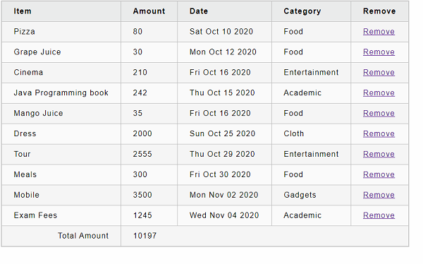
React - Bootstrap
Bootstrap is a popular CSS framework used by the front-end developer around the world. Bootstrap provides an excellent support for designing web pages through its flexible, responsive and high performance utility CSS components. Bootstrap also provides a large collection of jQuery based UI components.
Using bootstrap CSS and JavaScript components, front-end developer can design beautiful webpages along with responsive support for any devices. React can be used along with Bootstrap and get all benefits of Bootstrap in their web application. Let us see how to integrate Bootstrap into React application in this chapter.
Integrating Bootstrap
Bootstrap can be integrated into React application through multiple ways. If a developer wants to use only CSS features from the bootstrap library, then the developer can import the bootstrap library through CDN and use the bootstrap CSS class in the required places.
If a developer wants to use Bootstrap JavaScript library, then the developer can either use react components wrapped around the original bootstrap jQuery component or special react UI library designed to exploit the features of bootstrap library.
Below is the list of options to integrate bootstrap library into React application.
Link tag (CSS only).
import feature (CSS only).
Link tag (Bootstrap + jQuery UI).
Wrapper react component.
Native react bootstrap component.
Link tag (CSS only)
Let us learn how to apply link tag by creating a react application in this chapter. First of all, create a new react application and start it using below command.
create-react-app myapp cd myapp npm start
Next, open main html page (public/index.html) and include below tag in the head
<!-- CSS only --> <link href="https://cdn.jsdelivr.net/npm/bootstrap@5.2.2/dist/css/bootstrap.min.css" rel="stylesheet" integrity="sha384-Zenh87qX5JnK2Jl0vWa8Ck2rdkQ2Bzep5IDxbcnCeuOxjzrPF/et3URy9Bv1WTRi" crossorigin="anonymous">
Next, open App.css (src/App.css) and update the CSS to set the margin for button elements.
button {
margin: 5px;
}
App.js
Next, open App component (src/App.js) and update the content with bootstrap button as shown below −
import './App.css'
function App() {
return (
<div className="container">
<button type="button" class="btn btn-primary">Primary</button>
<button type="button" class="btn btn-secondary">Secondary</button>
<button type="button" class="btn btn-success">Success</button>
<button type="button" class="btn btn-danger">Danger</button>
<button type="button" class="btn btn-warning">Warning</button>
<button type="button" class="btn btn-info">Info</button>
<button type="button" class="btn btn-light">Light</button>
<button type="button" class="btn btn-dark">Dark</button>
<button type="button" class="btn btn-link">Link</button>
</div>
);
}
export default App;
Here,
Applied bootstrap CSS class for different type of buttons.
Included the App.css style.
Finally, open the application in the browser and check whether the bootstrap classes are properly applied in the button elements as shown below −

import feature (CSS only)
Let us see how to integrate the bootstrap CSS using import feature in this section.
First of all, create a new react application and start it using below command.
create-react-app myapp cd myapp npm start
Next, install the bootstrap library using below command.
npm install --save bootstrap
Next, open App.css (src/App.css) and update the CSS to set the margin for button elements.
button {
margin: 5px;
}
App.js
Next, open App component (src/App.js), import the bootstrap css and update the content with bootstrap button as shown below −
// Bootstrap CSS
import "bootstrap/dist/css/bootstrap.min.css";
// Bootstrap Bundle JS
import "bootstrap/dist/js/bootstrap.bundle.min";
import './App.css'
function App() {
return (
<div className="container">
<button type="button" class="btn btn-primary">Primary</button>
<button type="button" class="btn btn-secondary">Secondary</button>
<button type="button" class="btn btn-success">Success</button>
<button type="button" class="btn btn-danger">Danger</button>
<button type="button" class="btn btn-warning">Warning</button>
<button type="button" class="btn btn-info">Info</button>
<button type="button" class="btn btn-light">Light</button>
<button type="button" class="btn btn-dark">Dark</button>
<button type="button" class="btn btn-link">Link</button>
</div>
);
}
export default App;
Here we have −
Imported the bootstrap classes using import statement.
Applied bootstrap CSS class for different type of buttons.
Included the App.css style.
Finally, open the application in the browser and check whether the bootstrap classes are properly applied in the button elements as shown below −
Link tag (Bootstrap + jQuery UI)
React allows the developer to integrate the react component into specific part of the webpage using createRoot method. This feature enables developer to use React and Bootstrap component in a single webpage. Developer can mix both libraries without affecting each other. This is the simple and best option for small webpage. Since it does not need any extra learning, it is easy and safe to implement in a web application.
Wrapper react component
Developer can create a wrapper react component for the necessary bootstrap component and can use it in their application. This method can be used for moderate to complex web application where bootstrap component is not extensively used.
Native react bootstrap component
React community created many component library integrating Bootstrap and React. Some of the popular libraries are as follows −
React-Bootstrap (https://react-bootstrap.github.io/)
Bootstrap 4 React (https://bootstrap-4-react.com//)
Reactstrap (https://reactstrap.github.io/)
Bootstrap React from coreUI (https://coreui.io/bootstrap-react/)
Let us see how to use React-bootstrap in this chapter by creating a simple React application.
First of all, create a new react application and start it using below command.
create-react-app myapp cd myapp npm start
Next, install the bootstrap library using below command,
npm install --save react-bootstrap bootstrap
Next, open App.css (src/App.css) and update the CSS to set the margin for button elements.
button {
margin: 5px;
}
App.js
Next, open App component (src/App.js), import the bootstrap css and update the content with bootstrap button as shown below −
// Bootstrap CSS
import "bootstrap/dist/css/bootstrap.min.css";
// Bootstrap Bundle JS
import "bootstrap/dist/js/bootstrap.bundle.min";
import './App.css'
import { Button } from 'react-bootstrap';
function App() {
return (
<div className="container">
<Button variant="primary">Primary</Button>{' '}
<Button variant="secondary">Secondary</Button>{' '}
<Button variant="success">Success</Button>{' '}
<Button variant="warning">Warning</Button>{' '}
<Button variant="danger">Danger</Button>{' '}
<Button variant="info">Info</Button>{' '}
<Button variant="light">Light</Button>{' '}
<Button variant="dark">Dark</Button> <Button variant="link">Link</Button>
</div>
);
}
export default App;
Here we have −
Imported the bootstrap classes using import statement.
Imported the bootstrap button component.
Used button component using different variants.
Included the App.css style.
Finally, open the application in the browser and check whether the bootstrap classes are properly applied in the button elements as shown below −
Summary
React has many options to integrates with bootstrap library. React enables the smooth migration of bootstrap component to React bootstrap components in a web application. Rich set of third party bootstrap component enables the developer to provide the great UI/UX experience without moving away from bootstrap library.
React - Map
JavaScript Array datatype provides a range of easy to use function to manipulate the array and its values. The map() is one such function, which accepts a transform function and will create a new array by transforming each item in the given array by applying the transform function and return the newly created array.
The signature of the map function is as follows −
array.map(function(item, index, items), thisValue)
Here,
currentValue refers the value of the current element
index refers the index value of the current element
items refers the array of the current element
thisValue is the optional this value, which can be passed while invoking the map function
Let us consider that we have a list of numbers and wants to double each value in the array. We can do it in one line using map function as shown below −
var numbers = [2, 4, 6]
var transformed = numbers.map((val) => val + val)
for(var item of transformed) { console.log(item) }
Here, the output wil be as follows −
4 8 12
Example
Let us create a new application using create-react-app and start the application.
create-react-app myapp cd myapp npm start
Next, create a component, ExpenseListUsingForLoop under components folder (src/components/ExpenseListUsingForLoop.js).
import React from 'react'
class ExpenseListUsingForLoop extends React.Component {
render() {
return <table>
<thead>
<tr>
<th>Item</th>
<th>Amount</th>
</tr>
</thead>
<tbody>
</tbody>
<tfoot>
<tr>
<th>Sum</th>
<th></th>
</tr>
</tfoot>
</table>
}
}
export default ExpenseListUsingForLoop
Here, we created a basic table structure with header and footer.
Next, create a function to find the total expense amount. We will use it later in the render method.
getTotalExpenses() {
var items = this.props['expenses'];
var total = 0;
for(let i = 0; i < items.length; i++) {
total += parseInt(items[i]);
}
return total;
}
Here, getTotalExpenses loop over the expense props and summarize the total expenses.
Next, add expense items and total amount in the render method.
render() {
var items = this.props['expenses'];
var expenses = []
expenses = items.map((item, idx) => <tr><td>item {idx + 1}</td><td>{item}</td></tr>)
var total = this.getTotalExpenses();
return <table>
<thead>
<tr>
<th>Item</th>
<th>Amount</th>
</tr>
</thead>
<tbody>
{expenses}
</tbody>
<tfoot>
<tr>
<th>Sum</th>
<th>{total}</th>
</tr>
</tfoot>
</table>
}
Here we have,
Navigated each item in the expense array using map function, created table row (tr) for each entry using transform function and finally set the returned array in expenses variable.
Used expenses array in the JSX expression to include the generated rows.
Used getTotalExpenses method to find the total expense amount and add it into the render method.
ExpenseListUsingForLoop.js
The complete source code of the ExpenseListUsingForLoop component is as follows −
import React from 'react'
class ExpenseListUsingForLoop extends React.Component {
getTotalExpenses() {
var items = this.props['expenses'];
var total = 0;
for(let i = 0; i < items.length; i++) {
total += parseInt(items[i]);
}
return total;
}
render() {
var items = this.props['expenses'];
var expenses = []
expenses = items.map((item, idx) => <tr><td>item {idx + 1}</td><td>{item}</td></tr>)
var total = this.getTotalExpenses();
return <table>
<thead>
<tr>
<th>Item</th>
<th>Amount</th>
</tr>
</thead>
<tbody>
{expenses}
</tbody>
<tfoot>
<tr>
<th>Sum</th>
<th>{total}</th>
</tr>
</tfoot>
</table>
}
}
export default ExpenseListUsingForLoop
App.js
Next, update the App component (App.js) with ExpenseListUsingForLoop component.
import ExpenseListUsingForLoop from './ExpenseListUsingForLoop';
import './App.css';
function App() {
var expenses = [100, 200, 300]
return (
<div>
<ExpenseListUsingForLoop expenses={expenses} />
</div>
);
}
export default App;
Next, add include a basic styles in App.css
/* Center tables for demo */
table {
margin: 0 auto;
}
div {
padding: 5px;
}
/* Default Table Style */
table {
color: #333;
background: white;
border: 1px solid grey;
font-size: 12pt;
border-collapse: collapse;
}
table thead th,
table tfoot th {
color: #777;
background: rgba(0,0,0,.1);
text-align: left;
}
table caption {
padding:.5em;
}
table th,
table td {
padding: .5em;
border: 1px solid lightgrey;
}
Finally, check the application in the browser. It will show the expenses as shown below −

Map in JSX
JSX allows any JavaScript expression to be included in it. Since map is just an expression in JavaScript, we can use it directly inside the JSX as shown below −
render() {
var items = this.props['expenses'];
var expenses = []
// expenses = items.map((item, idx) => <tr><td>item {idx + 1}</td><td>{item}</td></tr>)
var total = this.getTotalExpenses();
return <table>
<thead>
<tr>
<th>Item</th>
<th>Amount</th>
</tr>
</thead>
<tbody>
{items.map((item, idx) => <tr><td>item {idx + 1}</td><td>{item}</td></tr>)}
</tbody>
<tfoot>
<tr>
<th>Sum</th>
<th>{total}</th>
</tr>
</tfoot>
</table>
}
export default ExpenseListUsingForLoop
React - Table
React provides table component through third party UI component library. React community provides a large collection of UI / UX components and it is tough to choose the right library for our requirement.
Bootstrap UI library is one of the popular choice for the developer and it is extensively used. React Bootstrap (https://react-bootstrap.github.io/) has ported almost all the bootstrap UI components to the React library and it has best support for Table component as well.
Let us learn how to use Table component from react-bootstrap library in this chapter.
Table component
Table component allows the developer to create simple table with bootstrap UI design in a web application. Table component accepts table tags as shown below −
thead
tbody
tfoot
Table component accepts a small set of props to customize the table component and they are follows −
bordered (boolean) − Adds border to all sides of the table and cell.
borderless (boolean) −Removes border to all sides of the table and cell.
hover (boolean) − Enables a hover state for each row in the table (tbody).
responsive (boolean | string) − Enables vertical scrolling for small devices. sm | md | lg | xl option enables the responsive for relevant devices. For example, sm will be enabled only when the device resolution is very small.
size (string) − Enables compact rendering of the table. Possible options are sm, md, etc.,
striped (boolean | string) − Enables the zebra stripping to all table rows. columns option adds zebra stripping to columns as well.
variant (dark) Enables dark variant when dark value is used.
bsPrefix (string) − Prefix used to customize the underlying CSS classes.
Applying Table component
First of all, create a new react application and start it using below command.
create-react-app myapp cd myapp npm start
Next, install the bootstrap and react-bootstrap library using below command,
npm install --save bootstrap react-bootstrap
Next, open App.css (src/App.css) and remove all CSS classes.
// remove all css classes
Next, create a simple table component, SimpleTable (src/Components/SimpleTable.js) and render a table as shown below −
import { Table } from 'react-bootstrap';
function SimpleTable() {
return (
<Table striped bordered hover>
<thead>
<tr>
<th>#</th>
<th>Name</th>
<th>Age</th>
<th>Email</th>
</tr>
</thead>
<tbody>
<tr>
<td>1</td>
<td>John</td>
<td>25</td>
<td>john.example@tutorialspoint.com</td>
</tr>
<tr>
<td>1</td>
<td>Peter</td>
<td>15</td>
<td>peter.example@tutorialspoint.com</td>
</tr>
<tr>
<td>1</td>
<td>Olivia</td>
<td>23</td>
<td>olivia.example@tutorialspoint.com</td>
</tr>
</tbody>
</Table>
);
}
export default SimpleTable;
Here we have,
Used striped props to create zebra tables.
Used bordered props to enable border around the table and cells.
Used hover props to enable hover state.
Next, open App component (src/App.js), import the bootstrap css and update the content with bootstrap button as shown below −
import './App.css'
import "bootstrap/dist/css/bootstrap.min.css";
import SimpleTable from './Components/SimpleTable'
function App() {
return (
<div className="container">
<div style={{ padding: "10px" }}>
<div>
<SimpleTable />
</div>
</div>
</div>
);
}
export default App;
Here we have,
Imported the bootstrap classes using import statement.
Rendered our new SimpleTable component.
Included the App.css style.
Finally, open the application in the browser and check the final result. Table component will be rendered as shown below −
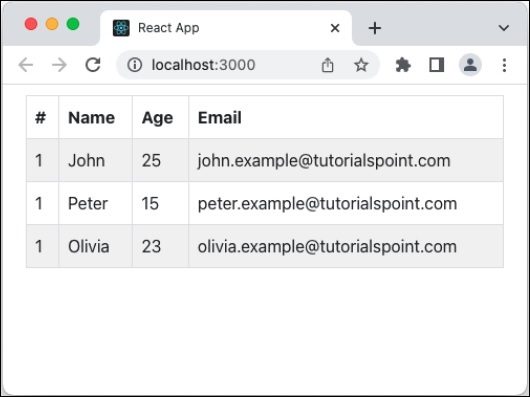
Add dark variant and column strip
Let us apply dark variant and column strip option in our table component and see how it updates the table design.
First of all, open our carousel application and update the SimpleCarousel component as shown below −
import { Table } from 'react-bootstrap';
function SimpleTable() {
return (
<Table bordered hover striped="columns" variant="dark">
// ...
Here we have,
Used striped props with columns to enable column based zebra stripping as well.
Used variant props with dark option to enable dark variant of the table design.
Next, open the application in the browser and check the final result. Table component will be rendered with column strip and dark variant as shown below −
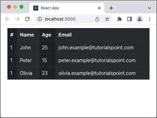
Summary
Bootstrap table component provides all necessary options to design a table in a simple, intuitive and flexible manner.
React - Managing State using Flux
One of the important feature in a front-end application is state management. React has its own state management technique for its component. React state management works in the component level only. A component's state will not be accessed in another component even through the components are in parent / child relationship (nested component). To overcome this problem, there are lot of third party state management libraries such as redux. mobx. etc.,
Flux is one of the technique to manage the state of the application effectively. Flux is introduced by Facebook and using it quite extensively in its web application. Flux uses a unidirectional data flow pattern to provide clear state management. Let us learn what is flux and how to use it in this chapter.
Managing State using Flux
Flux uses unidirectional data flow pattern. It has four distinct parts,
Store − As the name implies, all business data are stored in the store. Store does two process.
Store will update its data on its own by collecting the data from registered dispatcher. Dispatcher provides the store with data and related action.
Once the data is updated, the store emit a change data event to inform the view that the data is changed. View will listen for change event and update its view upon receiving the change event by accessing the updated data from store.
Action − Action are just the representation of the action to be processed with necessary data. View will create a action with necessary data based on the user interaction and send it to dispatcher. For example, the below mentioned payload is created by view (action creator) based on the user interaction to add a user.
{
actionType: "add",
data: {
name: "Peter"
}
}
Above mentioned action will be passed to dispatcher, which will send the information to all registered store. Store will update the data accordingly and send the change event to all view registered with it.
Dispatcher − Dispatcher receives the actions with proper payload and sent it to all registered stores for further processing.
View − View creates action based on the user interaction and send it to dispatcher. It registers with store to get the changes and once it receives the changes through events, it will update itself with new data.
Few things needs to be initialized for the efficient working of the flux and are as follows −
Dispatcher should be initialized by the application with proper actions and its callback.
Store should be initialized and registered with the dispatcher to receive data updates.
Views should be initialized with the dispatcher and store. Views should be registered to listen for store changes (events).
The workflow of the flux architecture is as follows −
User interact and fires an event in the view.
View handles the event and creates an action based on the user's action.
View send the action to dispatcher.
Dispatcher publish the action to all store registered with it,
Registered store will receive the action with payload. Store will update itself based on the action.
Store will emit change event to the view.
View listening to store changes will update the front end with updated data.
Applying flux
Let us create a new react application to learn how to apply flux concept in this section. First of all, create a new react application and start it using below command.
create-react-app myapp cd myapp npm start
Next, install flux package using npm as shown below −
npm install flux --save
Next, open App.css (src/App.css) and remove all CSS classes.
Dispatcher.js
Next, create a flux dispatcher, Dispatcher (src/Flux/Dispatcher.js) as shown below −
import {Dispatcher} from "flux";
export default new Dispatcher();
Here, we have created a new dispatcher from the flux package.
UserActions.js
Next, create actions (and action creator), UserActions (src/Flux/UserActions.js) as shown below −
import dispatcher from "./Dispatcher";
export const USER_ACTIONS = {
ADD: 'addUser'
};
export function addUser(userName) {
dispatcher.dispatch({
type: USER_ACTIONS.ADD,
value: {
name: userName
}
})
}
Here,
USER_ACTIONS.ADD is a constant used to refer the user's add action.
addUser() is the method used to create action along with user data and dispatch the created action to dispatcher.
UserStore.js
Next, create a store, UserStore (src/Flux/UserStore.js) as shown below −
import dispatcher from "./Dispatcher";
import {EventEmitter} from "events";
import * as UserActions from "./UserActions";
class UserStore extends EventEmitter {
constructor() {
super();
this.users = [];
}
handleActions(action) {
switch (action.type) {
case UserActions.USER_ACTIONS.ADD: {
this.users.push(action.value);
this.emit("storeUpdated");
break;
}
default: {
}
}
}
getUsers() {
return this.users;
}
}
const userStore = new userStore();
dispatcher.register(userStore.handleActions.bind(userStore));
export default userStore;
Here,
UserStore is extended from EventEmitter to emit changes.
handleActions retrieves the user details from dispatcher and update itself (this.users).
handleActions emits the store update event to inform the views that the store is updated.
getUsers() method will return the current user list information.
UserInput.js
Next, create a user input component, UserInput component to get the new user information as shown below −
import React from "react";
import * as UserActions from "./UserActions";
export default class ButtonComponent extends React.Component {
constructor(props) {
super(props);
this.state = {
username: ''
}
}
onButtonClick = () => {
UserActions.addUser(this.state.username)
};
render() {
return (
<div>
<input name="username" onChange={(e) => this.setState({username: e.target.value})}/>
<button onClick={() => this.onButtonClick()}>Add user</button>
</div>
);
}
}
Here,
Create a input element to get new user data from users.
Added a button to submit user information to UserActions's addUser() method
addUser will update user data and send it to dispatcher with proper action type. Dispatcher will call store with action type. Store will update the user list and inform all views registered with it.
UserList.js
Next, create a user list component, UserList component to show the users available in the store as shown below −
import React from "react";
import UserStore from "./UserStore";
export default class UserList extends React.Component {
constructor(props) {
super(props);
this.state = {
users: UserStore.getUsers()
}
}
componentDidMount() {
UserStore.on("storeUpdated", this.updateUserList);
}
componentWillUnmount() {
UserStore.removeListener("storeUpdated", this.updateUserList);
}
updateUserList = () => {
this.setState({users: UserStore.getUsers()})
};
render() {
return (
<ul>{
this.state.users && this.state.users.length > 0 &&
this.state.users.map((items) => <li>{items.name}</li>)
}
</ul>
);
}
}
Here,
componentDidMount registers the store event (storeUpdated) through UserStore.on method.
componentWillUnmount unregister the store event (storeUpdated) through UserStore.removeListener method.
updateUserList get the latest user data from store and update it's own store.
render method renders the user list from it's state (this.state.users).
App.js
Next, open App component (src/App.js), and use UserInput and UserList component as shown below −
import './App.css'
import React, { Suspense, lazy } from 'react';
import UserInput from './Flux/UserInput';
import UserList from './Flux/UserList';
function App() {
return (
<div className="container">
<div style={{ padding: "10px" }}>
<div>
<UserInput />
<UserList />
</div>
</div>
</div>
);
}
export default App;
Here,
UserInput will used to get information from user.
UserList will get the latest user list from store and render it.
Finally, open the application in the browser and check the final result. Initially, the user list will be empty. Once the user enters username and submit it, the below list will show the updated user list as shown below −
Summary
Flux is simple, unidirectional state management pattern for react application. It helps to reduce the complexity of the react application. It connects views and stores through dispatcher in a transparent manner. React community enhances the flux pattern and released lot of matured state management library (like redux), which are more powerful and easy to use.
React - Testing
Testing is one of the processes to make sure that the functionality created in any application is working in accordance with the business logic and coding specification. React recommends React testing library to test React components and jest test runner to run the test. The react-testing-library allows the components to be checked in isolation.
It can be installed in the application using below command −
npm install --save @testing-library/react @testing-library/jest-dom
Create React app
Create React app configures React testing library and jest test runner by default. So, testing a React application created using Create React App is just a command away.
cd /go/to/react/application npm test
The npm test command is similar to npm build command. Both re-compiles as and when the developer changes the code. Once the command is executed in the command prompt, it emits below questions.
No tests found related to files changed since last commit.
Press `a` to run all tests, or run Jest with `--watchAll`.
Watch Usage
Press a to run all tests.
Press f to run only failed tests.
Press q to quit watch mode.
Press p to filter by a filename regex pattern.
Press t to filter by a test name regex pattern.
Press Enter to trigger a test run.
Pressing a will try to run all the test script and finally summaries the result as shown below −
Test Suites: 1 passed, 1 total Tests: 1 passed, 1 total Snapshots: 0 total Time: 4.312 s, estimated 12 s Ran all test suites. Watch Usage: Press w to show more.
Testing in a custom application
Let us write a custom React application using Rollup bundler and test it using React testing library and jest test runner in this chapter.
First, create a new react application, react-test-app using Rollup bundler by following instruction in Creating a React application chapter.
Next, install the testing library.
cd /go/to/react-test-app npm install --save @testing-library/react @testing-library/jest-dom
Next, open the application in your favorite editor.
Next, create a file, HelloWorld.test.js under src/components folder to write test for HelloWorld component and start editing.
Next, import react library.
import React from 'react';
Next, import the testing library.
import { render, screen } from '@testing-library/react'; import '@testing-library/jest-dom';
Next, import our HelloWorld component.
import HelloWorld from './HelloWorld';
Next, write a test to check the existence of Hello World text in the document.
test('test scenario 1', () => {
render(<HelloWorld />);
const element = screen.getByText(/Hello World/i);
expect(element).toBeInTheDocument();
});
HelloWorld.test.js
The complete source code of the test code is given below −
import React from 'react';
import { render, screen } from '@testing-library/react';
import '@testing-library/jest-dom';
import HelloWorld from './HelloWorld';
test('test scenario 1', () => {
render(<HelloWorld />);
const element = screen.getByText(/Hello World/i);
expect(element).toBeInTheDocument();
});
Next, install jest test runner, if it is not installed already in the system.
npm install jest -g
Next, run jest command in the root folder of the application.
jest
Next, run jest command in the root folder of the application.
PASS src/components/HelloWorld.test.js
test scenario 1 (29 ms)
Test Suites: 1 passed, 1 total
Tests: 1 passed, 1 total
Snapshots: 0 total
Time: 5.148 s
Ran all test suites.
React - CLI Commands
React has its own command-line interface (CLI) commands. However, these CLI commands are currently only used to create a passable version of a react application using the command line. This will contain a default template as its design, so all the react application created this way will have great consistency as they all have same structure.
Basic CLI Commands in React
Let us learn the basic commands available in Create React App command line application in this chapter.
Creating a new application
Create React App provides multiple ways to create React application.
Using npx script.
npx create-react-app <react-app-name> npx create-react-app hello-react-app
Using npm package manager.
npm init react-app <react-app-name> npm init react-app hello-react-app
Using yarn package manager.
yarn init react-app <react-app-name> yarn init react-app hello-react-app
Selecting a template
Create React App creates React application using default template. Template refers the initial code with certain build-in functionality. There are hundreds of template with many advanced features are available in npm package server. Create React App allows the users to select the template through -template command line switch.
create-react-app my-app --template typescript
Above command will create react app using cra-template-typescript package from npm server.
Installing a dependency
React dependency package can be installed using normal npm or yarn package command as React uses the project structure recommended by npm and yarn.
Using npm package manager.
npm install --save react-router-dom
Using yarn package manager.
yarn add react-router-dom
Running the application
React application can be started using npm or yarn command depending on the package manager used in the project.
Using npm package manager.
npm start
Using yarn package manager.
yarn start
To run the application in secure mode (HTTPS), set an environment variable, HTTPS and set it to true before starting the application. For example, in windows command prompt (cmd.exe), the below command set HTTPS and starts the application is HTTPS mode.
set HTTPS=true && npm start
React - Building & Deployment
Let us learn how to do production build and deployment of React application in this chapter.
Building
Once a React application development is done, application needs to be bundled and deployed to a production server. Let us learn the command available to build and deploy the application in this chapter.
A single command is enough to create a production build of the application.
npm run build
> expense-manager@0.1.0 build path\to\expense-manager
> react-scripts build
Creating an optimized production build...
Compiled with warnings.
File sizes after gzip:
41.69 KB build\static\js\2.a164da11.chunk.js
2.24 KB build\static\js\main.de70a883.chunk.js
1.4 KB build\static\js\3.d8a9fc85.chunk.js
1.17 KB build\static\js\runtime-main.560bee6e.js
493 B build\static\css\main.e75e7bbe.chunk.css
The project was built assuming it is hosted at /.
You can control this with the homepage field in your package.json.
The build folder is ready to be deployed.
You may serve it with a static server:
npm install -g serve
serve -s build
Find out more about deployment here:
https://cra.link/deployment
Once the application is build, the application is available under build/static folder.
By default, profiling option is disable and can be enabled through -profile command line option. -profile will include profiling information in the code. The profiling information can be used along with React DevTools to analyse the application.
npm run build -- --profile
Deployment
Once the application is build, it can be deployed to any web server. Let us learn how to deploy a React application in this chapter.
Local deployment
Local deployment can be done using serve package. Let us first install serve package using below command −
npm install -g server
To start the application using serve, use the below command −
cd /go/to/app/root/folder serve -s build
By default, serve serve the application using port 5000. The application can be viewed @ http://localhost:5000.
Production deployment
Production deployment can be easily done by copying the files under build/static folder to the production application's root directory. It will work in all web server including Apache, IIS, Nginx, etc.
Relative path
By default, the production build is created assuming that the application will be hosted in the root folder of a web application. If the application needs to be hosted in a subfolder, then use below configuration in the package.json and then build the application.
{ ... "homepage": "http://domainname.com/path/to/subfolder", ... }
React - Example
In this chapter, let us create a sample expense manager application by applying the concepts that we have learned in this tutorial. Some of the concepts are listed below −
React basics (component, jsx, props and state)
Router using react-router
Http client programming (Web API)
Form programming using Formik
Advanced state management using Redux
Async / await programming
Features
Some of the features of our sample expense manager application are −
Listing all the expenses from the server
Add an expense item
Delete an expense item
Here,
React - Introduction to Hooks
Until React 16.8, function components are simply stateless component. To add state to a component, we need to convert the function component into class based component. Also, function component does not have option to manipulate lifecycle events of a component. To enable state and lifecycle events in the function component, React introduced a new concept called Hooks.
Hooks are plain JavaScript functions having access to state and lifecycle events of the component in which it is used / applied. In general, hooks starts with use keyword. React comes with a few built-in hooks and allows the creation of custom hooks as well.
Built-in hooks
Let us know the list of hooks available in React and its basic usage.
useState − Used to manipulate state of the component.
useReducer − Advanced version of useState hooks with reducer concept.
useEffect − Used to hook into lifecycle of the component.
useLayoutEffect − Similar to useEffect, but gets triggered synchronously after all DOM mutation or just before the DOM is going to painted on the screen.
useContext − Provides access to the context provider inside a component.
useMemo − Used to return a memoized version of a variable / function, which only changes based on supplied predefined set of dependencies. This will reduce the number of recomputation of expensive calculation and improves the performance of the application.
useCallback − returns a memoized version of a callback function, which only changes based on supplied predefined set of dependencies.
useRef − Provides access to a raw DOM node based on React ref object.
useImperativeHandle − Used to expose ref based value in the child component to parent component.
useDeferredValue − Used to defer a value similar to debouncing or throttling to defer updates.
useDebug − Used to display label for custom hooks in React DevTools.
useTransition − Used to identify the pending state of the transition.
useId − Used to create unique ID for an element in the application.
Applying hooks
Let us learn how to use a hook in a function component by creating an application.
Create a React application using create-react-app and start the application using below command
create-react-app myapp cd myapp npm start
Next, let us create a new Function component HelloWorld (src/components/HelloWorld.js), which render an input element and renders a greeting message based on the data entered into the input element by the user.
import { useState } from 'react';
export default function HelloWorld() {
const [name, setName] = useState("World")
return (
<div style={{ textAlign: "center", padding: "5px" }}>
<input id="name" name="name"
value={name}
onChange={(e) => setName(e.target.value)} />
<div>Hello {name}</div>
</div>
)
}
Here,
useState is a hook, which receives an initial value and returns a state and a function to update the state. it receives World as initial value and returns an array with two items, a) initial value of the state (name) and b) a function to update state (setName). The syntax used is array destruction syntax to get and set the array values into name and setName variables.
input is a react input element with an onChange event attached to it. onchange event get the user's updated values through event.target.value and set it into the current state using setName function.
Whenever user updates the input, onchange event fires and update the state, which inturn fires the render function of the component.
Next, let us apply our component in our application (App.js) as shown below −
import './App.css';
import HelloWorld from './components/HelloWorld';
function App() {
return (
<HelloWorld />
);
}
export default App;
Finally, open the browser and check the results by changing the input value. The message gets updated whenever the input changes as shown below −
Advantages of Hooks
Function component have many advantages over class based component when used along with Hooks. They are as follows −
Hooks are easy to understand and quick to start coding.
The complexity of the application can be kept minimum in a large application. In class based component, the complexity (state management and handling lifecycle events) grows as the project grows.
this in class (component) is hard to understand for a beginner in JavaScript programming. Since Function component and hooks don't depends on this, developers can quickly start coding in React without steep learning curve.
Stateful logic can be reused easily between components.
Function component can be used along with class based component, which makes it easily adoptable in the existing project of any size.
Function component can be written is few lines of code compared to class based components.
Disadvantages of Hooks
Hooks are alternative methodology to create components and it has its own disadvantages as well. They are as follows −
Hooks should be called only at top level and should be avoided inside a condition, loop or nested function.
Hooks are specialized features that they may not be best fit for certain situation and we may have to restore to class based component.
React handles the internals of hooks without exposing the core for optimization, which makes it less flexible and not suitable for certain scenarios.
Summary
Hooks are relatively new way of creating components. Large collection of project are still using class based component. Converting the component in those projects from class based to function based is not practically possible and we have to live with it. Instead, we can convert the application in the phased manner.
React - Using useState Hook
useState is a basic React hook, which allows a function component to maintain its own state and re-render itself based on the state changes. The signature of the useState is as follows −
const [ <state>, <setState> ] = useState( <initialValue> )
where,
initialValue − Initial value of the state. state can be specified in any type (number, string, array and object).
state − Variable to represent the value of the state.
setState − Function variable to represent the function to update the state returned by the useState.
The signature of the setState function is as follows −
setState( <valueToBeUpdated> )
Where, valueToBeUpdated is the value to be updated for the state. The sample usage to set and update the user's name is as follows −
// initialize the state
const [name, setName] = useState('John')
// update the state
setName('Peter)
Features
Notable features of useState are as follows −
Function Parameter − It Accepts a function (returns initial state) instead of initial value and execute the function only once during initial rendering of the component. This will help to improve the performance, if the computation of initial value is expensive.
const [val, setVal] = useState(() => {
var initialValue = null
// expensive calculation of initial value
return initialValue
})
Verifies the previous values − It checks the current and previous value of the state and only if they are different, React renders its children and fires the effects. This will improve performance of the rendering.
// ...
setName('John') // update the state and rerender the component
// ...
// ...
setName('John') // does not fire the rendering of the children because the value of the state have not changed.
// ...
Batches multiple state updates − Multiple state updates are batched and processed by React internally. If multiple state update has to be done immediately, then the special function flushSync provided by React can be used, which will immediately flush all the state changes.
flushSync(() => setName('Peter'))
Applying state hook
Let us create a login form component and maintain the values of the form using useState hook.
First of all, create and start a React application using below commands,
create-react-app myapp cd myapp npm start
Next, create a react component, LoginForm under component folder (src/components/LoginForm.js)
import { useState } from 'react';
export default function LoginForm() {
// render code
}
Next, create two state variable, username and password using useState hook as shown below −
import { useState } from 'react';
export default function LoginForm() {
const [username, setUsername] = useState('')
const [password, setPassword] = useState('')
// render code
}
Next, create a function to validate the login data as shown below −
import { useState } from 'react';
export default function LoginForm() {
const [username, setUsername] = useState('')
const [password, setPassword] = useState('')
let isEmpty = (val) => {
if(val == null || val == '') {
return true;
} else {
return false;
}
}
let validate = (e) => {
e.preventDefault()
if(!isEmpty(username) && !isEmpty(password)) {
alert(JSON.stringify({
username: username,
password: password
}))
} else {
alert("Please enter username / password")
}
}
// render code
}
Here, isEmpty is a function to check whether the data is available or empty.
Next, render a login form with two input fields and use state variables (username and password), state updated methods (setUsername and setPassword) and validate method to process the form.
import { useState } from 'react';
export default function LoginForm() {
return (
<div style={{ textAlign: "center", padding: "5px" }}>
<form name="loginForm">
<label for="username">Username: </label>
<input id="username" name="username" type="text"
value={username}
onChange={(e) => setUsername(e.target.value)} />
<br />
<label for="password">Password: </label>
<input id="password" name="password" type="password"
value={password}
onChange={(e) => setPassword(e.target.value)} />
<br />
<button type="submit" onClick={(e) => validate(e)}>Submit</button>
</form>
</div>
)
}
Here,
onChange uses the state setting function returned by hooks.
onClick uses the validate function to validate and show the user entered data.
LoginForm.js
The complete code of the LoginForm component is as follows −
import { useState } from 'react';
export default function LoginForm() {
const [username, setUsername] = useState('')
const [password, setPassword] = useState('')
let isEmpty = (val) => {
if(val == null || val == '') {
return true;
} else {
return false;
}
}
let validate = (e) => {
e.preventDefault()
if(!isEmpty(username) && !isEmpty(password)) {
alert(JSON.stringify({
username: username,
password: password
}))
} else {
alert("Please enter username / password")
}
}
return (
<div style={{ textAlign: "center", padding: "5px" }}>
<form name="loginForm">
<label for="username">Username: </label>
<input id="username" name="username" type="text"
value={username}
onChange={(e) => setUsername(e.target.value)} />
<br />
<label for="password">Password: </label>
<input id="password" name="password" type="password"
value={password}
onChange={(e) => setPassword(e.target.value)} />
<br />
<button type="submit" onClick={(e) => validate(e)}>Submit</button>
</form>
</div>
)
}
App.js
Next, update the root application component, App.js as below,
import './App.css';
import HelloWorld from './components/HelloWorld';
import LoginForm from './components/LoginForm';
function App() {
return (
<LoginForm />
);
}
export default App;
Next, open the browser and check the application. Application will gather the user entered data using state variable and validate it using validate function. if user entered proper data, it will show the data as shown below −
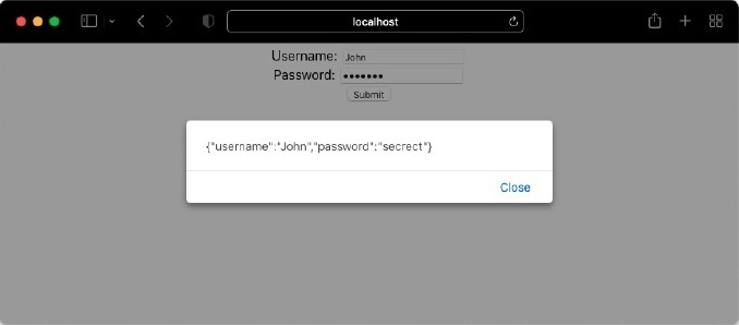
Otherwise, it will throw the error as shown below −
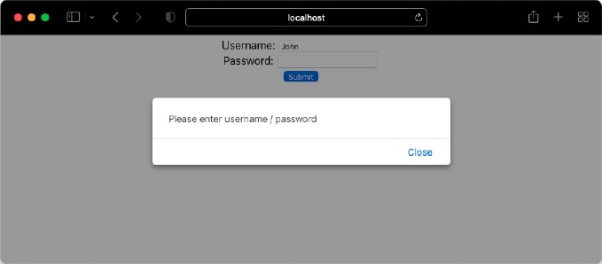
Object as state
In class based state management, setState method supports partial update of the state object. For example, let us consider login form data is maintained in state as an object.
{
username: 'John',
password: 'secret'
}
Updating the username using setState will only update the username in the state object and preserve the password field.
this.setState({
username: 'Peter'
})
In hooks, the setData (function return by useState) will update the whole object as shown below −
// create state
const [data, setDate] = useState({
username: 'John',
password: 'secret'
})
// update state - wrong
setData({
username: 'Peter'
})
The updated state don't have password field as shown below −
{
username: 'Peter'
}
To fix the issue, we can use spread operator in javascript as shown below −
setData({
...data,
username: 'Peter'
})
Let us create a new component by converting our LoginForm component and use object state variable as shown below −
import { useState } from 'react';
export default function LoginFormObject() {
const [data, setData] = useState({})
let isEmpty = (val) => {
if(val == null || val == '') {
return true;
} else {
return false;
}
}
let validate = (e) => {
e.preventDefault()
if(!isEmpty(data.username) && !isEmpty(data.password)) {
alert(JSON.stringify(data))
} else {
alert("Please enter username / password")
}
}
return (
<div style={{ textAlign: "center", padding: "5px" }}>
<form name="loginForm">
<label for="username">Username: </label>
<input id="username" name="username" type="text"
value={data.username}
onChange={(e) => setData( {...data, username: e.target.value} )} />
<br />
<label for="password">Password: </label>
<input id="password" name="password" type="password"
value={data.password}
onChange={(e) => setData({...data, password: e.target.value})} />
<br />
<button type="submit" onClick={(e) => validate(e)}>Submit</button>
</form>
</div>
)
}
Here,
State is maintained in object (data).
setData is returned by useState hook and used as state update function.
data.* syntax is used to get the details of the state.
data spread operator is used along with setData function to update the state.
Summary
useState hook is simple and easy way to do state management in the function component. useState can be used to handle single value or multiple value in the state. It support both basic data type and complex objects. It allows multiple state setting function (set*) and internally batches to simplify the process. Due to the introduction of useState hook, function component are finally improved to do any functionality (from stateless to stateful).
React - Using useEffect Hook
React provides useEffect to do side-effects in a component. Some of the side effects are as follows −
Fetching data from external source & updating the rendered content.
Updating DOM elements after rendering.
Subscriptions
Using Timers
Logging
In class based components, these side effects are done using life cycle components. So, useEffect hook is an effect replacement for below mentioned life cycle events.
componentDidMount − Fires after the rendering is done for the first time.
componentDidUpdate − Fires after the rendering is updated due to prop or state changes.
componentWillUnmount − Fires after the rendered content is unmounted during destruction of component.
Let us learn how to use effect hook in this chapter.
Signature of useEffect
The signature of useEffect is as follows −
useEffect( <update function>, <dependency> )
where, the signature of the update function is as follows −
{
// code
return <clean up function>
}
Here,
Update function − Update function is the function to be executed after each render phase. This corresponds to componentDidMount and componentDidUpdate events
Dependency − Dependency is an array with all the variables on which the function is dependent. Specifying the dependency is very important to optimize the effect hook. In general, update function is called after each render. Sometimes it is not necessary to render update function on each render. Let us consider that we are fetching data from external source and updating it after the render phase as shown below −
const [data, setDate] = useState({})
const [toggle, setToggle] = useState(false)
const [id, setID] = useState(0)
useEffect( () => {
fetch('/data/url/', {id: id}).then( fetchedData => setData(fetchedData) )
})
// code
Component will rerender whenever data and toggle variable are updated. But as you see, we don't need that the defined effect to be run during each update of toggle state. To fix the issue, we can pass an empty dependency as shown below −
const [data, setDate] = useState({})
const [toggle, setToggle] = useState(false)
const [id, setID] = useState(0)
useEffect( () => {
fetch('/data/url/', { id: id }).then( fetchedData => setData(fetchedData) )
}, [])
The above code will run the effect only once after the first render. Even though it will fix the issus, the effects has to be run on every change of id. To make it happen, we can include id as dependency for the effects as shown below −
const [data, setDate] = useState({})
const [toggle, setToggle] = useState(false)
const [id, setID] = useState(0)
useEffect( () => {
fetch('/data/url/', { id: id }).then( fetchedData => setData(fetchedData) )
}, [id])
This will ensure that the effects will rerun only after the modification of id
Cleanup function − Cleanup function is used to cleanup work during the usage of subscription function and timer function as shown below −
const [time, setTime] = useState(new Date())
useEffect(() => {
let interval = setInterval(() => {
setTime(new Date())
}, 1000)
return () => clearInterval(interval)
}, [time])
Let us create a complete application to understand the cleanup function in later section.
Features of effect hook
Some of the notable features of effect hook are as follows −
React allows multiple effect hook to be used in a function component. This will help us to write a function for each side effects and set it up as separate effect.
Each hook will be run in the order in which it is declared. Developer should make sure that the order of effects are declared correctly.
Dependency feature can be used to improve the performance and correct working of the side effects.
Cleanup function prevents memory leaks and unnecessary firing of events.
Fetching data using effect
Let us create an application that will fetch data from external source and render it using useEffect hook in this section.
First of all, create a new react application and start it using below command.
create-react-app myapp cd myapp npm start
NameList.js
Next, create a react component, NameList under component folder (src/components/NameList.js)
function NameList() {
return <div>names</div>
}
export default NameList
Here, the purpose of the NameList component is to showcase the popular list of common names
App.js
Next, update the root component, App.js to use the newly created NameList component.
import NameList from "./components/NameList";
function App() {
return (
<div style={{ padding: "5px"}}>
<NameList />
</div>
);
}
export default App;
names.json
Next, create a json file, names.json (public/json/names.json) and store popular names in json format as shown below.
[
{
"id": 1,
"name": "Liam"
},
{
"id": 2,
"name": "Olivia"
},
{
"id": 3,
"name": "Noah"
},
{
"id": 4,
"name": "Emma"
},
{
"id": 5,
"name": "Oliver"
},
{
"id": 6,
"name": "Charlotte"
},
{
"id": 7,
"name": "Elijah"
},
{
"id": 8,
"name": "Amelia"
},
{
"id": 9,
"name": "James"
},
{
"id": 10,
"name": "Ava"
},
{
"id": 11,
"name": "William"
},
{
"id": 12,
"name": "Sophia"
},
{
"id": 13,
"name": "Benjamin"
},
{
"id": 14,
"name": "Isabella"
},
{
"id": 15,
"name": "Lucas"
},
{
"id": 16,
"name": "Mia"
},
{
"id": 17,
"name": "Henry"
},
{
"id": 18,
"name": "Evelyn"
},
{
"id": 19,
"name": "Theodore"
},
{
"id": 20,
"name": "Harper"
}
]
Next, create a new state variable, data to store popular names in NameList component as shown below −
const [data, setData] = useState([])
Next, create a new state variable, isLoading to store loading status as shown below −
const [isLoading, setLoading] = useState([])
Next, use fetch method to get popular names from json file and set it into data state variable inside useEffect hook
useEffect(() => {
setTimeout(() => {
fetch("json/names.json")
.then( (response) => response.json())
.then( (json) => { console.log(json); setLoading(false); setData(json); } )
}, 2000)
})
Here we have,
Used setTimout method to simulate the loading process.
Used fetch method to get the json file.
Used json method to parse the json file.
Used setData to set the names parsed from json file into data state variable.
Used setLoading to set the loading status.
Next, render the names using map method. During fetching, show loading status.
<div>
{isLoading && <span>loading...</span>}
{!isLoading && data && <span>Popular names: </span>}
{!isLoading && data && data.map((item) =>
<span key={item.id}>{item.name} </span>
)}
</div>
Here we have,
Used isLoading to show the loading status
Used data variable to show the list of popular names
NameList.js
The complete source code of the component, NameList is as follows −
import { useState, useEffect } from "react"
function NameList() {
const [data, setData] = useState([])
const [isLoading, setLoading] = useState([])
useEffect(() => {
setTimeout(() => {
fetch("json/names.json")
.then( (response) => response.json())
.then( (json) => { console.log(json); setLoading(false); setData(json); } )
}, 2000)
})
return (
<div>
{isLoading && <span>loading...</span>}
{!isLoading && data && <span>Popular names: </span>}
{!isLoading && data && data.map((item) =>
<span key={item.id}>{item.name} </span>
)}
</div>
)
}
export default NameList
Next, open the browser and check the application. It will show the loading state and after 2 second, it will fetch the json and showcase the popular names as shown below −
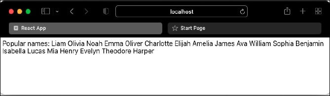
DOM mutations
The useEffect hook can be used to manipulate the document using DOM and its methods. It makes sure that the code inside it will execute only after DOM is ready. Let us change our name list application and update the title of the page using DOM mutation.
First of all, open NameList component and add the document title based on the loading status as shown below −
useEffect(() => {
if(isLoading)
document.title = "Loading popular names..."
else
document.title = "Popular name list"
setTimeout(() => {
fetch("json/names.json")
.then( (response) => response.json())
.then( (json) => { console.log(json); setLoading(false); setData(json);} )
}, 2000)
})
Here, we have used the DOM object, document.title to update the title to the page.
Finally, open the browser and check how the title of the document is updated through DOM manipulation


Cleanup function
useEffect can be used to remove the cleanup functions such as clearInterval, removeEventListener etc., during the unmounting of the component from the page document. This will prevent the memory leaks and improve the performance. To do this, we can create our own cleanup function and return it from the useEffect callback argument.
Let us change our name list application to use setInterval instead of setTimeout and later use clearInterval to remove set callback function during unmounting the component.
First of all, open NameList component and update the useEffect section as shown below −
useEffect(() => {
if(isLoading)
document.title = "Loading popular names..."
else
document.title = "Popular name list"
let interval = setInterval(() => {
setLoading(true)
fetch("json/names.json")
.then( (response) => response.json())
.then( (json) => { console.log(json); setLoading(false); setData(json);} )
}, 5000)
return () => { clearInterval(interval) }
})
Here we have,
Used setImterval to update the popular names every 5 seconds.
Used clearInterval in the clean up function to remove the setInterval during unmounting of the component.
Finally, open the browser and check how the application behaves. We will see that the data get updated every 5 seconds. When the component is unmounted, clearInterval will be called in the background.
Summary
useEffect is an essential feature of a function component and enables the components to use life cycle events. It helps the function component to provide rich functionality with predictable and optimized performance.
React - Using useContext Hook
Context is one of the important concept in React. It provides the ability to pass a information from the parent component to all its children to any nested level without passing the information through props in each level. Context will make the code more readable and simple to understand. Context can be used to store information which does not change or have minimal change. Some of the use cases of context are as follows −
Application configuration
Current authenticated user information
Current user setting
Language setting
Theme / Design configuration by application / users
React provides a special hook, useContext to access and update the context information in the function component. Let use learn context and its corresponding hook in this chapter.
How context works?
Before understanding useContext hook, let us revisit the basic concept of context and how it works. Context has four parts,
Creating a new context
Setting context provider in the root component
Setting context consumer in the component where we need the context information
Accessing context information and using it in render method
Let us create an application to better understand context and its usage. Let us create a global context for maintaining theme information in the application root component and use it in our child component.
First of all, create and start an application using below command,
create-react-app myapp cd myapp npm start
Next, create a component, HelloWorld under components folder (src/components/HelloWorld.js)
import React from "react";
import ThemeContext from "../ThemeContext";
class HelloWorld extends React.Component {
render() {
return <div>Hello World</div>
}
}
export default HelloWorld
Next, create with a new context (src/ThemeContext.js) for maintaining theme information.
import React from 'react'
const ThemeContext = React.createContext({
color: 'black',
backgroundColor: 'white'
})
export default ThemeContext
Here,
A new context is created using React.createContext.
Context is modeled as an object having style information.
Set initial value for color and background of the text.
App.js
Next, update the root component, App.js by including HelloWorld component and the theme provider with initial value for the theme context.
import './App.css';
import HelloWorld from './components/HelloWorld';
import ThemeContext from './ThemeContext'
function App() {
return (
<ThemeContext.Provider value={{
color: 'white',
backgroundColor: 'green'
}}>
<HelloWorld />
</ThemeContext.Provider>
);
}
export default App;
Here, the ThemeContext.Provider is used, which is a non-visual component to set the value of the theme context to be used in all its children component.
HelloWorld.js
Next, include a context consumer in HelloWorld component and style the hello world message using theme information in HelloWorld component.
import React from "react";
import ThemeContext from "../ThemeContext";
class HelloWorld extends React.Component {
render() {
return (
<ThemeContext.Consumer>
{
( {color, backgroundColor} ) =>
(<div style={{
color: color,
backgroundColor: backgroundColor }}>
Hello World
</div>)
}
</ThemeContext.Consumer>)
}
}
export default HelloWorld
Here we have,
Used ThemeContext.Consumer, which is a non-visual component providing access to the current theme context details
Used a function expression to get the current context information inside ThemeContext.Consumer
Used object deconstruction syntax to get the theme information and set the value in color and backgroundColor variable.
Used the theme information to style the component using style props.
Finally, open the browser and check the output of the application
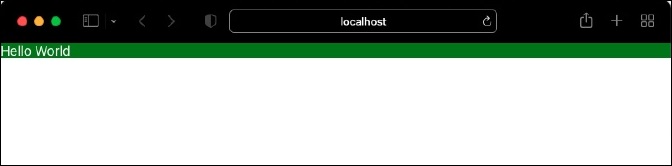
Signature of useContext
The signature of the useContext is as follows −
let contextValue = useContext( <contextName> )
Here,
contextName refers the name of the context to be accessed.
contextValue refers the current value of the referred context.
An example code to access the context using hooks is as follows −
const theme = useContext(ThemContext)
Context usage through hook
Let us update our application and use the context hook instead of context consumer.
First of all, convert the HelloWorld component into function component.
import React from "react";
function HelloWorld() {
return <div>Hello World</div>
}
export default HelloWorld
Next, access the current value of the context through useContext hook
import React, { useContext } from "react"
import ThemeContext from '../ThemeContext'
function HelloWorld() {
let theme = useContext(ThemeContext)
return <div>Hello World</div>
}
export default HelloWorld
Next, update the rendering function to use the theme information fetched through context.
import React, { useContext } from "react"
import ThemeContext from '../ThemeContext'
function HelloWorld() {
let theme = useContext(ThemeContext)
return (
<div style={{
color: theme.color,
backgroundColor: theme.backgroundColor }}>
Hello World
</div>
)
}
export default HelloWorld
Here we have,
Used useContext to access the ThemeContext context information.
Used ThemeContext information to set background color and color of the text.
Finally, open the browser and check the output of the application.
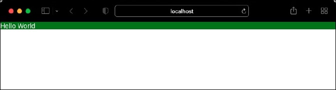
Updating context
In some scenarios, updating the context information is necessary. For example, we may provide an option to change the theme information by user. When user changes the theme, then the context should get updated. Updating the context will rerender all the child component, which will change the theme of the application.
React provides an option to update the context by using both useState and useContext hook. Let us update our application to support theme selection.
App.js
First of all, update the root component, App.js and use useState hook to manage the theme information as shown below −
import './App.css'
import { useState } from 'react'
import HelloWorld from './components/HelloWorld'
import ThemeContext from './ThemeContext'
function App() {
let initialTheme = {
color: 'white',
backgroundColor: 'green'
}
const [theme, setTheme] = useState(initialTheme)
return (
<ThemeContext.Provider value={{ theme, setTheme }}>
<HelloWorld />
</ThemeContext.Provider>
);
}
export default App;
Here we have,
Used useState hook to set the theme information in the state of the root component.
Theme update function, useTheme returned by useState is also included as part of theme information in the context.
Next, update the HelloWorld component to get the theme information stored in the context.
import React, { useContext } from "react"
import ThemeContext from '../ThemeContext'
function HelloWorld() {
let { theme, setTheme } = useContext(ThemeContext)
return (<div style={{
color: theme.color,
backgroundColor: theme.backgroundColor }}>
<div>Hello World</div>
</div>)
}
export default HelloWorld
Next, provide an option for the user to change the theme through a drop down option.
import React, { useContext } from "react"
import ThemeContext from '../ThemeContext'
function HelloWorld() {
let { theme, setTheme } = useContext(ThemeContext)
return (<div style={{
color: theme.color,
backgroundColor: theme.backgroundColor }}>
<div>
<select value={theme.backgroundColor}>
<option value="green">Green</option>
<option value="red">Red</option>
</select>
<div>Hello World</div>
</div>)
}
export default HelloWorld
Here we have,
Added a dropdown box with two options, Green and Red.
Set the current value of the dropdown box using the current theme value value={theme.backgroundColor).
Next, update the context whenever the theme is changed by the user through onChange event.
import React, { useContext } from "react"
import ThemeContext from '../ThemeContext'
function HelloWorld() {
let { theme, setTheme } = useContext(ThemeContext)
return (<div style={{
color: theme.color,
backgroundColor: theme.backgroundColor }}>
<div>
<select value={theme.backgroundColor}
onChange = {
(e) => {
setTheme({
...theme,
backgroundColor: e.target.value
})
}} >
<option value="green">Green</option>
<option value="red">Red</option>
</select>
</div>
<div>Hello World</div>
</div>)
}
export default HelloWorld
Here we have,
Attached an onChange event to the dropdown box.
Used the setTheme function inside the event handler and updated the background color of the theme to the color selected by the user.
HelloWorld.js
The complete code of the root component and HelloWorld component are as follows &miinus;
import React, { useContext } from "react"
import ThemeContext from '../ThemeContext'
function HelloWorld() {
let { theme, setTheme } = useContext(ThemeContext)
return (<div style={{
color: theme.color,
backgroundColor: theme.backgroundColor }}>
<div>
<select value={theme.backgroundColor}
onChange= {
(e) => {
setTheme({
...theme,
backgroundColor: e.target.value
})
}
} >
<option value="green">Green</option>
<option value="red">Red</option>
</select>
</div>
<div>Hello World</div>
</div>)
}
export default HelloWorld
Next, open the browser and check the application.
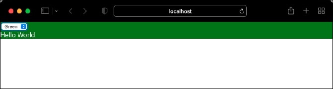
When user selected a different background color, it will update the context and consequently, it will rerender the component will new theme as shown below −
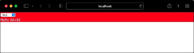
Summary
Context reduces the complexity of maintaining global data in a react application. Context hook further reduces the complexity by simplifying the accessing and updating (through useState) the context.
React - Using useRef Hook
React automatically emits the HTML elements as the state of the component changes. This greatly simplifies the UI development as it is enough to update the state of the component. Traditionally, it is normal to access the DOM element directly to update the UI of the component.
Sometimes we may need to fallback to accessing the DOM elements directly and update the UI of the component. React ref lends help in this scenario. It provides direct access to DOM elements. Also, it make sure that the component work smoothly with react Virtual DOM and HTML DOM.
React provides a function, createRef to create ref in class based component. The counterpart of createRef in function component is useRef hook. Let us learn how to use useRef in this chapter.
Signature of the useRef hook
The purpose of the useRef is to return a mutable object, which will persist between rerenders. The signature of useRef is as follows −
<refObj> = useRef(<val>)
Here,
val is the initial value to be set for the returned mutable object, refObj.
refObj is the object returned by the hook.
To automatically attach a DOM object to the refObj, it should be set in ref props of the element as shown below −
<input ref={refObj} />
To access the attached DOM element, use current property of the refObj as shown below −
const refElement = refObj.current
Applying ref hook
Let us learn how to apply useRef by creating a react application in this chapter.
First of all, create a new react application and start it using below command.
create-react-app myapp cd myapp npm start
Next, create a react component, RefInput under component folder (src/components/RefInput.js)
function RefInput() {
return <div>Hello World</div>
}
export default RefInput
Next, update the root component (App.js) to use our new component.
import RefInput from "./components/RefInput";
function App() {
return (
<div style={{ padding: "5px"}}>
<RefInput />
</div>
);
}
export default App;
Next, add a counter functionality to RefInput component as shown below −
import {useState} from 'react'
function RefInput() {
const [count, setCount] = useState(0)
const handleClick = () => setCount(count + 1)
return (
<div>
<div>Counter: {count} <button onClick={handleClick}>+</button></div>
</div>
)
}
export default RefInput
Here we have,
Used useState hook to handle counter state variable (count).
Rendered the counter state variable in the JSX.
Added a button and attached a click handler event (handleClick), which will increment the counter using setCount method.
Next, add an input field and show a greeting message based on the value entered by user in the input field as shown below −
import {useState, useRef} from 'react'
function RefInput() {
const [count, setCount] = useState(0)
const inputRef = useRef(null)
const labelRef = useRef(null)
console.log("RefInput is (re)rendered")
const handleClick = () => setCount(count + 1)
const handleChange = () => labelRef.current.innerText = inputRef.current.
value == "" ? "World" : inputRef.current.value
return (
<div>
<div>Counter: {count} <button onClick={handleClick}>+</button></div>
<div style={{ paddingTop: "5px"}}>
<label>Enter your name: </label><input type="text" name="username"
ref={inputRef} onChange={handleChange}/>
<br />
<div>Hello, <span ref={labelRef}></span></div>
</div>
</div>
)
}
export default RefInput
Here we have −
Created a ref, inputRef to represent the input element and attached it to the relevant element through ref props.
Created another ref, labelRef to represent the greeting message element and attached it to the relevant element through ref props.
Attached an event handler, handleChange to the input element. The event handler uses inputRef ref to get the greeting message and uses labelRef ref to update the message.
Next, open the application in the browser and enter your name. Application will update the greeting message as shown below.
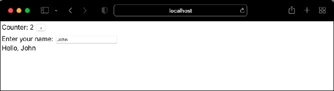
Check your console and you can notice that the component is not rerendered. Since react rerenders only on state changes and ref does not do any state changes, the component is not rerendered.
Next, click the + button. It will update the counter by rerendering the component as there is change in state (count). If you notice closely, you can find that the message remains same. The reason for this behavior is that the ref values are preserved between rendering by the react.
Use cases of useRef
Some of the use cases of useRef are as follows −
Accessing JavaScript DOM API − JavaScript DOM API provides rich set of feature to manipulate the UI of the application. When the application feature need access to JavaScript DOM API, useRef can be used to retrieve the raw DOM object. Once the raw DOM object is retrieved, the application can use the DOM API to access all the features. Some of the examples of DOM API are as follows −
Focusing an input element
Selecting text
play audio or video using media playback API
Imperative animation − Web Animation API provides a rich set of animation feature through imperative programming rather than declarative programming. To use Web animation API, we need access to the raw DOM.
Integration with third party library − Since third party library requires access to raw DOM to do its functionality, it is be mandatory to use useRef to get the DOM reference from react and provide it to third party library.
Summary
Even though react way of developing UI is simple and easy, developing UI based on DOM API has it own advantages in certain scenario. useRef hook fits perfectly in those scenario and provides simple and clean API to access the DOM element directly and subsequently its API.
React - Using useReducer Hook
useReducer hook is an advanced version of useState hook. As we know, the purpose of the useState is to manage a state variable. useState returns a function, which accepts a value and updates the state variable with the given value.
// counter = 0 const [counter, setCounter] = useState(0) // counter = 1 setCounter(1) // counter = 2 setCounter(2)
The useReducer hook accepts a reducer function along with the initial value and returns a dispatcher function. Reducer function will accept the initial state and an action (specific scenario) and then provides logic to update the state based on the action. The dispatcher function accepts the action (and corresponding details) and call the reducer function with provided action.
For example, useReducer can be used to update the counter state based on increment and decrement action. Increment action will increment the counter state by 1 and decrement action will decrement the counter by 1.
Let us learn how to use useReducer hook in this chapter.
Signature of the useReducer hook
The signature of the useReducer hook is as follows −
const [<state>, <dispatch function>] = useReducer(<reducer function>, <initial argument>, <init function>);
Here,
state represents the information to be maintained in the state
reducer function is a javascript function used to update the state based on the action.
Following is the syntax of the reducer function −
(<state>, <action>) => <updated state>
Where,
state − Current state information
action − Action to be carried out (should have payload to do the action)
updated state − Updated state
initial argument −represents the initial value of the state
init function − represents initialization function, which can be used to set the initial value / reset the current value of the state. If initial value needs to be computed, then we can use the init function. Otherwise, the argument can be skipped.
Applying reducer hook
Let us create a react application to manage a collection of todo items. First of all, we will implement it using useState and then convert it to use useReducer. By implementing the application using both hook, we will understand the benefit of useReducer over useState. Also, we can able to choose the hook wisely depending on the situation.
First of all, create a new react application and start it using below command.
create-react-app myapp cd myapp npm start
Next, create a react component, TodoList under component folder (src/components/TodoList.js).
function TodoList() {
return <div>Todo List</div>
}
export default TodoList
Next, update the root component, App.js to use the newly created TodoList component.
import logo from './logo.svg';
import './App.css';
import TodoList from './components/TodoList';
function App() {
return (
<div style={{ padding: "5px"}}>
<TodoList />
</div>
);
}
export default App;
Next, create a variable, todoData to manage todo list and set it to the state using useState hook.
const [todoData, setTodoData] = useState({
action: '',
items: [],
newItem: null,
id: 0
})
Here,
action is used to represent the current action, add & delete to be applied on the current list of todo items (items).
items is an array used to hold the current list of todo items.
newItem is an object used to represent the current todo item. The object will have two field, id and todo.
id is the id of the current item to be deleted during delete action.
useState is used to get and set the todo list (todoData).
Next, render the current list of todo item (todoData.items) along with a delete button and a input text field to enter new todo item.
<div>
<p>List of Todo list</p>
<ul>
{todoData.items && todoData.items.map((item) =>
<li key={item.id}>{item.todo} <span><button onClick={(e) =>
handleDeleteButton(item.id, e)}>Delete</button></span></li>
)}
<li><input type="text" name="todo" onChange={handleInput} />
<button onClick={handleAddButton}>Add</button></li>
</ul>
</div>
Here,
Rendered the current list of todo items from the state variable, todoData.
Rendered a input field for the user to enter new todo item and attached onChange event handler, handleInput. The event handler will update newItem in the todo state (todoData) with the data entered by user in the input field.
Rendered a button for the user to add the newly entered todo item to the current todo list and attached onClick event handler, handleAddButton. The event handler will add the current / new todo item to the todo state.
Rendered a button for every item in the todo list and attached onClick event handler, handleDeleteButton. The event handler will delete the corresponding todo item from the todo state.
Next, implement handleInput event handler as shown below −
const handleInput = (e) => {
var id = 0
if(todoData.newItem == null) {
for(let i = 0; i < todoData.items.length; i++) {
if(id < todoData.items[i].id) {
id = todoData.items[i].id
}
}
id += 1
} else {
id = todoData.newItem.id
}
let data = {
actions: '',
items: todoData.items,
newItem: {
id: id,
todo: e.target.value
},
id: 0
}
setTodoData(data)
}
Here we have,
Updated the newItem.todo with user entered data (e.target.value)
Created and set the id for the new item.
Next, implement handleDeleteButton event handler as shown below −
const handleDeleteButton = (deleteId, e) => {
let data = {
action: 'delete',
items: todoData.items,
newItem: todoData.newItem,
id: deleteId
}
setTodoData(data)
}
Here, the handler set the id (deleteid) of the todo item to be deleted and delete action in the todo state
Next, implement handleAddButton event handler as shown below −
const handleAddButton = () => {
let data = {
action: 'add',
items: todoData.items,
newItem: todoData.newItem,
id: 0
}
setTodoData(data)
}
Here, the handler set the new item and add action in the state
Next, implement add action as shown below −
if(todoData.action == 'add') {
if(todoData.newItem != null) {
let data = {
action: '',
items: [...todoData.items, todoData.newItem],
newItem: null,
id: 0
}
setTodoData(data)
}
}
Here, new item is added to the exiting list (todoData.items) in the todo state.
Next, implement the delete action as shown below −
if(todoData.action == 'delete' && todoData.id != 0) {
var newItemList = []
for(let i = 0; i < todoData.items.length; i++) {
if(todoData.items[i].id != todoData.id) {
newItemList.push(todoData.items[i])
}
}
let data = {
action: '',
items: newItemList,
newItem: null,
id: 0
}
setTodoData(data)
}
Here, the item with specified id is removed from the todo list (todoData.items).
TodoList.js
The complete source code of the component is as follows −
import { useState } from "react"
function TodoList() {
const [todoData, setTodoData] = useState({
action: '',
items: [],
newItem: null,
id: 0
})
if(todoData.action == 'add') {
if(todoData.newItem != null) {
let data = {
action: '',
items: [...todoData.items, todoData.newItem],
newItem: null,
id: 0
}
setTodoData(data)
}
}
if(todoData.action == 'delete' && todoData.id != 0) {
var newItemList = []
for(let i = 0; i < todoData.items.length; i++) {
if(todoData.items[i].id != todoData.id) {
newItemList.push(todoData.items[i])
}
}
let data = {
action: '',
items: newItemList,
newItem: null,
id: 0
}
setTodoData(data)
}
const handleInput = (e) => {
var id = 0
if(todoData.newItem == null) {
for(let i = 0; i < todoData.items.length; i++) {
if(id < todoData.items[i].id) {
id = todoData.items[i].id
}
}
id += 1
} else {
id = todoData.newItem.id
}
let data = {
action: '',
items: todoData.items,
newItem: {
id: id,
todo: e.target.value
},
id: 0
}
setTodoData(data)
}
const handleDeleteButton = (deleteId, e) => {
let data = {
action: 'delete',
items: todoData.items,
newItem: todoData.newItem,
id: deleteId
}
setTodoData(data)
}
const handleAddButton = () => {
let data = {
action: 'add',
items: todoData.items,
newItem: todoData.newItem,
id: 0
}
setTodoData(data)
}
return (
<div>
<p>List of Todo list</p>
<ul>
{todoData.items && todoData.items.map((item) =>
<li key={item.id}>{item.todo} <span><button onClick={(e) => handleDeleteButton(item.id, e)}>Delete</button></span></li>
)}
<li><input type="text" name="todo" onChange={handleInput} /><button onClick={handleAddButton}>Add</button></li>
</ul>
</div>
)
}
export default TodoList
Here, the application uses the useState hook to do the functionality.
Next, open the browser and add / delete the todo item. The application will run as shown below −
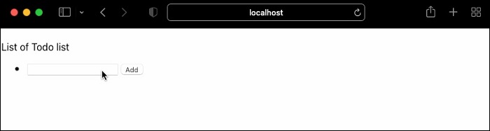
Using useReducer
Let us reimplement the functionality using useReducer
First of all, create a react component, TodoReducerList under component folder (src/components/TodoReducerList.js)
function TodoReducerList() {
return <div>Todo List</div>
}
export default TodoReducerList
App.js
Next, update the root component, App.js to use the newly created TodoReducerList component.
import './App.css';
import TodoReducerList from './components/TodoReducerList';
function App() {
return (
<div style={{ padding: "5px"}}>
<TodoReducerList />
</div>
);
}
export default App;
Next, implement a reducer function, todoReducer, which will receive two argument as shown below −
Current todo list (items)
Action (action.type) along with action related information (action.payload). For add action (action.type), the payload (action.payload) will have the new todo item and for delete action (action.type), it will have the id of the todo item to be deleted
The reducer will apply the relevant action to the todo list and sent back the modified todo list as shown below −
function todoReducer(items, action) {
// action = { type: 'add / delete', payload: 'new todo item'}
let newTodoList = []
switch (action.type) {
case 'add':
var id = 0
for(let i = 0; i < items.length; i++) {
if(id < items[i].id) {
id = items[i].id
}
}
action.payload.id = id + 1
newTodoList = [...items, action.payload]
break;
case 'delete':
for(let i = 0; i < items.length; i++) {
if(items[i].id != action.payload.id) {
newTodoList.push(items[i])
}
}
break;
default:
throw new Error()
}
return newTodoList
}
Here we have,
Used a switch statement two handle actions.
Added action adds the payload to the existing todo list.
deleted action removes the item specified in the payload from the existing todo list
Finally, the function returns the updated todo list
Next, use the newly created reducer in the TodoReducerList component as shown below −
const [items, dispatch] = useReducer(todoReducer, [])
Here, useReducer receives two argument, a) reducer function and b) the current todo list and returns the current todo list and a dispatcher function dispatch. The dispatcher function (dispatch) should be called with either add or delete action with relevant payload information.
Next, create handler function for input text field (new todo item) and two buttons (add and delete) as shown below −
const [todo, setTodo] = useState('')
const handleInput = (e) => {
setTodo(e.target.value)
}
const handleAddButton = () => {
dispatch({
type: 'add',
payload: {
todo: todo
}
})
setTodo('')
}
const handleDeleteButton = (id) => {
dispatch({
type: 'delete',
payload: {
id: id
}
})
}
Here we have,
Used useState to manage the user input (todo)
Used dispatch method to process add and delete action in relevant handler
Passed the payload specific to the action in the handler.
Next, update the render method as shown below −
<div>
<p>List of Todo list</p>
<ul>
{items && items.map((item) =>
<li key={item.id}>{item.todo} <span><button onClick={(e) =>
handleDeleteButton(item.id)}>Delete</button></span></li>
)}
<li><input type="text" name="todo" value={todo} onChange={handleInput} />
<button onClick={handleAddButton}>Add</button></li>
</ul>
</div>
TodoReducerList.js
The complete source code of the component along with the reducer function is as follows −
import {
useReducer,
useState
} from "react"
function todoReducer(items, action) {
// action = { type: 'add / delete', payload: 'new todo item'}
let newTodoList = []
switch (action.type) {
case 'add':
var id = 0
for(let i = 0; i < items.length; i++) {
if(id < items[i].id) {
id = items[i].id
}
}
action.payload.id = id + 1
newTodoList = [...items, action.payload]
break;
case 'delete':
for(let i = 0; i < items.length; i++) {
if(items[i].id != action.payload.id) {
newTodoList.push(items[i])
}
}
break;
default:
throw new Error()
}
return newTodoList
}
function TodoReducerList() {
const [todo, setTodo] = useState('')
const [items, dispatch] = useReducer(todoReducer, [])
const handleInput = (e) => {
setTodo(e.target.value)
}
const handleAddButton = () => {
dispatch({
type: 'add',
payload: {
todo: todo
}
})
setTodo('')
}
const handleDeleteButton = (id) => {
dispatch({
type: 'delete',
payload: {
id: id
}
})
}
return (
<div>
<p>List of Todo list</p>
<ul>
{items && items.map((item) =>
<li key={item.id}>{item.todo} <span><button onClick={(e) =>
handleDeleteButton(item.id)}>Delete</button></span></li>
)}
<li><input type="text" name="todo" value={todo} onChange={handleInput} />
<button onClick={handleAddButton}>Add</button></li>
</ul>
</div>
)
}
export default TodoReducerList
Next, open the browser and check the output.
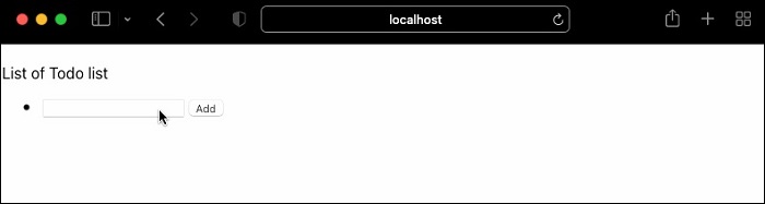
We can clearly understand that the useReducer implementation is simple, easy and understandable compared to the pure useState implementation.
Summary
useReducer hook introduces a reducer pattern in the state management. It encourages the code reuse and increases readability and understandability of the component. Overall, useReducer is an essential and powerful tool in the react developer's toolkit.
React - Using useCallback Hook
The useCallback hook is similar to useMemo hook and provides the functionality of memoizing the function instead of values. Since callback function in an integral part of the JavaScript programming and callback functions are passed by references, react provides a separate hook, useCallback to memoize the callback functions. In theory, useCallback functionality can be done using useMemo hook itself. But, useCallback improves the readability of the react code.
Signature of the useCallback hook
The signature of the useCallback hook is as follows −
const <memoized_callback_fn> = useCallback(<callback_fn>, <dependency_array>);
Here, the useCallback accepts two input and returns a memoized callback function. The input parameter are as follows −
callback_fn − Callback function to be memorized.
dependency_array − Hold variables, upon which the callback function depends.
The output of the useCallback hook is the memoized callback function of the callback_fn. Usage of useCallback hook is as follows −
const memoizedCallbackFn = useCallback(() => {
// code
}, [a, b])
Note − The useCallback(callback_fn, dependency_array) is equivalent to useMemo(() => callback_fn, dependency_array).
Applying useCallback
Let us learn how to apply the useCallback hook by creating a react application.
First of all, create and start a react application by using create-react-app command as shown below −
create-react-app myapp cd myapp npm start
Next, create a component, PureListComponent under components folder (src/components/PureListComponent.js)
import React from "react";
function PureListComponent() {
return <div>List</div>
}
export default PureListComponent
Next, update the root component with PureListComponent component as shown below −
import PureListComponent from './components/PureListComponent';
function App() {
return (
<div style={{ padding: "5px" }}>
<PureListComponent />
</div>
);
}
export default App;
Next, open PureListComponent.js and add two props
list of items to show in the component
callback function to show the item clicked by user in the console
PureListComponent.js
import React from "react";
function PureListComponent(props) {
const items = props['items'];
const handleClick = props['handleClick']
console.log("I am inside the PureListComponent")
return (
<div>
{items.map((item, idx) =>
<span key={idx} onClick={handleClick}>{item} </span>
)}
</div>
)
}
export default React.memo(PureListComponent)
Here we have,
Used items props to get the list of items
Used handleClick to get the handler for click event
Wrapped the component using React.memo to memoize the component. Since the component will render same output for the given set of input, it is called PureComponent in react.
Next, let us update App.js and use the PureListComponent as shown below −
import React, {useState, useEffect} from 'react';
import PureListComponent from './components/PureListComponent';
function App() {
// array of numbers
var listOfNumbers = [...Array(100).keys()];
// callback function
const handleCallbackFn = (e) => { console.log(e.target.innerText) }
const [currentTime, setCurrentTime] = useState(new Date())
useEffect(() => {
let interval = setInterval(() => {
setCurrentTime(new Date())
}, 1000)
return () => clearInterval(interval)
}, [currentTime])
return (
<div style={ { padding: "5px" } }>
<PureListComponent items={listOfNumbers} handleClick={handleCallbackFn}/>
<div>Time: <b>{currentTime.toLocaleString().split(',')[1]}</b></div>
</div>
);
}
export default App;
Here we have Included a state, currentTime and updated it every second using setInterval to make sure the component rerenders every second.
We may thought that PureListComponent will not rerender every second as it uses React.memo. But, it will rerender as the props value are of reference type.
App.js
Next, update the root component and use useMemo and useCallback to preserve the array and callback function as shown below −
import React, {useState, useEffect, useCallback, useMemo} from 'react';
import PureListComponent from './components/PureListComponent';
function App() {
// array of numbers
const listOfNumbers = useMemo(() => [...Array(100).keys()], []);
// callback function
const handleCallbackFn = useCallback((e) => console.log(e.target.innerText), [])
const [currentTime, setCurrentTime] = useState(new Date())
useEffect(() => {
let interval = setInterval(() => {
setCurrentTime(new Date())
}, 1000)
return () => clearInterval(interval)
}, [currentTime])
return (
<div style={ { padding: "5px" } }>
<PureListComponent items={listOfNumbers} handleClick={handleCallbackFn}/>
<div>Time: <b>{currentTime.toLocaleString().split(',')[1]}</b></div>
</div>
);
}
export default App;
Here we have,
Used useMemo to preserve the items array
Used useCallback to preserve the handleClick callback functions
Finally, check the application in the browser and it will not rerender PureListComponent every second.

Use cases of useCallback
Some of the use cases of the useCallback hook is as follows −
Pure functional component with function props
useEffect or other hooks having function as dependency
Usage of function during debouncing / throttling or similar action
Advantages
Advantages of useCallback hook are as follows −
Simple to use API
Easy to understand
Improves the performance of the application
Disadvantages
Technically, useCallback have no disadvantages. But, heavy usage of useCallback in a application will bring below disadvantages.
Decrease the readability of the application
Decrease the Understandability of the application
Debugging the application is complex
Developer should have deep understanding of JavaScript language to use it
Summary
useCallback is easy to use and improves performance. At the same time, useCallback should be used only when it is absolutely necessary. It should not be used in every scenario. The general rule is check the performance of the application. if it needs improvement, then we can check whether the usage of useCallback will help to improve the performance. If we get positive response, then we can use it. Otherwise, we can leave it to the react to improve and optimize the performance of the application.
React - Using useMemo Hook
React provides a core set of built-in hooks to simplify the development and built an efficient application. One of the important feature of an application is good performance. Every application will have certain complex computation logic, which will slow down the application performance. We have two option to encounter the complex computation.
Improve the algorithm of the complex calculation and make it fast.
Call complex calculation only when it is absolutely necessary.
The useMemo hook helps us to improve the performance of the application by providing an option to call the complex calculation only when it is absolutely necessary. useMemo preserves / memoize the output of the complex calculation and returns it instead of recomputing the complex calculation. useMemo will know when to use memoized value and when to rerun the complex calculation.
Signature of useMemo hook
The signature of the useMemo hook is as follows −
const <output of the expensive logic> = useMemo(<expensive_fn>, <dependency_array>);
Here, useMemo accepts two input and returns a computed value.
The input parameter are as follows −
expensive_fn − Do the expensive logic and returns the output to be memoized.
dependency_array − Hold variables, upon which the expensive logic depends. If the value of the array changes, then the expensive logic has to be rerun and the value have to be updated.
The output of the useMemo hook is the output of the expensive_fn. useMemo will return the output either by executing the function or fetching the memorized value.
Usage of useMemo hook is as follows −
const limit = 1000;
const val = useMemo(() => {
var sum = 0;
for(let i = 1; i <= limit; i++) {
sum += i;
}
return sum;
}, [limit])
Here, summation logic will execute once in the beginning and whenever the limit value is changed/updated. In between, the memoized value is returned by the useMemo hook.
Applying memo hook
Let us learn the useMemo hook deeply by applying the hook in a react application.
First of all, create and start a react application by using create-react-app command as shown below −
create-react-app myapp cd myapp npm start
Next, create a component, Sum under components folder (src/components/Sum.js)
import React from "react";
function Sum() {
return <div>Sum</div>
}
export default Sum
Next, update the root component with out Sum component as shown below −
import './App.css';
import Sum from './components/Sum';
function App() {
return (
<div>
<Sum />
</div>
);
}
export default App;
Next, open Sum.js and add a state to represent the current time and update the current time through setInterval as shown below −
import React, {
useState,
useEffect,
useMemo
} from "react";
function Sum() {
let [currentTime, setCurrentTime] = useState(new Date())
useEffect(() => {
let interval = setInterval(() => setCurrentTime(new Date()), 1000)
return () => { clearInterval(interval) }
})
const limit = 1000;
var sum = 0;
for(let i = 1; i <= limit; i++) {
sum += i;
}
return (
<div style={ {padding: "5px" } }>
<div>Summation of values from <i>1</i> to <i>{limit}</i>:
<b>{sum}</b></div>
<div>Time: <b>{currentTime.toLocaleString().split(',')[1]}</b></div>
</div>
)
}
export default Sum
Here we have,
Used setState to set the current time in the state using useState hook. It returns two variables; A state variable, currentTime and a function setCurrentTime to update the state variable, currentTime.
Used useEffect hooks to update the time at regular interval of 1 second using setInterval function. We have updated the time at regular interval to make sure that the component rerenders at regular interval.
Used clearInterval to remove the update time functionality when the component is unmounted.
Shown sum and currentTime value in the document through JSX
Sum component rerenders every second to update the currentTime. During each render, summation logic will execute even through it is not necessary.
Next, let us introduce the useMemo hook to prevent recalculation of the summation logic between the rerender as shown below −
import React, { useState, useEffect, useMemo } from "react";
function Sum() {
let [currentTime, setCurrentTime] = useState(new Date())
useEffect(() => {
let interval = setInterval(() => setCurrentTime(new Date()), 1000)
return () => { clearInterval(interval) }
})
const limit = 1000;
const sum = useMemo(() => {
var sum = 0;
for(let i = 1; i <= limit; i++) {
sum += i;
}
return sum;
}, [limit])
return (
<div style={ {padding: "5px" } }>
<div>Summation of values from <i>1</i> to <i>{limit}</i>: <b>{sum}</b></div>
<div>Time: <b>{currentTime.toLocaleString().split(',')[1]}</b></div>
</div>
)
}
export default Sum
Here we have, converted the summation logic into a function and passed it into useMemo hook. This will prevent the recalculation of the summation logic on every rerender.
The limit is set as dependency. This will ensure that the summation logic will not be executed until the limit value is changed.
Next, add a input to change the limit as shown below −
import React, {
useState,
useEffect,
useMemo
} from "react";
function Sum() {
let [currentTime, setCurrentTime] = useState(new Date())
let [limit, setLimit] = useState(10);
useEffect(() => {
let interval = setInterval(() => setCurrentTime(new Date()), 1000)
return () => { clearInterval(interval) }
})
const sum = useMemo(() => {
var sum = 0;
for(let i = 1; i <= limit; i++) {
sum += i;
}
return sum;
}, [limit])
return (<div style={ {padding: "5px" } }>
<div><input value={limit} onChange={ (e) => { setLimit(e.target.value) }} /></div>
<div>Summation of values from <i>1</i> to <i>{limit}</i>: <b>{sum}</b></div>
<div>Time: <b>{currentTime.toLocaleString().split(',')[1]}</b></div>
</div>)
}
export default Sum
Here we have,
Used useState hook to manage limit variable. useState hook will return two variables; a state variable, limit and a function variable, setLimit to update limit variable.
Added a new input element to allow the user to enter new value for the limit variable
Added an event, onChange to update the limit variable as the user updates it.
When user enters new value in the input element,
onChange event will get triggered.
setLimit function will be called by the onChange event.
limit variable will be updated by setLimit function.
Sum component will be rerendered as the state variable, limit is updated.
useMemo will rerun the logic as the limit variable is updated and it will memoize the new value and set it to sum variable.
render function will use the new value for sum variable and render it.
Finally, open the browser and check the application.
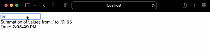
Preserving references
Let us understand how to use useMemo hook along with reference data type in this chapter. In general, data type of a variable comes under category, value types and reference types. Value types are managed in stack and they are passed between function as values. But, reference data types are managed in heap and are passed between function using its memory address or simply references.
The Value types are as follows −
Number
String
Boolean
null
undefined
Reference data types are as follows −
Array
Objects
Functions
In general, variables with reference data types are not easily comparable even through the value of two variable are identical. For example, let us consider two variable with value type and another two variable with reference data type and compare it as shown below −
var a = 10 var b = 10 a == b // true var x = [10, 20] var y = [10, 20] x == y // false
Even though x and y are same with respect to value, both points to different location in memory. useMemo can be used to memoize variables with reference data type correctly.
useMemo(x) == useMemo(y) // true
Let us create a new react application to better understand the usage of useMemo to handle reference data types.
First of all, create and start a react application by using create-react-app command as shown below −
create-react-app myapp cd myapp npm start
Next, create a component, PureSumComponent under components folder (src/components/PureSumComponent.js)
import React from "react";
function PureSumComponent() {
return <div>Sum</div>
}
export default PureSumComponent
Next, update the root component with PureSumComponent component as shown below −
import './App.css';
import PureSumComponent from './components/PureSumComponent';
function App() {
return (
<div style={{ padding: "5px" }}>
<PureSumComponent />
</div>
);
}
export default App;
Next, open PureSumComponent.js and add a props, range to represent the range of number as shown below −
import React from "react";
function PureSumComponent(props) {
const range = props['range'];
const start = range[0];
const end = range[1];
console.log('I am inside PureSumComponent component')
var sum = 0;
for(let i = start; i <= end; i++) {
sum += i;
}
return (
<div>
<div>Summation of values from <i>{start}</i> to
<i>{end}</i>: <b>{sum}</b></div>
</div>
)
}
export default React.memo(PureSumComponent)
Here,
Used range props to calculate the summation of the range of values. range is an array having two numbers, start and end of the range.
Shown start, end and sum value in the document through JSX
Wrapped the component using React.memo to memoize the component. Since the component will render same output for the given set of input, it is called PureComponent in react.
Next, let us update App.js and use the PureSumComponent as shown below −
import React, {useState, useEffect} from 'react';
import PureSumComponent from './components/PureSumComponent';
function App() {
var input = [1,1000]
const [currentTime, setCurrentTime] = useState(new Date())
useEffect(() => {
let interval = setInterval(() => {
setCurrentTime(new Date())
}, 1000)
return () => clearInterval(interval)
}, [currentTime])
return (
<div style={ {padding: "5px" } }>
<PureSumComponent range={input}/>
<div>Time: <b>{currentTime.toLocaleString().split(',')[1]}</b></div>
</div>
);
}
export default App;
Here, we have included a state, currentTime and updated it every second using setInterval to make sure the component rerenders every second.
We may thought that PureSumComponent will not rerender every second as it uses React.memo. But, it will rerender as the props is an array and it will be created with new reference with every second. You can confirm it by checking the console.
Next, update the root component and use useMemo to preserve the range array as shown below −
import React, {useState, useEffect, useMemo} from 'react';
import PureSumComponent from './components/PureSumComponent';
function App() {
const input = useMemo(() => [1, 1000], [])
const [currentTime, setCurrentTime] = useState(new Date())
useEffect(() => {
let interval = setInterval(() => {
setCurrentTime(new Date())
}, 1000)
return () => clearInterval(interval)
}, [currentTime])
return (
<div style={ {padding: "5px" } }>
<PureSumComponent range={input}/>
<div>Time: <b>{currentTime.toLocaleString().split(',')[1]}</b></div>
</div>
);
}
export default App;
Here, we have used useMemo to preserve the range array
Finally, check the application in the browser and it will not rerender PureSumComponent every second.
Advantages
Advantages of useMemo hook are as follows −
Simple to use API
Easy to understand
Improves the performance of the application
Disadvantages
Technically, useMemo have no disadvantages. But, heavy usage of useMemo in a application will bring below disadvantages.
Decrease the readability of the application
Decrease the Understandability of the application
Debugging the application is complex
Developer should have deep understanding of JavaScript language to use it
Summary
In general, react internally optimize the application and provides high performance. Still, we may need to intervene and provide our own optimization in certain scenarios. useMemo helps us in this situation and provides a simple solution to improve the performance of the react application. To summarize, use useMemo hook when it is absolutely necessary. Otherwise, leave the optimizing and providing the high performance to react itself.
React - Using Custom Hook
Hooks are integral part of a function component. They can used to enhance the feature of the function component. React provides few build-in hooks. Even though build-in hooks are powerful and can do any functionality, specialized hooks are necessary and in high demand.
React understands this need of the developer and allows to create new custom hooks through existing hooks. Developer can extract a special functionality from the function component and can create it as a separate hook, which can be used in any function component.
Let us learn how to create custom hooks in this chapter.
Create a custom hook
Let use create a new react function component with infinite scroll feature and then extract the infinite functionality from the function component and create a custom hook. Once the custom hook is created, we will try to change the original function component to use our custom hook.
Implement Infinite scroll functionality
The basic functionality of the component is to show a dummy list of todo item simply by generating it. As the user scrolls, the component will generate a new set of dummy todo list and append it to the existing list.
First of all, create a new react application and start it using below command.
create-react-app myapp cd myapp npm start
Next, create a react component, TodoList under component folder (src/components/TodoList.js)
function TodoList() {
return <div>Todo List</div>
}
export default TodoList
Next, update the root component, App.js to use the newly created TodoList component.
import TodoList from './components/TodoList';
function App() {
return (
<div style={{ padding: "5px"}}>
<TodoList />
</div>
);
}
export default App;
Next, create a count state variable to maintain the number of todo items to e generated.
const [count, setCount] = useState(100)
Here,
The initial number of items to be generated is 100
count is the state variable used to maintain the number to todo items
Next, create a data array to maintain the dummy generated todo items and preserve the reference using useMemo hook.
React.useMemo(() => {
for (let i = 1; i <= count; i++) {
data.push({
id: i,
todo: "Todo Item " + i.toString()
})
}
}, [count]);
Here,
Used useMemo to restrict the generation of todo items on every render.
Used count as a dependency to regenerate the todo items when the count changes
Next, attach a handler to the scroll event and update the count of the todo item to generated when the user moved to the end of the page.
React.useEffect(() => {
function handleScroll() {
const isBottom =
window.innerHeight + document.documentElement.scrollTop
=== document.documentElement.offsetHeight;
if (isBottom) {
setCount(count + 100)
}
}
window.addEventListener("scroll", handleScroll);
return () => {
window.removeEventListener("scroll", handleScroll);
};
}, [])
Here we have,
Used useEffect hook to make sure the DOM is ready to attach the event.
Attached an event handler, scrollHandler for scroll event.
Removed the event handler when the component is unmounted from the application
Found that the user hits the bottom of the page using DOM properties in the scroll event handler.
Once the user hit the bottom of the page, the count is incremented by 100
Once the count state variable is changed, the component gets rerendered and more todo item are loaded.
Finally, render the todo items as shown below −
<div>
<p>List of Todo list</p>
<ul>
{data && data.map((item) =>
<li key={item.id}>{item.todo}</li>
)}
</ul>
</div>
The complete source code of the component is as follows −
import React, { useState } from "react"
function TodoList() {
const [count, setCount] = useState(100)
let data = []
React.useMemo(() => {
for (let i = 1; i <= count; i++) {
data.push({
id: i,
todo: "Todo Item " + i.toString()
})
}
}, [count]);
React.useEffect(() => {
function handleScroll() {
const isBottom =
window.innerHeight + document.documentElement.scrollTop
=== document.documentElement.offsetHeight;
if (isBottom) {
setCount(count + 100)
}
}
window.addEventListener("scroll", handleScroll);
return () => {
window.removeEventListener("scroll", handleScroll);
};
}, [])
return (
<div>
<p>List of Todo list</p>
<ul>
{data && data.map((item) =>
<li key={item.id}>{item.todo}</li>
)}
</ul>
</div>
)
}
export default TodoList
Next, Open the browser and run the application. The application will append new todo item once the user hits the end of the page and goes on infinitely as shown below −
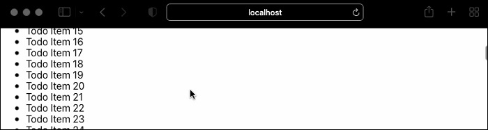
Implementing useInfiniteScroll hook
Next, let us try to create new custom hook by extracting the logic from the existing component and then use it in a separate component. Create a new custom hook, useInfiniteScroll (src/Hooks/useInfiniteScroll.js) as shown below
import React from "react";
export default function useInfiniteScroll(loadDataFn) {
const [bottom, setBottom] = React.useState(false);
React.useEffect(() => {
window.addEventListener("scroll", handleScroll);
return () => {
window.removeEventListener("scroll", handleScroll);
};
}, []);
React.useEffect(() => {
if (!bottom) return;
loadDataFn();
}, [bottom]);
function handleScroll() {
if (window.innerHeight + document.documentElement.scrollTop
!= document.documentElement.offsetHeight) {
return;
}
setBottom(true)
}
return [bottom, setBottom];
}
Here we have,
Used use keyword to name the custom hook. This is the general practice to start the name of the custom hook with use keyword and it is also a hint for the react to know that the function is a custom hook
Used a state variable, bottom to know whether the user hits the bottom of the page.
Used useEffect to register the scroll event once the DOM is available
Used a generic function, loadDataFn to be supplied during the creation of hook in the component. This will enable to create custom logic for loading the data.
Used DOM properties in the scroll event handler to track the user scroll position. when the user hits the bottom of the page, the bottom state variable is changed.
Returned the current value of the bottom state variable (bottom) and the function to update the bottom state variable (setBottom)
Next, create a new component, TodoListUsingCustomHook to apply the newly created hook.
function TodoListUsingCustomHook() {
return <div>Todo List</div>
}
export default TodoListUsingCustomHook
Next, update the root component, App.js to use the newly created TodoListUsingCustomHook component.
import TodoListUsingCustomHook from './components/TodoListUsingCustomHook';
function App() {
return (
<div style={{ padding: "5px"}}>
<TodoListUsingCustomHook />
</div>
);
}
export default App;
Next, create a state variable, data to manage the todo list items.
const [data, setData] = useState([])
Next, create a state variable, count to manage number of todo list items to be generated.
const [data, setData] = useState([])
Next, apply the infinite scroll custom hook.
const [bottom, setBottom] = useInfiniteScroll(loadMoreData)
Here, bottom and setBottom are exposed by the useInfiniteScroll hook.
Next, create the function to generate the todo list items, loadMoreData
function loadMoreData() {
let data = []
for (let i = 1; i <= count; i++) {
data.push({
id: i,
todo: "Todo Item " + i.toString()
})
}
setData(data)
setCount(count + 100)
setBottom(false)
}
Here,
Generated the todo items based on the count state variable
Incremented the count state variable by 100
Set the generated todo list to the data state variable using setData function
Set the bottom state variable to false using setBottom function
Next, generate the initial todo items as shown below −
const loadData = () => {
let data = []
for (let i = 1; i <= count; i++) {
data.push({
id: i,
todo: "Todo Item " + i.toString()
})
}
setData(data)
}
React.useEffect(() => {
loadData(count)
}, [])
Here,
Initial todo items are generated based on the initial count state variable
Set the generated todo list to the data state variable using setData function
Used useEffect to make sure that the data is generated once the DOM is available
Finally, render the todo items as shown below −
<div>
<p>List of Todo list</p>
<ul>
{data && data.map((item) =>
<li key={item.id}>{item.todo}</li>
)}
</ul>
</div>
The complete source code of the component is as shown below −
import React, { useState } from "react"
import useInfiniteScroll from '../Hooks/useInfiniteScroll'
function TodoListUsingCustomHook() {
const [data, setData] = useState([])
const [count, setCount] = useState(100)
const [bottom, setBottom] = useInfiniteScroll(loadMoreData)
const loadData = () => {
let data = []
for (let i = 1; i <= count; i++) {
data.push({
id: i,
todo: "Todo Item " + i.toString()
})
}
setData(data)
}
function loadMoreData() {
let data = []
for (let i = 1; i <= count; i++) {
data.push({
id: i,
todo: "Todo Item " + i.toString()
})
}
setData(data)
setCount(count + 100)
setBottom(false)
}
React.useEffect(() => {
loadData(count)
}, [])
return (
<div>
<p>List of Todo list</p>
<ul>
{data && data.map((item) =>
<li key={item.id}>{item.todo}</li>
)}
</ul>
</div>
)
}
export default TodoListUsingCustomHook
Finally, open the browser and check the output. The application will append new todo item once the user hits the end of the page and goes on infinitely as shown below −

The behavior is same as that of TodoList component. We have successfully extracted the logic from the component and used it to create our first custom hook. Now, the custom hook can be used in any application.
Summary
Custom hook is an existing feature to separate the reusable logic from a function component and allows to make it really reusable hook across different function component.
React - Accessibility
Accessibility (a11y) is designing the web application in such a way that the application will be accessible by everyone and support assistive technology to read the content of the application for the end user.
React supports all the aspects of accessibility in a web application. Let us see how react supports accessibility in this chapter.
ARIA (aria-*) attributes
WAI-ARIA (Web Accessibility Initiative - Accessible Rich Internet Applications) is a standard specifying ways to build fully accessible JavaScript widgets. It provides a large set of HTML attributes (aria-*) to support accessibility. React supports all those attributes in its components. In general, React restricts the HTML attributes to be in the form of camelCase, but for accessibility attributes, it should be in the form of kebab-case or lisp-case or simply as it is in the HTML document.
For example, the below code shows how to use the HTML accessibility attributes.
<input
type="text"
aria-label={labelText}
aria-required="true"
name="name"
/>
Here,
aria-label is used to specify the label of the input element
aria-required is used to specify that the input should be filled.
Note that the attributes are use as it is (in kebab-case format).
Sematic HTML
A web document coded by applying the sematic HTML (article, section, navigation, etc.,) tags improves the accessibility of the document. In react, there are situation where we use blocks (div) just to satisfy the react framework. For example, react does not support multiple tags in its render code. To overcome the restriction, developer may use parent tag (div) to make the multiple tags as children.
function ShowItems({ data }) {
return (
<div>
<dt>{data.title}</dt>
<dd>{data.description}</dd>
</div>
);
}
React provides Fragment component to work around the scenario. We can just replace Fragment instead of div as shown below −
function ShowItems({ data }) {
return (
<Fragment>
<dt>{data.title}</dt>
<dd>{data.description}</dd>
</Fragment>
);
}
Forms
Every input should be labeled and the label should be descriptive to understand the input element. React provides a special props htmlFor to specify the input element for the specific description. Developer can use it create accessible forms.
<label htmlFor="firstName">Firstname:</label> <input id="firstName" type="text" name="name"/>
Keyboard support
Keyboard support is a must for creating accessible web application. Some of the features expecting keyboard support are,
Focus − React provides a concept called Ref to access the raw DOM element. When the application needs raw access to DOM element, Ref and Forwarding Ref can be used to manage the raw DOM element.
Skip links − Skip navigation links are must feature to support accessibility. They allows the user to skip all the navigation in one go when accessing the application using only keyboard. It can be done using smart anchor tags, which are fully supported by react.
<body> <a href="#maincontent">Skip to main content</a> ... <main id="maincontent"> ... </main>
Mouse and pointer functionality − To create a true accessible application, all the feature should be accessible through keyboard. Component with high level mouse and pointer based user interaction should be changed to accommodate keyboard only user interaction. React provides all event handling logic to modify the default mouse based UI to keyboard based UI.
Aria components
React community provides many components with full accessibility support. They can be used as it is without any modification. They automatically enables the application to be accessible. Some of the third party components with aria support are as follows −
react-aria − react-aria provides large set of react component with full accessibility support
react-modal − react-modal provides modal component with aria support.
react-aria-modal − react-aria-modal is yet another modal component with aria support.
react-select − react-select provides select component with aria support.
react-dropdown-aria − react-dropdown-aria provides dropdown component with aria support.
react-aria-menubutton − react-aria-menubutton provides menu button component with aria support.
react-aria-tabpanel − react-aria-tabpanel provides tab panel component with aria support.
Summary
React provides many features to create fully accessible, aria supported web application. Creation of accessible application is always a challenge and react reduces the burden a bit in the form of ready-made component as well as core feature to write a accessible application from the scratch.
React - Code Splitting
Bundling is one of the important stage in a front end application. It bundles all the front end code along with dependency into one large bundle (bundle.js). The final bundle is size optimized by the bundler. Some of the popular bundler are webpack, parcel and rollup. The final bundle will be fine in most cases. If the final bundled code is big, then the bundler can be instructed to bundle the code into multiple item instead of single, big chunk.
Let us learn how to hint the bundler to split the code and bundle it separately.
Dynamic import
Dynamic import instruct the bundler to split the code. Dynamic import is basically fetching the required module based on the necessity. The code to do normal is as shown below −
import { round } from './math';
console.log(round(67.78));
The same code can be imported dynamically as shown below −
import("./math").then(math => {
console.log(math.round(67.78);
});
React Lazy component
React provides a function, React.lazy to dynamically import a component. Normally, as we know, a react component will be imported as shown below −
import MyComponent from './MyComponent';
To import the above component dynamically using React.lazy() function is as shown below −
const MyComponent = React.lazy(() => import('./MyComponent'));
The imported component should be wrapped into a Suspense component to use it in the application.
import React, { Suspense } from 'react';
const MyComponent = React.lazy(() => import('./MyComponent'));
function App() {
return (
<div>
<Suspense fallback={<div>Loading...</div>}>
<MyComponent />
</Suspense>
</div>
);
}
Suspense component is used to load a temporary UI during the loading of the original component. Suspense component includes a fallback props to specify the fallback UI. The fallback UI can be any React element. Sometimes, the dynamic component may fail to load due to network issue or code error. We can use error boundary to handle those situation as shown below −
import React, { Suspense } from 'react';
import MyErrorBoundary from './MyErrorBoundary';
const MyComponent = React.lazy(() => import('./MyComponent'));
const AnotherComponent = () => (
<div>
<MyErrorBoundary>
<Suspense fallback={<div>Loading...</div>}>
<section>
<MyComponent />
</section>
</Suspense>
</MyErrorBoundary>
</div>
);
Here,
MyErrorBoundary is wrapped around the Suspense component.
If there is any error in loading MyComponent, then MyErrorBoundary handles the error and fallback to the generic UI specified in its component.
One of best scenario to apply the code splitting is routing. Routing can be used to apply the code splitting as shown below −
import React, { Suspense, lazy } from 'react';
import { BrowserRouter, Routes, Route } from 'react-router-dom';
const Home = lazy(() => import('./routes/Home'));
const About = lazy(() => import('./routes/About'));
const App = () => (
<BrowserRouter>
<Suspense fallback={<div>Loading...</div>}>
<Routes>
<Route path="/" element={<Home />} />
<Route path="/about" element={<About />} />
</Routes>
</Suspense>
</BrowserRouter>
);
Here,
All routes (component) are loaded using React.lazy() feature
Since all routes (Home and About ) are loaded through dynamic import, each route will load only the necessary component instead of all components during its initialization.
React.lazy() supports only default exports. In React, we can export a component by specifying a dynamic name instead of default keyword as shown below −
export const MyComponent = /* ... */;
To make it usable in React.lazy(), we can reexport the component using default keyword as shown below −
export { MyLazyComponent as default } from "./MyComponent.js";
Then, we can import it as usual,
import React, { lazy } from 'react';
const MyComponent = lazy(() => import("./MyComponent.js"));
Applying lazy loading
Let us create a new react application to learn how to apply code splitting in this section.
First of all, create a new react application and start it using below command.
create-react-app myapp cd myapp npm
Next, open App.css (src/App.css) and remove all CSS classes.
// remove all css classes
Next, create a simple hello component, Hello (src/Components/Hello.js) and render a simple message as shown below −
import React from "react";
class Hello extends React.Component {
constructor(props) {
super(props)
}
render() {
return (
<div>Hello, {this.props.name}</div>
);
}
}
export default Hello;
Here, we have used the name props to render the hello message with the given name.
Next, create a simple component, SimpleErrorBoundary (src/Components/SimpleErrorBoundary.js) and render either fallback UI during error or children components as shown below −
import React from "react";
class SimpleErrorBoundary extends React.Component {
constructor(props) {
super(props);
this.state = { hasError: false };
}
static getDerivedStateFromError(error) {
return { hasError: true };
}
componentDidCatch(error, errorInfo) {
console.log(error);
console.log(errorInfo);
}
render() {
if (this.state.hasError) {
return <h1>Please contact the administrator.</h1>;
}
return this.props.children;
}
}
export default SimpleErrorBoundary;
Here,
hasError is a state variable initialized with false value.
getDerivedStateFromError updates the error state when there is an error.
componentDidCatch logs the error into the console.
render will render either error UI or children based on the error in the application.
Next, open App component (src/App.js), and load the hello component through React.lazy() as shown below −
import './App.css'
import React, { Suspense, lazy } from 'react';
import SimpleErrorBoundary from './Components/SimpleErrorBoundary';
const Hello = lazy(() => import('./Components/Hello'));
function App() {
return (
<div className="container">
<div style={{ padding: "10px" }}>
<div>
<SimpleErrorBoundary>
<Suspense fallback="<div>loading...</div>">
<Hello name="Peter" />
</Suspense>
</SimpleErrorBoundary>
</div>
</div>
</div>
);
}
export default App;
Here we have,
Imported lazy and Suspense component from the react package.
Used Hello component by wrapping it with Suspense and SimpleErrorBoundary component.
Finally, open the application in the browser and check the final result. The lazy load does not have have any visible changes in the front end. It will render the hello component in usual manner as shown below −

Summary
Code spitting will help to optimize a large application by loading only the necessary component used in the particular page. Suspense and error boundary component can be used to handle the unexpected error while dynamically loading the component.
React - Context
Context is one of the important concept in React. It provides the ability to pass a information from the parent component to all its children to any nested level without passing the information through props in each level. Context will make the code more readable and simple to understand. Context can be used to store information which does not change or have minimal change. Some of the use cases of context are as follows −
Application configuration
Current authenticated user information
Current user setting
Language setting
Theme / Design configuration by application / users
Let us learn how to create context and its usage in this chapter.
How context works?
Let us learn the basic concept of context and how it works. Context has four parts,
Creating a new context
Setting context provider in the root component
Setting context consumer in the component where we need the context information
Accessing context information and using it in render method
Let us create an application to better understand context and its usage. Let us create a global context for maintaining theme information in the application root component and use it in our child component.
First of all, create and start an application using below command,
create-react-app myapp cd myapp npm start
Next, create a component, HelloWorld under components folder (src/components/HelloWorld.js)
import React from "react";
import ThemeContext from "../ThemeContext";
class HelloWorld extends React.Component {
render() {
return <div>Hello World</div>
}
}
export default HelloWorld
ThemeContext.js
Next, create with a new context (src/ThemeContext.js) for maintaining theme information.
import React from 'react'
const ThemeContext = React.createContext({
color: 'black',
backgroundColor: 'white'
})
export default ThemeContext
Here,
A new context is created using React.createContext.
Context is modeled as an object having style information.
Set initial value for color and background of the text.
App.js
Next, update the root component, App.js by including HelloWorld component and the theme provider with initial value for the theme context.
import './App.css';
import HelloWorld from './components/HelloWorld';
import ThemeContext from './ThemeContext'
function App() {
return (
<ThemeContext.Provider value={{
color: 'white',
backgroundColor: 'green'
}}>
<HelloWorld />
</ThemeContext.Provider>
);
}
export default App;
Here, the ThemeContext.Provider is used, which is a non-visual component to set the value of the theme context to be used in all its children component.
HelloWorld.js
Next, include a context consumer in HelloWorld component and style the hello world message using theme information in HelloWorld component.
import React from "react";
import ThemeContext from "../ThemeContext";
class HelloWorld extends React.Component {
render() {
return (
<ThemeContext.Consumer>
{({color, backgroundColor} ) =>
(<div style={{
color: color,
backgroundColor: backgroundColor }}>
Hello World
</div>)
}
</ThemeContext.Consumer>
)
}
}
export default HelloWorld
Here,
Used ThemeContext.Consumer, which is a non-visual component providing access to the current theme context details
Used a function expression to get the current context information inside ThemeContext.Consumer
Used object deconstruction syntax to get the theme information and set the value in color and backgroundColor variable.
Used the theme information to style the component using style props.
Finally, open the browser and check the output of the application
Summary
Context reduces the complexity of maintaining global data in a react application. It provides a clean concept of provider and consumer and simplifies the implementation of context.
React - Error Boundaries
In general, it is quite challenging to catch error and process it without affecting the UI of the application. React introduces a concept called error boundaries to catch a error during UI rendering, process it in the background and show a fallback UI in the front-end application. This will not affect the UI application as it is handled using alternative UI like warning message instead of broken pages.
Let us learn what is error boundary and how to apply it in our application in this chapter.
Concept of error boundary
Error boundaries are normal react component with special features to catch all the errors occurred anywhere in the component tree. The error caught during the process can be logged and then alternative user interface specifying the error can be shown to the user.
A normal react class based component can be upgraded to a component supporting error boundary by implementing two functions.
static getDerivedStateFromError() − This is a static function and will be called when an error occurs in the application.
static getDerivedStateFromError(error) {
return { hasError: true };
}
Here, hasError is a custom state variable specifying that the application has some error and can be used in subsequent render to show fallback UI instead of normal UI.
componentDidCatch() − This is a component life cycle event called with the error information when an error occurs in the component tree
componentDidCatch(error, errorInfo) {
// log the error in console or store it somewhere using a log service
}
Once a component is upgraded to handle the error, then it can be use anywhere in the application as normal component. Let us consider the name of the component is SimpleErrorBoundary, then it can be use as shown below −
<SimpleErrorBoundary> <MyComponent /> </SimpleErrorBoundary>
Here,
React will catch the error occurs anywhere in the MyComponent component and send it to SimpleErrorBoundary component for further processing.
React will not catch all error except error occurring in below scenarios,
Event handlers − Event handlers are plain javascript function, which can use try/catch and render fallback UI itself and may not need error boundary hint.
Async code like setTimeout.
Server side rendering. Error boundary is exclusively for front-end application.
Error happening in the error boundary component itself.
Applying error boundary
Let us create a new react application to learn how to apply error boundary in this section.
First of all, create a new react application and start it using below command.
create-react-app myapp cd myapp npm start
Next, open App.css (src/App.css) and remove all CSS classes.
SimpleErrorBoundary.js
Then, create a simple component, SimpleErrorBoundary (src/Components/SimpleErrorBoundary.js) and render either fallback UI during error or children components as shown below −
import React from "react";
class SimpleErrorBoundary extends React.Component {
constructor(props) {
super(props);
this.state = { hasError: false };
}
static getDerivedStateFromError(error) {
return { hasError: true };
}
componentDidCatch(error, errorInfo) {
console.log(error);
console.log(errorInfo);
}
render() {
if (this.state.hasError) {
return <h1>Please contact the administrator.</h1>;
}
return this.props.children;
}
}
export default SimpleErrorBoundary;
Here,
hasError is a state variable initialized with false value.
getDerivedStateFromError updates the error state when there is an error
componentDidCatch logs the error into the console.
render will render either error UI or children based on the error in the application.
Hello.js
Next, create a simple component, Hello (src/Components/Hello.js) and render a simple text message as shown below −
import React from "react";
class Hello extends React.Component {
constructor(props) {
super(props)
}
render() {
if(this.props.name == "error") {
throw('Invoked error')
}
return (
<div>Hello, {this.props.name}</div>
);
}
}
export default Hello;
Here we have,
Used name props to show the greeting message.
Throws error if the given name is error.
App.js
Next, open App component (src/App.js), and use SimpleErrorBoundary component as shown below −
import './App.css'
import React from 'react';
import SimpleErrorBoundary from './Components/SimpleErrorBoundary'
import Hello from './Components/Hello'
function App() {
return (
<div className="container">
<div style={{ padding: "10px" }}>
<div>
<SimpleErrorBoundary>
<Hello name="error" />
</SimpleErrorBoundary>
</div>
</div>
</div>
);
}
export default App;
Here we have,
Imported SimpleErrorBoundary component from the react package.
Used SimpleErrorBoundary component with error as value for name props.
Finally, open the application in the browser and check the final result.

Open the console in the dev tools and you can see the error information as shown below −
Invoked error
SimpleErrorBoundary.js:17 {
componentStack: '\n at Hello (http://localhost:3000/static/js/bun09:5)\n at
div\n at div\n at div\n at App'
}
Summary
Error boundary is safe and valuable component to handle unexpected error in the front end application. Without error boundary, it will be hard to hide the error and get the valuable debugging information about the error happened.
React - Forwarding Refs
Ref is an escape hatch to manipulate the DOM directly without the effect of state changes updating the component. Ref can be applied to DOM element but to apply the Ref to a React component and get the DOM element deep inside the component, Forwarding Ref is the choice. Forwarding Ref lets a component to receive a ref from the top level component and pass it further down into the next level component for the purpose of getting the DOM element.
Let us learn how to use Forwarding ref in this chapter.
Signature of the forwardRef method
The signature of forwardRef is as follows −
const new-component = React.forwardRef(fn)
Where the signature of the fn is as follows −
(props, ref) => {
// renders a react component by attaching the ref and returns it
}
A simple example of using forwardRef is as follows −
const MyInput = React.forwardRef((props, ref) => (
<input type="text" ref={ref} value={props.value} />
));
const myRef = React.createRef();
<MyInput ref={myRef} value="Hi" />
Here,
MyInput gets the ref from the top level and pass it to the underlying input element.
myRef is is assigned to MyInput component.
MyInput component passes myRef to underlying input element.
Finally, myRef points to the input element.
Applying forwardRef in a component
Let us learn the concept of forwardRef by developing an application.
First of all, create a new react application and start it using below command.
create-react-app myapp cd myapp npm start
Next, open App.css (src/App.css) and remove all the CSS classes. Then, create a simple component, SimpleForwardRef (src/Components/SimpleForwardRef.js) as shown below −
import React from "react";
const SimpleForwardRef = React.forwardRef((props, ref) => (
<input type="text" ref={ref} value={props.value} />
));
export default SimpleForwardRef
Here we have,
Used forwardRef to pass the ref to input element.
input element used ref props to set the ref value.
Next, open App component (src/App.js) and update the content with SimpleForwardRef component as shown below −
import './App.css'
import React, { useEffect } from 'react';
import SimpleForwardRef from './Components/SimpleForwardRef'
function App() {
const myRef = React.createRef();
useEffect(() => {
setTimeout(() => {
myRef.current.value = "Hello"
}, 5000)
})
return (
<div className="container">
<div style={{ padding: "10px" }}>
<div>
<SimpleForwardRef ref={myRef} value="Hi" />
</div>
</div>
</div>
);
}
export default App;
Here,
myRef is created using createRef method and passed it into SimpleForwardRef component.
myRef represent the input element rendered by SimpleForwardRef component.
useEffect will access the input element through myRef and try to change the value of input from hi to Hello.
Finally, open the application in the browser. The value of the input will be get changed to Hello after 5 seconds as shown below −
Summary
Forward ref enhances the ref concept to be used anywhere in the react application. Any DOM element, which may be any level deep inside the component hierarchy can be accessed and manipulated using forwarding ref concept.
React - Fragments
Fragment is the simple solution to group multiple react elements without adding extra markup in the DOM.
In React, render method of a component is allowed to return a react element. For a component to return multiple elements, the elements needs to be wrapped into a generic container element. For example, to return multiple p elements, it should be wrapped around a div element as shown below −
<div> <p>One</p> <p>Two </p> </div>
Wrapping a generic root element is fine for most of the scenarios, but certain scenario needs special handling. They are as follows −
Certain elements such as li, td, etc., may not be wrapped around generic element.
When the component needs to return only a partial list of elements (which will be eventually wrapped in the parent component).
Let us write a simple component to better understand our problem. The functionality of the component is to return a partial list of customers as shown below −
<li>John</li> <li>Peter</li>
Create a new application using create-react-app and start the application.
create-react-app myapp cd myapp npm start
Create a component, ListOfCustomer under components folder (src/components/ListOfCustomer.js)
import React from 'react'
class ListOfCustomer extends React.Component {
constructor(props) {
super(props);
}
render() {
console.log(this.props)
var names = this.props['names'];
var namesList = names.map(
(name, index) => <li>{name}</li>
)
return <ul>{namesList}</ul>
}
}
export default ListOfCustomer
Here, the component loop over the names property and render it into a list of li elements.
Now, use the component in our root component (App.js)
import ListOfCustomer from './components/ListOfCustomer';
function App() {
var names = ["John", "Peter"]
return (
<ul>
<ListOfCustomer names={names} />
</ul>
);
}
export default App;
This will result in rendering of multiple ul as shown below −
<ul><ul><li>John</li><li>Peter</li></ul></ul>
Let us change the component to use React.Fragment
import React, { Fragment } from 'react'
class ListOfCustomer extends React.Component {
constructor(props) {
super(props);
}
render() {
console.log(this.props)
var names = this.props['names'];
var namesList = names.map(
(name, index) => <li>{name}</li>
)
return <React.Fragment>{namesList}</React.Fragment>
}
}
export default ListOfCustomer
Now, our component renders valid HTML document.
<ul><li>John</li><li>Peter</li></ul>
Keyed Fragments
In the above example, React throws a warning in the developer console as shown below −
Warning: Each child in a list should have a unique "key" prop. Check the render method of `ListOfCustomer`. See https://reactjs.org/link/warning-keys for more information. li ListOfCustomer@http://localhost:3000/main.4bbe8fa95c723e648ff5.hot-update.js:26:10 ul App render - ListOfCustomer.js:9
As the warning says, React excepts unique key for each element in the list. It uses the key to identify which elements are changed. are added or are removed. React.Fragment allows a key to be passed through its key attribute. React will use it internally to render only the modified item in the list. Let us change our code and add key to React.Fragment as shown below −
import React, { Fragment } from 'react'
class ListOfCustomer extends React.Component {
constructor(props) {
super(props);
}
render() {
console.log(this.props)
var names = this.props['names'];
var namesList = names.map(
(name, index) => <li key={index}>{name}</li>
)
return <React.Fragment>{namesList}</React.Fragment>
}
}
export default ListOfCustomer
This will remove the error.
Short syntax
React.Fragment has an alternative shorter syntax, which is both easy to use and readable.
<> JSX element </>
Let us change our code to accommodate the shorter syntax. The updated code is as follows −
import React, { Fragment } from 'react'
class ListOfCustomer extends React.Component {
constructor(props) {
super(props);
}
render() {
console.log(this.props)
var names = this.props['names'];
var namesList = names.map(
(name, index) => <li key={index}>{name}</li>
)
return <>{namesList}</>
}
}
export default ListOfCustomer
React - Higher-Order Components
Since react components are interconnected by composition (having one component inside another) rather than by inheritance, logic used in a react component will not be shared to an another component directly. React community provides multiple option to share the logic between components and one such option is Higher Order Component. HOC is not react api, per se, but a design pattern with no side effects.
Let us learn how to use Higher Order Component in this chapter.
How to use Higher Order Component
Basically, HOC is a function that takes a react component as input and then create a new react component based on the input component and return the newly created (wrapped) component. For example, HOC function may receive a pure data rendering component as input, then return a new component, which will have data fetching capabilities & data rendering capabilities using input component.
Let us see how to use HOC and share logic between two component in the step by step manner. Let us consider the scenario of fetching and rendering the data from an external URL.
Create a HOC function with one or more input parameters depending on the functionality.
The first parameter to the HOC function should be a react component with secondary logic (For example, data rendering logic).
The second parameter to the HOC function should be defined as per our requirement. For our data fetching scenario, the data url is the necessary information for fetching the data. So, we should include it as second parameter of our HOC function.
function createHOC(WrappedComponent, url) {
// create new component using WrappedComponent
}
Any number of parameter is fine for HOC function, if it is indeed necessary.
Create a new component inside the HOC function supporting primary logic (For example, data fetching logic using second url parameter) in it's componentDidMount event.
function createFetchHOC(WrappedComponent, url) {
class DataFetcher extends React.Component {
componentDidMount() {
fetch(url)
.then((response) => response.json())
.then((data) => {
this.setState({
data: data
});
});
}
}
}
Render the input component by passing the data fetched from componentDidMount event.
function createFetchHOC(WrappedComponent, url) {
class DataFetcher extends React.Component {
render() {
return (
<WrappedComponent data={this.state.data} {...this.props} />
)
}
}
}
Return the newly created component.
function createFetchHOC(WrappedComponent, url) {
class DataFetcher extends React.Component {
}
return DataFetcher;
}
Create a new component by combining DataFetcher (createFetchHOC) and Wrapped component.
const UserListWithFetch = createFetchHOC( UserList, "users.json" );
Finally, use the new component in any place as you wish
<UserListWithFetch />
Applying HOC component
Let us create a new application by applying the HOC component.
First of all, create a new react application and start it using below command.
create-react-app myapp cd myapp npm start
Next, open App.css (src/App.css) and remove all CSS classes.
// remove all css classes
Next, create a new HOC function as shown below −
import React from 'react';
function createFetchHOC(WrappedComponent, url) {
class DataFetcher extends React.Component {
constructor(props) {
super(props);
this.state = {
data: []
};
}
componentDidMount() {
fetch(url)
.then((response) => response.json())
.then((data) => {
this.setState({
data: data
});
});
}
render() {
return (
<WrappedComponent data={this.state.data} {...this.props} />
)
}
}
return DataFetcher;
}
export default createFetchHOC;
Next, create a file, users.json (public/users.json) in the public folder to store user information. We will try to fetch it using FetchRenderProps component and show it in our application.
[{"id":1,"name":"Fowler","age":18},
{"id":2,"name":"Donnell","age":24},
{"id":3,"name":"Pall","age":26}]
Next, create a file, todo_list.json (public/todo_list.json) in the public folder to store todo list information. We will try to fetch it using FetchRenderProps component and show it in our application.
[{"id":1,"title":"Learn JavaScript","is_done":true},
{"id":2,"title":"Learn React","is_done":true},
{"id":3,"title":"Learn Typescript","is_done":false}]
Next, Create a new component, UserList (src/Components/UserList.js) to render users as shown below −
import React from "react";
class UserList extends React.Component {
constructor(props) {
super(props);
}
render() {
return (
<>
<ul>
{this.props.data && this.props.data.length && this.props.data.map((item) =>
<li key={item.id}>{item.name}</li>
)}
</ul>
</>
)
}
}
export default UserList;
Here, we have used the data props to render the user list
Next, create a new component, TodoList (src/Components/TodoList.js) to render todos as shown below −
import React from "react";
class TodoList extends React.Component {
constructor(props) {
super(props);
this.todos = this.props.data
}
render() {
return (
<>
<ul>
{this.props.data && this.props.data.length && this.props.data.map(
(item) =>
<li key={item.id}>{item.title} {item.is_done && <strong>Done</strong>}</li>
)}
</ul>
</>
)
}
}
export default TodoList;
Here, we have used the data props to render the todo list.
Next, create a new component, SimpleHOC to render both user list and todo list through single HOC component.
import React from "react";
import UserList from "./UserList";
import TodoList from "./TodoList";
import createFetchHOC from "./createFetchHOC";
const UserListWithFetch = createFetchHOC(
UserList,
"users.json"
);
const TodoListWithFetch = createFetchHOC(
TodoList,
"todo_list.json"
);
class SimpleHOC extends React.Component {
constructor(props) {
super(props);
}
render() {
return (
<>
<UserListWithFetch />
<TodoListWithFetch />
</>
)
}
}
export default SimpleHOC;
Here we have,
Created UserListWithFetch component by combining TodoList and DataFetcher component.
Created TodoListWithFetch component by combining Users and DataFetcher component.
Next, open App.js and update it with SimpleHOC component.
import './App.css'
import React from 'react';
import SimpleHOC from './Components/SimpleHOC'
function App() {
return (
<div className="container">
<div style={{ padding: "10px" }}>
<div>
<SimpleHOC />
</div>
</div>
</div>
);
}
export default App;
Finally, open the application in the browser and check the final result. The application will render as shown below −
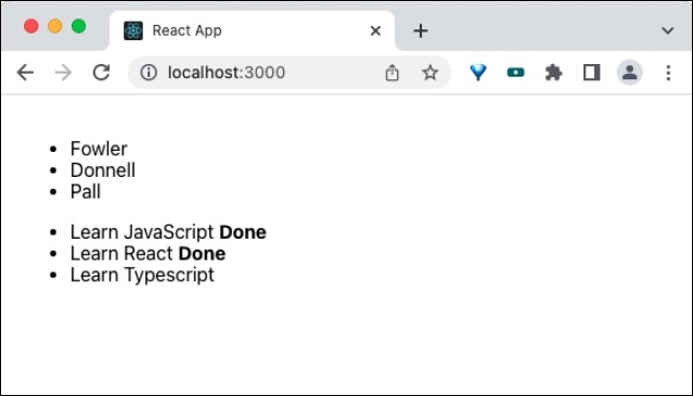
Summary
Higher Order Component is an efficient method to share logic between components. It is extensively used in many third party component with good success rate and it is time-tested method to share logic in the react domain.
React - Integrating with Other Libraries
Even though react provides all necessary feature to create a complete web application, integration with other libraries are a must due to legacy system coded in another library, migration from another framework, etc., React can co-exists with other libraries and provides necessary infrastructure to use along with other systems.
Let us see how to use react component with other libraries like jQuery, backbone, etc., in this chapter.
CreateRoot based integration
React use createRoot() method from ReactDOMClient module to attach itself to the main HTML document. createRoot() does not disturbs the HTML document except attached element. This behaviour can be exploited by the developer to intermix multiple libraries in the same document.
Let us see how to integrate jQuery and React component in a single document by attaching the react application in a separate element.
First of all, create a new react application and start it using below command.
create-react-app myapp cd myapp npm start
Next, create a react component, Hello under component folder (src/components/Hello.js)
import React from "react";
class Hello extends React.Component {
constructor(props) {
super(props)
}
render() {
return (
<div>Hello, {this.props.name}</div>
);
}
}
export default Hello;
Next, open index.html (public/index.html) and add a new container (jquery-root) as shown below −
<!DOCTYPE html>
<html lang="en">
<head>
<meta charset="utf-8" />
<link rel="icon" href="%PUBLIC_URL%/favicon.ico" />
<meta name="viewport" content="width=device-width, initial-scale=1" />
<meta name="theme-color" content="#000000" />
<meta name="description" content="Web site created using create-react-app" />
<link rel="apple-touch-icon" href="%PUBLIC_URL%/logo192.png" />
<link rel="manifest" href="%PUBLIC_URL%/manifest.json" />
<script src="https://code.jquery.com/jquery-3.6.1.slim.min.js"></script>
<title>React App</title>
</head>
<body>
<noscript>You need to enable JavaScript to run this app.</noscript>
<div style="padding: 10px;">
<div id="root"></div>
<div id="jquery-root"></div>
</div>
<script>
$(document).ready(function() {
$("#jquery-root").text("Hello, from jQuery")
})
</script>
</body>
</html>
Here,
jQuery library in linked through CDN
It is initialized as done traditionally through $(document).ready method
And is used to append the message using jQuery selector (#jquery-root) and text method
Next, open index.js (src/index.js) and attach our hello component into the root container as shown below −
import React from 'react';
import ReactDOM from 'react-dom/client';
import './index.css';
import Hello from './Components/Hello';
import reportWebVitals from './reportWebVitals';
const root = ReactDOM.createRoot(document.getElementById('root'));
root.render(
<React.StrictMode>
<Hello name="from React" />
</React.StrictMode>
);
reportWebVitals();
Here,
React application is attached using createRoot() method.
Rendered a Hello component into the root element in the HTML document.
Finally, open the application in the browser and check the result. Both react and jQuery libraries emit the hello messages as shown below −
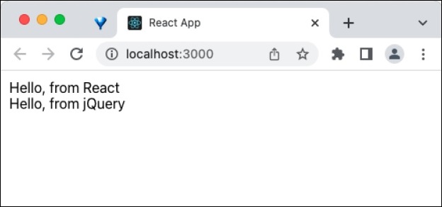
Ref based integration
In general, React does not know any DOM manipulation done by other libraries. So, to use React with other libraries, React should not do any DOM manipulation and should forward all changes to other libraries.
As we know, React provides an escape hatch called Ref to manipulate DOM elements without affecting / affected by the state changes. Developer can exploit these feature to create a wrapper react component of some other library and use it in a react application. The standard steps to use other libraries in React component is as follow,
Create a react component and renders an empty div
render() {
return <div />
}
Attach a ref to the rendered div as shown below −
render() {
return <div ref={el => this.el = el} />
}
Manipulate the dom element using attached ref in componentDidMount() life cycle event as shown below −
componentDidMount() {
this.$el = $(this.el);
this.$el.somePlugin(); // create dom
// call this.$el.pluginAPI() as necessary
}
Destroy the dom element using attached ref in componentWillUnmount() life cycle event as shown below −
componentWillUnmount() {
this.$el.somePlugin('destroy'); // destroy dom
// this.$el.destroyAPI() to remove the element from the dom
}
Let us apply these technics to integrate a jQuery plugin into the application in the next section.
JQuery slick plugin integration
Let us try to integrate slick jquery plugin (https://github.com/kenwheeler/slick) into a react component
First of all, create a new react application and start it using below command.
create-react-app myapp cd myapp npm start
Next, install the slick jQuery plugin
npm install jquery slick-carousel --save
Next, copy the slick folder from slick plugin package (css and assets) into the app's public folder. The content of the slider folder is as shown below −
.
ajax-loader.gif
config.rb
fonts
slick.eot
slick.svg
slick.ttf
slick.woff
slick-theme.css
slick-theme.less
slick-theme.scss
slick.css
slick.js
slick.less
slick.min.js
slick.scss
Next, create a simple component, ReactSlick (src/Components/ReactSlick.js) as shown below −
import React from "react";
import $ from 'jquery';
import slick from 'slick-carousel';
class ReactSlick extends React.Component {
componentDidMount() {
this.$el = $(this.el);
this.$el.slick();
}
componentWillUnmount() {
this.$el.slick('destroy');
}
render() {
return (
<div>
<div ref={el => this.el = el}>
{this.props.children}
</div>
</div>
);
}
}
export default ReactSlick;
Here,
Rendered a div with children from props
Attached a ref to the div element
Attached the plugin to the element using ref in componentDidMount() life cycle event
Destroyed the plugin to the element using ref in componentWillUnmount life cycle event
Next, open App component (src/App.js) and update the content with ReactSlick component as shown below −
import ReactSlick from './Components/ReactSlick';
function App() {
return (
<ReactSlick>
<div className="box"><h1>1</h1></div>
<div className="box"><h1>2</h1></div>
<div className="box"><h1>3</h1></div>
<div className="box"><h1>4</h1></div>
</ReactSlick>
);
}
export default App;
Here,
Rendered the ReactSlick component
Used four div with numbers (1,2,3 and 4) as sliders
Next, open App.css (src/App.css) and remove all the CSS classes. Then, open index.html (public/index.html) and add a necessary styles as shown below −
<!DOCTYPE html>
<html lang="en">
<head>
<meta charset="utf-8" />
<link rel="icon" href="%PUBLIC_URL%/favicon.ico" />
<meta name="viewport" content="width=device-width, initial-scale=1" />
<meta name="theme-color" content="#000000" />
<meta
name="description"
content="Web site created using create-react-app"
/>
<link rel="apple-touch-icon" href="%PUBLIC_URL%/logo192.png" />
<link rel="manifest" href="%PUBLIC_URL%/manifest.json" />
<link rel="stylesheet" type="text/css" href="slick/slick.css"/>
<link rel="stylesheet" type="text/css" href="slick/slick-theme.css"/>
<style>
#root {
margin: auto;
padding-left: 25px;
padding-top: 25px;
width: 300px;
color: gray;
font-family:Cambria, Cochin, Georgia, Times, 'Times New Roman', serif;
padding-left : 25px;
text-align: center;
}
.box {
background-color: skyblue;
text-align: center;
color: white
}
</style>
<title>React App</title>
</head>
<body>
<noscript>You need to enable JavaScript to run this app.</noscript>
<div style="background-color: white; margin: 2px;">
<div id="root"></div>
</div>
</body>
</html>
Here we have,
Updated the style for root component
Updated the style for sliders (.box)
Included the slick plugin specific styles (slick/slick.css and slick/slick-theme.css)
Finally, open the application in the browser. jQuery slick slider will be rendered through React component as shown below −
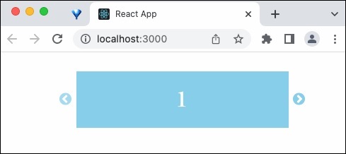
Summary
React provides multiple ways to use react and other libraries in the same project. Every integration method is simple and effective. Developer should use refrain from using other libraries except in unavoidable situation such as legacy application, migration application, etc.,
React - Optimizing Performance
React internally handles the performance of the application and optimize it on every opportunities. As a developer, we can do certain things to get maximum performance of our application. Let us see some of the techniques to get maximum performance out of react library in this chapter.
Techniques of Performance Optimization
Some of the techniques of performance optimization are as follows −
Use production build − React has two mode, development and production. Development mode is for the developers, Development mode enables lot of useful stuff for developer to get better inside of the application and to debug the application. This will slow down the application. To get maximum performance, enable the production mode and deploy the application.
CDN Application using cdn to link the react library should use production build of the react library as shown below −
<script src="https://unpkg.com/react@18/umd/react.production.min.js"></script> <script src="https://unpkg.com/react-dom@18/umd/react-dom.production.min.js"></script>
Create react app − Application created using create-react-app CLI can use below command to create production version of the application.
npm run build
Brunch − Application using brunch should install terser-brunch plugin and then invoke production build to get efficient and performance code.
npm install --save-dev terser-brunch brunch build -p
Rollup − Application using rollup should install commonjs, replace and terser plugins and configure it to get best production version.
npm install --save-dev rollup-plugin-commonjs rollup-plugin-replace rollup-plugin-terser
Use React devtools − React provides development tools for all browsers as extension. Once the extension is installed, the developer tools section of the browser will show a dedicated section for react. One of the tool provided by react extension is Profiler (React DevTool Profiler). The application can be profiled and optimized before deploying the application to the production.
Windowing technique − If the data to be shown in the front end is huge, then the performance of the application will get affected instantly. One way is to show only a small subset of the data through pagination and other similar technique. If those techniques are not feasible, React recommends windowing technique, which will render only a small subset of data at a time automatically. We will learn by applying window technique later in this chapter.
Avoid Reconciliation (shouldComponentUpdate) − Reconciliation is a a powerful technique to increase the performance of the react application. Still, reconciliation takes some time to run and apply it in our application. Skipping rendering (and subsequently reconciliation) will improve the performance. React provides an API, shouldComponentUpdate to give hint to the react core whether to skip or continue the rendering. Below code will skip the rendering of the application
shouldComponentUpdate(nextProps, nextState) {
return false;
}
Components can analyze its current state and props with its updated one and decide whether the rendering part can be skipped.
Pure component − Instead of writing shouldComponentUpdate, write a pure version of component by extending React.PureComponent. Pure component will usually emit same output if the given input is same. Pure component will do the shallow comparison and skip the reconciliation. But, there is one issue. If the changes are no shallow, then react skip the updates and rendering. To fix it, it is enough that the changes are done through visible mutation as shown below −
// non-mutation (wrong way to code)
const words = this.state.words;
words.push('john');
this.setState({words: words});
// mutated version (right way to code)
this.setState(state => ({
words: state.words.concat(['marklar'])
}));
Here,
In the first version of the code, the object is not mutated. So the comparison with old object succeeds and skip the reconciliation.
In the second version of the code, the object is mutated and will get caught during comparison.
Applying windowing technique
Let us create a new react application to render a large user list by applying windowing technique in this section.
First of all, create a new react application and start it using below command.
create-react-app myapp cd myapp npm start
Next, install the bootstrap and react-bootstrap library using below command,
npm install --save react-window
Next, open App.css (src/App.css) and remove all CSS classes.
// remove all css classes
Next, create a file, users.json under public folder and populate with below user information,
[
{
"id":1,
"name":"Fowler",
"age":18
},
{
"id":2,
"name":"Donnell",
"age":24
},
{
"id":3,
"name":"Pall",
"age":26
},
{
"id":4,
"name":"Christos",
"age":19
},
{
"id":5,
"name":"Dud",
"age":29
},
{
"id":6,
"name":"Rayner",
"age":22
},
{
"id":7,
"name":"Somerset",
"age":31
},
{
"id":8,
"name":"Stavros",
"age":32
},
{
"id":9,
"name":"Cody",
"age":19
},
{
"id":10,
"name":"Sharai",
"age":19
},
{
"id":11,
"name":"Kristo",
"age":28
},
{
"id":12,
"name":"Harvey",
"age":27
},
{
"id":13,
"name":"Christen",
"age":27
},
{
"id":14,
"name":"Hillard",
"age":19
},
{
"id":15,
"name":"Jaine",
"age":32
},
{
"id":16,
"name":"Annabel",
"age":29
},
{
"id":17,
"name":"Hildagarde",
"age":29
},
{
"id":18,
"name":"Cherlyn",
"age":18
},
{
"id":19,
"name":"Herold",
"age":32
},
{
"id":20,
"name":"Gabriella",
"age":32
},
{
"id":21,
"name":"Jessalyn",
"age":32
},
{
"id":22,
"name":"Opal",
"age":31
},
{
"id":23,
"name":"Westbrooke",
"age":27
},
{
"id":24,
"name":"Morey",
"age":22
},
{
"id":25,
"name":"Carleton",
"age":26
},
{
"id":26,
"name":"Cosimo",
"age":22
},
{
"id":27,
"name":"Petronia",
"age":23
},
{
"id":28,
"name":"Justino",
"age":32
},
{
"id":29,
"name":"Verla",
"age":20
},
{
"id":30,
"name":"Lanita",
"age":18
},
{
"id":31,
"name":"Karlik",
"age":23
},
{
"id":32,
"name":"Emmett",
"age":22
},
{
"id":33,
"name":"Abran",
"age":26
},
{
"id":34,
"name":"Holly",
"age":23
},
{
"id":35,
"name":"Beverie",
"age":23
},
{
"id":36,
"name":"Ingelbert",
"age":27
},
{
"id":37,
"name":"Kailey",
"age":30
},
{
"id":38,
"name":"Ralina",
"age":26
},
{
"id":39,
"name":"Stella",
"age":29
},
{
"id":40,
"name":"Ronnica",
"age":20
},
{
"id":41,
"name":"Brucie",
"age":20
},
{
"id":42,
"name":"Ryan",
"age":22
},
{
"id":43,
"name":"Fredek",
"age":20
},
{
"id":44,
"name":"Corliss",
"age":28
},
{
"id":45,
"name":"Kary",
"age":32
},
{
"id":46,
"name":"Kaylee",
"age":21
},
{
"id":47,
"name":"Haskell",
"age":25
},
{
"id":48,
"name":"Jere",
"age":29
},
{
"id":49,
"name":"Kathryne",
"age":31
},
{
"id":50,
"name":"Linnea",
"age":21
},
{
"id":51,
"name":"Theresina",
"age":24
},
{
"id":52,
"name":"Arabela",
"age":32
},
{
"id":53,
"name":"Howie",
"age":22
},
{
"id":54,
"name":"Merci",
"age":21
},
{
"id":55,
"name":"Mitchel",
"age":30
},
{
"id":56,
"name":"Clari",
"age":18
},
{
"id":57,
"name":"Laurena",
"age":19
},
{
"id":58,
"name":"Odessa",
"age":30
},
{
"id":59,
"name":"Pippy",
"age":25
},
{
"id":60,
"name":"Wilmar",
"age":23
},
{
"id":61,
"name":"Cherianne",
"age":24
},
{
"id":62,
"name":"Huberto",
"age":25
},
{
"id":63,
"name":"Ariella",
"age":26
},
{
"id":64,
"name":"Lorant",
"age":30
},
{
"id":65,
"name":"Francesca",
"age":25
},
{
"id":66,
"name":"Ingamar",
"age":28
},
{
"id":67,
"name":"Myrta",
"age":27
},
{
"id":68,
"name":"Nicolette",
"age":26
},
{
"id":69,
"name":"Petra",
"age":22
},
{
"id":70,
"name":"Cyrill",
"age":27
},
{
"id":71,
"name":"Ad",
"age":23
},
{
"id":72,
"name":"Denys",
"age":22
},
{
"id":73,
"name":"Karilynn",
"age":23
},
{
"id":74,
"name":"Gunner",
"age":30
},
{
"id":75,
"name":"Falkner",
"age":20
},
{
"id":76,
"name":"Thurston",
"age":19
},
{
"id":77,
"name":"Codi",
"age":30
},
{
"id":78,
"name":"Jacob",
"age":31
},
{
"id":79,
"name":"Gasparo",
"age":26
},
{
"id":80,
"name":"Mitzi",
"age":29
},
{
"id":81,
"name":"Rubetta",
"age":21
},
{
"id":82,
"name":"Clary",
"age":20
},
{
"id":83,
"name":"Oliviero",
"age":24
},
{
"id":84,
"name":"Ranique",
"age":21
},
{
"id":85,
"name":"Shae",
"age":24
},
{
"id":86,
"name":"Woodrow",
"age":20
},
{
"id":87,
"name":"Junia",
"age":31
},
{
"id":88,
"name":"Athene",
"age":26
},
{
"id":89,
"name":"Veriee",
"age":18
},
{
"id":90,
"name":"Rickie",
"age":30
},
{
"id":91,
"name":"Carly",
"age":23
},
{
"id":92,
"name":"Vern",
"age":19
},
{
"id":93,
"name":"Trix",
"age":26
},
{
"id":94,
"name":"Lenore",
"age":20
},
{
"id":95,
"name":"Hanna",
"age":30
},
{
"id":96,
"name":"Dominique",
"age":21
},
{
"id":97,
"name":"Karlotta",
"age":22
},
{
"id":98,
"name":"Levey",
"age":20
},
{
"id":99,
"name":"Dalila",
"age":18
},
{
"id":100,
"name":"Launce",
"age":21
}
]
Next, create a simple user list component, SimpleWindow (src/Components/SimpleWindow.js) and render a user list by applying windows feature as shown below −
import React from "react";
import { FixedSizeList as List } from 'react-window';
class SimpleWindow extends React.Component {
constructor(props) {
super(props);
this.state = {
data: []
};
}
componentDidMount() {
fetch("users.json")
.then((response) => response.json())
.then((data) => {
this.setState({
data: data
});
});
}
render() {
return (
<List
innerElementType="ul"
itemData={this.state.data}
itemCount={this.state.data.length}
itemSize={35}
width={500}
height={300}
>
{
({data, index, style}) => {
return (
<li style={style}>
{data[index].name}
</li>
)
}
}
</List>
)
}
}
export default SimpleWindow
Here we have,
Imported FixedSizeList component as List.
Fetched user list from users.json url using fetch method in componentDidMount() lifecycle event.
Rendered the use list using FixedSizeList component.
innerElementType props of FixedSizeList component refers the element to be generated inside the component.
itemData, itemCount and itemSize refers the item list, total number of available items and size of the each item.
Next, open App component (src/App.js), and include SimpleWindow component as shown below −
import './App.css'
import React from 'react';
import SimpleWindow from './Components/SimpleWindow'
function App() {
return (
<div className="container">
<div style={{ padding: "10px" }}>
<div>
<SimpleWindow />
</div>
</div>
</div>
);
}
export default App;
Here,
Imported our new component SimpleWindow using import statement
Rendered our new SimpleWindow component.
Finally, open the application in the browser and check the final result. Table component will be rendered as shown below −
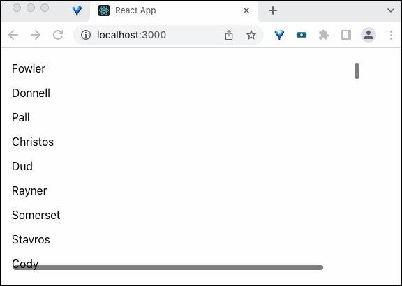
Summary
React optimizes the application out of the bax. Also, React library improves optimization in each and every release. In addition to those optimization, We can follow the above discussed technique to improve performance from our end.
React - Profiler API
Profiling is an important technique to collect and show the time taken for a specific function to execute in the live environment. Profiling is normally use to find the performance bottleneck in a application. React provides two option to profile a react application
Profiler Component
Profiler DevTools
Profiler Component
React profiler component is just another react component used to record the profile information of a react component. Profiler component can be used anywhere in the react element tree. React accepts multiple profiler and multi-level nesting of the profiler. Let us check the signature and how to apply profiler in a react application in this chapter.
Signature of the Profiler component
Profiler component can nest any react component and requires two props,
id
Identifier for the profiler component
onRender callback function
Callback function called during each phase of the component rendering
The signature of the callback function is as follows −
function onRenderCallback(
id,
phase,
actualDuration,
baseDuration,
startTime,
commitTime,
interactions
){
// Do anything with the profiler information
}
An example callback function implementation to log the profiling data in the console is as follows −
const logProfilerData = (id, phase, actualTime, baseTime, startTime, commitTime) => {
console.log(`${id}'s ${phase} phase:`);
console.log(`Actual time: ${actualTime}`);
console.log(`Base time: ${baseTime}`);
console.log(`Start time: ${startTime}`);
console.log(`Commit time: ${commitTime}`);
};
Applying Profiler
Let us create a new react application to learn how to apply Profiler component in this section.
First of all, create a new react application and start it using below command.
create-react-app myapp cd myapp npm start
Next, open App.css (src/App.css) and remove all CSS classes.
// remove all css classes
Hello.js
Next, create a simple hello component, Hello (src/components/Hello.js) and render a simple message as shown below −
import React from "react";
class Hello extends React.Component {
constructor(props) {
super(props)
}
render() {
return (
<div>Hello, {this.props.name}</div>
);
}
}
export default Hello;
Here,
Used name props to render the hello message with the given name
App.js
Next, open App component (src/App.js), and use profiler component as shown below −
import './App.css'
import React, { Profiler } from 'react';
import Hello from './components/Hello'
const logProfilerData = (id, phase, actualTime, baseTime, startTime, commitTime) => {
console.log(`${id}'s ${phase} phase:`);
console.log(`Actual time: ${actualTime}`);
console.log(`Base time: ${baseTime}`);
console.log(`Start time: ${startTime}`);
console.log(`Commit time: ${commitTime}`);
};
function App() {
return (
<div className="container">
<div style={{ padding: "10px" }}>
<div>
<Profiler id="helloWorld" onRender={logProfilerData}>
<Hello name="World" />
</Profiler>
</div>
</div>
</div>
);
}
export default App;
Here,
Imported Profiler component from the react package
Used Hello component by wrapping it with Profiler component
Created a callback function, logProfilerData and emitted all profiler data into the console
Set the logProfilerData callback function in onRender props of Profiler component
Finally, open the application in the browser and check the final result. It will render the hello component as shown below −
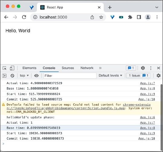
Open the console and you can see the profiler information as shown below −
helloWorld's mount phase: App.js:7 Actual time: 4.900000000372529 App.js:8 Base time: 1.800000000745058 App.js:9 Start time: 515.7999999988824 App.js:10 Commit time: 525.9000000003725 ... App.js:6 helloWorld's update phase: App.js:7 Actual time: 1 App.js:8 Base time: 0.6999999992549419 App.js:9 Start time: 19836.900000000373 App.js:10 Commit time: 19838.400000000373
Profiler React DevTools
React DevTools plugin introduced a separate section for profiler. Developer can open the Profiler tab and get lot of useful insight about the application. Some of the feature available in profiler DevTools are as follows −
Browsing commits
Filtering commits
Flame chart
Ranked chart
Component chart
Conclusion
React profiler component and profiler devtools are indispensible and powerful tools to profile and optimize a react application.
React - Portals
Portals provides a way for a component to render its children into a DOM node outside its own DOM hierarchy. Portal can be used in model dialog, popups, tooltip, etc., where the parent (the rendering component) and child DOM node (model dialogs) are preferred to be rendered in different DOM node.
Let us learn how portal works and how to apply it in our application in this chapter.
Concept and usage of portals
Let us consider that we have two DOM node in the main document as shown below −
<div id='root'></div> <div id='modalRoot'></div>
Here, root DOM node will be attached with main react component. modalRoot will be used by the react application whenever it needs to show a modal dialog by attaching the modal dialog into the modelRoot DOM node instead of rendering the model dialog inside its own DOM element.
This will help to separate the modal dialog from the actual application. The separation of modal dialog from its parent DOM element will preserve it from the styling of its parent DOM element. The styling can be applied separately as modal dialogs, tooltips, etc., differs from its parent with regard to styling.
React provides a special method createPortal in ReactDOM package to create a portal. The signature of the method is as follows −
ReactDOM.createPortal(child, container)
Here,
child is the model dialogs, tooltips, etc., rendered by the parent component.
render() {
return ReactDOM.createPortal(
this.props.children, // modal dialog / tooltips
domNode // dom outside the component
);
}
container is the DOM element outside the parent DOM node (domNode in above example)
Applying portals
Let us create a new react application to learn how to apply portals in this section.
First of all, create a new react application and start it using below command.
create-react-app myapp cd myapp npm start
App.css
Next, open App.css (src/App.css) and remove all CSS classes and include CSS for modal dialogs.
.modal {
position: absolute;
top: 0;
bottom: 0;
left: 0;
right: 0;
display: grid;
justify-content: center;
align-items: center;
background-color: rgba(0,0,0,0.2);
}
.modalContent {
padding: 20px;
background-color: #fff;
border-radius: 2px;
display: inline-block;
min-height: 300px;
margin: 1rem;
position: relative;
min-width: 300px;
box-shadow: 0 3px 6px rgba(0,0,0,0.16), 0 3px 6px rgba(0,0,0,0.23);
justify-self: center;
}
index.html
Next, open index.html (public/index.html) and add a DOM node to support portals
<!DOCTYPE html>
<html lang="en">
<head>
<link rel="icon" href="%PUBLIC_URL%/favicon.ico" />
<link rel="apple-touch-icon" href="%PUBLIC_URL%/logo192.png" />
<link rel="manifest" href="%PUBLIC_URL%/manifest.json" />
</head>
<body>
<noscript>You need to enable JavaScript to run this app.</noscript>
<div style="padding: 10px;">
<div id="root"></div>
</div>
<div id="modalRoot"></div>
</body>
</html>
SimplePortal.js
Next, create a simple component, SimplePortal (src/components/SimplePortal.js) and render a modal dialog as shown below −
import React from "react";
import PortalReactDOM from 'react-dom'
const modalRoot = document.getElementById('modalRoot')
class SimplePortal extends React.Component {
constructor(props) {
super(props);
}
render() {
return PortalReactDOM.createPortal(
<div
className="modal"
onClick={this.props.onClose}
>
<div className="modalContent">
{this.props.children}
<hr />
<button onClick={this.props.onClose}>Close</button>
</div>
</div>,
modalRoot,
)
}
}
export default SimplePortal;
Here,
createPortal to create a new portal and renders a modal dialog.
Content of the modal dialog are retrieved from children of the component through this.props.children
close button actions are handled through props and will be handled by the parent component.
App.js
Next, open App component (src/App.js), and use SimplePortal component as shown below −
import './App.css'
import React from 'react';
import SimplePortal from './components/SimplePortal'
class App extends React.Component {
constructor(props) {
super(props);
this.state = { modal: false }
}
handleOpenModal = () => this.setState({ modal: true })
handleCloseModal = () => this.setState({ modal: false })
render() {
return (
<div className="container">
<div style={{ padding: "10px" }}>
<div>
<div><p>Main App</p></div>
<div>
<button onClick={this.handleOpenModal}>
Show Modal
</button>
{ this.state.modal ? (
<SimplePortal onClose={this.handleCloseModal}>
Hi, I am the modal dialog created using portal.
</SimplePortal>
) : null}
</div>
</div>
</div>
</div>
);
}
}
export default App;
Here,
Imported SimplePortal component
Added a button to open the modal dialog
Created a handler to open the modal dialog
Created a handler to close the modal dialog and passed it to SimplePortal component through onClose props.
Finally, open the application in the browser and check the final result.
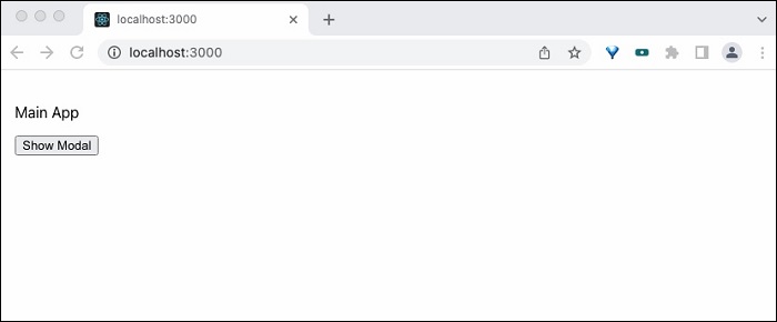
Summary
React portal provides an easy way to access and handle DOM outside the component. It enables the event bubbling across the different DOM nodes without any extra effort.
React - Without ES6 ECMAScript
As per Ecma International, ECMAScript is a general purpose, vendor-neutral and cross platform programming language. Ecma International defines the ECMAScript language syntax, its features and various aspect of the language and release it as ECMAScript specification. JavaScript is one of the popular implementation of the ECMAScript used for client side programming in the browser.
The latest specification of ECMAScript is ECMAScript 2022 and the most popular specification is ECMAScript 2015 language specification, which is also referred as ES6. Browser supports for ES6 is still lacking in older browser even through nearly all modern browser supports ES6. Now, it is considered safe to use ES6 features in client side scripting.
React application can be developed using ES6 language specification. Some of the core ES6 features used by React library are ES6 class and ES6 modules. To support older browser, which does not allows ES5 syntax, React provides alternative syntax to create components using ES5.
Create React class (create-react-class)
create-react-class is a module provided by React community to create new component without using ES6 syntax. Also, we should install create-react-class package in the current application to use ES5 syntax.
Let us create a React app using create-react-app
create-react-app myapp
Now, install create-react-class package into our newly created application as shown below −
npm i create-react-class --save
Now, run the application by running the below command,
cd myapp npm start
Let us see how to create a simple hello world component using both ES5 (myapp/src/components/ES5/HelloWorldES6.js) and ES6 syntax (myapp/src/components/ES5/HelloWorldES6.js) and learn what needs to be done to work with ES5 syntax.
The HelloWorldES6 component in ES6 Syntax is as follows −
import React from 'react'
class HelloWorldES6 extends React.Component {
render() {
return <h1>Hello, {this.props.name}</h1>
}
}
export default HelloWorldES6
The same component (myapp/src/components/ES5/HelloWorldES5.js) can be created using below code in ES5 syntax as shown below −
var createReactClass = require('create-react-class');
var HelloWorldES5 = createReactClass({
render: function() {
return <h1>Hello, {this.props.name}</h1>;
}
});
export default HelloWorldES5;
Now, let us use the component in the our application (App.js) as shown below −
import HelloWorldES5 from "./components/ES5/HelloWorldES5";
import HelloWorldES6 from "./components/ES5/HelloWorldES6";
function App() {
return (
<div>
<HelloWorldES5 name="Peter" />
<HelloWorldES6 name="John" />
</div>
);
}
export default App;
The output of the application is as follows
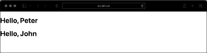
Set default value for props (getDefaultProps)
Let us set a default value for name props in ES6.
class HelloWorld extends React.Component {
render() {
return <h1>Hello, {this.props.name}</h1>;
}
}
HelloWorld.defaultProps = {
name: 'John'
}
The same can be accomplished in ES5 using below syntax
var createReactClass = require('create-react-class');
var HelloWorld = createReactClass({
render: function() {
return <h1>Hello, {this.props.name}</h1>;
},
getDefaultProps: function() {
return {
name: 'John'
};
}
});
Here, getDefaultProps is a special function used to set default values for the props of the components.
Set initial state (getInitialState)
As we know, this.state can be used in the component class constructor to set the initial value of the state.This is one of the ES6 class feature.
import React from 'react'
class BookListES6 extends React.Component {
constructor(props) {
super(props);
this.state = {
list: ['C++ Programming', 'Java Programming']
};
}
render() {
return <ol>
{this.state.list && this.state.list.map((item) =>
<li>{item}</li>
)}
</ol>
}
}
export default BookListES6
The same can be accomplished using getInitialState in ES5 syntax as shown below −
var createReactClass = require('create-react-class');
var BookListES5 = createReactClass({
getInitialState: function() {
return {
list: ['React Programming', 'Javascript Programming']
};
},
render: function() {
return <ol>
{this.state.list && this.state.list.map((item) =>
<li>{item}</li>
)}
</ol>
}
});
export default BookListES5;
Now, let us use the component in the our application (App.js) as shown below −
import BookListES6 from "./components/ES5/BookListES6";
import BookListES5 from "./components/ES5/BookListES5";
function App() {
return (
<div>
<BookListES6 />
<BookListES5 />
</div>
);
}
export default App;
The output of the application is as follows
Auto binding of event handler
As we know, the event handler method defined in the React component class needs to be bind to this object in the class constructor. The pseudo code is as follows
constructor(props) {
super(props);
this.state = {message: 'Hello!'};
// binding of `this` object
this.handleClick = this.handleClick.bind(this);
}
In ES5, the binding is not necessary as the function is by default bound to the this object.
React - React Without JSX
Let us learn how to use createElement to create react component instead of default JSX in this chapter.
What is JSX?
JSX is a JavaScript extension to create arbitrary HTML element using syntax similar to HTML. This will simplify the HTML document creation as well as easy to understand the document. React will convert the JSX into JavaScript object consisting of React's createElement function call before executing it.
It improves the performance of the application. Also, React allows the HTML document creation using pure createElement function without JSX as well. This enables the developer to directly create HTML document in a situation where JSX does not fit well.
What is createElement?
React.createElement is the core React API which is used to generate and render the HTML document. createElement method has three arguments,
component name
props as objects
inner content / children of the component
Here, children may refer an another component, again created using createElement. createElement can be nested to any level. The sample code to create a component using React.createElement is as follows −
React.createElement('h1', null, 'Hello World')
This will render the below mentioned HTML document
<h1>Hello World</h1>
Working example
Let us create a component BookListUsingCreateElement to learn and understand the createElement method.
First of all, create a new application using create-react-app
create-react-app myapp
Then, add a new component, BookListUsingCreateElement under components folder. The initial code is as follows −
import React from 'react'
class BookListUsingCreateElement extends React.Component {
constructor(props) {
super(props);
this.state = {
list: ['C++ Programming', 'Java Programming', "JavaScript Programming"]
};
}
}
export default BookListUsingCreateElement
Here, list is the initial collection of books available in the component.
Now, Let us render books using createElement in the render function as shown below.
render() {
let content = React.createElement(
'ol',
null,
this.state.list.map(
(item) =>
React.createElement('li', null, item)
)
)
return content;
}
Here, we have used createElement in two places. First of all, we used it to create the top-most layer of the component, which is ul HTML element. Second, we have used createElement multiple times to create the li element based on the books available in the list. We have used map function to loop over all books in the list and create a li element for each book using React.createElement('li', null, item) code.
Finally, the complete code of the component is as follows
import React from 'react'
class BookListUsingCreateElement extends React.Component {
constructor(props) {
super(props);
this.state = {
list: ['C++ Programming', 'Java Programming', "JavaScript Programming"]
};
}
render() {
let content = React.createElement(
'ol',
null,
this.state.list.map(
(item) =>
React.createElement('li', null, item)
)
)
return content;
}
}
export default BookListUsingCreateElement
Let us use our newly create component through App.js as shown below −
import BookListUsingCreateElement from "./components/CreateElement/BookListUsingCreateElement";
function App() {
return (
<div>
<BookListUsingCreateElement />
</div>
);
}
export default App;
Now, run the app using below command
npm start
The application will start in the default browser and show below result
React - Reconciliation
Reconciliation is an internal process of React library. As we know, react application will create a virtual DOM and then updates the actual DOM of the application based on the virtual DOM. Whenever react receives an update request, it will first create a virtual DOM and then compare the virtual DOM with previous state using different diffing algorithm and then only if it is absolutely necessary, it will update the DOM.
Even though the diff algorithm and updating the DOM is internal to React core, understanding the some of the internal will help us to tweak our application to take maximum leverage of the React library.
Diffing Algorithm
Let us see some of the diffing algorithm applied by react core in this chapter.
Element of same type
Whenever a react component changes an element from one type to another type (say from div to more specific p), the whole of the react virtual dom tree will get changed and it triggers the DOM updates.
<!-- Before --> <div> <Content /> </div> <!-- After --> <p> <Content /> </p>
Here, the entire element will get updated.
DOM Attributes of the same type.
When the element are of same type, react will check for attributes for differences. If react finds any new changes in attribute and its values, then it will only update the changed attributes.
<!-- Before --> <div className="someClass"> <Content /> </div> <!-- After --> <div className="someOtherClass"> <Content /> </div>
Here, only the class attribute of the DOM instance will get updated.
DOM Attributes (style) of the same type.
When the elements are of same type and react find differences in style properties, then it will update only the properties of the style.
<!-- Before -->
<div style={{fontFamily: 'Arial'}} />
<p> ... </p>
</div>
<!-- After -->
<div style={{color: 'red', fontFamily: 'Arial'}} />
<p> ... </p>
</div>
Here, only the color properties of the div element's style will be updated
Components elements of same type − Whenever react sees same react component type, then it will call componentWillUpdate event and other update events of the react component for the component to update its state. Then, it will call the render method of the component and the algorithm recurses
Collection of child elements of same type − Whenever react sees a collections of children of same type, it will check the element in order for differences. So, if we have a new first child, then the whole collection will get updated.
<!-- Before --> <ul> <li>Peter</li> <li>Olivia</li> </ul> <!-- After --> <ul> <li>John</li> <li>Peter</li> <li>Olivia</li> </ul>
Here, whole elements (children of ul element) will get updated as the first element (li) is an updated one.
To solve the issue, we can introduce a key attribute as shown in the below code snippet. React has a special key attribute for this purpose.
<!-- Before --> <ul> <li key="1">Peter</li> <li key="2">Olivia</li> </ul> <!-- After --> <ul> <li key="3">John</li> <li key="1">Peter</li> <li key="2">Olivia</li> </ul>
Summary
React tries to optimize the diffing algorithm in every release to make sure that the updates are minimum. Minimum updates means better performance of the application. Knowing the internal and coding accordingly by following best practices, we can improve our application performance exponentially.
React - Refs and the DOM
React automatically emits the HTML elements as the state of the component changes. This greatly simplifies the UI development as it is enough to update the state of the component. But, traditionally, accessing the DOM element directly is the norms to update the UI of the component.
Sometimes we may need to fallback to accessing the DOM elements directly and update the UI in the react application as well. React ref lends help in this scenario. It provides direct access to DOM elements. Also, it make sure that the component work smoothly with react Virtual DOM and HTML DOM.
React provides a function, createRef to create ref in class based component. Let us learn how to use createRef in this chapter.
Signature of the createRef method
The purpose of the createRef is to return a mutable object, which will persist between rerenders. The signature of createRef is as follows −
<refObj> = React.createRef()
Here, refObj is the object returned by the hook
To automatically attach a DOM object to the refObj, it should be set in ref props of the element as shown below −
<input ref={refObj} />
To access the attached DOM element, use current property of the refObj as shown below −
const refElement = refObj.current
Applying ref
Let us learn how to apply createRef by creating a react application in this chapter.
First of all, create a new react application and start it using below command.
create-react-app myapp cd myapp npm start
Next, create a react component, SimpleRef under component folder (src/components/SimpleRef.js)
import React from "react";
class SimpleRef extends React.Component {
render() {
return (
<div>Hello World</div>
);
}
}
export default SimpleRef;
Next, open App.css (src/App.css) and remove all the styles. Then, open App component (src/App.js) and update the content with our new SimpleRef component as shown below −
import './App.css'
import SimpleRef from './Components/SimpleRef'
function App() {
return (
<div className="container">
<div style={{ padding: "10px" }}>
<div>
<SimpleRef />
</div>
</div>
</div>
);
}
export default App;
Next, add a counter functionality to SimpleRef component as shown below −
import React from "react";
class SimpleRef extends React.Component {
constructor(props) {
super(props)
this.state = {
count: 0
}
this.handleClick = this.handleClick.bind(this);
}
handleClick() {
this.setState(
prevState => ({
count: prevState.count + 1
})
)
}
render() {
return (
<div>
<div>Counter: {this.state.count} <button onClick={this.handleClick}>+</button></div>
</div>
)
}
}
export default SimpleRef;
Here we have,
Used this.setState to handle counter state variable (count).
Rendered the counter state variable in the JSX
Added a button and attached a click handler event (this.handleClick), which will increment the counter using this.setState method
Next, add an input field and show a greeting message based on the value entered by user in the input field as shown below −
import React from "react";
import { createRef } from "react";
class SimpleRef extends React.Component {
constructor(props) {
super(props)
this.state = {
count: 0
}
this.handleClick = this.handleClick.bind(this);
this.handleChange = this.handleChange.bind(this);
this.inputRef = createRef()
this.labelRef = createRef()
}
handleClick() {
this.setState(prevState => ({
count: prevState.count + 1
}))
}
handleChange() {
this.labelRef.current.innerText =
this.inputRef.current.value == "" ? "World" : this.inputRef.current.value
}
render() {
return (
<div>
<div>Counter: {this.state.count} <button onClick={this.handleClick}>+</button></div>
<div style={{ paddingTop: "5px"}}>
<label>Enter your name: </label><input type="text" name="username"
ref={this.inputRef} onChange={this.handleChange}/>
<br />
<div>Hello, <span ref={this.labelRef}></span></div>
</div>
</div>
)
}
}
export default SimpleRef;
Here we have,
Created a ref, this.inputRef to represent the input element and attached it to the relevant element through ref props
Created a ref, this.labelRef to represent the greeting message element and attached it to the relevant element through ref props
Attached an event handler, this.handleChange to the input element. The event handler uses this.inputRef ref to get the greeting message and uses this.labelRef ref to update the message
Next, open the application in the browser and enter your name. Application will update the greeting message as shown below.

Check your console and you can notice that the component is not rerendered. Since react rerenders only on state changes and ref does not do any state changes, the component is not rerendered.
Next, click the + button. It will update the counter by rerendering the component as there is change in state (count). If you notice closely, you can find that the message remains same. The reason for this behavior is that the ref values are preserved between rendering by the react.
Use cases of createRef
Some of the use cases of createRef are as follows −
Accessing JavaScript DOM API − JavaScript DOM API provides rich set of feature to manipulate the UI of9 the application. When the application feature need access to JavaScript DOM API, createRef can be used to retrieve the raw DOM object. Once the raw DOM object is retrieved, the application can use the DOM API to access all the features. Some of the examples of DOM API are as follows −
Focusing an input element
Selecting text
play audio or video using media playback API
Imperative animation − Web Animation API provides a rich set of animation feature through imperative programming rather than declarative programming. To use Web animation API, we need access to the raw DOM.
Integration with third party library − Since third party library requires access to raw DOM to do its functionality, it is be mandatory to use createRef to get the DOM reference from react and provide it to third party library.
Summary
Even though react way of developing UI is simple and easy, developing UI based on DOM API has it own advantages in certain scenario. createRef hook fits perfectly in those scenario and provides simple and clean API to access the DOM element directly and subsequently its API.
React - Render Props
Since react components are interconnected by composition (having one component inside another) rather than by inheritance, logic used in a react component will not be shared to an another component directly. React provides multiple option to share the logic between components and one such option is Render props. Render props is basically passing a function with necessary rendering logic to a component having core functionality through its props. Hence, it is termed as render props.
Let us learn how to use render props in this chapter.
How to use render props
Let us see how to use render props and share logic between two component in the step by step manner. Let us consider the scenario of fetching and rendering the data from an external URL.
Create a component, FetcherComponent to fetch data from external url and FetcherConsumerComponent to consume the data and rendering it.
Create a component, FetcherComponent with data fetching logic for the given url (props.url).
componentDidMount() {
fetch(this.props.url)
.then((response) => response.json())
.then((data) => {
this.setState({
data: data
});
});
}
Now, Update the FetcherComponent in such a way that the core rendering logic will be delegated to props (this.props.render).
render() {
return (
<div>
<h2>Fetch react component</h2>
{this.state.data && this.props.render(this.state.data)}
</div>
)
}
Here,
this.props.render is the function with rendering logic and will be passed into the FetcherComponent through it's props by any other component.
Create a component, FetcherConsumerComponent and render the FetcherComponent by passing the rendering logic of the fetched data.
render() {
return (<FetcherComponent url="users.json" render={(items) => (
<ul>
{items && items.length && items.map((item) =>
<li key={item.id}>{item.name}</li>
)}
</ul>
)} />)
}
Here,
items is the data fetched by FetcherComponent's component.
And they are looped over and emit HTML unordered list.
We can follow the step defined in the section and create a working example in the following section.
Applying render props
First of all, create a new react application and start it using below command.
create-react-app myapp cd myapp npm start
Next, open App.css (src/App.css) and remove all CSS classes.
FetchRenderProps.js
Then, create a component, FetchRenderProps (src/components/FetchRenderProps.js) with data fetching logic as shown below −
import React from "react";
class FetchRenderProps extends React.Component {
constructor(props) {
super(props);
this.state = {
data: []
}
}
componentDidMount() {
fetch(this.props.url)
.then((response) => response.json())
.then((data) => {
console.log(data)
this.setState({
data: data
});
});
}
render() {
return (
<div>
<h2>Fetch react component</h2>
{this.state.data && this.props.render(this.state.data)}
</div>
)
}
}
export default FetchRenderProps;
Here we have,
Used fetch javascript method to fetch data from external url in the componentDidMount event.
Rendered the fetched data using render method passed through props.
users.json
Next, create a file, users.json (public/users.json) in the public folder to store user information. We will try to fetch it using FetchRenderProps component and show it in our application.
[{"id":1,"name":"Fowler","age":18},
{"id":2,"name":"Donnell","age":24},
{"id":3,"name":"Pall","age":26}]
todo_list.json
Next, create a file, todo_list.json (public/todo_list.json) in the public folder to store todo list information. We will try to fetch it using FetchRenderProps component and show it in our application.
[{"id":1,"title":"Learn JavaScript","is_done":true},
{"id":2,"title":"Learn React","is_done":true},
{"id":3,"title":"Learn Typescript","is_done":false
SimpleRenderProps.js
Next, create a component, SimpleRenderProps (src/components/SimpleRenderProps.js) to consume the FetchRenderProps component as shown below −
import React from "react";
import FetchRenderProps from "./FetchRenderProps";
class SimpleRenderProps extends React.Component {
render() {
return (
<>
<FetchRenderProps url="users.json" render={(items) => (
<ul>
{items && items.length && items.map((item) =>
<li key={item.id}>{item.name}</li>
)}
</ul>
)} />
<FetchRenderProps url="todo_list.json" render={(items) => (
<ul>
{items && items.length && items.map((item) =>
<li key={item.id}>{item.title} {item.is_done && <strong>Done</strong>}</li>
)}
</ul>
)} />
</>
)
}
}
export default SimpleRenderProps;
Here we have,
Used FetchRenderProps with users.json to fetch and render user list
Used FetchRenderProps with todo_list.json to fetch and render todo list
Fetching both user and todo list uses the same FetchRenderProps component.
App.js
Next, open App.js file and render a SimpleRenderProps component as shown below −
import './App.css'
import React from 'react';
import SimpleRenderProps from './components/SimpleRenderProps'
function App() {
return (
<div className="container">
<div style={{ padding: "10px" }}>
<div>
<SimpleRenderProps />
</div>
</div>
</div>
);
}
export default App;
Finally, open the application in the browser and check the final result. The application will render as shown below −
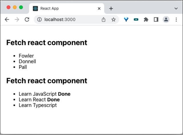
Summary
Render props is an efficient method to share logic between components. It is extensively used in many third party component with good success rate and it is time-tested method to share logic in the react domain.
React - Static Type Checking
Since JavaScript is a dynamically typed language, it is hard to find type mismatch error before running the code. React support type checking for props through prop-types package, which can be used to identity type mismatch for properties during development phase.
The other aspect of the program still needs a tool to properly identify the type issues during development phase. JavaScript has lot of static type checker tools to handle the type problem. We will check two of the popular option, which will integrate smoothly into the workflow of the React application and give hints of the possible type error during development phase of the application. They are as follows −
Flow
TypeScript language
Flow
Flow is static type checker for JavaScript. Flow extends the JavaScript language to specify type and allows static type annotation to be set inside the JavaScript code. Flow will check the static type annotation set by the developer in the code and make sure the proper type is used. Otherwise, it will throw error. A simple example is as follows −
// @flow
function sum(a: number, b: number) : number {
return a + b;
}
sum(10, 20) // Pass
sum("10", "20") // Fail
Here, // @flow annotation enables the flow static checker to analyze the function defined below. As you see, the function sum uses the Flow language extension to specify the type of the argument. Let us see how to enable Flow in a react project and the development workflow of the Flow enabled react project.
Step1 − Create a new react project using create-react-app CLI app.
create-react-app myapp
Step 2 − Add Flow to the project using below command
cd myapp npm install --save-bin flow-bin
Step 3 − Now, add Flow command in the scripts of the package.json file
{
// ...
"scripts": {
"flow": "flow",
// ...
},
// ...
}
This will allow us to run flow command through npm
Step 4 − Initialize the flow configuration using flow command as shown below −
npm run flow init
This will create a basic flow configuration file .flowconfig at the root of the project with below content.
[ignore] [include] [libs] [lints] [options] [strict]
Advanced flow options can be added here. By default, flow will check all files in our application. To ignore node_modules, add .*/node_modules/.* under [ignore] option. This will instruct the flow application to ignore all files inside the node_modules folder.
[ignore] .*/node_modules/.* [include] [libs] [lints] [options] react.runtime=automatic [strict]
Step 5 − Now, we have configured the flow into our application. We can use flow annotation into our code and test it against flow using below command
npm run flow
Flow will check our code and show the similar result in the console as shown below −
> myapp@0.1.0 flow /path/to/myapp > flow Launching Flow server for /path/to/myapp Spawned flow server (pid=1629) Logs will go to /private/tmp/flow/zSUserszSbalazSProjectszSArticleszSreact-revision-v2zSworkspacezSmyapp.log Monitor logs will go to /private/tmp/flow/zSUserszSbalazSProjectszSArticleszSreact-revision-v2zSworkspacezSmyapp.monitor_log No errors!
Step 6 − Now, it is fine to use flow annotation in our code. Let us add a simple flow annotation into our code and run the flow command to check the correctness of the code. Create a simple HelloWorld component (src/components/HelloWorld.js) as shown below −
import React from 'react'
class HelloWorld extends React.Component {
render() {
return <h1>Hello, {this.props.name}</h1>
}
}
export default HelloWorld
Step 7 − Include the component in our root component (App.js) as shown below −
// @flow
import React from "react";
import HelloWorld from "./components/HelloWorld";
function App() : any {
var name: string = 10
return (
<div>
<HelloWorld name={name} />
</div>
)
}
export default App;
Step 8 − Now, check the code with flow as shown below
npm run flow
Flow command will check the code and show the error that the name is set with string value as shown below.
> myapp@0.1.0 flow /path/to/myapp
> flow
Error ............................................src/App.js:6:22
Cannot assign 10 to name because number [1] is incompatible with string [2]. [incompatible-type]
3 import HelloWorld from "./components/HelloWorld";
4
5 function App() : any {
[2][1]6 var name: string = 10
7
8 return (
9 <div>
Found 1 error
.....
.....
Step 9 − Let us fix the error by providing a string value for name variable and rerun the flow command.
// @flow
import React from "react";
import HelloWorld from "./components/HelloWorld";
function App() : any {
var name: string = "John"
return (
<div>
<HelloWorld name={name} />
</div>
)
}
export default App;
Now, flow command will succeed and show that there is no issue in the code.
> myapp@0.1.0 flow /path/to/myapp > flow No errors!
Step 10 − Finally, we can run the app by running below command,
npm start
The optimized production build can be created using below command,
npm run build
TypeScript
TypeScript is a language with first class support for static typing. Static typing enables TypeScript to catch the type error during compile time instead of runtime. TypeScript support all language features of JavaScript.
So, it is really easy for a JavaScript developer to work in TypeScript. React has build-in support for TypeScript. To create a React project, just include TypeScript template during the react app creation through create-react-app.
create-react-app myapp --template typescript
Once the application is created, add a new HelloWorld component (HelloWorld.tsx) under src/components folder as shown below −
// src/components/HelloWorld.tsx
import React from 'react'
class HelloWorld extends React.Component {
render() {
return <h1>Hello, {this.props.name}</h1>
}
}
export default HelloWorld
Now, include the HelloWorld component −
import React from "react";
import HelloWorld from "./components/HelloWorld";
function App() : any {
var name: string = 10
return (
<div>
<HelloWorld name={name} />
</div>
)
}
export default App;
Here, we have intentionally set the value of name to 10. Let us run the application and check whether the compiler catch the error.
npm start
Running the command throws error as shown below −
...
...
ERROR in src/App.tsx:5:7
TS2322: Type 'number' is not assignable to type 'string'.
3 |
4 | function App() : any {
> 5 | var name: string = 10
| ^^^^
6 |
7 | return (
8 | <div>
...
...
Let us change the value of name and set a string value ("John"). The above error get fixed but still the compiler throws error in HelloWorld component as shown below −
Issues checking in progress...
ERROR in src/App.tsx:9:19
TS2769: No overload matches this call.
Overload 1 of 2, '(props: {} | Readonly<{}>): HelloWorld', gave the following error.
Type '{ name: string; }' is not assignable to type 'IntrinsicAttributes & IntrinsicClassAttributes<HelloWorld> & Readonly<{}>'.
Property 'name' does not exist on type 'IntrinsicAttributes & IntrinsicClassAttributes<HelloWorld> & Readonly<{}>'.
Overload 2 of 2, '(props: {}, context: any): HelloWorld', gave the following error.
Type '{ name: string; }' is not assignable to type 'IntrinsicAttributes & IntrinsicClassAttributes<HelloWorld> & Readonly<{}>'.
Property 'name' does not exist on type 'IntrinsicAttributes & IntrinsicClassAttributes<HelloWorld> & Readonly<{}>'.
7 | return (
8 | <div>
> 9 | <HelloWorld name={name} />
| ^^^^
10 | </div>
11 | )
12 | }
ERROR in src/components/HelloWorld.tsx:9:39
TS2339: Property 'name' does not exist on type 'Readonly<{}>'.
7 | class HelloWorld extends React.Component {
8 | render() {
> 9 | return <h1>Hello, {this.props.name}</h1>
| ^^^^
10 | }
11 | }
12 |
To fix error, HelloWorld component should be provided with type information for its properties. Create a new interface for properties and then include it in HelloWorld component as shown below −
import React from 'react'
interface HelloWorldProps {
name: string
}
class HelloWorld extends React.Component<HelloWorldProps> {
render() {
return <h1>Hello, {this.props.name}</h1>
}
}
export default HelloWorld
Finally, our code gets compiled with no errors as shown below and can be viewed through at `http://localhost:3000/
No issues found.
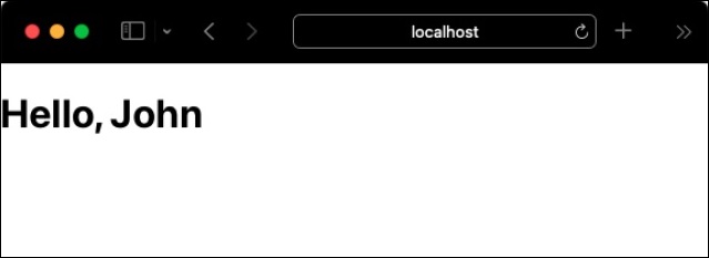
React - Strict Mode
React is build on the concept of component, properties and state. React provides a relatively few set of API to create and update components. The basic features of React is enough for large part of the our front end application. But, still modern application has complex scenarios, which needs advanced front-end logic. React provides lot of high-level API, which will help us to create complex front-end application. The high-level API comes with a cost. High-level API are little bit tough to learn and apply it in our application.
React provides a strict mode, which helps the developer to properly apply the high-level API by highlighting the potential problem during development phase of our application. As we know, everything in the React is build on the concept of components, strict mode is simply a non-visual component, React.StrictMode. The usage of strict mode component is also very simple. Just wrap the component to be analyzed with React.StrictMode component as shown below −
<React.StrictMode> <OurComplexComponent /> </React.StrictMode>
Another functionality of the strict mode is to throw error or warning when certain legacy or depreciated API (which will eventually introduce bugs in the application) are used in the application.
Let us learn the list of items highlighted by strict mode component in this chapter.
Unsafe lifecycle usage
React identifies some of the legacy lifecycle events are unsafe to use in the async based application. They are as follows −
componentWillMount
componentWillReceiveProps
componentWillUpdate
Unsafe means it will create hard to debug bugs in the application. React will eventually remove these unsafe lifecycle event in the future version of the library. Until then, developer are alerted when they use legacy unsafe lifecycle events.
Legacy ref API usage
Earlier version of React uses string based ref management and later added callback based ref management. The recommended way is to use callback based option due to its stability and less error-prone nature. Strict mode will throw warning if we use string based option.
The most recent version of React provides improved ref management option, which is both easy to code and less error-prone nature.
Legacy findDOMNode usage
findDOMNode helps to search the tree of DOM node given a class instance. The usage of findDOMNode is depreciated and promotes the usage of ref based DOM management.
Side effects
React has two major phases, render and commit. render phase involves major work and time-consuming and commit phase is straight forward and fast. React introduces a concurrent mode, which will improve the performance of the render phase. One of the requirement of the concurrent mode is that the lifecycle event used in the render phase should not contain side effects.
React will try to find the unexpected side effects using different approaches during development phase and report it as warning.
Legacy context API
Legacy context API is error-prone and it is not recommended to use. It will be removed in the future version. Until then, strict mode will detect the usage of legacy context API and report it.
Reusable state
Components with reusable state can be mounted and destroyed multiple time without any side effects and will help to improve the performance of the application. The future version of the React library will add or remove section of UI while preserving state. React 18 introduces a strict mode feature, which will try to unmount and remount the component to ensure the component is resilient. Any issue during this phase will be reported.
React - Web Components
React and web components can be mixed in a web application. A react component can have one or more web component and a web component can use react component to create its content. Both options are supported by react.
Using Web components in a react application
Let us create a web component and then try to apply it in a react application. First of all, create a new react application and start it using below command.
create-react-app myapp cd myapp npm start
Next, open App.css (src/App.css) and remove all CSS classes.
// remove all css classes
Next, create a simple web component, HelloMessage (public/WebComponents/HelloMessage.js) and add below code. The purpose of the web component () is to welcome a user (by specifying username in the name attribute of the web component).
// web component
class HelloMessage extends HTMLElement {
constructor() {
super();
this.name = 'Folks';
}
static get observedAttributes() {
return ['name'];
}
attributeChangedCallback(property, oldValue, newValue) {
if (oldValue === newValue) return;
this[property] = newValue;
}
connectedCallback() {
this.textContent = `Hello ${this.name}!`;
}
}
customElements.define('hello-message', HelloMessage);
Here,
connectedCallback() is used to create the content of the web component.
observedAttributes function access the name attributes.
attributeChangedCallback function updates the value of the name attributes, if it gets changed in the application.
customElements.define is used to attach the created web component with a tag name into the web document.
Next, open the index.html (public/index.html) file and add the web component as shown below −
<!DOCTYPE html>
<html lang="en">
<head>
<link rel="icon" href="%PUBLIC_URL%/favicon.ico" />
<link rel="apple-touch-icon" href="%PUBLIC_URL%/logo192.png" />
<link rel="manifest" href="%PUBLIC_URL%/manifest.json" />
<script src="%PUBLIC_URL%/WebComponents/HelloMessage.js"></script>
</head>
<body>
<noscript>You need to enable JavaScript to run this app.</noscript>
<div style="padding: 10px;">
<div id="root"></div>
<div style="padding: 10px;">
<hello-message name="John"></hello-message>
</div>
</div>
</body>
</html>
Here we have,
Included the web component in the head section
Used the hello-message web component in the page to showcase it's usage
Next, create a simple component, SimpleWebComponent (src/Components/SimpleWebComponent.js) and render the newly created web component as shown below −
import React from "react";
class SimpleWebComponent extends React.Component {
constructor(props) {
super(props)
}
render() {
return (
<hello-message name="Peter"></hello-message>
);
}
}
export default SimpleWebComponent;
Here, the web component hello is used inside the component's render method.
Next, open App component (src/App.js), and use SimpleWebComponent component as shown below −
import './App.css'
import React from 'react';
import SimpleWebComponent from './Components/SimpleWebComponent'
function App() {
return (
<div className="container">
<div style={{ padding: "10px" }}>
<div>
<SimpleWebComponent />
</div>
</div>
</div>
);
}
export default App;
Here we have,
Imported SimpleWebComponent component from the react package
Used SimpleWebComponent component and rendered hello web component
Finally, open the application in the browser and check the final result.
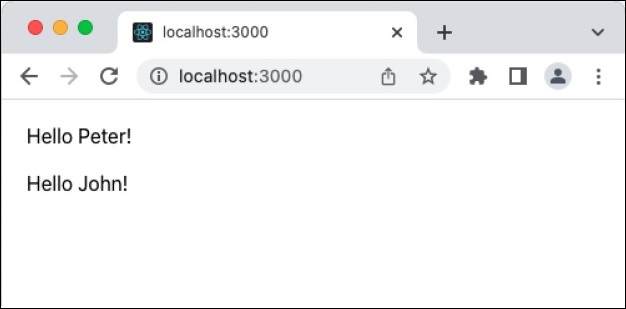
Summary
React and web component complement each other in a nice way. Each has its own advantages and disadvantages and can be used in a single application by analyzing its pros and cons with respect to the application.
React - Date Picker
React provides form component through third party UI component library. React community provides a large collection of UI / UX components and it is tough to choose the right library for our requirement.
Bootstrap UI library is one of the popular choice for the developer and it is extensively used. React Bootstrap (https://react-bootstrap.github.io/) has ported almost all the bootstrap UI components to the React library and it has best support for date picker component as well.
Let us learn how to use date picker component from react-bootstrap library in this chapter.
What is date picker?
Date picker allows the developer to easily choose a date instead of entering it through text box with correct formatting details. HTML input element has type attributes to refer the type of data to be entered into the element. One of the type is date. Setting the type in a input element will enable the date picker.
<input type="date">
React bootstrap provides Form.Control component to create various input elements. Developer can use it to create date picker control. Some of the useful props of the Form.Control are as follows −
ref (ReactRef) − Ref element to access underlying DOM node
as (elementType) − Enable to specify element other than *<input>*
disabled (boolean) − Enable / Disable the control element
htmlSize (number) − Size of the underlying control element
id (string) − Id of the control element. Uses *controlId* of the parent *Form.Group* component, if not specified here.
IsInValid (boolean) − Enables / Disable the style associated with invalid data
IsValid (boolean) − Enables / Disable the style associated with valid data
plaintext (boolean) − Enable / disable the input and render it as plain text. To be used along with *readonly* props
readOnly (boolean) − Enable / disable the readonly attribute of the control
size (sm | lg) − Size of the input element
type (string) − Type of the input element to be rendered
value (string | arrayOf | number) − Value of the underlying control. Manipulated by *onChange* event and the initial value will be default to *defaultValue* props
bsPrefix (string) − Prefix used to customize the underlying CSS classes
onChange (boolean) − Callback function to be called when *onChange* event is fired
A simple date control component can be used as shown below −
<Form.Group className="mb-3" controlId="password"> <Form.Label>Date of birth</Form.Label> <Form.Control type="date" /> </Form.Group>
Applying Date picker component
First of all, create a new react application and start it using below command.
create-react-app myapp cd myapp npm start
Next, install the bootstrap library using below command,
npm install --save bootstrap react-bootstrap
Next, open App.css (src/App.css) and remove all the CSS classes.
// remove css classes
SimpleDatePicker.js
Next, create a simple date component, SimpleDatePicker (src/Components/SimpleDatePicker.js) and render a form as shown below −
import { Form, Button } from 'react-bootstrap';
function SimpleDatePicker() {
return (
<Form>
<Form.Group className="mb-3" controlId="name">
<Form.Label>Name</Form.Label>
<Form.Control type="name" placeholder="Enter your name" />
</Form.Group>
<Form.Group className="mb-3" controlId="password">
<Form.Label>Date of birth</Form.Label>
<Form.Control type="date" />
</Form.Group>
<Button variant="primary" type="submit">
Submit
</Button>
</Form>
);
}
export default SimpleDatePicker;
Here we have,
Used Form.Control with type date to create date picker control.
Used Form component to create a basic form component.
Used Form.Group to group form control and label.
App.js
Next, open App component (src/App.js), import the bootstrap css and render the date picker as shown below −
import './App.css'
import "bootstrap/dist/css/bootstrap.min.css";
import SimpleDatePicker from './Components/SimpleDatePicker'
function App() {
return (
<div className="container">
<div style={{ padding: "10px" }}>
<div>
<SimpleDatePicker />
</div>
</div>
</div>
);
}
export default App;
Here,
Imported the bootstrap classes using import statement
Rendered our new SimpleDatePicker component.
Included the App.css style
Finally, open the application in the browser and check the final result. Date picker will be rendered as shown below −
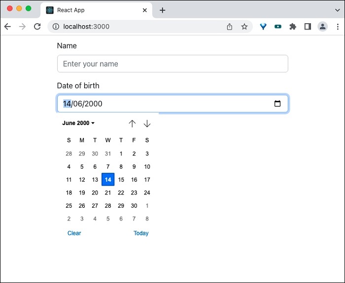
Summary
React Bootstrap date picker component provides necessary options to create date picker form control.
React - Helmet
The meta information of a web document is very important for SEO purposes. The meta information of a document is generally specified inside the head using meta tag. title tag also plays an important role in providing meta information about a document. Head section will have script and style tags as well. Helmet component provides an easy way to manage the head section of a document by providing all valid head tags. Helmet will gather all the information specified inside it and update the head section of the document.
Let us learn how to use Helmet component in this chapter.
Installing Helmet
Before going through the concept and usage of helmet, let us learn how to install the helmet component using npm command.
npm install --save react-helmet
The above command will install the helmet component and will be ready to use in our application.
Concept and usage of Helmet
Helmet accepts all valid head tags. It accepts the plain HTML tags and output the tags in the head section of the document as shown below −
import React from "react";
import {Helmet} from "react-helmet";
class Application extends React.Component {
render () {
return (
<div className="application">
<Helmet>
<title>Helmet sample application</title>
<meta charSet="utf-8" />
<meta name="description" content="Helmet sample program to understand the working of the helmet component" />
<meta name="keywords" content="React, Helmet, HTML, CSS, Javascript" />
<meta name="author" content="Peter" />
<meta name="viewport" content="width=device-width, initial-scale=1.0" />
</Helmet>
// ...
</div>
);
}
};
Here,
title is used to specify the title to the document
description meta tag is used to specify the details of the document
keywords is used to specify the main keywords of the document. It will be used by search engine.
author is used to specify the author of the document
viewport is used to specify the default view port of the document
charSet is used to specify the character set used in the document.
The output of the head section will be as follows −
<head> <title>Helmet sample application</title> <meta charSet="utf-8" /> <meta name="description" content="Helmet sample program to understand the working of the helmet component" /> <meta name="keywords" content="React, Helmet, HTML, CSS, Javascript" /> <meta name="author" content="Peter" /> <meta name="viewport" content="width=device-width, initial-scale=1.0" /> </head>
Helmet component can be used inside any other react component to change the header section. It can also be nested so that the header section will change when the child component is rendered.
<Parent>
<Helmet>
<title>Helmet sample application</title>
<meta charSet="utf-8" />
<meta name="description" content="Helmet sample program to understand the working of the helmet component" />
<meta name="keywords" content="React, Helmet, HTML, CSS, Javascript" />
<meta name="author" content="Peter" />
<meta name="viewport" content="width=device-width, initial-scale=1.0" />
</Helmet>
<Child>
<Helmet>
<title>Helmet sample application :: rendered by child component</title>
<meta name="description" content="Helmet sample program to explain nested feature of the helmet component" />
</Helmet>
</Child>
</Parent>
Here,
Helmet in the child component will update the head section as below,
<head> <title>Helmet sample application :: rendered by child component</title> <meta charSet="utf-8" /> <meta name="description" content="Helmet sample program to explain nested feature of the helmet component" /> <meta name="keywords" content="React, Helmet, HTML, CSS, Javascript"> <meta name="author" content="Peter"> <meta name="viewport" content="width=device-width, initial-scale=1.0"> </head>
Applying Helmet
Let us create a new react application to learn how to apply Helmet component in this section.
First of all, create a new react application and start it using below command.
create-react-app myapp cd myapp npm start
Next, open App.css (src/App.css) and remove all CSS classes.
// remove all css classes
SimpleHelmet.js
Next, create a simple component, SimpleHelmet (src/Components/SimpleHelmet.js) and render a −
import React from "react";
import {Helmet} from "react-helmet";
class SimpleHelmet extends React.Component {
render() {
return (
<div>
<Helmet>
<title>Helmet sample application</title>
<meta charSet="utf-8" />
<meta name="description" content="Helmet sample program to understand the working of the helmet component" />
<meta name="keywords" content="React, Helmet, HTML, CSS, Javascript" />
<meta name="author" content="Peter" />
<meta name="viewport" content="width=device-width, initial-scale=1.0" />
</Helmet>
<p>A sample application to demonstrate helmet component.</p>
</div>
)
}
}
export default SimpleHelmet;
Here we have,
Imported Helmet from the react-helmet package
Used Helmet in the component to update the head section.
App.js
Next, open App component (src/App.js), and use SimpleHelmet component as shown below −
import './App.css'
import React from 'react';
import SimpleHelmet from './Components/SimpleHelmet'
function App() {
return (
<div className="container">
<div style={{ padding: "10px" }}>
<div>
<SimpleHelmet />
</div>
</div>
</div>
);
}
export default App;
Here we have,
Imported SimpleHelmet component from the react package
Used SimpleHelmet component
index.html
Next, open index.html (public/index.html) file and remove the meta tags as shown below −
<!DOCTYPE html>
<html lang="en">
<head>
<link rel="icon" href="%PUBLIC_URL%/favicon.ico" />
<link rel="apple-touch-icon" href="%PUBLIC_URL%/logo192.png" />
<link rel="manifest" href="%PUBLIC_URL%/manifest.json" />
</head>
<body>
<noscript>You need to enable JavaScript to run this app.</noscript>
<div style="padding: 10px;">
<div id="root"></div>
</div>
</body>
</html>
Here,
title tag is removed
meta tag for description, theme-color and viewport are removed
Finally, open the application in the browser and check the final result.
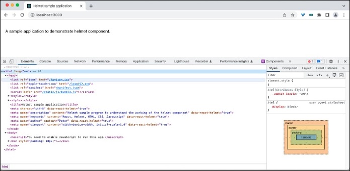
Open the source code in the dev tools and you can see the html information as shown below −
<title>Helmet sample application</title> <meta charset="utf-8" data-react-helmet="true"> <meta name="description" content="Helmet sample program to understand the working of the helmet component" data-react-helmet="true"> <meta name="keywords" content="React, Helmet, HTML, CSS, Javascript" data-react-helmet="true"> <meta name="author" content="Peter" data-react-helmet="true"> <meta name="viewport" content="width=device-width, initial-scale=1.0" data-react-helmet="true">
Summary
Helmet component is an easy to use component to manage the head content of the document supporting both server side and client side rendering.
React - Inline Style
React provides a unique way of directly writing the CSS in the react component and using it inside JSX. The concept is called CSS in JS and provides many advantages over traditional usage of styles.
Let us learn what is inline styling and how to use it react component.
Concept of inline styling
CSS enables the developer to design the UI of the web application. React provides first class support for CSS and allows CSS to be imported directly into the react application. Directly importing CSS into a react component is as simple as importing a package.
import './App.css'
But, importing css directly into the web component has one major disadvantage, Global namespace. Global style may affect the style of an individual component if there is a conflict in the class name. Developer need to be careful to assign some prefix to make sure that the conflict will not happen.
The other way around is to allow the Javascript to manage the CSS and it is called CSS in JS. React allows the CSS to be used inside the JSX through special CSS syntax. React provides a style props for every component, which can be used specify inline style. The inline style should be provided in a Javascript object. The object should follows the below mentioned rules,
The object key should be CamelCased version of normal CSS attributes. For example, the background-color should be specified as backgroundColor.
{
backgroundColor: "red"
}
The object value should be one of the allowed values of the corresponding object key in CSS and should be in string format. For example, the font-size CSS attributes and its value (12px) should be specified as follows −
{
fontSize: "12px"
}
React will handle the conflict and render the application correctly.
Applying inline style
Let us learn how to apply inline style in a react application in this section.
First of all, create a new react application and start it using below command.
create-react-app myapp cd myapp npm start
Next, open App.css (src/App.css) and remove all the CSS classes.
// remove the css
SimpleStyle.js
Next, create a simple component, SimpleStyle (src/Components/SimpleStyle.js) as shown below −
import React from "react";
class SimpleStyle extends React.Component {
displayStyle = {
fontFamily: 'Times New Roman',
fontSize: "24px",
color: "red"
}
render() {
return (
<div>
<div style={this.displayStyle}>
Sample text to understand inline style (object as variable) in React component
</div>
<hr />
<div style={{ fontFamily: 'Arial', fontSize: "24px", color: "grey"}}>
Sample text to understand inline style (object as expression) in React component
</div>
</div>
)
}
}
export default SimpleStyle
Here we have,
Styled the first div using variable (displayStyle).
Styled the second div using expression.
App.js
Next, open App component (src/App.js) and update the content with SimpleStyle component as shown below −
import './App.css'
import React from 'react';
import SimpleStyle from './Components/SimpleStyle'
function App() {
return (
<div className="container">
<div style={{ padding: "10px" }}>
<div>
<SimpleStyle />
</div>
</div>
</div>
);
}
export default App;
Here we have,
Imported the SimpleStyle component.
Used SimpleStyle component to render the calender icon.
Finally, open the application in the browser. The content will be rendered as shown below −
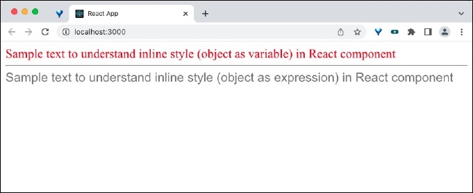
Summary
Inline styling helps developer to quickly include the CSS style without worrying about the conflict of the CSS styles. Also, the syntax is very similar to CSS and it makes it easy for the developer to use the feature without much learning curve.
React - PropTypes
JavaScript is a dynamically typed language. It means that JavaScript does not need the type of a variable to be declared or specified. During program execution (Runtime), JavaScript checks the value assigned to variable and then it infers the type of the variable. For example, if a variable, num is assigned to John, then it infers that the type of num is string. If the same variable, num is assigned to 10, then it infers that the type of num is number.
var num = 'John' // The type of 'num' is string var num = 10 // The type of 'num' is number
Dynamic typing is good for scripting language as it speeds up the development. The flip side of the dynamic typing is that the JavaScript engine does not know the type of a variable before it start executing the program. This prevent the JavaScript engine to find or identify certain bugs. For example, the below mentioned code does not execute and stops the program.
var num = 10 var name = 'John' var result = num + name // throws error during runtime
React and types
In React, each component will have multiple props and each props should be assigned to value with correct type. Component props with wrong type will throw unexpected behavior. To better understand the problem, let us create a new application and create a component, which sums its properties and shows the result.
To create a new React app, execute below command,
create-react-app myapp
Once the application is created, create a new component, Sum under component folder (src/components/PropTypes/Sum.js)
import React from 'react'
class Sum extends React.Component {
render() {
return <p>The sum of {this.props.num1} and {this.props.num2}
is {parseInt(this.props.num1) + parseInt(this.props.num2)}</p>
}
}
export default Sum
Here, Sum component accept two number, num1 and num2 and prints the summation the given two number. The component will work if it is provided the number value for the props. But, if sum component is supplied with string then it will show NaN as the sum of the two properties.
Their is no way to find that the given value for num1 and num2 props are not in correct format. Let us use Sum component in the our root component (src/App.js) and see how it renders.
import Sum from "./components/PropTypes/Sum";
function App() {
var num1 = 10
var num2 = 200
var name1 = "John"
var name2 = "Peter"
return (
<div>
<Sum num1={num1} num2={num2} />
<Sum num1={name1} num2={name2} />
</div>
);
}
export default App;
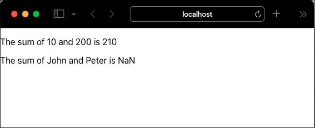
PropTypes
React community provides a special package, prop-types to address the properties type mismatch problem. prop-types allows the properties of the component to be specified with type through a custom setting (propTypes) inside the component. For example, properties with number type can specified using PropTypes.number option as shown below.
Sum.propTypes = {
num1: PropTypes.number,
num2: PropTypes.number
}
Once the type of the properties is specified, then the React will throw warning during the development phase of the application. Let us include propTypes in our sample application and see how it helps to catch properties type mismatch issue.
Install prop-types package using node package manager (npm) as shown below −
npm i prop-types --save
Now, specify the type of the properties of Sum component as shown below −
import React from 'react'
import PropTypes from 'prop-types'
class Sum extends React.Component {
render() {
return <p>The sum of {this.props.num1} and {this.props.num2}
is {parseInt(this.props.num1) + parseInt(this.props.num2)}</p>
}
}
Sum.propTypes = {
num1: PropTypes.number,
num2: PropTypes.number
}
export default Sum
Finally, run the application using below command −
npm start
Open the application in your favorite browser and open the JavaScript console through developer tools. JavaScript throws the warning that the unexpected type is provided as shown below −
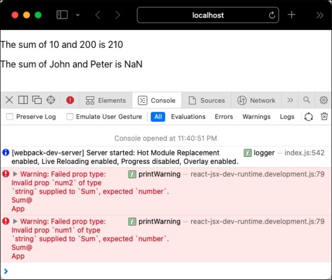
propTypes only works during development phase to nullify the performance reduction of the application due to additional checking of the props types. This will not affect the performance of the application in production / live setup.
Available validators
prop-types supplies a good collection of ready-made validators. They are as follows −
PropTypes.array
PropTypes.bigint
PropTypes.bool
PropTypes.func
PropTypes.number
PropTypes.object
PropTypes.string
PropTypes.symbol
PropTypes.node - Anything that can be rendered
PropTypes.element - React component
PropTypes.elementType - Type of React component
PropTypes.instanceOf() - instance of the specified class
propTypes.oneOf(['Value1', 'valueN']) - one of Value and ValueN
PropTypes.oneOfType([]) - Example, PropTypes.oneOfType([PropTypes.number, PropTypes.bigint])
PropTypes.arrayOf() - Example, PropTypes.arrayOf(PropTypes.number)
PropTypes.objectOf() - Example, PropTypes.objectOf(PropTypes.number)
PropTypes.func.isRequired
propTypes.element.isRequired
PropTypes.any.isRequired
A custom validator can also be created and used to validate the property's value. Let us consider that the component have a email property and the value should be a valid email address. Then, a validate function can be written and attached to the email property as shown below −
Sum.propTypes = {
num1: PropTypes.number,
num2: PropTypes.number,
email: function(myProps, myPropName, myComponentName) {
if (!/^[^\s@]+@[^\s@]+\.[^\s@]+$/.test(myProps[myPropName])) {
return new Error(
'Invalid prop value '' + myProps[myPropName] + '' supplied to' +
' '' + myComponentName + '/' + myPropName + ''. Validation failed.'
);
}
}
}
Here,
/^[^\s@]+@[^\s@]+\.[^\s@]+$/ is a simple regex email pattern.
myProps represents all properties.
myPropName represent the current property being validated.
myComponentName represent the name of the component being validated.
Similarly, custom validator can be created and used for array and object properties using below function signature
PropTypes.arrayOf(function(propValue, key, componentName, location, propFullName) { ... })
React - BrowserRouter
Routing is one of the important concept in a front end application. React community provides an excellent router library called React Router. Let us learn the concept of React router and how to use it in a react application in this chapter.
Router concepts
The primary purpose of the router is to match the given url to a react component and render the matched component. In addition to matching and rendering, the router should manage the history of the browser as well for an efficient forward and backward navigation in the browser.
Before understanding the how the router works, let us know some of the useful components of react router library.
BrowserRouter − BrowserRouter is top level component. It creates a history (navigation history), put the initial location (router object representing "where the user is at") into the react state and finally subscribes to the location URL.
<BrowserRouter> <!-- children --> </BrowserRouter>
Routes − Routes will recurses it's child node and build a router configuration. It matches the configured routes against the location and render the first matched route element.
<BrowserRouter>
<Routes>
<Route path="/" element={<App />}>
<Route index element={<Home />} />
<Route path="admin" element={<Admin />}>
<Route path="product" element={<ProductListing />} />
<Route path="category" element={<CategoryListing />} />
<Route index element={<Dashboard />} />
</Route>
</Route>
<Route path="/login" element={<Login />}>
<!-- more nested routes -->
</Route>
<!-- more routes -->
</Routes>
</BrowserRouter>
Here,
/ path is mapped to App component.
/ path's index component is mapped to Home component.
/admin path is mapped to Admin component.
/admin path's index component is mapped to Dashboard component.
/admin/product path is matched to ProductListing component.
/admin/category path is matched to CategoryListing component.
/admin/dashboard path is matched to Dashboard component.
Route − Route is the actual router configuration. It can be nested to any level similar to folders.
Outlet − Outlet component renders the next match in a set of matches.
function Hello() {
return (
<div>Hello</div>
<Outlet />
)
}
Here,
Placed the Outlet component at the bottom of the hello component.
Router will render the next match inside the Outlet component.
Link − Link component is similar to anchor tag and used for navigation purpose. Once the user click on it, it changes the location based on it's to props
<Link to="/admin" />
navigate() − navigate() is an API used for navigation purpose similar to Link component.
navigate("/admin")
Router workflow
Let us consider a react application has two five pages / components as shown below −
Home (/)
Contact (/contact)
Register (/register)
Admin (/admin)
AdminDashboard (/admin/dashboard)
A sample router configuration is as follows −
<BrowserRouter>
<Routes>
<Route path="/" element={<App />}>
<Route index element={<Home />} />
<Route path="contact" element={<Contact />} />
<Route path="register" element={<Register />} />
<Route path="admin" element={<Admin />}>
<Route path="dashboard" element={<AdminDashboard />} />
<Route path="category" element={<CategoryListing />} />
<Route index element={<AdminDashboard />} />
</Route>
</Routes>
</BrowserRouter>
Let us see how admin dashboard url (/admin/dashboard) will get matched and rendered by the react router.
At First of all, react library will render our application. Since our application will have BrowserRouter at the top of the render tree, it gets called and rendered
BrowserRouter component creates a history, put the initial location in the state and subscribe to the url
Routes component will checks all its children, build the router configuration and finally render the first match (/admin => )
Admin component will be rendered. It will have an Outlet component as shown below -
function Admin() {
return (
<div>
<!-- Admin content -->
</div>
<Outlet />
)
}
Outlet component renders the next match within itself (/admin/dashboard => )
User may click a link (Link component) in the dashboard, say "/admin/category"
Link component calls the navigate("/admin/category") method
The history (object) changes the url and notifies the BrowserRouter
As BrowserRouter component is already subscribed to the url, BrowserRouter component will be rerendered and the whole process will be repeated (from 2)
How to apply routers
First of all, create a new react application and start it using below command.
create-react-app myapp cd myapp npm start
Next, install the react router library using below command,
npm install --save react-router-dom
Next, open App.css (src/App.css) and remove all CSS classes.
// remove all css classes
Home.js
Next, create a folder, Pages under src and create a new home page component, Home (src/Pages/Home.js) and render simple home page content as shown below −
function Home() {
return <h3>Home</h3>
}
export default Home
Greeting.js
Next, create a new greeting page component, Greeting (src/Pages/Greeting.js) and render simple greeting message as shown below −
function Greeting() {
return <h3>Hello World!</h3>
}
export default Greeting;
App.js
Next, open App.js file and render a BrowserRoutes component as shown below −
import './App.css'
import React from 'react';
import { BrowserRouter, Route, Routes } from 'react-router-dom';
import Layout from './Pages/Layout';
import Home from './Pages/Home';
import Greeting from './Pages/Greeting';
function App() {
return (
<BrowserRouter>
<Routes>
<Route path="/" element={<Layout />}>
<Route index element={<Home />} />
<Route path="greet" element={<Greeting />} />
</Route>
</Routes>
</BrowserRouter>
);
}
export default App;
Here,
BrowserRouter is the main component. It will have router setting as its children and render the entire application based on the router setting.
Routes is the main router component. It holds a list of individual router setting.
Route is the actual router component having the mapping between web path (/home) and the component (Home).
Route can be nested to support nested paths.
The mapping defined in the routes are as follows −
/ is mapped to Layout component. Layout component will be created in the next step.
/home is mapped to Home component and it is nested under / path.
/greet is mapped to Greet component and it is nested under / path.
Layout.js
Next, create a Layout component, Layout (src/Pages/Layout.js). The purpose of the layout component is to show the entire application with navigation link. It is the main component of the application and points to / route. The source code of the Layout component is as follows −
import { Outlet, Link } from "react-router-dom";
function Layout() {
return (
<>
<nav>
<ul>
<li>
<Link to="/">Home</Link>
</li>
<li>
<Link to="/greet">Greeting</Link>
</li>
</ul>
</nav>
<Outlet />
</>
)
}
export default Layout;
Here,
Imported Link and Outlet components.
Link component is used to create web navigation links.
to props of the Link component is set with one of the routes defined in the parent BrowserRouter component.
Used / and /greet routes available in the router setting.
Outlet component is used at the bottom to load the selected component. During the initial rendering, it will load the default component (home).
Once the user click the web link, it will get router path from the to props and get the mapped component through router setting. Finally, it will render the component inside the Outlet component.
PageNotAvailable.js
Next, create a new component, PageNotAvailable (src/Pages/PageNotAvailable.js) to show when the link does not match with any of the router setting.
import { Link } from "react-router-dom"
function PageNotAvailable() {
return (
<p>The page is not available. Please <Link to=
"/">click here</Link> to go to home page.</p>
)
}
export default PageNotAvailable
Here, the Link component is used to navigate back to home page.
App.js
Next, update the App component and include PageNotAvailable component in the router setting.
import './App.css'
import React from 'react';
import { BrowserRouter, Route, Routes } from 'react-router-dom';
import Layout from './Pages/Layout';
import Home from './Pages/Home';
import Greeting from './Pages/Greeting';
import PageNotAvailable from './Pages/PageNotAvailable'
function App() {
return (
<BrowserRouter>
<Routes>
<Route path="/" element={<Layout />}>
<Route index element={<Home />} />
<Route path="greet" element={<Greeting />} />
<Route path="*" element={<PageNotAvailable />} />
</Route>
</Routes>
</BrowserRouter>
);
}
export default App;
Here,
When user click a link, react router will try to match the clicked link and the router setting one by one in the given order. if a link is matched, then the react router will stop and render the matched component.
* pattern will match all links. Since it is placed as last entry, it will match all undefined / unknown links.
Layout.js
Next, update the Layout component and add an unavailable link to check PageNotAvailable component is properly configured.
import { Outlet, Link } from "react-router-dom";
function Layout() {
return (
<>
<nav>
<ul>
<li>
<Link to="/">Home</Link>
</li>
<li>
<Link to="/greet">Greeting</Link>
</li>
<li>
<Link to="/unknown">Unavailable page</Link>
</li>
</ul>
</nav>
<Outlet />
</>
)
}
export default Layout;
Finally, open the application in the browser and check the final result. The application will render as shown below −
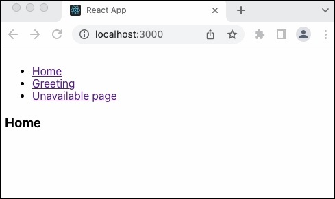
User can navigate to any page using the navigation link as shown in the above output.
Summary
React router is easy to configure and use. It does not have so many fancy feature but has necessary features like link, outlet, routes and route to create a complete web application with navigation links.
React - DOM
To run a react application, it needs to be attached itself to the main document of the web application. React provides a module to access and attach the application to the DOM of the document and the module is ReactDOM (react-dom).
Let us learn how to create a simple react component and attach the component into the document using reactDOM module in this chapter.
ReactDOM usage
react-dom is the core package used to manipulate the DOM of the document. react-dom allows one or more react application to be attached to the document. The react-dom should be imported into the application as shown below −
import * as ReactDOM from 'react-dom';
The react-dom provides two method to manipulate the DOM and they are as follows −
createPortal() − Create a portal in the react application. A portal is a special react node, which enables the main react application to render it's children into the DOM outside of it's own hierarchy of the DOM component.
return ReactDOM.createPortal( this.props.children, // child node domNode // DOM node outside the root element );
Let us learn the portals in more details in the upcoming chapters.
flushSync() − Flushes the state changes immediately and updates the DOM. Generally, react creates a virtual dom and then updates the real DOM by analyzing the differences between virtual and real DOM. The update frequency is determined internally by react. flushSync() interrupts and update the changes immediately.
The react-dom provides two submodules, one for server side application and another for client side application. The modules are as follows −
react-dom/server
react-dom/client
ReactDOMServer
Server module will be used to render a react component in the server and the module can be imported as shown below −
import * as ReactDOMServer from 'react-dom/server';
Some of the methods provided by ReactDOMServer are as follows −
renderToPipeableStream() − Render a react component to its initial HTML and returns a pipe stream.
renderToReadableStream() − Render a react component to its initial HTML and returns a readable web stream through promise.
renderToStaticNodeStream() − Render a react component to its initial HTML and returns a readable nodejs stream that outputs a HTML string. It skips extra markup such as data-reactroot and the output will be same as renderToStaticMarkup().
renderToString() − Render a react component to its initial HTML and returns a HTML string.
renderToStaticMarkup() −Same as renderToString() except it skips extra markup such as data-reactroot.
ReactDOMClient
Client module will be extensively used in the front-end development and can be imported into the application as shown below −
import * as ReactDOM from 'react-dom/client';
Some of the methods provided by ReactDOMClient are as follows −
createRoot() − Create a root element to attach and render a react component later. It accepts a html element and returns a react node. The react node is called as root of the application. The returned react node will have two method, render to render a react component and unmount to unmount the react component.
const root = createRoot(container);
root.render(element); // where element = document.getElementById('root-id')
root.umount();
hydrateRoot() − Same as createRoot() but it is used in combination with react-dom/server module to hydrate the react component rendered in the server.
Applying ReactDOMClient
First of all, create a new react application and start it using below command.
create-react-app myapp cd myapp npm start
Hello.js
Next, create a react component, Hello under component folder (src/components/Hello.js).
import React from "react";
class Hello extends React.Component {
constructor(props) {
super(props)
}
render() {
return (
<div>Hello, {this.props.name}</div>
);
}
}
export default Hello;
index.html
Next, open index.html (public/index.html) and add a new container (root2) as shown below −
<!DOCTYPE html>
<html lang="en">
<head>
<meta charset="utf-8" />
<link rel="icon" href="%PUBLIC_URL%/favicon.ico" />
<meta name="viewport" content="width=device-width, initial-scale=1" />
<meta name="theme-color" content="#000000" />
<meta name="description" content="Web site created using create-react-app" />
<link rel="apple-touch-icon" href="%PUBLIC_URL%/logo192.png" />
<link rel="manifest" href="%PUBLIC_URL%/manifest.json" />
<title>React App</title>
</head>
<body>
<noscript>You need to enable JavaScript to run this app.</noscript>
<div style="padding: 10px;">
<div id="root"></div>
<div id="root2"></div>
</div>
</body>
</html>
index.js
Next, open index.js (src/index.js) and attach our hello component into the root and root2 container as shown below −
import React from 'react';
import ReactDOM from 'react-dom/client';
import './index.css';
import Hello from './Components/Hello';
import reportWebVitals from './reportWebVitals';
const root = ReactDOM.createRoot(document.getElementById('root'));
root.render(
<React.StrictMode>
<Hello name="Main root container" />
</React.StrictMode>
);
const root2 = ReactDOM.createRoot(document.getElementById('root2'));
root2.render(
<React.StrictMode>
<Hello name="Another root container" />
</React.StrictMode>
);
reportWebVitals();`
Finally, open the application in the browser and check the result. The react component will be attached to both the root element as shown below −
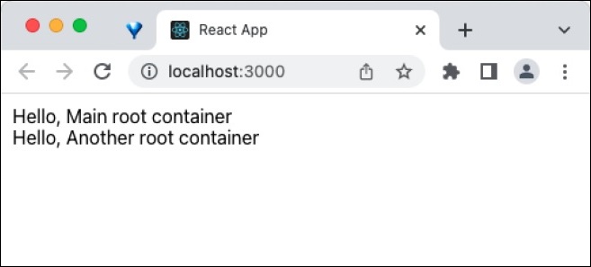
Summary
ReactDOM provides the ability to create the entry point for the react application by attaching the react component into the HTML document in both client and server environment.
React - Carousel
React provides carousel component through third party UI component library. React community provides a large collection of UI / UX components and it is tough to choose the right library for our requirement. Bootstrap UI library is one of the popular choice for the developer and it is extensively used. React Bootstrap (https://react-bootstrap.github.io/) has ported almost all the bootstrap UI components to the React library and it has best support for Carousel component as well.
Let us learn how to use Carousel component from react-bootstrap library in this chapter.
What is Carousel?
Carousel is basically a slideshow cycling through a series of content with rich animation support. It accepts a series of images as its main content. It also accepts title content for each slides. It has buttons / indicators to navigate from current content to the next / previous content. The time duration to pause and show a content can be configured as per requirement.
Carousel component
Carousel component allows the developer to create simple carousel with bootstrap design in a web application. Carousel component accepts two components,
Carousel.Item
Carousel component accepts multiple Carousel.Item items. Each Carousel.Items is a slide and can accepts a image. A sample code is as follows −
<Carousel>
<Carousel.Item>
<img
className="d-block w-100"
src="react_bootstrap_carousel_slide1.png"
alt="First slide"
/>
</Carousel.Item>
<Carousel.Item>
<img
className="d-block w-100"
src="react_bootstrap_carousel_slide2.png"
alt="Second slide"
/>
</Carousel.Item>
</Carousel>
Carousel.Caption
Carousel.Caption is a special component to show a short description about the slide and it should be included inside the Carousel.Item component. A sample code is as follows −
<Carousel.Item>
<img
className="d-block w-100"
src="react_bootstrap_carousel_slide1.png"
alt="First slide"
/>
<Carousel.Caption>
<h3>React Bootstrap</h3>
<p>React component library providing bootstrap components</p>
</Carousel.Caption>
</Carousel.Item>
Carousel component accepts a small set of props to configure the functionality and they are follows,
controls (boolean)
Enables / Disables the controls such as previous / next buttons
keyboard (boolean)
Enables keyboard controls
touch (boolean)
Enables / Disable touch controls
indicators (boolean)
Enables / Disables the indicators at the bottom of the carousel
nextIcon (React node)
Option to customize custom next icons
nextLabel (string)
Option to customize next label
prevIcon (React Node)
Option to customize custom previous icons
prevLabel (string)
Option to customize previous label
interval (number)
Time duration to pause and play between two slide
activeIndex (number)
Represent the index number of the slide to be shown
slide (boolean)
Enable / disable auto slide feature
variant (dark)
Enables the different variant of the carousel design. dark option changes the carousel theme from light to dark
bsPrefix (string)
Prefix used to customize the underlying CSS classes
onSelect (function)
Enables to attach a function to handle onSelect event
onSlide (function)
Enables to attach a function to handle onSlide event
Carousel.Item component accepts a few props to configure the functionality and they are follows,
interval (number)
Time duration to pause for the individual slide
bsPrefix (string)
Prefix used to customize the underlying CSS classes
Applying Carousel component
First of all, create a new react application and start it using below command.
create-react-app myapp cd myapp npm start
Next, install the bootstrap and react-bootstrap library using below command,
npm install --save bootstrap react-bootstrap
SimpleCarousel.js
Next, create a simple carousel component, SimpleCarousel (src/Components/SimpleCarousel.js) and render a carousel as shown below −
import { Carousel } from 'react-bootstrap';
function SimpleCarousel() {
return (
<Carousel fade indicators={false} controls={false}>
<Carousel.Item>
<img
className="d-block w-100"
src="react_bootstrap_carousel_slide1.png"
alt="First slide"
/>
<Carousel.Caption>
<h3>React Bootstrap</h3>
<p>React component library providing bootstrap components</p>
</Carousel.Caption>
</Carousel.Item>
<Carousel.Item>
<img
className="d-block w-100"
src="react_bootstrap_carousel_slide2.png"
alt="Second slide"
/>
<Carousel.Caption>
<h3>Button</h3>
<p>React Bootstrap button component</p>
</Carousel.Caption>
</Carousel.Item>
<Carousel.Item>
<img
className="d-block w-100"
src="react_bootstrap_carousel_slide3.png"
alt="Third slide"
/>
<Carousel.Caption>
<h3>Carousel</h3>
<p>React bootstrap Carousel component</p>
</Carousel.Caption>
</Carousel.Item>
</Carousel>
);
}
export default SimpleCarousel;
Here,
Imported Carousel component and added a single Carousel component.
Used fade props in Carousel component to change the animation type
Used indicators props in Carousel component to remove indicators
Used controls props in Carousel component to remove controls
Added three Carousel.Item items and used three images.
Added Carousel.Caption in each Carousel.Item component and set the captions for each slide.
Next, open App.css (src/App.css) and remove all the styles.
// remove all default styles
App.js
Next, open App component (src/App.js), import the bootstrap css and update the content with our new carousel component as shown below −
import './App.css'
import "bootstrap/dist/css/bootstrap.min.css";
import SimpleCarousel from './Components/SimpleCarousel'
function App() {
return (
<div className="container">
<div style={{ padding: "10px" }}>
<div style={{ width: "400px", height: "400px", backgroundColor: "skyblue" }}>
<SimpleCarousel />
</div>
</div>
</div>
);
}
export default App;
Here,
Imported the bootstrap classes using import statement
Rendered our new SimpleCarousel component.
Included the App.css style
Finally, open the application in the browser and check the final result. Carousel component will be rendered as shown below −

Add controls and indicators
Let us update our component to include controls to navigate next and previous slide and also indicator to identify the current slide position.
First of all, open our carousel application and update the SimpleCarousel component as shown below −
import { Carousel } from 'react-bootstrap';
function SimpleCarousel() {
return (
<Carousel fade indicators={true} controls={true}>
<Carousel.Item>
// ...
Here,
Used indicators props to enable indicators
Used controls props to enable controls
Next, open the application in the browser and check the final result. Carousel component will be rendered with controls and indicators as shown below −

Summary
React-bootstrap Carousel component provides all necessary options to create a clean and simple carousel component.
React - Icons
Web Icons are important assets in a web application. Developer use it extensively in multiple places to better visualize the context. For example, a menu can be made easily identifiable with a menu icon. Web icons has a long history and have multiple implementation throughout its long history.
Initially, icons are simple images in standard sizes, like 24x24, 32x32, 48x48, etc., Later, multiple icons are designed as single image called icon sprint as used in a website through CSS positioning property. Then, fonts are used to hold multiple icons and used through CSS font-family property. Latest in the list is the SVG icons. SVG icons are designed and saved in SVG format and used in the website either through img tag or inline SVG option.
React provides a community based icon library called React icons, which provides extensive set of icons from different icon library. Let us learn how to use react icon library in this chapter.
React icon (React-icon) library
React icon library collects thousand of icons from different vendor and wrap it as React component. Developer can use it as simple as including a react component to use a particular icon in their project. A small list of icon set provided by React icons is as follows −
Bootstrap icons
Material design icons
Font Awesome
Devicons
Boxicons
Ant Design icons
Github Octicons icons
VS Code icons
React icons provides much more set of icons and we can check all the icons at their website (https://react-icons.github.io/react-icons/)
Installing react icons library
Installing React icons library in a web application is as simple as installing a package using npm as shown below −
npm install react-icons --save
Using react icon component
Each icon in the library will have a relevant react component. Developer can find the icon component they need from the React icon library website and use it in their web application. Let us see how to use a calender icon from material design set from react icon library. The name of the calendar icon component from material design is MdCalendarToday. The package of material design icon set is react-icons/md. Developer need to import the package and should use the component in the relevant place as shown below −
import { MdCalendarToday } from "react-icons/md";
// ...
// ...
class SimpleIcon extends React.Component {
render() {
return <div>This icons <MdCalendarToday /> is calendar icon imported from react icon library</div>
}
}
Developer can change the color and size of the icon through CSS.
class SimpleIcon extends React.Component {
render() {
return <div>This icons <MdCalendarToday style={{backgroundColor: "red", size: "24px"}}/>
is calendar icon imported from react icon library</div>
}
}
Applying react icon library
Let us learn the concept of forwardRef by developing an application.
First of all, create a new react application and start it using below command.
create-react-app myapp cd myapp npm start
Next, install the react icon library as shown below −
npm install react-icons --save
Next, open App.css (src/App.css) and remove all the CSS classes.
// remove the css
SimpleIcon.js
Next, create a simple component, SimpleIcon (src/Components/SimpleIcon.js) as shown below −
import React from "react";
import { MdCalendarToday } from "react-icons/md";
class SimpleIcon extends React.Component {
render() {
return <div>This icons <MdCalendarToday style={{ color: "red", size: "24px" }} />
is calendar icon imported from react icon library</div>
}
}
export default SimpleIcon
Here,
Imported react-icons/md library.
Used MdCalendarToday component to render the calendar icon.
Used inline style to change the color and size of the icon.
App.js
Next, open App component (src/App.js) and update the content with SimpleIcon component as shown below −
import './App.css'
import React from 'react';
import SimpleIcon from './Components/SimpleIcon'
function App() {
return (
<div className="container">
<div style={{ padding: "10px" }}>
<div>
<SimpleIcon />
</div>
</div>
</div>
);
}
export default App;
Here,
Imported the SimpleIcon component.
Used SimpleIcon component to render the calender icon.
Finally, open the application in the browser. The calendar icon will be rendered as shown below −
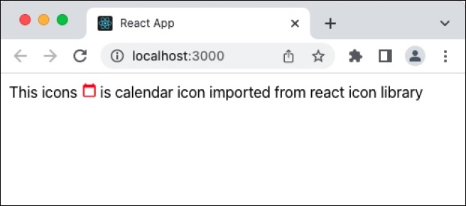
Summary
React icon library helps developer by collecting all kind of icons from different sources and put it in one place and provides it in a simple and easy way.
React - Form Components
React provides form component through third party UI component library. React community provides a large collection of UI / UX components and it is tough to choose the right library for our requirement. Bootstrap UI library is one of the popular choice for the developer and it is extensively used. React Bootstrap (https://react-bootstrap.github.io/) has ported almost all the bootstrap UI components to the React library and it has best support for form component as well.
Let us learn how to use Form component from react-bootstrap library in this chapter.
What is Form component?
Form programming is one of the highlight feature of a web application. It is used to collect information from user in the front-end and then pass it to the server side for further processing. The collected information will be validated in the front-end before sending it to the server. HTML has different input tags like text, checkbox, radio, etc., to collect different type of information from user.
React bootstrap provides nearly all bootstrap based form components. They are as follows −
Form
Form component is used to render the basic html form (form). It is the top most form component. Some of the useful props of the Form component is as follows −
ref (ReactRef) − Ref element to access underlying DOM node.
as (elementType) − Enable to specify element other than *<form>*.
validated (boolean) − To specify that the form is being validated. Toggling the value to true will show the validation styles set in the form.
A simple form component can be used as shown below −
<Form> <!-- Use form control--> </Form>
Form.Control
Form.Control component is used to render various input element through it's type props. Some of the useful props of the Form.Control component is as follows −
ref (ReactRef) − Ref element to access underlying DOM node.
as (elementType) − Enable to specify element other than *<input>*.
disabled (boolean) − Enable / Disable the control element.
htmlSize (number) − Size of the underlying control element.
id (string) − Id of the control element. Uses *controlId* of the parent *Form.Group* component, if not specified here.
IsInValid (boolean) − Enables / Disable the style associated with invalid data.
IsValid (boolean) − Enables / Disable the style associated with valid data.
plaintext (boolean) − Enable / disable the input and render it as plain text. To be used along with *readonly* props.
readOnly (boolean) − Enable / disable the readonly attribute of the control.
size (sm | lg) − Size of the input element.
type (string) − Type of the input element to be rendered.
value (string | arrayOf | number) − Value of the underlying control. Manipulated by *onChange* event and the initial value will be default to *defaultValue* props
bsPrefix (string) − Prefix used to customize the underlying CSS classes.
onChange (boolean) − Callback function to be called when *onChange* event is fired.
A simple form control component can be used as shown below −
<> <Form.Control type="text" size="lg" placeholder="Large text" /> <br /> <Form.Control type="text" placeholder="Normal text" /> <br /> <Form.Control type="text" size="sm" placeholder="Small text" /> </>
Form.Label
Form.Label component is used to render the html label component (). Some of the useful props of the Form.Label component is as follows −
ref (ReactRef) − Ref element to access underlying DOM node.
as (elementType) − Enable to specify element other than *<label>*.
htmlFor (string) − Used to specify the input element for which the particular label is created. If the *htmlFor* is not specified, then it will use *controlId* of the top level *Form.Group* component.
column (boolean | sm | lg) − To render the label using *<Col>* component for layout purpose.
visuallyHidden (boolean) − To visually hide the label and yet allowed to used by assistive technology.
bsPrefix (string) − Prefix used to customize the underlying CSS classes.
Form.Group
Form.Group component is used to group a form control and label. It will be used to layout the control with respect to its label. Some of the useful props of the Form.Group component is as follows −
ref (ReactRef) − Ref element to access underlying DOM node.
as (elementType) − Enable to specify element other than *<form>*.
controlId (string) − Id to refer the group of control and label. It will be used as id for form control inside the group, if the control does not have *Id* props.
A simple form group along with form label can be used as shown below −
<Form.Group controlId="formFile" className="mb-3"> <Form.Label>Upload file</Form.Label> <Form.Control type="file" /> </Form.Group>
Form.Text
Form.Text component is used to show helpful message for the form controls(*). Some of the useful props of the Form* component is as follows −
ref (ReactRef) − Ref element to access underlying DOM node.
as (elementType) − Enable to specify element other than *<form>*.
muted (boolean) − Apply *text-muted* class.
bsPrefix (string) − Prefix used to customize the underlying CSS classes.
A simple form text component can be use as follows −
<Form.Label htmlFor="pwd">Password</Form.Label> <Form.Control type="password" id="pwd" aria-describedby="passwordHelpMessage" /> <Form.Text id="passwordHelpMessage" muted> Please set password within 8 - 12 characters long. Use minimum of 1 digit, 1 special character and 1 capital letter. Try to use strong password. </Form.Text>
Form.Select
Form.Select component is used to render the select element(select). Some of the useful props of the Form.Select component is as follows −
disabled (boolean) − Enable / Disable the control element.
htmlSize (number) − Size of the underlying control element./p>
IsInValid (boolean) − Enables / Disable the style associated with invalid data.
IsValid (boolean) − Enables / Disable the style associated with valid data.
size (sm | lg) − Size of the input element.
value (string | arrayOf | number) − Value of the underlying control. Manipulated by *onChange* event and the initial value will be default to *defaultValue* props.
bsPrefix (string) − Prefix used to customize the underlying CSS classes.
onChange (boolean) − Callback function to be called when *onChange* event is fired.
A simple form select component can be used as shown below −
<Form.Select aria-label="Select category"> <option value="sm">Small</option> <option value="lg">Large</option> <option value="xl">Extra large</option> </Form.Select>
Form.Check
The Form.Check component is used to render the checkboxes () and radio button () in the html form. Some of the useful props of the Form component is as follows −
ref (ReactRef) − Ref element to access underlying DOM node.
as (elementType) − Enable to specify element other than *<input>*
disabled (boolean) − Enable / Disable the control element.
id (string) − Id of the control element. Uses *controlId* of the parent *Form.Group* component, if not specified here.
children (node) −Customize the rendering of the *FormCheck* content.
title (string) − Title attributes for the underlying *FormCheckLabel*
type (radio | checkbox | switch) − Type of the input element to be rendered.
value (string | arrayOf | number) − Value of the underlying control. Manipulated by *onChange* event and the initial value will be default to *defaultValue* props.
label (node) − Label for the control.
feedback (node) − Feedback message to be rendered during validation process.
feedbackTooltip (boolean) − Enable / disable the feedback message to be shown as tooltip.
IsInValid (boolean) − Enables / Disable the style associated with invalid data.
IsValid (boolean) − Enables / Disable the style associated with valid data.
inline (boolean) − Enable / disable the controls to be layout in a horizontal manner.
reverse (boolean) − Enable / disable the reverse layout of the children.
bsPrefix (string) − Prefix used to customize the underlying CSS classes.
bsSwitchPrefix (string) − Prefix used to customize the underlying CSS classes for switch control.
A simple form check component can be used as shown below −
<Form.Group controlId="gender" className="mb-3">
<Form.Label>Select your gender</Form.Label>
<div className="mb-3">
<Form.Check
type='radio'
id='Male'
label='Male'
name='gender'
/>
<Form.Check
type='radio'
id='Female'
label='Female'
name='gender'
/>
</div>
</Form.Group>
Here, Form.Check is grouped under Form.Group component.
Form.Check.Label
Form.Check.Label component is used to render the label for the underlying input for the Form.Check component. It will included as the children of the Form.Check component. Some of the useful props of the Form.Check.Input component is as follows −
htmlFor (string) − Used to specify the input element for which the particular label is created. If the *htmlFor* is not specified, then it will use *controlId* of the top level *Form.Group* component.
bsPrefix (string) − Prefix used to customize the underlying CSS classes
Form.Check.Input
Form.Check.Input component is used to render the underlying input for the Form.Check component. It will included as the children of the Form.Check component. Some of the useful props of the Form.Check.Input component is as follows −
as (elementType) − Enable to specify element other than *<input>*.
id (string) − Id of the control element. Uses *controlId* of the parent .*Form.Group* component, if not specified here.
type (radio | checkbox | switch) − Type of the input element to be rendered.
IsInValid (boolean) − Enables / Disable the style associated with invalid data.
IsValid (boolean) − Enables / Disable the style associated with valid data.
type (radio | checkbox) − Type of the input element to be rendered.
bsPrefix (string) − Prefix used to customize the underlying CSS classes.
A simple form check input and label component can be used as shown below −
<Form.Group controlId="gender" className="mb-3">
<Form.Label>Select your favorite programming language</Form.Label>
<div className="mb-3">
<Form.Check
type='checkbox'
id='java-lang'
name='language'
>
<Form.Check.Input type='checkbox' isValid />
<Form.Check.Label>Java</Form.Check.Label>
</Form.Check>
<Form.Check
type='checkbox'
id='c-lang'
name='language'
>
<Form.Check.Input type='checkbox' isValid />
<Form.Check.Label>C</Form.Check.Label>
</Form.Check>
<Form.Check
type='checkbox'
id='javascript-lang'
name='language'
>
<Form.Check.Input type='checkbox' isValid />
<Form.Check.Label>Javascript</Form.Check.Label>
</Form.Check>
</div>
</Form.Group>
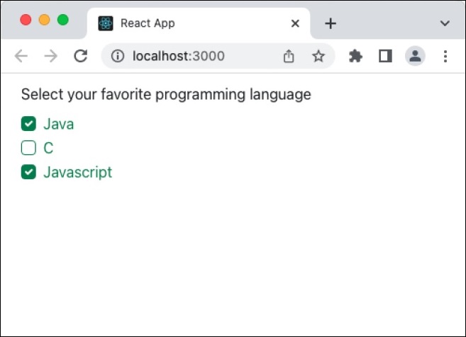
Form.Range
Form.Range component is used to render the range input control in the html form. Some of the useful props of the Form.Range component is as follows −
disabled (boolean) − Enable / Disable the control element.
id (string) − Id of the control element. Uses *controlId* of the parent *Form.Group* component, if not specified here.
value (string | arrayOf | number) − Value of the underlying control. Manipulated by *onChange* event and the initial value will be default to *defaultValue* props.
bsPrefix (string) − Prefix used to customize the underlying CSS classes.
A simple form range component can be used as shown below −
<Form.Label>Select by range</Form.Label> <Form.Range value="25"/>
InputGroup
InputGroup component is used to group multiple input & text component and produce new advanced components in a easy and simple way. Some of the useful props of the InputGroup component is as follows −
as (elementType) − Enable to specify element other than *<div>*.
hasValidation (boolean) − To be used when the input group contains both input and feedback elements.
size (sm | lg) − Size of the control. It will be handled internally by the component.
bsPrefix (string) − Prefix used to customize the underlying CSS classes.
InputGroup.Text
InputGroup.Text component is used to render text inside the InputGroup.Text component. Some of the useful props of the Form component is as follows −
id (string) − Id of the node.
A simple input group and text component can be used as shown below −
<Form.Group controlId="email" className="mb-3">
<Form.Label>Enter your email address</Form.Label>
<InputGroup className="mb-3">
<Form.Control
aria-label="Email address"
aria-describedby="domain"
/>
<InputGroup.Text id="domain">@tutorialspoint.com</InputGroup.Text>
</InputGroup>
</Form.Group>
Applying Form component
First of all, create a new react application and start it using below command.
create-react-app myapp cd myapp npm start
Next, install the bootstrap and react-bootstrap library using below command,
npm install --save bootstrap react-bootstrap
Next, open App.css (src/App.css) and remove all CSS classes.
// remove all css classes
Next, create a simple form component, SimpleForm (src/Components/SimpleForm.js) and render a form as shown below −
import { Form, Button } from 'react-bootstrap';
function SimpleForm() {
return (
<Form>
<Form.Group className="mb-3" controlId="email">
<Form.Label>Email address</Form.Label>
<Form.Control type="email" placeholder="Enter email" />
<Form.Text className="text-muted">
This email address will be used for communication purpose.
</Form.Text>
</Form.Group>
<Form.Group className="mb-3" controlId="password">
<Form.Label>Password</Form.Label>
<Form.Control type="password" placeholder="Password" />
</Form.Group>
<Form.Group className="mb-3" controlId="formBasicCheckbox">
<Form.Check type="checkbox" label="Save password" />
</Form.Group>
<Button variant="primary" type="submit">
Submit
</Button>
</Form>
);
}
export default SimpleForm;
Here,
Used Form.Control with type text and password to get user name and password respectively.
Used Button component to submit the form
Used Form.Group to group form control component and its related label component
Next, open App component (src/App.js), import the bootstrap css and update the content with bootstrap button as shown below −
import './App.css'
import "bootstrap/dist/css/bootstrap.min.css";
import SimpleForm from './Components/SimpleForm'
function App() {
return (
<div className="container">
<div style={{ padding: "10px" }}>
<div>
<SimpleForm />
</div>
</div>
</div>
);
}
export default App;
Here,
Imported the bootstrap classes using import statement
Rendered our new SimpleForm component.
Included the App.css style
Finally, open the application in the browser and check the final result. Form will be rendered as shown below −
Summary
Bootstrap form component provides all options necessary to design a good looking form. It exploits the bootstrap CSS framework and provides easy to use props to do heavy customization of the form.
React - Reference API
React is a JavaScript library for building user interfaces. React allows developers to create interactive UI components efficiently. So this reference attempts to document every built-in function, hooks, components, and other essential functionalities provided by React. In this tutorial we will use the React@19 version.
In the React, functions are organized into two main sections based on their functionalities and usage. Here are the main functions in React
Built-in Hooks
In this we have included all the built-in hooks which can be used with different React features in your components.
| S.No | Function & Description |
|---|---|
| 1 |
use() Lets us read the value of a resource. |
| 2 |
useDebugValue() Add a label to a custom Hook. |
| 3 |
useDeferredValue() Lets us defer updating a portion of the User Interface. |
| 4 |
useId() Use for generating unique IDs. |
| 5 |
useImperativeHandle() Helps us connect with a child component. |
| 6 |
useInsertionEffect() Allows us for inserting elements into the DOM. |
| 7 |
useLayoutEffect() Used to perform the layout measurements. |
| 8 |
useSyncExternalStore() Lets us subscribe to an external store. |
| 9 |
useTransition() Help us to update the state without blocking the UI. |
Built-in Component
In this we have documented components you can use in your code and other components as well.
| S.No | Function & Description |
|---|---|
| 1 |
<Suspense> Display a fallback until its children have finished loading. |
Built-in React APIs
There are some built-in APIs React provides which are useful for defining components.
| S.No | Function & Description |
|---|---|
| 1 |
cache() Cache the result of a data fetch. |
| 2 |
createContext() It creates a context that components can provide. |
| 3 |
lazy() Allows us to delay loading a component's code. |
| 4 |
startTransition() Update the state without blocking the UI. |
Directives
These are the instructions for bundlers compatible with React Server Components.
| S.No | Function & Description |
|---|---|
| 1 |
use client Used to mark what code runs on the client. |
| 2 |
use server It is used to mark server-side functions. |
Built-in React DOM Hooks
There are some built-in React DOM hooks which run in the browser DOM environment. These Hooks are not best fit for non browser environments like Android, iOS, and Windows applications.
| S.No | Function & Description |
|---|---|
| 1 |
useFormState() Update state as per the result of a form action. |
| 2 |
useFormStatus() Gives status information of the last form submission. |
Event Handling Functions
In this section we have included some event handling functions that supports all built−in HTML and SVG components.
| S.No | Function & Description |
|---|---|
| 1 |
event object Acts as a link between our code and the browser events. |
| 2 |
AnimationEvent handler An event handler type for the CSS animation events. |
| 3 |
ClipboardEvent handler It is an event handler type for the Clipboard API events. |
| 4 |
CompositionEvent handler It is an event handler type for the input method editor events. |
| 5 |
DragEvent handler Event handler type for the HTML Drag and Drop API events. |
| 6 |
FocusEvent handler An event handler type for the focus events. |
| 7 |
InputEvent handler An event handler type for the onBeforeInput event. |
| 8 |
KeyboardEvent handler Handles events for keyboard events. |
| 9 |
MouseEvent handler An event handler type for mouse events. |
| 10 |
PointerEvent handler It is an event handler type for pointer events. |
| 11 |
TouchEvent handler Event handler type for touch events. |
| 12 |
TransitionEvent handler An event handler type for the CSS transition events. |
| 13 |
UIEvent handler Event handler type for generic User Interface events. |
| 14 |
WheelEvent handler An event handler type for the onWheel event. |
React DOM APIs
The react-dom package contains methods that are only supported for the web applications. In this section we have included APIs, Client APIs and server APIs.
| S.No | Function & Description |
|---|---|
| 1 |
createPortal() Get the current Axes instance. |
| 2 |
flushSync() Create a new Axes instance. |
| 3 |
findDOMNode() Find the HTML DOM Node. |
| 4 |
createRoot() Integrate React with web page. |
| 5 |
hydrateRoot() Check if a figure with a given figure number exists. |
| 6 |
renderToReadableStream() Create a new figure. |
| 7 |
renderToString() Get the current figure. |
| 8 |
renderToStaticMarkup() Get the labels of all figures. |
| 9 |
cloneElement() Set the current Axes instance to a given axes. |
| 10 |
isValidElement() Add contour labels to a contour plot. |
| 11 |
PureComponent It is an enhanced version of the regular Component. |
Other Class components
These components are the base class for the React components defined as JavaScript classes. Class components are still supported by React so we have included them in the below section.
| S.No | Function & Description |
|---|---|
| 1 |
componentDidCatch() Used to call when some child component throws an error. |
| 2 |
componentDidUpdate() Used to call immediately after component has been re−rendered. |
| 3 |
componentWillUnmount() Call it before your component is removed. |
| 4 |
forceUpdate() Forces a component to re-render. |
| 5 |
getChildContext() Specify the values for the legacy context. |
| 6 |
getSnapshotBeforeUpdate() Enables your component to capture some information. |
| 7 |
static contextType Lets us specify which legacy context is consumed. |
| 8 |
static defaultProps Used to set the default props for the class. |
| 9 |
static propTypes To declare the types of the props accepted by your component. |
| 10 |
static getDerivedStateFromError() Call it when a child component throws an error during rendering. |
| 11 |
static getDerivedStateFromProps() Used to call it right before calling render. |
| 12 |
UNSAFE_componentWillMount() It is a lifecycle method that runs during server rendering. |
| 13 |
UNSAFE_componentWillReceiveProps() Used to call when the component receives new props. |
| 14 |
UNSAFE_componentWillUpdate() Call it before rendering with the new props or state. |
| 15 |
createElement() Create a React element for an alternative to writing JSX. |
| 16 |
createRef() Creates a ref object to contain arbitrary value. |
Test Utilities
Test Utilities are used to make it easy to test React components in the testing framework of your choice. In this section we have included some function to do perform testing.
| S.No | Function & Description |
|---|---|
| 1 |
act() To wrap code that interacts with component. |
| 2 |
mockComponent() To create a mock version of a React component. |
| 3 |
isElement() Checks if a given object is a React element. |
| 4 |
isElementOfType() Checks if a given object is an element of a specific type. |
| 5 |
isDOMComponent() Checks if a given object is a DOM component. |
| 6 |
isCompositeComponent() Checks if a given object is a composite component. |
| 7 |
isCompositeComponentWithType() Checks given object is a composite component of a specific type. |
| 8 |
findAllInRenderedTree() Finds all rendered instances of a component in tree. |
| 9 |
scryRenderedDOMComponentsWithClass() Finds all DOM components with a specific class. |
| 10 |
findRenderedDOMComponentWithClass() Finds the first DOM component with a specific class in the rendered tree. |
| 11 |
scryRenderedDOMComponentsWithTag() Finds all DOM components with a specific tag. |
| 12 |
findRenderedDOMComponentWithTag() Finds the first DOM component with a specific tag. |
| 13 |
scryRenderedComponentsWithType() Finds all composite components of a specific type. |
| 14 |
findRenderedComponentWithType() Finds the first composite component of a specific type. |
| 15 |
renderIntoDocument() Renders a React component into the DOM. |
| 16 |
Simulate() Used to simulate user interactions. |
Test Renderer
The Test Renderer is a utility for rendering React components to pure JavaScript objects, without the need for a DOM. In this section we have included some functions for this utility.
| S.No | Function & Description |
|---|---|
| 1 |
TestRenderer.create() Renders a React component in a test renderer instance. |
| 2 |
TestRenderer.act() Executes interactions with the test renderer. |
| 3 |
testRenderer.toJSON() Returns a JSON representation of the rendered component tree. |
| 4 |
testRenderer.toTree() Returns a tree structure showing the rendered component tree. |
| 5 |
testRenderer.update() Manually triggers an update on the rendered component. |
| 6 |
testRenderer.unmount() Unmounts the rendered component. |
| 7 |
testRenderer.getInstance() Returns the instance of the root component. |
| 8 |
testRenderer.root() Provides access to the root node of the component tree. |
| 9 |
testInstance.find() Finds nodes in the component tree. |
| 10 |
testInstance.findByType() Finds nodes in the component tree as per their type. |
| 11 |
testInstance.findByProps() Finds nodes in the component tree as per their props. |
| 12 |
testInstance.findAll() Finds all nodes in the component tree. |
| 13 |
testInstance.findAllByType() Finds all nodes in the component tree based on their type. |
| 14 |
testInstance.findAllByProps() Finds all nodes as per their props. |
| 15 |
testInstance.instance Represents the actual instance of the component. |
| 16 |
testInstance.type Represents the type of the component. |
| 17 |
testInstance.props Represents the props passed to the component. |
| 18 |
testInstance.parent Represents the parent node in the component tree. |
| 19 |
testInstance.children Shows the children nodes in the component tree. |
