- React - Home
- React - Introduction
- React - Roadmap
- React - Installation
- React - Features
- React - Advantages & Disadvantages
- React - Architecture
- React - Creating a React Application
- React - JSX
- React - Components
- React - Nested Components
- React - Using Newly Created Components
- React - Component Collection
- React - Styling
- React - Properties (props)
- React - Creating Components using Properties
- React - props Validation
- React - Constructor
- React - Component Life Cycle
- React - Event management
- React - Creating an Event−Aware Component
- React - Introduce Events in Expense Manager APP
- React - State Management
- React - State Management API
- React - Stateless Component
- React - State Management Using React Hooks
- React - Component Life Cycle Using React Hooks
- React - Layout Component
- React - Pagination
- React - Material UI
- React - Http Server
- React - Http client programming
- React - Form Programming
- React - Forms
- React - Controlled Component
- React - Uncontrolled Component
- React - Formik
- React - Conditional Rendering
- React - Lists
- React - Keys
- React - Routing
- React - Redux
- React - Animation
- React - Bootstrap
- React - Map
- React - Table
- React - Managing State Using Flux
- React - Testing
- React - CLI Commands
- React - Building and Deployment
- React - Example
- Hooks
- React - Introduction to Hooks
- React - Using useState
- React - Using useEffect
- React - Using useContext
- React - Using useRef
- React - Using useReducer
- React - Using useCallback
- React - Using useMemo
- React - Custom Hooks
- React Advanced
- React - Accessibility
- React - Code Splitting
- React - Context
- React - Error Boundaries
- React - Forwarding Refs
- React - Fragments
- React - Higher Order Components
- React - Integrating With Other Libraries
- React - Optimizing Performance
- React - Profiler API
- React - Portals
- React - React Without ES6 ECMAScript
- React - React Without JSX
- React - Reconciliation
- React - Refs and the DOM
- React - Render Props
- React - Static Type Checking
- React - Strict Mode
- React - Web Components
- Additional Concepts
- React - Date Picker
- React - Helmet
- React - Inline Style
- React - PropTypes
- React - BrowserRouter
- React - DOM
- React - Carousel
- React - Icons
- React - Form Components
- React - Reference API
- React Useful Resources
- React - Quick Guide
- React - Cheatsheet
- React - Axios CheatSheet
- React - Useful Resources
- React - Discussion
React - Portals
Portals provides a way for a component to render its children into a DOM node outside its own DOM hierarchy. Portal can be used in model dialog, popups, tooltip, etc., where the parent (the rendering component) and child DOM node (model dialogs) are preferred to be rendered in different DOM node.
Let us learn how portal works and how to apply it in our application in this chapter.
Concept and usage of portals
Let us consider that we have two DOM node in the main document as shown below −
<div id='root'></div>
<div id='modalRoot'></div>
Here, root DOM node will be attached with main react component. modalRoot will be used by the react application whenever it needs to show a modal dialog by attaching the modal dialog into the modelRoot DOM node instead of rendering the model dialog inside its own DOM element.
This will help to separate the modal dialog from the actual application. The separation of modal dialog from its parent DOM element will preserve it from the styling of its parent DOM element. The styling can be applied separately as modal dialogs, tooltips, etc., differs from its parent with regard to styling.
React provides a special method createPortal in ReactDOM package to create a portal. The signature of the method is as follows −
ReactDOM.createPortal(child, container)
Here,
child is the model dialogs, tooltips, etc., rendered by the parent component.
render() {
   return ReactDOM.createPortal(
      this.props.children, // modal dialog / tooltips
      domNode // dom outside the component
   );
}
container is the DOM element outside the parent DOM node (domNode in above example)
Applying portals
Let us create a new react application to learn how to apply portals in this section.
First of all, create a new react application and start it using below command.
create-react-app myapp
cd myapp
npm start
App.css
Next, open App.css (src/App.css) and remove all CSS classes and include CSS for modal dialogs.
.modal {
   position: absolute;
   top: 0;
   bottom: 0;
   left: 0;
   right: 0;
   display: grid;
   justify-content: center;
   align-items: center;
   background-color: rgba(0,0,0,0.2);
}
.modalContent {
   padding: 20px;
   background-color: #fff;
   border-radius: 2px;
   display: inline-block;
   min-height: 300px;
   margin: 1rem;
   position: relative;
   min-width: 300px;
   box-shadow: 0 3px 6px rgba(0,0,0,0.16), 0 3px 6px rgba(0,0,0,0.23);
   justify-self: center;
}
index.html
Next, open index.html (public/index.html) and add a DOM node to support portals
<!DOCTYPE html>
<html lang="en">
   <head>
      <link rel="icon" href="%PUBLIC_URL%/favicon.ico" />
      <link rel="apple-touch-icon" href="%PUBLIC_URL%/logo192.png" />
      <link rel="manifest" href="%PUBLIC_URL%/manifest.json" />
   </head>
   <body>
      <noscript>You need to enable JavaScript to run this app.</noscript>
      <div style="padding: 10px;">
         <div id="root"></div>
      </div>
      <div id="modalRoot"></div>
   </body>
</html>
SimplePortal.js
Next, create a simple component, SimplePortal (src/components/SimplePortal.js) and render a modal dialog as shown below −
import React from "react";
import PortalReactDOM from 'react-dom'
const modalRoot = document.getElementById('modalRoot')
class SimplePortal extends React.Component {
   constructor(props) {
      super(props);
   }
   render() {
      return PortalReactDOM.createPortal(
         <div
            className="modal"
            onClick={this.props.onClose}
            >
            <div className="modalContent">
               {this.props.children}
               <hr />
               <button onClick={this.props.onClose}>Close</button>
            </div>
         </div>,
         modalRoot,
      )
   }
}
export default SimplePortal;
Here,
createPortal to create a new portal and renders a modal dialog.
Content of the modal dialog are retrieved from children of the component through this.props.children
close button actions are handled through props and will be handled by the parent component.
App.js
Next, open App component (src/App.js), and use SimplePortal component as shown below −
import './App.css'
import React from 'react';
import SimplePortal from './components/SimplePortal'
class App extends React.Component {
   constructor(props) {
      super(props);
      this.state = { modal: false }
   }
   handleOpenModal = () => this.setState({ modal: true })
   handleCloseModal = () => this.setState({ modal: false })
   render() {
      return (
         <div className="container">
            <div style={{ padding: "10px" }}>
               <div>
                  <div><p>Main App</p></div>
                  <div>
                     <button onClick={this.handleOpenModal}>
                        Show Modal
                     </button>
                     { this.state.modal ? (
                        <SimplePortal onClose={this.handleCloseModal}>
                           Hi, I am the modal dialog created using portal.
                        </SimplePortal>
                     ) : null}
                  </div>
               </div>
            </div>
         </div>
      );
   }
}
export default App;
Here,
Imported SimplePortal component
Added a button to open the modal dialog
Created a handler to open the modal dialog
Created a handler to close the modal dialog and passed it to SimplePortal component through onClose props.
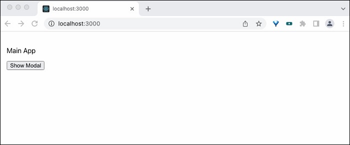
Finally, open the application in the browser and check the final result.
Summary
React portal provides an easy way to access and handle DOM outside the component. It enables the event bubbling across the different DOM nodes without any extra effort.
