- React - Home
- React - Introduction
- React - Roadmap
- React - Installation
- React - Features
- React - Advantages & Disadvantages
- React - Architecture
- React - Creating a React Application
- React - JSX
- React - Components
- React - Nested Components
- React - Using Newly Created Components
- React - Component Collection
- React - Styling
- React - Properties (props)
- React - Creating Components using Properties
- React - props Validation
- React - Constructor
- React - Component Life Cycle
- React - Event management
- React - Creating an Event−Aware Component
- React - Introduce Events in Expense Manager APP
- React - State Management
- React - State Management API
- React - Stateless Component
- React - State Management Using React Hooks
- React - Component Life Cycle Using React Hooks
- React - Layout Component
- React - Pagination
- React - Material UI
- React - Http Server
- React - Http client programming
- React - Form Programming
- React - Forms
- React - Controlled Component
- React - Uncontrolled Component
- React - Formik
- React - Conditional Rendering
- React - Lists
- React - Keys
- React - Routing
- React - Redux
- React - Animation
- React - Bootstrap
- React - Map
- React - Table
- React - Managing State Using Flux
- React - Testing
- React - CLI Commands
- React - Building and Deployment
- React - Example
- Hooks
- React - Introduction to Hooks
- React - Using useState
- React - Using useEffect
- React - Using useContext
- React - Using useRef
- React - Using useReducer
- React - Using useCallback
- React - Using useMemo
- React - Custom Hooks
- React Advanced
- React - Accessibility
- React - Code Splitting
- React - Context
- React - Error Boundaries
- React - Forwarding Refs
- React - Fragments
- React - Higher Order Components
- React - Integrating With Other Libraries
- React - Optimizing Performance
- React - Profiler API
- React - Portals
- React - React Without ES6 ECMAScript
- React - React Without JSX
- React - Reconciliation
- React - Refs and the DOM
- React - Render Props
- React - Static Type Checking
- React - Strict Mode
- React - Web Components
- Additional Concepts
- React - Date Picker
- React - Helmet
- React - Inline Style
- React - PropTypes
- React - BrowserRouter
- React - DOM
- React - Carousel
- React - Icons
- React - Form Components
- React - Reference API
- React Useful Resources
- React - Quick Guide
- React - Cheatsheet
- React - Axios CheatSheet
- React - Useful Resources
- React - Discussion
React - Date Picker
React provides form component through third party UI component library. React community provides a large collection of UI / UX components and it is tough to choose the right library for our requirement.
Bootstrap UI library is one of the popular choice for the developer and it is extensively used. React Bootstrap (https://react-bootstrap.github.io/) has ported almost all the bootstrap UI components to the React library and it has best support for date picker component as well.
Let us learn how to use date picker component from react-bootstrap library in this chapter.
What is date picker?
Date picker allows the developer to easily choose a date instead of entering it through text box with correct formatting details. HTML input element has type attributes to refer the type of data to be entered into the element. One of the type is date. Setting the type in a input element will enable the date picker.
<input type="date">
React bootstrap provides Form.Control component to create various input elements. Developer can use it to create date picker control. Some of the useful props of the Form.Control are as follows −
ref (ReactRef) − Ref element to access underlying DOM node
as (elementType) − Enable to specify element other than *<input>*
disabled (boolean) − Enable / Disable the control element
htmlSize (number) − Size of the underlying control element
id (string) − Id of the control element. Uses *controlId* of the parent *Form.Group* component, if not specified here.
IsInValid (boolean) − Enables / Disable the style associated with invalid data
IsValid (boolean) − Enables / Disable the style associated with valid data
plaintext (boolean) − Enable / disable the input and render it as plain text. To be used along with *readonly* props
readOnly (boolean) − Enable / disable the readonly attribute of the control
size (sm | lg) − Size of the input element
type (string) − Type of the input element to be rendered
value (string | arrayOf | number) − Value of the underlying control. Manipulated by *onChange* event and the initial value will be default to *defaultValue* props
bsPrefix (string) − Prefix used to customize the underlying CSS classes
onChange (boolean) − Callback function to be called when *onChange* event is fired
A simple date control component can be used as shown below −
<Form.Group className="mb-3" controlId="password">
   <Form.Label>Date of birth</Form.Label>
   <Form.Control type="date" />
</Form.Group>
Applying Date picker component
First of all, create a new react application and start it using below command.
create-react-app myapp
cd myapp
npm start
Next, install the bootstrap library using below command,
npm install --save bootstrap react-bootstrap
Next, open App.css (src/App.css) and remove all the CSS classes.
// remove css classes
SimpleDatePicker.js
Next, create a simple date component, SimpleDatePicker (src/Components/SimpleDatePicker.js) and render a form as shown below −
import { Form, Button } from 'react-bootstrap';
function SimpleDatePicker() {
   return (
      <Form>
         <Form.Group className="mb-3" controlId="name">
            <Form.Label>Name</Form.Label>
            <Form.Control type="name" placeholder="Enter your name" />
         </Form.Group>
         <Form.Group className="mb-3" controlId="password">
            <Form.Label>Date of birth</Form.Label>
            <Form.Control type="date" />
         </Form.Group>
         <Button variant="primary" type="submit">
            Submit
         </Button>
      </Form>
   );
}
export default SimpleDatePicker;
Here we have,
Used Form.Control with type date to create date picker control.
Used Form component to create a basic form component.
Used Form.Group to group form control and label.
App.js
Next, open App component (src/App.js), import the bootstrap css and render the date picker as shown below −
import './App.css'
import "bootstrap/dist/css/bootstrap.min.css";
import SimpleDatePicker from './Components/SimpleDatePicker'
function App() {
   return (
      <div className="container">
         <div style={{ padding: "10px" }}>
            <div>
               <SimpleDatePicker />
            </div>
         </div>
      </div>
   );
}
export default App;
Here,
Imported the bootstrap classes using import statement
Rendered our new SimpleDatePicker component.
Included the App.css style
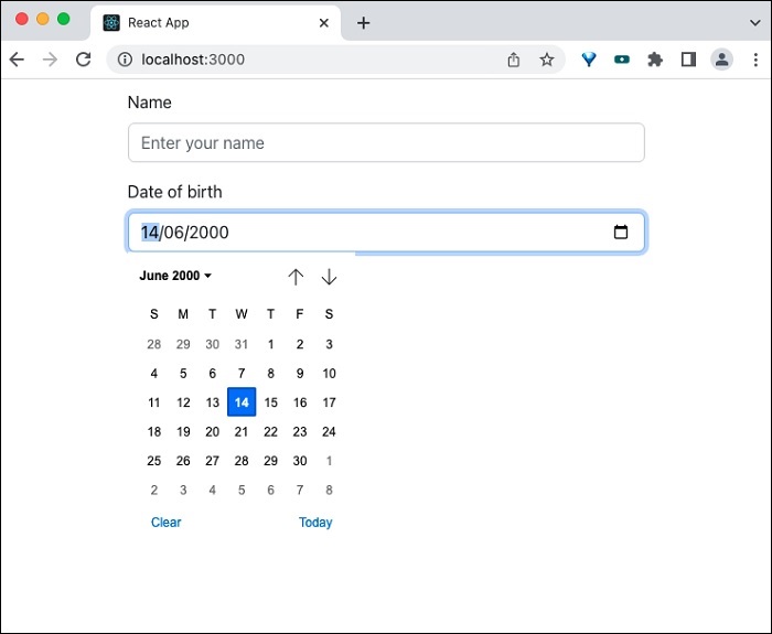
Finally, open the application in the browser and check the final result. Date picker will be rendered as shown below −
Summary
React Bootstrap date picker component provides necessary options to create date picker form control.
