- React - Home
- React - Introduction
- React - Roadmap
- React - Installation
- React - Features
- React - Advantages & Disadvantages
- React - Architecture
- React - Creating a React Application
- React - JSX
- React - Components
- React - Nested Components
- React - Using Newly Created Components
- React - Component Collection
- React - Styling
- React - Properties (props)
- React - Creating Components using Properties
- React - props Validation
- React - Constructor
- React - Component Life Cycle
- React - Event management
- React - Creating an Event−Aware Component
- React - Introduce Events in Expense Manager APP
- React - State Management
- React - State Management API
- React - Stateless Component
- React - State Management Using React Hooks
- React - Component Life Cycle Using React Hooks
- React - Layout Component
- React - Pagination
- React - Material UI
- React - Http Server
- React - Http client programming
- React - Form Programming
- React - Forms
- React - Controlled Component
- React - Uncontrolled Component
- React - Formik
- React - Conditional Rendering
- React - Lists
- React - Keys
- React - Routing
- React - Redux
- React - Animation
- React - Bootstrap
- React - Map
- React - Table
- React - Managing State Using Flux
- React - Testing
- React - CLI Commands
- React - Building and Deployment
- React - Example
- Hooks
- React - Introduction to Hooks
- React - Using useState
- React - Using useEffect
- React - Using useContext
- React - Using useRef
- React - Using useReducer
- React - Using useCallback
- React - Using useMemo
- React - Custom Hooks
- React Advanced
- React - Accessibility
- React - Code Splitting
- React - Context
- React - Error Boundaries
- React - Forwarding Refs
- React - Fragments
- React - Higher Order Components
- React - Integrating With Other Libraries
- React - Optimizing Performance
- React - Profiler API
- React - Portals
- React - React Without ES6 ECMAScript
- React - React Without JSX
- React - Reconciliation
- React - Refs and the DOM
- React - Render Props
- React - Static Type Checking
- React - Strict Mode
- React - Web Components
- Additional Concepts
- React - Date Picker
- React - Helmet
- React - Inline Style
- React - PropTypes
- React - BrowserRouter
- React - DOM
- React - Carousel
- React - Icons
- React - Form Components
- React - Reference API
- React Useful Resources
- React - Quick Guide
- React - Cheatsheet
- React - Axios CheatSheet
- React - Useful Resources
- React - Discussion
React - Table
React provides table component through third party UI component library. React community provides a large collection of UI / UX components and it is tough to choose the right library for our requirement.
Bootstrap UI library is one of the popular choice for the developer and it is extensively used. React Bootstrap (https://react-bootstrap.github.io/) has ported almost all the bootstrap UI components to the React library and it has best support for Table component as well.
Let us learn how to use Table component from react-bootstrap library in this chapter.
Table component
Table component allows the developer to create simple table with bootstrap UI design in a web application. Table component accepts table tags as shown below −
thead
tbody
tfoot
Table component accepts a small set of props to customize the table component and they are follows −
bordered (boolean) − Adds border to all sides of the table and cell.
borderless (boolean) −Removes border to all sides of the table and cell.
hover (boolean) − Enables a hover state for each row in the table (tbody).
responsive (boolean | string) − Enables vertical scrolling for small devices. sm | md | lg | xl option enables the responsive for relevant devices. For example, sm will be enabled only when the device resolution is very small.
size (string) − Enables compact rendering of the table. Possible options are sm, md, etc.,
striped (boolean | string) − Enables the zebra stripping to all table rows. columns option adds zebra stripping to columns as well.
variant (dark) Enables dark variant when dark value is used.
bsPrefix (string) − Prefix used to customize the underlying CSS classes.
Applying Table component
First of all, create a new react application and start it using below command.
create-react-app myapp
cd myapp
npm start
Next, install the bootstrap and react-bootstrap library using below command,
npm install --save bootstrap react-bootstrap
Next, open App.css (src/App.css) and remove all CSS classes.
// remove all css classes
Next, create a simple table component, SimpleTable (src/Components/SimpleTable.js) and render a table as shown below −
import { Table } from 'react-bootstrap';
function SimpleTable() {
   return (
      <Table striped bordered hover>
         <thead>
            <tr>
               <th>#</th>
               <th>Name</th>
               <th>Age</th>
               <th>Email</th>
            </tr>
         </thead>
         <tbody>
            <tr>
               <td>1</td>
               <td>John</td>
               <td>25</td>
               <td>john.example@tutorialspoint.com</td>
            </tr>
            <tr>
               <td>1</td>
               <td>Peter</td>
               <td>15</td>
               <td>peter.example@tutorialspoint.com</td>
            </tr>
            <tr>
               <td>1</td>
               <td>Olivia</td>
               <td>23</td>
               <td>olivia.example@tutorialspoint.com</td>
            </tr>
         </tbody>
      </Table>
   );
}
export default SimpleTable;
Here we have,
Used striped props to create zebra tables.
Used bordered props to enable border around the table and cells.
Used hover props to enable hover state.
Next, open App component (src/App.js), import the bootstrap css and update the content with bootstrap button as shown below −
import './App.css'
import "bootstrap/dist/css/bootstrap.min.css";
import SimpleTable from './Components/SimpleTable'
function App() {
   return (
      <div className="container">
         <div style={{ padding: "10px" }}>
            <div>
               <SimpleTable />
            </div>
         </div>
      </div>
   );
}
export default App;
Here we have,
Imported the bootstrap classes using import statement.
Rendered our new SimpleTable component.
Included the App.css style.
Finally, open the application in the browser and check the final result. Table component will be rendered as shown below −
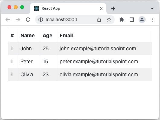
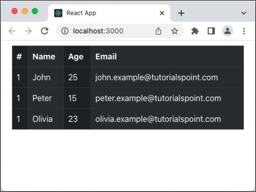
Add dark variant and column strip
Let us apply dark variant and column strip option in our table component and see how it updates the table design.
First of all, open our carousel application and update the SimpleCarousel component as shown below −
import { Table } from 'react-bootstrap';
function SimpleTable() {
   return (
      <Table bordered hover striped="columns" variant="dark">
      // ...
Here we have,
Used striped props with columns to enable column based zebra stripping as well.
Used variant props with dark option to enable dark variant of the table design.
Next, open the application in the browser and check the final result. Table component will be rendered with column strip and dark variant as shown below −
Summary
Bootstrap table component provides all necessary options to design a table in a simple, intuitive and flexible manner.
