- React - Home
- React - Introduction
- React - Roadmap
- React - Installation
- React - Features
- React - Advantages & Disadvantages
- React - Architecture
- React - Creating a React Application
- React - JSX
- React - Components
- React - Nested Components
- React - Using Newly Created Components
- React - Component Collection
- React - Styling
- React - Properties (props)
- React - Creating Components using Properties
- React - props Validation
- React - Constructor
- React - Component Life Cycle
- React - Event management
- React - Creating an Event−Aware Component
- React - Introduce Events in Expense Manager APP
- React - State Management
- React - State Management API
- React - Stateless Component
- React - State Management Using React Hooks
- React - Component Life Cycle Using React Hooks
- React - Layout Component
- React - Pagination
- React - Material UI
- React - Http Server
- React - Http client programming
- React - Form Programming
- React - Forms
- React - Controlled Component
- React - Uncontrolled Component
- React - Formik
- React - Conditional Rendering
- React - Lists
- React - Keys
- React - Routing
- React - Redux
- React - Animation
- React - Bootstrap
- React - Map
- React - Table
- React - Managing State Using Flux
- React - Testing
- React - CLI Commands
- React - Building and Deployment
- React - Example
- Hooks
- React - Introduction to Hooks
- React - Using useState
- React - Using useEffect
- React - Using useContext
- React - Using useRef
- React - Using useReducer
- React - Using useCallback
- React - Using useMemo
- React - Custom Hooks
- React Advanced
- React - Accessibility
- React - Code Splitting
- React - Context
- React - Error Boundaries
- React - Forwarding Refs
- React - Fragments
- React - Higher Order Components
- React - Integrating With Other Libraries
- React - Optimizing Performance
- React - Profiler API
- React - Portals
- React - React Without ES6 ECMAScript
- React - React Without JSX
- React - Reconciliation
- React - Refs and the DOM
- React - Render Props
- React - Static Type Checking
- React - Strict Mode
- React - Web Components
- Additional Concepts
- React - Date Picker
- React - Helmet
- React - Inline Style
- React - PropTypes
- React - BrowserRouter
- React - DOM
- React - Carousel
- React - Icons
- React - Form Components
- React - Reference API
- React Useful Resources
- React - Quick Guide
- React - Cheatsheet
- React - Axios CheatSheet
- React - Useful Resources
- React - Discussion
React - Form Components
React provides form component through third party UI component library. React community provides a large collection of UI / UX components and it is tough to choose the right library for our requirement. Bootstrap UI library is one of the popular choice for the developer and it is extensively used. React Bootstrap (https://react-bootstrap.github.io/) has ported almost all the bootstrap UI components to the React library and it has best support for form component as well.
Let us learn how to use Form component from react-bootstrap library in this chapter.
What is Form component?
Form programming is one of the highlight feature of a web application. It is used to collect information from user in the front-end and then pass it to the server side for further processing. The collected information will be validated in the front-end before sending it to the server. HTML has different input tags like text, checkbox, radio, etc., to collect different type of information from user.
React bootstrap provides nearly all bootstrap based form components. They are as follows −
Form
Form component is used to render the basic html form (form). It is the top most form component. Some of the useful props of the Form component is as follows −
ref (ReactRef) − Ref element to access underlying DOM node.
as (elementType) − Enable to specify element other than *<form>*.
validated (boolean) − To specify that the form is being validated. Toggling the value to true will show the validation styles set in the form.
A simple form component can be used as shown below −
<Form>
   <!-- Use form control-->
</Form>
Form.Control
Form.Control component is used to render various input element through it's type props. Some of the useful props of the Form.Control component is as follows −
ref (ReactRef) − Ref element to access underlying DOM node.
as (elementType) − Enable to specify element other than *<input>*.
disabled (boolean) − Enable / Disable the control element.
htmlSize (number) − Size of the underlying control element.
id (string) − Id of the control element. Uses *controlId* of the parent *Form.Group* component, if not specified here.
IsInValid (boolean) − Enables / Disable the style associated with invalid data.
IsValid (boolean) − Enables / Disable the style associated with valid data.
plaintext (boolean) − Enable / disable the input and render it as plain text. To be used along with *readonly* props.
readOnly (boolean) − Enable / disable the readonly attribute of the control.
size (sm | lg) − Size of the input element.
type (string) − Type of the input element to be rendered.
value (string | arrayOf | number) − Value of the underlying control. Manipulated by *onChange* event and the initial value will be default to *defaultValue* props
bsPrefix (string) − Prefix used to customize the underlying CSS classes.
onChange (boolean) − Callback function to be called when *onChange* event is fired.
A simple form control component can be used as shown below −
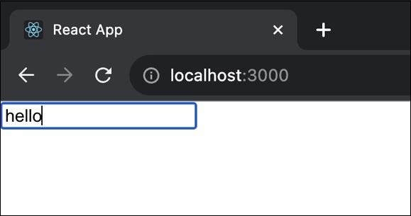
<>
   <Form.Control type="text" size="lg" placeholder="Large text" />
   <br />
   <Form.Control type="text" placeholder="Normal text" />
   <br />
   <Form.Control type="text" size="sm" placeholder="Small text" />
</>
Form.Label
Form.Label component is used to render the html label component (). Some of the useful props of the Form.Label component is as follows −
ref (ReactRef) − Ref element to access underlying DOM node.
as (elementType) − Enable to specify element other than *<label>*.
htmlFor (string) − Used to specify the input element for which the particular label is created. If the *htmlFor* is not specified, then it will use *controlId* of the top level *Form.Group* component.
column (boolean | sm | lg) − To render the label using *<Col>* component for layout purpose.
visuallyHidden (boolean) − To visually hide the label and yet allowed to used by assistive technology.
bsPrefix (string) − Prefix used to customize the underlying CSS classes.
Form.Group
Form.Group component is used to group a form control and label. It will be used to layout the control with respect to its label. Some of the useful props of the Form.Group component is as follows −
ref (ReactRef) − Ref element to access underlying DOM node.
as (elementType) − Enable to specify element other than *<form>*.
controlId (string) − Id to refer the group of control and label. It will be used as id for form control inside the group, if the control does not have *Id* props.
A simple form group along with form label can be used as shown below −
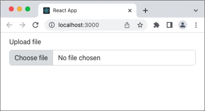
<Form.Group controlId="formFile" className="mb-3">
   <Form.Label>Upload file</Form.Label>
   <Form.Control type="file" />
</Form.Group>
Form.Text
Form.Text component is used to show helpful message for the form controls(*). Some of the useful props of the Form* component is as follows −
ref (ReactRef) − Ref element to access underlying DOM node.
as (elementType) − Enable to specify element other than *<form>*.
muted (boolean) − Apply *text-muted* class.
bsPrefix (string) − Prefix used to customize the underlying CSS classes.
A simple form text component can be use as follows −
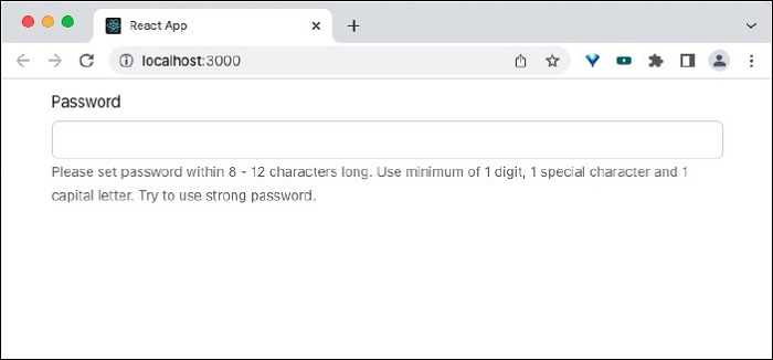
<Form.Label htmlFor="pwd">Password</Form.Label>
<Form.Control
   type="password"
   id="pwd"
   aria-describedby="passwordHelpMessage"
/>
<Form.Text id="passwordHelpMessage" muted>
   Please set password within 8 - 12 characters long. Use minimum of 1 digit,
   1 special character and 1 capital letter. Try to use strong password.
</Form.Text>
Form.Select
Form.Select component is used to render the select element(select). Some of the useful props of the Form.Select component is as follows −
disabled (boolean) − Enable / Disable the control element.
htmlSize (number) − Size of the underlying control element./p>
IsInValid (boolean) − Enables / Disable the style associated with invalid data.
IsValid (boolean) − Enables / Disable the style associated with valid data.
size (sm | lg) − Size of the input element.
value (string | arrayOf | number) − Value of the underlying control. Manipulated by *onChange* event and the initial value will be default to *defaultValue* props.
bsPrefix (string) − Prefix used to customize the underlying CSS classes.
onChange (boolean) − Callback function to be called when *onChange* event is fired.
A simple form select component can be used as shown below −
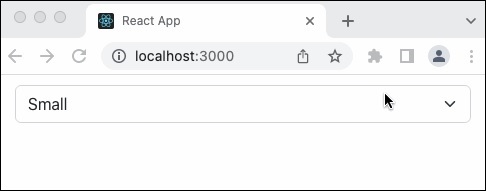
<Form.Select aria-label="Select category">
   <option value="sm">Small</option>
   <option value="lg">Large</option>
   <option value="xl">Extra large</option>
</Form.Select>
Form.Check
The Form.Check component is used to render the checkboxes () and radio button () in the html form. Some of the useful props of the Form component is as follows −
ref (ReactRef) − Ref element to access underlying DOM node.
as (elementType) − Enable to specify element other than *<input>*
disabled (boolean) − Enable / Disable the control element.
id (string) − Id of the control element. Uses *controlId* of the parent *Form.Group* component, if not specified here.
children (node) −Customize the rendering of the *FormCheck* content.
title (string) − Title attributes for the underlying *FormCheckLabel*
type (radio | checkbox | switch) − Type of the input element to be rendered.
value (string | arrayOf | number) − Value of the underlying control. Manipulated by *onChange* event and the initial value will be default to *defaultValue* props.
label (node) − Label for the control.
feedback (node) − Feedback message to be rendered during validation process.
feedbackTooltip (boolean) − Enable / disable the feedback message to be shown as tooltip.
IsInValid (boolean) − Enables / Disable the style associated with invalid data.
IsValid (boolean) − Enables / Disable the style associated with valid data.
inline (boolean) − Enable / disable the controls to be layout in a horizontal manner.
reverse (boolean) − Enable / disable the reverse layout of the children.
bsPrefix (string) − Prefix used to customize the underlying CSS classes.
bsSwitchPrefix (string) − Prefix used to customize the underlying CSS classes for switch control.
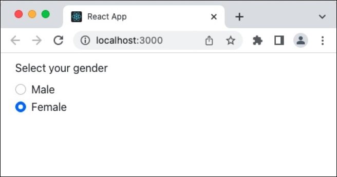
A simple form check component can be used as shown below −
<Form.Group controlId="gender" className="mb-3">
   <Form.Label>Select your gender</Form.Label>
   <div className="mb-3">
      <Form.Check
         type='radio'
         id='Male'
         label='Male'
         name='gender'
      />
      <Form.Check
         type='radio'
         id='Female'
         label='Female'
         name='gender'
      />
   </div>
</Form.Group>
Here, Form.Check is grouped under Form.Group component.
Form.Check.Label
Form.Check.Label component is used to render the label for the underlying input for the Form.Check component. It will included as the children of the Form.Check component. Some of the useful props of the Form.Check.Input component is as follows −
htmlFor (string) − Used to specify the input element for which the particular label is created. If the *htmlFor* is not specified, then it will use *controlId* of the top level *Form.Group* component.
bsPrefix (string) − Prefix used to customize the underlying CSS classes
Form.Check.Input
Form.Check.Input component is used to render the underlying input for the Form.Check component. It will included as the children of the Form.Check component. Some of the useful props of the Form.Check.Input component is as follows −
as (elementType) − Enable to specify element other than *<input>*.
id (string) − Id of the control element. Uses *controlId* of the parent .*Form.Group* component, if not specified here.
type (radio | checkbox | switch) − Type of the input element to be rendered.
IsInValid (boolean) − Enables / Disable the style associated with invalid data.
IsValid (boolean) − Enables / Disable the style associated with valid data.
type (radio | checkbox) − Type of the input element to be rendered.
bsPrefix (string) − Prefix used to customize the underlying CSS classes.
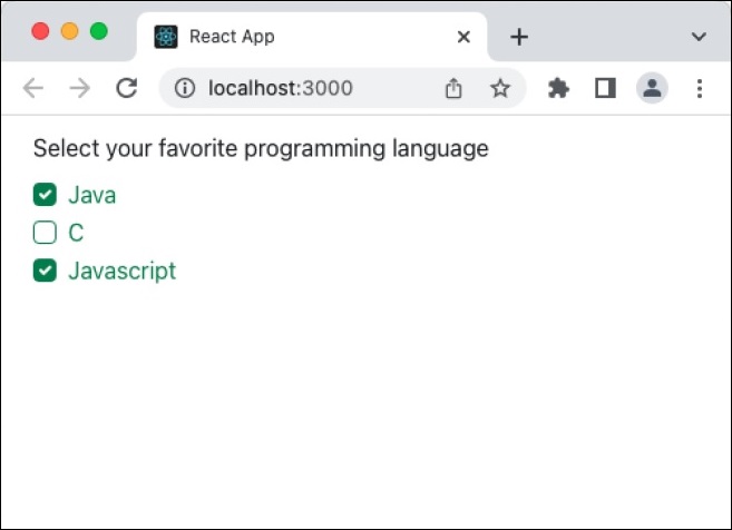
A simple form check input and label component can be used as shown below −
<Form.Group controlId="gender" className="mb-3">
<Form.Label>Select your favorite programming language</Form.Label>
   <div className="mb-3">
      <Form.Check
         type='checkbox'
         id='java-lang'
         name='language'
      >
         <Form.Check.Input type='checkbox' isValid />
         <Form.Check.Label>Java</Form.Check.Label>
      </Form.Check>
      <Form.Check
         type='checkbox'
         id='c-lang'
         name='language'
      >
         <Form.Check.Input type='checkbox' isValid />
         <Form.Check.Label>C</Form.Check.Label>
      </Form.Check>
      <Form.Check
         type='checkbox'
         id='javascript-lang'
         name='language'
      >
         <Form.Check.Input type='checkbox' isValid />
         <Form.Check.Label>Javascript</Form.Check.Label>
      </Form.Check>
   </div>
</Form.Group>
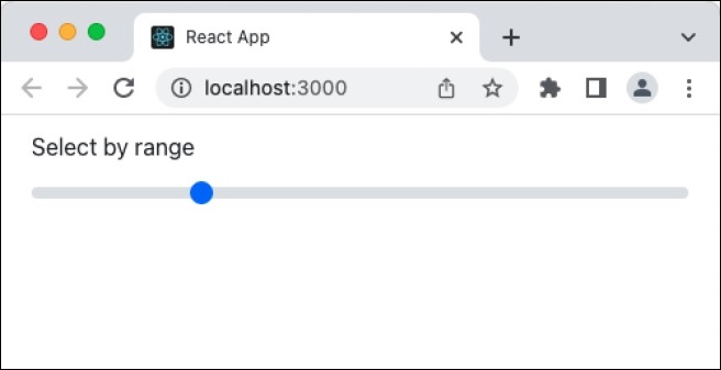
Form.Range
Form.Range component is used to render the range input control in the html form. Some of the useful props of the Form.Range component is as follows −
disabled (boolean) − Enable / Disable the control element.
id (string) − Id of the control element. Uses *controlId* of the parent *Form.Group* component, if not specified here.
value (string | arrayOf | number) − Value of the underlying control. Manipulated by *onChange* event and the initial value will be default to *defaultValue* props.
bsPrefix (string) − Prefix used to customize the underlying CSS classes.
A simple form range component can be used as shown below −
<Form.Label>Select by range</Form.Label>
<Form.Range value="25"/>
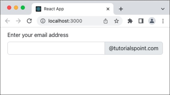
InputGroup
InputGroup component is used to group multiple input & text component and produce new advanced components in a easy and simple way. Some of the useful props of the InputGroup component is as follows −
as (elementType) − Enable to specify element other than *<div>*.
hasValidation (boolean) − To be used when the input group contains both input and feedback elements.
size (sm | lg) − Size of the control. It will be handled internally by the component.
bsPrefix (string) − Prefix used to customize the underlying CSS classes.
InputGroup.Text
InputGroup.Text component is used to render text inside the InputGroup.Text component. Some of the useful props of the Form component is as follows −
id (string) − Id of the node.
A simple input group and text component can be used as shown below −
<Form.Group controlId="email" className="mb-3">
   <Form.Label>Enter your email address</Form.Label>
   <InputGroup className="mb-3">
      <Form.Control
         aria-label="Email address"
         aria-describedby="domain"
      />
      <InputGroup.Text id="domain">@tutorialspoint.com</InputGroup.Text>
   </InputGroup>
</Form.Group>
Applying Form component
First of all, create a new react application and start it using below command.
create-react-app myapp
cd myapp
npm start
Next, install the bootstrap and react-bootstrap library using below command,
npm install --save bootstrap react-bootstrap
Next, open App.css (src/App.css) and remove all CSS classes.
// remove all css classes
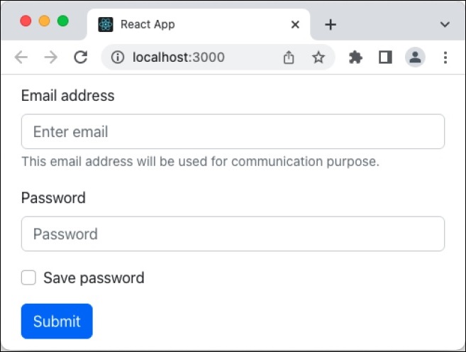
Next, create a simple form component, SimpleForm (src/Components/SimpleForm.js) and render a form as shown below −
import { Form, Button } from 'react-bootstrap';
function SimpleForm() {
   return (
      <Form>
         <Form.Group className="mb-3" controlId="email">
            <Form.Label>Email address</Form.Label>
            <Form.Control type="email" placeholder="Enter email" />
            <Form.Text className="text-muted">
               This email address will be used for communication purpose.
            </Form.Text>
         </Form.Group>
         <Form.Group className="mb-3" controlId="password">
            <Form.Label>Password</Form.Label>
            <Form.Control type="password" placeholder="Password" />
         </Form.Group>
         <Form.Group className="mb-3" controlId="formBasicCheckbox">
            <Form.Check type="checkbox" label="Save password" />
         </Form.Group>
         <Button variant="primary" type="submit">
            Submit
         </Button>
      </Form>
   );
}
export default SimpleForm;
Here,
Used Form.Control with type text and password to get user name and password respectively.
Used Button component to submit the form
Used Form.Group to group form control component and its related label component
Next, open App component (src/App.js), import the bootstrap css and update the content with bootstrap button as shown below −
import './App.css'
import "bootstrap/dist/css/bootstrap.min.css";
import SimpleForm from './Components/SimpleForm'
function App() {
   return (
      <div className="container">
         <div style={{ padding: "10px" }}>
            <div>
               <SimpleForm />
            </div>
         </div>
      </div>
   );
}
export default App;
Here,
Imported the bootstrap classes using import statement
Rendered our new SimpleForm component.
Included the App.css style
Finally, open the application in the browser and check the final result. Form will be rendered as shown below −
Summary
Bootstrap form component provides all options necessary to design a good looking form. It exploits the bootstrap CSS framework and provides easy to use props to do heavy customization of the form.
