- MATLAB - Home
- MATLAB - Overview
- MATLAB - Features
- MATLAB - Environment Setup
- MATLAB - Editors
- MATLAB - Online
- MATLAB - Workspace
- MATLAB - Syntax
- MATLAB - Variables
- MATLAB - Commands
- MATLAB - Data Types
- MATLAB - Operators
- MATLAB - Dates and Time
- MATLAB - Numbers
- MATLAB - Random Numbers
- MATLAB - Strings and Characters
- MATLAB - Text Formatting
- MATLAB - Timetables
- MATLAB - M-Files
- MATLAB - Colon Notation
- MATLAB - Data Import
- MATLAB - Data Output
- MATLAB - Normalize Data
- MATLAB - Predefined Variables
- MATLAB - Decision Making
- MATLAB - Decisions
- MATLAB - If End Statement
- MATLAB - If Else Statement
- MATLAB - If…Elseif Else Statement
- MATLAB - Nest If Statememt
- MATLAB - Switch Statement
- MATLAB - Nested Switch
- MATLAB - Loops
- MATLAB - Loops
- MATLAB - For Loop
- MATLAB - While Loop
- MATLAB - Nested Loops
- MATLAB - Break Statement
- MATLAB - Continue Statement
- MATLAB - End Statement
- MATLAB - Arrays
- MATLAB - Arrays
- MATLAB - Vectors
- MATLAB - Transpose Operator
- MATLAB - Array Indexing
- MATLAB - Multi-Dimensional Array
- MATLAB - Compatible Arrays
- MATLAB - Categorical Arrays
- MATLAB - Cell Arrays
- MATLAB - Matrix
- MATLAB - Sparse Matrix
- MATLAB - Tables
- MATLAB - Structures
- MATLAB - Array Multiplication
- MATLAB - Array Division
- MATLAB - Array Functions
- MATLAB - Functions
- MATLAB - Functions
- MATLAB - Function Arguments
- MATLAB - Anonymous Functions
- MATLAB - Nested Functions
- MATLAB - Return Statement
- MATLAB - Void Function
- MATLAB - Local Functions
- MATLAB - Global Variables
- MATLAB - Function Handles
- MATLAB - Filter Function
- MATLAB - Factorial
- MATLAB - Private Functions
- MATLAB - Sub-functions
- MATLAB - Recursive Functions
- MATLAB - Function Precedence Order
- MATLAB - Map Function
- MATLAB - Mean Function
- MATLAB - End Function
- MATLAB - Error Handling
- MATLAB - Error Handling
- MATLAB - Try...Catch statement
- MATLAB - Debugging
- MATLAB - Plotting
- MATLAB - Plotting
- MATLAB - Plot Arrays
- MATLAB - Plot Vectors
- MATLAB - Bar Graph
- MATLAB - Histograms
- MATLAB - Graphics
- MATLAB - 2D Line Plot
- MATLAB - 3D Plots
- MATLAB - Formatting a Plot
- MATLAB - Logarithmic Axes Plots
- MATLAB - Plotting Error Bars
- MATLAB - Plot a 3D Contour
- MATLAB - Polar Plots
- MATLAB - Scatter Plots
- MATLAB - Plot Expression or Function
- MATLAB - Draw Rectangle
- MATLAB - Plot Spectrogram
- MATLAB - Plot Mesh Surface
- MATLAB - Plot Sine Wave
- MATLAB - Interpolation
- MATLAB - Interpolation
- MATLAB - Linear Interpolation
- MATLAB - 2D Array Interpolation
- MATLAB - 3D Array Interpolation
- MATLAB - Polynomials
- MATLAB - Polynomials
- MATLAB - Polynomial Addition
- MATLAB - Polynomial Multiplication
- MATLAB - Polynomial Division
- MATLAB - Derivatives of Polynomials
- MATLAB - Transformation
- MATLAB - Transforms
- MATLAB - Laplace Transform
- MATLAB - Laplacian Filter
- MATLAB - Laplacian of Gaussian Filter
- MATLAB - Inverse Fourier transform
- MATLAB - Fourier Transform
- MATLAB - Fast Fourier Transform
- MATLAB - 2-D Inverse Cosine Transform
- MATLAB - Add Legend to Axes
- MATLAB - Object Oriented
- MATLAB - Object Oriented Programming
- MATLAB - Classes and Object
- MATLAB - Functions Overloading
- MATLAB - Operator Overloading
- MATLAB - User-Defined Classes
- MATLAB - Copy Objects
- MATLAB - Algebra
- MATLAB - Linear Algebra
- MATLAB - Gauss Elimination
- MATLAB - Gauss-Jordan Elimination
- MATLAB - Reduced Row Echelon Form
- MATLAB - Eigenvalues and Eigenvectors
- MATLAB - Integration
- MATLAB - Integration
- MATLAB - Double Integral
- MATLAB - Trapezoidal Rule
- MATLAB - Simpson's Rule
- MATLAB - Miscellenous
- MATLAB - Calculus
- MATLAB - Differential
- MATLAB - Inverse of Matrix
- MATLAB - GNU Octave
- MATLAB - Simulink
MATLAB - Plot Arrays
Data visualization helps in understanding complex information, and MATLAB stands as a powerful programming language in transforming raw numbers into meaningful visual representations.
MATLAB provides powerful tools for visualizing data, and plotting arrays is a fundamental technique for representing numerical information graphically. Whether you're working with one-dimensional arrays, matrices, or multidimensional arrays, MATLAB's plotting functions offer various options to create insightful visualizations.
MATLAB provides an extensive suite of plotting functions and customization options, empowering users to create a diverse range of visualizations.
When it comes to plotting in Matlab we have following advantages −
- Line plots, scatter plots, bar graphs, histograms, surface plots, and more cater to different data types and analysis needs in Matlab.
- You have control over colors, markers, line styles, axes properties, and annotations that allow tailoring plots to specific requirements.
- MATLABs plots can be made interactive, allowing zooming, panning, and data inspection for deeper exploration.
Basic plotting functions available in matlab are as follows −
- plot() Function − Creates line plots to visualize relationships between variables or functions.
- scatter() Function − Produces scatter plots ideal for showcasing individual data points.
- bar() Function − Constructs bar graphs useful for comparing categorical data.
Plotting Array in Matlab
To plot an array in matlab we need to first create an array. One for the X axis and another for Y axis.
Let us take an simple example as shown below −
Example 1
X = [16, 2, 3,13, 5];
Y = [1, 3, 5, 7, 20];
So here X is now the coordinates which will plot on the X -axis and Y array has coordinates that will be plotted on Y axis.
Now that the arrays X and Y are defined , let us make use of the plot() function available in Matlab to plot it.
The code used for plotting is as follows −
% An array with coordinates that needs to be plotted
X = [16, 2, 3,13, 5];
Y = [1, 3, 5, 7, 20];
% Plotting the array using plot() function
plot(X, Y);
Now let us execute the code in matlab , which will show us the line graph with values in X plotted on x-axis and values from array Y plotted on y-axis.

After execution you can see the figure which shows line graphs on the values plotted. Let us add more customization to it.
First let us put labels for the X-axis and Y-axis, right now we don;t see any label on the figure.
The code to make that happen is as shown below −
% An array with coordinates that needs to be plotted
X = [16, 2, 3,13, 5];
Y = [1, 3, 5, 7, 20];
% Plotting the array using plot() function
plot(X, Y);
The output on execution is as follows −

To add labels simply make use of xlabel and ylabel methods, with the label you want to see on the axis.
Let us now add legend and title to the graph above using legend() and title() methods. The code for same is as follows −
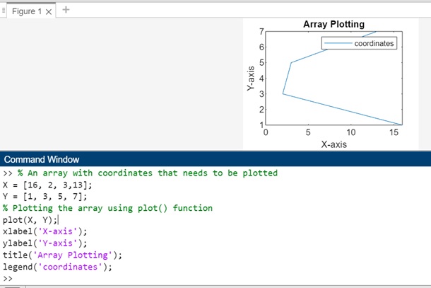
% An array with coordinates that needs to be plotted
X = [16, 2, 3,13];
Y = [1, 3, 5, 7];
% Plotting the array using plot() function
plot(X, Y);
xlabel('X-axis');
ylabel('Y-axis');
title('Array Plotting');
legend('coordinates');
When you execute the same the output is as shown below −
Let us now convert the line plotting into Dashed line, with marker as circle and color as green.The code for it −
% An array with coordinates that needs to be plotted
X = [16, 2, 3,13];
Y = [1, 3, 5, 7];
% Plotting the array using plot() function
plot(X, Y, '--go', 'LineWidth', 1, 'MarkerSize', 4);
xlabel('X-axis');
ylabel('Y-axis');
title('Array Plotting');
legend('coordinates');
On execution the output is −

Example 2
Another example of plotting using arrays is as shown below −
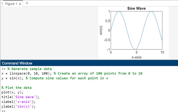
% Generate sample data
x = linspace(0, 10, 100); % Create an array of 100 points from 0 to 10
y = sin(x); % Compute sine values for each point in x

% Plot the data
plot(x, y);
title('Sine Wave');
xlabel('x-axis');
ylabel('sin(x)');
Here linspace() generates an array of 100 points from 0 to 10. The sin() calculates the sine values for each point in the array. The plot() creates the line plot using the x and y values.
The methods title(), xlabel(), and ylabel() add labels and a title to the plot.
This example generates a sine wave by plotting the sin function against an array x that ranges from 0 to 10. The resulting plot showcases the relationship between the x-values and their corresponding sine values.
On execution the output is as follows −
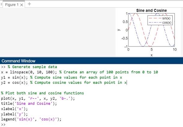
Multiple Line Plotting using Arrays
Consider following data we got −
x = linspace(0, 10, 100); % Create an array of 100 points from 0 to 10
y1 = sin(x); % Compute sine values for each point in x
y2 = cos(x); % Compute cosine values for each point in x
The linspace(0,10,100) creates an array of 100 points from 0 to 10. In addition we have sin(x) and cos(x) that will generate sine values for each array value in x and cosine values for each array value in x.
Let us make use of the plot() function to do the plotting. The code is as follows −
% Generate sample data
x = linspace(0, 10, 100); % Create an array of 100 points from 0 to 10
y1 = sin(x); % Compute sine values for each point in x
y2 = cos(x); % Compute cosine values for each point in x

% Plot both sine and cosine functions
plot(x, y1, 'r--', x, y2, 'b-.');
title('Sine and Cosine');
xlabel('x');
ylabel('y');
legend('sin(x)', 'cos(x)');
When you execute the code in matlab the output is −