- MATLAB - Home
- MATLAB - Overview
- MATLAB - Features
- MATLAB - Environment Setup
- MATLAB - Editors
- MATLAB - Online
- MATLAB - Workspace
- MATLAB - Syntax
- MATLAB - Variables
- MATLAB - Commands
- MATLAB - Data Types
- MATLAB - Operators
- MATLAB - Dates and Time
- MATLAB - Numbers
- MATLAB - Random Numbers
- MATLAB - Strings and Characters
- MATLAB - Text Formatting
- MATLAB - Timetables
- MATLAB - M-Files
- MATLAB - Colon Notation
- MATLAB - Data Import
- MATLAB - Data Output
- MATLAB - Normalize Data
- MATLAB - Predefined Variables
- MATLAB - Decision Making
- MATLAB - Decisions
- MATLAB - If End Statement
- MATLAB - If Else Statement
- MATLAB - If…Elseif Else Statement
- MATLAB - Nest If Statememt
- MATLAB - Switch Statement
- MATLAB - Nested Switch
- MATLAB - Loops
- MATLAB - Loops
- MATLAB - For Loop
- MATLAB - While Loop
- MATLAB - Nested Loops
- MATLAB - Break Statement
- MATLAB - Continue Statement
- MATLAB - End Statement
- MATLAB - Arrays
- MATLAB - Arrays
- MATLAB - Vectors
- MATLAB - Transpose Operator
- MATLAB - Array Indexing
- MATLAB - Multi-Dimensional Array
- MATLAB - Compatible Arrays
- MATLAB - Categorical Arrays
- MATLAB - Cell Arrays
- MATLAB - Matrix
- MATLAB - Sparse Matrix
- MATLAB - Tables
- MATLAB - Structures
- MATLAB - Array Multiplication
- MATLAB - Array Division
- MATLAB - Array Functions
- MATLAB - Functions
- MATLAB - Functions
- MATLAB - Function Arguments
- MATLAB - Anonymous Functions
- MATLAB - Nested Functions
- MATLAB - Return Statement
- MATLAB - Void Function
- MATLAB - Local Functions
- MATLAB - Global Variables
- MATLAB - Function Handles
- MATLAB - Filter Function
- MATLAB - Factorial
- MATLAB - Private Functions
- MATLAB - Sub-functions
- MATLAB - Recursive Functions
- MATLAB - Function Precedence Order
- MATLAB - Map Function
- MATLAB - Mean Function
- MATLAB - End Function
- MATLAB - Error Handling
- MATLAB - Error Handling
- MATLAB - Try...Catch statement
- MATLAB - Debugging
- MATLAB - Plotting
- MATLAB - Plotting
- MATLAB - Plot Arrays
- MATLAB - Plot Vectors
- MATLAB - Bar Graph
- MATLAB - Histograms
- MATLAB - Graphics
- MATLAB - 2D Line Plot
- MATLAB - 3D Plots
- MATLAB - Formatting a Plot
- MATLAB - Logarithmic Axes Plots
- MATLAB - Plotting Error Bars
- MATLAB - Plot a 3D Contour
- MATLAB - Polar Plots
- MATLAB - Scatter Plots
- MATLAB - Plot Expression or Function
- MATLAB - Draw Rectangle
- MATLAB - Plot Spectrogram
- MATLAB - Plot Mesh Surface
- MATLAB - Plot Sine Wave
- MATLAB - Interpolation
- MATLAB - Interpolation
- MATLAB - Linear Interpolation
- MATLAB - 2D Array Interpolation
- MATLAB - 3D Array Interpolation
- MATLAB - Polynomials
- MATLAB - Polynomials
- MATLAB - Polynomial Addition
- MATLAB - Polynomial Multiplication
- MATLAB - Polynomial Division
- MATLAB - Derivatives of Polynomials
- MATLAB - Transformation
- MATLAB - Transforms
- MATLAB - Laplace Transform
- MATLAB - Laplacian Filter
- MATLAB - Laplacian of Gaussian Filter
- MATLAB - Inverse Fourier transform
- MATLAB - Fourier Transform
- MATLAB - Fast Fourier Transform
- MATLAB - 2-D Inverse Cosine Transform
- MATLAB - Add Legend to Axes
- MATLAB - Object Oriented
- MATLAB - Object Oriented Programming
- MATLAB - Classes and Object
- MATLAB - Functions Overloading
- MATLAB - Operator Overloading
- MATLAB - User-Defined Classes
- MATLAB - Copy Objects
- MATLAB - Algebra
- MATLAB - Linear Algebra
- MATLAB - Gauss Elimination
- MATLAB - Gauss-Jordan Elimination
- MATLAB - Reduced Row Echelon Form
- MATLAB - Eigenvalues and Eigenvectors
- MATLAB - Integration
- MATLAB - Integration
- MATLAB - Double Integral
- MATLAB - Trapezoidal Rule
- MATLAB - Simpson's Rule
- MATLAB - Miscellenous
- MATLAB - Calculus
- MATLAB - Differential
- MATLAB - Inverse of Matrix
- MATLAB - GNU Octave
- MATLAB - Simulink
MATLAB - Formatting a Plot
To make your plots look different to show more information or make the data easier to see. You can do things like adding titles and labels, changing how far the lines go on the graph, and putting in lines to help read the graph. You can also put different groups of information in one picture, either by showing everything on the same lines or by using many lines in one picture.
The formatting of plots can be done by using the following −
- Labels and Annotations
- Axes Appearance
- Colormaps
Labels and Annotations
Helps to put a title on top, name the lines, or write notes on a graph to show what's important. You can make a key to name different things on the graph or write words near the dots on the graph. Also, you can draw shapes like boxes, circles, arrows, or lines to point out specific parts of the graph.
To handle labels and annotations here are few methods that you can make use of it −
Methods for Labels
| Sr.No | Method & Description |
|---|---|
| 1 | title title(titletext) : helps to add title |
| 2 | subtitle subtitle(txt) : add subtitle to the plot |
| 3 | sgtitle sgtitle(txt) : add title to the grid of plot |
| 4 | xlabel xlabel(txt) : add label to x-axis |
| 5 | ylabel ylabel(txt) : add label to y-axis |
| 6 | zlabel zlabel(txt) : add label to z-axis |
| 7 | fontname fontname(fname) : sets the font name to the label used. |
| 8 | fontsize fontsize(size,units) : sets the font size |
| 9 | legend legend() : The legend makes a key with clear names for every set of data on the plot. |
Methods for Annotations
| Sr.No | Method & Description |
|---|---|
| 1 | text text(x,y,txt) : The text function places words on one or more dots in the graph. If you're writing on just one dot, use single numbers for x and y. If you're writing on several dots, use lists of x and y that have the same number of items. |
| 2 | xline xline(x) : Vertical line with constant x-value. |
| 3 | yline yline(y) : Horizontal line with constant y-value. |
| 4 | xregion xregion(x1,x2) : 1-D filled region between x-coordinates |
| 5 | yregion yregion(y1,y2): 1-D filled region between y-coordinates |
| 6 | annotation annotation(lineType,x,y) : The annotation function makes a line or arrow that goes between two spots on the picture you're working on. Choose the type of line you want, like 'line', 'arrow', 'doublearrow', or 'textarrow'. Use [x_begin x_end] and [y_begin y_end] as pairs to show where the line or arrow should start and end on the graph. |
Labels Examples
Let us see a few examples on how to use the above methods for formatting plots in Matlab.
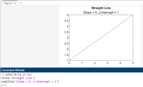
Example 1
Let us add title and subtitle to the 2-D graph
plot([0 5],[1 5])
title('Straight Line')
subtitle('Slope = 5, y-Intercept = 1')
When you execute the same in matlab command window the output is −
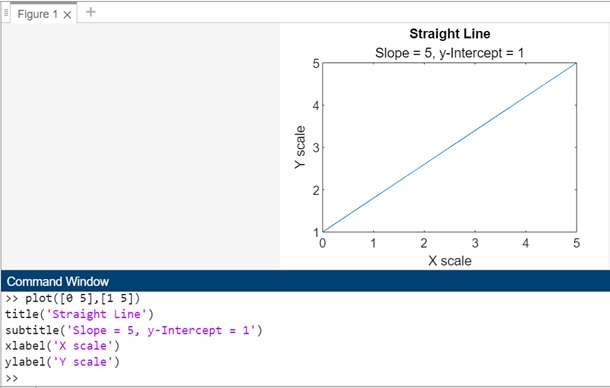
Example 2
along with title will add xlabel and ylabel as shown below
plot([0 5],[1 5])
title('Straight Line')
subtitle('Slope = 5, y-Intercept = 1')
xlabel('X scale')
ylabel('Y scale')
On execution in matlab command window the output is −
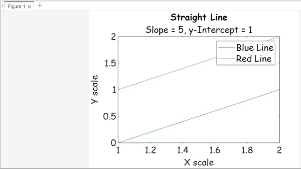
Example 3
In this example will add legend and also change the font name and font size for legend,title and labels.
plot([0 1; 1 2])
title('Straight Line')
subtitle('Slope = 5, y-Intercept = 1')
xlabel('X scale')
ylabel('Y scale')
legend("Blue Line","Red Line")
fontname("Comic Sans MS")
fontsize(16,"points")
Annotation Examples
Let us see a few examples on how to use the above methods for formatting plots in Matlab.
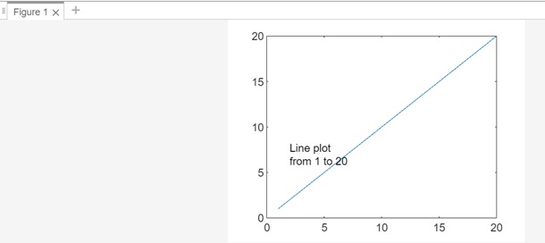
Example 1
Using text() on a 2-D line graph.
plot(1:20)
str = {'Line plot','from 1 to 20'};
text(2,7,str)
When you execute the same in matlab command window the output is −
Example 2
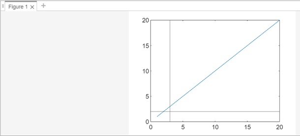
Using xline() and yline()
plot(1:20)
xline(3);
yline(2);
When you execute the code in matlab command window the output is −
Example 3
x = -10:0.25:10;
y = x.^4;
plot(x,y)
xregion(-2,3)
When you execute the same in matlab command window the output is −

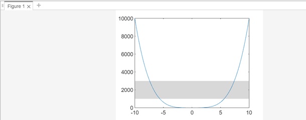
Now will make use of yregion as shown below −
x = -10:0.25:10;
y = x.^4;
plot(x,y)
yregion(1000,3000)
When you execute the same in the output is −

Now will make use of yregion as shown below −
x = -10:0.25:10;
y = x.^4;
plot(x,y)
yregion(1000,3000)
When you execute the same in the output is −
Example 4
In this example let's add a text arrow annotation with the text 'y = x ' starting at the point (0.3, 0.6) and ending at the point (0.5, 0.5) on the plot.
plot(1:10)
x = [0.3 0.5];
y = [0.6 0.5];
annotation('textarrow',x,y,'String','y = x ')
annotation('textarrow', x, y, 'String', 'y = x '): This line creates a text arrow annotation on the plot. It specifies that the annotation should be a text arrow, using the x and y coordinates provided earlier. The text associated with the arrow is 'y = x '.

Axes Appearance
You can change how the lines and numbers look on the sides of the graph by making them longer or shorter, changing how they're labeled, or adding lines to help read the graph. You can also put different graphs on top of each other or next to each other, and even have two sets of numbers on the side.
Here are a few methods that can help format the axes' appearance.
| Sr.No | Methods & Description |
|---|---|
| 1 | xlim() xlim(limits) : controls how far the x-axis goes in the current graph or chart. |
| 2 | ylim() ylim(limits) : controls how far the y-axis goes in the current graph or chart. |
| 3 | xscale() xscale(scale) : changes how the x-axis is shown in the current graphit can be straight or in a special math way called logarithmic. |
| 4 | yscale() yscale(scale) : changes how the y-axis looks in the current graphit can be straight or use a math trick called logarithmic. |
| 5 | box on Using "box on," it shows the outline around the current graph by turning on its Box feature. For GeographicAxes objects, this is already set as the default. |
| 6 | xticks() xticks(ticks): places the tick marks on the x-axis at specific spots you choose. Use a list of increasing numbers, like [0 2 4 6], to show where you want these marks. This works for the current graph. |
| 7 | yticks() yticks(ticks): places the tick marks on the y-axis at specific spots you choose. Use a list of increasing numbers, like [0 2 4 6], to show where you want these marks. This works for the current graph. |
| 8 | xticklabels() xticklabels(labels) : assigns new labels to the tick marks on the x-axis in the current graph. You can use a set of words like {'January','February','March'} to replace the default labels. Remember, once you set these labels, any changes to the graph won't update them automatically. |
| 9 | yticklabels() yticklabels(labels) : assigns new labels to the tick marks on the y-axis in the current graph. You can use a set of words like {'January','February','March'} to replace the default labels. Remember, once you set these labels, any changes to the graph won't update them automatically. |
Let us see a few examples which show the working of above methods.
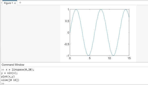
Example 1: Using xlim() and ylim()
In the example below we have following code −
x = linspace(0,20);
y = sin(x);
plot(x,y)
xlim([0 15])
The x axis has a linspace specified from 0 to 20. Using xlim() will limit the x-axis from 0 to 15.
When you execute the code in matlab command window the output is −
Now let us see how to make use of ylim() to limit the y-axis while plotting.
The code we have is as follows −
x = linspace(0,20);
y = sin(x);
plot(x,y)
ylim([-5 5])
We are using the same code as used in the example to show the limit to x-axis, but here instead of limiting x-axis will limit y-axis as shown above.
When you execute the code in matlab command window the output is as follows −

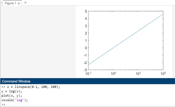
Example 2: Using xscale() and yscale()
Let us first understand how to make use of the xscale() method followed by using the yscale() method.
The code below shows how the xscale() is used −
x = linspace(0.1, 100, 100);
y = log(x);
plot(x, y);
xscale('log');
In this example, the first plot uses a linear x-axis scale, and the second plot uses a logarithmic x-axis scale. The xscale('log') function is used to set the x-axis scale to logarithmic.
When you execute the same in matlab command window the output is −
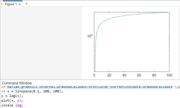
Let us understand now using the yscale() method.The code we have is as follows −
x = linspace(0.1, 100, 100);
y = log(x);
plot(x, y);
yscale('log');
In this example, the yscale('log') statement sets the y-axis scale to logarithmic.
On executing the code in matlab command window the output is −
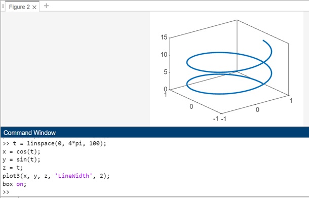
Example 3: Using box on
The code below shows how to make use of the box on , so that you get a display of the box around the 3D plot.
t = linspace(0, 4*pi, 100);
x = cos(t);
y = sin(t);
z = t;
plot3(x, y, z, 'LineWidth', 2);
box on;
When you execute the same in matlab command window the output is −
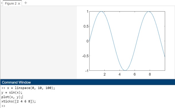
Example 4: Using xticks() and yticks()
Let us first understand how to make use of the xticks() method. The code for same is as shown below −
x = linspace(0, 10, 100);
y = sin(x);
plot(x, y);
xticks([2 4 6 8]);
In the example, the xticks([2 4 6 8]) command sets the x-axis tick values to 2, 4, 6, and 8. You can modify the vector [2 4 6 8] to any increasing values that match the locations where you want tick marks to appear on the x-axis.After executing this code, you'll see a plot with tick marks specifically at the values 2, 4, 6, and 8 on the x-axis.
When you execute the same in matlab command window the output is −
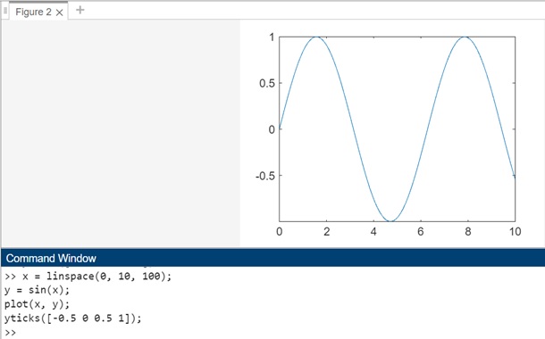
Let us now see an example for yticks() as shown below −
x = linspace(0, 10, 100);
y = sin(x);
plot(x, y);
yticks([-0.5 0 0.5 1]);
In this example, the yticks([-1 -0.5 0 0.5 1]) command sets the y-axis tick values to -1, -0.5, 0, 0.5, and 1. You can modify the vector [-1 -0.5 0 0.5 1] to any increasing or decreasing values that match the locations where you want tick marks to appear on the y-axis.After executing this code, you'll see a plot with tick marks specifically at the values -1, -0.5, 0, 0.5, and 1 on the y-axis.
On code execution in matlab command window the output is −
Example 5: Using xticklabels() and yticklabels()
Let us see an example of how to use xticklabels(). The code for same is as follows −
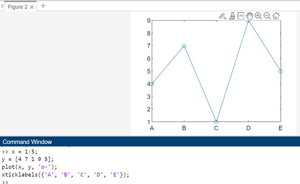
x = 1:5;
y = [4 7 1 9 5];
plot(x, y, 'o-');
xticklabels({'A', 'B', 'C', 'D', 'E'});
In this example, the xticklabels({'A', 'B', 'C', 'D', 'E'}) command sets the x-axis tick labels to 'A', 'B', 'C', 'D', and 'E'. The vector x represents the tick values along the x-axis, and the xticklabels function allows you to assign custom labels to those ticks.
When you execute the same in matlab command window the output is −
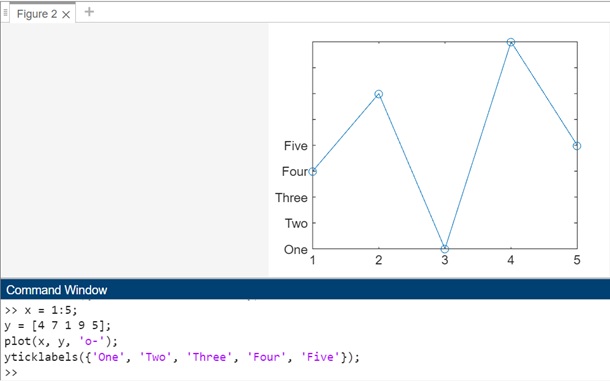
Let us now understand the how to make use of yticklabels() as show below in the code −
x = 1:5;
y = [4 7 1 9 5];
plot(x, y, 'o-');
yticklabels({'One', 'Two', 'Three', 'Four', 'Five'});
In this example, the yticklabels({'One', 'Two', 'Three', 'Four', 'Five'}) command sets the y-axis tick labels to 'One', 'Two', 'Three', 'Four', and 'Five'. The vector y represents the tick values along the y-axis, and the yticklabels function allows you to assign custom labels to those ticks.
Colormaps
Colormaps are like sets of colors used in different pictures or graphs. Colorbars show how the colors in the set match with your information. Colormaps are made up of rows with three numbers that represent colors. The connection between colors and your data changes based on the kind of picture or graph you make.
Here are a few methods that can help with colors.
| Sr.No | Method & Description |
|---|---|
| 1 | colormap() colormap(map) adjusts the color scheme of the current figure to the one defined by the specified colormap, 'map'. |
| 2 | colorbar() colorbar(location) shows the colorbar in a designated place, like 'northoutside'. |
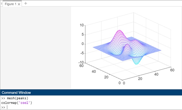
Example 1: Using colormap()
mesh(peaks)
colormap('cool')
mesh(peaks) − This command generates a 3D surface plot using the "peaks" function. The peaks function is commonly used for testing and demonstrating various MATLAB plotting capabilities.
colormap('cool') − After creating the mesh plot, the colormap function is used to set the color scheme of the plot. Specifically, it sets the colormap to 'cool'. The 'cool' colormap is a built-in MATLAB colormap that transitions smoothly from dark blue to light cyan, creating a visually appealing representation of the data.
On execution in matlab command window the output is −
Example 2: Using colorbar()
mesh(peaks)
colormap('cool')
colorbar('southoutside')
In the example above the colorbar function adds a colorbar to the plot. The argument 'southoutside' specifies the location of the colorbar at the bottom of the plot, outside the axes. This colorbar provides a reference for interpreting the colors in the plot, indicating the correspondence between color and data values.
The output on execution is as follows −

