- SAP Dashboards - Home
- SAP Dashboards - Introduction
- SAP Dashboards - Version
- SAP Dashboards - WorkSpace
- SAP Dashboards - Font Options
- Components Browser
- SAP Dashboards - Object Browser
- SAP Dashboards - Quick Views
- Docking/Undocking
- Working With Components
- SAP Dashboards - Properties Panel
- Binding Components
- Setting Component Properties
- Configure Component Properties
- Component Colors
- Setting Component Text
- Chart Components
- Container Components
- Selector Components
- Single Value Components
- SAP Dashboards - Map Components
- SAP Dashboards - Text Components
- Web Connectivity Components
- Universe Connectivity
- Deleting Components & Alerts
- Models & Templates
- SAP Dashboards - Themes
- SAP Dashboards - Color Schemes
- Previewing Models
- Working With Data Sources
- SAP Dashboards - Data Connections
- Export Format Options
- Dynamic Dashboard
SAP Dashboards - Quick Views
In this chapter, we will discuss what Quick Views are and how is it beneficial to SAP Dashboards.
Ways to Access Quick Views
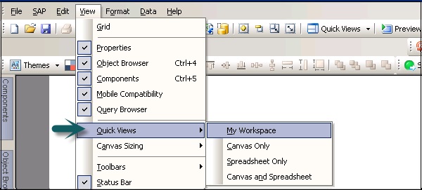
To quickly access different views in the Dashboard, you can use the Quick Views option. Go to View → Quick Views.
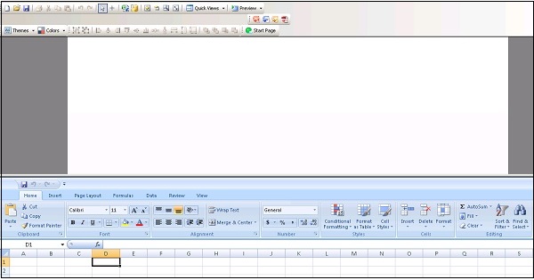
You can also access Quick Views by going to the Standard Tool Bar as shown in the following screenshot.
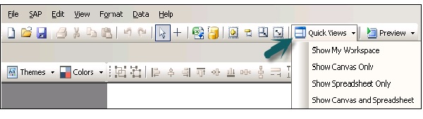
My Workspace − This is used to view workspace as you last configured it.
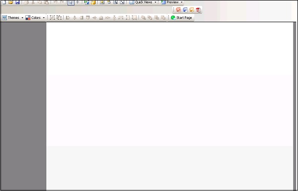
Canvas Only − This view can be selected to arrange components on Canvas while designing your model.
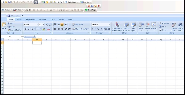
Spreadsheet Only − This view is used to display spreadsheet. It is useful to see the correctness of data, creating blank cells, or to put formulas. You can perform a search easily in case of large size spreadsheets.
Canvas and Spreadsheet − This is used to view Canvas and spreadsheet so that you can get more space to select components and to bind them to spreadsheets.
Using Auto-Hide
The auto − hide feature is used to automatically hide the panels when they are not in use. This function is available for the following components −
- Property
- Object Browser
- Component Browser
- Query Browser
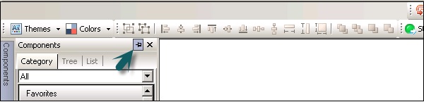
When you have auto hide enabled, a panel will automatically collapse when you point the cursor outside the panel. You can again expand a panel by clicking on the panel name in the workspace area.
