- SAP Dashboards - Home
- SAP Dashboards - Introduction
- SAP Dashboards - Version
- SAP Dashboards - WorkSpace
- SAP Dashboards - Font Options
- Components Browser
- SAP Dashboards - Object Browser
- SAP Dashboards - Quick Views
- Docking/Undocking
- Working With Components
- SAP Dashboards - Properties Panel
- Binding Components
- Setting Component Properties
- Configure Component Properties
- Component Colors
- Setting Component Text
- Chart Components
- Container Components
- Selector Components
- Single Value Components
- SAP Dashboards - Map Components
- SAP Dashboards - Text Components
- Web Connectivity Components
- Universe Connectivity
- Deleting Components & Alerts
- Models & Templates
- SAP Dashboards - Themes
- SAP Dashboards - Color Schemes
- Previewing Models
- Working With Data Sources
- SAP Dashboards - Data Connections
- Export Format Options
- Dynamic Dashboard
SAP Dashboards - Properties Panel
You can use the Properties Panel for settings and format options for the selected component. After you place a component on the Canvas, properties panel can be accessed using the following method.
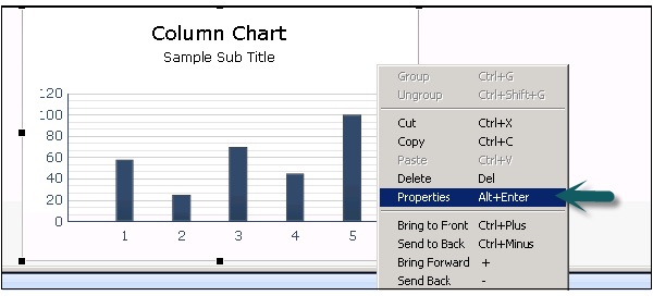
Double click the components that you have added to the Canvas or you can right click → Properties as shown in the following screenshot.
Properties panel can be accessed for each component but the options available under Properties varies as per the component.
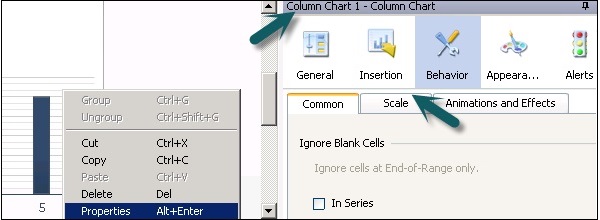
Types of Tabs in the Properties Pane
The following tabs are there in the Properties pane and each tab contains sub − tabs to set more properties.
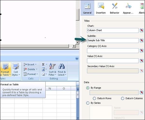
General
This tab is used to set the basic configuration properties of the component like Subtitle, source, category and value axis, etc.
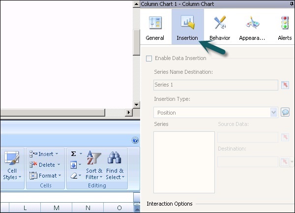
Insertion
This is available for charts and hierarchical tables. You can use this to configure charts as selectors so that clicking a chart adds more detailed information into the embedded spreadsheet.
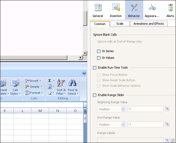
Behavior
It is used to set the behavior of a component in the modellimits, Blank cell, visibility, etc.
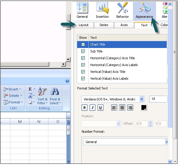
Appearance
It is used to set the appearance of the component. You can select text font, color, font size, legends, etc.
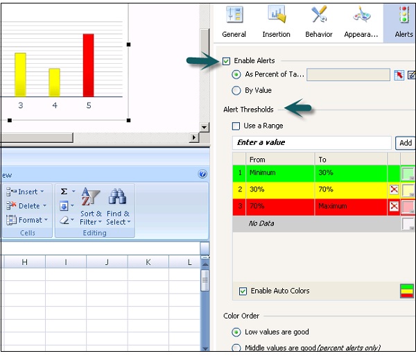
Alerts
Alerts are used to set notifications for data values, if values are acceptable or require attention. To enable alerts, click the check box as shown in the following screenshot.
You can set Alert Thresholds, enable auto color, etc.