- SAP Dashboards - Home
- SAP Dashboards - Introduction
- SAP Dashboards - Version
- SAP Dashboards - WorkSpace
- SAP Dashboards - Font Options
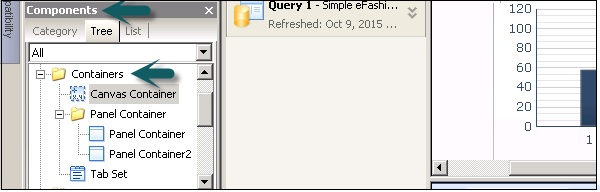
- Components Browser
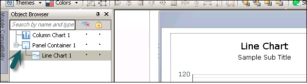
- SAP Dashboards - Object Browser
- SAP Dashboards - Quick Views
- Docking/Undocking
- Working With Components
- SAP Dashboards - Properties Panel
- Binding Components
- Setting Component Properties
- Configure Component Properties
- Component Colors
- Setting Component Text
- Chart Components
- Container Components
- Selector Components
- Single Value Components
- SAP Dashboards - Map Components
- SAP Dashboards - Text Components
- Web Connectivity Components
- Universe Connectivity
- Deleting Components & Alerts
- Models & Templates
- SAP Dashboards - Themes
- SAP Dashboards - Color Schemes
- Previewing Models
- Working With Data Sources
- SAP Dashboards - Data Connections
- Export Format Options
- Dynamic Dashboard
SAP Dashboards - Quick Guide
SAP Dashboards - Introduction
In this chapter, we will begin with discussing about the basics of what SAP Dashboard is and how it evolved.
What is SAP Dashboard?
Dashboard designer is a SAP Business Objects Data Visualization Tool that is used to create interactive dashboards from different data sources. Dashboard designer allows BI developers to create custom dashboards from almost any type of data source to meet the business requirements in an organization.
Dashboards can include different graphs, charts and gauge that are based on the data provided by data sources. Dashboards are used by Senior Management that offers up to date information to information to company CEOs and VPs.
SAP Dashboard Overview
Consider that you have been promoted to the position of CEO of a company and you want to head a board meeting that shows your companys annual sales growth in different regions.
SAP Business Objects allow you to create dynamic corporate Dashboards for business presentations that looks user interactive and provides the information in quick up to date summary form.
A Dashboard will contain −
A tab that contains a dynamic chart that contains profit margin by product line, region and Year.
A tab that contains a chart showing sales versus profit margin.
In the above image, a currency convertor option has been added, to see $ by value in different currencies.
SAP Dashboards - Version
Earlier this Dashboard Designer was known as Xcelsius in SAP Business Objects 3.x version. It was also called Crystal Dashboard when Business Objects was not a product suite of SAP.
When Business Objects was acquired by SAP, the products were renamed as follows −
BOXI 3.1 compatible Dashboard is called Xcelsius 2008.
BOXI 4.0 compatible Dashboard is called Dashboard 4.0.
BOXI 4.1 compatible Dashboard is called Dashboard 4.1.
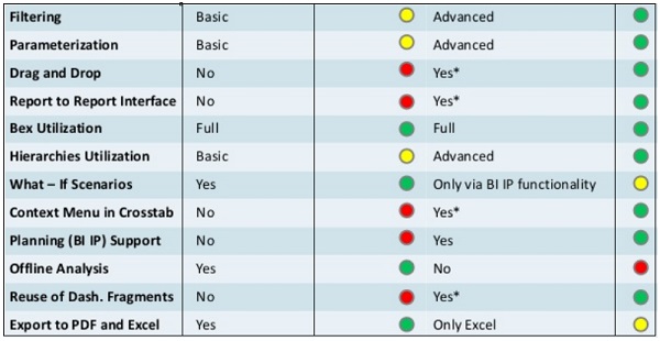
SAP Dashboards Vs Design Studio
SAP Dashboards Designer and Design Studio both are excellent tools for creating dashboards and support advanced features. The selection to choose one over other purely depends on the client requirements and system landscape.
| Features | Dashboards Designer | Design Studio |
|---|---|---|
| Chart Types | There are 22 charts of 16 types | 34 charts of 12 types |
| Selectors | 18 Selectors of 16 types | 10 Selectors of 10 Types |
| Containers | 7 Containers of 3 Types | 5 Container of 5 Types |
| Maps | For 100 Countries | No Maps |
| Calendar | Calendar is available as table | Calendar is available as input field |
| Filter Panel | No filter Panel | Drilling and Filtering Capabilities |
| What−If Component | 6 components | No components |
| Visualization Engine | Adobe Flash with HTML5 support | Native HTML with CSS |
| Design and Color Schemes | Multiple themes, customize using GUI | Basic themes, customized using CSS |
Sample Models
Sample models can be used to check how the different functions work in Dashboards and how you can use these functions in your own model. Each sample model includes own embedded spreadsheets data to check how different components are bound to data in spreadsheets.
You can check sample models in Dashboard by going to the File option at the top.
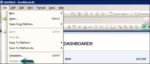
Under Category → User Guide Samples → Items list → OK
SAP Dashboards - WorkSpace
In this chapter, we will discuss about the various tools and buttons that are available in SAP Dashboards.
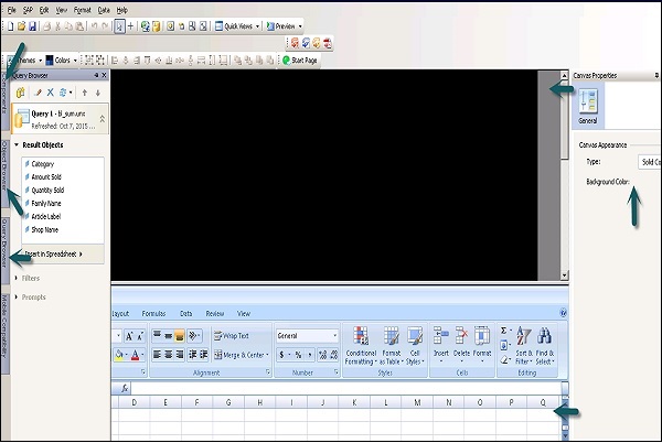
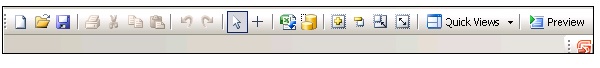
The following image shows the most commonly used browsers available in the Dashboard designer −
- Component Browser
- Object Browser
- Query Browser
- Canvas
- Embedded Spreadsheets
- Properties Panel
There are five toolbars that you can use when working with models. These are −
- Standard
- Theme
- Export
- Format
- Start Page.
Standard Tool Bar
It contains a button for completing general tasks.
Theme Tool Bar
It contains buttons for working with themes.

Export Toolbar
It contains buttons for exporting your model to different formats.

Format Toolbar
It contains buttons for adjusting component on the canvas.

Start Page Toolbar
It contains one button that is used to toggle the start page. You can use shortcuts to create new files or to open existing files.

SAP Dashboards - Font Options
Different fonts can be set for different components. There is an option to setup the global font if you want to use the same font for all the components. This can be used on device fonts or on embedded fonts. When you use machine fonts, exported file is smaller and you cant rotate text. When embedded fonts are used, you can rotate the text but the file size will be large.
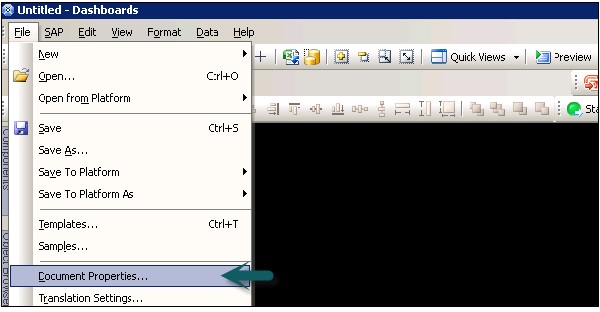
To set Global Font, go to files → Document Properties.
Click on use Global fonts and options for setting up the global font. It will be enabled as shown in the following screenshot −
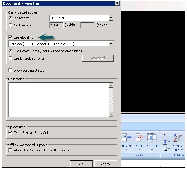
From the list, you can select −
- Use Device Fonts (Fonts will not be embedded).
- Use Embedded Fonts.
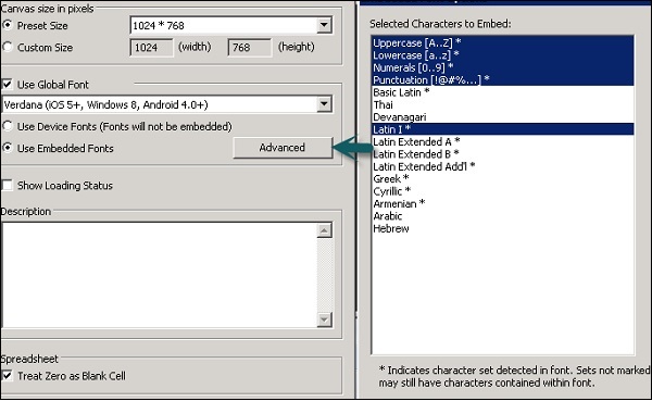
In Embedded fonts, you can go to the advanced tab as shown in the following screenshot and then Click OK.
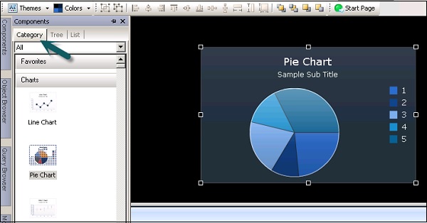
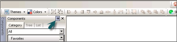
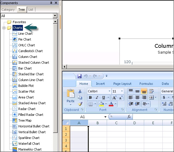
SAP Dashboards - Components Browser
This browser provides you with a list of all the components that are available to add to the model in Dashboard. You can drag these components to Canvas.
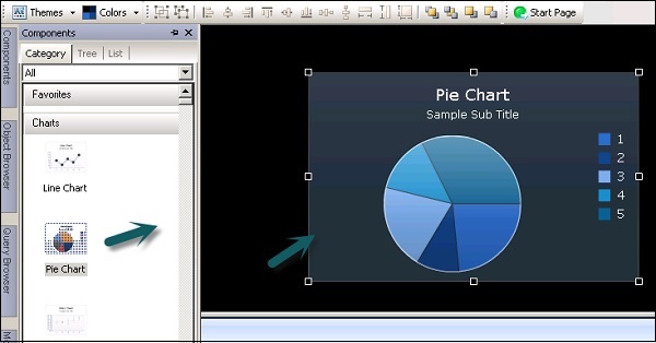
You can also view the components under Tree and List as per the functional category.
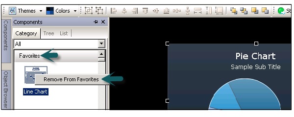
Favorites − These are available under Category and Tree view. To add a component to Favorite, right click on the component → Add to Favorites.
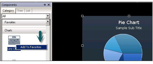
Once you add a component to Favorite, you can see it under the Favorite tab. To remove the component, right click → Remove from Favorites as shown in the following screenshot.
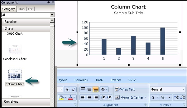
Charts − Charts are used to perform comparison, trend and patterns.
Containers − Container components group and display other components.
Selectors − It allows dashboard consumer to select data at run time.
Maps − It is used to display data by region.
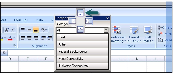
Category View − Components are grouped in a sliding view and you can scroll down to open each category.
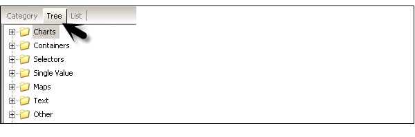
Tree View − In tree view, the components are organized in folders as per their category. You can click on the folders to see what all categories are there and check the list of available components as well.
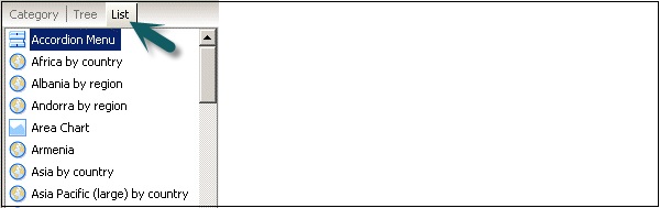
List View − In list view, the components are arranged in alphabetical order and they are not grouped based on the category.
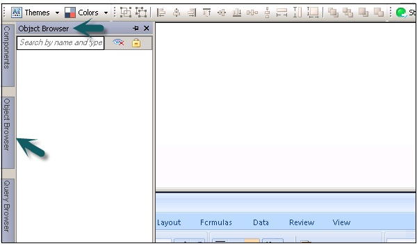
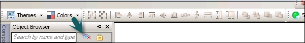
SAP Dashboards - Object Browser
An Object Browser provides you with list of all the available components that you can add to your model. You can use Object Browser to add and change these components and to lock or hide the components in the canvas.
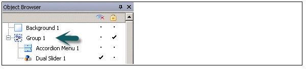
To select a component in the Object Browser, click the component name to make it active on the canvas. To select multiple components, you can use the CTRL key.
Renaming and Hiding the Components
You can also rename a component that you add to the Canvas in Object Browser. Click on the component that you want to rename. The name is highlighted and the cursor is in the text box. Enter the name of the component and press ENTER.
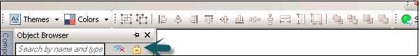
You can hide the components on the Canvas to prevent any interaction with them. To hide or show all the components in the Object Browser, do the following −
Locking the Components
You can also lock the components and groups in the Canvas so that they cant be used in the model.
To lock all the components or group, you can click on the lock icon.
Setting up the Canvas Background
You can change the color of the canvas background and can add grid to help you arrange items on the Canvas. You can adjust the size of the canvas to get more space to work. You can set the canvas background as solid or gradient background.
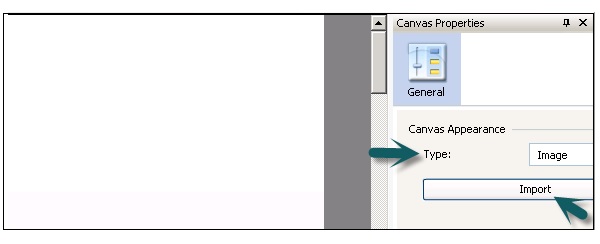
To set a transparent background, under the Canvas properties, select type as None. If you cant see the Canvas property pane, open a model. You can set the following value for type −
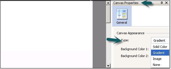
| Solid | A Single solid color |
| Gradient | Two colors that fade together from top to bottom |
| Image | A JPG or SWF file. Select the file to import as the background |
| None | A transparent background |
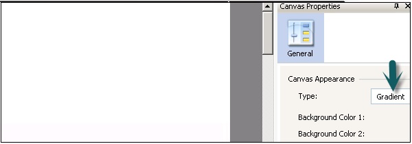
Background Color
When you select solid or gradient type, you can select the background color box to set the colors to be used in the background.
For Solid Background, select a single color and or Gradient background select Background color 1 and Background color 2.
When you select type as Image, you can get an import option to add an image from your local computer. You can add a background in your data model that may match your company logo or any other image represents objective of the model.
Display Grid on Canvas with Components
You can also line items along with gridlines. You can use grid manually to position each component.
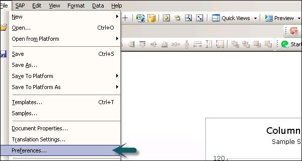
Go to File → Preferences −
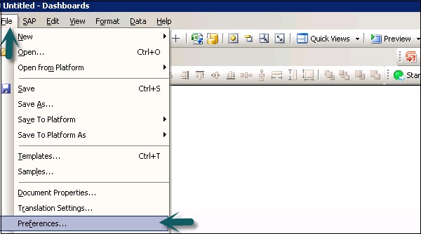
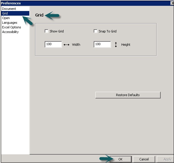
On the left side, select Grid and you can choose from the following options −
| Show Grid | Select to display a grid on the canvas. |
| Snap To Grid | Select to have components automatically align to the nearest gridlines. |
| Width | Specify the spacing between grid columns in pixels. |
| Height | Specify the spacing between grid rows in pixwls. |
SAP Dashboards - Quick Views
In this chapter, we will discuss what Quick Views are and how is it beneficial to SAP Dashboards.
Ways to Access Quick Views
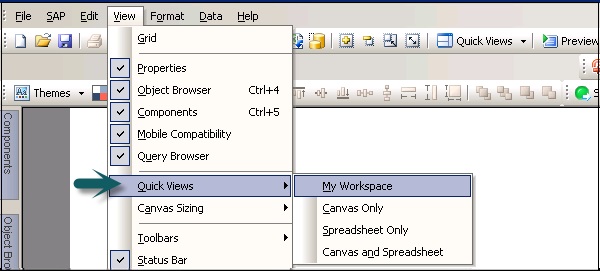
To quickly access different views in the Dashboard, you can use the Quick Views option. Go to View → Quick Views.
You can also access Quick Views by going to the Standard Tool Bar as shown in the following screenshot.
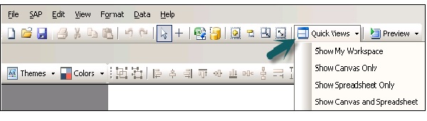
My Workspace − This is used to view workspace as you last configured it.
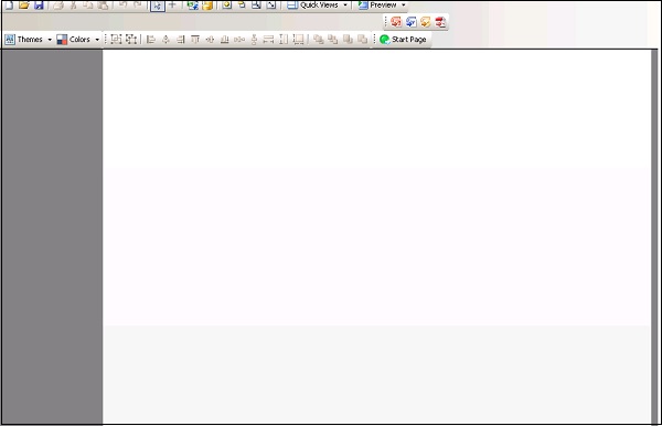
Canvas Only − This view can be selected to arrange components on Canvas while designing your model.
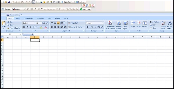
Spreadsheet Only − This view is used to display spreadsheet. It is useful to see the correctness of data, creating blank cells, or to put formulas. You can perform a search easily in case of large size spreadsheets.
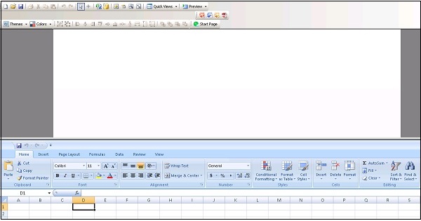
Canvas and Spreadsheet − This is used to view Canvas and spreadsheet so that you can get more space to select components and to bind them to spreadsheets.
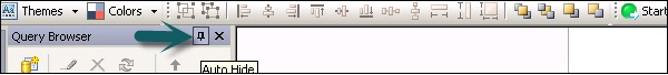
Using Auto-Hide
The auto − hide feature is used to automatically hide the panels when they are not in use. This function is available for the following components −
- Property
- Object Browser
- Component Browser
- Query Browser
When you have auto hide enabled, a panel will automatically collapse when you point the cursor outside the panel. You can again expand a panel by clicking on the panel name in the workspace area.
SAP Dashboards - Docking/Undocking
It is also possible to move the Object Browser, Components Browser, Query Browser and the Properties Panel from their default locations. To dock a component, you have to click on top of the panel and drag it to the docking icon. To move a component, you have to first remove auto hiding.
Each item has a unique docking location. The symbol represents all the possible locations where you can dock the component.
If you want to undock a panel, you can drag the panel to any place away from the docking icon.
SAP Dashboards - Working With Components
Components are defined as visual elements in your dashboard. You can categorize components by functions like charts, selectors, maps, and other categories. You can link components to a query in the query browser or to cells that are there in the spreadsheet.
Components can receive data from queries or a cell or you can also return the data to a query or cells in the spreadsheets.
SAP Dashboards - Properties Panel
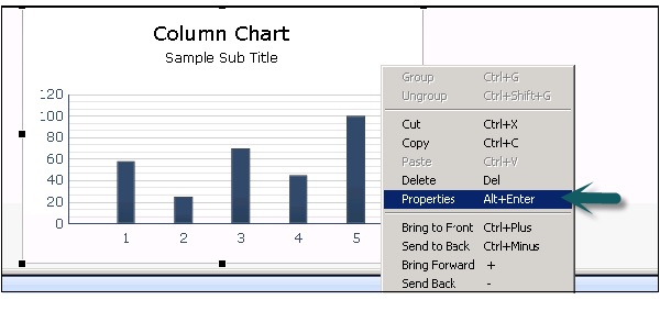
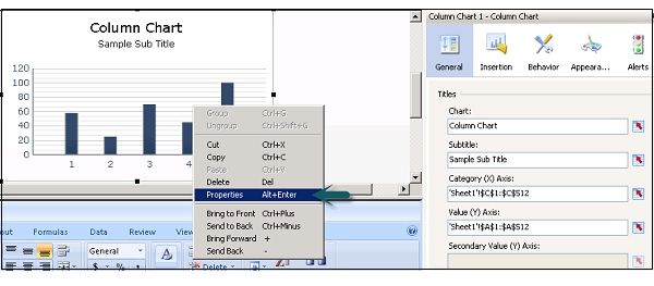
You can use the Properties Panel for settings and format options for the selected component. After you place a component on the Canvas, properties panel can be accessed using the following method.
Double click the components that you have added to the Canvas or you can right click → Properties as shown in the following screenshot.
Properties panel can be accessed for each component but the options available under Properties varies as per the component.
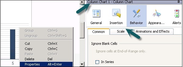
Types of Tabs in the Properties Pane
The following tabs are there in the Properties pane and each tab contains sub − tabs to set more properties.
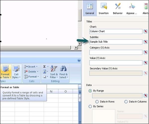
General
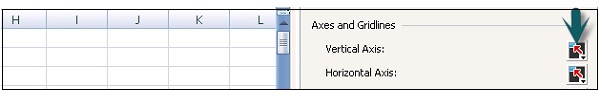
This tab is used to set the basic configuration properties of the component like Subtitle, source, category and value axis, etc.
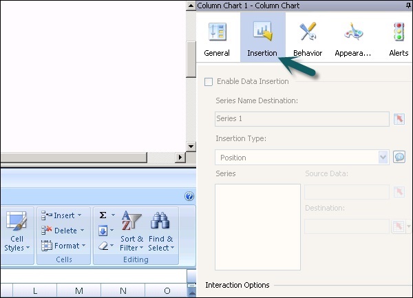
Insertion
This is available for charts and hierarchical tables. You can use this to configure charts as selectors so that clicking a chart adds more detailed information into the embedded spreadsheet.
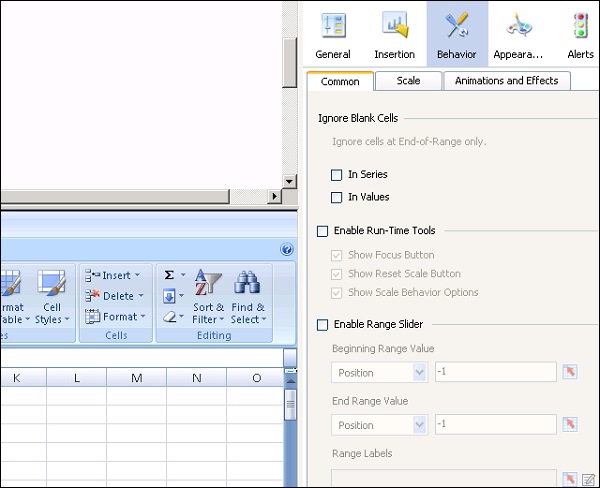
Behavior
It is used to set the behavior of a component in the modellimits, Blank cell, visibility, etc.
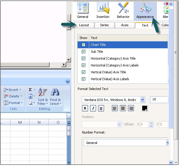
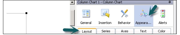
Appearance
It is used to set the appearance of the component. You can select text font, color, font size, legends, etc.
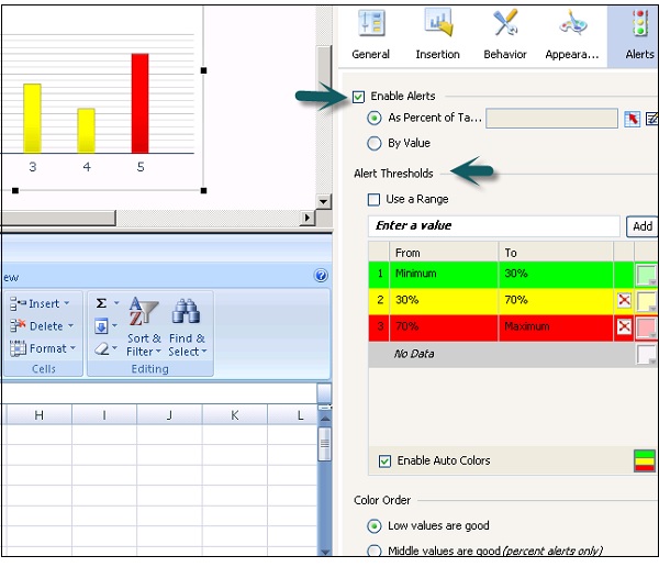
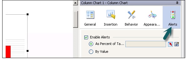
Alerts
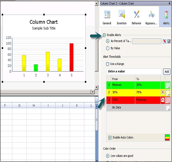
Alerts are used to set notifications for data values, if values are acceptable or require attention. To enable alerts, click the check box as shown in the following screenshot.
You can set Alert Thresholds, enable auto color, etc.
SAP Dashboards - Binding Components
To create a data model in the Dashboard designer, you need to bind the components to data sources. If you want to display numerical data in charts, maps and tables you need to perform binding
You can also bind component parameters to set parameters like titles, colors, visibility to data sources. Components can bind to cells in spreadsheets or to query in query browser.
Component Binding can be performed in the following two ways −
Embedded Spreadsheets
You can link the component data sets and parameters to source data in embedded spreadsheets. You have to specify each cell in spreadsheet that contains data for parameters or data set. Data can be added to cells manually or by connecting to external sources.
You can also use few components to write data to spread sheets by using the same procedure.
BEX Query or Universe Query
You can also use BEX query or Universe query as data source for different components in the model. You can select result objects from query to bind to the components. In many scenarios, it is not possible to bind query objects to component parameters.
You can also use a few components to write the data to query objects.
To clear the binding from a chart, you can select Clear Binding from the list as shown in the following screenshot.
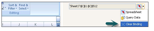
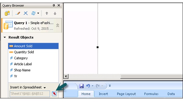
Note − You can select a maximum range of 512 rows in a range. Larger the value, slower the performance of the data model. To change this value, go to File → Preferences → Excel Options.
Setting Component Properties
You can select the multiple components and edit the properties. To go to the Properties page, select multiple components and right click → Go to Properties option as shown in the following screenshot.
Setting Colors for Component Elements
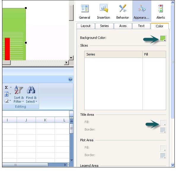
You can select colors for every element of every component in a model in the Dashboard. To set colors, go to Appearance View in the Properties pane.
There are a number of color combinations and you can also define your own color combination.
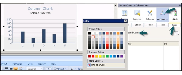
To add your own color combinations, you can click on more color options and select RGB or HSL. You can also set color at run time based on the user input or to a cell in a spreadsheet. Go to Properties → Appearance.
Go to Color tab and click on Color selector → Bind to a Color as shown in the following screen shot.
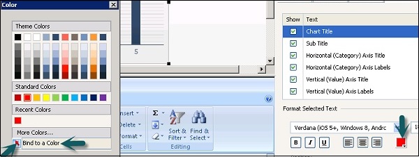
Color selection cell changes to bound color icon as shown in the following screenshot.
In a similar way, you can format text elements in a model in the Dashboard.
Configure Component Properties
You can configure the settings of components in the Properties panel. Select a component in the Canvas and go to Properties as shown in the following screenshot.
Not all the properties are available for all the components.
Different Tabs to Configure Component Properties
Following are a few Tabs that help in configuring different component properties in SAP Dashboard.
The General Tab allows you to configure basic properties like labels, displays, source and destination data and so on.
Insertion tab allows you to configure data insertion options for the component.
Behavior tab allows you to configure component functions like dynamic visibility, variable amount of data and scaling, etc.

The Appearance tab allows you to set visual characteristics of the component, its layout options, text options, color, etc.
The Alert tab is used to enable alerts of acceptable values of data, threshold values, acceptable range and color coding for different values.
SAP Dashboards - Component Colors
You can set the color for each element of a component in the data model. Colors can be defined in the Appearance tab under the Properties pane. There are a wide range of colors available and you can also create your own custom colors.
How to Define a Color for an Element?
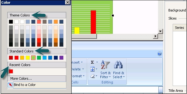
To define color for each element, select the element then → Go to Color Selector for each element. You can select the following sections in the color dialog box −
Theme Color − To define color of current theme.
Standard Color − These are group of basic colors.
Recent Color − This shows recently used colors.
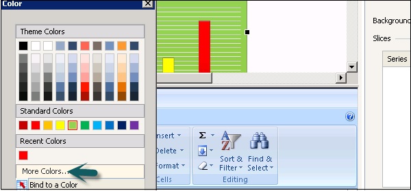
How to Create Custom Colors for Elements?
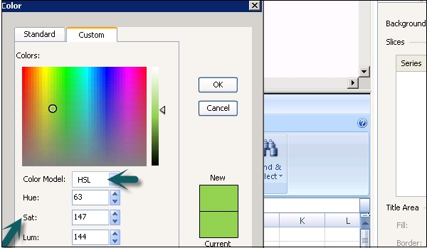
If you want to create a custom color for an element, go to Color selector → More Colors.
Go to Custom Tab → Select RGB or HSL from the dropdown list.
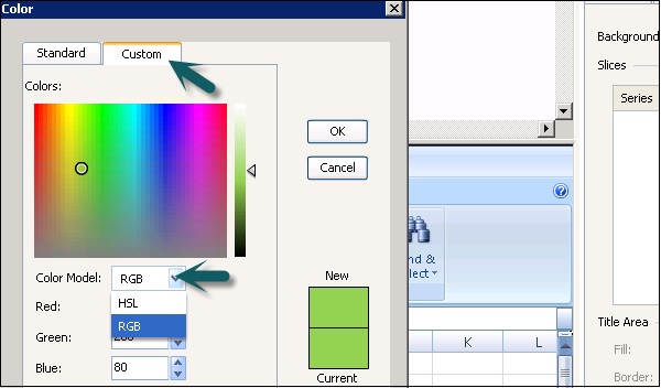
You can select Red, Green and Blue values for RGB and Hue, Sat and Lum for HSL. Once the custom color is selected, click OK to apply the color to that specific component.
SAP Dashboards - Setting Component Text
You can decide text formatting in a data model, if text has to be hidden or displayed like in labels, button text, legends, etc. When you select text to be displayed, you can define how the text will be look like.
How to Define Text Formatting?
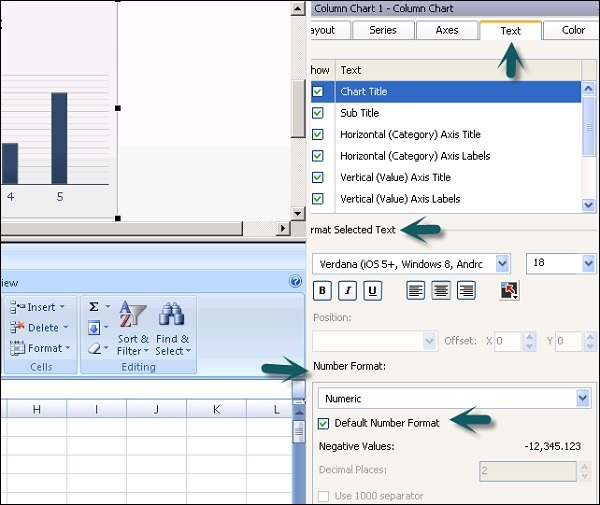
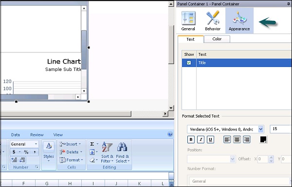
To define Text Formatting, go to Properties → Appearance → Text.
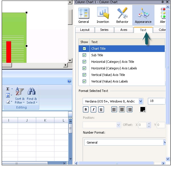
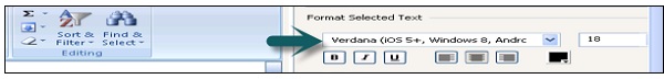
When you click on the Text tab, it shows a list of text elements that you can set for a component. In a format selected text, you can select font name, size, and text type (Bold, Italic or Underline), text color settings, etc.
The Position section defines where the label should be in relation to a component and in the offset you can set the distance to move it relatively to the position.

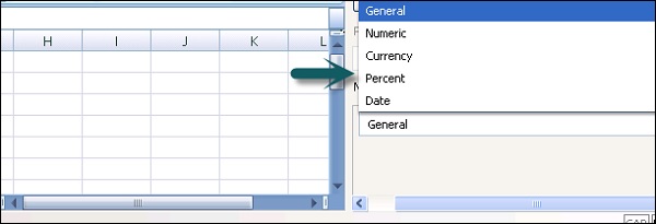
Number Formatting
In the Number format you can select the following values from drop down list −
General − No specific number format.
Numeric − Values are considered as numbers only.
Currency − In this format, values are displayed as monetary values.
Percent − Values are displayed as percentage format.
Date − The values are displayed in the Date format.
Time − The format allows values to display in time format.
Boolean − The values are displayed as two value option (true/false, etc.)
Text − The data is displayed as text only.
Additional Formatting
You can also do some additional formatting for a few format types. Some of them are as follows −
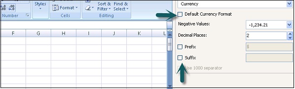
Negative Values − This is applicable to numeric and currency format and is used to specify formatting for numeric values.
Decimal Places − This is used to specify the number of decimal places.
Prefix/Suffix − This is used to specify the current symbol to show before/after the value.
Use 1000 Separators − This is used to put comma between hundred and thousand values.
SAP Dashboards - Chart Components
In a Data model, charts are used to perform comparisons, value analysis, and trend summary of data from data source. There are different charts options available for multiple purposes. The following screenshot shows what all options are there in the charts folder.
In this section, we will discuss regarding the different types of charts that are available in SAP Dashboards.
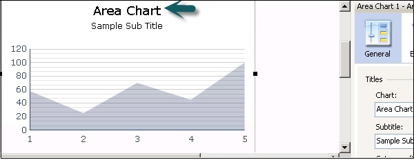
Area Chart
This is a standard chart with a horizontal and vertical axis.
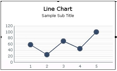
Line Chart
A Line Chart is useful for showing tendency over a period of time. It should be used for continuous data like stock revenues.
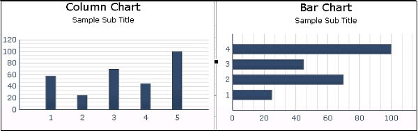
Bar and Column Chart
These charts are used to compare one or more items over a specific period of time. Bar and Column Charts are same and the only difference is their orientation.
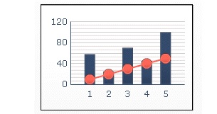
Combination Chart
This is a combination of column and line chart where the line chart shows the trend line for values.
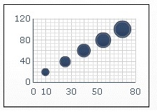
Bubble Chart
A Bubble chart is used to compare a group or series of item. On Z axis you represent the item size.
Bullet Chart
You can use bullet charts to show a single primary measure on a vertical or a horizontal bar.
Pie Chart
It is used to represent the participation of each item of a certain total value in a circular format. The Pie Chart is suitable for models like total revenue by the product line.
There are quite a few different types of charts that can be used, some of which are as follows −
- Radar Chart
- Sparkline
- Water Fall Chart
- XV Chart
SAP Dashboards - Container Components
The container component can be nested to create multilayer models. You can use a canvas container within the main canvas to hold one or more components. You can add, move, delete or change components in the panel container.
Types of Containers
You can use different types of containers, some of which are as follows −
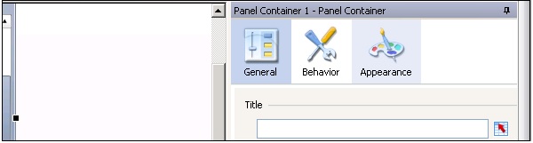
Panel Container
You can use a panel container to hold components in smaller canvases within the main canvas. You can add, delete, move or change components in a panel container.
To see the list of components in a panel container, go to Object Browser → Expand.
Tab Set
A Tab Set component acts as a smaller canvas within the main canvas and contains multiple tabs. To display a view, you can click on the corresponding tab.
Note − In case you delete a container or a tab set, all the components in a container or tab set are also deleted.
Container Properties
Like a Canvas, you can set different properties for a container −
Container General Properties − You can add general properties of a Container such as − Title, etc.
Container Behavior Properties − You can set behavior properties of the container such as the Scroll bar options, Dynamic visibility, etc.
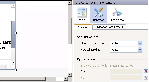
Container Appearance Properties − You can define Appearance for the container elements like Text and Color properties.
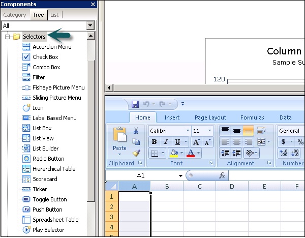
SAP Dashboards - Selector Components
A Selector component allows users to pick different options at run time. A selector can be used to configure the items row, value, position and label into an embedded spreadsheet. You can add selectors from the Component browser in the Dashboard designer.
Types of Selectors
There are quite a few selectors which are available in the Selector Component. Some of them are as follows.
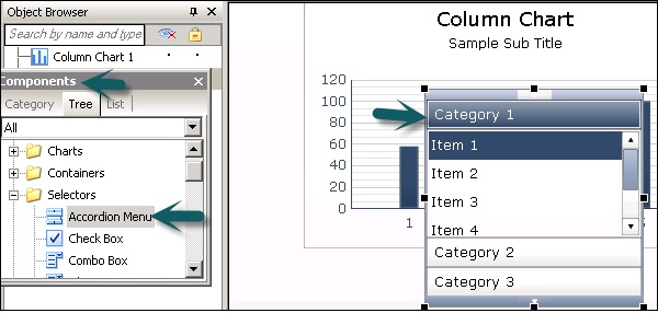
According Menu
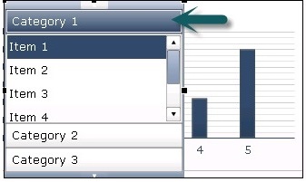
This is defined as a two-type of a selector that allows the users to select a category and then select items from that category.
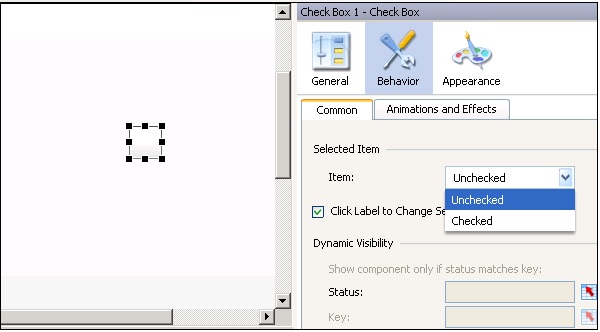
Check Box
This is a two-way box where a user can assign a checked or unchecked box. You can pass specific values to be checked or unchecked states or can bind the value to each state to use in the spreadsheet.
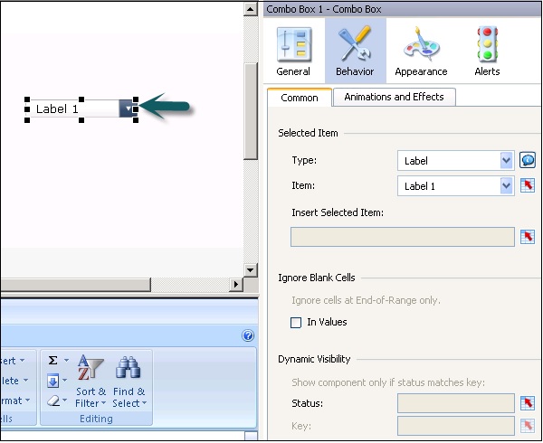
Combo Box
It allows you to use a drop down list of the items when it is clicked. A user can select an item from the list.
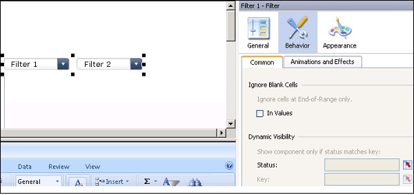
Filter
The Filter component checks a range of cells with multiple fields of data and categorizes them as multiple set of filter criteria. A User can select different information in each filter list.
There are many other selectors that you can use in the data models.
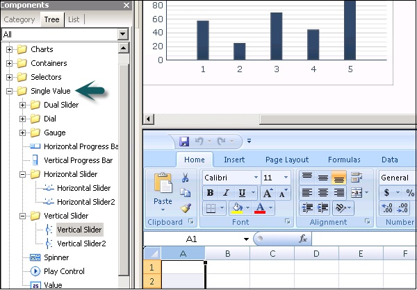
SAP Dashboards - Single Value Components
Single Value Components (SVC) are used for adding interactivity to data models. You can use them to add more attention to important parameters.
Types of SVC
Single value components can be used in different styles, some of which are as follows −
- Horizontal Progress Bar
- Vertical Progress Bar
- Dual Slider
- Dual Slider 2
- Dial and many more
Single value components can be used as an input or output element. As an input element, it can add user interactivity and output element is used to display value of cells.
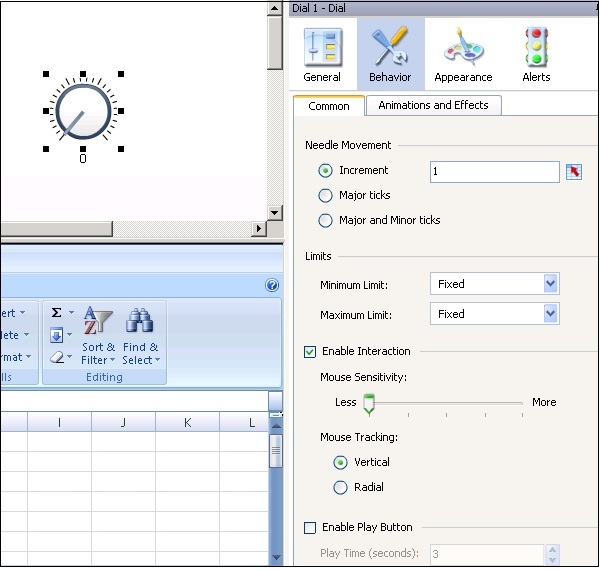
Dial
Dial is used as a link to a single cell. Users can click and drag dial to change the values.
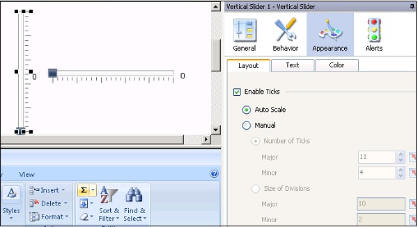
Horizontal and Vertical Slider
These are connected to a single cell and is used to pass user input. Users can drag the slider to change the values in the data model.
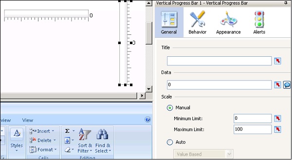
Horizontal and Vertical Progress Bar
When value displayed by progress bar increases, more and more area gets filled.
There are various single selector components that you can use in a data model. Some of these are shown in the following screenshot.
Like other components, you can also set different properties for a Single Value Component.
Note − You can use Data inside General Properties to display a value statically or use cell selector to choose a cell from spreadsheet. You should select a single cell for many of the components except Dual slider and Gauge components.
Properties of Single Value Component (SVC)
Following are a few properties of Single Value Component (SVC).
General Properties
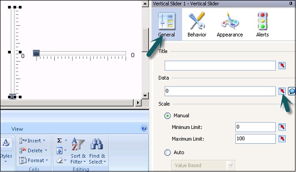
It includes title, data, range, minimum and maximum value and other general properties.
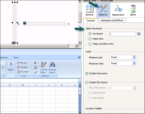
Behavior Properties
You have two tabs in behavior properties, which are
- Common
- Animations and Effect
Appearance Properties
You have different tabs under appearance such as −
- Layout tab
- Text tab
- Color tab
You can select different values under these tabs for various components.
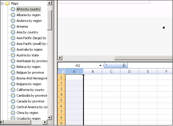
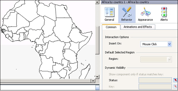
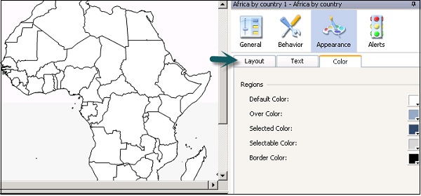
SAP Dashboards - Map Components
You can use the map component to create data models to display data by region. You can also use each region as a selector. This allows the user to create a data model that shows data for each region whenever the users cursor is over that region and allows the user to check more details for each region.
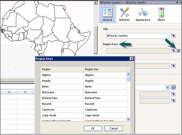
The data is associated to a map using region keys and that usually is the name of that region. You can also edit region keys by clicking manual edit option or by clicking on the cell selector.
Under the General Properties you can set the title, region keys, display data and other general properties. Whereas, under the Behavior properties, you can select insert on, region, dynamic visibility, etc.
Under the Appearance properties, you can select transparency, mouse over labels, values, default color, selected color and other text and color properties.
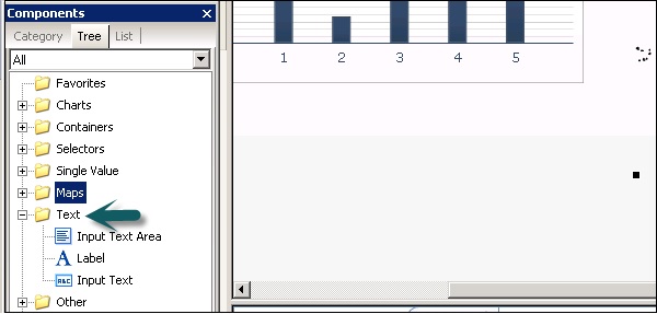
SAP Dashboards - Text Components
Text Components in a data model allows you to customize that data model. You can link text components to cells in embedded spreadsheet to change values dynamically or can also insert static text. You can also use formulas with HTML to allow more formatting options.
Various text components can be used in data models, some of which are shown in the following screenshot.
The input text area allows the user to display multiple times at run time.
A label component allows you to add comments like − explanation, help, etc.
Input text component allows you to display text that a user can edit at runtime. Like other components you can set the properties for text components.
Apart from the above components there are various other components that you can use for a different purpose.
Web Connectivity Components
These components allow you to connect your data model to the web. Apart from this, you can also use data manager to configure web connectivity.
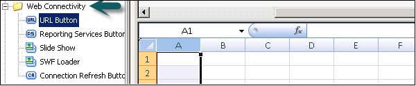
URL button − When a user clicks at run time, a button links to a relative or absolute URL.
Reporting Service Button − This allows you to connect to the reporting services server and select a report to use in the data model.
Slide Show − This allows you to create a slide show of URL based images and SWF files.
SWL Loader − This allows you to load the SWF files from a URL and you dont have to import the files. It is similar to the slide show component but it provides better memory management.
Connection Refresh Button − This allows the user to refresh the connection manually when you link to it.
SAP Dashboards - Universe Connectivity
This category provides components that can be used with queries on the Universe.
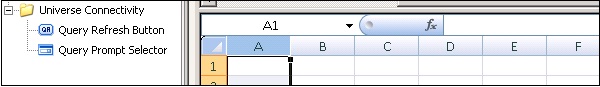
Query Refresh Button
This allows the user to refresh the data at runtime. You can include Universe or BEX query to allow users to request a query refresh at run time.
Add Query Refresh button to Canvas and Right Click → Properties.
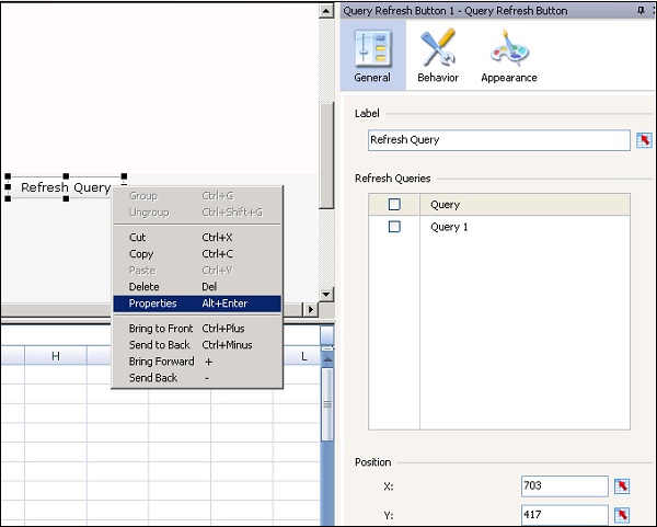
In the label tab, you can enter the text manually or can use cell selector to add a text from a cell in spreadsheet. Refresh the queries window which allows you to select the query active for your data model.
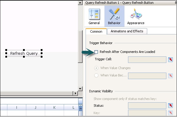
In a similar way you can go to the Behavior tab and set the following property.
Refresh after components are loaded − This option allows you to refresh the connection automatically when your data model loads. There are various other fields that you can select for a query refresh.
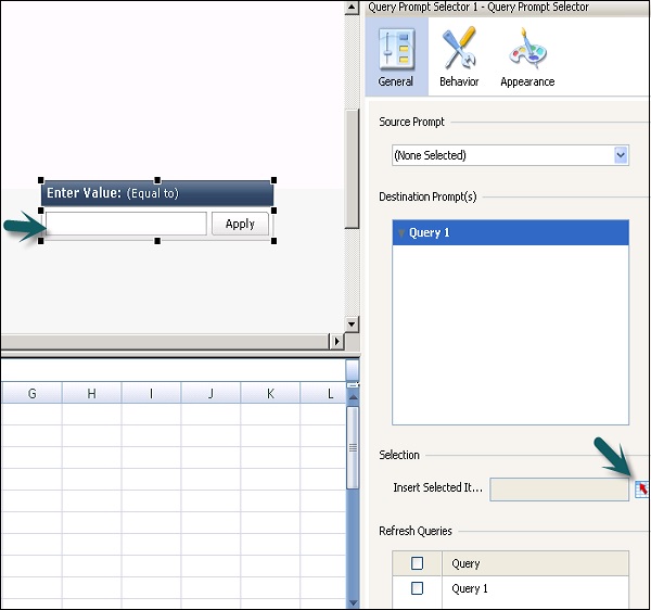
Query Prompt Selector
This allows the user to select values from the BEX or Universe query prompts at run time. As per the prompt type, a user can select a single value to use as the filter parameter or can choose selection objects.
To add a query prompt, you can add it from the components list and select a source query prompt or a preconfigured query prompt by dragging a query prompt to canvas.
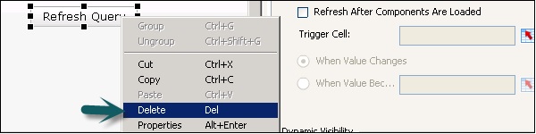
Deleting Components And Alerts
To delete a component, select the component and delete or right click and the delete as shown in the following screenshots.
Alerts
Alerts are used to bring the users attention to a specific item that reaches as per a preestablished limit. You can set different colors showing the level of alerts. In a common scenario the following colors represent some conditions, which are mentioned alongside them −
Green − Represents a desired condition.
Yellow − Represents a warning or not a desired condition.
Red − Represents a critical issue.
You can enable alerts for the following components in a data model.
- Selectors
- Single Value Component
- Charts
- Maps
- Other Components
SAP Dashboards - Models And Templates
A data model is known to consist multiple components that are bound to the data source in a query or a spreadsheet. You can use the default templates in the Dashboard designer to create data models.
To create a model in the Dashboard, you first need to import data into the embedded spreadsheet or create a query from the external data source. The next step is to add components as per the model requirements and link them to a data source. Then comes setting the properties of component like formatting, text, color and layout of component and last step is to preview and publish the model.
Templates
To create new models, you can use templates as the starting point. Templates also gives an idea how different the component works and you can add them to the canvas to build a new model. You can add a template, delete it or can also modify it.
You can use templates that contain basic components and add customization to meet the dashboard needs as per the requirement.
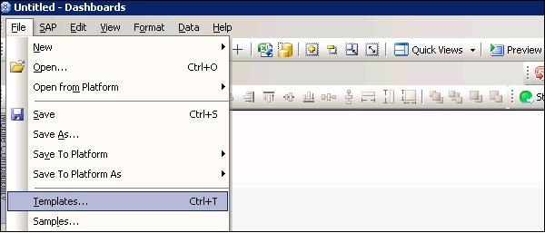
To open templates, go to File → Templates as shown in the following screenshot.
In the next window, you can see the template category. When you select a category, it shows you the list of templates under that category.
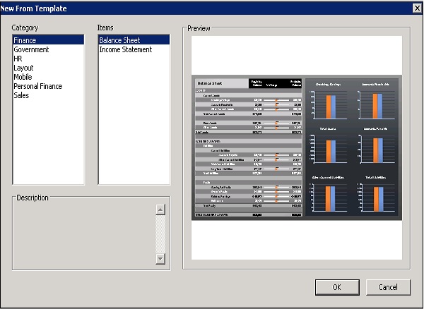
You can see the template item in the preview tab. Select the template and click OK.
Creating New Templates
Suppose you want to create templates with a company logo to use in the dashboards. You can add logos and set appearances and once it is done you can save your model.
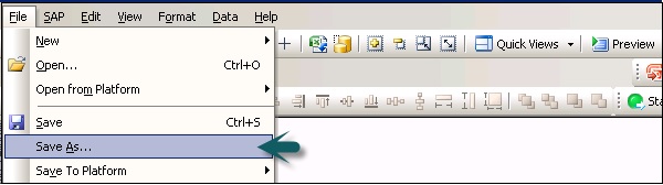
Go to File → Save As and navigate to template folder \assets\template. Enter the name of file and click Save.
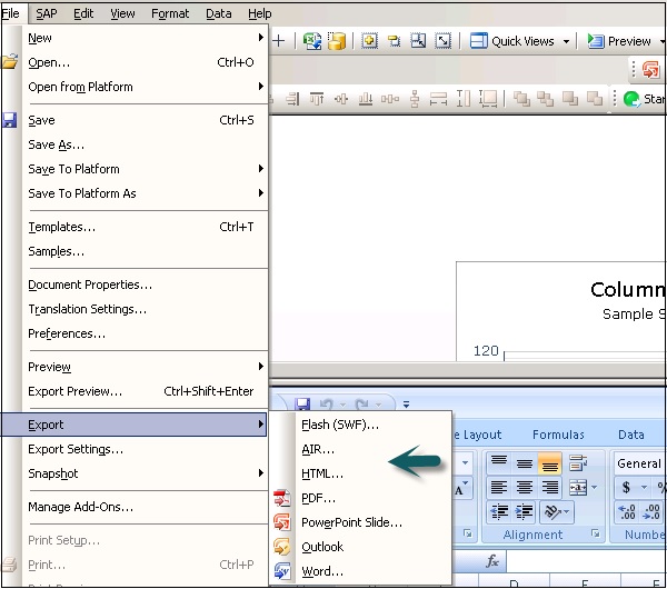
To export the template, go to File → Export → Flash (SWF)
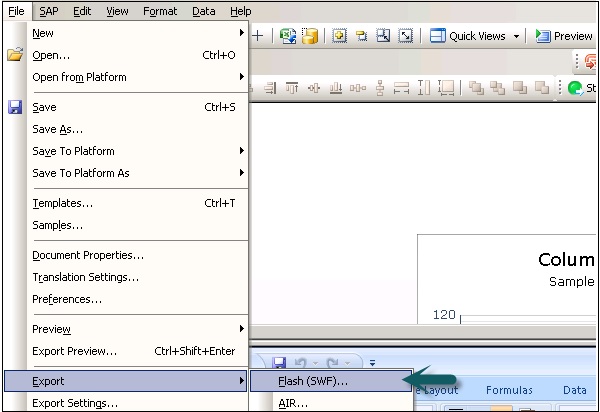
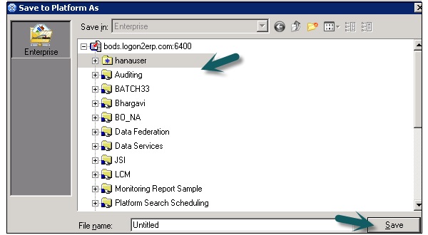
Navigate to the Template folder and select the file name and click Save.
SAP Dashboards - Themes
Using themes, you can apply the same layout, appearance and formatting to data models when you need all models with the same look. Theme provides you with a color scheme but you can customize it as per the requirement.
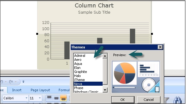
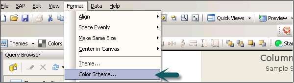
To apply a theme, go to Format → Theme
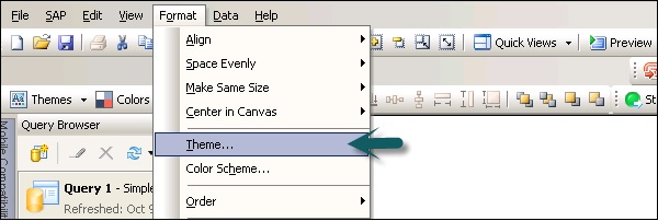
From the theme list, select the theme and you can see the preview of that theme in the preview window. Your model is updated as per the theme properties.
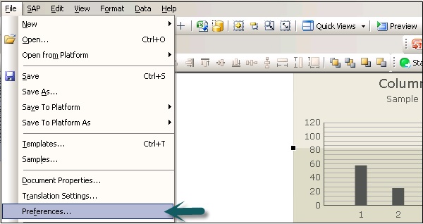
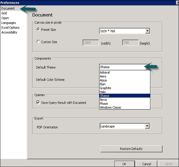
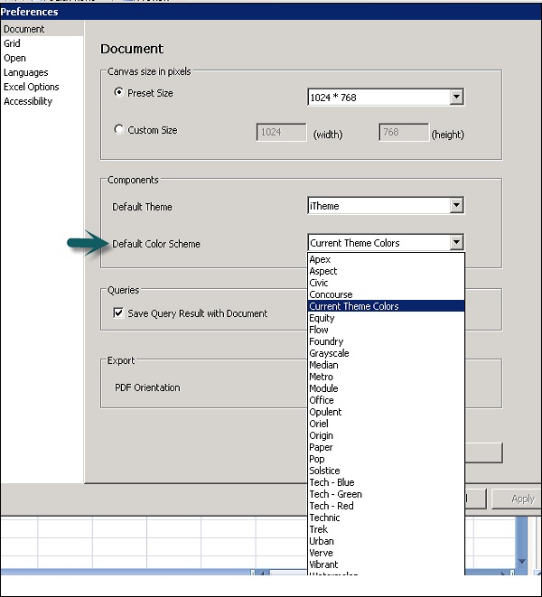
You can also set that theme as the default theme for your model. To set a theme as default, go to File → Preference
Go to Document → Under Components → Select Theme from drop down list → OK.
SAP Dashboards - Color Schemes
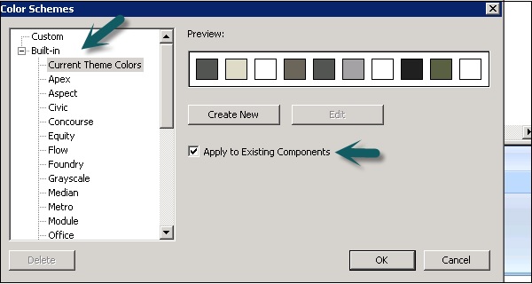
Color Schemes are used to set color platelet components in the model. A color scheme can be applied to an entire mode or to specific components.
How to Apply a Color Scheme?
To apply a color scheme, select the model.
Go to Format → Color Scheme.
Select the color scheme you want to apply. You can select Apply to the existing components otherwise it is applied to the canvas and all the newly added components.
You can set a color scheme as default by going to File → Preference.
SAP Dashboards - Previewing Models
You can use the Preview option to view different combination of components, colors, layouts, and can check how different schemes can be applied to the models.
How to Preview a Model?
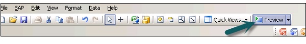
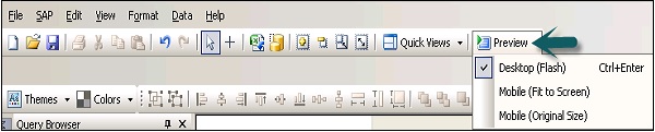
To Preview a model, go to File → Preview as shown in the following screenshot.
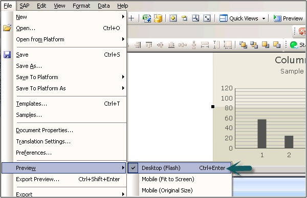
The other option is to click on the Preview button at the top in the tool bar as shown in the following screenshot.
Working With Data Sources
To create data models, you need to import data from different data sources. You can use the following functions −
- Data connections
- Embedded spreadsheets
- BEX and Universe queries
Embedded Spreadsheets
In your data model, you can link your components to cells in the spreadsheet. It supports many features that are supported by Excel files. However, few of its functions like Macros, Conditional Formatting and Function Formulas, etc. are not supported.
You can insert data in the spreadsheets using different ways, some of which are −
You can copy paste the data from other excel spreadsheets to the embedded spreadsheets.
You can import a spreadsheet from excel.
You can manually enter the data in a spreadsheet.
You can link query objects from a BEX or a Universe query to cells in an embedded spreadsheet.
Before you create a data model using embedded spreadsheets, it is necessary for you to create a performance optimized structure. You can consider multiple points to ensure that the structure is good. Some of these points are −
Use Excel functions with small data sets.
Use only supported Excel functions.
You can use color, labels and borders to find out cells or range in spreadsheet.
In case you have a large volume of data in the spreadsheet, you can create multiple tabs.
How to Set Preference for Embedded Spreadsheets?
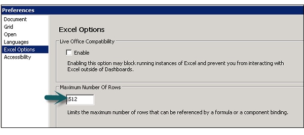
To set preference for Embedded Spreadsheets, go to File → Preferences as shown in the following screenshot.
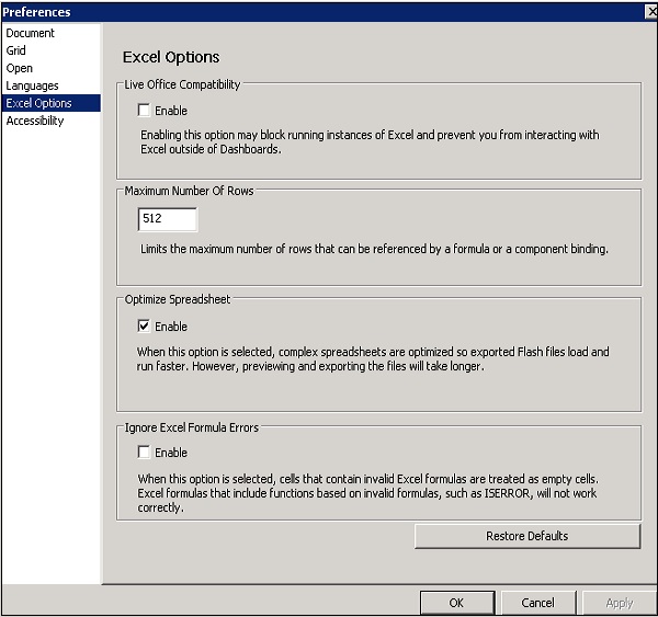
On the left side, go to Excel Options and you can select the following options −
Live Office Compatibility − You can work with Live Office enabled spreadsheet within dashboards.
Maximum Number of Rows − Here you can select the maximum number of rows in a spreadsheet that can be bound to components.
Optimize Spreadsheet − This is used to optimize the spreadsheet at run time. This allows to calculate the formulas and save them in SWF, hence the model performs better at run time.
Ignore Excel Formula Errors − You can use this option to ignore the errors in the spreadsheet.
How to Import an Excel Spreadsheet?
To use an existing spreadsheet that will be used as a source for a new data model, you can import it to a new spreadsheet.
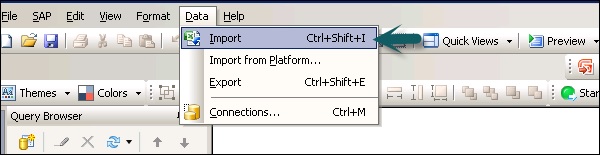
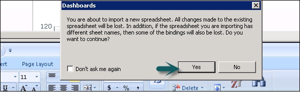
For this you will have to go to Data → Import as shown in the following screenshot.
In the dialog box which appears soon afterwards, click Yes as shown in the following screenshot.
Select the spreadsheet you want to import and click Open.
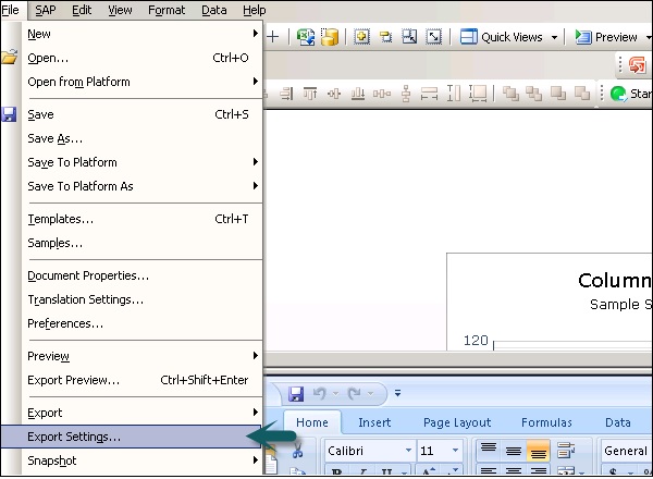
To Generate SWF Using an External Spreadsheet
To create the same model using the same spreadsheet structure but different values, the model can be exported using an external spreadsheet.
To do this, go to File → Export Settings as shown in the following screenshot.
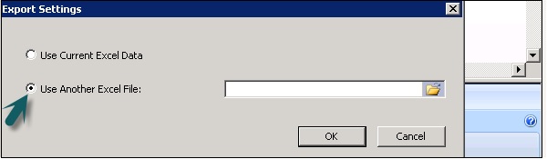
Select Another Excel File → Go to folder and select the spreadsheet to use. Click OK.
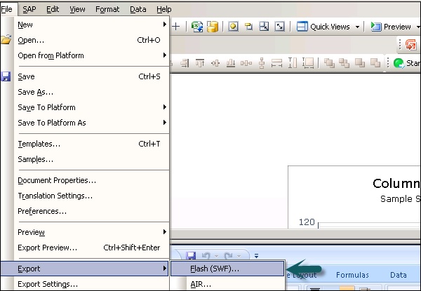
Now go to File → Export → Flash (SWF).
This opens a Save As Dialog Box. Enter the path and name of SWF File → OK.
SAP Dashboards - Data Connections
You can connect your model to an external data source. When you run the model, data is updated as per the current information in the data source. You can connect to an external data sources in the following ways −
- Using an External data connection in Data Manager
- Create query from BI source
Managing Data Connections
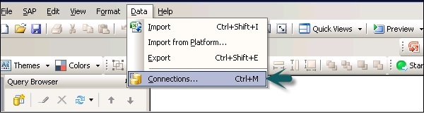
You can manage all the data connections using the Data Manager (CTRL + M). To open the Data Manager, go to Data → Connections as shown in the following screenshot.
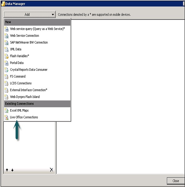
In SAP Dashboard Designer, the following data connections are supported −
- Query as a Web service (QWAAS)
- Web Service Connection
- SAP NetWeaver BW connection
- XML Data
- Crystal Report Data Consumer
- Live cycle Data Services
- External Interface Connection
- Live Office Connections
- Web Dynpro application as Flash Island and many more as below.
Adding an External Data Connection
To add an external data connection, go to Data → Connections as shown in the following screenshot.
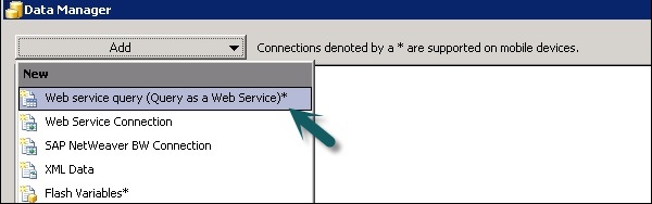
In the Data Manager Dialog Box, click on Add Connection and select a connection type from the list.
The next step is to configure the data connection.
To delete a connection, select the connection in the data manager and click on the Delete button.
How to Configure a Query as a Web Service?
To configure a query as a web service, go to Data → Connections. In the Data Manager dialog box, click on Add → select Web Service Query.
In the Definition window, enter the following details −
Name − A name for the connection.
WSDL URL − Type URL for WSDL generated by the web service query or select from the list. Click Import.
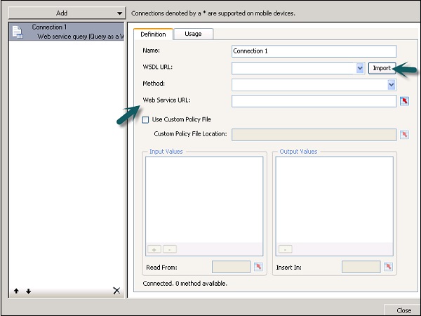
Select the method from the drop down list. When you select the method, the web service URL is displayed.
| RunQueryAsAService | This web service call is generated for index unaware prompts. This method requires an Enter_Year_As string as the prompt value for year. |
| RunQueryAsAServiceEx | This web service call is generated for index aware prompts. The input and output parameter sets are the same as for RunQueryAsAService method except for the input prompt for year values. This method requires an instance of LovValueIndex for year. |
| Valueof_ | This method is generated only when the Web service query encloses atleast one prompt and is intended to provide a list of values for the prompt it is named after. |
Input Value −
| Input Values | When you import the WSDL, the required inputs defined for the web service are displayed in this list. To set a value for each item, select the input object from the list then set the Read From option to map it to your model. |
Read from and Output Value −
| Read From | If the input values list includes items that require input, select the input item and then click the cell selector ( |
| Output Values | When you import the WSDL, the output parameters for the results object in the web service are displayed in this list. |
 ) to select a cell from the embedded spreadsheet where the selected object will retrive its value.
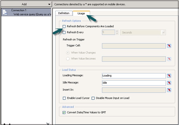
In the Usage tab, set the refresh and message options as shown in the following screenshot.
In a similar way you can configure other external data connections as well in the Dashboard.
SAP Dashboards - Export Format Options
You can export models from the Dashboard designer in different formats. Once you complete the configuration of the data model, to export the model, go to File → Export.
The following table shows the list of supported format for a Dashboard Designer.
| Supported Format | Presentation Design | SAP Crystal Dashboard | SAP BO Dashboards |
|---|---|---|---|
| Macromedia Flash (SWF) | ☑ | ☑ | |
| Adobe AIR | ☑ | ☑ | |
| Adobe Acrobat 6(PDF) | ☑ | ☑ | ☑ |
| Adobe Acrobat 9(PDF) | ☑ | ☑ | ☑ |
| HTML | ☑ | ||
| Microsoft PowerPoint | ☑ | ||
| Microsoft Outlook | ☑ | ||
| Microsoft Word | ☑ | ||
| BusinessObjects Enterprise | ☑ |
To export the model, go to File → Export and then select as shown in the following screenshot.
Enter the name of the exported file and then save it. If you are exporting to Outlook, enter the message and then click on the Send button.
SAP Dashboards - Dynamic Dashboard
In this chapter, we will discuss how to create a Dashboard on top of the SQL Server using Embedded Spreadsheets.
Dynamic Dashboard using SQL Server
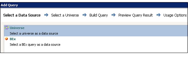
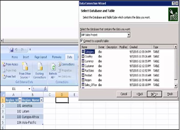
Open the Dashboard Designer and select an untitled dashboard.
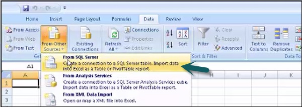
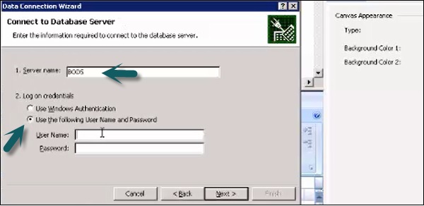
Go to the Data tab in the Spreadsheet → From Other sources → From SQL server.
Enter the SQL Server name and credentials to connect to the SQL server database as shown in the following screenshot.
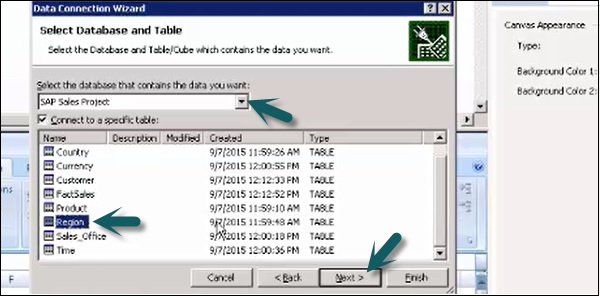
In the next window, select the database and table you want to use in the model.
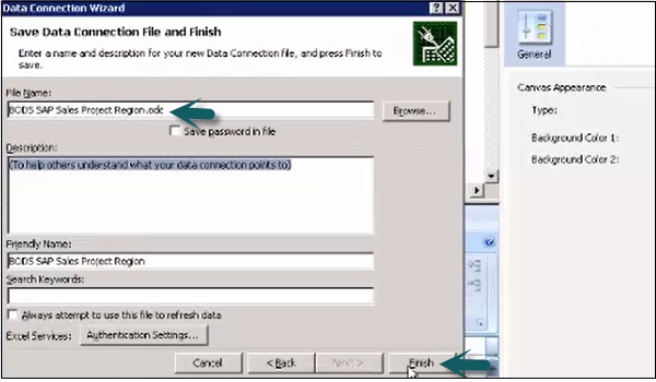
Enter the name of your data connection file and click Finish.
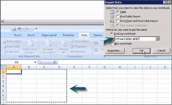
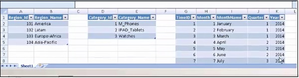
Select the area in the embedded spreadsheet and click ok. Enter the credentials again if it prompts.
In a similar way, select all the tables from the database to the embedded spreadsheet.
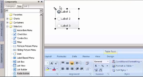
How to Add a Selector Component?
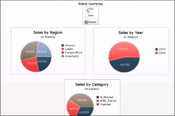
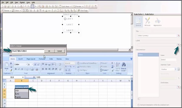
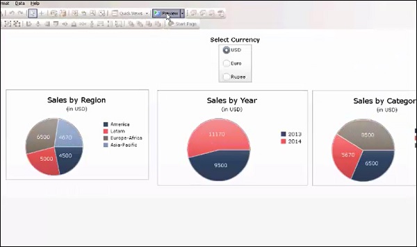
Here we can add the selector component − A radio button to implement Currency conversion in the data model.
Enter the title of the Radio button and go to the Cell selector to select cells from the spreadsheet.
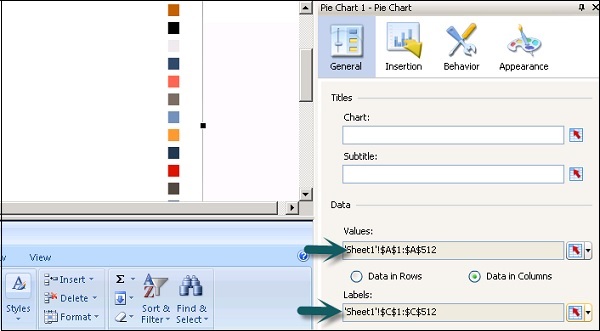
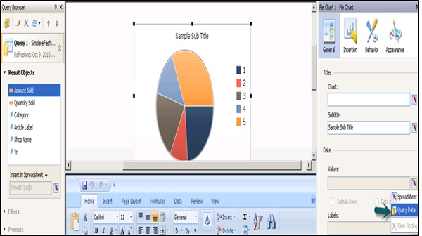
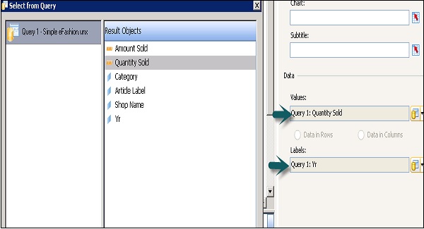
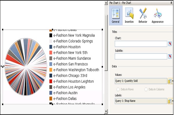
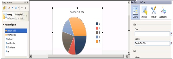
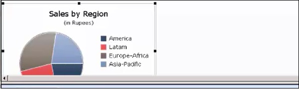
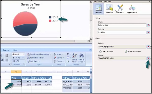
From components, select a Pie chart. Enter the title and sub title of the chart. Go to cell selector from the Values tab and select cells from the spreadsheets.
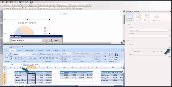
Go to General → Labels → Cell Selector to add labels to this component. Select cells from the spreadsheet to add labels as shown in the following screenshot.
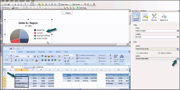
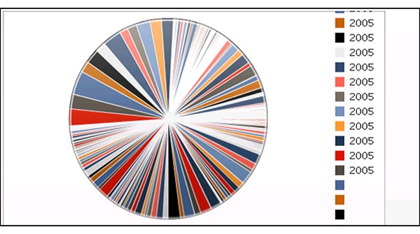
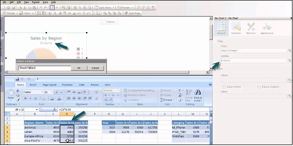
In a similar way, add more pie charts to add Currency in Euros and Rupees to show the sales. Add titles and subtitles to the chart to show the same and go to a cell selector.
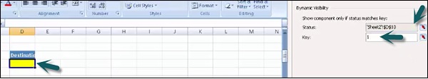
How to Enable Dynamic Visibility?
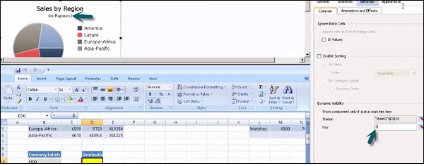
To enable dynamic visibility for each chart, go to Behavior → Dynamic Visibility and Status. Go to that cell in the Chart which stores value for dynamic visibility.
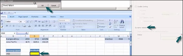
Enter the key value of each pie chart as per the Radio button selector component.
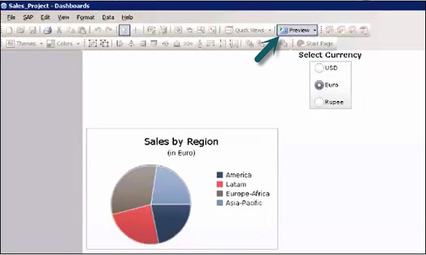
Save the model using the option at the top and go to the Preview option to see the preview as shown in the following screenshot.
To add more components to show sales by year, select a Pie chart and title it as Sales by year and subtitle as USD. Go to cell selector to pass value from embedded spreadsheet.
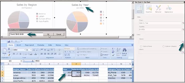
To add years as labels, go to labels and select the Years column from the embedded spreadsheet.
Set the dynamic visibility of the chart as mentioned in the previous topics. Value of the key is stored in the cell under Destination.
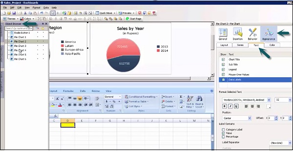
In a similar way, add pie charts for Sales by Year (In Euros) and Sales by Year (In Rupees). Save the Sales Project. To apply any type of formatting, you can view all the charts from the object browser, go to Appearance → Text.
Similarly, you can add more charts with the title − Sales by Category, as shown in the following screenshot.
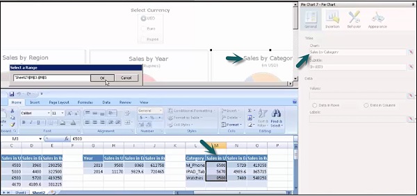
Add labels by going to the cell selector. Set the dynamic visibility for the components and multiple charts.

Save the project again and go to Preview option at the top.
This is how you can create models in SAP Business Objects Dashboard Designer and use embedded spreadsheets to get data from external data sources and do binding data with different components in the Canvas and use the dynamic visibility feature.
