- SAP Dashboards - Home
- SAP Dashboards - Introduction
- SAP Dashboards - Version
- SAP Dashboards - WorkSpace
- SAP Dashboards - Font Options
- Components Browser
- SAP Dashboards - Object Browser
- SAP Dashboards - Quick Views
- Docking/Undocking
- Working With Components
- SAP Dashboards - Properties Panel
- Binding Components
- Setting Component Properties
- Configure Component Properties
- Component Colors
- Setting Component Text
- Chart Components
- Container Components
- Selector Components
- Single Value Components
- SAP Dashboards - Map Components
- SAP Dashboards - Text Components
- Web Connectivity Components
- Universe Connectivity
- Deleting Components & Alerts
- Models & Templates
- SAP Dashboards - Themes
- SAP Dashboards - Color Schemes
- Previewing Models
- Working With Data Sources
- SAP Dashboards - Data Connections
- Export Format Options
- Dynamic Dashboard
SAP Dashboards - Chart Components
In a Data model, charts are used to perform comparisons, value analysis, and trend summary of data from data source. There are different charts options available for multiple purposes. The following screenshot shows what all options are there in the charts folder.
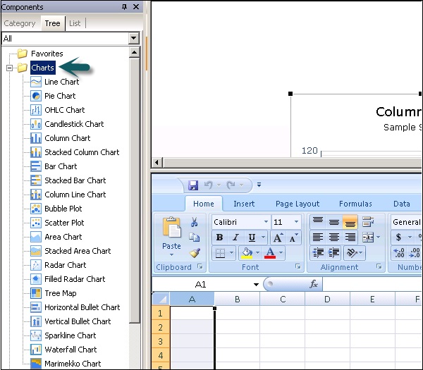
In this section, we will discuss regarding the different types of charts that are available in SAP Dashboards.
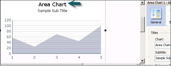
Area Chart
This is a standard chart with a horizontal and vertical axis.
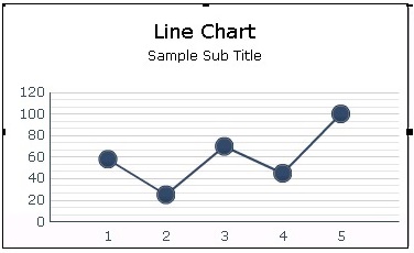
Line Chart
A Line Chart is useful for showing tendency over a period of time. It should be used for continuous data like stock revenues.
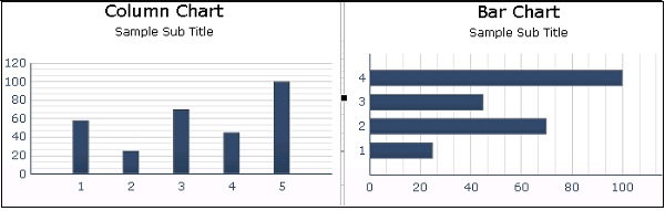
Bar and Column Chart
These charts are used to compare one or more items over a specific period of time. Bar and Column Charts are same and the only difference is their orientation.
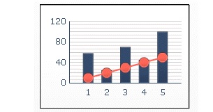
Combination Chart
This is a combination of column and line chart where the line chart shows the trend line for values.
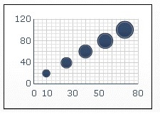
Bubble Chart
A Bubble chart is used to compare a group or series of item. On Z axis you represent the item size.
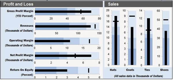
Bullet Chart
You can use bullet charts to show a single primary measure on a vertical or a horizontal bar.
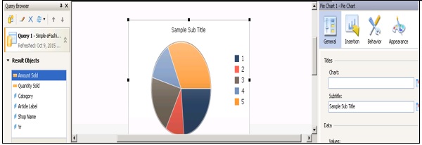
Pie Chart
It is used to represent the participation of each item of a certain total value in a circular format. The Pie Chart is suitable for models like total revenue by the product line.
There are quite a few different types of charts that can be used, some of which are as follows −
- Radar Chart
- Sparkline
- Water Fall Chart
- XV Chart
