- SAP Dashboards - Home
- SAP Dashboards - Introduction
- SAP Dashboards - Version
- SAP Dashboards - WorkSpace
- SAP Dashboards - Font Options
- Components Browser
- SAP Dashboards - Object Browser
- SAP Dashboards - Quick Views
- Docking/Undocking
- Working With Components
- SAP Dashboards - Properties Panel
- Binding Components
- Setting Component Properties
- Configure Component Properties
- Component Colors
- Setting Component Text
- Chart Components
- Container Components
- Selector Components
- Single Value Components
- SAP Dashboards - Map Components
- SAP Dashboards - Text Components
- Web Connectivity Components
- Universe Connectivity
- Deleting Components & Alerts
- Models & Templates
- SAP Dashboards - Themes
- SAP Dashboards - Color Schemes
- Previewing Models
- Working With Data Sources
- SAP Dashboards - Data Connections
- Export Format Options
- Dynamic Dashboard
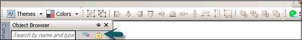
SAP Dashboards - Object Browser
An Object Browser provides you with list of all the available components that you can add to your model. You can use Object Browser to add and change these components and to lock or hide the components in the canvas.
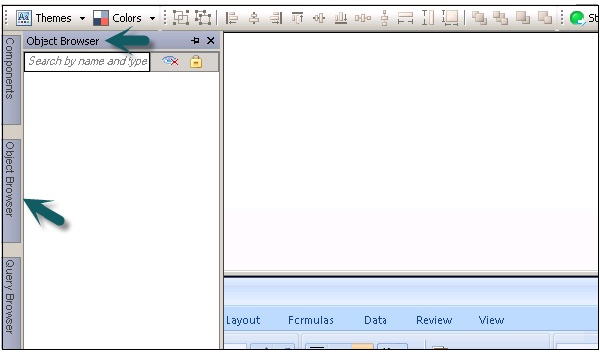
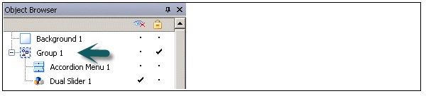
To select a component in the Object Browser, click the component name to make it active on the canvas. To select multiple components, you can use the CTRL key.
Renaming and Hiding the Components
You can also rename a component that you add to the Canvas in Object Browser. Click on the component that you want to rename. The name is highlighted and the cursor is in the text box. Enter the name of the component and press ENTER.
You can hide the components on the Canvas to prevent any interaction with them. To hide or show all the components in the Object Browser, do the following −
Locking the Components
You can also lock the components and groups in the Canvas so that they cant be used in the model.
To lock all the components or group, you can click on the lock icon.
Setting up the Canvas Background
You can change the color of the canvas background and can add grid to help you arrange items on the Canvas. You can adjust the size of the canvas to get more space to work. You can set the canvas background as solid or gradient background.
To set a transparent background, under the Canvas properties, select type as None. If you cant see the Canvas property pane, open a model. You can set the following value for type −
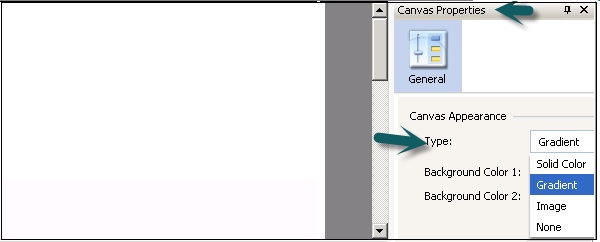
| Solid | A Single solid color |
| Gradient | Two colors that fade together from top to bottom |
| Image | A JPG or SWF file. Select the file to import as the background |
| None | A transparent background |
Background Color
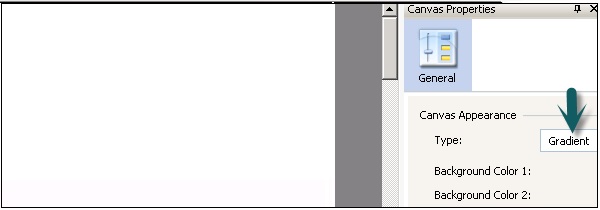
When you select solid or gradient type, you can select the background color box to set the colors to be used in the background.
For Solid Background, select a single color and or Gradient background select Background color 1 and Background color 2.
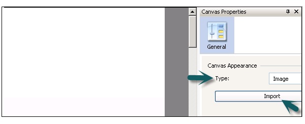
When you select type as Image, you can get an import option to add an image from your local computer. You can add a background in your data model that may match your company logo or any other image represents objective of the model.
Display Grid on Canvas with Components
You can also line items along with gridlines. You can use grid manually to position each component.
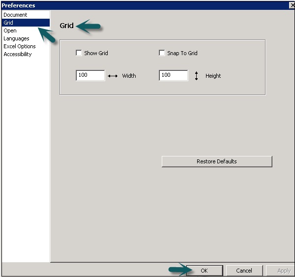
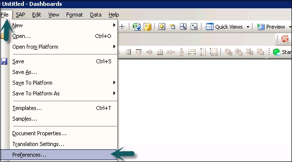
Go to File → Preferences −
On the left side, select Grid and you can choose from the following options −
| Show Grid | Select to display a grid on the canvas. |
| Snap To Grid | Select to have components automatically align to the nearest gridlines. |
| Width | Specify the spacing between grid columns in pixels. |
| Height | Specify the spacing between grid rows in pixwls. |