- XAML - Home
- XAML - Overview
- XAML - Environment Setup
- Writing XAML Aplication On MAC OS
- XAML Vs C# Code
- XAML Vs.VB.NET
- XAML - Building Blocks
- XAML - Controls
- XAML - Layouts
- XAML - Event Handling
- XAML - Data Binding
- XAML - Markup Extensions
- XAML - Dependency Properties
- XAML - Resources
- XAML - Templates
- XAML - Styles
- XAML - Triggers
- XAML - Debugging
- XAML - Custom Controls
XAML - Quick Guide
XAML - Overview
XAML stands for Extensible Application Markup Language. Its a simple and declarative language based on XML.
In XAML, it very easy to create, initialize, and set properties of an object with hierarchical relations.
It is mainly used for designing GUIs.
It can be used for other purposes as well, e.g., to declare workflow in Workflow Foundation.
XAML can be used in different platforms such as WPF (Windows Presentation Foundation), Silverlight, Mobile Development, and Windows Store App. It can be used across different .Net framework and CLR (common language runtime) versions.
How XAML Works
XAML is a declarative language in the sense it defines the WHAT and HOW you want to do. XAML processor is responsible for the HOW part to find out. Let's have a look at the following schema. It sums up the XAML side of things −
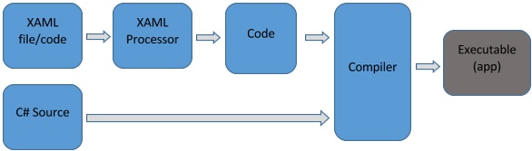
The figure illustrates the following actions −
The XAML file is interpreted by a platform-specific XAML processor.
The XAML processor transforms the XAML to internal code that describes the UI element.
The internal code and the C# code are linked together through partial classes definitions and then the .NET compiler builds the app.
Advantages of XAML
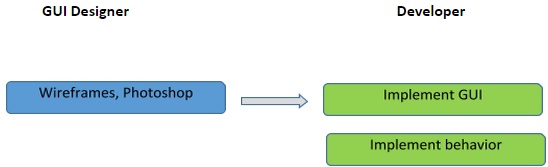
One of the longstanding problems that all of us face with GUI design can be solved by using XAML. It can be used to design UI elements in Windows Forms applications.
In the earlier GUI frameworks, there was no real separation between how an application looks like and how it behaves. Both the GUI and its behavior were created in the same language, e.g. C# or VB.net, which would require more effort from the developer to implement both the UI and the behavior associated with it.
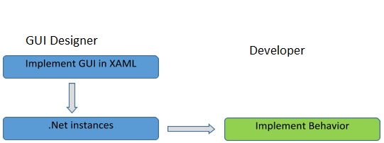
With XAML, it is very easy to separate the behavior from the designer code. Hence, the XAML programmer and the designer can work in parallel. XAML codes are very easy to read and understand.
XAML - Environment Setup
Microsoft provides two important tools for XAML −
- Visual Studio
- Expression Blend
Currently, both the tools can create XAML, but the fact is that Visual Studio is used more by developers while Expression Blend is still used more often by designers.
Microsoft provides a free version of Visual Studio which can be downloaded from https://www.visualstudio.com/en-us/downloads/download-visual-studio-vs.aspx
Note − For this tutorial, we will mostly be using WPF projects and Windows Store App. But the free version of Visual Studio doesnt support Windows Store App. So for that purpose, you will need a licensed version of Visual Studio.
Installation
Follow the steps given below to install Visual Studio on your system −
After downloading the files, run the installer. The following dialog box will be displayed.
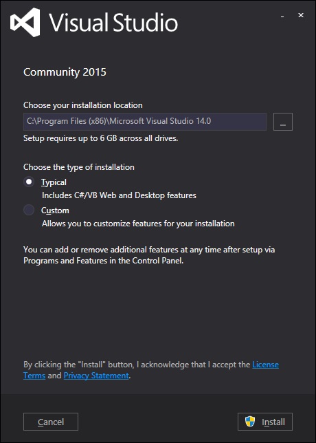
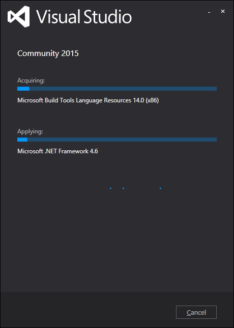
Click on the Install button and it will start the installation process.
Once the installation process completes successfully, you will see the following screen.
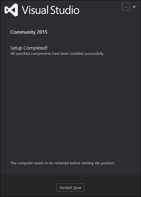
Close this dialog box and restart your computer if required.
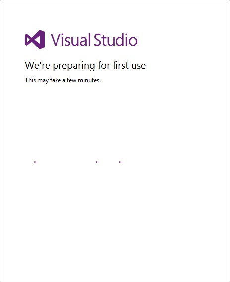
Now open Visual studio from the Start Menu which will show the following dialog box. It will take some time for the first time, only for preparation.
Once all is done, you will see the main window of Visual Studio.
First Step towards Implementation
Let us start with a simple implementation. Follow the steps given below −
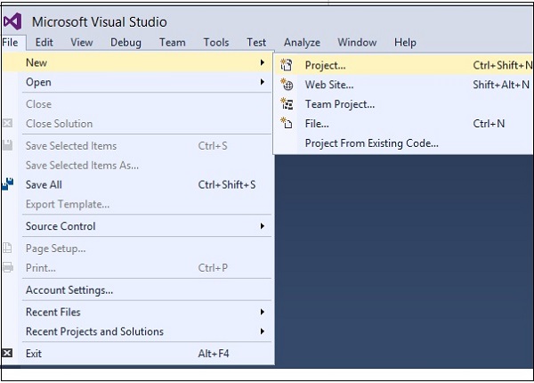
Click on File → New → Project menu option.
The following dialog box will be displayed −
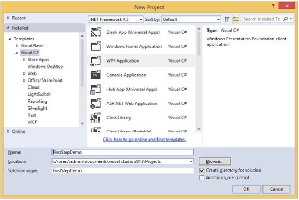
Under Templates, select Visual C# and select WPF Application. Give a name to the project and click the OK button.
In the mainwindow.xaml file, the following XAML tags are written by default. You will understand all these tags later in this tutorial.
<Window x:Class = "FirstStepDemo.MainWindow"
   xmlns = "http://schemas.microsoft.com/winfx/2006/xaml/presentation"
   xmlns:x = "http://schemas.microsoft.com/winfx/2006/xaml"
   xmlns:d = "http://schemas.microsoft.com/expression/blend/2008"
   xmlns:mc = "http://schemas.openxmlformats.org/markup-compatibility/2006"
   xmlns:local = "clr-namespace:FirstStepDemo"
   mc:Ignorable = "d" Title = "MainWindow" Height = "350" Width = "604">

   <Grid>

   </Grid>
</Window>
By default, a grid is set as the first element after page.
Let's add a button and a text block under the Grid element. This is called object element syntax, a left angle bracket followed by the name of what we want to instantiate, for example a button, then define a content property. The string assigned to the Content will be displayed on the button. Now set the height and width of the button as 30 and 50 respectively. Similarly initialize the properties of the Text block.
Now look at the design window. You will get to see a button. Now press F5 to execute this XAML code.
<Window x:Class = "FirstStepDemo.MainWindow"
   xmlns = "http://schemas.microsoft.com/winfx/2006/xaml/presentation"
   xmlns:x = "http://schemas.microsoft.com/winfx/2006/xaml"
   xmlns:d = "http://schemas.microsoft.com/expression/blend/2008"
   xmlns:mc = "http://schemas.openxmlformats.org/markup-compatibility/2006"
   xmlns:local = "clr-namespace:FirstStepDemo"
   mc:Ignorable = "d" Title = "MainWindow" Height = "350" Width = "604">

   <Grid>
      <Button Content = "First Button" Height = "30" Width = "80"/>
      <TextBlock Text = "Congratulations you have successfully build your first app"
         Height = "30" Margin = "162,180,122,109"/>
   </Grid>

</Window>
When you compile and execute the above code, you will see the following window.
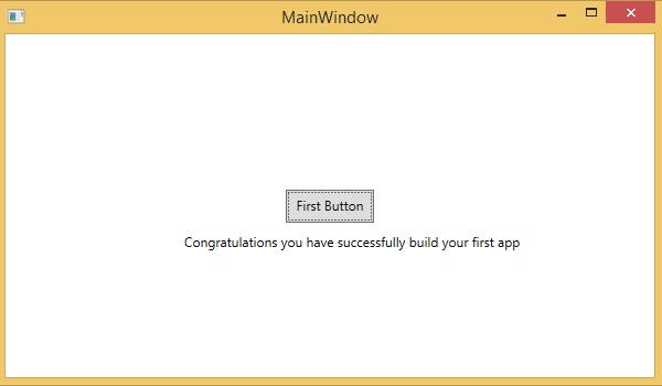
Congratulation! You have designed your First Button.
Writing XAML Application On MAC OS
XAML applications can be developed on Mac as well. On Mac, XAML can be used as iOS and Android applications. To setup the environment on Mac, go to www.xamarin.com. Click on Products and select the Xamarin Platform. Download Xamarin Studio and install it. It will allow you to develop applications for the various platforms.
XAML C# Syntax
In this chapter, you will learn the basic XAML syntax/rules to write XAML applications. Lets have a look at a simple XAML file.
<Window x:Class = "Resources.MainWindow"
   xmlns = "http://schemas.microsoft.com/winfx/2006/xaml/presentation"
   xmlns:x = "http://schemas.microsoft.com/winfx/2006/xaml" Title = "MainWindow" Height = "350" Width = "525">

   <Grid>

   </Grid>
</Window>
As you can see in the above XAML file, there are different kinds of tags and elements. The following table briefly describes all the elements.
| Sr.No | Elements & Description |
|---|---|
| 1 | <Window It is the opening object element or container of the root. |
| 2 | x:Class="Resources.MainWindow" It is the partial class declaration which connects the markup to the partial class code behind defined in it. |
| 3 | xmlns Maps the default XAML namespace for WPF client/framework |
| 4 | xmlns:x XAML namespace for XAML language which maps it to x: prefix |
| 5 | > End of object element of the root. |
| 6 | <Grid> </Grid> Starting and closing tags of an empty grid object. |
| 7 | </Window> Closing the object element |
Syntax Rules for Object Element
Syntax rules for XAML is almost similar to XML. If you take a look at an XAML document, then you will notice that actually it is a valid XML file. However, an XML file cannot be a valid XAML file. It is because in XML, the value of the attributes must be a string, while in XAML, it can be a different object which is known as Property element syntax.
The syntax of an Object element starts with a left angle bracket (<) followed by the name of the object, e.g. Button.
Define some Properties and attributes of that object element.
The Object element must be closed by a forward slash (/) followed immediately by a right angle bracket (>).
Example of simple object with no child element −
<Button/>
Example of object element with some attributes −
<Button Content = "Click Me" Height = "30" Width = "60"/>
Example of an alternate syntax to define properties (Property element syntax) −
<Button>
   <Button.Content>Click Me</Button.Content>
   <Button.Height>30</Button.Height>
   <Button.Width>60</Button.Width>
</Button>
Example of Object with Child Element − StackPanel contains Textblock as child element
<StackPanel Orientation = "Horizontal">
   <TextBlock Text = "Hello"/>
</StackPanel>
XAML Vs C# Code
You can use XAML to create, initialize, and set the properties of objects. The same activities can also be performed using programming code.
XAML is just another simple and easy way to design UI elements. With XAML, it is up to you to decide whether you want to declare objects in XAML or declare them using code.
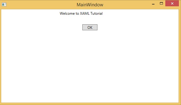
Lets take a simple example to demonstrate how to write in XAML −
<Window x:Class = "XAMLVsCode.MainWindow"
   xmlns = "http://schemas.microsoft.com/winfx/2006/xaml/presentation"
   xmlns:x = "http://schemas.microsoft.com/winfx/2006/xaml" Title = "MainWindow" Height = "350" Width = "525">

   <StackPanel>
      <TextBlock Text = "Welcome to XAML Tutorial" Height = "20" Width = "200" Margin = "5"/>
      <Button Content = "Ok" Height = "20" Width = "60" Margin = "5"/>
   </StackPanel>

</Window>
In this example, we have created a stack panel with a Button and a Text block and defined some of the properties of button and text block such as Height, Width, and Margin. When the above code is compiled and executed, it will produce the following output −

Now look at the same code which is written in C#.
using System;
using System.Text;
using System.Windows;
using System.Windows.Controls;

namespace XAMLVsCode {
   /// <summary>
      /// Interaction logic for MainWindow.xaml
   /// </summary>

   public partial class MainWindow : Window {
      public MainWindow() {
         InitializeComponent();

         // Create the StackPanel
         StackPanel stackPanel = new StackPanel();
         this.Content = stackPanel;

         // Create the TextBlock
         TextBlock textBlock = new TextBlock();
         textBlock.Text = "Welcome to XAML Tutorial";
         textBlock.Height = 20;
         textBlock.Width = 200;
         textBlock.Margin = new Thickness(5);
         stackPanel.Children.Add(textBlock);

         // Create the Button
         Button button = new Button();
         button.Content = "OK";
         button.Height = 20;
         button.Width = 50;
         button.Margin = new Thickness(20);
         stackPanel.Children.Add(button);
      }
   }
}
When the above code is compiled and executed, it will produce the following output. Note that it is exactly the same as the output of XAML code.
Now you can see that how simple it is to use and understand XAML.
XAML Vs. VB.NET
In this chapter, we will write the same example in VB.Net so that those who are familiar with VB.Net can also understand the advantages of XAML.
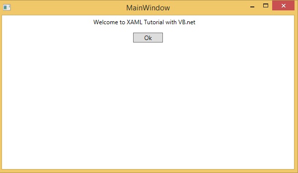
Lets take a look at the the same example again which is written in XAML −
<Window x:Class = "XAMLVsCode.MainWindow"
   xmlns = "http://schemas.microsoft.com/winfx/2006/xaml/presentation"
   xmlns:x = "http://schemas.microsoft.com/winfx/2006/xaml" Title = "MainWindow" Height = "350" Width = "604">

   <StackPanel>
      <TextBlock Text = "Welcome to XAML Tutorial with VB.net" Height = "20" Width = "220" Margin = "5"/>
      <Button Content = "Ok" Height = "20" Width = "60" Margin = "5"/>
   </StackPanel>

</Window>
In this example, we have created a stack panel with a button and a Text block and defined some of the properties of the button and the text block such as Height, Width, and Margin. When the above code is compiled and executed, it will produce the following output −
Now look at the same code which is written in VB.Net −
Public Class MainWindow
   Private Sub Window_Loaded(sender As Object, e As RoutedEventArgs)
      Dim panel As New StackPanel()
      panel.Orientation = Orientation.Vertical
      Me.Content = panel
      Dim txtInput As New TextBlock

      txtInput.Text = "Welcome to XAML Tutorial with VB.net"
      txtInput.Width = 220
      txtInput.Height = 20
      txtInput.Margin = New Thickness(5)

      panel.Children.Add(txtInput)
      Dim btn As New Button()

      btn.Content = "Ok"
      btn.Width = 60
      btn.Height = 20
      btn.Margin = New Thickness(5)

      panel.Children.Add(btn)
   End Sub
End Class
When the above code is compiled and executed the output is exactly the same as the output of XAML code.
You can now visualize how simple it is to work with XAML as compared to VB.Net.
In the above example, we have seen that what we can do in XAML can also be done in other procedural languages such as C# and VB.Net.
Lets have a look at another example in which we will use both XAML and VB.Net. We will design a GUI in XAML and the behavior will be implemented in VB.Net.
In this example, a button is added to the main window. When the user clicks this button, it displays a message on the message box. Here is the code in XAML in which a Button Object is declared with some properties.
<Window x:Class="MainWindow"
xmlns = "http://schemas.microsoft.com/winfx/2006/xaml/presentation"
xmlns:x = "http://schemas.microsoft.com/winfx/2006/xaml" Title = "MainWindow" Height = "350" Width = "604">
<Grid>
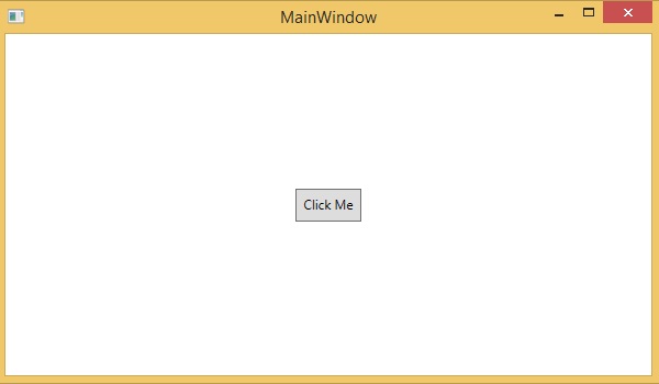
<Button Name = "btn" HorizontalAlignment = "Center" Width = "60" Height = "30" Content = "Click Me" />
</Grid>
</Window>
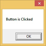
In VB.Net, the button click event (behavior) is implemented. This event displays the message on the messagebox.
Public Class MainWindow
   Private Sub btn_Click(sender As Object, e As RoutedEventArgs) Handles btn.Click
      MessageBox.Show("Button is Clicked")
   End Sub
End Class
When the above code is compiled and executed, it will display the following screen −
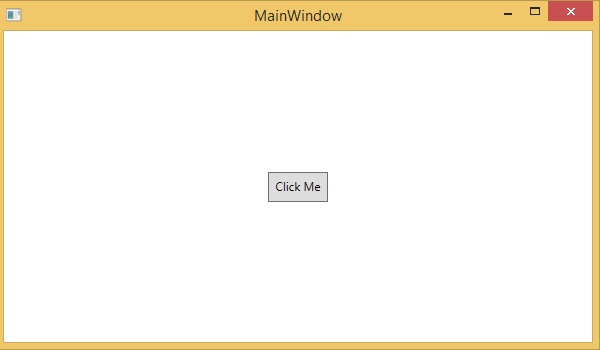
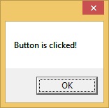
Now click on the above button that says "Click Me". It will display the following message −
XAML - Building Blocks
This chapter will describe some of the basic and important building blocks of XAML applications. It will explain how
- to create and initialize an object,
- an object can be modified easily by using resources, styles, and templates,
- to make an object interactive by using transformations and animations.
Objects
XAML is a typically declarative language which can create and instantiate objects. It is another way to describe objects based on XML, i.e., which objects need to be created and how they should be initialized before the execution of a program. Objects can be
- Containers (Stack Panel, Dock Panel)
- UI Elements / Controls (Button, TextBox, etc.)
- Resource Dictionaries
Resources
Resources are normally definitions connected with some object that you just anticipate to use more often than once. It is the ability to store data locally for controls or for the current window or globally for the entire applications.
Styles
XAML framework provides several strategies to personalize and customize the appearance of an application. Styles give us the flexibility to set some properties of an object and reuse these specific settings across multiple objects for a consistent look.
- In styles, you can set only the existing properties of an object such as Height, Width, Font size, etc.
- Only the default behavior of a control can be specified.
- Multiple properties can be added into a style.
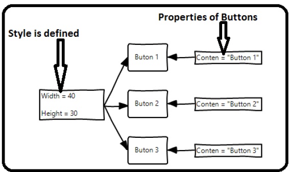
In the first diagram, you can see the same height and width properties are set for all the three button separately; but in the second diagram, you can see that height and width which are same for all the buttons are added to a style and then this style is associated with all the buttons.
Templates
A template describes the overall look and visual appearance of a control. For each control, there is a default template associated with it which gives the appearance to that control. In XAML, you can easily create your own templates when you want to customize the visual behavior and visual appearance of a control.
In the following screenshot, there are two buttons, one is with template and the other one is the default button.
Now when you hover the mouse over the button, it also changes the color as shown below.
With templates, you can access more parts of a control than in styles. You can specify both existing and new behavior of a control.
Animations and Transformations
Animations and transformations inside the Windows Runtime can improve your XAML application by building interactivity and movement. You can easily integrate the interactive look and feel in your XAML application by using the animations from Windows Runtime animation library. Animations are used
- to enhance the user interface or to make it more attractive.
- to attract the attention of the user to a change.
In the following screenshot, you can see a square −
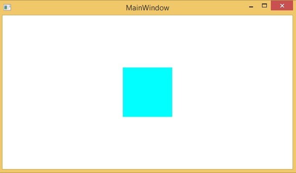
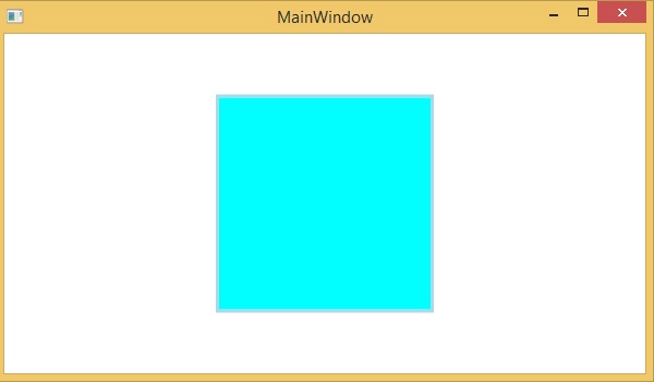
When you hover the mouse over this square, it will expend in all directions as shown below.
XAML - Controls
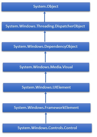
The XAML User Interface framework offers an extensive library of controls that supports UI development for Windows. Some of them have a visual representation such Button, Textbox, TextBlock, etc.; while other controls are used as containers for other controls or content, for example, images. All the XAML controls are inherited from System.Windows.Controls.Control.
The complete inheritance hierarchy of controls is as follows −
Here is the list of controls which we will discuss one by one in this chapter.
| Sr.No. | Controls & Description |
|---|---|
| 1 | Button
A control that responds to user input. |
| 2 | Calendar
Represents a control that enables a user to select a date by using a visual calendar display. |
| 3 | CheckBox
A control that a user can select or clear. |
| 4 | ComboBox
A drop-down list of items a user can select from. |
| 5 | ContextMenu
Gets or sets the context menu element that should appear whenever the context menu is requested through a user interface (UI) from within this element. |
| 6 | DataGrid
Represents a control that displays data in a customizable grid. |
| 7 | DatePicker
A control that lets a user select a date. |
| 8 | Dialogs
An application may also display additional windows to the user to gather or display important information. |
| 9 | GridView
A control that presents a collection of items in rows and columns that can scroll horizontally. |
| 10 | Image
A control that presents an image. |
| 11 | ListBox
A control that presents an inline list of items that the user can select from. |
| 12 | Menus
Represents a Windows menu control that enables you to hierarchically organize elements associated with commands and event handlers. |
| 13 | PasswordBox
A control for entering passwords. |
| 14 | Popup
Displays content on top of existing content, within the bounds of the application window. |
| 15 | ProgressBar
A control that indicates progress by displaying a bar. |
| 16 | ProgressRing
A control that indicates indeterminate progress by displaying a ring. |
| 17 | RadioButton
A control that allows a user to select a single option from a group of options. |
| 18 | RichEditBox
A control that lets a user edit rich text documents with content like formatted text, hyperlinks, and images. |
| 19 | ScrollViewer
A container control that lets the user pan and zoom its content. |
| 20 | SearchBox
A control that lets a user enter search queries. |
| 21 | Slider
A control that lets the user select from a range of values by moving a Thumb control along a track. |
| 22 | TextBlock
A control that displays text. |
| 23 | TimePicker
A control that lets a user set a time value. |
| 24 | ToggleButton
A button that can be toggled between 2 states. |
| 25 | ToolTip
A pop-up window that displays information for an element. |
| 26 | Window
The root window which provides minimize/maximize option, Title bar, border and close button. |
In this chapter we will discuss all these controls with implementation.
XAML - Layouts
The layout of controls is very important and critical for application usability. It is required to arrange a group of GUI elements in your application. There are certain important points to consider while selecting layout panels;
- Positions of the child elements.
- Sizes of the child elements.
- Layering of overlapping child elements on top of each other.
Fixed pixel arrangement of controls doesnt work when an application has been used on different screen resolutions. XAML provides a rich set of built-in layout panels to arrange GUI elements in an appropriate way. Some of the most commonly used and popular layout panels are as follows −
| Sr.No | Panels & Description |
|---|---|
| 1 | StackPanel
Stack panel is a simple and useful layout panel in XAML. In a stack panel, child elements can be arranged in a single line, either horizontally or vertically, based on the orientation property. |
| 2 | WrapPanel
In WrapPanel, child elements are positioned in a sequential order from left to right or from top to bottom based on the orientation property. |
| 3 | DockPanel
DockPanel defines an area to arrange child elements relative to each other, either horizontally or vertically. With DockPanel, you can easily dock child elements to top, bottom, right, left, and center with Dock property. |
| 4 | CanvasPanel
Canvas panel is the basic layout panel in which child elements can be positioned explicitly using coordinates that are relative to the Canvas any side such as left, right, top, and bottom. |
| 5 | GridPanel
A Grid panel provides a flexible area which consists of rows and columns. In a Grid, child elements can be arranged in a tabular form. |
XAML - Event Handling
The general concept of events in XAML is similar to events in other popular programming languages such as .NET and C++. In XAML, all of the controls expose some events so that they can be subscribed for specific purposes.
Whenever an event takes place, the application will be notified and the program can react to them, e.g., close buttons are used to close a dialog.
There are many types of events that can be subscribed for different behaviors of an application based on the requirement of that application, but the most commonly used events are those which are related to mouse and keyboard such as,
- Click
- MouseDown
- MouseEnter
- MouseLeave
- MouseUp
- KeyDown
- KeyUp
In this chapter, we will use some of the basic and most commonly used events to understand how an event of a specific control can be linked to the code behind where the behavior will be implemented depending on what the user wants to do when a specific event occurs.
Lets have a look at a simple example of a button click event. Given below is the XAML implementation for Button control which is created and initialized with some properties and a Click event (Click="OnClick").
<Window x:Class = "XAMLEventHandling.MainWindow"
   xmlns = "http://schemas.microsoft.com/winfx/2006/xaml/presentation"
   xmlns:x = "http://schemas.microsoft.com/winfx/2006/xaml"
   Title = "MainWindow" Height = "350" Width = "604">

   <Grid>
      <Button x:Name = "button1" Content = "Click" Click = "OnClick"
         Width = "150" Height = "30" HorizontalAlignment = "Center" />
   </Grid>

</Window>
Whenever this button is clicked, it will fire an OnClick event and you can add any type of behavior as a response to the Click. Lets have a look at the OnClick event implementation which will show a message when this button is clicked.
using System;
using System.Windows;
using System.Windows.Controls;

namespace XAMLEventHandling {
   /// <summary>
      /// Interaction logic for MainWindow.xaml
   /// </summary>

   public partial class MainWindow : Window {
      public MainWindow() {
         InitializeComponent();
      }
      private void OnClick(object sender, RoutedEventArgs e) {
         MessageBox.Show("Button is clicked!");
      }
   }
}
When you compile and execute the above code, it will produce the following output −

When you click on the button, the click (OnClick) event will be fired and the following message will be displayed.
Now lets have a look at a little bit complex example where multiple events are handled.
Example
The following example contains a textbox with ContextMenu which manipulates the text within the textbox.
The following XAML code creates a TextBox, a ContextMenu, and MenuItems with some properties and events such as Checked, Unchecked, and Click.
<Window x:Class = "XAMLContextMenu.MainWindow"
   xmlns = "http://schemas.microsoft.com/winfx/2006/xaml/presentation"
   xmlns:x = "http://schemas.microsoft.com/winfx/2006/xaml"
   Title = "MainWindow" Height = "350" Width = "604">

   <Grid>
      <TextBox Name = "textBox1" TextWrapping = "Wrap" Margin = "10" Grid.Row = "7">
         Hi, this is XAML tutorial.
         <TextBox.ContextMenu>

            <ContextMenu>
               <MenuItem Header = "_Bold" IsCheckable = "True"
                  Checked = "Bold_Checked" Unchecked = "Bold_Unchecked" />
               <MenuItem Header = "_Italic" IsCheckable = "True"
                  Checked = "Italic_Checked" Unchecked = "Italic_Unchecked" />
               <Separator />
               <MenuItem Header = "Increase Font Size" Click = "IncreaseFont_Click" />
               <MenuItem Header = "_Decrease Font Size" Click = "DecreaseFont_Click" />
            </ContextMenu>

         </TextBox.ContextMenu>
      </TextBox>
   </Grid>

</Window>
Here is the implementation in C# for the different events which will be fired whenever a menu item is checked, unchecked, or clicked.
using System;
using System.Collections.Generic;
using System.Linq;
using System.Text;
using System.Threading.Tasks;
using System.Windows;
using System.Windows.Controls;
using System.Windows.Data;

namespace XAMLContextMenu {
   /// <summary>
      /// Interaction logic for MainWindow.xaml
   /// </summary>

   public partial class MainWindow : Window {
      public MainWindow() {
         InitializeComponent();
      }
      private void Bold_Checked(object sender, RoutedEventArgs e) {
         textBox1.FontWeight = FontWeights.Bold;
      }
      private void Bold_Unchecked(object sender, RoutedEventArgs e) {
         textBox1.FontWeight = FontWeights.Normal;
      }
      private void Italic_Checked(object sender, RoutedEventArgs e) {
         textBox1.FontStyle = FontStyles.Italic;
      }
      private void Italic_Unchecked(object sender, RoutedEventArgs e) {
         textBox1.FontStyle = FontStyles.Normal;
      }
      private void IncreaseFont_Click(object sender, RoutedEventArgs e) {
         if (textBox1.FontSize < 18) {
            textBox1.FontSize += 2;
         }
      }
      private void DecreaseFont_Click(object sender, RoutedEventArgs e) {
         if (textBox1.FontSize > 10) {
            textBox1.FontSize -= 2;
         }
      }
   }
}
When you compile and execute the above code, it will produce the following output −
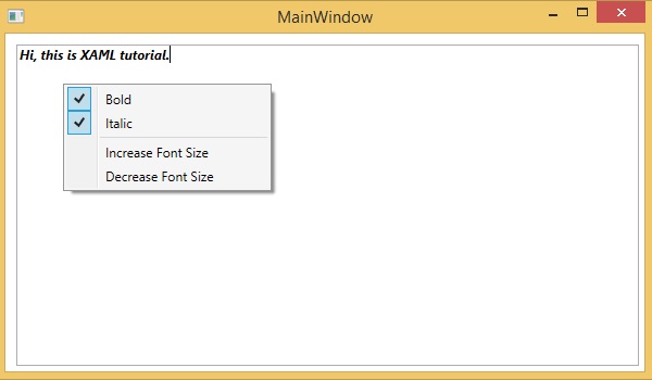
We recommend you to execute the above example code and experiment with some other events.
Events
| Sr.No. | Controls & Description |
|---|---|
| 1 | Checked Fires when a ToggleButton is checked. (Inherited from ToggleButton) |
| 2 | Click Occurs when a button control is clicked. (Inherited from ButtonBase) |
| 3 | ContextMenuClosing Occurs just before any context menu on the element is closed. (Inherited from FrameworkElement.) |
| 4 | ContextMenuOpening Occurs when any context menu on the element is opened. (Inherited from FrameworkElement.) |
| 5 | DataContextChanged Occurs when the value of the FrameworkElement.DataContext property changes. (Inherited from FrameworkElement) |
| 6 | DragEnter Occurs when the input system reports an underlying drag event with this element as the target. (Inherited from UIElement). |
| 7 | DragLeave Occurs when the input system reports an underlying drag event with this element as the origin. (Inherited from UIElement) |
| 8 | DragOver Occurs when the input system reports an underlying drag event with this element as the potential drop target. (Inherited from UIElement) |
| 9 | DragStarting Occurs when a drag operation is initiated. (Inherited from UIElement) |
| 10 | DropCompleted Occurs when a drag-and-drop operation is ended. (Inherited from UIElement) |
| 11 | DropDownClosed Occurs when the drop-down portion of the ComboBox closes. |
| 12 | DropDownOpened Occurs when the drop-down portion of the ComboBox opens. |
| 13 | GotFocus Occurs when a UIElement receives focus. (Inherited from UIElement) |
| 14 | Holding Occurs when an otherwise unhandled Hold interaction occurs over the hit test area of this element. (Inherited from UIElement) |
| 15 | Intermediate Fires when the state of a ToggleButton is switched to the indeterminate state. (Inherited from ToggleButton) |
| 16 | IsEnabledChanged Occurs when the IsEnabled property changes. (Inherited from Control) |
| 17 | KeyDown Occurs when a keyboard key is pressed while the UIElement has focus. (Inherited from UIElement) |
| 18 | KeyUp Occurs when a keyboard key is released while the UIElement has focus. (Inherited from UIElement) |
| 19 | LostFocus Occurs when a UIElement loses focus. (Inherited from UIElement) |
| 20 | ManipulationCompleted Occurs when a manipulation on the UIElement is complete. (Inherited from UIElement) |
| 21 | ManipulationDelta Occurs when the input device changes position during a manipulation. (Inherited from UIElement) |
| 22 | ManipulationInertiaStarting Occurs when the input device loses contact with the UIElement object during a manipulation and inertia begins. (Inherited from UIElement) |
| 23 | ManipulationStarted Occurs when an input device begins a manipulation on the UIElement. (Inherited from UIElement) |
| 24 | ManipulationStarting Occurs when the manipulation processor is first created. (Inherited from UIElement) |
| 25 | SelectionChanged Occurs when the text selection has changed. |
| 26 | SizeChanged Occurs when either the ActualHeight or the ActualWidth property changes value on a FrameworkElement. (Inherited from FrameworkElement) |
| 27 | Unchecked Occurs when a ToggleButton is unchecked. (Inherited from ToggleButton) |
| 28 | ValueChanged Occurs when the range value changes. (Inherited from RangeBase) |
XAML - Data Binding
Data binding is a mechanism in XAML applications that provides a simple and easy way for Windows Runtime Apps using partial classes to display and interact with data. The management of data is entirely separated from the way the data is displayed in this mechanism.
Data binding allows the flow of data between UI elements and data object on user interface. When a binding is established and the data or your business model changes, then it will reflect the updates automatically to the UI elements and vice versa. It is also possible to bind, not to a standard data source, but rather to another element on the page. Data binding can be of two types −
- One-way data binding
- Two-way data binding
One-Way Data Binding
In one-way binding, data is bound from its source (that is the object that holds the data) to its target (that is the object that displays the data).
Lets have a look at a simple example of one-way data binding. The following XAML code creates four text blocks with some properties.
<Window x:Class = "DataBindingOneWay.MainWindow"
   xmlns = "http://schemas.microsoft.com/winfx/2006/xaml/presentation"
   xmlns:x = "http://schemas.microsoft.com/winfx/2006/xaml"
   Title = "MainWindow" Height = "350" Width = "604">

   <Grid>
      <StackPanel Name = "Display">
         <StackPanel Orientation = "Horizontal" Margin = "50, 50, 0, 0">
            <TextBlock Text = "Name: " Margin = "10" Width = "100" />
            <TextBlock Margin = "10" Width = "100" Text = "{Binding Name}" />
         </StackPanel>

         <StackPanel Orientation = "Horizontal" Margin = "50,0,50,0">
            <TextBlock Text = "Title: " Margin = "10" Width = "100" />
            <TextBlock Margin = "10" Width = "100" Text = "{Binding Title}" />
         </StackPanel>
      </StackPanel>
   </Grid>

</Window>
Text properties of two text blocks are set to Name and Title statically, while the other two text blocks Text properties are bound to Name and Title which are class variables of Employee class which is shown below.
using System;
using System.Collections.Generic;
using System.Linq;
using System.Text;
using System.Threading.Tasks;

namespace DataBindingOneWay {
   public class Employee {
      public string Name { get; set; }
      public string Title { get; set; }

      public static Employee GetEmployee() {
         var emp = new Employee() {
            Name = "Ali Ahmed", Title = "Developer"
         };
         return emp;
      }
   }
}
In this class, we have just two variables, Name and Title, and one static method in which the Employee object is initialized which will return that employee object. So we are binding to a property, Name and Title, but we have not selected what object that property belongs to. The easiest way is to assign an object to DataContext whose properties we are binding in the following C# code −
using System;
using System.Windows;
using System.Windows.Controls;

namespace DataBindingOneWay {
   /// <summary>
      /// Interaction logic for MainWindow.xaml
   /// </summary>

   public partial class MainWindow : Window {
      public MainWindow() {
         InitializeComponent();
         DataContext = Employee.GetEmployee();
      }
   }
}
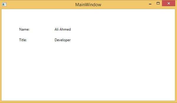
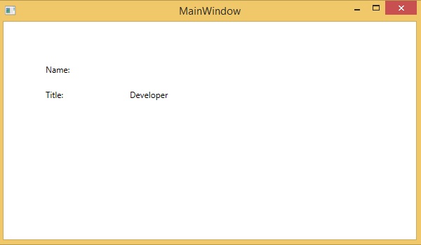
Let's run this application and you can see immediately in our MainWindow that we have successfully bound to the Name and Title of that Employee object.
Two-Way Data Binding
In two-way binding, the user can modify the data through the user interface and have that data updated in the source. If the source changes while the user is looking at the view, you would want to update the view.
Example
Lets have a look at the following example in which one combobox with three combobox items and one textbox are created with some properties. In this example, we dont have any standard data source, but the UI elements are bound to other UI elements.
<Window x:Class = "XAMLTestBinding.MainWindow"
   xmlns = "http://schemas.microsoft.com/winfx/2006/xaml/presentation"
   xmlns:x = "http://schemas.microsoft.com/winfx/2006/xaml"
   Title = "MainWindow" Height = "350" Width = "604">

   <StackPanel>
      <ComboBox Name = "comboBox"  Margin = "50" Width = "100">
         <ComboBoxItem Content = "Green" />
         <ComboBoxItem Content = "Yellow" IsSelected = "True" />
         <ComboBoxItem Content = "Orange" />
      </ComboBox>

      <TextBox  Name = "textBox" Margin = "50"
         Width = "100" Height = "23" VerticalAlignment = "Top"
         Text  = "{Binding ElementName = comboBox, Path = SelectedItem.Content,
         Mode = TwoWay, UpdateSourceTrigger = PropertyChanged}"
         Background = "{Binding ElementName = comboBox, Path = SelectedItem.Content}">
      </TextBox>
   </StackPanel>

</Window>
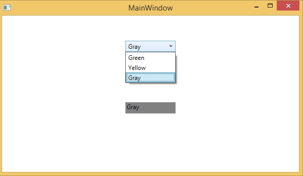
When you compile and execute the above code, it will produce the following output. When the user selects an item from the combobox, the textbox text and the background color will be updated accordingly.
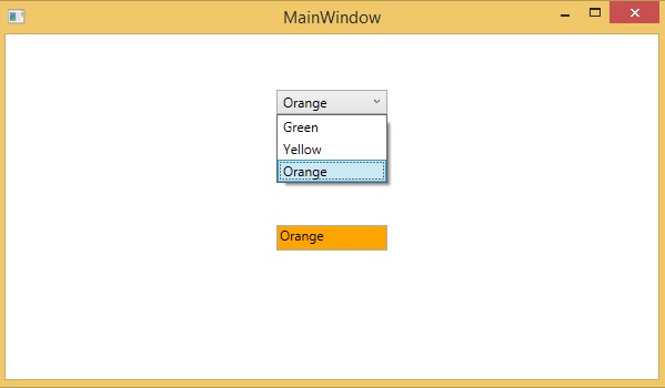
Similarly, when the user types a valid color name in the textbox, then the combobox and the textbox background color will also be updated.
XAML - Markup Extensions
In XAML applications, markup extensions are a method/technique to gain a value that is neither a specific XAML object nor a primitive type. Markup extensions can be defined by opening and closing curly braces and inside that curly braces, the scope of the markup extension is defined.
Data binding and static resources are markup extensions. There are some predefined XAML markup extensions in System.xaml which can be used.
Lets have a look at a simple example where StaticResources markup extension is used which is a predefined XAML markup extension.
The following XAML code creates two text blocks with some properties and their foreground is defined in Window.Resources.
<Window x:Class = "XAMLStaticResourcesMarkupExtension.MainWindow"
   xmlns = "http://schemas.microsoft.com/winfx/2006/xaml/presentation"
   xmlns:x = "http://schemas.microsoft.com/winfx/2006/xaml"
   Title = "MainWindow" Height = "350" Width = "525">

   <Window.Resources>
      <SolidColorBrush Color = "Blue" x:Key = "myBrush"></SolidColorBrush>
   </Window.Resources>

   <Grid>
      <StackPanel Orientation = "Vertical">
         <TextBlock Foreground = "{StaticResource myBrush}" Text = "First Name"
            Width = "100" Margin = "10" />
         <TextBlock Foreground = "{StaticResource myBrush}" Text = "Last Name"
            Width = "100" Margin = "10" />
      </StackPanel>
   </Grid>

</Window>
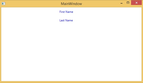
In Window.Resources, you can see x:Key is used which uniquely identifies the elements that are created and referenced in an XAML defined dictionary to identify a resource in a resource dictionary.
When you compile and execute the above code, it will produce the following MainWindow. You can see the two text blocks with blue foreground color.
In XAML, custom markup extensions can also be defined by inheriting MarkupExtension class and overriding the ProvideValue method which is an abstract method in the MarkupExtension class.
Lets have a look at a simple example of custom markup extension.
<Window x:Class = "XAMLMarkupExtension.MainWindow"
   xmlns = "http://schemas.microsoft.com/winfx/2006/xaml/presentation"
   xmlns:x = "http://schemas.microsoft.com/winfx/2006/xaml"
   xmlns:my = "clr-namespace:XAMLMarkupExtension"
   Title = "MainWindow" Height = "350" Width = "525">

   <Grid>
      <Button Content = "{my:MyMarkupExtension FirstStr = Markup, SecondStr = Extension}"
         Width = "200" Height = "20" />
   </Grid>

</Window>
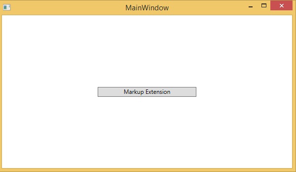
In the above XAML code, a button is created with some properties and for the content value, a custom markup extension (my:MyMarkupExtension) has been used with two values Markup and Extension which are assigned to FirstStr and SecondStr respectively.
Actually, MyMarkupExtension is a class which is derived from MarkupExtension as shown below in the C# implementation. This class contains two string variables, FirstStr and SecondStr, which are concatenated and return that string from the ProvideValue method to the Content of a button.
using System;
using System.Collections.Generic;
using System.Linq;
using System.Text;
using System.Threading.Tasks;

using System.Windows;
using System.Windows.Controls;
using System.Windows.Data;
using System.Windows.Documents;
using System.Windows.Input;
using System.Windows.Markup;
using System.Windows.Media;
using System.Windows.Media.Imaging;
using System.Windows.Navigation;
using System.Windows.Shapes;

namespace XAMLMarkupExtension {
   /// <summary>
      /// Interaction logic for MainWindow.xaml
   /// </summary>

   public partial class MainWindow : Window {
      public MainWindow() {
         InitializeComponent();
      }
   }
   public class MyMarkupExtension : MarkupExtension {
      public MyMarkupExtension() { }
      public String FirstStr { get; set; }
      public String SecondStr { get; set; }

      public override object ProvideValue(IServiceProvider serviceProvider) {
        return FirstStr + " " + SecondStr;
      }
   }
}
Let's run this application and you can see immediately in our MainWindow that "markup extension" has been successfully used as the content of the button.
XAML - Dependency Properties
A dependency property is a specific type of property where the value is followed by a keen property system which is also a part of the Windows Runtime App. A class which defines a dependency property must be inherited from the DependencyObject class.
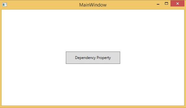
Many of the UI control classes which are used in XAML are derived from the DependencyObject class and support dependency properties. The following XAML code creates a button with some properties.
<Window x:Class = "XAMLDependencyProperty.MainWindow"
   xmlns = "http://schemas.microsoft.com/winfx/2006/xaml/presentation"
   xmlns:x = "http://schemas.microsoft.com/winfx/2006/xaml"
   xmlns:local = "clr-namespace:XAMLDependencyProperty"
   Title = "MainWindow" Height = "350" Width = "604">

   <Grid>
      <Button Height = "40" Width = "175" Margin = "10" Content = "Dependency Property">
         <Button.Style>
            <Style TargetType = "{x:Type Button}">
               <Style.Triggers>
                  <Trigger Property = "IsMouseOver" Value = "True">
                     <Setter Property = "Foreground" Value = "Red" />
                  </Trigger>
               </Style.Triggers>
            </Style>
         </Button.Style>
      </Button>
   </Grid>

</Window>
The x:Type markup extension in XAML has a similar functionality like typeof() in C#. It is used when attributes are specified that take the type of the object such as <Style TargetType = "{x:Type Button}">
When you compile and execute the above code, it will produce the following MainWindow. When the mouse is over the button, it will change the foreground color of the button. When the mouse leaves the button, it will change back to its original color.
The main difference between dependency properties and other CLR properties are −
CLR properties can directly read/write from the private member of a class by using getter and setter. In case of dependency properties, it is not stored in a local object.
Dependency properties are stored in a dictionary of key/value pairs which is provided by the DependencyObject class.
It also saves a lot of memory because it stores the property when changed.
It can be bound in XAML as well.
In .NET framework, custom dependency properties can also be defined. Here are the steps to define custom dependency property in C#.
Declare and register your dependency property with system call register.
Provide the setter and getter for the property.
Define a static handler to handle any changes that occur globally.
Define an instance handler to handle any changes that occur to that particular instance.
Given below is the code in C# for dependency property which defined to set the SetText property of the user control.
using System;
using System.Collections.Generic;
using System.Linq;
using System.Text;
using System.Threading.Tasks;

using System.Windows;
using System.Windows.Controls;
using System.Windows.Data;
using System.Windows.Documents;
using System.Windows.Input;
using System.Windows.Media;
using System.Windows.Media.Imaging;
using System.Windows.Navigation;
using System.Windows.Shapes;

namespace WpfApplication3 {
   /// <summary>
      /// Interaction logic for UserControl1.xaml
   /// </summary>

   public partial class UserControl1 : UserControl {
      public UserControl1() {
         InitializeComponent();
      }
      public static readonly DependencyProperty
         SetTextProperty = DependencyProperty.Register("SetText", typeof(string),
         typeof(UserControl1), new PropertyMetadata("",
         new PropertyChangedCallback(OnSetTextChanged)));
      public string SetText {
         get {return(string) GetValue(SetTextProperty); }
         set {SetValue(SetTextProperty, value);}
      }
      private static void OnSetTextChanged(DependencyObject d, DependencyPropertyChangedEventArgs e) {
         UserControl1 UserControl1Control = d as UserControl1;
         UserControl1Control.OnSetTextChanged(e);
      }
      private void OnSetTextChanged(DependencyPropertyChangedEventArgs e) {
         tbTest.Text = e.NewValue.ToString();
      }
   }
}
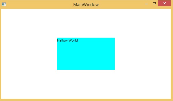
Here is the XAML file in which the TextBlock is defined as a user control and the Text property will be assigned to it by the SetText dependency property.
The following XAML code creates a user control with initializing its SetText dependency property and some other properties.
<Window x:Class = "WpfApplication3.MainWindow"
   xmlns = "http://schemas.microsoft.com/winfx/2006/xaml/presentation"
   xmlns:x = "http://schemas.microsoft.com/winfx/2006/xaml"
   xmlns:views = "clr-namespace:WpfApplication3"
   Title = "MainWindow" Height = "350" Width = "604">

   <Grid>
      <views:UserControl1 SetText = "Hellow World" />
   </Grid>

</Window>
Let's run this application and you can see immediately in our MainWindow that dependency property for user control has been successfully used as a Text.
XAML - Resources
Resources are normally definitions connected with some object that you just anticipate to use more often than once. It has the ability to store data locally for controls or for the current window or globally for the entire applications.
Defining an object as a resource allows us to access it from another place. Hence, it allows reusability. Resources are defined in resource dictionaries and any object can be defined as a resource effectively making it a shareable asset. A unique key is specified to XAML resource and with that key, it can be referenced by using a StaticResource markup extension.
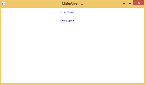
Lets have a look at a simple example again in which two text blocks are created with some properties and their foreground color is defined in Window.Resources.
<Window x:Class = "XAMLResources.MainWindow"
   xmlns = "http://schemas.microsoft.com/winfx/2006/xaml/presentation"
   xmlns:x = "http://schemas.microsoft.com/winfx/2006/xaml"
   Title = "MainWindow" Height = "350" Width = "604">

   <Window.Resources>
      <SolidColorBrush Color = "Blue" x:Key = "myBrush"></SolidColorBrush>
   </Window.Resources>

   <StackPanel Orientation = "Vertical">
      <TextBlock Foreground = "{StaticResource myBrush}"
         Text = "First Name" Width = "100" Margin = "10" />
      <TextBlock Foreground = "{StaticResource myBrush}"
         Text = "Last Name" Width = "100" Margin = "10" />
   </StackPanel>

</Window>
When the above code is compiled and executed, it will produce the following MainWindow. You can see two text blocks with blue foreground color. The advantage of the resource is that if there are multiple text blocks and you want to change their background color, then you will need just to change it in the resource dictionary.
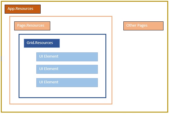
Resource Scope
Resources are defined in resource dictionaries, but there are numerous places where a resource dictionary can be defined. In the above example, a resource dictionary is defined on Window/page level. In what dictionary a resource is defined immediately limits the scope of that resource. So the scope, i.e. where you can use the resource, depends on where you've defined it.
Define the resource in the resource dictionary of a grid and it's accessible by that grid and by its child elements only.
Define it on a window/page and it's accessible by all elements on that window/page.
The App root can be found in App.xaml resources dictionary. It's the root of our application, so the resources defined here are scoped to the complete application.
As far as the scope of the resource is concerned, the most often are application level, page level, and a specific element level like a Grid, StackPanel, etc.
Resource Dictionaries
Resource dictionaries in XAML apps imply resource dictionaries in separate files. It is followed in almost all XAML apps. Defining resources in separate files can have the following advantages −
Separation between defining resources in the resource dictionary and UI related code.
Defining all the resources in a separate file such as App.xaml would make them available across the App.
So, how we can define our resources in a resource dictionary in a separate file? Well, it is very easy, just add a new resource dictionary through Visual Studio by the following steps −
In your solution, add a new folder and name it ResourceDictionaries.
Right-click on this folder and select Resource Dictionary from Add submenu item and name it DictionaryWithBrush.xaml
Lets have a look at the same application; just the resource dictionary is now defined in App level.
Here is the XAML code for MainWindow.xaml.
<Window x:Class = "XAMLResources.MainWindow"
   xmlns = "http://schemas.microsoft.com/winfx/2006/xaml/presentation"
   xmlns:x = "http://schemas.microsoft.com/winfx/2006/xaml"
   Title = "MainWindow" Height = "350" Width = "604">

   <StackPanel Orientation = "Vertical">
      <TextBlock Foreground = "{StaticResource myBrush}" Text = "First Name"
         Width = "100" Margin = "10" />
      <TextBlock Foreground = "{StaticResource myBrush}" Text = "Last Name"
         Width = "100" Margin = "10"/>
   </StackPanel>

</Window>
Here is the implementation in DictionaryWithBrush.xaml −
<ResourceDictionary
   xmlns = "http://schemas.microsoft.com/winfx/2006/xaml/presentation"
   xmlns:x = "http://schemas.microsoft.com/winfx/2006/xaml">

   <SolidColorBrush Color = "Blue" x:Key = "myBrush"></SolidColorBrush>

</ResourceDictionary>
Here is the implementation in app.xaml −
<Application x:Class = "XAMLResources.App"
   xmlns = "http://schemas.microsoft.com/winfx/2006/xaml/presentation"
   xmlns:x = "http://schemas.microsoft.com/winfx/2006/xaml"
   StartupUri = "MainWindow.xaml">

   <Application.Resources>
      <ResourceDictionary Source = " XAMLResources\ResourceDictionaries\DictionaryWithBrush.xaml" />
   </Application.Resources>

</Application>
When the above code is compiled and executed, it will produce the following output −
We recommend you to execute the above code and experiment with some more resources such as background color, etc.
XAML - Templates
A template describes the overall look and visual appearance of a control. For each control, there is a default template associated with it which gives the appearance to that control.
In XAML, you can easily create your own templates when you want to customize the visual behavior and visual appearance of a control. Connectivity between the logic and template can be achieved by data binding.
The main difference between styles and templates are −
Styles can only change the appearance of your control with default properties of that control.
With templates, you can access more parts of a control than in styles. You can also specify both existing and new behavior of a control.
There are two types of templates which are most commonly used.
- Control Template
- Data Template
Control Template
The Control Template defines or specifies the visual appearance and structure of a control. All of the UI elements have some kind of appearance as well as behavior, e.g., Button has an appearance and behavior. Click event or mouse hover events are the behaviors which are fired in response to a click and hover, and there is also a default appearance of button which can be changed by the Control template.
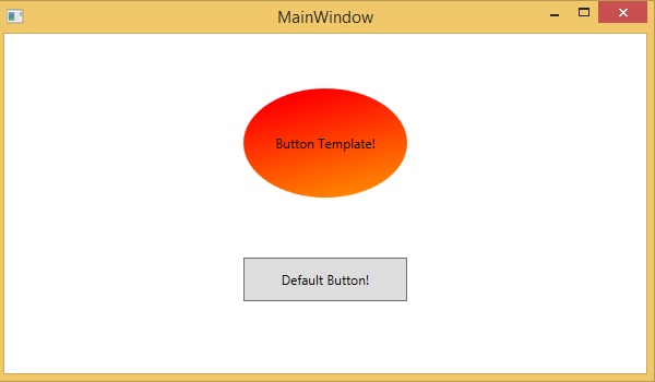
Lets have a look at a simple example again in which two buttons are created with some properties. One is with template and the other one is with the default button.
<Window x:Class = "TemplateDemo.MainWindow"
xmlns = "http://schemas.microsoft.com/winfx/2006/xaml/presentation"
xmlns:x = "http://schemas.microsoft.com/winfx/2006/xaml"
Title = "MainWindow" Height = "350" Width = "604">
<Window.Resources>
<ControlTemplate x:Key = "ButtonTemplate" TargetType = "Button">
<Grid>
<Ellipse x:Name = "ButtonEllipse" Height = "100" Width = "150" >
<Ellipse.Fill>
<LinearGradientBrush StartPoint = "0,0.2" EndPoint = "0.2,1.4">
<GradientStop Offset = "0" Color = "Red"/>
<GradientStop Offset = "1" Color = "Orange"/>
</LinearGradientBrush>
</Ellipse.Fill>
</Ellipse>
<ContentPresenter Content = "{TemplateBinding Content}"
HorizontalAlignment = "Center" VerticalAlignment = "Center" />
</Grid>
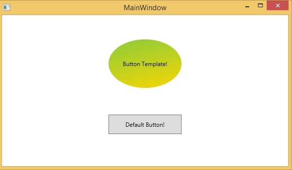
<ControlTemplate.Triggers>
<Trigger Property = "IsMouseOver" Value = "True">
<Setter TargetName = "ButtonEllipse" Property = "Fill" >
<Setter.Value>
<LinearGradientBrush StartPoint = "0,0.2" EndPoint="0.2,1.4">
<GradientStop Offset = "0" Color = "YellowGreen"/>
<GradientStop Offset = "1" Color = "Gold"/>
</LinearGradientBrush>
</Setter.Value>
</Setter>
</Trigger>
<Trigger Property = "IsPressed" Value = "True">
<Setter Property = "RenderTransform">
<Setter.Value>
<ScaleTransform ScaleX = "0.8" ScaleY = "0.8" CenterX = "0" CenterY = "0" />
</Setter.Value>
</Setter>
<Setter Property = "RenderTransformOrigin" Value = "0.5,0.5" />
</Trigger>
</ControlTemplate.Triggers>
</ControlTemplate>
</Window.Resources>
<StackPanel>
<Button Content = "Round Button!" Template = "{StaticResource ButtonTemplate}"
Width = "150" Margin = "50" />
<Button Content = "Default Button!" Height = "40" Width = "150" Margin = "5" />
</StackPanel>
</Window>
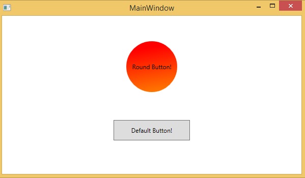
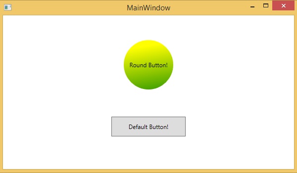
When the above code is compiled and executed, it will produce the following MainWindow −
When you hover the mouse over the button with custom template, then it also changes the color as shown below −
Data Template
A Data Template defines and specifies the appearance and structure of the collection of data. It provides the flexibility to format and define the presentation of the data on any UI element. It is mostly used on data related Item controls such as ComboBox, ListBox, etc.
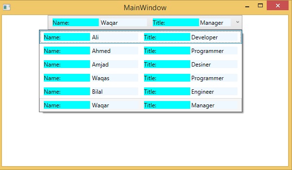
Lets have a look at a simple example of data template. The following XAML code creates a combobox with Data Template and text blocks.
<Window x:Class = "XAMLDataTemplate.MainWindow"
   xmlns = "http://schemas.microsoft.com/winfx/2006/xaml/presentation"
   xmlns:x = "http://schemas.microsoft.com/winfx/2006/xaml"
   Title = "MainWindow" Height = "350" Width = "604">

   <Grid VerticalAlignment = "Top">
      <ComboBox Name = "Presidents" ItemsSource = "{Binding}" Height = "30" Width = "400">
         <ComboBox.ItemTemplate>
            <DataTemplate>
               <StackPanel Orientation = "Horizontal" Margin = "2">
                  <TextBlock Text = "Name: " Width = "95" Background = "Aqua" Margin = "2" />
                  <TextBlock Text = "{Binding Name}" Width = "95" Background = "AliceBlue" Margin = "2" />
                  <TextBlock Text = "Title: " Width = "95" Background = "Aqua" Margin = "10,2,0,2" />
                  <TextBlock Text = "{Binding Title}" Width = "95" Background = "AliceBlue" Margin = "2" />
               </StackPanel>
            </DataTemplate>
         </ComboBox.ItemTemplate>
      </ComboBox>
   </Grid>

</Window>
Here is the implementation in C# in which the employee object is assigned to DataContext −
using System;
using System.Windows;
using System.Windows.Controls;

namespace XAMLDataTemplate {
   /// <summary>
      /// Interaction logic for MainWindow.xaml
   /// </summary>

   public partial class MainWindow : Window {
      public MainWindow() {
         InitializeComponent();
         DataContext = Employee.GetEmployees();
      }
   }
}
Here is the implementation in C# for Employee class −
using System;
using System.Collections.Generic;
using System.Collections.ObjectModel;
using System.ComponentModel;
using System.Linq;
using System.Runtime.CompilerServices;
using System.Text;
using System.Threading.Tasks;

namespace XAMLDataTemplate {
   public class Employee : INotifyPropertyChanged {
      private string name; public string Name {
         get { return name; }
         set { name = value; RaiseProperChanged(); }
      }
      private string title; public string Title {
         get { return title; }
         set { title = value; RaiseProperChanged(); }
      }
      public static Employee GetEmployee() {
         var emp = new Employee() {
            Name = "Waqas", Title = "Software Engineer" };
         return emp;
      }
      public event PropertyChangedEventHandler PropertyChanged;
      private void RaiseProperChanged( [CallerMemberName] string caller = ""){
         if (PropertyChanged != null) {
            PropertyChanged(this, new PropertyChangedEventArgs(caller));
         }
      }
      public static ObservableCollection<Employee> GetEmployees() {
         var employees = new ObservableCollection<Employee>();
         employees.Add(new Employee() { Name = "Ali", Title = "Developer" });
         employees.Add(new Employee() { Name = "Ahmed", Title = "Programmer" });
         employees.Add(new Employee() { Name = "Amjad", Title = "Desiner" });
         employees.Add(new Employee() { Name = "Waqas", Title = "Programmer" });
         employees.Add(new Employee() { Name = "Bilal", Title = "Engineer" });
         employees.Add(new Employee() { Name = "Waqar", Title = "Manager" });
         return employees;
      }
   }
}
When the above code is compiled and executed, it will produce the following output. It contains a combobox and when you click on the combobox, you see that the collection of data which are created in the Employee class is listed as the combobox items.
We recommend you to execute the above code and experiment with it.
XAML - Styles
XAML framework provides several strategies to personalize and customize the appearance of an application. Styles give us the flexibility to set some properties of an object and reuse these specific settings across multiple objects for a consistent look.
In styles, you can set only the existing properties of an object such as Height, Width, and Font size.
Only default behavior of a control can be specified.
Multiple properties can be added into a single style.
Styles are used to give a uniform look to a set of controls. Implicit Styles are used to apply an appearance to all controls of a given type and simplify the application.
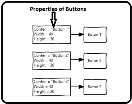
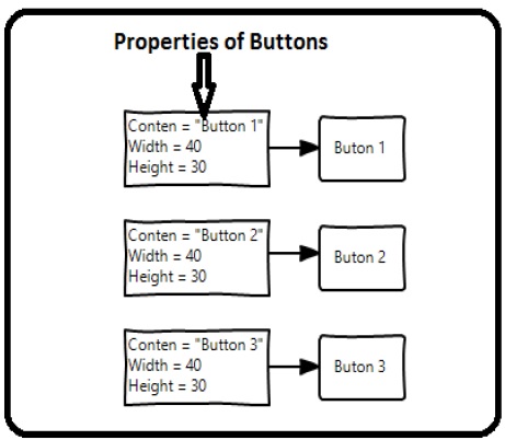
Imagine we have three buttons and all of them have to look the same − same width and height, same font size, and same foreground color. We can set all those properties on the button elements themselves and that's still quite okay for all of the buttons as shown in the following diagram.
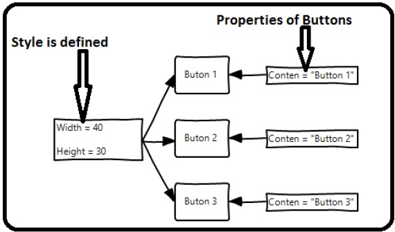
But in a real-life App, you'll typically have a lot more of these that need to look exactly the same. And not only buttons of course, you'll typically want your text blocks, text boxes, and combo boxes, etc., to look the same across your App. Surely there must be a better way to achieve this − it is known as styling. You can think of a style as a convenient way to apply a set of property values to more than one element as shown in the following diagram.
Lets have look at the example which contains three buttons which are created in XAML with some properties.
<Window x:Class = "XAMLStyle.MainWindow"
   xmlns = "http://schemas.microsoft.com/winfx/2006/xaml/presentation"
   xmlns:x = "http://schemas.microsoft.com/winfx/2006/xaml"
   xmlns:d = "http://schemas.microsoft.com/expression/blend/2008"
   xmlns:mc = "http://schemas.openxmlformats.org/markup-compatibility/2006"
   xmlns:local = "clr-namespace:XAMLStyle" mc:Ignorable = "d"
   Title = "MainWindow" Height = "350" Width = "604">

   <StackPanel>
      <Button Content = "Button1" Height = "30" Width = "80" Foreground = "Blue"
         FontSize = "12" Margin = "10"/>

      <Button Content = "Button2" Height = "30" Width = "80" Foreground = "Blue"
         FontSize = "12" Margin = "10"/>

      <Button Content = "Button3" Height = "30" Width = "80" Foreground = "Blue"
         FontSize = "12" Margin = "10"/>
   </StackPanel>

</Window>
When you look at the above code, you will see that for all the buttons, height, width, foreground color, font size, and margin properties remain same. When the above code is compiled and executed, it will display the following output −
Now lets have a look at the same example, but this time, we will be using style.
<Window x:Class = "XAMLStyle.MainWindow"
   xmlns = "http://schemas.microsoft.com/winfx/2006/xaml/presentation"
   xmlns:x = "http://schemas.microsoft.com/winfx/2006/xaml"
   xmlns:d = "http://schemas.microsoft.com/expression/blend/2008"
   xmlns:mc = "http://schemas.openxmlformats.org/markup-compatibility/2006"
   xmlns:local = "clr-namespace:XAMLStyle" mc:Ignorable = "d"
   Title = "MainWindow" Height = "350" Width = "604">

   <Window.Resources>
      <Style x:Key = "myButtonStyle" TargetType = "Button">
         <Setter Property = "Height" Value = "30"/>
         <Setter Property = "Width" Value = "80"/>
         <Setter Property = "Foreground" Value = "Blue"/>
         <Setter Property = "FontSize" Value = "12"/>
         <Setter Property = "Margin" Value = "10"/>
      </Style>
   </Window.Resources>

   <StackPanel>
      <Button Content = "Button1" Style = "{StaticResource myButtonStyle}"/>
      <Button Content = "Button2" Style = "{StaticResource myButtonStyle}"/>
      <Button Content = "Button3" Style = "{StaticResource myButtonStyle}"/>
   </StackPanel>

</Window>
Styles are defined in the resource dictionary and each style has a unique key identifier and a target type. Inside <style>, you can see that multiple setter tags are defined for each property which will be included in the style.
In the above example, all of the common properties of each button are now defined in style and then the style are assigned to each button with a unique key by setting the style property through the StaticResource markup extension.
When the above code is compiled and executed, it will produce the following window which is the same output.
The advantage of doing it like this is immediately obvious. We can reuse that style anywhere in its scope, and if we need to change it, we simply change it once in the style definition instead of on each element.
In what level a style is defined instantaneously limits the scope of that style. So the scope, i.e. where you can use the style, depends on where you've defined it. Style can be defined on the following levels −
| Sr.No | Levels & Description |
|---|---|
| 1 | Control Level
Defining a style on control level can only be applied to that particular control. |
| 2 | Layout Level
Defining a style on any layout level can only be accessible by that layout and by its child elements only. |
| 3 | Window Level
Defining a style on a window level can be accessible by all the elements on that window. |
| 4 | Application Level
Defining a style on App level makes it accessible in entire application. |
XAML - Triggers
Basically, a trigger enables you to change property values or take actions based on the value of a property. So, it basically allows you to dynamically change the appearance and/or behavior of your control without having to create a new one.
Triggers are used to change the value of any given property, when certain conditions are satisfied. Triggers are usually defined in a style or in the root of a document which are applied to that specific control. There are three types of triggers −
- Property Triggers
- Data Triggers
- Event Triggers
Property Triggers
In property triggers, when a change occurs in one property, it will bring either an immediate or an animated change in another property. For example, you can use a property trigger if you want to change the button appearance when the mouse is over the button.
Example
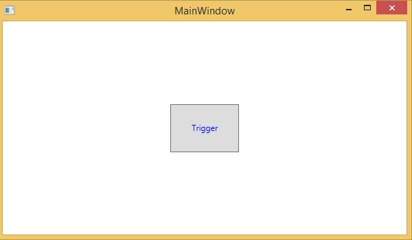
The following example demonstrates how to change the foreground color of a button when the mouse enters its region.
<Window x:Class = "XAMLPropertyTriggers.MainWindow"
   xmlns = "http://schemas.microsoft.com/winfx/2006/xaml/presentation"
   xmlns:x = "http://schemas.microsoft.com/winfx/2006/xaml"
   Title = "MainWindow" Height = "350" Width = "604">

   <Window.Resources>
      <Style x:Key = "TriggerStyle" TargetType = "Button">
         <Setter Property = "Foreground" Value = "Blue" />
         <Style.Triggers>
            <Trigger Property = "IsMouseOver" Value = "True">
               <Setter Property = "Foreground" Value = "Green" />
            </Trigger>
         </Style.Triggers>
      </Style>
   </Window.Resources>

   <Grid>
      <Button Width = "100" Height = "70" Style = "{StaticResource TriggerStyle}"
         Content = "Trigger"/>
   </Grid>

</Window>
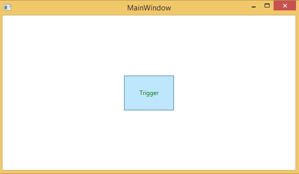
When you compile and execute the above code, it will produce the following output −
When the mouse enters the region of button, the foreground color will change to green.
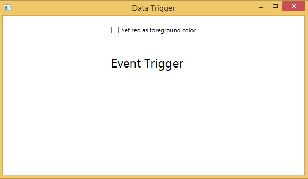
Data Triggers
A data trigger performs some action when the bound data satisfies some condition. Lets have a look at the following XAML code in which a checkbox and a text block are created with some properties. When the checkbox is checked, it will change the foreground color to red.
<Window x:Class = "XAMLDataTrigger.MainWindow"
   xmlns = "http://schemas.microsoft.com/winfx/2006/xaml/presentation"
   xmlns:x = "http://schemas.microsoft.com/winfx/2006/xaml"
   Title = "Data Trigger" Height = "350" Width = "604">

   <StackPanel HorizontalAlignment = "Center">
      <CheckBox x:Name = "redColorCheckBox" Content = "Set red as foreground color" Margin = "20"/>

      <TextBlock Name = "txtblock" VerticalAlignment = "Center"
         Text = "Event Trigger" FontSize = "24" Margin = "20">
         <TextBlock.Style>
            <Style>
               <Style.Triggers>
                  <DataTrigger Binding = "{Binding ElementName = redColorCheckBox, Path = IsChecked}"
                     Value = "true">
                     <Setter Property = "TextBlock.Foreground" Value = "Red"/>
                     <Setter Property = "TextBlock.Cursor" Value = "Hand" />
                  </DataTrigger>
               </Style.Triggers>
            </Style>
         </TextBlock.Style>
      </TextBlock>
   </StackPanel>

</Window>
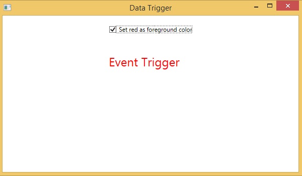
When you compile and execute the above code, it will produce the following output −
When the checkbox is checked, the foreground color of the text block will change to red.
Event Triggers
An event trigger performs some action when a specific event is fired. It is usually used to accomplish some animation such DoubleAnimation, ColorAnimation, etc. The following code block creates a simple button. When the click event is fired, it will expand the width and height of the button.
<Window x:Class = "XAMLEventTrigger.MainWindow"
   xmlns = "http://schemas.microsoft.com/winfx/2006/xaml/presentation"
   xmlns:x = "http://schemas.microsoft.com/winfx/2006/xaml"
   Title = "MainWindow" Height = "350" Width = "604">

   <Grid>
      <Button Content = "Click Me" Width = "60" Height = "30">
         <Button.Triggers>
            <EventTrigger RoutedEvent = "Button.Click">
               <EventTrigger.Actions>
                  <BeginStoryboard>
                     <Storyboard>

                        <DoubleAnimationUsingKeyFrames Storyboard.TargetProperty = "Width" Duration = "0:0:4">
                           <LinearDoubleKeyFrame Value = "60" KeyTime = "0:0:0"/>
                           <LinearDoubleKeyFrame Value = "120" KeyTime = "0:0:1"/>
                           <LinearDoubleKeyFrame Value = "200" KeyTime = "0:0:2"/>
                           <LinearDoubleKeyFrame Value = "300" KeyTime = "0:0:3"/>
                        </DoubleAnimationUsingKeyFrames>

                        <DoubleAnimationUsingKeyFrames Storyboard.TargetProperty = "Height" Duration = "0:0:4">
                           <LinearDoubleKeyFrame Value = "30" KeyTime = "0:0:0"/>
                           <LinearDoubleKeyFrame Value = "40" KeyTime = "0:0:1"/>
                           <LinearDoubleKeyFrame Value = "80" KeyTime = "0:0:2"/>
                           <LinearDoubleKeyFrame Value = "150" KeyTime = "0:0:3"/>
                        </DoubleAnimationUsingKeyFrames>

                     </Storyboard>
                  </BeginStoryboard>
               </EventTrigger.Actions>
            </EventTrigger>
         </Button.Triggers>
      </Button>
   </Grid>
</Window>
When you compile and execute the above code, it will produce the following output −
Now, click on the button and you will observe that it will start expanding in both dimensions.
XAML - Debugging
If you are familiar with debugging in any procedural language (such as C#, C/C++ etc.) and you know the usage of break and are expecting the same kind of debugging in XAML, then you will be surprised to know that it is not possible yet to debug an XAML code like the way you used to debug any other procedural language code. Debugging an XAML app means trying to find an error;
In data binding, your data doesn't show up on screen and you don't know why
Or an issue is related to complex layouts.
Or an alignment issue or issues in margin color, overlays, etc. with some extensive templates like ListBox and combo box.
Debugging in XAML is something you typically do to check if your bindings work, and if it is not working, then to check what's wrong. Unfortunately, setting breakpoints in XAML bindings isn't possible except in Silverlight, but we can use the Output window to check for data binding errors. Let's have a look at the following XAML code to find the error in data binding.
<Window x:Class = "DataBindingOneWay.MainWindow"
   xmlns = "http://schemas.microsoft.com/winfx/2006/xaml/presentation"
   xmlns:x = "http://schemas.microsoft.com/winfx/2006/xaml"
   Title = "MainWindow" Height = "350" Width = "604">

   <Grid>
      <StackPanel Name = "Display">
         <StackPanel Orientation = "Horizontal" Margin = "50, 50, 0, 0">
            <TextBlock Text = "Name: " Margin = "10" Width = "100"/>
            <TextBlock Margin = "10" Width = "100" Text = "{Binding FirstName}"/>
         </StackPanel>

         <StackPanel Orientation = "Horizontal" Margin = "50,0,50,0">
            <TextBlock Text = "Title: " Margin = "10" Width = "100"/>
            <TextBlock Margin = "10" Width="100" Text = "{Binding Title}" />
         </StackPanel>
      </StackPanel>
   </Grid>

</Window>
Text properties of the two text blocks are set to Name and Title statically, while the other two text blocks Text properties are bound to FirstName and Title. But the class variables are intentionally taken as Name and Title in the Employee class which are incorrect variable names. Let us now try to understand where we can find this type of mistake when the desired output is not shown.
using System;
using System.Collections.Generic;
using System.Linq;
using System.Text;
using System.Threading.Tasks;

namespace DataBindingOneWay {
   public class Employee {
      public string Name { get; set; }
      public string Title { get; set; }

      public static Employee GetEmployee() {
         var emp = new Employee() {
            Name = "Ali Ahmed",
            Title = "Developer"
         };
         return emp;
      }
   }
}
Here is the implementation of MainWindow class in C# code −
using System;
using System.Windows;
using System.Windows.Controls;

namespace DataBindingOneWay {
   /// <summary>
      /// Interaction logic for MainWindow.xaml
   /// </summary>

   public partial class MainWindow : Window {
      public MainWindow() {
         InitializeComponent();
         DataContext = Employee.GetEmployee();
      }
   }
}
Let's run this application and you can see immediately in our MainWindow that we have successfully bound to the Title of that Employee object but the name is not bound.
To check what happened with the name, lets look at the output window where a lot of log is generated.
The easiest way to find an error is to just search for error and you will find the below mentioned error which says BindingExpression path error: 'FirstName' property not found on 'object' ''Employe
System.Windows.Data Error: 40 : BindingExpression path error: 'FirstName'
   property not found on 'object' ''Employee' (HashCode = 11611730)'.
BindingExpression:Path = FirstName;
DataItem = 'Employee' (HashCode = 11611730); target element is 'TextBlock' (Name = '');
target property is 'Text' (type 'String')
Which clearly indicate that FirstName is not a member of Employee class, so it helps to fix this type of issues in your application.
When you change the FirstName to Name again, you will see the desired output.
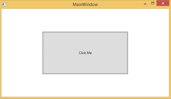
UI Debugging Tools for XAML
UI debugging tools for XAML are introduced with Visual Studio 2015 to inspect the XAML code at runtime. With the help of these tools, XAML code is presented in the form of visual tree of your running WPF application and also the different UI element properties in the tree. To enable this tool, follow the steps given below.
Step 1 − Go to the Tools menu and select Options from the Tools menu.
Step 2 − You will get to see the following dialog box.
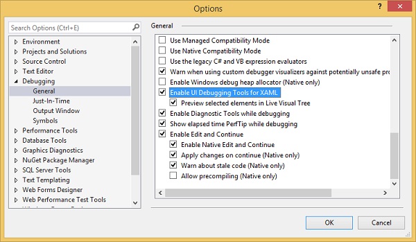
Step 3 − Go to the General Options under Debugging item on the left side.
Step 4 − Check the highlighted option, i.e, Enable UI Debugging Tools for XAML
Step 5 − Press the OK button.
Now run any XAML application or use the following XAML code −
<Window x:Class = "XAMLTestBinding.MainWindow"
   xmlns = "http://schemas.microsoft.com/winfx/2006/xaml/presentation"
   xmlns:x = "http://schemas.microsoft.com/winfx/2006/xaml"
   Title = "MainWindow" Height = "350" Width = "604">

   <StackPanel>
      <ComboBox Name = "comboBox" Margin = "50" Width = "100">
         <ComboBoxItem Content = "Green"/>
         <ComboBoxItem Content = "Yellow" IsSelected = "True"/>
         <ComboBoxItem Content = "Orange" />
      </ComboBox>

      <TextBox Name = "textBox" Margin = "50" Width = "100"
         Height = "23" VerticalAlignment = "Top" Text = "{
         Binding ElementName = comboBox, Path = SelectedItem.Content,
         Mode = TwoWay, UpdateSourceTrigger = PropertyChanged}"
         Background = "{Binding ElementName = comboBox, Path = SelectedItem.Content}">
      </TextBox>
   </StackPanel>

</Window>
When the application executes, it will show the Live Visual Tree where all the elements are shown in a tree.
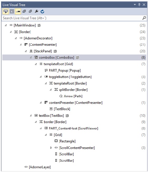
This Live Visual Tree shows the complete layout structure to understand where the UI elements are placed. But this option is only available in Visual Studio 2015. If you are using an older version of Visual studio, then you cant use this tool; however there is another tool which can be integrated with Visual Studio such as XAML Spy for Visual Studio. You can download it from http://xamlspy.com/download. We recommend you to download this tool if you are using an older version of Visual Studio.
XAML - Custom Controls
XAML has one of the most powerful features provided to create custom controls which make it very easy to create feature-rich and customizable controls. Custom controls are used when all the built-in controls provided by Microsoft are not fulfilling your criteria or you dont want to pay for 3rd party controls.
In this chapter, you will learn how to create custom controls. Before we start taking a look at Custom Controls, let's take a quick look at a User Control first.
User Control
User Controls provide a technique to collect and combine different built-in controls together and package them into re-usable XAML. User controls are used in the following scenarios −
If the control consists of existing controls, i.e., you can create a single control of multiple, already existing controls.
If the control don't need support for theming. User Controls do not support complex customization, control templates, and also difficult to style.
If a developer prefers to write controls using the code-behind model where a view and then a direct code is written behind for event handlers.
You won't be sharing your control across applications.
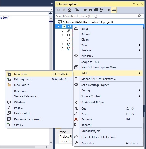
Lets take an example of User control and follow the steps given below −
Step 1 − Create a new WPF project and then right-click on your solution and select Add > New Item...
Step 2 − The following dialog will open, now select User Control (WPF) and name it MyUserControl.
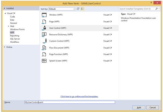
Step 3 − Click on the Add button and you will see that two new files (MyUserControl.xaml and MyUserControl.cs) will be added in your solution.
Given below is the XAML code in which a button and a textbox is created with some properties in MyUserControl.xaml file.
<UserControl x:Class = "XAMLUserControl.MyUserControl"
   xmlns = "http://schemas.microsoft.com/winfx/2006/xaml/presentation"
   xmlns:x = "http://schemas.microsoft.com/winfx/2006/xaml"
   xmlns:mc = "http://schemas.openxmlformats.org/markup-compatibility/2006"
   xmlns:d = "http://schemas.microsoft.com/expression/blend/2008"
   mc:Ignorable = "d" d:DesignHeight = "300" d:DesignWidth = "300">

   <Grid>
      <TextBox Height = "23" HorizontalAlignment = "Left"
         Margin = "80,49,0,0" Name = "txtBox" VerticalAlignment = "Top" Width = "200" />
      <Button Content = "Click Me" Height = "23"
         HorizontalAlignment = "Left" Margin = "96,88,0,0" Name = "button"
         VerticalAlignment = "Top" Width = "75" Click = "button_Click" />
   </Grid>

</UserControl>
Given below is the C# code for button click event in MyUserControl.cs file which updates the textbox.
using System;
using System.Windows;
using System.Windows.Controls;
namespace XAMLUserControl {
/// <summary>
/// Interaction logic for MyUserControl.xaml
/// </summary>
public partial class MyUserControl : UserControl {
public MyUserControl() {
InitializeComponent();
}
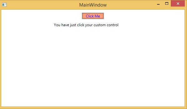
private void button_Click(object sender, RoutedEventArgs e) {
txtBox.Text = "You have just clicked the button";
}
}
}
Here is implementation in MainWindow.xaml to add the user control.
<Window x:Class = "XAMLUserControl.MainWindow"
   xmlns = "http://schemas.microsoft.com/winfx/2006/xaml/presentation"
   xmlns:x = "http://schemas.microsoft.com/winfx/2006/xaml"
   xmlns:control = "clr-namespace:XAMLUserControl"
   Title = "MainWindow" Height = "350" Width = "525">

   <Grid>
      <control:MyUserControl/>
   </Grid>

</Window>
When you compile and execute the above code, it will produce the following output −
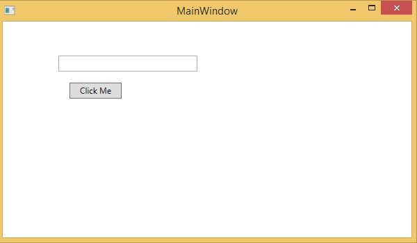
Now click on the "Click Me" button and you will see that the textbox text is updated.
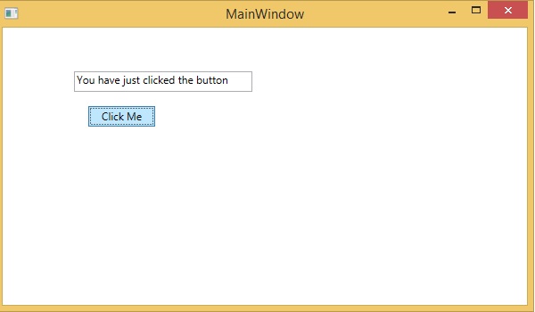
Custom Controls
A custom control is a class which offers its own style and template which are normally defined in generic.xaml. Custom controls are used in following scenarios,
If the control doesn't exist and you have to create it from scratch.
If you want to extend or add functionality to a preexisting control by adding an extra property or an extra functionality to fit your specific scenario.
If your controls need to support theming and styling.
If you want to share you control across applications.
Lets take an example of custom control and follow the steps given below.
Step 1 − Create a new WPF project and then right-click on your solution and select Add > New Item...
Step 2 − The following dialog box will open. Now select Custom Control (WPF) and name it MyCustomControl.
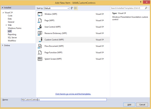
Step 3 − Click on the Add button and you will see that two new files (Themes/Generic.xaml and MyCustomControl.cs) will be added in your solution.
Given below is the XAML code in which style is set for the custom control in Generic.xaml file.
<ResourceDictionary
   xmlns = "http://schemas.microsoft.com/winfx/2006/xaml/presentation"
   xmlns:x = "http://schemas.microsoft.com/winfx/2006/xaml"
   xmlns:local = "clr-namespace:XAMLCustomControls">

   <Style TargetType = "{x:Type local:MyCustomControl}"
      BasedOn = "{StaticResource {x:Type Button}}">
      <Setter Property = "Background" Value = "LightSalmon"/>
      <Setter Property = "Foreground" Value = "Blue"/>
   </Style>

</ResourceDictionary>
Given below is the C# code for MyCustomControl class which is inherited from the button class and in the constructor, it overrides the metadata.
using System;
using System.Windows;
using System.Windows.Controls;

namespace XAMLCustomControls {
   public class MyCustomControl : Button {
      static MyCustomControl() {
         DefaultStyleKeyProperty.OverrideMetadata(typeof(MyCustomControl),
            new FrameworkPropertyMetadata(typeof(MyCustomControl)));
      }
   }
}
Given below is the custom control click event implementation in C# which updates the text of the text block.
using System;
using System.Windows;
using System.Windows.Controls;

namespace XAMLCustomControls {
   /// <summary>
      /// Interaction logic for MainWindow.xaml
   /// </summary>

   public partial class MainWindow : Window {
      public MainWindow() {
         InitializeComponent();
      }
      private void customControl_Click(object sender, RoutedEventArgs e) {
         txtBlock.Text = "You have just click your custom control";
      }
   }
}
Here is the implementation in MainWindow.xaml to add the custom control and a TextBlock.
<Window x:Class = "XAMLCustomControls.MainWindow"
   xmlns = "http://schemas.microsoft.com/winfx/2006/xaml/presentation"
   xmlns:x = "http://schemas.microsoft.com/winfx/2006/xaml"
   xmlns:control = "clr-namespace:XAMLCustomControls" Title = "MainWindow"
   Height = "350" Width = "604">

   <StackPanel>
      <control:MyCustomControl x:Name = "customControl"
         Content = "Click Me" Width = "70" Margin = "10" Click = "customControl_Click"/>
      <TextBlock Name = "txtBlock" Width = "250" Height = "30"/>
   </StackPanel>

</Window>
When you compile and execute the above code, it will produce the following output. Observe the output contains a custom control which is a customized button.
Now click on the customized button. You will see that the text block text is updated.