- XAML - Home
- XAML - Overview
- XAML - Environment Setup
- Writing XAML Aplication On MAC OS
- XAML Vs C# Code
- XAML Vs.VB.NET
- XAML - Building Blocks
- XAML - Controls
- XAML - Layouts
- XAML - Event Handling
- XAML - Data Binding
- XAML - Markup Extensions
- XAML - Dependency Properties
- XAML - Resources
- XAML - Templates
- XAML - Styles
- XAML - Triggers
- XAML - Debugging
- XAML - Custom Controls
XAML - Triggers
Basically, a trigger enables you to change property values or take actions based on the value of a property. So, it basically allows you to dynamically change the appearance and/or behavior of your control without having to create a new one.
Triggers are used to change the value of any given property, when certain conditions are satisfied. Triggers are usually defined in a style or in the root of a document which are applied to that specific control. There are three types of triggers −
- Property Triggers
- Data Triggers
- Event Triggers
Property Triggers
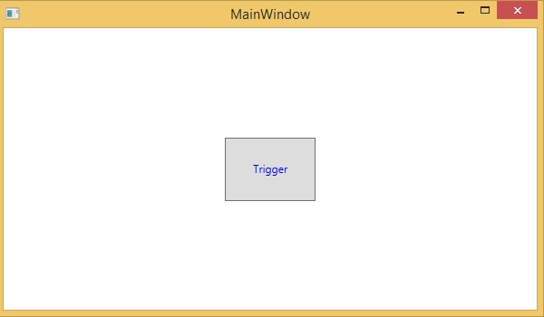
In property triggers, when a change occurs in one property, it will bring either an immediate or an animated change in another property. For example, you can use a property trigger if you want to change the button appearance when the mouse is over the button.
Example
The following example demonstrates how to change the foreground color of a button when the mouse enters its region.
<Window x:Class = "XAMLPropertyTriggers.MainWindow"
   xmlns = "http://schemas.microsoft.com/winfx/2006/xaml/presentation"
   xmlns:x = "http://schemas.microsoft.com/winfx/2006/xaml"
   Title = "MainWindow" Height = "350" Width = "604">

   <Window.Resources>
      <Style x:Key = "TriggerStyle" TargetType = "Button">
         <Setter Property = "Foreground" Value = "Blue" />
         <Style.Triggers>
            <Trigger Property = "IsMouseOver" Value = "True">
               <Setter Property = "Foreground" Value = "Green" />
            </Trigger>
         </Style.Triggers>
      </Style>
   </Window.Resources>

   <Grid>
      <Button Width = "100" Height = "70" Style = "{StaticResource TriggerStyle}"
         Content = "Trigger"/>
   </Grid>

</Window>
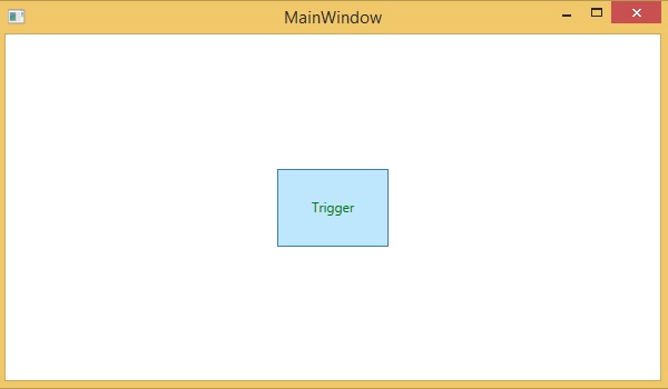
When you compile and execute the above code, it will produce the following output −
When the mouse enters the region of button, the foreground color will change to green.
Data Triggers
A data trigger performs some action when the bound data satisfies some condition. Lets have a look at the following XAML code in which a checkbox and a text block are created with some properties. When the checkbox is checked, it will change the foreground color to red.
<Window x:Class = "XAMLDataTrigger.MainWindow"
   xmlns = "http://schemas.microsoft.com/winfx/2006/xaml/presentation"
   xmlns:x = "http://schemas.microsoft.com/winfx/2006/xaml"
   Title = "Data Trigger" Height = "350" Width = "604">

   <StackPanel HorizontalAlignment = "Center">
      <CheckBox x:Name = "redColorCheckBox" Content = "Set red as foreground color" Margin = "20"/>

      <TextBlock Name = "txtblock" VerticalAlignment = "Center"
         Text = "Event Trigger" FontSize = "24" Margin = "20">
         <TextBlock.Style>
            <Style>
               <Style.Triggers>
                  <DataTrigger Binding = "{Binding ElementName = redColorCheckBox, Path = IsChecked}"
                     Value = "true">
                     <Setter Property = "TextBlock.Foreground" Value = "Red"/>
                     <Setter Property = "TextBlock.Cursor" Value = "Hand" />
                  </DataTrigger>
               </Style.Triggers>
            </Style>
         </TextBlock.Style>
      </TextBlock>
   </StackPanel>

</Window>
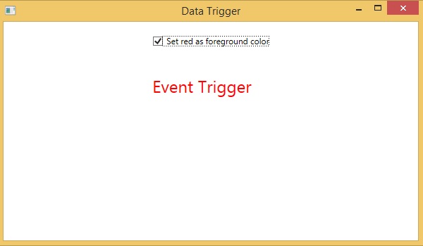
When you compile and execute the above code, it will produce the following output −
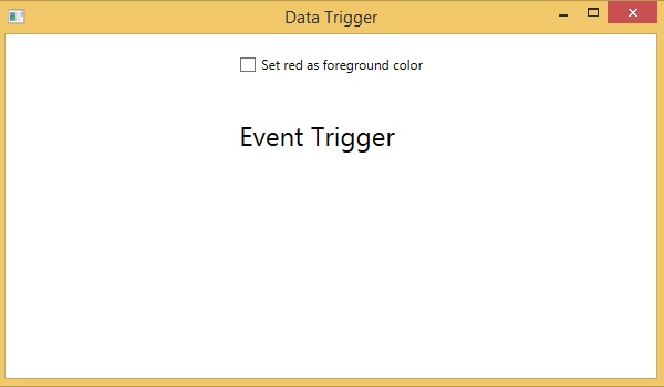
When the checkbox is checked, the foreground color of the text block will change to red.
Event Triggers
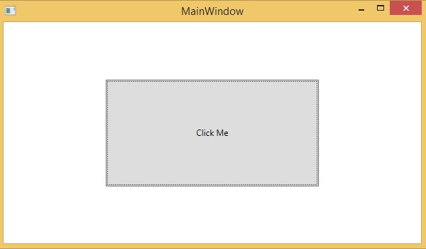
An event trigger performs some action when a specific event is fired. It is usually used to accomplish some animation such DoubleAnimation, ColorAnimation, etc. The following code block creates a simple button. When the click event is fired, it will expand the width and height of the button.
<Window x:Class = "XAMLEventTrigger.MainWindow"
   xmlns = "http://schemas.microsoft.com/winfx/2006/xaml/presentation"
   xmlns:x = "http://schemas.microsoft.com/winfx/2006/xaml"
   Title = "MainWindow" Height = "350" Width = "604">

   <Grid>
      <Button Content = "Click Me" Width = "60" Height = "30">
         <Button.Triggers>
            <EventTrigger RoutedEvent = "Button.Click">
               <EventTrigger.Actions>
                  <BeginStoryboard>
                     <Storyboard>

                        <DoubleAnimationUsingKeyFrames Storyboard.TargetProperty = "Width" Duration = "0:0:4">
                           <LinearDoubleKeyFrame Value = "60" KeyTime = "0:0:0"/>
                           <LinearDoubleKeyFrame Value = "120" KeyTime = "0:0:1"/>
                           <LinearDoubleKeyFrame Value = "200" KeyTime = "0:0:2"/>
                           <LinearDoubleKeyFrame Value = "300" KeyTime = "0:0:3"/>
                        </DoubleAnimationUsingKeyFrames>

                        <DoubleAnimationUsingKeyFrames Storyboard.TargetProperty = "Height" Duration = "0:0:4">
                           <LinearDoubleKeyFrame Value = "30" KeyTime = "0:0:0"/>
                           <LinearDoubleKeyFrame Value = "40" KeyTime = "0:0:1"/>
                           <LinearDoubleKeyFrame Value = "80" KeyTime = "0:0:2"/>
                           <LinearDoubleKeyFrame Value = "150" KeyTime = "0:0:3"/>
                        </DoubleAnimationUsingKeyFrames>

                     </Storyboard>
                  </BeginStoryboard>
               </EventTrigger.Actions>
            </EventTrigger>
         </Button.Triggers>
      </Button>
   </Grid>
</Window>
When you compile and execute the above code, it will produce the following output −
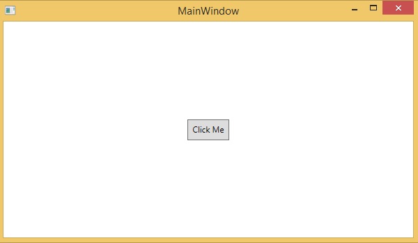
Now, click on the button and you will observe that it will start expanding in both dimensions.