- XAML - Home
- XAML - Overview
- XAML - Environment Setup
- Writing XAML Aplication On MAC OS
- XAML Vs C# Code
- XAML Vs.VB.NET
- XAML - Building Blocks
- XAML - Controls
- XAML - Layouts
- XAML - Event Handling
- XAML - Data Binding
- XAML - Markup Extensions
- XAML - Dependency Properties
- XAML - Resources
- XAML - Templates
- XAML - Styles
- XAML - Triggers
- XAML - Debugging
- XAML - Custom Controls
XAML - DatePicker
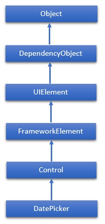
A DatePicker represents a control that allows a user to pick a date value. The user picks the date by using ComboBox selection for month, day, and year values. The hierarchical inheritance of DatePicker class is as follows −
Properties
| Sr.No. | Property & Description |
|---|---|
| 1 | CalendarIdentifier Gets or sets the calendar system to use. |
| 2 | CalendarIdentifierProperty Gets the identifier for the CalendarIdentifier dependency property. |
| 3 | Date Gets or sets the date currently set in the date picker. |
| 4 | DateProperty Gets the identifier for the Date dependency property. |
| 5 | DayFormat Gets or sets the display format for the day value. |
| 6 | DayFormatProperty Gets the identifier for the DayFormat dependency property. |
| 7 | DayVisible Gets or sets a value that indicates whether the day selector is shown. |
| 8 | DayVisibleProperty Gets the identifier for the DayVisible dependency property. |
| 9 | Header Gets or sets the content for the control's header. |
| 10 | HeaderProperty Identifies the Header dependency property. |
| 11 | HeaderTemplate Gets or sets the DataTemplate used to display the content of the control's header. |
| 12 | HeaderTemplateProperty Identifies the HeaderTemplate dependency property. |
| 13 | MaxYear Gets or sets the maximum Gregorian year available for picking. |
| 14 | MaxYearProperty Gets the identifier for the MaxYear dependency property. |
| 15 | MinYear Gets or sets the minimum Gregorian year available for picking. |
| 16 | MinYearProperty Gets the identifier for the MinYear dependency property. |
| 17 | MonthFormat Gets or sets the display format for the month value. |
| 18 | MonthFormatProperty Gets the identifier for the MonthFormat dependency property. |
| 19 | MonthVisible Gets or sets a value that indicates whether the month selector is shown. |
| 20 | MonthVisibleProperty Gets the identifier for the MonthVisible dependency property. |
| 21 | Orientation Gets or sets a value that indicates whether the day, month, and year selectors are stacked horizontally or vertically. |
| 22 | OrientationProperty Gets the identifier for the Orientation dependency property. |
| 23 | YearFormat Gets or sets the display format for the year value. |
| 24 | YearFormatProperty Gets the identifier for the YearFormat dependency property. |
| 25 | YearVisible Gets or sets a value that indicates whether the year selector is shown. |
| 26 | YearVisibleProperty Gets the identifier for the YearVisible dependency property. |
Events
| Sr.No. | Event & Description |
|---|---|
| 1 | DateChanged Occurs when the date value is changed. |
| 2 | DragEnter Occurs when the input system reports an underlying drag event with this element as the target. (Inherited from UIElement) |
| 3 | DragLeave Occurs when the input system reports an underlying drag event with this element as the origin. (Inherited from UIElement) |
| 4 | DragOver Occurs when the input system reports an underlying drag event with this element as the potential drop target. (Inherited from UIElement) |
| 5 | DragStarting Occurs when a drag operation is initiated. (Inherited from UIElement) |
| 6 | GotFocus Occurs when a UIElement receives focus. (Inherited from UIElement) |
| 7 | Holding Occurs when an otherwise unhandled Hold interaction occurs over the hit test area of this element. (Inherited from UIElement) |
| 8 | IsEnabledChanged Occurs when the IsEnabled property changes. (Inherited from Control) |
| 9 | KeyDown Occurs when a keyboard key is pressed while the UIElement has focus. (Inherited from UIElement) |
| 10 | KeyUp Occurs when a keyboard key is released while the UIElement has focus. (Inherited from UIElement) |
| 11 | LostFocus Occurs when a UIElement loses focus. (Inherited from UIElement) |
Methods
| Sr.No. | Method & Description |
|---|---|
| 1 | ClearValue Clears the local value of a dependency property. (Inherited from DependencyObject) |
| 2 | FindName Retrieves an object that has the specified identifier name. (Inherited from FrameworkElement) |
| 3 | OnApplyTemplate Invoked whenever application code or internal processes (such as a rebuilding layout pass) call ApplyTemplate. In simplest terms, this means the method is called just before a UI element displays in your app. Override this method to influence the default post-template logic of a class. (Inherited from FrameworkElement) |
| 4 | OnDragEnter Called before the DragEnter event occurs. (Inherited from Control) |
| 5 | OnDragLeave Called before the DragLeave event occurs. (Inherited from Control) |
| 6 | OnDragOver Called before the DragOver event occurs. (Inherited from Control) |
| 7 | OnDrop Called before the Drop event occurs. (Inherited from Control) |
| 8 | OnGotFocus Called before the GotFocus event occurs. (Inherited from Control) |
| 9 | OnKeyDown Called before the KeyDown event occurs. (Inherited from Control) |
| 10 | OnKeyUp Called before the KeyUp event occurs. (Inherited from Control) |
| 11 | OnLostFocus Called before the LostFocus event occurs. (Inherited from Control) |
| 12 | SetBinding Attaches a binding to a FrameworkElement, using the provided binding object. (Inherited from FrameworkElement) |
Example
The following example shows how to create a DatePicker control. When you click on any date from the DatePicker control, the program will update the title with that date.
Here is the XAML code to create a DatePicker with some properties and a click event.
<Window x:Class = "XAMLDatePicker.MainWindow"
   xmlns = "http://schemas.microsoft.com/winfx/2006/xaml/presentation"
   xmlns:x = "http://schemas.microsoft.com/winfx/2006/xaml"
   Title = "MainWindow" Height = "350" Width = "604">

   <Grid>
      <DatePicker HorizontalAlignment = "Center"
         Margin = "10,10,0,0" VerticalAlignment = "Top"
         SelectedDateChanged = "DatePicker_SelectedDateChanged"/>
   </Grid>
</Window>
Given below is the C# implementation for DatePicker_SelectedDateChanged event.
using System;
using System.Windows;
System.Windows.Controls;

namespace XAMLDatePicker {
   /// <summary>
      /// Interaction logic for MainWindow.xaml
   /// </summary>

   public partial class MainWindow : Window {
      public MainWindow() {
         InitializeComponent();
      }
      private void DatePicker_SelectedDateChanged(object sender, SelectionChangedEventArgs e) {
         var picker = sender as DatePicker;
         DateTime? date = picker.SelectedDate;

         if (date == null) {
            this.Title = "No date";
         } else {
            this.Title = date.Value.ToShortDateString();
         }
      }
   }
}
When you compile and execute the above code, it will display the following output −
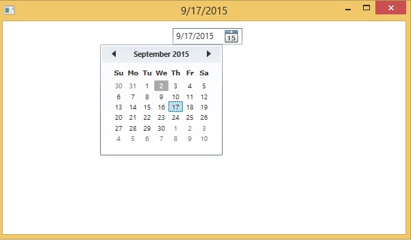
We recommend you to execute the above example code and experiment with some other properties and events.
