- XAML - Home
- XAML - Overview
- XAML - Environment Setup
- Writing XAML Aplication On MAC OS
- XAML Vs C# Code
- XAML Vs.VB.NET
- XAML - Building Blocks
- XAML - Controls
- XAML - Layouts
- XAML - Event Handling
- XAML - Data Binding
- XAML - Markup Extensions
- XAML - Dependency Properties
- XAML - Resources
- XAML - Templates
- XAML - Styles
- XAML - Triggers
- XAML - Debugging
- XAML - Custom Controls
XAML - CheckBox
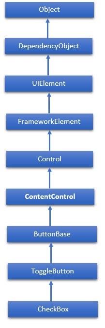
A CheckBox is a control that a user can select (check) or clear (uncheck). It provides a list of options that a user can select, such as a list of settings to apply to an application. The hierarchical inheritance of Checkbox class is as follows −
Properties
| Sr.No. | Property & Description |
|---|---|
| 1 | Background Gets or sets a brush that provides the background of the control. (Inherited from Control) |
| 2 | BorderBrush Gets or sets a brush that describes the border fill of a control. (Inherited from Control) |
| 3 | BorderThickness Gets or sets the border thickness of a control. (Inherited from Control) |
| 4 | Content Gets or sets the content of a ContentControl. (Inherited from ContentControl) |
| 5 | ClickMode Gets or sets a value that indicates when the Click event occurs, in terms of device behavior. (Inherited from ButtonBase) |
| 6 | ContentTemplate Gets or sets the data template that is used to display the content of the ContentControl. (Inherited from ContentControl) |
| 7 | FontFamily Gets or sets the font used to display text in the control. (Inherited from Control) |
| 8 | FontSize Gets or sets the size of the text in this control. (Inherited from Control) |
| 9 | FontStyle Gets or sets the style in which the text is rendered. (Inherited from Control) |
| 10 | FontWeight Gets or sets the thickness of the specified font. (Inherited from Control) |
| 11 | Foreground Gets or sets a brush that describes the foreground color. (Inherited from Control) |
| 12 | Height Gets or sets the suggested height of a FrameworkElement. (Inherited from FrameworkElement) |
| 13 | HorizontalAlignment Gets or sets the horizontal alignment characteristics that are applied to a FrameworkElement when it is composed in a layout parent, such as a panel or items control. (Inherited from FrameworkElement) |
| 14 | IsChecked Gets or sets whether the ToggleButton is checked. (Inherited from ToggleButton) |
| 15 | IsEnabled Gets or sets a value indicating whether the user can interact with the control. (Inherited from Control) |
| 16 | IsPressed Gets a value that indicates whether a ButtonBase is currently in a pressed state. (Inherited from ButtonBase) |
| 17 | IsThreeState Gets or sets a value that indicates whether the control supports three states. (Inherited from ToggleButton) |
| 18 | Margin Gets or sets the outer margin of a FrameworkElement. (Inherited from FrameworkElement) |
| 19 | Name Gets or sets the identifying name of the object. When a XAML processor creates the object tree from XAML markup, run-time code can refer to the XAML-declared object by this name. (Inherited from FrameworkElement) |
| 20 | Opacity Gets or sets the degree of the object's opacity. (Inherited from UIElement) |
| 21 | Resources Gets the locally defined resource dictionary. In XAML, you can establish resource items as child object elements of a frameworkElement. Resources property element, through XAML implicit collection syntax. (Inherited from FrameworkElement) |
| 22 | Style Gets or sets an instance Style that is applied for this object during layout and rendering. (Inherited from FrameworkElement) |
| 23 | Template Gets or sets a control template. The control template defines the visual appearance of a control in UI, and is defined in XAML markup. (Inherited from Control) |
| 24 | VerticalAlignment Gets or sets the vertical alignment characteristics that are applied to a FrameworkElement when it is composed in a parent object such as a panel or items control. (Inherited from FrameworkElement) |
| 25 | Visibility Gets or sets the visibility of a UIElement. A UIElement that is not visible is not rendered and does not communicate its desired size to layout. (Inherited from UIElement) |
| 26 | Width Gets or sets the width of a FrameworkElement. (Inherited from FrameworkElement) |
Methods
| Sr.No. | Method & Description |
|---|---|
| 1 | ClearValue Clears the local value of a dependency property. (Inherited from DependencyObject) |
| 2 | FindName Retrieves an object that has the specified identifier name. (Inherited from FrameworkElement) |
| 3 | OnApplyTemplate Invoked whenever application code or internal processes (such as a rebuilding layout pass) call ApplyTemplate. In simplest terms, this means the method is called just before a UI element displays in your app. Override this method to influence the default post-template logic of a class. (Inherited from FrameworkElement) |
| 4 | OnContentChanged Invoked when the value of the Content property changes. (Inherited from ContentControl) |
| 5 | OnDragEnter Called before the DragEnter event occurs. (Inherited from Control) |
| 6 | OnDragLeave Called before the DragLeave event occurs. (Inherited from Control) |
| 7 | OnDragOver Called before the DragOver event occurs. (Inherited from Control) |
| 8 | OnDrop Called before the Drop event occurs. (Inherited from Control) |
| 9 | OnGotFocus Called before the GotFocus event occurs. (Inherited from Control) |
| 10 | OnKeyDown Called before the KeyDown event occurs. (Inherited from Control) |
| 11 | OnKeyUp Called before the KeyUp event occurs. (Inherited from Control) |
| 12 | OnLostFocus Called before the LostFocus event occurs. (Inherited from Control) |
| 13 | OnToggle Called when the ToggleButton receives toggle stimulus. (Inherited from ToggleButton) |
| 14 | SetBinding Attaches a binding to a FrameworkElement, using the provided binding object. (Inherited from FrameworkElement) |
Events
| Sr.No. | Event & Description |
|---|---|
| 1 | Checked Fires when a ToggleButton is checked. (Inherited from ToggleButton) |
| 2 | Click Occurs when a button control is clicked. (Inherited from ButtonBase) |
| 3 | DataContextChanged Occurs when the value of the FrameworkElement. DataContext property changes. (Inherited from FrameworkElement) |
| 4 | DragEnter Occurs when the input system reports an underlying drag event with this element as the target. (Inherited from UIElement) |
| 5 | DragLeave Occurs when the input system reports an underlying drag event with this element as the origin. (Inherited from UIElement) |
| 6 | DragOver Occurs when the input system reports an underlying drag event with this element as the potential drop target. (Inherited from UIElement) |
| 7 | DragStarting Occurs when a drag operation is initiated. (Inherited from UIElement) |
| 8 | GotFocus Occurs when a UIElement receives focus. (Inherited from UIElement) |
| 9 | Holding Occurs when an otherwise unhandled Hold interaction occurs over the hit test area of this element. (Inherited from UIElement) |
| 10 | Intermediate Fires when the state of a ToggleButton is switched to the indeterminate state. (Inherited from ToggleButton) |
| 11 | IsEnabledChanged Occurs when the IsEnabled property changes. (Inherited from Control) |
| 12 | KeyDown Occurs when a keyboard key is pressed while the UIElement has focus. (Inherited from UIElement) |
| 13 | KeyUp Occurs when a keyboard key is released while the UIElement has focus. (Inherited from UIElement) |
| 14 | LostFocus Occurs when a UIElement loses focus. (Inherited from UIElement) |
| 15 | SizeChanged Occurs when either the ActualHeight or the ActualWidth property changes value on a FrameworkElement. (Inherited from FrameworkElement) |
| 16 | Unchecked Occurs when a ToggleButton is unchecked. (Inherited from ToggleButton) |
Example
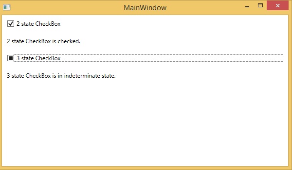
The following example contains two checkboxes. The first checkbox has two states checked or unchecked. The second checkbox has 3 states which are checked, unchecked, and intermediate state. Both checkboxes display a message based on Checked, Unchecked, and Intermediate events.
Here is the XAML code in which two checkboxes have been created with some properties and events.
<Window x:Class = "XAMLCheckBox.MainWindow"
   xmlns = "http://schemas.microsoft.com/winfx/2006/xaml/presentation"
   xmlns:x = "http://schemas.microsoft.com/winfx/2006/xaml"
   Title = "MainWindow" Height = "350" Width = "604">

   <Grid>
      <StackPanel Orientation = "Vertical" >
         <CheckBox x:Name = "cb1"
            Content = "2 state CheckBox"
            Checked = "HandleCheck"
            Unchecked = "HandleUnchecked"
            Margin = "10" />

         <TextBlock x:Name = "text1" Margin = "10" />

         <CheckBox x:Name = "cb2"
            Content = "3 state CheckBox"
            IsThreeState = "True"
            Indeterminate = "HandleThirdState"
            Checked = "HandleCheck"
            Unchecked = "HandleUnchecked"
            Margin = "10" />

         <TextBlock x:Name = "text2" Margin = "10" />
      </StackPanel>
   </Grid>

</Window>
Here is the implementation in C# for different events −
using System;
using System.Windows;
using System.Windows.Controls;
using System.Windows.Media;

namespace XAMLCheckBox {
   /// <summary>
      /// Interaction logic for MainWindow.xaml
   /// </summary>
	public partial class MainWindow : Window {
      public MainWindow() {
         InitializeComponent();
      }
      private void HandleCheck(object sender, RoutedEventArgs e) {
         CheckBox cb = sender as CheckBox;

         if (cb.Name == "cb1") {
            text1.Text = "2 state CheckBox is checked.";
         } else {
            text2.Text = "3 state CheckBox is checked.";
         }
      }
      private void HandleUnchecked(object sender, RoutedEventArgs e) {
         CheckBox cb = sender as CheckBox;

         if (cb.Name == "cb1") {
            text1.Text = "2 state CheckBox is unchecked.";
         } else {
            text2.Text = "3 state CheckBox is unchecked.";
         }
      }
      private void HandleThirdState(object sender, RoutedEventArgs e) {
         CheckBox cb = sender as CheckBox;
         text2.Text = "3 state CheckBox is in indeterminate state.";
      }
   }
}
When you compile and execute the above code, it will produce the following output −
We recommend you to execute the above example code and experiment with some other properties and events
