- XAML - Home
- XAML - Overview
- XAML - Environment Setup
- Writing XAML Aplication On MAC OS
- XAML Vs C# Code
- XAML Vs.VB.NET
- XAML - Building Blocks
- XAML - Controls
- XAML - Layouts
- XAML - Event Handling
- XAML - Data Binding
- XAML - Markup Extensions
- XAML - Dependency Properties
- XAML - Resources
- XAML - Templates
- XAML - Styles
- XAML - Triggers
- XAML - Debugging
- XAML - Custom Controls
XAML - Styles
XAML framework provides several strategies to personalize and customize the appearance of an application. Styles give us the flexibility to set some properties of an object and reuse these specific settings across multiple objects for a consistent look.
In styles, you can set only the existing properties of an object such as Height, Width, and Font size.
Only default behavior of a control can be specified.
Multiple properties can be added into a single style.
Styles are used to give a uniform look to a set of controls. Implicit Styles are used to apply an appearance to all controls of a given type and simplify the application.
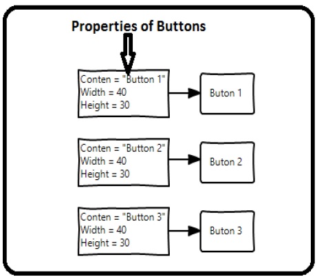
Imagine we have three buttons and all of them have to look the same − same width and height, same font size, and same foreground color. We can set all those properties on the button elements themselves and that's still quite okay for all of the buttons as shown in the following diagram.
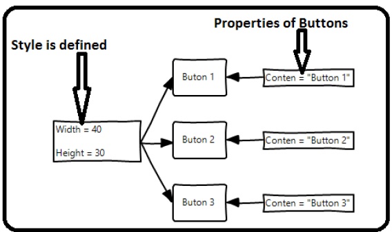
But in a real-life App, you'll typically have a lot more of these that need to look exactly the same. And not only buttons of course, you'll typically want your text blocks, text boxes, and combo boxes, etc., to look the same across your App. Surely there must be a better way to achieve this − it is known as styling. You can think of a style as a convenient way to apply a set of property values to more than one element as shown in the following diagram.
Lets have look at the example which contains three buttons which are created in XAML with some properties.
<Window x:Class = "XAMLStyle.MainWindow"
   xmlns = "http://schemas.microsoft.com/winfx/2006/xaml/presentation"
   xmlns:x = "http://schemas.microsoft.com/winfx/2006/xaml"
   xmlns:d = "http://schemas.microsoft.com/expression/blend/2008"
   xmlns:mc = "http://schemas.openxmlformats.org/markup-compatibility/2006"
   xmlns:local = "clr-namespace:XAMLStyle" mc:Ignorable = "d"
   Title = "MainWindow" Height = "350" Width = "604">

   <StackPanel>
      <Button Content = "Button1" Height = "30" Width = "80" Foreground = "Blue"
         FontSize = "12" Margin = "10"/>

      <Button Content = "Button2" Height = "30" Width = "80" Foreground = "Blue"
         FontSize = "12" Margin = "10"/>

      <Button Content = "Button3" Height = "30" Width = "80" Foreground = "Blue"
         FontSize = "12" Margin = "10"/>
   </StackPanel>

</Window>
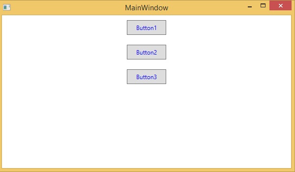
When you look at the above code, you will see that for all the buttons, height, width, foreground color, font size, and margin properties remain same. When the above code is compiled and executed, it will display the following output −
Now lets have a look at the same example, but this time, we will be using style.
<Window x:Class = "XAMLStyle.MainWindow"
   xmlns = "http://schemas.microsoft.com/winfx/2006/xaml/presentation"
   xmlns:x = "http://schemas.microsoft.com/winfx/2006/xaml"
   xmlns:d = "http://schemas.microsoft.com/expression/blend/2008"
   xmlns:mc = "http://schemas.openxmlformats.org/markup-compatibility/2006"
   xmlns:local = "clr-namespace:XAMLStyle" mc:Ignorable = "d"
   Title = "MainWindow" Height = "350" Width = "604">

   <Window.Resources>
      <Style x:Key = "myButtonStyle" TargetType = "Button">
         <Setter Property = "Height" Value = "30"/>
         <Setter Property = "Width" Value = "80"/>
         <Setter Property = "Foreground" Value = "Blue"/>
         <Setter Property = "FontSize" Value = "12"/>
         <Setter Property = "Margin" Value = "10"/>
      </Style>
   </Window.Resources>

   <StackPanel>
      <Button Content = "Button1" Style = "{StaticResource myButtonStyle}"/>
      <Button Content = "Button2" Style = "{StaticResource myButtonStyle}"/>
      <Button Content = "Button3" Style = "{StaticResource myButtonStyle}"/>
   </StackPanel>

</Window>
Styles are defined in the resource dictionary and each style has a unique key identifier and a target type. Inside <style>, you can see that multiple setter tags are defined for each property which will be included in the style.
In the above example, all of the common properties of each button are now defined in style and then the style are assigned to each button with a unique key by setting the style property through the StaticResource markup extension.
When the above code is compiled and executed, it will produce the following window which is the same output.
The advantage of doing it like this is immediately obvious. We can reuse that style anywhere in its scope, and if we need to change it, we simply change it once in the style definition instead of on each element.
In what level a style is defined instantaneously limits the scope of that style. So the scope, i.e. where you can use the style, depends on where you've defined it. Style can be defined on the following levels −
| Sr.No | Levels & Description |
|---|---|
| 1 | Control Level
Defining a style on control level can only be applied to that particular control. |
| 2 | Layout Level
Defining a style on any layout level can only be accessible by that layout and by its child elements only. |
| 3 | Window Level
Defining a style on a window level can be accessible by all the elements on that window. |
| 4 | Application Level
Defining a style on App level makes it accessible in entire application. |
