- XAML - Home
- XAML - Overview
- XAML - Environment Setup
- Writing XAML Aplication On MAC OS
- XAML Vs C# Code
- XAML Vs.VB.NET
- XAML - Building Blocks
- XAML - Controls
- XAML - Layouts
- XAML - Event Handling
- XAML - Data Binding
- XAML - Markup Extensions
- XAML - Dependency Properties
- XAML - Resources
- XAML - Templates
- XAML - Styles
- XAML - Triggers
- XAML - Debugging
- XAML - Custom Controls
XAML - Building Blocks
This chapter will describe some of the basic and important building blocks of XAML applications. It will explain how
- to create and initialize an object,
- an object can be modified easily by using resources, styles, and templates,
- to make an object interactive by using transformations and animations.
Objects
XAML is a typically declarative language which can create and instantiate objects. It is another way to describe objects based on XML, i.e., which objects need to be created and how they should be initialized before the execution of a program. Objects can be
- Containers (Stack Panel, Dock Panel)
- UI Elements / Controls (Button, TextBox, etc.)
- Resource Dictionaries
Resources
Resources are normally definitions connected with some object that you just anticipate to use more often than once. It is the ability to store data locally for controls or for the current window or globally for the entire applications.
Styles
XAML framework provides several strategies to personalize and customize the appearance of an application. Styles give us the flexibility to set some properties of an object and reuse these specific settings across multiple objects for a consistent look.
- In styles, you can set only the existing properties of an object such as Height, Width, Font size, etc.
- Only the default behavior of a control can be specified.
- Multiple properties can be added into a style.
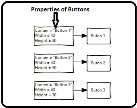
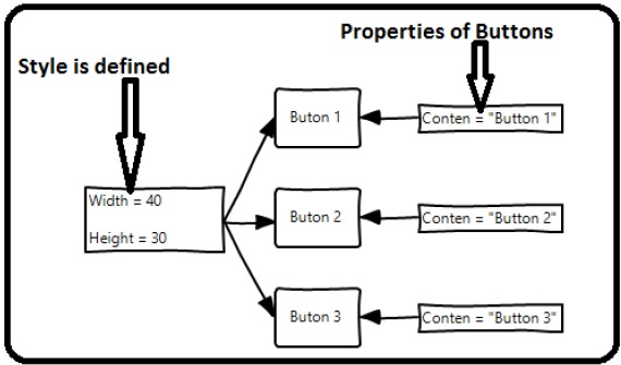
In the first diagram, you can see the same height and width properties are set for all the three button separately; but in the second diagram, you can see that height and width which are same for all the buttons are added to a style and then this style is associated with all the buttons.
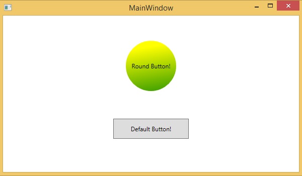
Templates
A template describes the overall look and visual appearance of a control. For each control, there is a default template associated with it which gives the appearance to that control. In XAML, you can easily create your own templates when you want to customize the visual behavior and visual appearance of a control.
In the following screenshot, there are two buttons, one is with template and the other one is the default button.
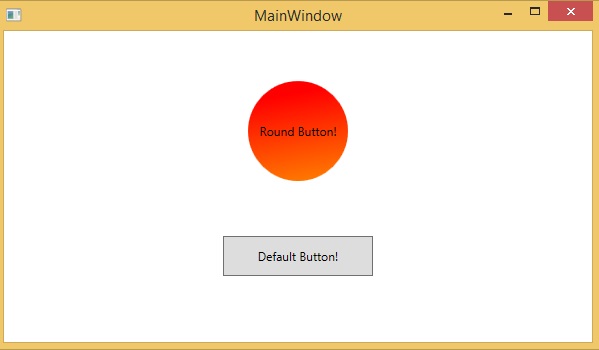
Now when you hover the mouse over the button, it also changes the color as shown below.
With templates, you can access more parts of a control than in styles. You can specify both existing and new behavior of a control.
Animations and Transformations
Animations and transformations inside the Windows Runtime can improve your XAML application by building interactivity and movement. You can easily integrate the interactive look and feel in your XAML application by using the animations from Windows Runtime animation library. Animations are used
- to enhance the user interface or to make it more attractive.
- to attract the attention of the user to a change.
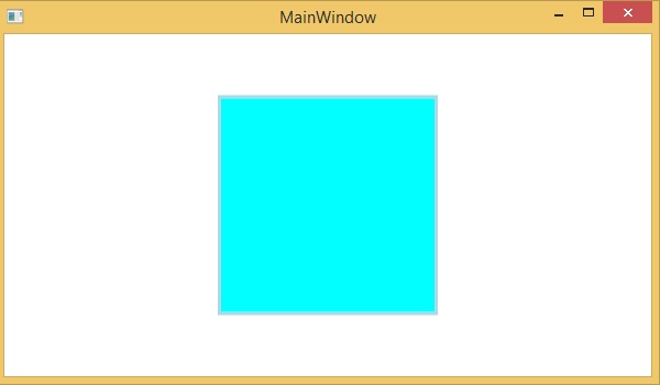
In the following screenshot, you can see a square −
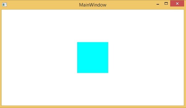
When you hover the mouse over this square, it will expend in all directions as shown below.