- XAML - Home
- XAML - Overview
- XAML - Environment Setup
- Writing XAML Aplication On MAC OS
- XAML Vs C# Code
- XAML Vs.VB.NET
- XAML - Building Blocks
- XAML - Controls
- XAML - Layouts
- XAML - Event Handling
- XAML - Data Binding
- XAML - Markup Extensions
- XAML - Dependency Properties
- XAML - Resources
- XAML - Templates
- XAML - Styles
- XAML - Triggers
- XAML - Debugging
- XAML - Custom Controls
XAML - ProgressBar
A ProgressBar represents a control that indicates the progress of an operation, where the typical visual appearance is a bar that animates a filled area as the progress continues. It can show the progress in either of the two following styles −
- A bar that displays a repeating pattern, or
- A bar that fills based on a value.
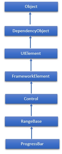
The hierarchical inheritance of ProgressBar class is as follows −
Properties
| Sr.No. | Property & Description |
|---|---|
| 1 | IsIndeterminate Gets or sets a value that indicates whether the progress bar reports generic progress with a repeating pattern or reports progress based on the Value property. |
| 2 | IsIndeterminateProperty Identifies the IsIndeterminate dependency property. |
| 3 | ShowError Gets or sets a value that indicates whether the progress bar should use visual states that communicate an Error state to the user. |
| 4 | ShowErrorProperty Identifies the ShowError dependency property. |
| 5 | ShowPaused Gets or sets a value that indicates whether the progress bar should use visual states that communicate a Paused state to the user. |
| 6 | ShowPausedProperty Identifies the ShowPaused dependency property. |
| 7 | TemplateSettings Gets an object that provides calculated values that can be referenced as TemplateBinding sources when defining templates for a ProgressBar control. |
Events
| Sr.No. | Event & Description |
|---|---|
| 1 | ManipulationCompleted Occurs when a manipulation on the UIElement is complete. (Inherited from UIElement) |
| 2 | ManipulationDelta Occurs when the input device changes position during a manipulation. (Inherited from UIElement) |
| 3 | ManipulationInertiaStarting Occurs when the input device loses contact with the UIElement object during a manipulation and inertia begins. (Inherited from UIElement) |
| 4 | ManipulationStarted Occurs when an input device begins a manipulation on the UIElement. (Inherited from UIElement) |
| 5 | ManipulationStarting Occurs when the manipulation processor is first created. (Inherited from UIElement) |
| 6 | ValueChanged Occurs when the range value changes. (Inherited from RangeBase) |
Methods
| Sr.No. | Method & Description |
|---|---|
| 1 | OnManipulationCompleted Called before the ManipulationCompleted event occurs. (Inherited from Control) |
| 2 | OnManipulationDelta Called before the ManipulationDelta event occurs. (Inherited from Control) |
| 3 | OnManipulationInertiaStarting Called before the ManipulationInertiaStarting event occurs. (Inherited from Control) |
| 4 | OnManipulationStarted Called before the ManipulationStarted event occurs. (Inherited from Control) |
| 5 | OnManipulationStarting Called before the ManipulationStarting event occurs. (Inherited from Control) |
| 6 | OnMaximumChanged Called when the Maximum property changes. (Inherited from RangeBase) |
| 7 | OnMinimumChanged Called when the Minimum property changes. (Inherited from RangeBase) |
| 8 | OnValueChanged Fires the ValueChanged routed event. (Inherited from RangeBase) |
| 9 | SetBinding Attaches a binding to a FrameworkElement, using the provided binding object. (Inherited from FrameworkElement) |
| 10 | SetValue Sets the local value of a dependency property on a DependencyObject. (Inherited from DependencyObject) |
Example
The following example shows how to use the ProgressBar control. Here is the XAML code to create and initialize two ProgressBar controls with IsIndeterminate property.
<Window x:Class = "ProgressBar.MainWindow"
   xmlns = "http://schemas.microsoft.com/winfx/2006/xaml/presentation"
   xmlns:x = "http://schemas.microsoft.com/winfx/2006/xaml"
   Title = "MainWindow" Height = "350" Width = "525">

   <Grid>
      <StackPanel x:Name = "LayoutRoot" >
         <Border BorderThickness = "5" BorderBrush = "LightCoral">
            <StackPanel Background = "LightBlue">
               <TextBlock HorizontalAlignment = "Center" Margin = "10"
                  Text = "Value-Based Progress Bar" />
               <ProgressBar x:Name = "pg1" Value = "100" Margin = "10" Maximum = "200"
                  Height = "15" IsIndeterminate = "False" />
            </StackPanel>
         </Border>

         <Border BorderThickness = "5" BorderBrush = "LightCoral">
            <StackPanel Background = "LightBlue">
               <TextBlock HorizontalAlignment = "Center" Margin = "10" Text = "Indeterminate Progress Bar" />
               <ProgressBar x:Name = "pg2" Margin = "10" Height = "15" IsIndeterminate = "True" />
            </StackPanel>
         </Border>
      </StackPanel>
   </Grid>

</Window>
When you compile and execute the above code, it will produce the following output −
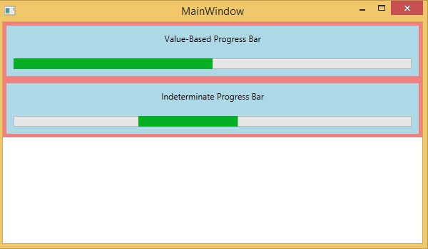
We recommend you to execute the above example code and experiment with some other properties and events.
