- XAML - Home
- XAML - Overview
- XAML - Environment Setup
- Writing XAML Aplication On MAC OS
- XAML Vs C# Code
- XAML Vs.VB.NET
- XAML - Building Blocks
- XAML - Controls
- XAML - Layouts
- XAML - Event Handling
- XAML - Data Binding
- XAML - Markup Extensions
- XAML - Dependency Properties
- XAML - Resources
- XAML - Templates
- XAML - Styles
- XAML - Triggers
- XAML - Debugging
- XAML - Custom Controls
XAML - ListBox
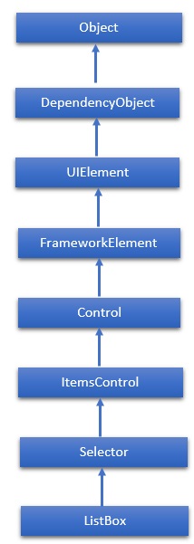
A ListBox is a control that provides a list of items to the user item selection. The user can select one or more items from a predefined list of items at a time. In a ListBox, multiple options are always visible to the user without any user interaction. The hierarchical inheritance of ListBox class is as follows −
Properties
| Sr.No. | Property & Description |
|---|---|
| 1 | Background Gets or sets a brush that provides the background of the control. (Inherited from Control) |
| 2 | BorderThickness Gets or sets the border thickness of a control. (Inherited from Control) |
| 3 | FontFamily Gets or sets the font used to display text in the control. (Inherited from Control) |
| 4 | FontSize Gets or sets the size of the text in this control. (Inherited from Control) |
| 5 | FontStyle Gets or sets the style in which the text is rendered. (Inherited from Control) |
| 6 | FontWeight Gets or sets the thickness of the specified font. (Inherited from Control) |
| 7 | Foreground Gets or sets a brush that describes the foreground color. (Inherited from Control) |
| 8 | GroupStyle Gets a collection of GroupStyle objects that define the appearance of each level of groups. (Inherited from ItemsControl) |
| 9 | Height Gets or sets the suggested height of a FrameworkElement. (Inherited from FrameworkElement) |
| 10 | HorizontalAlignment Gets or sets the horizontal alignment characteristics that are applied to a FrameworkElement when it is composed in a layout parent, such as a panel or items control. (Inherited from FrameworkElement) |
| 11 | IsEnabled Gets or sets a value indicating whether the user can interact with the control. (Inherited from Control) |
| 12 | Item Gets the collection used to generate the content of the control. (Inherited from ItemsControl) |
| 13 | ItemsSource Gets or sets an object source used to generate the content of the ItemsControl. (Inherited from ItemsControl) |
| 14 | Margin Gets or sets the outer margin of a FrameworkElement. (Inherited from FrameworkElement) |
| 15 | Name Gets or sets the identifying name of the object. When a XAML processor creates the object tree from XAML markup, run-time code can refer to the XAML-declared object by this name. (Inherited from FrameworkElement) |
| 16 | Opacity Gets or sets the degree of the object's opacity. (Inherited from UIElement) |
| 17 | SelectedIndex Gets or sets the index of the selected item. (Inherited from Selector) |
| 18 | SelectedItem Gets or sets the selected item. (Inherited from Selector) |
| 19 | SelectedValue Gets or sets the value of the selected item, obtained by using the SelectedValuePath. (Inherited from Selector) |
| 20 | Style Gets or sets an instance Style that is applied for this object during layout and rendering. (Inherited from FrameworkElement) |
| 21 | VerticalAlignment Gets or sets the vertical alignment characteristics that are applied to a FrameworkElement when it is composed in a parent object such as a panel or items control. (Inherited from FrameworkElement) |
| 22 | Width Gets or sets the width of a FrameworkElement. (Inherited from FrameworkElement) |
Events
| Sr.No. | Event & Description |
|---|---|
| 1 | DragEnter Occurs when the input system reports an underlying drag event with this element as the target. (Inherited from UIElement) |
| 2 | DragLeave Occurs when the input system reports an underlying drag event with this element as the origin. (Inherited from UIElement) |
| 3 | DragOver Occurs when the input system reports an underlying drag event with this element as the potential drop target. (Inherited from UIElement) |
| 4 | DragStarting Occurs when a drag operation is initiated. (Inherited from UIElement) |
| 5 | Drop Occurs when the input system reports an underlying drop event with this element as the drop target. (Inherited from UIElement) |
| 6 | DropCompleted Occurs when a drag-and-drop operation is ended. (Inherited from UIElement) |
| 7 | GotFocus Occurs when a UIElement receives focus. (Inherited from UIElement) |
| 8 | IsEnabledChanged Occurs when the IsEnabled property changes. (Inherited from Control) |
| 9 | KeyDown Occurs when a keyboard key is pressed while the UIElement has focus. (Inherited from UIElement) |
| 10 | KeyUp Occurs when a keyboard key is released while the UIElement has focus. (Inherited from UIElement) |
| 11 | LostFocus Occurs when a UIElement loses focus. (Inherited from UIElement) |
| 12 | SelectionChanged Occurs when the currently selected item changes. (Inherited from Selector) |
| 13 | SizeChanged Occurs when either the ActualHeight or the ActualWidth property changes value on a FrameworkElement. (Inherited from FrameworkElement) |
Methods
| Sr.No. | Method & Description |
|---|---|
| 1 | Arrange Positions child objects and determines a size for a UIElement. Parent objects that implement custom layout for their child elements should call this method from their layout override implementations to form a recursive layout update. (Inherited from UIElement) |
| 2 | FindName Retrieves an object that has the specified identifier name. (Inherited from FrameworkElement) |
| 3 | Focus Attempts to set the focus on the control. (Inherited from Control) |
| 4 | GetValue Returns the current effective value of a dependency property from a DependencyObject. (Inherited from DependencyObject) |
| 5 | IndexFromContainer Returns the index to the item that has the specified, generated container. (Inherited from ItemsControl) |
| 6 | OnDragEnter Called before the DragEnter event occurs. (Inherited from Control) |
| 7 | OnDragLeave Called before the DragLeave event occurs. (Inherited from Control) |
| 8 | OnDragOver Called before the DragOver event occurs. (Inherited from Control) |
| 9 | OnDrop Called before the Drop event occurs. (Inherited from Control) |
| 10 | OnKeyDown Called before the KeyDown event occurs. (Inherited from Control) |
| 11 | OnKeyUp Called before the KeyUp event occurs. (Inherited from Control) |
| 12 | OnLostFocus Called before the LostFocus event occurs. (Inherited from Control) |
| 13 | ReadLocalValue Returns the local value of a dependency property, if a local value is set. (Inherited from DependencyObject) |
| 14 | SetBinding Attaches a binding to a FrameworkElement, using the provided binding object. (Inherited from FrameworkElement) |
| 15 | SetValue Sets the local value of a dependency property on a DependencyObject. (Inherited from DependencyObject) |
Example
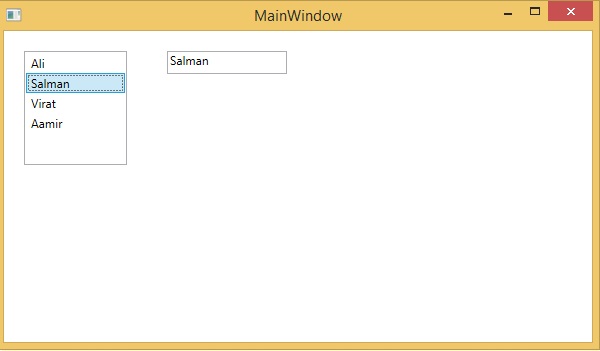
The following example shows the ListBox control and a TextBox. When a user selects any item from the ListBox, then it gets displayed on the TextBox as well.
Here is the XAML code to create and initialize a ListBox and a TextBox with some properties.
<Window x:Class = "XAMLListBox.MainWindow"
   xmlns = "http://schemas.microsoft.com/winfx/2006/xaml/presentation"
   xmlns:x = "http://schemas.microsoft.com/winfx/2006/xaml"
   Title = "MainWindow" Height = "350" Width = "604">

   <Grid>
      <StackPanel Orientation = "Horizontal">
         <ListBox Name = "listbox" Margin = "20,20,20,177" Width = "103">
            <ListBoxItem Content = "Ali"/>
            <ListBoxItem Content = "Salman"/>
            <ListBoxItem Content = "Virat"/>
            <ListBoxItem Content = "Aamir"/>
         </ListBox>

         <TextBox Height = "23"
            Name = "textBox1"
            Width = "120"
            Margin = "20"
            HorizontalAlignment = "Left"
            VerticalAlignment = "Top">

         <TextBox.Text>
            <Binding ElementName = "listbox" Path = "SelectedItem.Content"/> </TextBox.Text>
         </TextBox>
      </StackPanel>
   </Grid>

</Window>
When you compile and execute the above code, it will produce the following output −
We recommend you to execute the above example code and experiment with some other properties and events.
