- MicroStrategy - Home
- MicroStrategy - Overview
- MicroStrategy - Environment Setup
- MicroStrategy - Desktop
- MicroStrategy - Architecture
- MicroStrategy - Importing Data
- MicroStrategy - OLAP Services
- Configuration Objects
- MicroStrategy - Public Objects
- MicroStrategy - Schema Objects
- MicroStrategy - Report Objects
- MicroStrategy Basic Reporting
- MicroStrategy - Report Types
- MicroStrategy - Slicing
- MicroStrategy - Dicing
- MicroStrategy - Pivoting
- MicroStrategy - Drilldown
- MicroStrategy - Rollup
- MicroStrategy - Creating Metrics
- MicroStrategy - Nested Metrics
- MicroStrategy Advanced Reporting
- Creating Derived Metrics
- MicroStrategy - Metric Comparison
- MicroStrategy - Creating Filters
- MicroStrategy - Advanced Filters
- Shortcut & Embedded Filters
- MicroStrategy - Refreshing Reports
- MicroStrategy - Intelligent Cubes
- MicroStrategy Dashboards
- Creating a Dashboard
- Formatting a Dashboard
- MicroStrategy - Graph Visualizations
- MicroStrategy - Grid Visualizations
- Heat Map Visualization
- MicroStrategy - N/W Visualization
- Visualization with Multiple Datasets
- Filtering Data in Dashboard
- MicroStrategy - Adding Web Content
- MicroStrategy Office
- Conditional Formatting
- MicroStrategy - Custom Groups
- MicroStrategy - Report Cache Flow
- MicroStrategy - Data Marts
- MicroStrategy - Predictive Models
- MicroStrategy Useful Resources
- MicroStrategy - Quick Guide
- MicroStrategy - Useful Resources
- MicroStrategy - Discussion
MicroStrategy - Quick Guide
MicroStrategy - Overview
As a Business Intelligence tool with wide range of capabilities, MicroStrategy has powerful features that helps to find answers and insights in business data analysis. Following are some of the important features.
Data Discovery
This feature enables MicroStrategy to connect to any data source and blend the data from various sources. It can connect to relational sources, flat files, big data sources, social media platforms, and cloud systems to name a few.
Data Wrangling
This feature helps in data transformation and modification with an extensive set of builtin data wrangling and parsing capabilities. Business users benefit from automatic recommendations while data scientists can leverage the full breadth of wrangling capabilities. There are history scripts that remember data transformations and can be reapplied to any analysis.
Data Mining and Predictive Analysis
MicroStrategy has a wide range of native analytical capabilities, with the option to easily incorporate third-party data mining and modeling tools. The Data Mining Services can be used by business users, report designers and analysts to view and build predictive reports and distribute these reports to users on any device.
Library of Analytics Functions
It has an extensive library of over 300 OLAP, mathematical, financial, and data mining functions, which can be used to better understand the relationships between data, create business metrics and top-level KPIs, or build advanced statistical analyses.
Extensible Visualization Library
It has out-of-the-box grids, graphs, and in-built data visualizations tools. It also allows addition of hundreds of open-source visualizations available from D3 or other providers with built-in tools that help with the integration process. It also has a visualization builder and SK to code a new visualization from scratch.
Real-time Dashboards
You can build dashboards that can source live data to provide real-time monitoring of the most current information. With scheduled updates that have controllable intervals, users can be guaranteed of the latest data.
Embedded BI
MicroStrategy comes with several out-of-the-box development-ready portlets that require no additional coding. These portlets allow organizations to seamlessly embed MicroStrategy functionality with IBM WebSphere, Oracle WebLogic, Microsoft SharePoint, and SAP NetWeaver, among others. A portal integration kit includes sample code and documentation for integrating MicroStrategy Web with other enterprise portals.
Mobile Platform
The existing visualizations, reports, and dashboards are instantly available in mobile platforms, once they are created.
MicroStrategy - Environment Setup
Download MicroStrategy Desktop
The Free Personal Edition of MicroStrategy Desktop can be downloaded from the Microstrategy Desktop. To download, you need to register with your details.
After downloading, the installation is a very straightforward process in which you need to accept the license agreement and provide the target folder for storing the desktop version. Desktop version is available for both Windows and Mac OS. In this tutorial, we will consider only the Windows version. The following screenshots describe the setup steps.
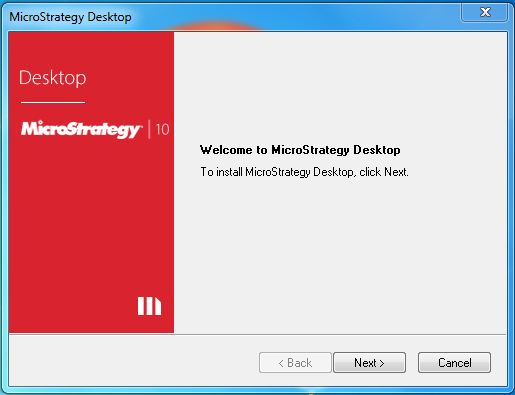
Start the Installation Wizard
Double-click the MicroStrategy Desktop-64bit.exe and it will present a screen to allow the installation program to run. Click Next.
Required Components
Depending on the Windows environment, you may need additional Windows platform software for MicroStrategy to run. .Net Framework is a common requirement. The installation process takes care of it on its own.
On successful completion of the above steps, MicroStrategy Desktop is available on your system.
Verify the Installation
To verify that MicroStrategy Desktop has been successfully installed, open the start menu in Windows and click the icon for MicroStrategy. The following window opens confirming the installation of MicroStrategy Desktop.
MicroStrategy - Desktop
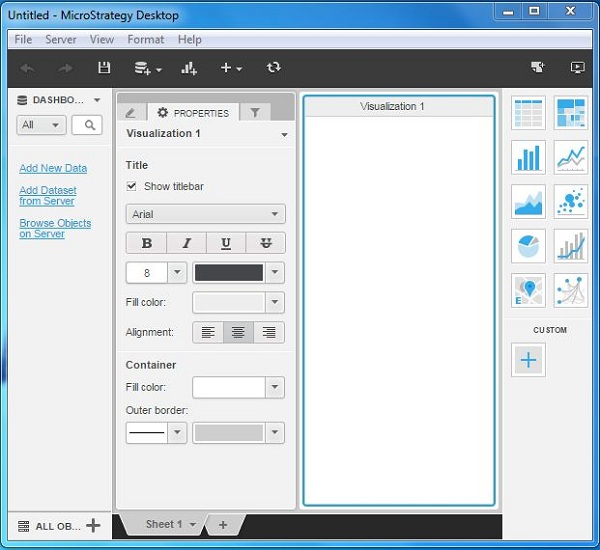
The MicroStrategy Desktop environment is very intuitive. It has a simple menu to import data for analysis and export the result of analysis. The menu also provides features to connect to a server if required, view the data sets available, the visualization gallery, and data filtering options, etc.
Desktop Windows
Following screenshot shows the image of MicroStrategy desktop windows.
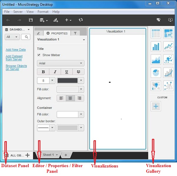
Following is a brief description of each of these windows.
Dataset Panel − This is used to add the required data sets to be analyzed. The data sets can come from any of the compatible sources. This section also gives an option to connect to the data sets available in MicroStrategy server.
Editor Panel − This is used to bring in the required rows and columns from the data set for analysis. Also the different matrices or mathematical expressions can be applied to the data analysis available here.
Properties Panel − This panel is used to set the display formats of the data such as font size, color alignment. etc.
Filter Panel − This panel is used to apply various filters on the data sets being analyzed.
Visualizations − It is the panel which shows data analysis. You can drag the data objects to this panel and apply a method of visualization to see the results.
Visualization Gallery − This panel displays the inbuilt-visualizations available, which can be applied directly on the data set. The various visualizations available are Heat maps, bar charts, bubble charts, network diagrams, etc. It also allows to create custom visualizations.
MicroStrategy - Architecture
MicroStrategy has a metadata-driven architecture. The metadata is a central repository, which stores all the objects used by it. Also the metadata can be used by any of the MicroStrategy products, which has ensured uniformity in the values of the objects. The objects stored in the metadata are reusable.
Object Layers
The following diagram represents the different layer of objects created and stored in MicroStrategy metadata.
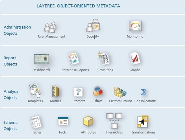
Administration Objects − This Objects layer establishes the security, user grouping, and performance parameters that govern the MicroStrategy applications.
Report Objects − This objects layer assembles the building blocks from the Schema and Analysis Object Layers to provide insightful textual and visual analysis.
Analysis Objects − This objects layer provides the building blocks for sophisticated analysis. The analysis objects are built on the objects developed in the schema layer.
Schema Objects − This objects layer provides a logical abstraction of the database schema that is tailored for the business model.
ROLAP Architecture
MicroStrategy can access data from data warehouses, cube databases, flat files, operational databases such as ERPs, CRMS, Web applications, etc. For this, it uses a relational OLAP architecture.
The following diagram shows an overall architecture of MicroStrategy platform describing how it accesses data from various sources using the metadata objects.
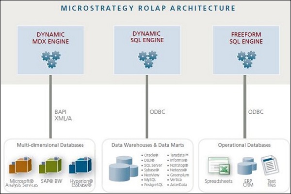
Dynamic MDX Engine − It generates optimized Multidimensional Expressions (MDX) for interactively accessing cube databases from SAP, Microsoft Analysis Services, Hyperion Essbase, etc.
Dynamic SQL Engine − It generates optimized SQL for interactively accessing data warehouses.
Freeform SQL Engine − It provides direct access to operational databases, text files, and spreadsheets via a graphical Query Builder or through freehand SQL.
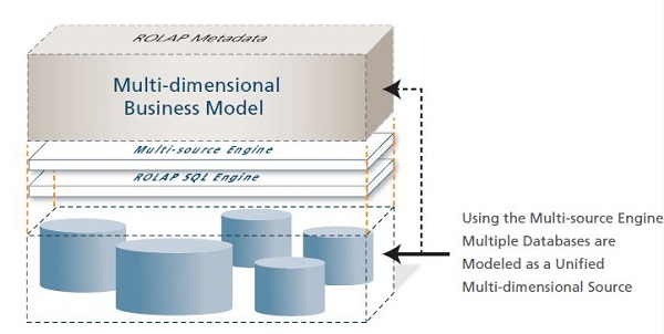
Unified Metadata
Finally, MicroStrategy Architect can model multiple sources as if they were a single data source, storing all this information in MicroStrategy's unified metadata.
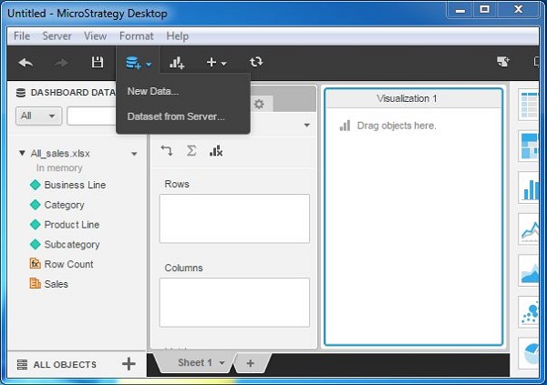
MicroStrategy - Importing Data
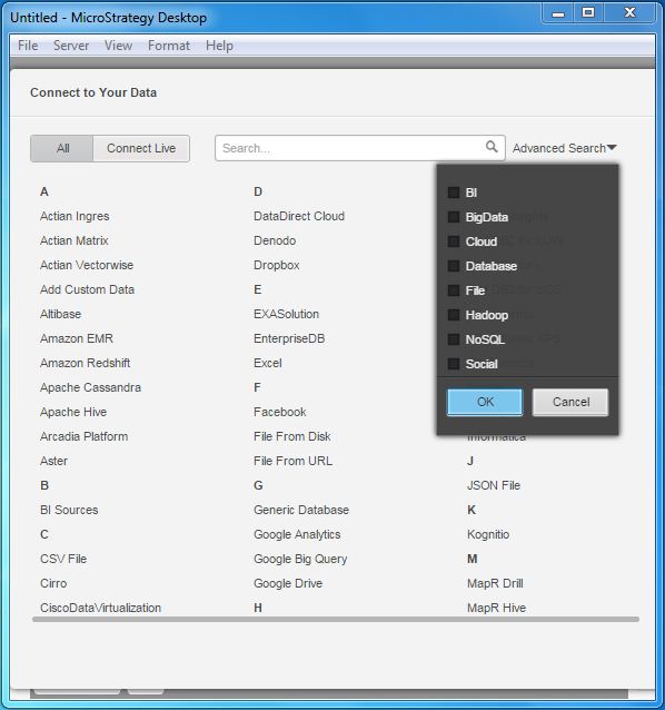
MicroStrategy connects to nearly every kind of data source available. It has native connectors, which establish connection with these data sources and also has a connect live feature, which fetches data as and when required. Interestingly, it also shows the icons of data sources for quicker identification of data source you are looking for.
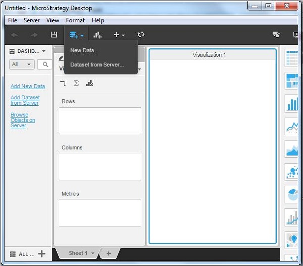
Add Data
The simplest way to search and select the required data set is by using the Add Data option available with a + icon under the main menu. The following diagram shows the steps to add data.
Data Sources
On clicking the Add Data option, we see the icons of various data sources. These help in quickly identifying the data source.
Search Data Source
With this vast number of connection types available, sometimes we need to type in the data source name or filter it from a small group of data set names. MicroStrategy has the feature of advanced search, which makes it possible.
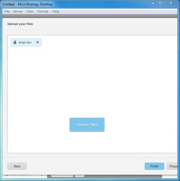
Adding Data from Files
In this section, we will see how to add an excel file as a data source and create a simple visualization.
Select the Excel File
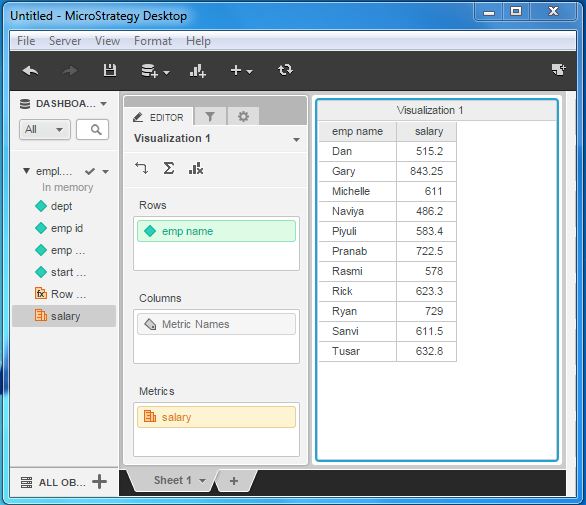
Click the option Add Data and choose Excel available under the alphabetically arranged headers showing E. The window shows a Choose File option and clicking it we can browse the local system to select the required excel file. In the following example, we have a sample file containing the employee data of an organization.
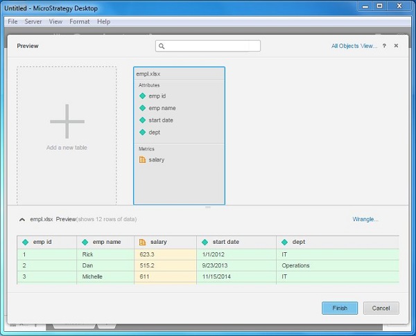
Prepare the Excel File
Before accepting the content of the Excel file, we can preview and also edit the data present in it. Once the file is selected, we can see the button Prepare Data next to the Finish button. Clicking it produces a preview of the data present in the file.
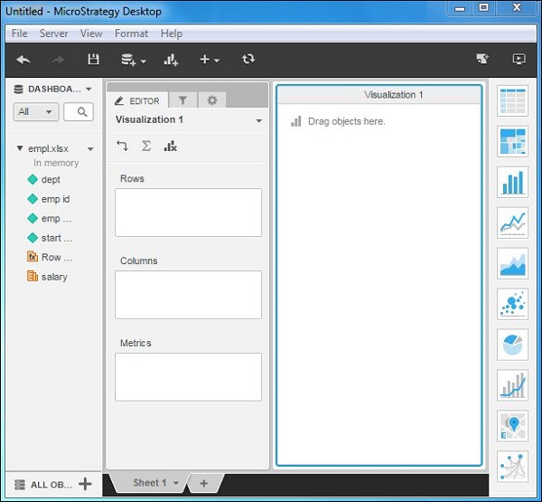
Prepare Visualization
On clicking Finish, after the data is previewed, we are presented with the MicroStrategy window showing the data objects chosen.
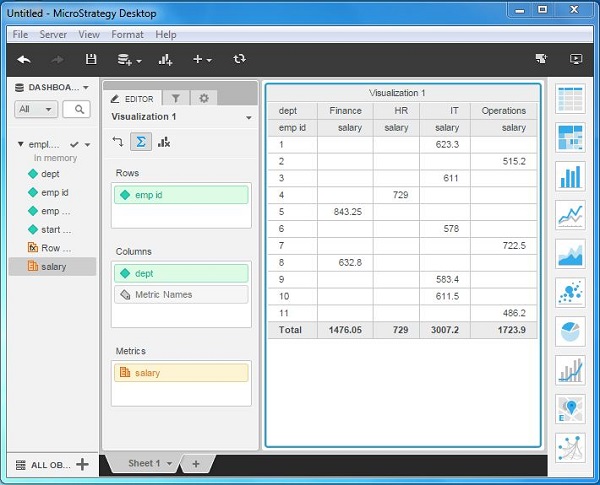
Next, we can create a simple visualization from this data source by dragging the columns in the data source into rows and columns boxes. A metric can also be added. The following diagram shows the final visualization.
MicroStrategy - OLAP Services
Online Analytical Processing (OLAP) is a multidimensional analysis of business data. It provides the capability for complex calculations, trend analysis, etc. MicroStrategys OLAP Services is an expansion of MicroStrategy Intelligence Server. It uses the concept of Inmemory Business Intelligence. This helps the BI platform to extensively improve the performance and analysis.
The various OLAP manipulations on the report uses features such as aliasing, banding, sorting, pivoting, page-by, and so on. These features do not cause the report to be reexecuted against the warehouse, and therefore have a much faster response time. Following is a brief description of various OLAP features available in MicroStrategy Desktop.
Aliasing − This feature is used to rename any object on the report grid, such as attribute names, consolidation names, custom group names, and metric names.
Banding − Used to color groups of rows or columns so that they form bands of data that are easy to locate and analyze.
Page-by − It is a way to segment data in a grid report by placing available attributes, consolidations, or metrics on a third axis called the Page axis.
Pivoting − Used to rearrange the columns and rows in a report to view data from different perspectives such as moving an object from the row header to the column header and vice versa.
Sorting − MicroStrategy Desktop offers quick sort, advanced sort, and hierarchical sort of row or columns.
Subtotals − It is used to add, remove, and edit the subtotals at different levels for metrics on the report.
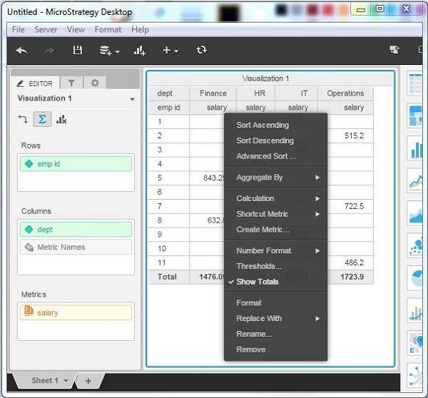
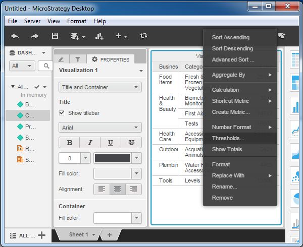
Thresholds − A threshold highlights data that meets conditions defined by the user.
Following is an example of applying thresholds.
Consider the Employee report created in the previous chapter using an excel file. In the report, we will apply threshold colors to various salaries using the following steps.
Select Threshold Column
In the employee report, click the salary column and choose the threshold from the drop down.
Apply Threshold Option
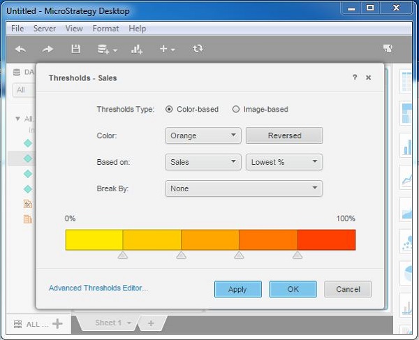
The next window provides options to choose the type of threshold. We choose the color based threshold with default colors and values.
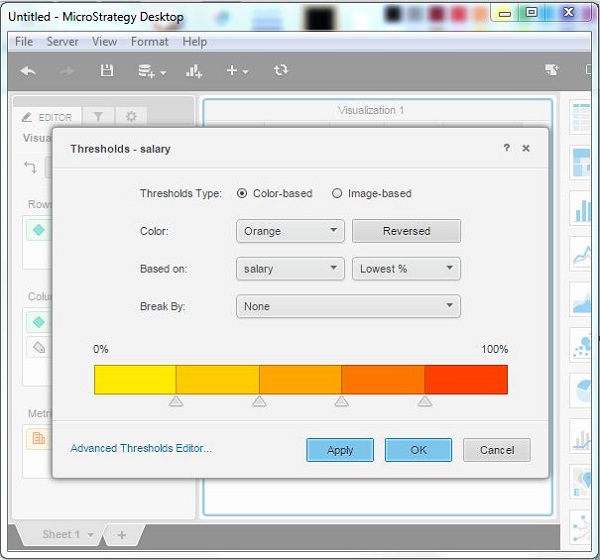
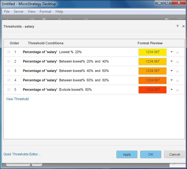
In case we want to explore other non-default threshold options, we can click the Advanced Threshold Editor, which shows the following additional options.
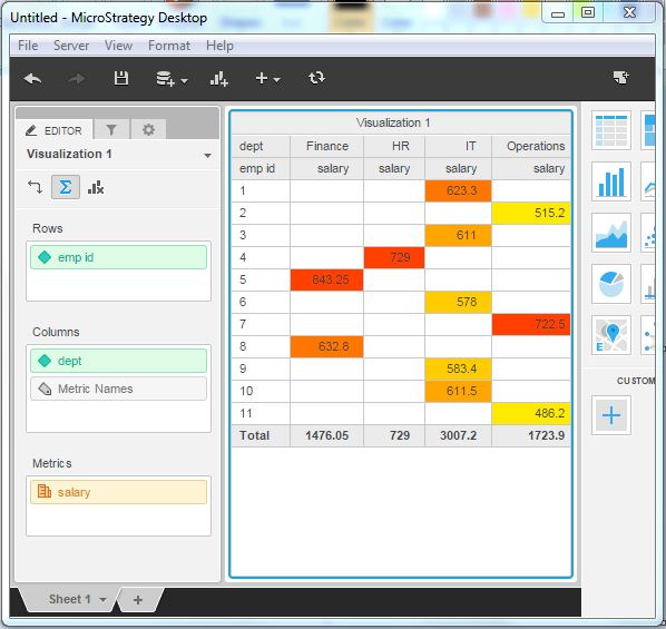
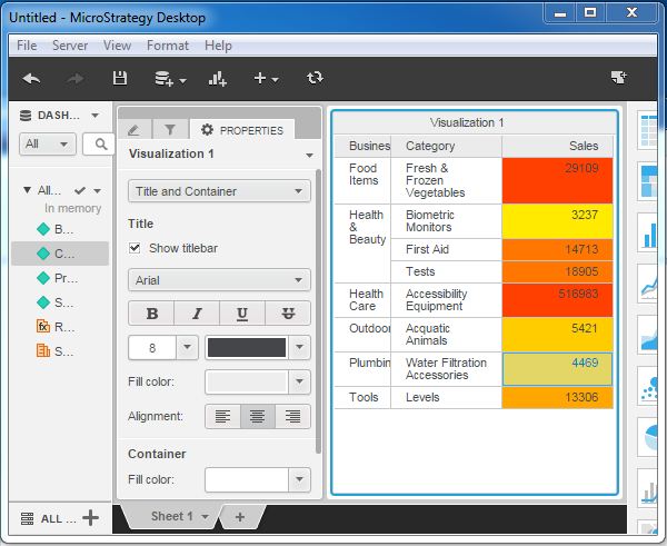
Threshold Result
The final result of the threshold is shown in the following image which highlights the different salary values as per the threshold color chosen.
MicroStrategy - Configuration Objects
MicroStrategy objects appear in the system layer and are usable across multiple projects. Configuration objects include objects such as users, database instances, database login IDs, and schedules.
On logging in to MicroStrategy Developer, as a admin we get the Administration option under MicroStrategy Secure Enterprise. Expanding this option gives us the various configuration objects which are discussed in the following sections.
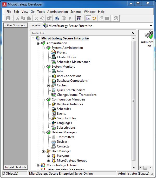
User Manager
These objects are used by the administrator to manage the MicroStrategy users. It is configured to handle the following user configurations. It offers the following configuration options −
User authentication − To allow the user into the environment.
User groups − A collection of users to whom some specific privilege is assigned.
User privileges − To use only a subset of all the features available in the environment.
User permissions − To allow/disallow the use of a specific object.
Configuration Manager
These objects are used to manage the database connectivity information. They store the path and credential information for the many databases to which MicroStrategy can connect. It offers the following configuration options −
Database instance − The name of the database instance and its credentials.
The Connection lifetime − This limit is the maximum amount of time that a database connection thread remains cached.
Events − Triggers the tasks related to a database event.
Security role − Control the access of the user to various objects in the database.
System Monitor
There are many system monitors which help in identifying the health of the MicroStrategy environment. They help in predicting the load on the system and any performance issue that is likely to arise. Following are some of the important system monitor options.
Jobs − Monitors currently executing jobs.
User Connections − Monitors the number of user connections at a given time.
Caches − Monitors the number of caches and their sizes.
System Administration
This administrative activity involves setting up various projects, allocate clusters to the projects, and schedule the maintenance windows.
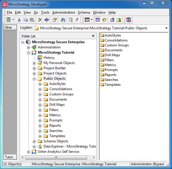
MicroStrategy - Public Objects
When a new MicroStrategy project is created, users with access to that project can create objects and store them only in their personal folders under that project. However, it is desirable sometimes to make many MicroStrategy objects available to other users. For such a scenario, a user of the administrative group can create and place various MicroStrategy Objects under the public folder.
Non-administrative users can only view and use the objects from the public folder, but they cannot delete or create new objects under the public folder.
To access the public folder, login to MicroStrategy developer as administrator and go to option Public Objects. On expanding the button, the following screen opens showing different public objects available in MicroStrategy.
MicroStrategy - Schema Objects
Schema Objects are the MicroStrategy Objects which are logical representation of the structures of a data warehouse. These are the objects which are decided during the creation of a MicroStrategy project.
Login to MicroStrategy developer as administrator. Navigate to MicroStrategy Tutorial and expand the Schema Objects option. The following screen opens up showing the various schema objects.
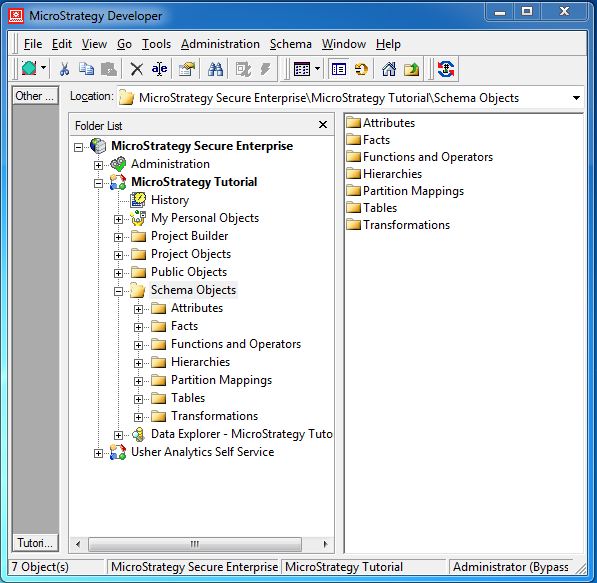
Following are the various Schema Objects with their description.
Facts − They are the numeric values, which can be aggregated to represent the value of some business data.
Attributes − They represent the granularity of data in the facts table. They are generally the descriptive data from the business.
Hierarchies − They represent the relationship between various attribute values. They help in carrying out drill-up and drill-down analysis on the data.
Functions and Operators − These are the various inbuilt mathematical functions and operators available in MicroStrategy to apply calculations to the data.
Tables − They simply represent data in a tabular form (columns and rows).
Transformations − They are the data transformation features used for time-series based analysis of the data.
Partition Mapping − This feature is used to create a logical division of the partition of fact tables so the querying becomes more efficient.
MicroStrategy - Report Objects
Each report in MicroStrategy is built using some underlying objects which represent the business scenario. These objects together represent the set of data requested by the report user and also the relationship between the various data elements.
To get the report objects of a report, open the report and click the report object icon as shown in the following screenshot.
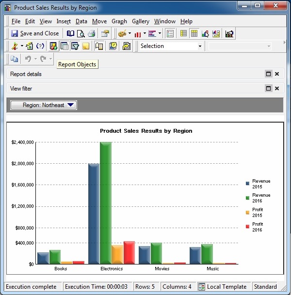
The above screenshot shows the report objects used in the report.
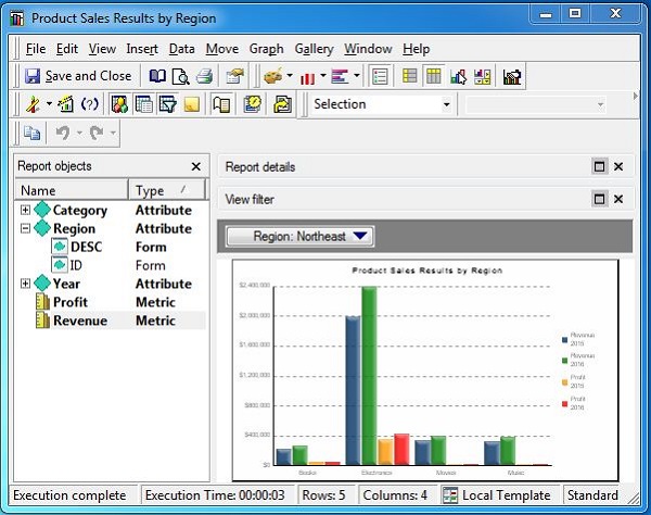
In the current example, we have three report objects −
Category − It is a report attribute showing the category of the products sold.
Region − It is a report attribute showing the region of the products sold.
Year − It is an attribute which contains two metric objects (profit and revenue).
Report Objects are very important from report design perspective as they decide which fields from the data source goes into the report and also the calculations applied on those fields.
MicroStrategy - Report Types
The reports created in MicroStrategy can be seen from a different prospective. Some can be seen as only numbers and text, while some other only as graphs. We can also combine the textual and graphical visualizations together.
The reports created in MicroStrategy can be seen from a different prospective. Some can be seen as only numbers and text. While some other only as graphs. We can also combine the textual and graphical visualizations together.
Following are the three report types used in MicroStrategy Desktop.
Grid Reports − These reports display only textual information in the form of grids showing rows and columns of data.
Graph Reports − These reports show various graphs created from the data sets.
Combined Reports − These reports can show the combination of both the Grid and Graphical reports.
Lets discuss these types of reports in detail.
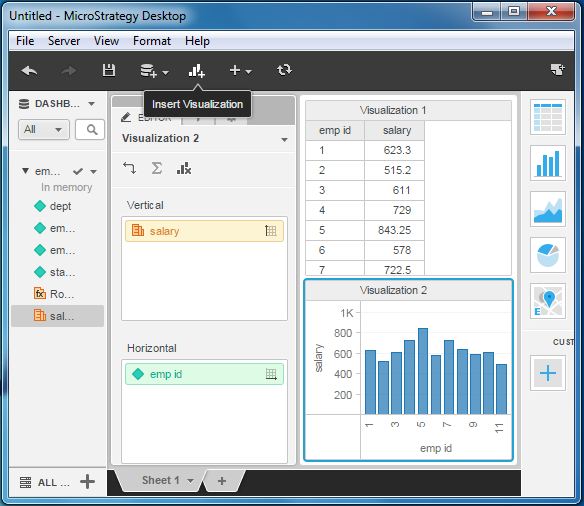
Grid Reports
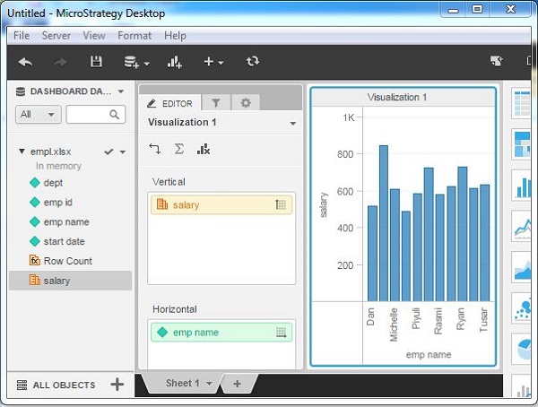
Consider the report created from the employee data earlier. As we display only the textual information showing the employee ID and salary for each of the departments, it is an example of a grid report.
Graph Reports
We can choose an appropriate graphical visualization of the data from the gallery of visualizations available in MicroStrategy. In the following screenshot, we see the bar chart graph created for the above data set by simply clicking the bar chart visualization available in the right pane.
Combination Graph
We can combine both the grid and graph charts by adding both the types of visualizations on one screen.
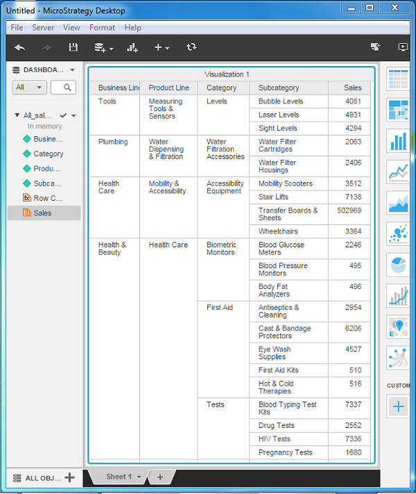
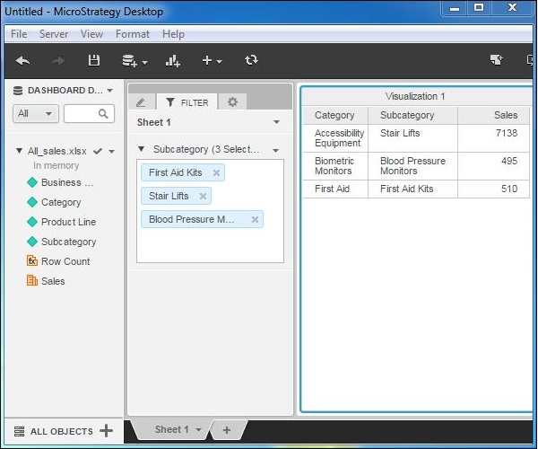
MicroStrategy - Slicing
The Slicing operation of a data set involves creating a smaller data set by filtering one dimension. It helps in analyzing the relationship between a given dimension and all the remaining variables of the data set.
Consider the data set, All-Sales, which contains the following dimensions −
- Business Line
- Product line
- Category
- Subcategory
- Sales
The following screenshot shows a chart with the entire data set projecting all the variables.
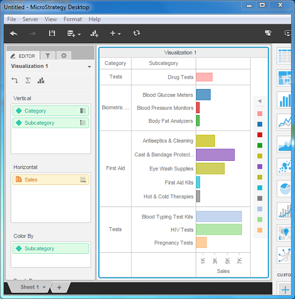
Now, lets find out the Sales value for each value in the category dimension. For this, we can go to Editor → Visualization, and keep the dimension Category in the vertical axis.
Then keep Sales in the horizontal axis. Also choose the Color By option as sales.
This will produce the following screenshot with the diagram showing the sales data for each category.
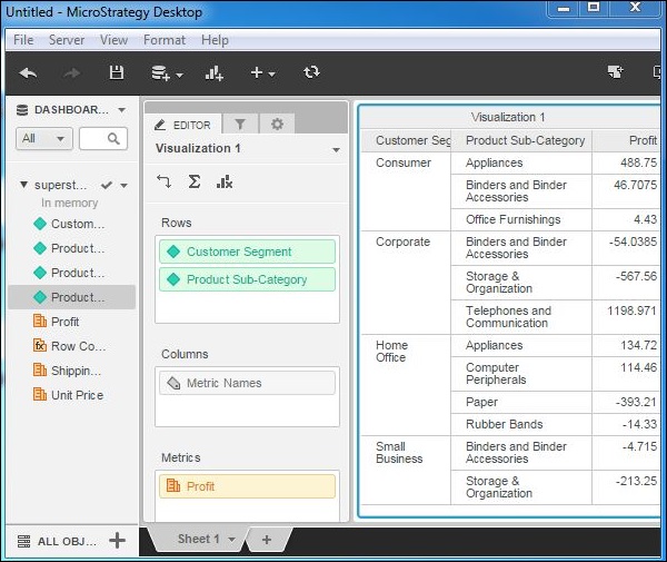
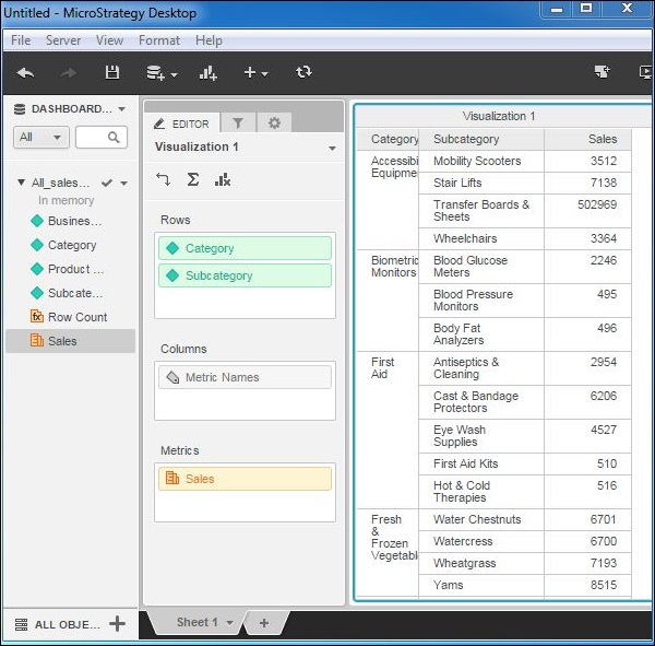
MicroStrategy - Dicing
The Dicing operation of a data set involves creating a smaller data set by fetching multiple values of one dimension with respect to one value from another dimension. For example, we get the values of sales for different subcategory of products with respect to one single category. Here, there is a hierarchical relationship between the category and sub-category of products.
Consider the data set superstore which contains the following dimensions −
- Customer segment
- Product category
- Product sub-category
- Profit
Following screenshots show the steps to dice the data with respect to the dimensions customer segment and product sub-category.
Step 1
Lets first create a grid report with the dimensions Customer segment and Product subcategory. We can also add the metric Profit.
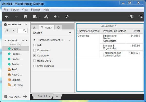
Step 2
Next, let's create a filter using the dimension customer segment. For this filter, we choose the value 'Customer segment'. However, we get the value of profit for all the values of sub-categories under this customer segment. Here, the data is diced across the subcategories for a given customer segment.
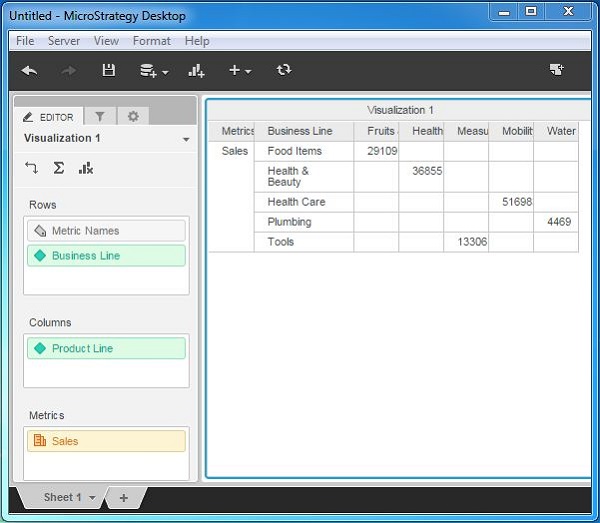
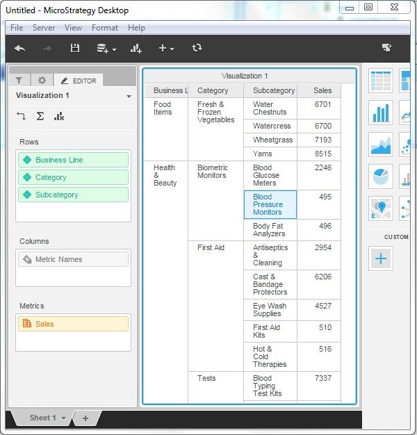
MicroStrategy - Pivoting
Pivoting of data in tables is done when we want to swap the position of columns and rows. It is also called rotating data. The change in such structure produces different kinds of summaries of data.
Example
The sales value for the table All_sales is summarized for each Business Line. In the following screenshots, each row represents a Business Line and Sales value for each product line in different columns.
However, if we want to see the result as Product Line in each row and Business Line in each column, then we have to apply pivoting. Following are the steps to apply the pivot.
Step 1
Create the Table with the required dimensions and measures as shown in the following screenshot. Here, sales is summarized and shown for each business line in each row.
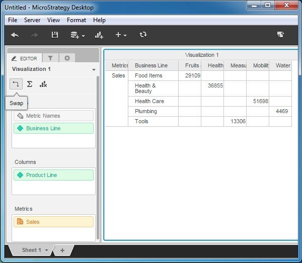
Step 2
Using the visualization editor, swap the dimensions in the rows and columns. Use the swap button as shown in the following screenshot.
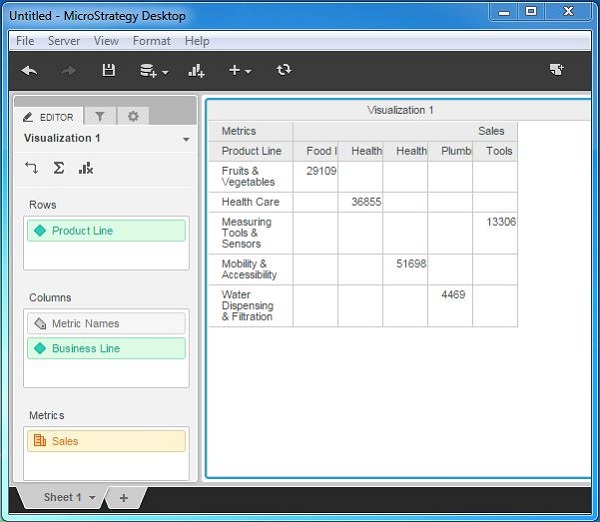
Result
As we can see the summary of sales is now displayed for product line in each row.
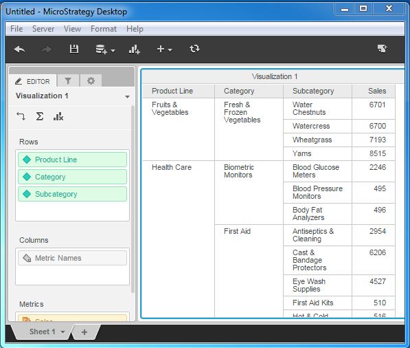
MicroStrategy - Drilldown
Drilldown is the process of going down in a hierarchy of dimensions to get more granular values of the measures. In a data set with more than one dimension, which is linked to each other in an hierarchical fashion, we start with a dimension at the top and then gradually add more dimensions to get new granular values.
Drill-down options give more insight into how different values at each level get aggregated.
Example
In the all_slaes data set, lets consider the following 3 dimensions applied to the measure Sales.
- Product Line
- Category
- Subcategory
Following are the steps to perform a drill-down.
Step 1
Create a visualization with dimension - product line and measure sales as shown in the following screenshot.
Step 2
Add the dimension category to the visualization below Product Line. As you can see the value of the sales column changes, reflecting the values for each category under the product line.
Step 3
Next, lets add the dimension sub-category below the dimension category and it further changes the values in the sales column.
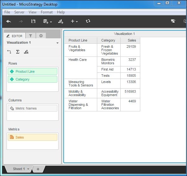
MicroStrategy - Rollup
Rollup is the process of moving up in the hierarchy of dimensions in a given data set. As we move up, the values of the measure become less granular and more summarized. It is the opposite of drilldown. For example, in the hierarchy of Area → region → country, we move from an area to a country and finally the values get summarized at the country level. This process is called Rollup.
Example
In the dataset named All_Sales, lets consider the following dimensions for a rollup.
- Product Line
- category
- Subcategory
Step 1
Create a visualization with all the three dimensions mentioned above and sales as the measure value.
Step 2
Lets remove the dimension subcategory from the above visualization. Now, the result shows the summary at the Category level. To remove, right-click and choose remove from the options.
Step 3
The result now shows sales value at the category level.
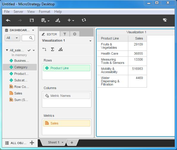
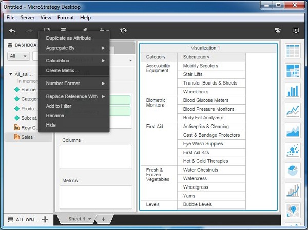
MicroStrategy - Creating Metrics
Metrics in MicroStrategy are the calculations performed on data. They are the derived columns which show results such as sum or average of some numeric values of a column in source data.
They are useful in creating custom calculations required by business. Creation of a metric involves using the in-built functions already available in MicroStrategy. The formula editor is used to create the formula for a metric.
Example
In this example, we aim to find the average sales for each sub-category under every category from the sales data. This can be done by creating a metric which uses the Avg Function to find the average sales. The steps to create and use this metric is as follows.
Step 1
Create a report with Category and sub-category as its two columns. Next, right click anywhere under the data source tab and near any of the measure fields. A pop-up appears which shows the create metric option.
Step 2
In the Metric editor, write the formula for the average sales. Save the metric by giving it a name, say AvgSales.
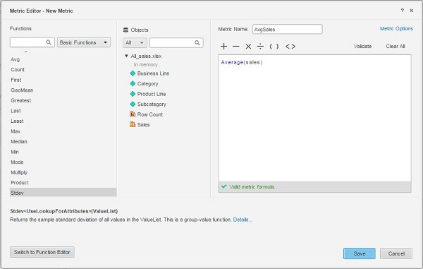
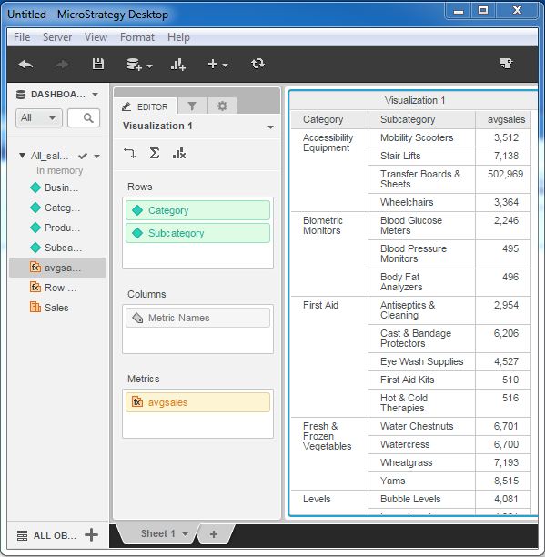
Step 3
Now, the metric AvgSales appears under the Dashboard Data as a measure. It can be dragged to the metric filed and then appears in the report.
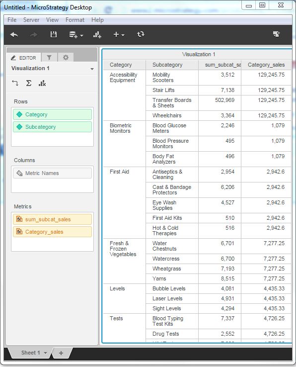
MicroStrategy - Nested Metrics
Nested Metric in MicroStrategy are the calculations in which one aggregation function is enclosed inside another. They are useful when in the data warehouse design, we do not have data stored at the required level of granularity. In such case, we create an inner formula and an outer formula. Combining them creates the nested metric.
Example
In this example, we aim to find the average sales for each sub-category as compared to the total sales under each category.
Step 1
Create a report with Category and sub-category as its two columns. Next, right-click anywhere under the data source tab and near any of the measure fields. A pop-up appears which shows the create metric option. We create the first metric with the following formula and name it as sum_subcat_sales.
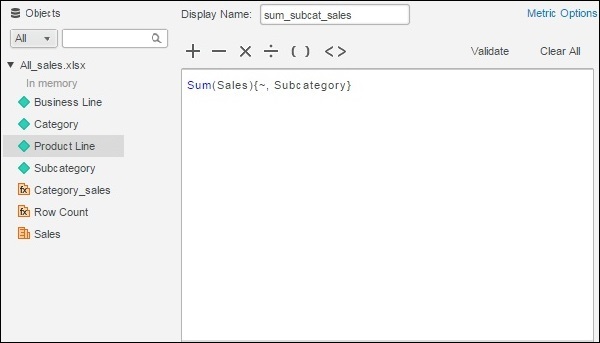
Step 2
Next, we create another metric with the name Category_sales. In it, we write the inner formula for the sum of sales for each category and the outer formula giving average sales for each category, corresponding to the sub-category.
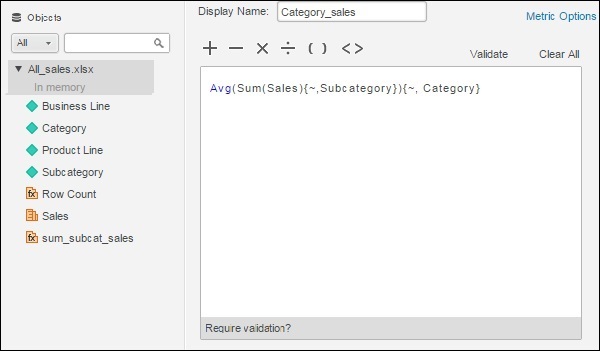
Step 3
Finally, drag both the newly created metrics to the report to see the result.
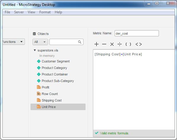
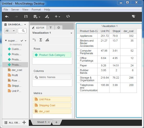
MicroStrategy - Creating Derived Metrics
Many times we need calculated metrics which are not already available in the data source. If such situations, metric values can be calculated from the existing metrics, using the create metric option. Thus, creating a derived metric is an approach to create values which we will need frequently in the report but which do not exist in the data source.
Example
In this example, we are going to calculate the total of shipping cost and unit price for a product in the superstore sales data. Following are the steps to calculate it.
Step 1
Lets create a grip report using superstore sales. The report contains product-sub category as attribute and unit price as well as shipping cost as the metrics.
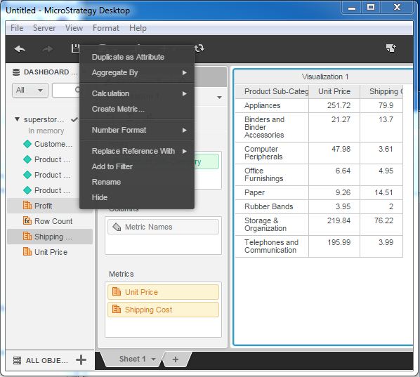
Step 2
Next, right-click near any of the metrics and choose the create metric option. It gives us a window to write the formula for the new metric. Here, write the formula we use in the existing metrics. The formula is as shown in the following screenshot.
Step 3
The new metric appears under the list of metric of the data source. We drag it to the existing grid report.
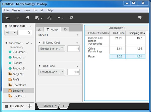
MicroStrategy - Metric Comparison
Metrics are the numerical values on which we can apply mathematical calculations and also compare them numerically. MicroStrategy desktop provides some functionality to compare the values of two metrics using the filtering functions. If required, we can also create a derived metric to make complex comparisons based on some specific calculation.
Following are the steps to create a comparison between two metrics.
Step 1
Create a visualization with the grid report using the superstore.xlx as an example data set. Next, drag the two metrics - Unit price and Shipping cost - under the filter tab as shown in the following screenshot.
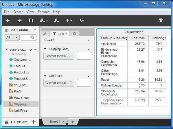
Step 2
Enter some specific values in the filter condition of both the metrics, so that we can compare their values within a range. The following screenshot shows the result after entering the values.
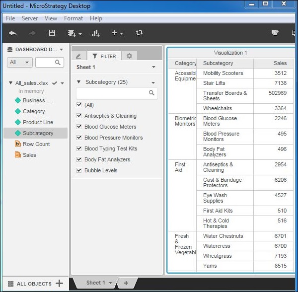
MicroStrategy - Creating Filters
Filtering data is a very important part of data analysis and visualization. MicroStrategy Desktop provides a variety of options to filter data in a report. It has simple filters, which get the data based on the values selected by the user. It also has features to create complex features, which will filter out data based on the calculations.
In this chapter, we will learn the basic steps to create a filter on a column with non-numeric values.
Example
In this example, we aim to create a filter on the field subcategory in a grid report made up of the fields category, subcategory, and sales.
Step 1
Create a new visualization by choosing the fields category, subcategory as the rows and sales as the metric. The visualization is shown in the following screenshot.
Step 2
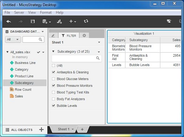
Go to the Filter tab next to the Editor tab. Drag the field subcategory to this tab. It will automatically create a filter of type Dropdown as shown in the following screenshot. Also note that the number of values for this are shown in parentheses (25).
Step 3
Now check mark the specific values on which we want to filter out the results in the report. On checking these values, only the respective results are visible in the report.
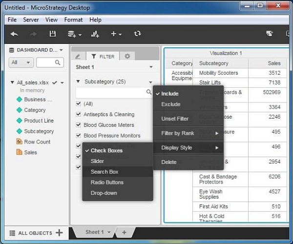
MicroStrategy - Advanced Filters
The advanced filter feature is useful in applying filter conditions, which will otherwise involve complicated steps. In MicroStrategy desktop, we access these features after the filter is created and applied to the report.
We have the following additional options besides the check box option.
- Slider
- Search Box
- Radio Button
- Drop down
In this chapter, we will be looking at the search box option in detail.
Using Search Box
The search box option is available by choosing the already existing check box filter. Rightclick it to get the display type option as shown in the following screenshot.
Step 1
Start writing the initial letters of the subcategory we want to filter. It automatically populates the different values from the data set. We choose some specific values by selecting them with clicks.
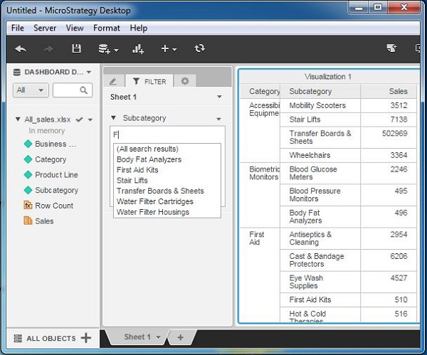
Step 2
On finishing the selection, we get the result in the report as shown in the following screenshot.
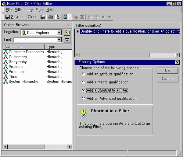
MicroStrategy - Shortcut & Embedded Filters
In MicroStrategy, we can create shortcuts to filters. For this, we have to use the results of an existing report as a filter for another report. The first report itself becomes a filter inside a new report. This type of filter is called a shortcut-to-a-report filter.
This is a part of MicroStrategy server edition and we will take some examples from builtin data sets in MicroStrategy server. Following are the steps to create a shortcut-to-afilter.
Step 1
Open the filter editor. Choose the filter definition area and double-click it. It will open the dialog box showing the option Add a shortcut to a filter.
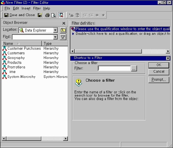
Step 2
On the next screen, a filter dialog box pops up. Enter the name of the filter, which we want to use or click browse and select the filter to use.
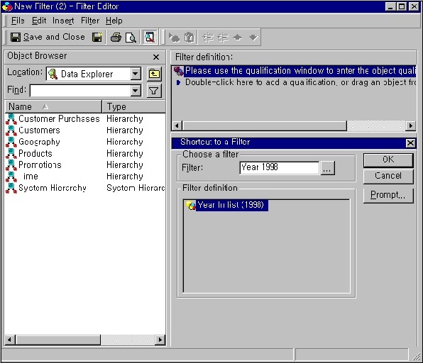
Step 3
Finally, the following screenshot opens which has the filter name and filter definition which is now a shortcut-to-a-filter.
MicroStrategy - Refreshing Reports
The reports created in MicroStrategy Servers are accessed by the users repeatedly to find the new results from the additional data gathered in the report source. Hence, the data in the report needs to be refreshed both periodically as well as on demand by the user.
The reports in MicroStrategy desktop version can be refreshed by simply reporting the data again. This is done by using the refresh button available in the menu.
Example
Let's consider the All_sales report. Currently, the report shows the data as shown in the following screenshot.
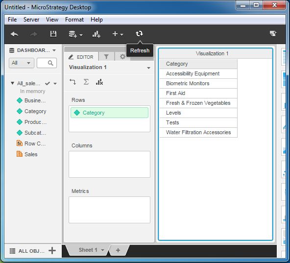
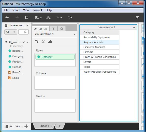
Lets add some data to the source. We add the category aquatic animals. On clicking the refresh button, we get the new result as shown in the following screenshot.
MicroStrategy - Intelligent Cubes
When we run the reports created in MicroStrategy, they fetch the data from the warehouse to apply the calculations and generate a report. When multiple users request for the same report but with different range of values or different filter conditions, then the warehouse has to repeat similar calculations for each of the report and this hits the performance.
To avoid this, MicroStrategy uses intelligent cubes, which is an object sitting in the middle layer between reports and the warehouse.
The following diagram depicts the role of the intelligent cube.
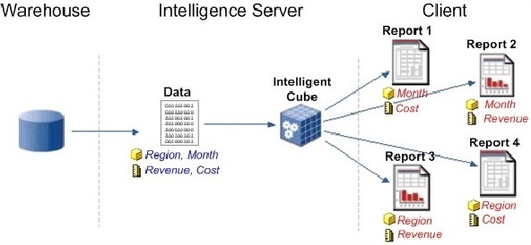
The Intelligent Cube is shared as a single in-memory copy, among the different reports created by many users. A set of data is returned from the data warehouse and saved directly to the Intelligence Server memory. Multiple reports are built that gather data from the Intelligent Cube instead of querying the data warehouse.
Following are the features, which make intelligent cubes useful.
- Supports dynamic aggregation.
- Can be scheduled for refresh.
- Supports derived metric creation.
- Faster performance than directly querying warehouse.
- More than one cube can be used in a single dashboard.
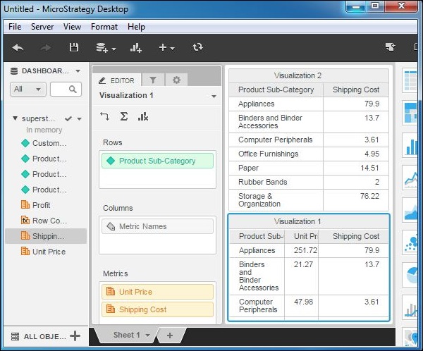
MicroStrategy - Creating Dashboard
A dashboard is made up of multiple visualizations. It shows many attributes grouped into separate visualizations. When we place some common attribute or metric in multiple visualization, it is easy to study the variations among them.
In the following example, we will create a dashboard showing some common attributes among the visualizations.
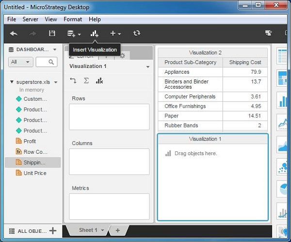
Step 1
Create a grid visualization using superstore.xlsx as an example data source. We drag the attributes product - Subcategory and Shipping cost - to the rows box. Then we insert the second visualization into the report as shown in the following screenshot.
Step 2
Add all the above attributes as well as an additional attribute named unit price to the newly inserted visualization as shown in the following screenshot.
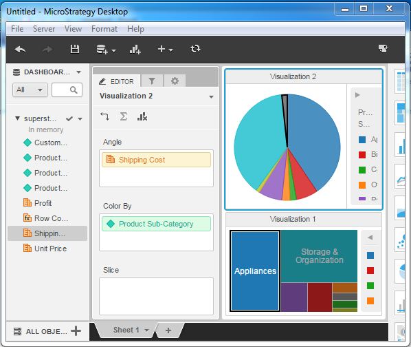
Step 3
Finally, apply different visualization types to these grids. We apply pie-chart to the top visualization and heat-map chart to the bottom visualization as shown in the following screenshot. The result shows a dashboard with some common attributes used in the two visualizations.
MicroStrategy - Formatting a Dashboard
A dashboard is made up of multiple visualizations. Different parts of the dashboard can be formatted for a better look using the formatting dashboard option available.
In the following example, we are going format a dashboard using additional colors and highlighted areas.
Step 1
Consider the dashboard visualization we created in the last chapter. Choose the Dashboard formatting option as shown in the following screenshot.
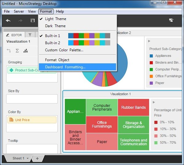
Step 2
Next, in the screen that pops up with formatting options such as selecting the font, fill color and border style, etc. make the selections as shown in the following screenshot.
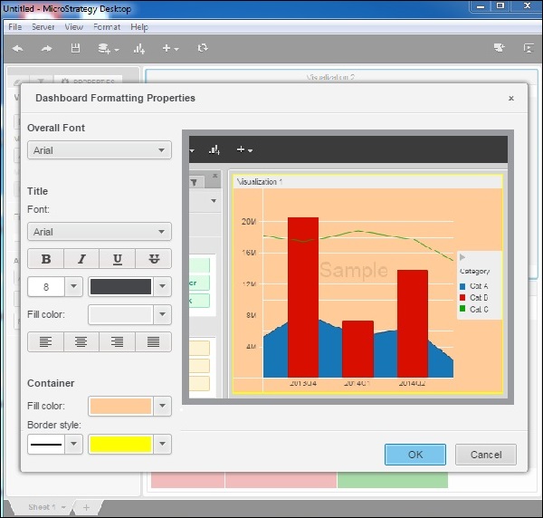
Step 3
Finally, the formatting is applied to the dashboard. The formatting reflects in both the visualizations present in the dashboard.
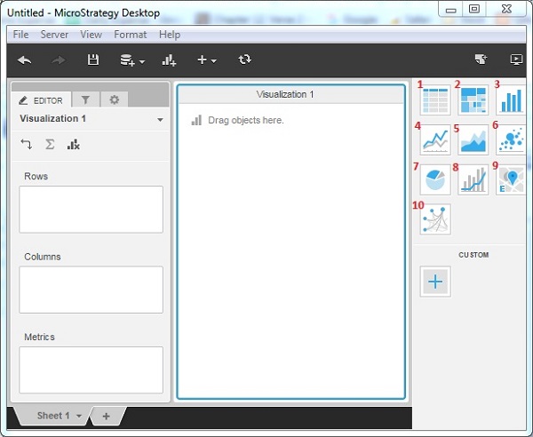
MicroStrategy - Graph Visualizations
MicroStrategy Desktop provides 10 standard graphs which are readily available to be plotted with a data source. Each of them gives a different view of the data depending on the number of attribute or metrics we are going to use. The coloring features in each of them will make it easy to understand the different chunks of data present in a single data visualization.
Visualization Gallery
In the right most window of MicroStrategy Desktop, there is a visualization gallery, which shows options for 10 different graph types.
Grid − Represents data in the form of data grid as rows and columns.
Heat Map − Shows rectangles of different colors showing a range of values.
Bar Chart − Presents vertical bars of different length showing the strength of the parameter measured.
Line Chart − Shows the lines indicating variation of value of one variable with respect to another.
Area Chart − Shows areas of different colors corresponding to different values.
Pie Chart − Shows the slices in a circle, with the size of the slice corresponding to the value of the variable measured.
Bubble Chart − Represents many bubbles corresponding to the range of the value of the variable.
Combo Chart − Combines Bar chart and Line chart into one visualization.
Map − Displays data as map markers on an interactive map.
Network − Used to identify relationships between related items and clusters of values.
The following screenshot shows different Graph Visualizations.
MicroStrategy - Grid Visualizations
Grid Visualization is the simplest form of visualization in MicroStrategy, yet a very powerful analysis method. Here, data is presented as a grid with rows and columns as well as headers of the columns. It provides features such as sorting and drilling the data.
Creating a Grid Visualization
After loading the required data set into the MicroStrategy Environment, we pull the required fields to the editor panel. This automatically creates the Grid visualization. In the following example as shown, we pull the relevant fields from the data set and create a grid.
Operations in Grid Visualization
Following operations can be carried out in a grid visualization.
- Sorting data on multiple columns
- Swapping column and rows
- Drill on an attribute
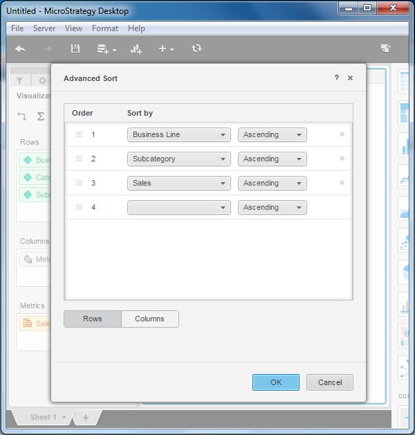
Sorting Data on Multiple Columns
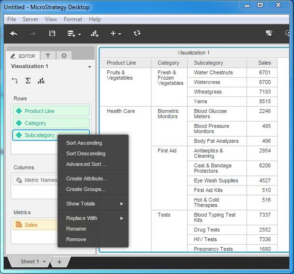
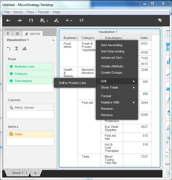
Grid visualization provides a facility to sort on multiple columns simultaneously. Right-click on a column name and choose the option advanced sort. This brings us to a screen where we can select all the columns and their order to do the sorting.
Swapping Column and Rows
We can swap the columns and rows in the grid visualization to make a pivot report. Just drag and drop the columns into rows as shown in the following screenshot.
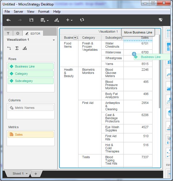
Drill on an Attribute
We can drill on an attribute on the grid visualization to get down to the values of the next attribute in the hierarchy. Right-click the column name and choose the drill option as shown in the following screenshot.
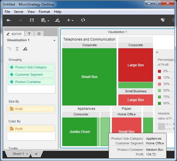
MicroStrategy - Heat Map Visualization
A Heat Map visualization shows adjacent colored rectangles, each representing an attribute from the data set. It allows you to quickly grasp the state and impact of a large number of variables at one time. For example, heat maps are often used in the financial services industry to review the status of a portfolio.
The rectangles show a wide variety and many shades of colors, which emphasize the weight of the various components. In a Heat Map visualization −
The size of each rectangle represents its relative weight.
The color of each rectangle represents its relative value. For example, larger values are green and smaller values are red.
The large areas, represent different groups of data.
The small rectangles, represent individual attribute elements.
Example
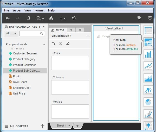
In this example, we will create a heat map visualization for product subcategory in terms of the profit they generate.
Step 1
Create a blank visualization and choose heat map from the list of available graphs. As you can see it needs at least 1 metric and 1 attribute.
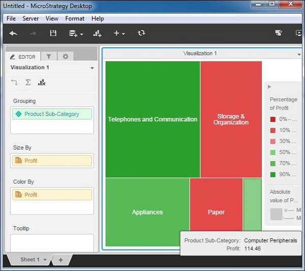
Step 2
Let's add product sub-category to the groupings tab and profit to the size by and color by tabs. This produces the heat map rectangles. The green color indicates a profit value of more than 50% while the red color indicates a profit value of less than 50%. The stronger the shade of the green color, the higher is the profit. Similarly, the stronger shade of the red color, the lower is the profit.
Step 3
It is possible to add more attributes to the Grouping clause and it will produce large number of rectangles. In this example, add Customer segment and Product container. On hovering the mouse pointer on each rectangle, we can see the description of all the attributes that make that rectangle.
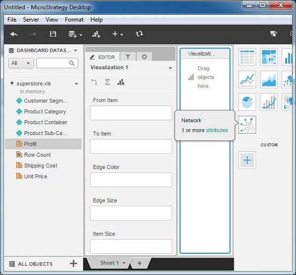
MicroStrategy - Network Visualization
Network visualization is used to quickly and easily identify relationships between related data items. For example, visualizing a social network. Attribute elements are displayed as nodes in the visualization, with lines (called edges) drawn between the nodes to represent relationships between the elements. Once the visualization is created, the users can view characteristics of the nodes and the relationships between them, using the display options such as node size, edge thickness, and edge color.
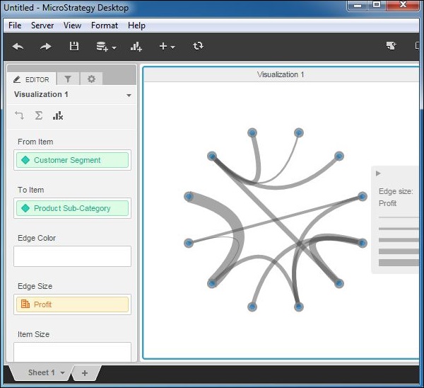
Example
In this example, we will create a network visualization between the customer segment and product-subcategory in terms of profit. Here, the customer segment and product subcategory are the nodes, while profit is the edge representing the relationship between them.
Step 1
Create a new visualization by choosing a network as the option. As shown, it needs at least 1 attribute to be added.
Step 2
Add customer segment in the From Item and product subcategory in the To Item box. Also the attribute profit is added to the Edge size box. The following diagram shows the network diagram created. The thickness of the edge is proportionate to the size of the profit.
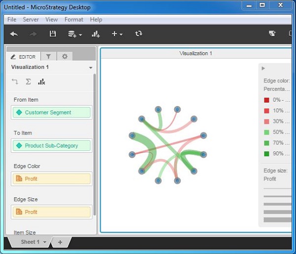
Step 3
Adding profit to the edge color gives a better diagram which shows different colors of the edges, based on what percentage of profit it represents for a given product subcategory of a given customer segment.
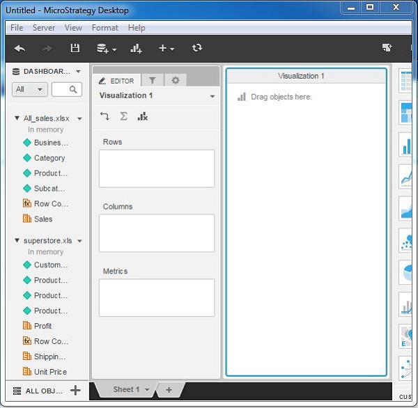
Visualization with Multiple Datasets
So far we saw reporting with one source of data as the source. But we can also add more than one data source to the same report. In such case, we can use the attributes and metrics from both the sources in creating the visualization. The result appears as if we are dealing with one source of data. This happens because MicroStrategy combines both these sources and internally treats them as one.
Following are the steps to combine two source data sets and create a visualization.
Step 1
Create a report with one source of data. We will use All_sales.xlsx in the example. Next, click the New Data menu as shown in the following screenshot.
Step 2
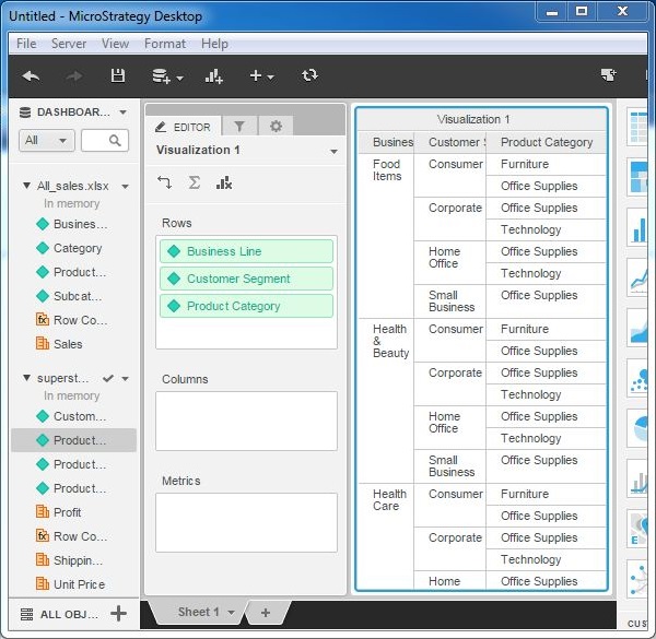
Now you can see both the data sources available under the Dashboard. The attributes and metrics of both of these sources are available under their respective names.
Step 3
Next, drag the attribute Business Line from All_sales.xlsx to the rows box. Drag the attributes customer segment and Product Category from the second data set to the rows box. The grid visualization appears showing data from both the data sets.
MicroStrategy - Filtering Data in Dashboard
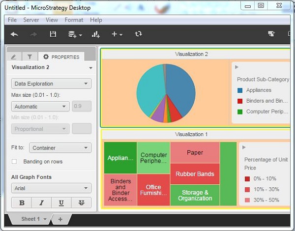
A dashboard is a document containing many visualizations displaying the results simultaneously. While carrying out data analysis, we may need to apply filter which will show the effect of the filter on each of the visualizations present in the dashboard. Also, all the results should have a synchronized value. This is possible by creating a normal filter and applying it to the dashboard.
Following is an example of applying a filter to the dashboard.
Step 1
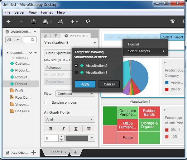
Lets consider the dashboard which we created in the last chapter. Lets create a filter as shown in the following screenshot.
Step 2
Click the Select Target option and apply the filter to visualization2. This will change the displayed values in visualization2, however visulaization1 will display a synchronized result.
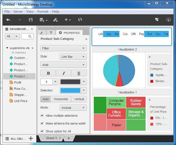
Step 3
After applying the filter, click some of the values of the product category visible in the top bar filter section. This will change the diagrams, depending on the value selected. In the following example, we have selected multiple values and you can notice how the pie-chart changes as each of the values are selected.
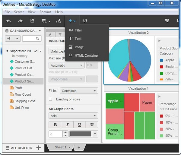
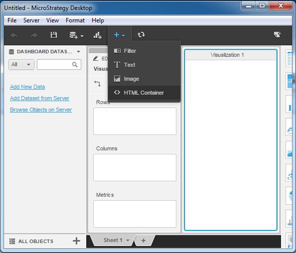
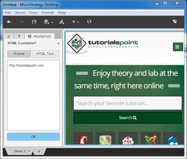
MicroStrategy - Adding Web Content
Besides data from different sources, we can also add data from web in a MicroStrategy report. It becomes a part of the visualization. Visualization shows the entire webpage, which appears embedded in it.
Following are the steps to get the content from the web.
Step 1
Go to the + menu and choose the option HTML Container as shown in the following screenshot.
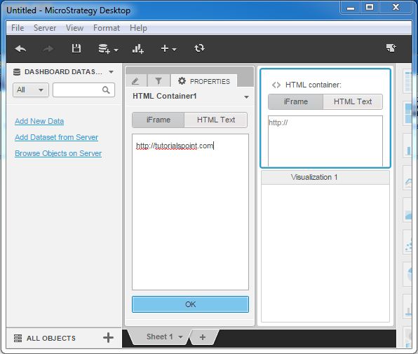
Step 2
Now, an Iframe Box pops up asking us to enter the URL of the website we want to show. Enter the complete URL as shown in the following screenshot.
Step 3
Finally, the webpage appears as shown in the following screenshot.
MicroStrategy - Conditional Formatting
Conditional formatting in MicroStrategy involves highlighting parts of the visualization, which meets some pre-defined criteria in their values. Usually in case of metrics, we want to highlight the values which are greater than a certain percentage. There can also be examples of highlighting some category of product names, etc.
In MicroStrategy desktop, we can achieve this using the threshold feature. In this example, we will define the color to be used for highlighting certain values when a certain threshold is satisfied. Following are the steps.
Step 1
Create a grid report with the all_sales.xlsx as an example data set. Put the attributes Business line, Category in the grid along with the metric sales. Right-click the metric sales, and we get the option to choose the threshold as shown in the following screenshot.
Step 2
The following screenshot shows options to choose different colors based on the percentage value of sales.
Step 3
Finally, the result of applying the threshold is displayed in the following screenshot. In the metric Sales, the values are highlighted in different colors based on the percentage value of the sales as compared to the total sales.
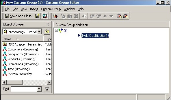
MicroStrategy - Custom Groups
Custom groups are a type of virtual attributes useful in clubbing many attributes together and presenting them as a single attribute. For example, if we want to analyze the sales result for every 4 months instead of every quarter, then we have to create a complex formula to choose these months and apply them in calculations. Instead, we can create a custom group by clubbing the required months and use this custom group as a single attribute.
Following are the steps to create a custom group.
Step 1
Open the custom group editor and drag an object from the object browser to create a custom group.
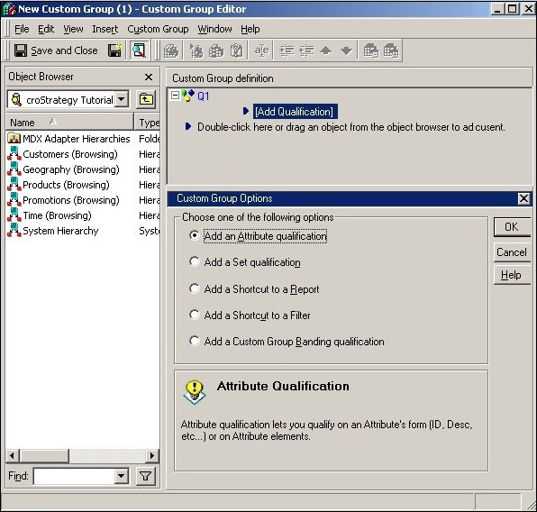
Step 2
The following window appears on completing the above step. Choose the option, Add an Attribute qualification.
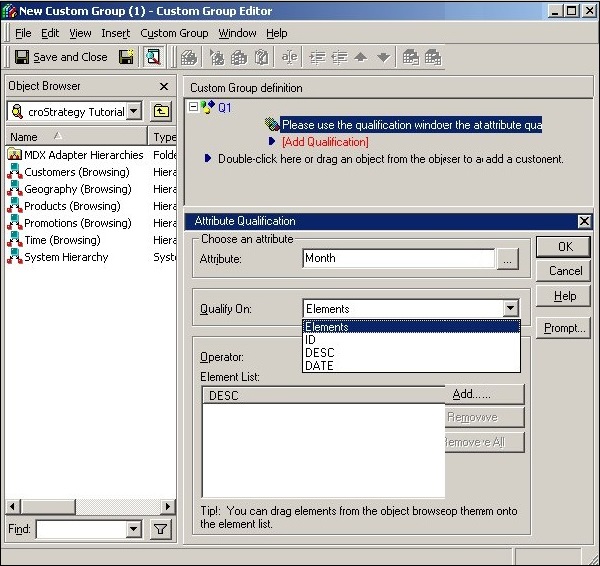
Step 3
Next, browse and choose the required attributes to create the custom group.
MicroStrategy - Report Cache Flow
A report cache is a data store which holds the information that was recently requested from the data source to be used in a report. Whenever a report is executed for the first time, a cache is created. The reports cache contains the results that were fetched from the database, files, or web sources.
Advantages of Report Cache
Following are some of the advantages we get by using MicroStrategy caching feature.
A cached report returns the results faster as the data is already available inside MicroStrategy software.
The execution time involving any calculations and derived metrics is quicker as the cached reports do not need to run against the data source.
In a cache, results from the data source are stored and can be used by new job requests that require the same data.
Types of Cache
There are three types of cache used in MicroStrategy.
Report Caches − These are the results which are pre-calculated and pre-processed. They are stored in the memory on the Intelligence Server machine or on the disk. They can be retrieved more quickly than repeatedly re-executing the request against the data warehouse.
Element Caches − These are frequently used table elements, which are stored in the memory on the Intelligence Server machine. They can be retrieved quickly as the users browse through displays of attribute elements.
Object Caches − These are metadata objects stored in the memory on the Intelligence Server, so that they can be retrieved quickly on subsequent requests.
Enabling the Cach
Cache can be enabled, both at the report level and at the project level. This is done using the project configuration editor.
Enabling at the Project Level
If the cache is enabled at the project level then, all the reports within the project will use the caching feature.
Enabling at the Report Level
On enabling at the report level, only specific reports will use the cache. Even if the reporting is disabled at the project level, it will function at the report level, when enabled at the report level.
Cache Disadvantage
The cached data is not always the most up-to-date, as it has not been run through the data source since the cache was created. This can be avoided by deleting the reports cache before executing the report. This forces the report to be executed through the data source again, thus returning the most recent data from the data source. However, it needs administrative privileges to delete a report cache.
MicroStrategy - Data Marts
Data mart is a smaller form of data warehouse, which serves some specific needs on data analysis. It is usually derived as a small part from the bigger data warehouse. The main purpose of creating data marts is to achieve some analysis, which is difficult to achieve through the regular warehouse because of the different level of granularity of data in the warehouse or applying some complex calculations.
In MicroStrategy, a data mart is created using the following steps.
Step 1
Open a report in the edit mode. Choose Datamart → Configure Datamart. And the following window appears.
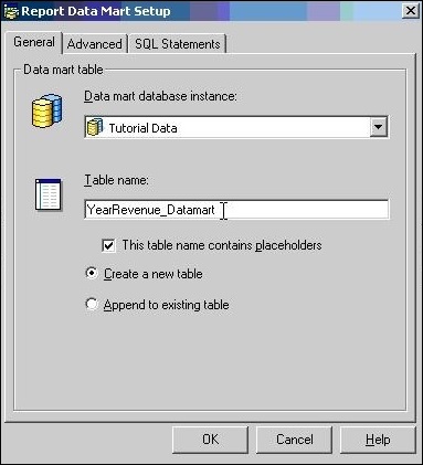
Step 2
Choose the appropriate location from the database instance dropdown menu.
Step 3
Choose the option to create a new table, if the table is to be re-created every time the report is run. Or you may choose to add to an existing table so that the data gets added to the result from the previous run.
On successful completion of the above three steps, the data mart gets added to the report.
MicroStrategy - Predictive Models
Predictive Modeling is a mathematical approach to build models based on the existing data, which helps in finding the future value or trend of a variable. It involves very heavy mathematical and statistical analysis to create such models.
Following are some examples, where predictive modeling is used.
Weather forecasting.
A university tries to predicts whether a student will choose to enroll by applying predictive models to applicant data and admissions history.
In a retail shop to find out which two items are most likely to sell well together.
In airline industry to estimate the number of passengers who wont show up for a flight.
MicroStrategy can help in carrying out predictive modeling as its data mining services is fully integrated to its BI platform.
Predictive Analysis Using MicroStrategy
MicroStrategy has data mining services, which allows the users to import PMML (Predictive Model Markup Language) from third party data mining tools, which can then be used to create predictive reports.
PMML is an XML standard that represents data mining models developed and trained by data mining tool. PMML supports a number of different data mining algorithms, including Regression, Neural Networks, Clustering, Decision Trees and Association. It incorporates data transformation and descriptive statistics.
The following diagram describes the process of creating predictive data model reports in MicroStrategy.
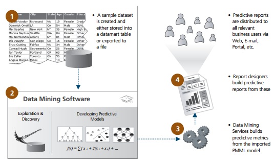
Once imported into MicroStrategy, we can enhance the model by using the following features.
Features for Predictive Modeling
Following are the list of features which highlight the strength of MicroStrategy to be used as a predictive modeling tool.
Built-in Data Mining Functions − There are 250 basic, OLAP, mathematical, financial, and statistical functions that can be used to create key performance indicators.
Data Mining Integration Using PMML − It allows the users to import PMML from third party data mining tools, which can then be used to create predictive reports.
User Scalability − Hundreds of thousands of users, internal and external to the enterprise, can access this feature.
Data Scalability − MicroStrategys relational OLAP (ROLAP) architecture combined with its Intelligent Cube technology can handle any size of database while delivering high performance.
