- MicroStrategy - Home
- MicroStrategy - Overview
- MicroStrategy - Environment Setup
- MicroStrategy - Desktop
- MicroStrategy - Architecture
- MicroStrategy - Importing Data
- MicroStrategy - OLAP Services
- Configuration Objects
- MicroStrategy - Public Objects
- MicroStrategy - Schema Objects
- MicroStrategy - Report Objects
- MicroStrategy Basic Reporting
- MicroStrategy - Report Types
- MicroStrategy - Slicing
- MicroStrategy - Dicing
- MicroStrategy - Pivoting
- MicroStrategy - Drilldown
- MicroStrategy - Rollup
- MicroStrategy - Creating Metrics
- MicroStrategy - Nested Metrics
- MicroStrategy Advanced Reporting
- Creating Derived Metrics
- MicroStrategy - Metric Comparison
- MicroStrategy - Creating Filters
- MicroStrategy - Advanced Filters
- Shortcut & Embedded Filters
- MicroStrategy - Refreshing Reports
- MicroStrategy - Intelligent Cubes
- MicroStrategy Dashboards
- Creating a Dashboard
- Formatting a Dashboard
- MicroStrategy - Graph Visualizations
- MicroStrategy - Grid Visualizations
- Heat Map Visualization
- MicroStrategy - N/W Visualization
- Visualization with Multiple Datasets
- Filtering Data in Dashboard
- MicroStrategy - Adding Web Content
- MicroStrategy Office
- Conditional Formatting
- MicroStrategy - Custom Groups
- MicroStrategy - Report Cache Flow
- MicroStrategy - Data Marts
- MicroStrategy - Predictive Models
- MicroStrategy Useful Resources
- MicroStrategy - Quick Guide
- MicroStrategy - Useful Resources
- MicroStrategy - Discussion
MicroStrategy - Heat Map Visualization
A Heat Map visualization shows adjacent colored rectangles, each representing an attribute from the data set. It allows you to quickly grasp the state and impact of a large number of variables at one time. For example, heat maps are often used in the financial services industry to review the status of a portfolio.
The rectangles show a wide variety and many shades of colors, which emphasize the weight of the various components. In a Heat Map visualization −
The size of each rectangle represents its relative weight.
The color of each rectangle represents its relative value. For example, larger values are green and smaller values are red.
The large areas, represent different groups of data.
The small rectangles, represent individual attribute elements.
Example
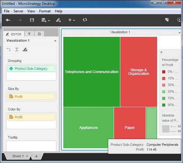
In this example, we will create a heat map visualization for product subcategory in terms of the profit they generate.
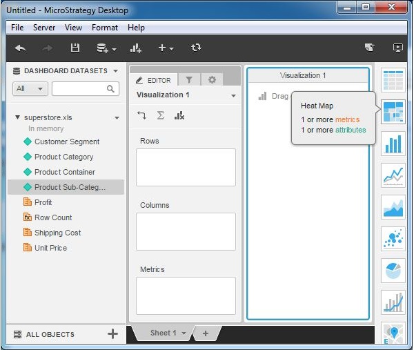
Step 1
Create a blank visualization and choose heat map from the list of available graphs. As you can see it needs at least 1 metric and 1 attribute.
Step 2
Let's add product sub-category to the groupings tab and profit to the size by and color by tabs. This produces the heat map rectangles. The green color indicates a profit value of more than 50% while the red color indicates a profit value of less than 50%. The stronger the shade of the green color, the higher is the profit. Similarly, the stronger shade of the red color, the lower is the profit.
Step 3
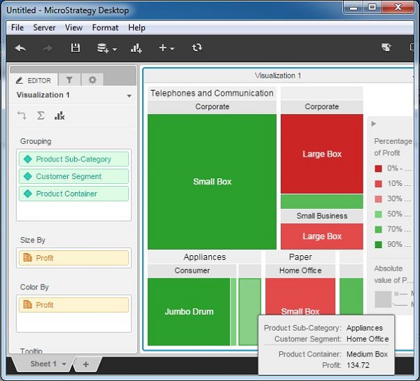
It is possible to add more attributes to the Grouping clause and it will produce large number of rectangles. In this example, add Customer segment and Product container. On hovering the mouse pointer on each rectangle, we can see the description of all the attributes that make that rectangle.