- MicroStrategy - Home
- MicroStrategy - Overview
- MicroStrategy - Environment Setup
- MicroStrategy - Desktop
- MicroStrategy - Architecture
- MicroStrategy - Importing Data
- MicroStrategy - OLAP Services
- Configuration Objects
- MicroStrategy - Public Objects
- MicroStrategy - Schema Objects
- MicroStrategy - Report Objects
- MicroStrategy Basic Reporting
- MicroStrategy - Report Types
- MicroStrategy - Slicing
- MicroStrategy - Dicing
- MicroStrategy - Pivoting
- MicroStrategy - Drilldown
- MicroStrategy - Rollup
- MicroStrategy - Creating Metrics
- MicroStrategy - Nested Metrics
- MicroStrategy Advanced Reporting
- Creating Derived Metrics
- MicroStrategy - Metric Comparison
- MicroStrategy - Creating Filters
- MicroStrategy - Advanced Filters
- Shortcut & Embedded Filters
- MicroStrategy - Refreshing Reports
- MicroStrategy - Intelligent Cubes
- MicroStrategy Dashboards
- Creating a Dashboard
- Formatting a Dashboard
- MicroStrategy - Graph Visualizations
- MicroStrategy - Grid Visualizations
- Heat Map Visualization
- MicroStrategy - N/W Visualization
- Visualization with Multiple Datasets
- Filtering Data in Dashboard
- MicroStrategy - Adding Web Content
- MicroStrategy Office
- Conditional Formatting
- MicroStrategy - Custom Groups
- MicroStrategy - Report Cache Flow
- MicroStrategy - Data Marts
- MicroStrategy - Predictive Models
- MicroStrategy Useful Resources
- MicroStrategy - Quick Guide
- MicroStrategy - Useful Resources
- MicroStrategy - Discussion
MicroStrategy - Network Visualization
Network visualization is used to quickly and easily identify relationships between related data items. For example, visualizing a social network. Attribute elements are displayed as nodes in the visualization, with lines (called edges) drawn between the nodes to represent relationships between the elements. Once the visualization is created, the users can view characteristics of the nodes and the relationships between them, using the display options such as node size, edge thickness, and edge color.
Example
In this example, we will create a network visualization between the customer segment and product-subcategory in terms of profit. Here, the customer segment and product subcategory are the nodes, while profit is the edge representing the relationship between them.
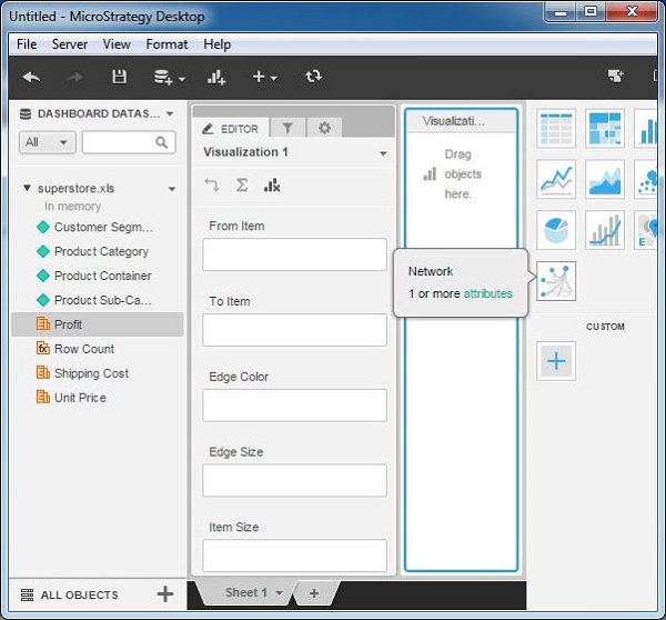
Step 1
Create a new visualization by choosing a network as the option. As shown, it needs at least 1 attribute to be added.
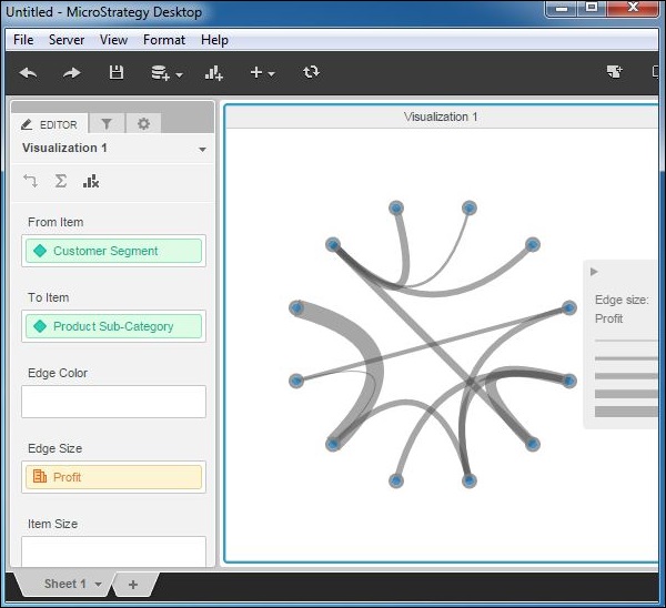
Step 2
Add customer segment in the From Item and product subcategory in the To Item box. Also the attribute profit is added to the Edge size box. The following diagram shows the network diagram created. The thickness of the edge is proportionate to the size of the profit.
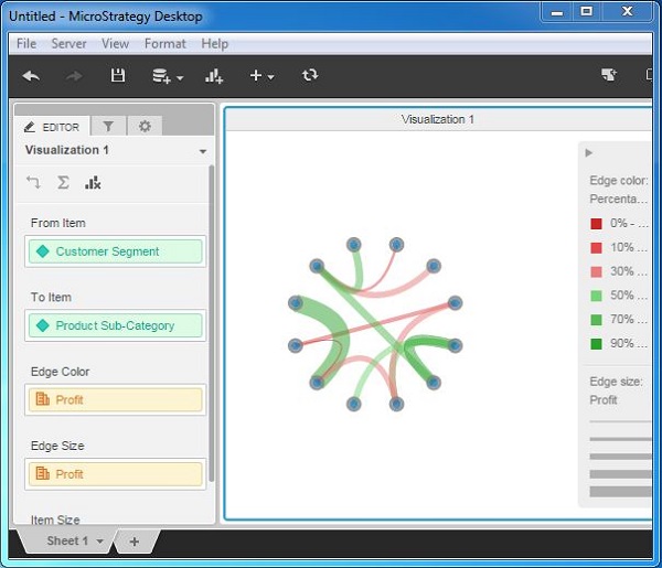
Step 3
Adding profit to the edge color gives a better diagram which shows different colors of the edges, based on what percentage of profit it represents for a given product subcategory of a given customer segment.