- MicroStrategy - Home
- MicroStrategy - Overview
- MicroStrategy - Environment Setup
- MicroStrategy - Desktop
- MicroStrategy - Architecture
- MicroStrategy - Importing Data
- MicroStrategy - OLAP Services
- Configuration Objects
- MicroStrategy - Public Objects
- MicroStrategy - Schema Objects
- MicroStrategy - Report Objects
- MicroStrategy Basic Reporting
- MicroStrategy - Report Types
- MicroStrategy - Slicing
- MicroStrategy - Dicing
- MicroStrategy - Pivoting
- MicroStrategy - Drilldown
- MicroStrategy - Rollup
- MicroStrategy - Creating Metrics
- MicroStrategy - Nested Metrics
- MicroStrategy Advanced Reporting
- Creating Derived Metrics
- MicroStrategy - Metric Comparison
- MicroStrategy - Creating Filters
- MicroStrategy - Advanced Filters
- Shortcut & Embedded Filters
- MicroStrategy - Refreshing Reports
- MicroStrategy - Intelligent Cubes
- MicroStrategy Dashboards
- Creating a Dashboard
- Formatting a Dashboard
- MicroStrategy - Graph Visualizations
- MicroStrategy - Grid Visualizations
- Heat Map Visualization
- MicroStrategy - N/W Visualization
- Visualization with Multiple Datasets
- Filtering Data in Dashboard
- MicroStrategy - Adding Web Content
- MicroStrategy Office
- Conditional Formatting
- MicroStrategy - Custom Groups
- MicroStrategy - Report Cache Flow
- MicroStrategy - Data Marts
- MicroStrategy - Predictive Models
- MicroStrategy Useful Resources
- MicroStrategy - Quick Guide
- MicroStrategy - Useful Resources
- MicroStrategy - Discussion
MicroStrategy - Creating Dashboard
A dashboard is made up of multiple visualizations. It shows many attributes grouped into separate visualizations. When we place some common attribute or metric in multiple visualization, it is easy to study the variations among them.
In the following example, we will create a dashboard showing some common attributes among the visualizations.
Step 1
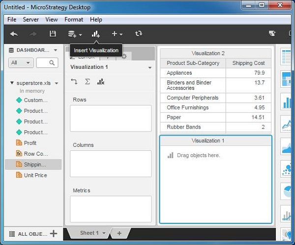
Create a grid visualization using superstore.xlsx as an example data source. We drag the attributes product - Subcategory and Shipping cost - to the rows box. Then we insert the second visualization into the report as shown in the following screenshot.
Step 2
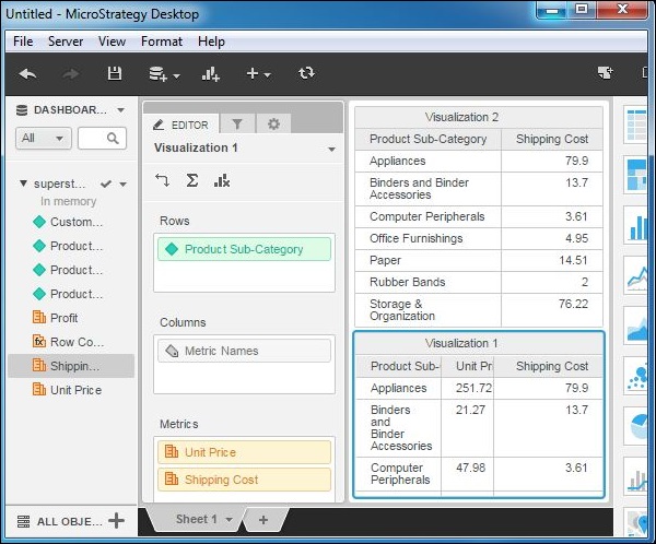
Add all the above attributes as well as an additional attribute named unit price to the newly inserted visualization as shown in the following screenshot.
Step 3
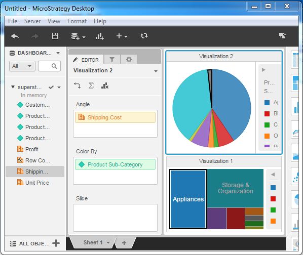
Finally, apply different visualization types to these grids. We apply pie-chart to the top visualization and heat-map chart to the bottom visualization as shown in the following screenshot. The result shows a dashboard with some common attributes used in the two visualizations.