- Kivy Tutorial
- Kivy - Home
- Kivy Basics
- Kivy - Getting Started
- Kivy - Installation
- Kivy - Architecture
- Kivy - File Syntax
- Kivy - Applications
- Kivy - Hello World
- Kivy - App Life Cycle
- Kivy - Events
- Kivy - Properties
- Kivy - Inputs
- Kivy - Behaviors
- Kivy Buttons
- Kivy - Buttons
- Kivy - Button Events
- Kivy - Button Colors
- Kivy - Button Size
- Kivy - Button Position
- Kivy - Round Buttons
- Kivy - Disabled Buttons
- Kivy - Image Button
- Kivy Widgets
- Kivy - Widgets
- Kivy - Label
- Kivy - Text Input
- Kivy - Canvas
- Kivy - Line
- Kivy - Checkbox
- Kivy - Dropdown List
- Kivy - Windows
- Kivy - ScrollView
- Kivy - Carousel
- Kivy - Slider
- Kivy - Images
- Kivy - Popup
- Kivy - Switch
- Kivy - Spinner
- Kivy - Splitter
- Kivy - Progress Bar
- Kivy - Bubble
- Kivy - Tabbed Panel
- Kivy - Scatter
- Kivy - Accordion
- Kivy - File Chooser
- Kivy - Color Picker
- Kivy - Code Input
- Kivy - Modal View
- Kivy - Toggle Button
- Kivy - Camera
- Kivy - Tree View
- Kivy - reStructuredText
- Kivy - Action Bar
- Kivy - Video Player
- Kivy - Stencil View
- Kivy - VKeyboard
- Kivy - Touch Ripple
- Kivy - Audio
- Kivy - Videos
- Kivy - Spelling
- Kivy - Effects
- Kivy - Input Recorder
- Kivy - OpenGL
- Kivy - Text
- Kivy - Text Markup
- Kivy - Settings
- Kivy Layouts
- Kivy - Layouts
- Kivy - Float Layout
- Kivy - Grid Layouts
- Kivy - Box Layouts
- Kivy - Stack Layout
- Kivy - Anchor Layout
- Kivy - Relative Layout
- Kivy - Page Layout
- Kivy - Recycle Layout
- Kivy - Layouts in Layouts
- Kivy Advanced Concepts
- Kivy - Configuration Object
- Kivy - Atlas
- Kivy - Data Loader
- Kivy - Cache Manager
- Kivy - Console
- Kivy - Animation
- Kivy - Multistroke
- Kivy - Clock
- Kivy - SVGs
- Kivy - UrlRequest
- Kivy - Clipboard
- Kivy - Factory
- Kivy - Gesture
- Kivy - Language
- Kivy - Graphics
- Kivy - Drawing
- Kivy - Packaging
- Kivy - Garden
- Kivy - Storage
- Kivy - Vector
- Kivy - Utils
- Kivy - Inspector
- Kivy - Tools
- Kivy - Logger
- Kivy - Framebuffer
- Kivy Applications and Projects
- Kivy - Drawing App
- Kivy - Calculator App
- Kivy - Stopwatch App
- Kivy - Camera Handling
- Kivy - Image Viewer
- Kivy - Bezier
- Kivy - Canvas Stress
- Kivy - Circle Drawing
- Kivy - Widget Animation
- Kivy - Miscellaneous
- Kivy Useful Resources
- Kivy - Quick Guide
- Kivy - Useful Resources
- Kivy - Discussion
Kivy - Label
Labels are one of the most often used widgets in any GUI toolkit. Labels display any textual content, which can not be directly edited. A label is used to display the page heading, as a placeholder for the field name along with the input controls like text box, or just to render output message.
In Kivy, the label widget is an object of Label class, defined in the "kivy.uix.label" module.
from kivy.uix.Label import Label
lbl = Label(**kwargs)
To customize the label object, you can use the following properties as keyword arguments for the constructor −
bold − bold is a BooleanProperty and defaults to False. Set it to True for the use of the bold version of your font. Note that depending of your font, the bold attribute may have no impact on your text rendering.
color − Text color, in the format (r, g, b, a). It is a ColorProperty, defaults to [1, 1, 1, 1].
disabled_color − The color of the text when the label is disabled, in the (r, g, b, a) format. It is a ColorProperty and defaults to [1, 1, 1, .3].
font_name − Filename of the font to use. font_name is a StringProperty and defaults to 'Roboto'. This value is taken from Config.
font_size − Font size of the text, in pixels. It is a NumericProperty and defaults to 15sp.
halign − Horizontal alignment of the text. halign is an OptionProperty and defaults to 'auto'. Available options are : auto, left, center, right and justify.
italic − Indicates use of the italic version of your font. italic is a BooleanProperty and defaults to False.
markup − If True, the text will be rendered using the MarkupLabel: you can change the style of the text using tags.
outline_color − The color of the text outline, in the (r, g, b) format. It is a ColorProperty and defaults to [0, 0, 0, 1]
padding − Padding of the text in the format [padding_left, padding_top, padding_right, padding_bottom]. padding also accepts a two argument form [padding_horizontal, padding_vertical] and a one argument form [padding].
strikethrough − Adds a strikethrough line to the text. strikethrough is a BooleanProperty and defaults to False.
text − Text of the label caption. text is a StringProperty and defaults to ''. For example −
lbl = Label(text='Hello world')
text_size − By default, the label is not constrained to any bounding box. You can set the size constraint of the label with this property. The text will autoflow into the constraints. So although the font size will not be reduced, the text will be arranged to fit into the box as best as possible, with any text still outside the box clipped.
Label(text='long text . . . ', text_size=(200, None))
text_size is a ListProperty and defaults to (None, None), meaning no size restriction by default.
texture − Texture object of the text. The text is rendered automatically when a property changes. The texture is an ObjectProperty and defaults to None.
texture_size − Texture size of the text. The size is determined by the font size and text. If text_size is [None, None], the texture will be the size required to fit the text, otherwise it's clipped to fit text_size.
underline − Adds an underline to the text. underline is a BooleanProperty and defaults to False.
valign − Vertical alignment of the text. It is an OptionProperty and defaults to 'bottom'. Available options are : 'bottom', 'middle' (or 'center') and 'top'.
Alignment
Although the Label class has halign and valign properties, the text image (texture) is only large enough so that characters are positioned in the center of the Label.
The valign property will have no effect and halign will only have an effect if your text has newlines; a single line of text will appear to be centered even though halign is set to left (by default).
For the alignment properties to be effective, set the text_size, which is the size of the bounding box within which text is aligned. For instance, the following code binds this size to the size of the Label, so text will be aligned within the widget bounds.
Label:
   text_size: self.size
   halign: 'left'
   valign: 'middle'
Markup
If the markup property of Label is True, the text will be rendered using the Text markup, used for nline text styling. Just like html tags, the Text markup tags have [tag], and should have a corresponding [/tag] closing tag. For example −
[b]Hello [color=ff0000]world[/color][/b]
The following tags can be used to construct the label text −
| Sr.No | Tags & Label Text Description |
|---|---|
| 1 | [b][/b] Activate bold text |
| 2 | [i][/i] Activate italic text |
| 3 | [u][/u] Underlined text |
| 4 | [s][/s] Strikethrough text |
| 5 | [font=<str>][/font] Change the font (note - this refers to a TTF file or registered alias) |
| 6 | [size=<size>][/size] Change the font size. |
| 7 | [color=#<color>][/color] Change the text color |
| 8 | [sub][/sub] Display the text at a subscript position relative to the text before it. |
| 9 | [sup][/sup] Display the text at a superscript position relative to the text before it. |
For example, this creates a label hello world with world in bold
l = Label(text='Hello [b]World[/b]', markup=True)
Sizing
The size of Label is not affected by text content and also the text is not affected by the size. In order to control sizing, you must specify text_size to constrain the text and/or bind size to texture_size to grow with the text.
For example in kv language script, this label's size will be set to the text content (plus padding) −
Label:
   size: self.texture_size
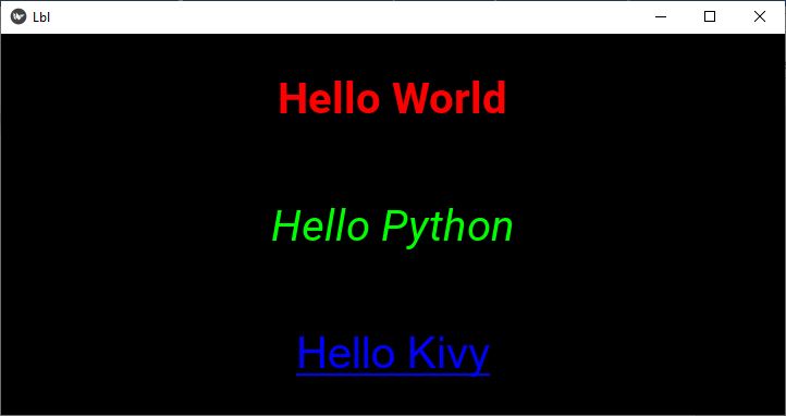
Example
We shall now demonstrate the use of some of the Label properties in the following example. Three labels are placed in a vertical box layout here. Each of the labels is constructed with certain properties of the Label class.
from kivy.app import App
from kivy.uix.boxlayout import BoxLayout
from kivy.uix.label import Label
from kivy.graphics import Color, Rectangle
from kivy.core.window import Window

Window.size = (720, 350)

class LblApp(App):
   def build(self):
      layout = BoxLayout(orientation='vertical')
      self.l1 = Label(
         text='Hello World', color=[1, 0, 0, 1],
         font_size=40, bold=True
   )

   self.l2 = Label(
   text='Hello Python', color=[0, 1, 0, 1],
   font_size=40, italic=True
   )

   self.l3 = Label(
      text='Hello Kivy', color=[0, 0, 1, 1],
      font_size=40, font_name='Arial',
      underline=True
   )
   layout.add_widget(self.l1)
   layout.add_widget(self.l2)
   layout.add_widget(self.l3)
   return layout

if __name__ == '__main__':
   LblApp().run()
Output
When you run the above program, three labels with their caption in corresponding formatting properties as defined in the code will be displayed −
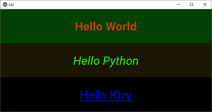
Example with kv file
The above design will now be created with the "kv" file. In addition to the properties used in the above Python code, we apply the background color to each label.
The Label class doesn't support background color properties. To overcome this, we draw a rectangle with desired color as its fill color on the canvas of the button. For example −
Label:
   canvas:
      Color :
         rgba: 0, 1, 0, 0.25
      Rectangle:
         pos:self.pos
         size : self.size
We utilize this feature to apply different colors as background for the three labels.
BoxLayout:
   orientation:'vertical'
   Label:
      text:'Hello World'
      color : [1,0,0,1]
      font_size : 40
      bold : True
      canvas:
         Color :
            rgba: 0, 1, 0, 0.25
         Rectangle:
            pos:self.pos
            size : self.size

   Label:
      text:'Hello Python'
      color:[0,1,0,1]
      font_size:40
      italic:True
      canvas:
         Color :
            rgba: 1, 1, 0, 0.1
         Rectangle:
            pos:self.pos
            size : self.size
   Label:
      text:'Hello Kivy'
      color:[0,0,1,1]
      font_size:40
      font_name:'Arial'
      underline:True
Output
Incorporate this "lbl.kv" file in the Python Kivy app, and run the program. You shuld get the following display, showing three labels with corresponding background color.
To Continue Learning Please Login