- Kivy Tutorial
- Kivy - Home
- Kivy Basics
- Kivy - Getting Started
- Kivy - Installation
- Kivy - Architecture
- Kivy - File Syntax
- Kivy - Applications
- Kivy - Hello World
- Kivy - App Life Cycle
- Kivy - Events
- Kivy - Properties
- Kivy - Inputs
- Kivy - Behaviors
- Kivy Buttons
- Kivy - Buttons
- Kivy - Button Events
- Kivy - Button Colors
- Kivy - Button Size
- Kivy - Button Position
- Kivy - Round Buttons
- Kivy - Disabled Buttons
- Kivy - Image Button
- Kivy Widgets
- Kivy - Widgets
- Kivy - Label
- Kivy - Text Input
- Kivy - Canvas
- Kivy - Line
- Kivy - Checkbox
- Kivy - Dropdown List
- Kivy - Windows
- Kivy - ScrollView
- Kivy - Carousel
- Kivy - Slider
- Kivy - Images
- Kivy - Popup
- Kivy - Switch
- Kivy - Spinner
- Kivy - Splitter
- Kivy - Progress Bar
- Kivy - Bubble
- Kivy - Tabbed Panel
- Kivy - Scatter
- Kivy - Accordion
- Kivy - File Chooser
- Kivy - Color Picker
- Kivy - Code Input
- Kivy - Modal View
- Kivy - Toggle Button
- Kivy - Camera
- Kivy - Tree View
- Kivy - reStructuredText
- Kivy - Action Bar
- Kivy - Video Player
- Kivy - Stencil View
- Kivy - VKeyboard
- Kivy - Touch Ripple
- Kivy - Audio
- Kivy - Videos
- Kivy - Spelling
- Kivy - Effects
- Kivy - Input Recorder
- Kivy - OpenGL
- Kivy - Text
- Kivy - Text Markup
- Kivy - Settings
- Kivy Layouts
- Kivy - Layouts
- Kivy - Float Layout
- Kivy - Grid Layouts
- Kivy - Box Layouts
- Kivy - Stack Layout
- Kivy - Anchor Layout
- Kivy - Relative Layout
- Kivy - Page Layout
- Kivy - Recycle Layout
- Kivy - Layouts in Layouts
- Kivy Advanced Concepts
- Kivy - Configuration Object
- Kivy - Atlas
- Kivy - Data Loader
- Kivy - Cache Manager
- Kivy - Console
- Kivy - Animation
- Kivy - Multistroke
- Kivy - Clock
- Kivy - SVGs
- Kivy - UrlRequest
- Kivy - Clipboard
- Kivy - Factory
- Kivy - Gesture
- Kivy - Language
- Kivy - Graphics
- Kivy - Drawing
- Kivy - Packaging
- Kivy - Garden
- Kivy - Storage
- Kivy - Vector
- Kivy - Utils
- Kivy - Inspector
- Kivy - Tools
- Kivy - Logger
- Kivy - Framebuffer
- Kivy Applications and Projects
- Kivy - Drawing App
- Kivy - Calculator App
- Kivy - Stopwatch App
- Kivy - Camera Handling
- Kivy - Image Viewer
- Kivy - Bezier
- Kivy - Canvas Stress
- Kivy - Circle Drawing
- Kivy - Widget Animation
- Kivy - Miscellaneous
- Kivy Useful Resources
- Kivy - Quick Guide
- Kivy - Useful Resources
- Kivy - Discussion
Kivy - Action Bar
Kivy framework provides ActionBar widget, which acts as an easy to access menu, usually towards top or bottom of the application window, somewhat similar to ActionBar in Android.
The ActionBar class is defined in kivy.uix.actionbar module. The appearance of an action bar depends on the composition of ActionView inside it. The ActionView holds one or more ActionButtons, represented by appropriate text caption and/or icon.

The ActionView contains ActionButtons, separators, or ActionGroup. ActionGroup is a collection of ActionButtons. When you click the ActionGroup caption, the buttons are shown in a dropdown.
When the ActionBar area becomes too small to accommodate all the contents, widgets are moved into the ActionOverflow area.
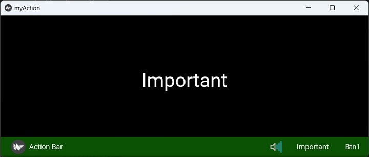
You may want to display some ActionItems always on the ActionBar, irrespective of the number of items present. If you set the Important property of the ActionButton to True, it will get a priority placement on the bar.
Example
The code given below puts a label and an ActionBar at the bottom of the app window. The ActionBar displays a couple of ActionButtons, the "on_press" event of each updates the label caption to its own text property.
The App code consists of the myActionApp class, whose build method constructs the appearance of the window by loading the associated kv file script.
The Python code is shown below −
from kivy.app import App
from kivy.uix.widget import Widget
from kivy.core.window import Window

Window.size = (720,400)

class mywidget(Widget):
   def pressed(self, obj):
   self.ids.l1.text=obj.text

class myActionApp(App):
   def build(self):
      return mywidget()

myActionApp().run()
Here, mywidget class subclasses Widget class. Following kv language script, to be saved as myAaction.kv, composes the ActionBar with two buttons. It also places a label to show the caption of the ActionButton pressed.
<mywidget>
   Label:
      id:l1
      text:'Hello'
      pos_hint:{'center_x':.5, 'center_y':1}
      pos:(root.width/2-150, root.height/2-50)
      font_size:48
      size:(300,100)
   ActionBar:
      size:root.width, 50
      pos_hint: {'top':1}
      background_color: .6, 4, .2, .6
      ActionView:
         use_separator: True
         ActionPrevious:
            title: 'Action Bar'
            with_previous: False
         ActionOverflow:
         ActionButton:
            icon: 'atlas://data/images/defaulttheme/audio-volume-high'
         ActionButton:
            important: True
            text: 'Important'
            on_press:root.pressed(self)
         ActionButton:
            text: 'Btn1'
            on_press:root.pressed(self)
Output
To Continue Learning Please Login