- Kivy Tutorial
- Kivy - Home
- Kivy Basics
- Kivy - Getting Started
- Kivy - Installation
- Kivy - Architecture
- Kivy - File Syntax
- Kivy - Applications
- Kivy - Hello World
- Kivy - App Life Cycle
- Kivy - Events
- Kivy - Properties
- Kivy - Inputs
- Kivy - Behaviors
- Kivy Buttons
- Kivy - Buttons
- Kivy - Button Events
- Kivy - Button Colors
- Kivy - Button Size
- Kivy - Button Position
- Kivy - Round Buttons
- Kivy - Disabled Buttons
- Kivy - Image Button
- Kivy Widgets
- Kivy - Widgets
- Kivy - Label
- Kivy - Text Input
- Kivy - Canvas
- Kivy - Line
- Kivy - Checkbox
- Kivy - Dropdown List
- Kivy - Windows
- Kivy - ScrollView
- Kivy - Carousel
- Kivy - Slider
- Kivy - Images
- Kivy - Popup
- Kivy - Switch
- Kivy - Spinner
- Kivy - Splitter
- Kivy - Progress Bar
- Kivy - Bubble
- Kivy - Tabbed Panel
- Kivy - Scatter
- Kivy - Accordion
- Kivy - File Chooser
- Kivy - Color Picker
- Kivy - Code Input
- Kivy - Modal View
- Kivy - Toggle Button
- Kivy - Camera
- Kivy - Tree View
- Kivy - reStructuredText
- Kivy - Action Bar
- Kivy - Video Player
- Kivy - Stencil View
- Kivy - VKeyboard
- Kivy - Touch Ripple
- Kivy - Audio
- Kivy - Videos
- Kivy - Spelling
- Kivy - Effects
- Kivy - Input Recorder
- Kivy - OpenGL
- Kivy - Text
- Kivy - Text Markup
- Kivy - Settings
- Kivy Layouts
- Kivy - Layouts
- Kivy - Float Layout
- Kivy - Grid Layouts
- Kivy - Box Layouts
- Kivy - Stack Layout
- Kivy - Anchor Layout
- Kivy - Relative Layout
- Kivy - Page Layout
- Kivy - Recycle Layout
- Kivy - Layouts in Layouts
- Kivy Advanced Concepts
- Kivy - Configuration Object
- Kivy - Atlas
- Kivy - Data Loader
- Kivy - Cache Manager
- Kivy - Console
- Kivy - Animation
- Kivy - Multistroke
- Kivy - Clock
- Kivy - SVGs
- Kivy - UrlRequest
- Kivy - Clipboard
- Kivy - Factory
- Kivy - Gesture
- Kivy - Language
- Kivy - Graphics
- Kivy - Drawing
- Kivy - Packaging
- Kivy - Garden
- Kivy - Storage
- Kivy - Vector
- Kivy - Utils
- Kivy - Inspector
- Kivy - Tools
- Kivy - Logger
- Kivy - Framebuffer
- Kivy Applications and Projects
- Kivy - Drawing App
- Kivy - Calculator App
- Kivy - Stopwatch App
- Kivy - Camera Handling
- Kivy - Image Viewer
- Kivy - Bezier
- Kivy - Canvas Stress
- Kivy - Circle Drawing
- Kivy - Widget Animation
- Kivy - Miscellaneous
- Kivy Useful Resources
- Kivy - Quick Guide
- Kivy - Useful Resources
- Kivy - Discussion
Kivy - Disabled Buttons
The Kivy API has button widgets of different types. The objects of Button, ToggleButton, CheckBox are all buttons with different characteristics. There is one common attribute in all of them. They can accept and propagate the "touch" events on click events. All button objects can raise the button events, as these classes inherit the ButtonBehavior interface.
You can make a button irresponsive to the button events by setting the "disabled" property to True. (The default value of disabled property is False. The disabled property is inherited from the Widget class.)
from kivy.uix.button import Button
b1 = Button(text="OK", disabled=True)
In order to configure the appearance of a disabled button from a normal or enabled button, one can use the following properties −
background_disabled_down − The background image of the button is a StringProperty, a string containing path to an image file and is used for the default graphical representation when the button is disabled and pressed.
background_disabled_normal − Background image of the button is also an image path, used for the default graphical representation when the button is disabled and not pressed.
disabled_color − This property is inherited from the Label class. It defines the color of the button text or caption when it is disabled. It's a ColorProperty and defaults to [1,1,1,3]
disabled_outline_color − This property defines the color of the text outline when the widget is disabled, in the (r, g, b) format. It is inherited from Label class. This feature requires the SDL2 text provider. The disabled_outline_color is a ColorProperty and defaults to [0, 0, 0].
Example
The code given below arranges a ToggleButton and a normal Button in vertical BoxLayout. The toggle button changes the disabled property of the other button to True or False if its state is down or normal.
from kivy.app import App
from kivy.uix.button import Button
from kivy.uix.togglebutton import ToggleButton
from kivy.core.window import Window
from kivy.uix.boxlayout import BoxLayout

Window.size = (720, 350)

class HelloApp(App):
   def on_button_press(self, instance, value):
      if value == 'down':
         self.btn2.disabled = True
         self.btn2.text = 'Disabled'
         instance.text = 'Enable Btn 2'
      if value == 'normal':
         self.btn2.disabled = False
         self.btn2.text = 'Enabled'
         instance.text = 'Disable Btn 2'

   def build(self):
      flo = BoxLayout(orientation='vertical')

      btn1 = ToggleButton(
         text='Disable Btn 2', font_size=40,
         size_hint=(1, .25),
         pos_hint={'center_x': .5, 'center_y': .8}
      )
      btn1.bind(state=self.on_button_press)
      self.btn2 = Button(
         text='Enabled', color=[0, 0, 1, 1],
         disabled_color=[1, 0, 0, 1], font_size=40,
         size_hint=(1, .25),
         pos_hint={'center_x': .5, 'center_y': .2}
      )
      flo.add_widget(btn1)
      flo.add_widget(self.btn2)
      return flo

if __name__ == '__main__':
   HelloApp().run()
Output
When the program is run, it shows the button at the bottom (i.e., btn2) as enabled, with its caption in the Color property.
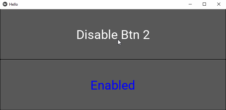
As the button at the top (btn1) is pressed down, the one below becomes disabled, changing the color specified by the "disabled_color" property.
To Continue Learning Please Login