- Adobe InDesign CC - Home
- Desktop Publishing - Introduction
- Popular DTP Software
- InDesign CC - Introduction
- InDesign CC - Workspace Basics
- Create the First Document
- InDesign CC - Page Management
- InDesign CC - Section Options
- InDesign CC - Text Frames
- InDesign CC - Story Editor
- Spellchecking Features
- InDesign CC - Find/Change Function
- InDesign CC - Import Images
- InDesign CC - Image Links
- InDesign CC - Edit Images
- InDesign CC - Image Fitting
- InDesign CC - Image Transparency
- InDesign CC - QR Codes
- Selection Tools & Fill Strokes
- Image Color & Transparency
- InDesign CC - Drop Shadows
- Special Effects to Objects
- InDesign CC - Eyedropper Tool
- Find/Change Feature for Objects
- InDesign CC - Swatches Panel
- InDesign CC - Color Panel
- InDesign CC - Gradients & Blends
- InDesign CC - Paths & Outlines
- InDesign CC - Stack Objects
- InDesign CC - Layers
- InDesign CC - Nest Objects
- InDesign CC - Align Objects
- Text Wrap & Anchor Objects
- InDesign CC - Object Transformation
- InDesign CC - Characters
- InDesign CC - Text Formatting
- InDesign CC - Paragraph Formatting
- Paragraph & Character Styles
- InDesign CC - Tables
- InDesign CC - Long Documents
- InDesign CC - Table of Contents
- InDesign CC - Interactive Documents
- InDesign CC - Ebook
- InDesign CC - Preflighting
- InDesign CC - Package Documents
- Print Documents & Booklets
- Export Documents as PDFs
- Selective Text Frame Export
- Word & InDesign
- Word File Import to InDesign
- Word To InDesign
- Photoshop & Illustrator Workflows
- Export InDesign Artwork
- Preserve Layers & Vectors
Adobe InDesign CC - Workspace Basics
It is important to properly understand the user interface to get the most out of InDesign. Let us take a quick tour of the user interface.
What we see above is the default interface for most installations. Remember that the interface is fully customizable. The interface is grouped into many panels as follows.
Application Bar
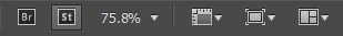
First up, is the Application Bar on the top of the window beside the Help menu which allows us to set the document zoom level or allow turning the rulers and guides on and off. It also allows us to tile multiple windows vertically or horizontally. The Br and St icons stand for Adobe Bridge and Adobe Stock respectively and you may or may not see them depending on your installation.
Control Panel
Below the application bar is the long strip called the Control Panel which is a quintessential component of the UI. The Control Panel basically allows you to change properties such as text formatting, color fill, and a host of contextually dependent functions. It is freely movable and you can float or dock it. Make sure you dock it in a place, which is convenient as youll be using this very often.

Document Layout
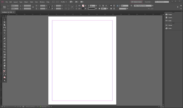
Next, we will take a look at the blank document. This blank document was created using the default options in the New dialog box. We will be learning more about the New dialog box in the next chapter. If you observe closely, the blank document is surrounded by black borders. That is the limit of the printed page. The pink guides on the top and bottom define the margins. The purple guides on the left and right are column guides.

If you have multiple columns, you will find that the purple guides define each column. Neither the pink nor the purple guides print out or will be seen in the exported PDF.
Toolbar
The Toolbar which is usually to the left of the main workspace contains all the tools required to work with the document. It has the selection tools, the text tools, eyedropper tools, etc. Clicking on these tools will open up further functions relevant to that tool in the Control Panel described above. Some tools like the Type tool for example have a small arrow underneath them which can reveal a similar tool with a different function.

Panels Bar
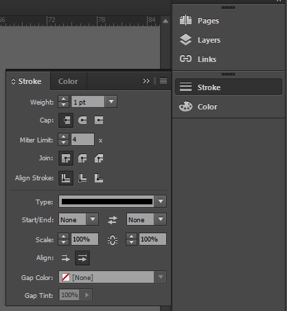
To the right of the workspace is the Panels bar which has some additional fucntions. What you see on the Panels bar can vary based on the workspace. Similar to the other window components described above, the Panels bar can be moved around freely or docked to a suitable position.
Clicking a button in the Panels bar will open up additional options. For example, clicking the Stroke option will open a pop-out window allowing us to change the properties of the stroke. You can add more functions to the Panel bar by going to the Window menu and choosing the desired function.
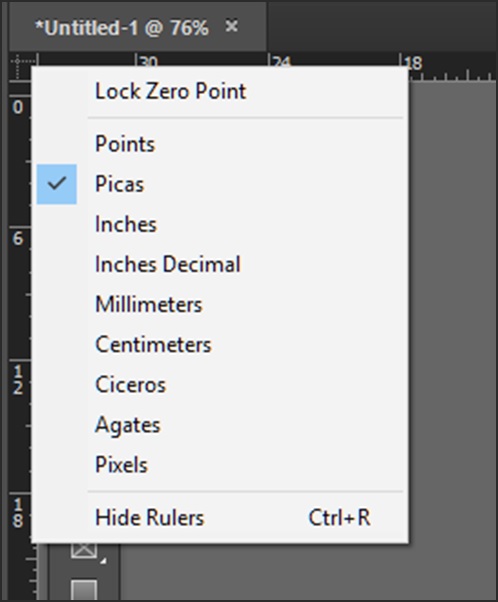
Ruler Measurements
It is important to be able to set the ruler measurements as desired. There are two ways of doing this. One of the ways, is to right-click on the point where the horizontal and vertical rulers intersect and select the desired measurement units. You can also hide the rulers, if you dont need them.
The other way, if you want to use a different measurement from now on for all new documents, is to use the Units and Increments option in the Preferences dialog box in the Edit menu or simply press Ctrl + K on Windows or Command + K on the Mac to open the Preferences dialog box. This is detailed in the subsequent chapters.