- SwiftUI - Home
- SwiftUI - Overview
- SwiftUI vs UIkit
- SwiftUI Environment
- SwiftUI - Environment Setup
- SwiftUI - Basic Components
- SwiftUI - Building First Application
- SwiftUI Views
- SwiftUI - Views
- SwiftUI - Customize Text View
- SwiftUI - Custom Image View
- SwiftUI - Stacks
- SwiftUI Drawing Shapes
- SwiftUI - Shapes
- SwiftUI - Drawing line
- SwiftUI - Drawing Rectangle
- SwiftUI - Drawing Rounded Rectangle
- SwiftUI - Drawing Triangle
- SwiftUI - Drawing Circle
- SwiftUI - Drawing Star
- SwiftUI - Drawing Polygon
- SwiftUI - Drawing Pie chart
- SwiftUI - Using built-in shapes
- SwiftUI - Text
- SwiftUI - Text View
- SwiftUI - Text Input and Output
- SwiftUI - Color
- SwiftUI - Color
- SwiftUI - Colorpicker
- SwiftUI - Gradients
- SwiftUI - Adjust Color
- SwiftUI - Effects
- SwiftUI - Effects
- SwiftUI - Blend Effect
- SwiftUI - BLur Effect
- SwiftUI - Shadow Effect
- SwiftUI - Hover Effect
- SwiftUI - Animations
- SwiftUI - Animations
- SwiftUI - Creating Animations
- SwiftUI - Creating an Explicit Animation
- SwiftUI - Multiple Animations
- SwiftUI - Transitions
- SwiftUI - Asymmetric Transition
- SwiftUI - Custom Transition
- SwiftUI - Image
- SwiftUI - Images
- SwiftUI - Image as Background
- SwiftUI - Rotating Image
- SwiftUI - Media
- SwiftUI - View Layout
- SwiftUI - View Layout
- SwiftUI - View Size
- SwiftUI - View Spacing
- SwiftUI - View Padding
- SwiftUI - UI Controls
- SwiftUI - UI Controls
- SwiftUI - Button
- SwiftUI - CheckBox
- SwiftUI - Menubar
- SwiftUI - Toolbar
- SwiftUI - Search Bar
- SwiftUI - TextField
- SwiftUI - Slider
- SwiftUI - Toggle
- SwiftUI - Pickers
- SwiftUI - Menus
- SwiftUI - List & Tables
- SwiftUI - Lists
- SwiftUI - Static List
- SwiftUI - Dynamic List
- SwiftUI - Customize List
- SwiftUI - Tables
- SwiftUI - Forms
- SwiftUI - Forms
- SwiftUI - Breaking Forms in Sections
- SwiftUI - Event Handling
- SwiftUI - Event Handling
- SwiftUI - Gesture
- SwiftUI - Clipboard
- SwiftUI - Drag and Drop
- SwiftUI - Focus
- SwiftUI - Alert
- SwiftUI - Miscellaneous
- SwiftUI - Containers
- SwiftUI - Navigation
- SwiftUI - Notifications
- SwiftUI - Cross-Platform UI
- SwiftUI - Data
- SwiftUI - Accessibility
- SwiftUI - Framework Integration
- SwiftUI - Framework Integration
- SwiftUI - Interfacing with UIKit
- SwiftUI - Creating macOS App
- SwiftUI Useful Resources
- SwiftUI - Useful Resources
- SwiftUI - Discussion
SwiftUI - TextField
SwiftUI support various types of pre-defined UI controls and textfield is among them. Textfield control is a special type of control that displays an editable text field where users can enter values.
It is commonly used in login or registration forms, search bar, numeric input, feedback, etc. It can accept different types of text such as plain, secure, email, etc., and also numeric values. It can also be styled in various ways.
Creating Textfield in SwiftUI
In SwiftUI, we can create a text field with TextField View TextField View's help. This view creates a text field which takes input value in the form of text from the user.
It generally requires a placeholder text which will display when the field is empty, it helps the user to understand what to enter in the field, and a state variable which holds the input value. We can also edit the data entered in the field.
Syntax
Following is the syntax −
TextField(
   _ titleKey: LocalizedStringKey,
   text: Binding Variable
)
Parameters
Following parameters are used by this view −
titleKey: Represent the purpose of the field.
text: Represent the text that will be displayed.
Overloaded Methods
Following are the commonly used overloaded methods of TextField view −
| TextField | Description |
|---|---|
| TextField(_:text:) | It is used to create a textfield with a text label generated from the given string. |
| TextField(_:text:prompt:) | It is used to create a textfield with a text label and prompt. |
| TextField(_:value:format:prompt:) | It is used to create a textfield that applies a format style to a bounded value along with a label. |
| TextField(_:text:axis:) | It is used to create a textfield with a scrollable text field. |
Example
The following SwiftUI program creates text fields with labels and placeholder text.
import SwiftUI
struct ContentView: View {
   @State private var fname : String = ""
   @State private var lname : String = ""
   @State private var contact : String = ""
   @State private var age : String = ""
   var body: some View {
      VStack{
         TextField("Enter First Name", text: $fname)
         TextField(text: $lname, label: {Text("Enter Last Name ")})
         TextField("Contact Number", text: $contact, prompt: Text("Contact Number"))
         TextField("Enter Age", text: $age)
      }
   }
}
#Preview {
   ContentView()
}
Output
Styling TextField in SwiftUI
As we know, every UI control has its default style, which they will display when the user does not use any specific style on them, similarly for TextField. It also has its default style, but we can change the default style of the text field with the help of the textFieldStyle() modifier.
This modifier can style the text field with the customized style or standard styles. Apart from the textFieldStyle() modifier, we can also use other modifiers, such as .background(), .foregroundStyle(), font(), etc, to style the given text field.
Syntax
Following is the syntax −
func textFieldStyle(_ style: S) -> some View
Parameter
It takes only one parameter, which is the style of the text field it can be pre-defined, such as automatic, plain, roundedBorder, etc., or a custom style that conforms to the textFieldStyle protocol.
Example
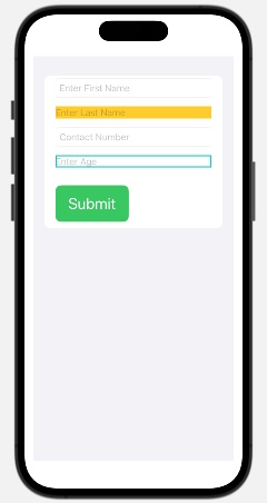
The following SwiftUI program is used to style text-field view.
import SwiftUI

struct ContentView: View {
   @State private var fname: String = ""
   @State private var lname: String = ""
   @State private var contact: String = ""
   @State private var age: String = ""
   @State private var submit = false

   var body: some View {
      VStack {
         Form {

            // Text Fields
            TextField("Enter First Name", text: $fname)
               .textFieldStyle(RoundedBorderTextFieldStyle())
               .foregroundColor(.brown)
               .textInputAutocapitalization(.characters)

            TextField("Enter Last Name", text: $lname)
               .textFieldStyle(PlainTextFieldStyle())
               .background(Color.yellow)
               .foregroundColor(.black)
               .textInputAutocapitalization(.characters)

            TextField("Contact Number", text: $contact, prompt: Text("Contact Number"))
               .textFieldStyle(RoundedBorderTextFieldStyle())
               .foregroundColor(.mint)

            TextField("Enter Age", text: $age)
               .textFieldStyle(DefaultTextFieldStyle())
               .border(Color.mint, width: 2)

            // Submit button
            Button(action: {
               Submit()
            }) {
               Text("Submit")
                  .font(.title)
                  .frame(maxWidth: 100, alignment: .center)
                  .padding()
                  .background(.green)
                  .foregroundStyle(.white)
                  .cornerRadius(10)
            }.padding(.top, 10)

            // Display Message
            if submit {
               Text("Form is Submitted")
                  .font(.headline)
                  .foregroundColor(.mint)
            }
         }
      }
      .padding()
   }

   func Submit() {
      if !fname.isEmpty && !lname.isEmpty {
         submit = true
      } else {
         submit = false
      }
   }
}

#Preview {
   ContentView()
}
Output
