- SwiftUI - Home
- SwiftUI - Overview
- SwiftUI vs UIkit
- SwiftUI Environment
- SwiftUI - Environment Setup
- SwiftUI - Basic Components
- SwiftUI - Building First Application
- SwiftUI Views
- SwiftUI - Views
- SwiftUI - Customize Text View
- SwiftUI - Custom Image View
- SwiftUI - Stacks
- SwiftUI Drawing Shapes
- SwiftUI - Shapes
- SwiftUI - Drawing line
- SwiftUI - Drawing Rectangle
- SwiftUI - Drawing Rounded Rectangle
- SwiftUI - Drawing Triangle
- SwiftUI - Drawing Circle
- SwiftUI - Drawing Star
- SwiftUI - Drawing Polygon
- SwiftUI - Drawing Pie chart
- SwiftUI - Using built-in shapes
- SwiftUI - Text
- SwiftUI - Text View
- SwiftUI - Text Input and Output
- SwiftUI - Color
- SwiftUI - Color
- SwiftUI - Colorpicker
- SwiftUI - Gradients
- SwiftUI - Adjust Color
- SwiftUI - Effects
- SwiftUI - Effects
- SwiftUI - Blend Effect
- SwiftUI - BLur Effect
- SwiftUI - Shadow Effect
- SwiftUI - Hover Effect
- SwiftUI - Animations
- SwiftUI - Animations
- SwiftUI - Creating Animations
- SwiftUI - Creating an Explicit Animation
- SwiftUI - Multiple Animations
- SwiftUI - Transitions
- SwiftUI - Asymmetric Transition
- SwiftUI - Custom Transition
- SwiftUI - Image
- SwiftUI - Images
- SwiftUI - Image as Background
- SwiftUI - Rotating Image
- SwiftUI - Media
- SwiftUI - View Layout
- SwiftUI - View Layout
- SwiftUI - View Size
- SwiftUI - View Spacing
- SwiftUI - View Padding
- SwiftUI - UI Controls
- SwiftUI - UI Controls
- SwiftUI - Button
- SwiftUI - CheckBox
- SwiftUI - Menubar
- SwiftUI - Toolbar
- SwiftUI - Search Bar
- SwiftUI - TextField
- SwiftUI - Slider
- SwiftUI - Toggle
- SwiftUI - Pickers
- SwiftUI - Menus
- SwiftUI - List & Tables
- SwiftUI - Lists
- SwiftUI - Static List
- SwiftUI - Dynamic List
- SwiftUI - Customize List
- SwiftUI - Tables
- SwiftUI - Forms
- SwiftUI - Forms
- SwiftUI - Breaking Forms in Sections
- SwiftUI - Event Handling
- SwiftUI - Event Handling
- SwiftUI - Gesture
- SwiftUI - Clipboard
- SwiftUI - Drag and Drop
- SwiftUI - Focus
- SwiftUI - Alert
- SwiftUI - Miscellaneous
- SwiftUI - Containers
- SwiftUI - Navigation
- SwiftUI - Notifications
- SwiftUI - Cross-Platform UI
- SwiftUI - Data
- SwiftUI - Accessibility
- SwiftUI - Framework Integration
- SwiftUI - Framework Integration
- SwiftUI - Interfacing with UIKit
- SwiftUI - Creating macOS App
- SwiftUI Useful Resources
- SwiftUI - Useful Resources
- SwiftUI - Discussion
SwiftUI - Stack
Stacks are the essential containers that are used to arrange multiple views in an organized view. They are static and can hold up to 10 sub views/child views in it. Using stacks we can create complex and easy layouts with the help of reusable components. Stacks are not scrollable but if you want to make a scrollable stack then you can use ScrollView.
Type of stack support by SwiftUI −
HStack
VStack
ZStack
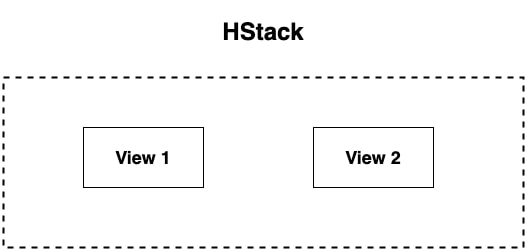
HStack in SwiftUI
HStack is known as Horizontal Stack. HStack is used to display its child views horizontally in a left-to-right list. It is the fundamental container which is used when the User interface is required to align its components in a horizontal line.
Syntax
Following is the syntax −
HStack{
    View 1
    View 2
    View 3
}
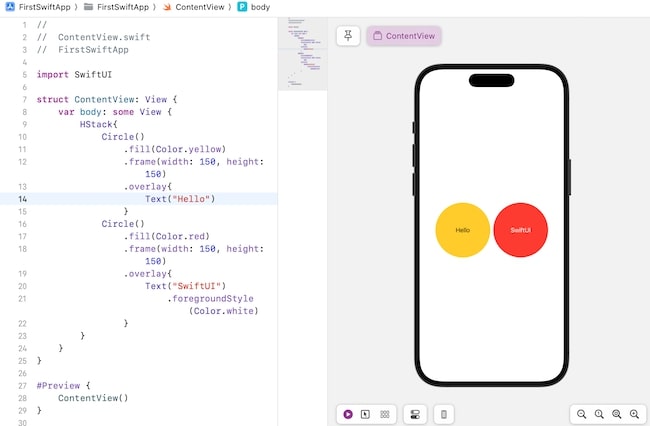
Example
The following SwiftUI program will show how to use HStack.
import SwiftUI

struct ContentView: View {
   var body: some View {
      HStack{
         Circle()
            .fill(Color.yellow)
            .frame(width: 150, height: 150)
            .overlay{
               Text("Hello")
         }
         Circle()
            .fill(Color.red)
            .frame(width: 150, height: 150)
            .overlay{
               Text("SwiftUI")
                  .foregroundStyle(Color.white)
            }
      }
   }
}

#Preview {
   ContentView()
}
Output
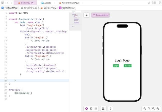
Customize HStack in SwiftUI
We can customize HStack to create more complex and dynamic interfaces for Apple's app. As we know HStack is a box-like layout so it is necessary to specify the positions of child views in it so it supports two types of attributes and both the attributes are optional−
Syntax
Following is the syntax of alignment and spacing attributes−
HStack(alignment:.top){
   View 1
   View 2
   View 3
}
HStack(spacing: 30){
   View 1
   View 2
   View 3
}
- alignment: It aligns the child views of HStack. It uses VerticalAlignment type parameters such as .bottom, .center, and .top. Here, .bottom is used to align views to the bottom of the stack. .center is used to align views in the middle of the stack, it is by default alignment of the stack. .top is used to align views on the top of the stack.
- spacing: It is used to provide space between each child's views present in the stack.
Example
The following SwiftUI program will show how to customize the content of HStack.
import SwiftUI

struct ContentView: View {
   var body: some View {
      Text("Login Page")
         .font(.largeTitle)
      HStack(alignment: .center, spacing: 50){
         Button("Login"){
            // Some Action
         }
         .buttonStyle(.bordered)
         .background(Color.green)
         .foregroundStyle(Color.white)
         Button("Register"){
            // Some Action
         }
         .buttonStyle(.bordered)
         .background(Color.green)
         .foregroundStyle(Color.white)
      }
   }
}

#Preview {
   ContentView()
}
Output
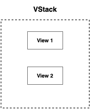
VStack in SwiftUI
VStack is known as Vertical Stack. VStack is used to display its child views vertically. Just like HStack, it is also a container which is used to display components in top-to-bottom/vertical lines in the user interface of an app.
Syntax
Following is the syntax−
VStack{
   View 1
   View 2
   View 3
}
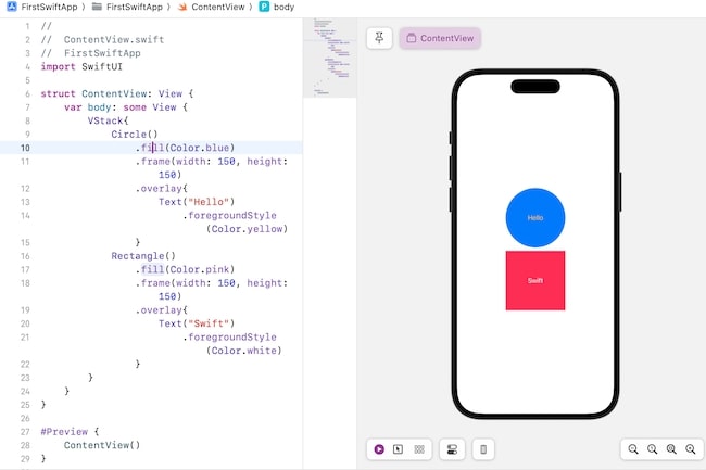
Example
The following SwiftUI program will show how to use VStack.
import SwiftUI

struct ContentView: View {
   var body: some View {
      VStack{
         Circle()
            .fill(Color.blue)
            .frame(width: 150, height: 150)
            .overlay{
               Text("Hello")
                  .foregroundStyle(Color.yellow)
            }
         Rectangle()
            .fill(Color.pink)
            .frame(width: 150, height: 150)
            .overlay{
               Text("Swift")
                  .foregroundStyle(Color.white)
            }
      }
   }
}

#Preview {
   ContentView()
}
Output
Customize VStack in SwiftUI
Customization of VStack helps in creating more advanced interfaces for an app. So to arrange its child views or components in a specific format SwiftUI provide two attributes, these attributes are optional you can use them according to your need and the attributes are −
Syntax
Following is the syntax of alignment and spacing attributes−
VStack(alignment:.leading){
   View 1
   View 2
   View 3
}
VStack(spacing: 40){
   View 1
   View 2
   View 3
}
- alignment: It aligns the child views of VStack. It uses HorizontalAlignment type parameters such as .leading, .center, and .trailing. Here, .leading is used to align views to the left side of the stack. .center is used to align views in the middle of the stack, it is by default alignment of the stack. .trailing is used to align views on the right side of the stack.
- spacing: It is used to provide space between each child views present in the stack.
Example
The following SwiftUI program will show how to customize the content of VStack.
import SwiftUI

struct ContentView: View {
   var body: some View {
      VStack(alignment: .leading, spacing: 40){
         Text("Languages:")
         Rectangle()
            .frame(width: 150, height: 190)
            .overlay(
               List{
                  Text("Swift")
                  Text("C#")
                  Text("Python")
               })
         Text("Databases:")
         Rectangle()
            .frame(width: 150, height: 190)
            .overlay(
               List{
                  Text("MongoDB")
                  Text("MySQL")
                  Text("Oracle")
               })

      }

   }
}

#Preview {
   ContentView()
}
Output

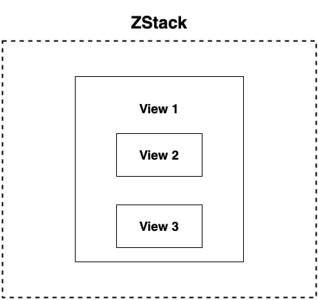
ZStack in SwiftUI
ZStack is used to arrange views on top of another view or we can say that it overlap a single or multiple views on another view. This container displays a group of views together in a back-to-front line. It is useful for creating overlapping views and complex layered UI components
Syntax
Following is the syntax−
ZStack{
   View 1
   View 2
   View 3
}
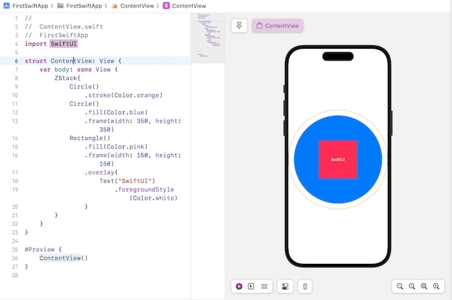
Example
The following SwiftUI program will show how to use ZStack.
import SwiftUI

struct ContentView: View {
   var body: some View {
      ZStack{
         Circle()
            .stroke(Color.orange)
         Circle()
            .fill(Color.blue)
            .frame(width: 350, height: 350)
         Rectangle()
            .fill(Color.pink)
            .frame(width: 150, height: 150)
            .overlay{
               Text("SwiftUI")
                  .foregroundStyle(Color.white)
            }
      }
   }
}

#Preview {
   ContentView()
}
Output
Customize ZStack in SwiftUI
Just like HStack and VStack, ZStack also support alignment attribute to customize the compoennets or childviews present in it. This attribute is optional. It uses the combination of horizontal and vertical alignments as well as can use both of them separately as a parameter type. By default, it aligns views in the center
Syntax
Following is the syntax of alignment and spacing attributes−
ZStack(alignment:.top){
   View 1
   View 2
   View 3
}
Example
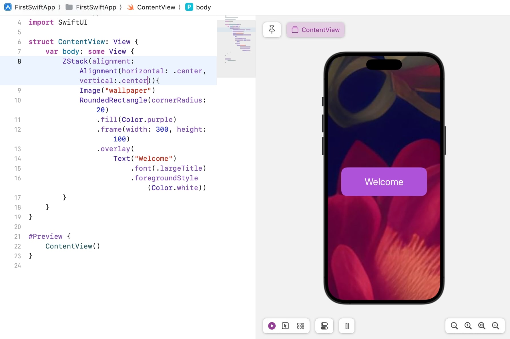
The following SwiftUI program will show how to customize the content of ZStack.
import SwiftUI

struct ContentView: View {
   var body: some View {
      ZStack(alignment: Alignment(horizontal: .center, vertical:.center)){
         Image("wallpaper")
         RoundedRectangle(cornerRadius: 20)
            .fill(Color.purple)
            .frame(width: 300, height: 100)
            .overlay(
               Text("Welcome")
                  .font(.largeTitle)
                  .foregroundStyle(Color.white))
      }
   }
}

#Preview {
   ContentView()
}
Output
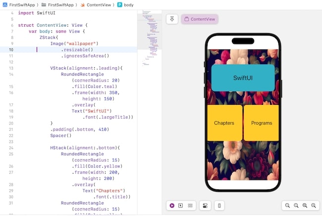
Combining Multiple Views in SwiftUI
SwiftUI allows us to combine all these three stacks to create a dynamic and user-engaging user interface for Apple's app. We can also nest them to create more complex interfaces. Let understand this concept with the help of an example.
Example
The following SwiftUI program will show how to combine HStack, VStack and ZStack to create a simple layout for an app.
import SwiftUI

struct ContentView: View {
   var body: some View {
      ZStack{
         Image("wallpaper")
            .resizable()
            .ignoresSafeArea()

         VStack(alignment:.leading){
            RoundedRectangle(cornerRadius: 20)
               .fill(Color.teal)
               .frame(width: 350, height: 150)
               .overlay(
               Text("SwiftUI")
                  .font(.largeTitle))
         }
         .padding(.bottom, 410)
         Spacer()

         HStack(alignment:.bottom){
            RoundedRectangle(cornerRadius: 15)
               .fill(Color.yellow)
               .frame(width: 200, height: 200)
               .overlay(
                  Text("Chapters")
                     .font(.title))
            RoundedRectangle(cornerRadius: 15)
               .fill(Color.yellow)
               .frame(width: 200, height: 200)
               .overlay(
               Text("Programs")
                  .font(.title))
         }
         .padding(.top, 90)
      }
      .padding()
   }
}

#Preview {
   ContentView()
}
Output