- SwiftUI - Home
- SwiftUI - Overview
- SwiftUI vs UIkit
- SwiftUI Environment
- SwiftUI - Environment Setup
- SwiftUI - Basic Components
- SwiftUI - Building First Application
- SwiftUI Views
- SwiftUI - Views
- SwiftUI - Customize Text View
- SwiftUI - Custom Image View
- SwiftUI - Stacks
- SwiftUI Drawing Shapes
- SwiftUI - Shapes
- SwiftUI - Drawing line
- SwiftUI - Drawing Rectangle
- SwiftUI - Drawing Rounded Rectangle
- SwiftUI - Drawing Triangle
- SwiftUI - Drawing Circle
- SwiftUI - Drawing Star
- SwiftUI - Drawing Polygon
- SwiftUI - Drawing Pie chart
- SwiftUI - Using built-in shapes
- SwiftUI - Text
- SwiftUI - Text View
- SwiftUI - Text Input and Output
- SwiftUI - Color
- SwiftUI - Color
- SwiftUI - Colorpicker
- SwiftUI - Gradients
- SwiftUI - Adjust Color
- SwiftUI - Effects
- SwiftUI - Effects
- SwiftUI - Blend Effect
- SwiftUI - BLur Effect
- SwiftUI - Shadow Effect
- SwiftUI - Hover Effect
- SwiftUI - Animations
- SwiftUI - Animations
- SwiftUI - Creating Animations
- SwiftUI - Creating an Explicit Animation
- SwiftUI - Multiple Animations
- SwiftUI - Transitions
- SwiftUI - Asymmetric Transition
- SwiftUI - Custom Transition
- SwiftUI - Image
- SwiftUI - Images
- SwiftUI - Image as Background
- SwiftUI - Rotating Image
- SwiftUI - Media
- SwiftUI - View Layout
- SwiftUI - View Layout
- SwiftUI - View Size
- SwiftUI - View Spacing
- SwiftUI - View Padding
- SwiftUI - UI Controls
- SwiftUI - UI Controls
- SwiftUI - Button
- SwiftUI - CheckBox
- SwiftUI - Menubar
- SwiftUI - Toolbar
- SwiftUI - Search Bar
- SwiftUI - TextField
- SwiftUI - Slider
- SwiftUI - Toggle
- SwiftUI - Pickers
- SwiftUI - Menus
- SwiftUI - List & Tables
- SwiftUI - Lists
- SwiftUI - Static List
- SwiftUI - Dynamic List
- SwiftUI - Customize List
- SwiftUI - Tables
- SwiftUI - Forms
- SwiftUI - Forms
- SwiftUI - Breaking Forms in Sections
- SwiftUI - Event Handling
- SwiftUI - Event Handling
- SwiftUI - Gesture
- SwiftUI - Clipboard
- SwiftUI - Drag and Drop
- SwiftUI - Focus
- SwiftUI - Alert
- SwiftUI - Miscellaneous
- SwiftUI - Containers
- SwiftUI - Navigation
- SwiftUI - Notifications
- SwiftUI - Cross-Platform UI
- SwiftUI - Data
- SwiftUI - Accessibility
- SwiftUI - Framework Integration
- SwiftUI - Framework Integration
- SwiftUI - Interfacing with UIKit
- SwiftUI - Creating macOS App
- SwiftUI Useful Resources
- SwiftUI - Useful Resources
- SwiftUI - Discussion
SwiftUI - Customize Text View
Text view is the most powerful and flexible view in SwiftUI, it is used to display text in various styles and layouts in the UI of an app. The text displayed by the Text view is static, it is not editable. It also provides various in-built modifiers to control text's font, color, alignment, spacing, etc. Apart from displaying text on the screen, the Text view is also used for headings, labellings, paragraphs, etc
Displaying Text using Text View in SwiftUI
In SwiftUI, we can display text very easily with the help of Text View. Text view displays any single or multi line string on the screen and can also provide various modifiers to customize the appearance of the string on the screen. To display a line of string we need to initialize Text() with the string value that we want to display
Syntax
Following is the syntax −
Text("Write your text here..")
Example
The following SwiftUI program is used to create a text view.
import SwiftUI

struct ContentView: View {
   var body: some View {
      VStack{
         // Text view
         Text("TutorialsPoint")
      }
   }
}
#Preview {
   ContentView()
}
Output
Customize Text View in SwiftUI
Customizing the text view means we can change the visual appearance and behavior of the text according to our design requirements using the modifiers provided by SwiftUI.
Using these modifiers we can change the shape, size, color, alignment etc., of the text view. SwiftUI provide various in-built modifiers to customize the text and some of the commonly used modifiers are as follows −
| Modifiers | Description |
|---|---|
| font() | It is used to change the font and style of the text. |
| foregroundStyle() | It is used to change the color of the text. |
| multilineTextAlignment() | It is used to set the alignment of the text view. |
| lineLimit() | It is used to set the maximum number of lines the text can use in the view. |
| padding() | It is used to insert space around the text view. |
| background() | It is used to set the background of the text view. |
| border(color:width:) | It is used to apply border around the given text. |
| tracking() | It is used to adjust space between each character of the text view. |
| underline() | It is used to insert under line under the text view. |
| strikethrough() | It is used to add strikethrough in the text view. |
Example
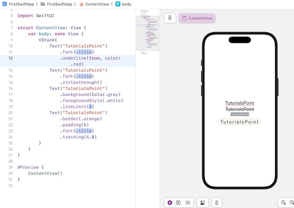
The following SwiftUI program is used to customize text view.
import SwiftUI

struct ContentView: View {
   var body: some View {
      VStack{
         Text("TutorialsPoint")
            .font(.title)
            .underline(true, color: .red)
         Text("TutorialsPoint")
            .font(.title)
            .strikethrough()
         Text("TutorialsPoint")
            .background(Color.gray)
            .foregroundStyle(.white)
            .lineLimit(2)
         Text("TutorialsPoint")
            .border(.orange)
            .padding(5)
            .font(.title)
            .tracking(4.0)
      }
   }
}

#Preview {
   ContentView()
}
Output
