- SwiftUI - Home
- SwiftUI - Overview
- SwiftUI vs UIkit
- SwiftUI Environment
- SwiftUI - Environment Setup
- SwiftUI - Basic Components
- SwiftUI - Building First Application
- SwiftUI Views
- SwiftUI - Views
- SwiftUI - Customize Text View
- SwiftUI - Custom Image View
- SwiftUI - Stacks
- SwiftUI Drawing Shapes
- SwiftUI - Shapes
- SwiftUI - Drawing line
- SwiftUI - Drawing Rectangle
- SwiftUI - Drawing Rounded Rectangle
- SwiftUI - Drawing Triangle
- SwiftUI - Drawing Circle
- SwiftUI - Drawing Star
- SwiftUI - Drawing Polygon
- SwiftUI - Drawing Pie chart
- SwiftUI - Using built-in shapes
- SwiftUI - Text
- SwiftUI - Text View
- SwiftUI - Text Input and Output
- SwiftUI - Color
- SwiftUI - Color
- SwiftUI - Colorpicker
- SwiftUI - Gradients
- SwiftUI - Adjust Color
- SwiftUI - Effects
- SwiftUI - Effects
- SwiftUI - Blend Effect
- SwiftUI - BLur Effect
- SwiftUI - Shadow Effect
- SwiftUI - Hover Effect
- SwiftUI - Animations
- SwiftUI - Animations
- SwiftUI - Creating Animations
- SwiftUI - Creating an Explicit Animation
- SwiftUI - Multiple Animations
- SwiftUI - Transitions
- SwiftUI - Asymmetric Transition
- SwiftUI - Custom Transition
- SwiftUI - Image
- SwiftUI - Images
- SwiftUI - Image as Background
- SwiftUI - Rotating Image
- SwiftUI - Media
- SwiftUI - View Layout
- SwiftUI - View Layout
- SwiftUI - View Size
- SwiftUI - View Spacing
- SwiftUI - View Padding
- SwiftUI - UI Controls
- SwiftUI - UI Controls
- SwiftUI - Button
- SwiftUI - CheckBox
- SwiftUI - Menubar
- SwiftUI - Toolbar
- SwiftUI - Search Bar
- SwiftUI - TextField
- SwiftUI - Slider
- SwiftUI - Toggle
- SwiftUI - Pickers
- SwiftUI - Menus
- SwiftUI - List & Tables
- SwiftUI - Lists
- SwiftUI - Static List
- SwiftUI - Dynamic List
- SwiftUI - Customize List
- SwiftUI - Tables
- SwiftUI - Forms
- SwiftUI - Forms
- SwiftUI - Breaking Forms in Sections
- SwiftUI - Event Handling
- SwiftUI - Event Handling
- SwiftUI - Gesture
- SwiftUI - Clipboard
- SwiftUI - Drag and Drop
- SwiftUI - Focus
- SwiftUI - Alert
- SwiftUI - Miscellaneous
- SwiftUI - Containers
- SwiftUI - Navigation
- SwiftUI - Notifications
- SwiftUI - Cross-Platform UI
- SwiftUI - Data
- SwiftUI - Accessibility
- SwiftUI - Framework Integration
- SwiftUI - Framework Integration
- SwiftUI - Interfacing with UIKit
- SwiftUI - Creating macOS App
- SwiftUI Useful Resources
- SwiftUI - Useful Resources
- SwiftUI - Discussion
SwiftUI - Gradients
Gradient refers to a visual effect created by blending two or more colors. Or gradient effect is a smooth color transition from one color to another. It is used to fill the shape with a smooth transition of colors such as from light to dark or from dark to light.
It is commonly used in backgrounds, buttons, icons, and other UI components to enhance the visual appearance of the components. SwiftUI supports three types of gradients: Linear, radial, and angular.
Gradient uses various components such as an array of color that will display, size and direction, and the type of gradient. SwiftUI provide the following four ways for applying the gradient effect −
- Gradient
- Linear Gradient
- Radial Gradient
- Angular Gradient
- Elliptical Gradient
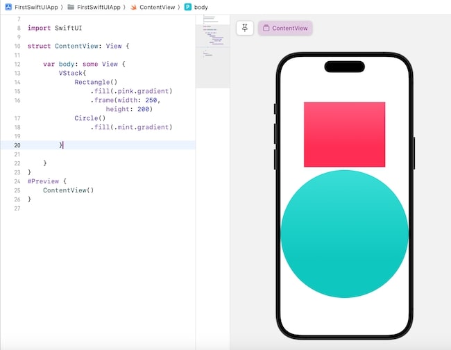
Gradient
The .gradient: modifier is used to apply the gradient effect to the specified component.
It is commonly used with background or fill modifiers. You can use this modifier with whatever color you want. It is the simplest way to apply the linear gradient effect.
Syntax
Following is the syntax −
@State private var userData: String = ""
Example
The following SwiftUI program creates and applies gradients in the specified shapes using a gradient modifier.
import SwiftUI
struct ContentView: View {
   var body: some View {
      VStack{
         Rectangle().fill(.pink.gradient).frame(width: 250, height: 200)
         Circle().fill(.mint.gradient)
      }
   }
}
#Preview {
   ContentView()
}
Output
Linear Gradient
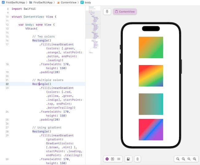
In Linear Gradient, the transition of the colors takes place in a straight-line format. SwiftUI provides an in-built LinearGradient() function using which we can create gradient color effects by mixing two or more colors.
This function fills the area or component with the linear color transition from one point to another in a straight-line form. The transitions can be horizontal, vertical, diagonal, etc.
Syntax
Following is the syntax −
LinearGradient(_gradient:AnyGradient, startPoint: UnitPoint, endPoint: UnitPoint)
Parameter
This method takes the following parameters −
- gradient: It is a Gradient object which is to contain an array of Color objects.
- startPoint: It represents the point from where the gradient starts. Its values can be: .top, .topLeading, .topTrailing, .bottom, .bottomLeading, .bottomTrailing, .leading, .trailing, .topleading, etc.
- endPoint: It represents the point from where the gradient ends. Its values can be: .top, .topLeading, .topTrailing, .bottom, .bottomLeading, .bottomTrailing, .leading, .trailing, .topleading, etc.
Example
The Following SwiftUI program is to create a linear gradient.
import SwiftUI
struct ContentView: View {
   var body: some View {
      VStack{

         // Two colors
         Rectangle()
            .fill(LinearGradient(colors: [.green, .orange], startPoint: .bottom, endPoint: .leading))
            .frame(width: 170, height: 150)
            .padding(20)

         // Multiple colors
         Rectangle()
            .fill(LinearGradient(colors: [.red, .yellow, .green, .indigo], startPoint: .top, endPoint: .bottomTrailing))
            .frame(width: 170, height: 150)
            .padding(20)

         // Using gradient
         Rectangle()
            .fill(LinearGradient(gradient: Gradient(colors:[.brown, .mint] ), startPoint: .leading, endPoint: .trailing))
            .frame(width: 170, height: 150)
            .padding(20)

         // Setting the coordinates of start and end point
         Rectangle()
            .fill(LinearGradient(colors: [.pink, .blue, .purple], startPoint: UnitPoint(x: 0.4, y: 0.3), endPoint: UnitPoint(x: 0.8, y: 0.7)))
            .frame(width: 170, height: 150)
      }

   }
}
#Preview {
   ContentView()
}
Output
Radial Gradient
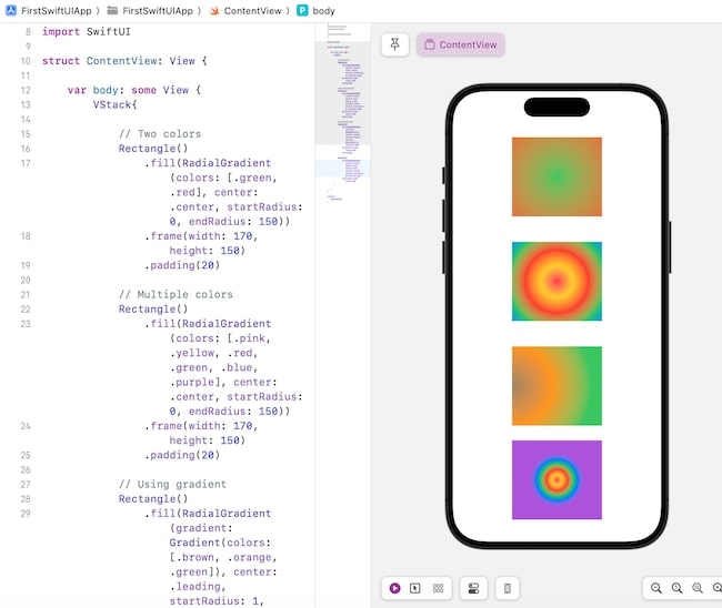
A radial gradient is used to create a transition of two or more colors where the color changes as the distance from the center point increases. The transition happens in an outward direction and the colors are scaled to fit in between the start and end radius.
SwiftUI provides an in-built function named RadialGradient(). This function is used to fill the given area with gradient color transition means it creates a circular gradient where the initial color is present at the center and the final color is present at the edge of the circle.
If the size of the area of the given shape increases, then SwiftUI automatically adjust the gradient. By adjusting the values of center, startRadius, and endRadius parameters of the RadialGradient() we can create different effects.
Syntax
Following is the syntax −
RadialGradient(colors:[Color], center: UnitPoint, startRadius: CGFloat, endRadius: CGFloat)
Parameter
This method takes the following parameters −
- colors: It is an array of Color objects.
- center: It represent the center points.
- startRadius: It represents the radius from where the gradient starts.
- endRadius: It represents the radius from where the gradient ends.
Example
The Following SwiftUI program is to apply a radial gradient.
import SwiftUI

struct ContentView: View {
   var body: some View {
      VStack{
         // Two colors
         Rectangle()
            .fill(RadialGradient(colors: [.green, .red], center: .center, startRadius: 0, endRadius: 150))
            .frame(width: 170, height: 150)
            .padding(20)

         // Multiple colors
         Rectangle()
            .fill(RadialGradient(colors: [.pink, .yellow, .red, .green, .blue, .purple], center: .center, startRadius: 0, endRadius: 150))
            .frame(width: 170, height: 150)
            .padding(20)

         // Using gradient
         Rectangle()
            .fill(RadialGradient(gradient: Gradient(colors: [.brown, .orange, .green]), center: .leading, startRadius: 1, endRadius: 150))
            .frame(width: 170, height: 150)
            .padding(20)

         Rectangle()
            .fill(RadialGradient(colors: [.pink, .yellow, .red, .green, .blue, .purple], center: .center, startRadius: 0, endRadius: 50))
            .frame(width: 170, height: 150)
      }
   }
}

#Preview {
   ContentView()
}
Output
Angular Gradient
Angular Gradient is used to create a transition of two or more colors where the color changes according to the angles. It is also known as a conic gradient. SwiftUI provides an in-built function named AngularGradient(). This function is used to fill the given area with angular color transition.
Just like radial gradient, angular gradient also displays the color gradient in circular form but here the colors radiate around the center point. If the size of the given area increases, then SwiftUI will automatically adjust the colors in the gradient.
By adjusting the values of center, startAngle, and endAngle parameters of the AngularGradient() we can create different effects.
Syntax
Following is the syntax −
AngularGradient(colors:[Color], center: UnitPoint, angle: Angle)
Parameter
This method takes the following parameters −
- colors: It is an array of Color objects.
- center: It represent the center points.
- angle: It represents the angle from where the gradient starts.
Example
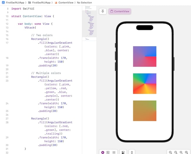
The Following SwiftUI program is to apply angular gradient.
import SwiftUI
struct ContentView: View {
   var body: some View {
      VStack{

         // Two colors
         Rectangle()
            .fill(AngularGradient(colors: [.pink, .blue], center: .center))
            .frame(width: 170, height: 150)
            .padding(20)

         // Multiple colors
         Rectangle()
            .fill(AngularGradient(colors: [.pink, .yellow, .red, .green, .blue, .purple], center: .center))
            .frame(width: 170, height: 150)
            .padding(20)

         Rectangle()
            .fill(AngularGradient(colors: [.red, .green], center: .trailing))
            .frame(width: 170, height: 150)
            .padding(20)
      }
   }
}

#Preview {
   ContentView()
}
Output
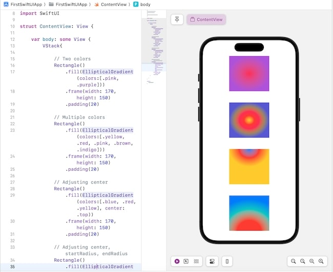
Elliptical Gradient
Elliptical gradient is used to create a transition of two or more colors where the gradient will display in an ellipse shape. We can create an elliptical gradient with the help of EllipticalGradient() function supported by SwiftUI.
This function creates an elliptical gradient from the center to the edge of the given area, here the initial color will present at the center and the final color will present at the edge of the given shape.
By changing the values of center, startRadiusFraction and endRadiusFraction parameters we can able to create different variations in the elliptical gradient.
Syntax
Following is the syntax −
EllipticalGradient(colors:[Color], center: UnitPoint, startRadiusFraction: CGFloat, endRadiusFraction:CGFloat)
Parameter
This method takes the following parameters −
- colors: It is an array of Color objects.
- center: It represent the center points.
- startRadiusFraction: It represents the starting value of the radius. Here the value varies between 0 and 1. The 0 value maps to the center point whereas 1 value maps to the diameter of the circle.
- endRadiusFraction: It represents the ending value of the radius. Here the value varies between 0 and 1. The 0 value maps to the center point whereas 1 value maps to the diameter of the circle.
Example
The Following SwiftUI program is to apply elliptical gradient.
import SwiftUI
struct ContentView: View {
   var body: some View {
      VStack{
         Rectangle().fill(.pink.gradient).frame(width: 250, height: 200)
         Circle().fill(.mint.gradient)
      }
   }
}
#Preview {
   ContentView()
}
Output