- SwiftUI - Home
- SwiftUI - Overview
- SwiftUI vs UIkit
- SwiftUI Environment
- SwiftUI - Environment Setup
- SwiftUI - Basic Components
- SwiftUI - Building First Application
- SwiftUI Views
- SwiftUI - Views
- SwiftUI - Customize Text View
- SwiftUI - Custom Image View
- SwiftUI - Stacks
- SwiftUI Drawing Shapes
- SwiftUI - Shapes
- SwiftUI - Drawing line
- SwiftUI - Drawing Rectangle
- SwiftUI - Drawing Rounded Rectangle
- SwiftUI - Drawing Triangle
- SwiftUI - Drawing Circle
- SwiftUI - Drawing Star
- SwiftUI - Drawing Polygon
- SwiftUI - Drawing Pie chart
- SwiftUI - Using built-in shapes
- SwiftUI - Text
- SwiftUI - Text View
- SwiftUI - Text Input and Output
- SwiftUI - Color
- SwiftUI - Color
- SwiftUI - Colorpicker
- SwiftUI - Gradients
- SwiftUI - Adjust Color
- SwiftUI - Effects
- SwiftUI - Effects
- SwiftUI - Blend Effect
- SwiftUI - BLur Effect
- SwiftUI - Shadow Effect
- SwiftUI - Hover Effect
- SwiftUI - Animations
- SwiftUI - Animations
- SwiftUI - Creating Animations
- SwiftUI - Creating an Explicit Animation
- SwiftUI - Multiple Animations
- SwiftUI - Transitions
- SwiftUI - Asymmetric Transition
- SwiftUI - Custom Transition
- SwiftUI - Image
- SwiftUI - Images
- SwiftUI - Image as Background
- SwiftUI - Rotating Image
- SwiftUI - Media
- SwiftUI - View Layout
- SwiftUI - View Layout
- SwiftUI - View Size
- SwiftUI - View Spacing
- SwiftUI - View Padding
- SwiftUI - UI Controls
- SwiftUI - UI Controls
- SwiftUI - Button
- SwiftUI - CheckBox
- SwiftUI - Menubar
- SwiftUI - Toolbar
- SwiftUI - Search Bar
- SwiftUI - TextField
- SwiftUI - Slider
- SwiftUI - Toggle
- SwiftUI - Pickers
- SwiftUI - Menus
- SwiftUI - List & Tables
- SwiftUI - Lists
- SwiftUI - Static List
- SwiftUI - Dynamic List
- SwiftUI - Customize List
- SwiftUI - Tables
- SwiftUI - Forms
- SwiftUI - Forms
- SwiftUI - Breaking Forms in Sections
- SwiftUI - Event Handling
- SwiftUI - Event Handling
- SwiftUI - Gesture
- SwiftUI - Clipboard
- SwiftUI - Drag and Drop
- SwiftUI - Focus
- SwiftUI - Alert
- SwiftUI - Miscellaneous
- SwiftUI - Containers
- SwiftUI - Navigation
- SwiftUI - Notifications
- SwiftUI - Cross-Platform UI
- SwiftUI - Data
- SwiftUI - Accessibility
- SwiftUI - Framework Integration
- SwiftUI - Framework Integration
- SwiftUI - Interfacing with UIKit
- SwiftUI - Creating macOS App
- SwiftUI Useful Resources
- SwiftUI - Useful Resources
- SwiftUI - Discussion
SwiftUI - Text View
SwiftUI - Text View
Text View displays one or more lines of static text or strings in SwiftUI. It is the developers' most commonly used building block to display textual data on the user interface. The text displayed by this view is read-only means we are not allowed to edit the text.
If we want to display dynamic text then we need to use text with variables. We are allowed to change the appearance and behavior of the Text view with the help of pre-define modifiers provided by the SwiftUI. In this chapter, we will learn how to implement Text View and how to customize the Text View.
Syntax
Following is the syntax −
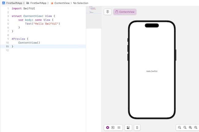
Text("Hello SwiftUI")
Example
The Following SwiftUI program is used to display static text on the view.
import SwiftUI

struct ContentView: View {
   var body: some View {
      Text("Hello SwiftUI")
   }
}
#Preview {
   ContentView()
}
Output
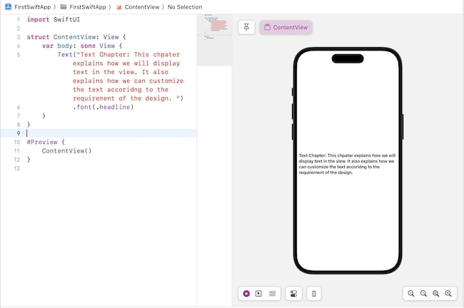
Multiline Text
In SwiftUI, we are allowed to display single or multiple lines or a paragraph using Text View. It also provides modifiers such as .multilineTextAlignment, lineLimit, .foregroundStyle, etc. to customize the appearance of the multi-line text in the user interface.
Example
The Following SwiftUI program is used to display multiple lines of text on the view.
import SwiftUI

struct ContentView: View {
   var body: some View {
      Text("Text Chapter: This chapter explains how we will display text in the view. It also explains how we can customize the text according to the requirement of the design. ").font(.headline)
   }
}
#Preview {
   ContentView()
}
Output
Customize Text View
Customize Text View means we can change the look of the text including text color, background color, font style, alignment, line spacing,e etc., in the user interface. We can change the appearance of the text to fit in the desired design of the interface using the following modifiers −
- Font
- Font Style
- Alignment
- Color
- Line Spacing
- Line Limit
Let us discuss these modifiers in detail along with examples −
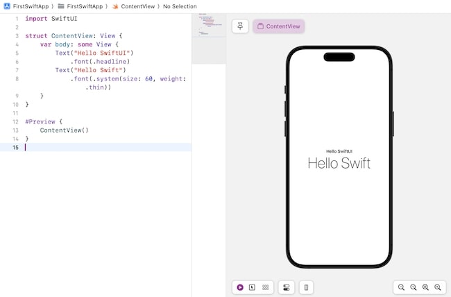
Customizing Font
We can customize the font of the text view with the help of a font modifier. We can use this modifier in two different ways −
Basic font style: This modifier supports predefined styles that are already supported by the system and they are: .title, .largeTitle, .title2, .title3, .headline, .subheadline, .body, .caption, .caption2, etc. Following is the syntax −
.font(.title)
Custom Font: We can also create custom font. with the help of the .font() modifier. Here we can specify the size, weight, design, etc., of the font. Following is the syntax −
.font(.system(size: 30, weight: .bold))
Example
The Following SwiftUI program is used to change the font of the text present in the text view.
import SwiftUI

struct ContentView: View {
   var body: some View {
      Text("Hello SwiftUI").font(.headline)
      Text("Hello Swift").font(.system(size: 60, weight: .thin))
   }
}
#Preview {
   ContentView()
}
Output
Customizing Font Style
SwiftUI provide various modifiers to style the text present in the text view. Using these modifiers we can adjust the weight, design, size, etc., of the font. Some of the commonly used font styles are as follows −
| Modifier Name | Syntax | Description |
|---|---|---|
| Font Weight | .fontWeight()->Text | This modifier is used to specify the font weight of the given text. It takes only one parameter which is weight and its value can be: .black, .bold, .heavy, .light, .medium, .regular, .semibold, .thin, .ultraLight. |
| Italic | .italic() | It is used to apply italics to the text. |
| Underline | .underLine()-> Text | It is used to apply underlining to the text. It takes two parameters: the value of the isActive parameter represents whether the text has an underline or not whereas the color is used to represent the color of the underline. The default color is black. |
| Strikethrough | .strikethrough()-> Text | It is used to strikethrough the text. It takes two parameters: the value of the isActive parameter represents whether the text has strikethrough applied or not whereas the color is used to represent the color of the strikethrough. The default color is black. |
| Kerning | .kerning()-> Text | It is used to set the spacing between each character present in a line. It takes only one parameter that represents the amount of space between each character. The default value of this modifier is 0. |
| Bold | .bold() | It is used to bold the text. |
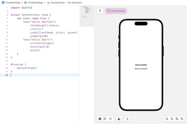
Example
The Following SwiftUI program is used to style text present in the text view.
import SwiftUI

struct ContentView: View {
   var body: some View {
      Text("Hello SwiftUI")
         .fontWeight(.heavy)
         .italic()
         .underline(true, color: .green)
         .padding(10)
      Text("Hello Swift")
         .strikethrough()
         .kerning(3.0)
         .bold()
   }
}
#Preview {
   ContentView()
}
Output
Text Alignment
In SwiftUI, alignment is used to specify the position of the text inside the given container or view. We can change the alignment of the given text using any of the following modifiers −
The .frame() modifier
This is used specify the position of the view inside the invisible frame. Following is the syntax −
.frame(width:CGFloat, height:CGFloat, alignment: Alignment)
It takes the following parameters −
- width: It is used to set the width of the frame. If the value of this parameter is nil, then the width of the frame will be set according to the view's sizing behaviour.
- height: It is used to set the height of the frame. If the value of this parameter is nil, then the height of the frame will be set according to the view's sizing behaviour.
- Alignment: It is used to set the alignment of the view inside the frame. The value of this parameter can be of any one among these: .topLeading, .top, .topTrailing, .leading, .center, .trailing, .bottomLeading, .bottom, .bottomTrailing.
The multilineTextAlignment(_:) modifier
This used set the alignment of multiple lines in the text view. Following is the syntax −
.multilineTextAlignment(_alignment: TextAlignement) -> some View
This takes only one parameter which is alignment. The value of this parameter can be of any one among these: .leading, .trailing, and .center.
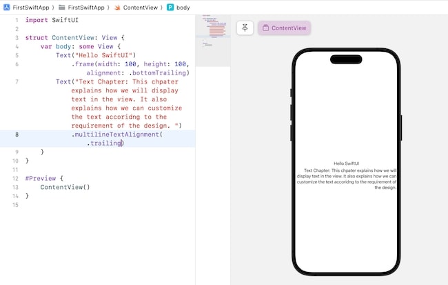
Example
The Following SwiftUI program is used to align the text on the view.
import SwiftUI

struct ContentView: View {
   var body: some View {
      Text("Hello SwiftUI")
         .frame(width: 100, height: 100, alignment: .bottomTrailing)
      Text("Text Chapter: This chapter explains how we will display text in the view. It also explains how we can customize the text according to the requirement of the design. ")
         .multilineTextAlignment(.trailing)
   }
}
#Preview {
   ContentView()
}
Output
Customizing Color
In SwiftUI, we are allowed to enhance the appearance of the text by changing the text color and background color. We can change the color of the text using the following modifiers −
.foregroundStyle(_:) modifier: This modifier is used to style the foreground text/elements. Following is the syntax −
.foregroundStyle<S>(_style:S)-> some View where S : ShapeStyle
This modifier takes only one parameter which is style. Here style represents either the color or pattern of the foreground text/element.
To change the color of the text we use Color.colorName attribute in this modifier, it changes the color of the text. Apart from Color, image() and linearGradient() are also the attributes of the foregroundstyle modifier.
.background(_:) modifier: This modifier is used to style the background color of the text view. Following is the syntax −
.background(.colorName)
This modifier takes the name of the color which we want to use as a background for the text.
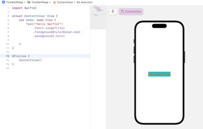
Example
The Following SwiftUI program is used to background and foreground color of the text on the view.
import SwiftUI

struct ContentView: View {
   var body: some View {
      Text("Hello SwiftUI")
         .font(.largeTitle)
         .foregroundStyle(Color.red)
         .background(.mint)
   }
}

#Preview {
   ContentView()
}
Output
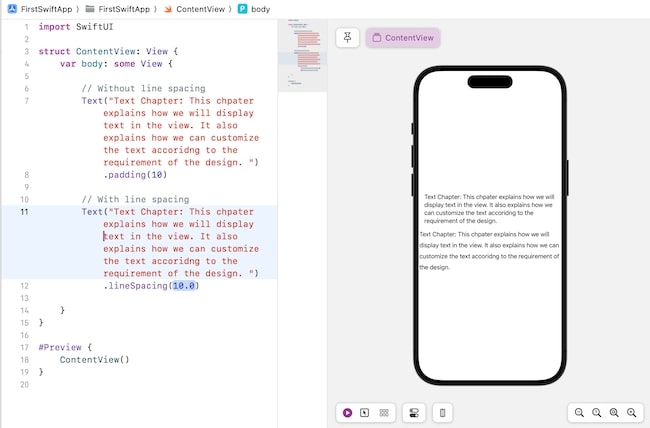
Line Spacing
To add extra space between the lines SwiftUI provide a .lineSpacing modifier.
Syntax
Following is the syntax −
.lineSpacing(_lineSpacing:CGFloat)-> some View
This modifier takes only one parameter lineSpacing. It represents the amount of extra space between the bottom of one line and the top of the next line.
Example
The Following SwiftUI program is used to add line spacing in between the lines present in the text view.
import SwiftUI

struct ContentView: View {
   var body: some View {

      // Without line spacing
      Text("Text Chapter: This chapter explains how we will display text in the view. It also explains how we can customize the text according to the requirement of the design. ")
      .padding(10)

      // With line spacing
      Text("Text Chapter: This chapter explains how we will display text in the view. It also explains how we can customize the text according to the requirement of the design. ")
      .lineSpacing(10.0)

   }
}
#Preview {
   ContentView()
}
Output
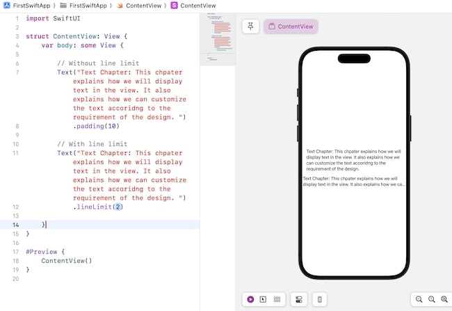
Line Limit
To limit the number of lines displayed on the user interface SwiftUI provides a modifier named as .lineLine(_:). If the text present in the given is overflowing then it uses ellipsis(...) at the end of the last line of the text.
Syntax
Following is the syntax −
.lineLimit(_number: Int?)->some View
It takes only one parameter which is the number that represents the line limit. If the value of this modifier is nil then there is no line limit.
Example
The Following SwiftUI program is used to limit the number of lines in the text view.
import SwiftUI

struct ContentView: View {
   var body: some View {

      // Without line limit
      Text("Text Chapter: This chapter explains how we will display text in the view. It also explains how we can customize the text according to the requirement of the design. ")
          .padding(10)

      // With line limit
      Text("Text Chapter: This chapter explains how we will display text in the view. It also explains how we can customize the text according to the requirement of the design. ").lineLimit(2)
   }
}

#Preview {
   ContentView()
}
Output