- SwiftUI - Home
- SwiftUI - Overview
- SwiftUI vs UIkit
- SwiftUI Environment
- SwiftUI - Environment Setup
- SwiftUI - Basic Components
- SwiftUI - Building First Application
- SwiftUI Views
- SwiftUI - Views
- SwiftUI - Customize Text View
- SwiftUI - Custom Image View
- SwiftUI - Stacks
- SwiftUI Drawing Shapes
- SwiftUI - Shapes
- SwiftUI - Drawing line
- SwiftUI - Drawing Rectangle
- SwiftUI - Drawing Rounded Rectangle
- SwiftUI - Drawing Triangle
- SwiftUI - Drawing Circle
- SwiftUI - Drawing Star
- SwiftUI - Drawing Polygon
- SwiftUI - Drawing Pie chart
- SwiftUI - Using built-in shapes
- SwiftUI - Text
- SwiftUI - Text View
- SwiftUI - Text Input and Output
- SwiftUI - Color
- SwiftUI - Color
- SwiftUI - Colorpicker
- SwiftUI - Gradients
- SwiftUI - Adjust Color
- SwiftUI - Effects
- SwiftUI - Effects
- SwiftUI - Blend Effect
- SwiftUI - BLur Effect
- SwiftUI - Shadow Effect
- SwiftUI - Hover Effect
- SwiftUI - Animations
- SwiftUI - Animations
- SwiftUI - Creating Animations
- SwiftUI - Creating an Explicit Animation
- SwiftUI - Multiple Animations
- SwiftUI - Transitions
- SwiftUI - Asymmetric Transition
- SwiftUI - Custom Transition
- SwiftUI - Image
- SwiftUI - Images
- SwiftUI - Image as Background
- SwiftUI - Rotating Image
- SwiftUI - Media
- SwiftUI - View Layout
- SwiftUI - View Layout
- SwiftUI - View Size
- SwiftUI - View Spacing
- SwiftUI - View Padding
- SwiftUI - UI Controls
- SwiftUI - UI Controls
- SwiftUI - Button
- SwiftUI - CheckBox
- SwiftUI - Menubar
- SwiftUI - Toolbar
- SwiftUI - Search Bar
- SwiftUI - TextField
- SwiftUI - Slider
- SwiftUI - Toggle
- SwiftUI - Pickers
- SwiftUI - Menus
- SwiftUI - List & Tables
- SwiftUI - Lists
- SwiftUI - Static List
- SwiftUI - Dynamic List
- SwiftUI - Customize List
- SwiftUI - Tables
- SwiftUI - Forms
- SwiftUI - Forms
- SwiftUI - Breaking Forms in Sections
- SwiftUI - Event Handling
- SwiftUI - Event Handling
- SwiftUI - Gesture
- SwiftUI - Clipboard
- SwiftUI - Drag and Drop
- SwiftUI - Focus
- SwiftUI - Alert
- SwiftUI - Miscellaneous
- SwiftUI - Containers
- SwiftUI - Navigation
- SwiftUI - Notifications
- SwiftUI - Cross-Platform UI
- SwiftUI - Data
- SwiftUI - Accessibility
- SwiftUI - Framework Integration
- SwiftUI - Framework Integration
- SwiftUI - Interfacing with UIKit
- SwiftUI - Creating macOS App
- SwiftUI Useful Resources
- SwiftUI - Useful Resources
- SwiftUI - Discussion
SwiftUI - Pickers
Pickers are the special type of UI controls in SwiftUI. Pickers are used to store a set of related data and allow users to pick the desired data from the given set of data. It is quite similar to drop-down or spinners.
They are commonly used to select a single value, select multiple values, select date and time, controls, etc. They are compact, consistent, and can be customized in various styles. In SwiftUI, there are three types of pickers available, and they are:
Regular Picker View
DatePicker View
ColorPicker View
Picker View in SwiftUI
We can create a picker with the help of a Picker structure. With the help of this Picker, we can provide the label, binding, and content of the picker. It can display a set of data in various styles such as wheel, list, or segments.
Syntax
Following is the syntax −
Picker(
   _ titleKey: LocalizedStringKey,
   selection: BindingValue
)
Parameters
Following parameters are used by this view −
titleKey: Represent the label or purpose of selecting an option.
selection: Represent the current selected option.
Example
The following SwiftUI program creates a picker.
import SwiftUI

struct ContentView: View {
   @State private var selectedOption = "Open"
   let options = ["New", "Open", "SaveAs", "Save", "Recent"]
   var body: some View {
      VStack{
         Picker("Select an option", selection: $selectedOption){
            ForEach(options, id:\.self){x  in Text(x)}
         }
      }
   }
}
#Preview {
   ContentView()
}
Output

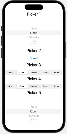
Styling Picker View in SwiftUI
We can style the picker using a pre-defined modifier named pickerStyle(). This modifier styles the given picker either in customized style or in standard styles/pre-defined styles. For customize style, we have to create a custom style that conforms to the PickerStyle protocol.
Whereas standard styles are menu, automatic, wheel, inline, palette, navigationLink, radioGroup, and segment. We can apply these styles to all types of pickers.
Syntax
Following is the syntax −
pickerStyle(style)
Example
The following SwiftUI program styles the picker.
import SwiftUI

struct ContentView: View {
   @State private var selectedOption = "Open"
   let options = ["New", "Open", "SaveAs", "Save", "Recent"]
   var body: some View {
      VStack{
         Text("Picker 1").font(.title)
         Picker("Select an option", selection: $selectedOption){
            ForEach(options, id:\.self){x  in Text(x)}
         }.pickerStyle(.inline)
         Text("Picker 2").font(.title)
         Picker("Select an option", selection: $selectedOption){
            ForEach(options, id:\.self){x  in Text(x)}
         }.pickerStyle(.menu)
         Text("Picker 3").font(.title)
         Picker("Select an option", selection: $selectedOption){
            ForEach(options, id:\.self){x  in Text(x)}
         }.pickerStyle(.palette)
         Text("Picker 4").font(.title)
         Picker("Select an option", selection: $selectedOption){
            ForEach(options, id:\.self){x  in Text(x)}
         }.pickerStyle(.segmented)
         Text("Picker 5").font(.title)
         Picker("Select an option", selection: $selectedOption){
            ForEach(options, id:\.self){x  in Text(x)}
         }.pickerStyle(.wheel)
      }
   }
}
#Preview {
   ContentView()
}
Output
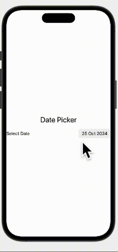
DatePicker View in SwiftUI
DatePicker view in SwiftUI is used to display a set of dates, times or both so that a user can choose them according to their requirement. It also provides a user-friendly interface to select calendar date, time or both. It can also display data in various styles such as wheel, compact, graphical, etc.
Syntax
Following is the syntax −
Picker(
   _ titleKey: LocalizedStringKey,
   selection: BindingValue,
   displayedComponents: [.time, .Date]
)
Parameters
Following parameters are used by this view −
titleKey: Represent its purpose.
selection: Represent the current selected option.
displayedComponents: Represent the date components such as .hourAndMinute, .date, .hourMinuteAndSecond, etc.
Example
The following SwiftUI program creates a date picker.
import SwiftUI

struct ContentView: View {
   @State private var selectedOption = Date()

   var body: some View {
      VStack{
         Text("Date Picker").font(.title)
         DatePicker("Select Date", selection: $selectedOption, displayedComponents: [.date])
      }
   }
}

#Preview {
   ContentView()
}
Output
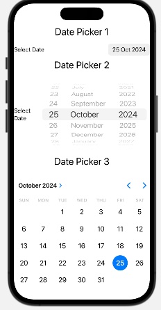
Style DatePicker
In SwiftUI, we can style a date picker with the help of the datePickerStyle() modifier. It styles date picker in either customised as well as in pre-defined styles. The customised style should conform the datePickerStyle protocol. It can style date picker in automatic, graphical, wheel, and compact.
Syntax
Following is the syntax −
pickerStyle(style)
Example
The following SwiftUI program styles date picker.
import SwiftUI

struct ContentView: View {
   @State private var selectedOption = Date()

   var body: some View {
      VStack{
         Text("Date Picker 1").font(.title)
         DatePicker("Select Date", selection: $selectedOption, displayedComponents: [.date]).datePickerStyle(.compact)
         Text("Date Picker 2").font(.title)
         DatePicker("Select Date", selection: $selectedOption, displayedComponents: [.date]).datePickerStyle(.wheel)
         Text("Date Picker 3").font(.title)
         DatePicker("Select Date", selection: $selectedOption, displayedComponents: [.date]).datePickerStyle(.graphical)
      }
   }
}

#Preview {
   ContentView()
}
Output
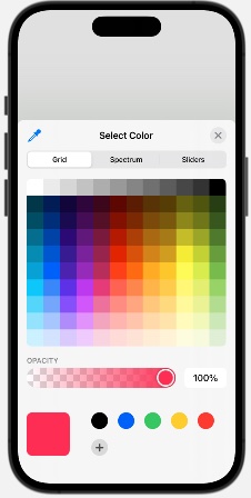
ColorPicker View in SwiftUI
In SwiftUI, ColorPicker is used to select color from the given system of color. It provides a color pallet which contains all the colors supported by the system, from this pallet, the user can select a new color.
It also provides an opacity setting feature so that we can adjust the opacity of the selected color.
Syntax
Following is the syntax −
ColorPicker(
   _ titleKey: LocalizedStringKey,
   selection: BindingValue,
   supportsOpacity: Bool
)
Parameters
Following parameters are used by this view −
titleKey: Represent the purpose or title of the picker.
selection: Represent the currently selected color.
supportsOpacity: Represent the opacity of the color. By default, the value of this parameter is true, which means the color picker will contain the opacity slider.
Example
The following SwiftUI program creates a color picker.
import SwiftUI

struct ContentView: View {
   @State private var selectedOption : Color = .pink

   var body: some View {
      VStack{
         ColorPicker("Select Color", selection: $selectedOption)
      }
   }
}

#Preview {
   ContentView()
}
Output