- SwiftUI - Home
- SwiftUI - Overview
- SwiftUI vs UIkit
- SwiftUI Environment
- SwiftUI - Environment Setup
- SwiftUI - Basic Components
- SwiftUI - Building First Application
- SwiftUI Views
- SwiftUI - Views
- SwiftUI - Customize Text View
- SwiftUI - Custom Image View
- SwiftUI - Stacks
- SwiftUI Drawing Shapes
- SwiftUI - Shapes
- SwiftUI - Drawing line
- SwiftUI - Drawing Rectangle
- SwiftUI - Drawing Rounded Rectangle
- SwiftUI - Drawing Triangle
- SwiftUI - Drawing Circle
- SwiftUI - Drawing Star
- SwiftUI - Drawing Polygon
- SwiftUI - Drawing Pie chart
- SwiftUI - Using built-in shapes
- SwiftUI - Text
- SwiftUI - Text View
- SwiftUI - Text Input and Output
- SwiftUI - Color
- SwiftUI - Color
- SwiftUI - Colorpicker
- SwiftUI - Gradients
- SwiftUI - Adjust Color
- SwiftUI - Effects
- SwiftUI - Effects
- SwiftUI - Blend Effect
- SwiftUI - BLur Effect
- SwiftUI - Shadow Effect
- SwiftUI - Hover Effect
- SwiftUI - Animations
- SwiftUI - Animations
- SwiftUI - Creating Animations
- SwiftUI - Creating an Explicit Animation
- SwiftUI - Multiple Animations
- SwiftUI - Transitions
- SwiftUI - Asymmetric Transition
- SwiftUI - Custom Transition
- SwiftUI - Image
- SwiftUI - Images
- SwiftUI - Image as Background
- SwiftUI - Rotating Image
- SwiftUI - Media
- SwiftUI - View Layout
- SwiftUI - View Layout
- SwiftUI - View Size
- SwiftUI - View Spacing
- SwiftUI - View Padding
- SwiftUI - UI Controls
- SwiftUI - UI Controls
- SwiftUI - Button
- SwiftUI - CheckBox
- SwiftUI - Menubar
- SwiftUI - Toolbar
- SwiftUI - Search Bar
- SwiftUI - TextField
- SwiftUI - Slider
- SwiftUI - Toggle
- SwiftUI - Pickers
- SwiftUI - Menus
- SwiftUI - List & Tables
- SwiftUI - Lists
- SwiftUI - Static List
- SwiftUI - Dynamic List
- SwiftUI - Customize List
- SwiftUI - Tables
- SwiftUI - Forms
- SwiftUI - Forms
- SwiftUI - Breaking Forms in Sections
- SwiftUI - Event Handling
- SwiftUI - Event Handling
- SwiftUI - Gesture
- SwiftUI - Clipboard
- SwiftUI - Drag and Drop
- SwiftUI - Focus
- SwiftUI - Alert
- SwiftUI - Miscellaneous
- SwiftUI - Containers
- SwiftUI - Navigation
- SwiftUI - Notifications
- SwiftUI - Cross-Platform UI
- SwiftUI - Data
- SwiftUI - Accessibility
- SwiftUI - Framework Integration
- SwiftUI - Framework Integration
- SwiftUI - Interfacing with UIKit
- SwiftUI - Creating macOS App
- SwiftUI Useful Resources
- SwiftUI - Useful Resources
- SwiftUI - Discussion
SwiftUI - Drawing Rounded Rectangle
Rounded Rectangle is a rectangle but with rounded corners. This shape is created by defining the radius of the curvature for its corners. In UI, the rounded rectangle is used to design fields, buttons, icons, etc. because visually it is more appealing as compared to a rectangle. SwiftUI provides an in-built function to create a rounded rectangle but here we will create a rounded rectangle without any in-built function.
Drawing Rounded Rectangle in SwiftUI
In SwiftUI, we can create line and line segments using the addLine(to:) method. This method adds a straight line segment from the current point to the given point(end point). This function takes two coordinates(CGPoint(x:, y:)) which is the length of the line from the current point and the endpoint to where the line will end.
Syntax
Following is the syntax −
addLine(to end: CGPoint)
This function takes only one parameter that is "end". It represents the location of the end point of the line segment in the user space coordinates.
Steps to Draw a Rounded Rectangle in SwiftUI
Follow the following steps to draw a rounded rectangle in SwiftUI −
Step 1: Define the Custom Shape
To draw a custom rounded rectangle we need to create a struct that conforms to Shape protocol. In this structure, we will define how the rounded rectangle will be created. Or we can say define the path(in:) method
struct RoundedRectangle: Shape {
   var cRadius: CGFloat
   var corners: UIRectCorner

   func path(in rRect: CGRect) -> Path {
      let xpath = UIBezierPath(
         roundedRect: rRect,
         byRoundingCorners: corners,
         cornerRadii: CGSize(width: cRadius, height: cRadius)
      )
      return Path(xpath.cgPath)
   }
}
Step 2: Create a View
Now we use the custom rounded rectangle in a SwiftUI view. It will show how the custom rounded rectangle will look.
struct ContentView: View {
   var body: some View {
      RoundedRectangle(cRadius: 30, corners: [.topLeft, .topRight, .bottomLeft, .bottomRight])
   }
}
Step 3: Adding Additional Customization
We can also include additional customization like stroke, fill, shadow, overlay text etc. in the rounded rectangle.
struct ContentView: View {
   var body: some View {
      RoundedRectangle(cRadius: 30, corners: [.topLeft, .topRight, .bottomLeft, .bottomRight])
         .fill(Color.blue)
         .frame(width: 200, height: 100)
         .padding()
   }
}
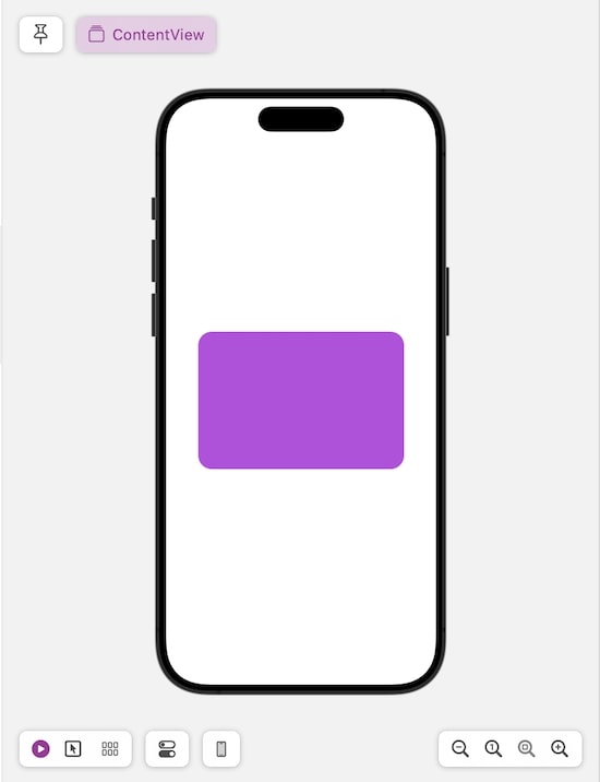
Example 1
The following SwiftUI program is used to create a solid custom rounded rectangle.
import SwiftUI

struct RoundedRectangle: Shape {
   var cRadius: CGFloat
   var corners: UIRectCorner

   func path(in rRect: CGRect) -> Path {
      let xpath = UIBezierPath(
         roundedRect: rRect,
         byRoundingCorners: corners,
         cornerRadii: CGSize(width: cRadius, height: cRadius)
      )
      return Path(xpath.cgPath)
   }
}
struct ContentView: View {
   var body: some View {
      RoundedRectangle(cRadius: 30, corners: [.topLeft, .topRight, .bottomLeft, .bottomRight])
         .fill(Color.blue)
         .frame(width: 200, height: 100)
         .padding()
   }
}

#Preview {
   ContentView()
}
Output

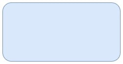
Example 2
The following SwiftUI program is used to draw a custom rounded rectangle. Here we will create each line and corner of the rounded rectangle.
import SwiftUI

struct RoundedRectangle: Shape {
   var topLeftRadius: CGFloat
   var topRightRadius: CGFloat
   var bottomLeftRadius: CGFloat
   var bottomRightRadius: CGFloat

   func path(in rectangle: CGRect) -> Path {
      var xpath = Path()
      // Define the starting point of the rectangle
      let sPoint = CGPoint(x: rectangle.minX + topLeftRadius, y: rectangle.minY)

      // Move to the starting point
      xpath.move(to: sPoint)

      // Top Right Side
      xpath.addLine(to: CGPoint(x: rectangle.maxX - topRightRadius, y: rectangle.minY))
      xpath.addArc(
	     center: CGPoint(x: rectangle.maxX - topRightRadius,
	     y: rectangle.minY + topRightRadius),
         radius: topRightRadius, startAngle: Angle(degrees: -90),
         endAngle: Angle(degrees: 0), clockwise: false
      )

      // Right Bottom Side
      xpath.addLine(to: CGPoint(x: rectangle.maxX, y: rectangle.maxY - bottomRightRadius))
      xpath.addArc(
	     center: CGPoint(x: rectangle.maxX - bottomRightRadius, y: rectangle.maxY - bottomRightRadius),
         radius: bottomRightRadius,
         startAngle: Angle(degrees: 0),
         endAngle: Angle(degrees: 90),
         clockwise: false
      )

      // Bottom Left Side
      xpath.addLine(to: CGPoint(x: rectangle.minX + bottomLeftRadius, y: rectangle.maxY))
      xpath.addArc(center: CGPoint(x: rectangle.minX + bottomLeftRadius, y: rectangle.maxY - bottomLeftRadius),
         radius: bottomLeftRadius,
         startAngle: Angle(degrees: 90),
         endAngle: Angle(degrees: 180),
         clockwise: false)

        // Top Left side
        xpath.addLine(to: CGPoint(x: rectangle.minX, y: rectangle.minY + topLeftRadius))
        xpath.addArc(center: CGPoint(x: rectangle.minX + topLeftRadius, y: rectangle.minY + topLeftRadius),
           radius: topLeftRadius,
           startAngle: Angle(degrees: 180),
           endAngle: Angle(degrees: 270),
           clockwise: false)

        return xpath
   }
}

struct ContentView: View {
   var body: some View {
      RoundedRectangle(topLeftRadius: 20, topRightRadius: 20, bottomLeftRadius: 20, bottomRightRadius: 20)
         .fill(Color.purple)
        .frame(width: 300, height: 200)
   }
}
Output
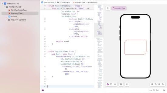
To create a stroke-rounded rectangle we will use the .stroke modifier. Here we will make changes in the view section only and the rest of the code is the same as above
struct ContentView: View {
   var body: some View {
      RoundedRectangle(topLeftRadius: 20, topRightRadius: 20, bottomLeftRadius: 20, bottomRightRadius: 20)
         .stroke(Color.red, lineWidth: 3)
         .frame(width: 300, height: 200)
   }
}
Output
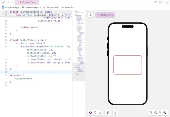
Using the above code we can customize the rounded rectangle according to our need. Here we change the size of each corner and it will create an uneven rounded rectangle.
struct ContentView: View {
   var body: some View {
      RoundedRectangle(topLeftRadius: 50, topRightRadius: 20, bottomLeftRadius: 20, bottomRightRadius: 50)
         .stroke(Color.red, lineWidth: 3)
         .frame(width: 300, height: 200)
   }
}
Output