- SwiftUI - Home
- SwiftUI - Overview
- SwiftUI vs UIkit
- SwiftUI Environment
- SwiftUI - Environment Setup
- SwiftUI - Basic Components
- SwiftUI - Building First Application
- SwiftUI Views
- SwiftUI - Views
- SwiftUI - Customize Text View
- SwiftUI - Custom Image View
- SwiftUI - Stacks
- SwiftUI Drawing Shapes
- SwiftUI - Shapes
- SwiftUI - Drawing line
- SwiftUI - Drawing Rectangle
- SwiftUI - Drawing Rounded Rectangle
- SwiftUI - Drawing Triangle
- SwiftUI - Drawing Circle
- SwiftUI - Drawing Star
- SwiftUI - Drawing Polygon
- SwiftUI - Drawing Pie chart
- SwiftUI - Using built-in shapes
- SwiftUI - Text
- SwiftUI - Text View
- SwiftUI - Text Input and Output
- SwiftUI - Color
- SwiftUI - Color
- SwiftUI - Colorpicker
- SwiftUI - Gradients
- SwiftUI - Adjust Color
- SwiftUI - Effects
- SwiftUI - Effects
- SwiftUI - Blend Effect
- SwiftUI - BLur Effect
- SwiftUI - Shadow Effect
- SwiftUI - Hover Effect
- SwiftUI - Animations
- SwiftUI - Animations
- SwiftUI - Creating Animations
- SwiftUI - Creating an Explicit Animation
- SwiftUI - Multiple Animations
- SwiftUI - Transitions
- SwiftUI - Asymmetric Transition
- SwiftUI - Custom Transition
- SwiftUI - Image
- SwiftUI - Images
- SwiftUI - Image as Background
- SwiftUI - Rotating Image
- SwiftUI - Media
- SwiftUI - View Layout
- SwiftUI - View Layout
- SwiftUI - View Size
- SwiftUI - View Spacing
- SwiftUI - View Padding
- SwiftUI - UI Controls
- SwiftUI - UI Controls
- SwiftUI - Button
- SwiftUI - CheckBox
- SwiftUI - Menubar
- SwiftUI - Toolbar
- SwiftUI - Search Bar
- SwiftUI - TextField
- SwiftUI - Slider
- SwiftUI - Toggle
- SwiftUI - Pickers
- SwiftUI - Menus
- SwiftUI - List & Tables
- SwiftUI - Lists
- SwiftUI - Static List
- SwiftUI - Dynamic List
- SwiftUI - Customize List
- SwiftUI - Tables
- SwiftUI - Forms
- SwiftUI - Forms
- SwiftUI - Breaking Forms in Sections
- SwiftUI - Event Handling
- SwiftUI - Event Handling
- SwiftUI - Gesture
- SwiftUI - Clipboard
- SwiftUI - Drag and Drop
- SwiftUI - Focus
- SwiftUI - Alert
- SwiftUI - Miscellaneous
- SwiftUI - Containers
- SwiftUI - Navigation
- SwiftUI - Notifications
- SwiftUI - Cross-Platform UI
- SwiftUI - Data
- SwiftUI - Accessibility
- SwiftUI - Framework Integration
- SwiftUI - Framework Integration
- SwiftUI - Interfacing with UIKit
- SwiftUI - Creating macOS App
- SwiftUI Useful Resources
- SwiftUI - Useful Resources
- SwiftUI - Discussion
SwiftUI - Color Picker
SwiftUI - Color Picker
In SwiftUI, ColorPicker is an inbuilt UI component which enables users to select color from the palette. It is a simple interface for color selection. It is always embedded inside the view.
We can include color pickers in various containers such as VStack, HStack, List, etc. The ColorPicker component displays the currently selected color along with a large system color palette from where a user can select a new color.
Syntax
Following is the syntax −
ColorPicker requires a state variable which holds the selected color. Here the currently selected color is red.
@State var myColor = Color.red
ColorPicker(_titlekKey: LocalizedStringKey, selection: Binding<CGColor>, supportsOpacity:Bool = true)
Parameter
This function takes the following parameters −
- text: A text that will display on the view. Or we can say that it is a label for color picker.
- selection: It contains the binding link to the state variable.
- supportOpacity: It is used to check whether the given color picker allows to adjust opacity or not. The default value to this parameter is true.
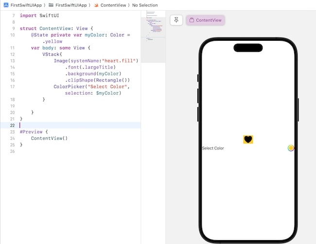
Example
The Following SwiftUI program is used to display static text on the view.
import SwiftUI

struct ContentView: View {
   @State private var myColor: Color = .yellow
   var body: some View {
      VStack{
         Image(systemName:"heart.fill")
            .font(.largeTitle)
            .background(myColor)
            .clipShape(Rectangle())
         ColorPicker("Select Color", selection: $myColor, supportsOpacity: true)
      }
   }
}

#Preview {
   ContentView()
}
Output
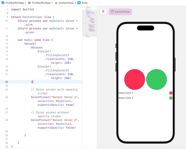
Adjusting Opacity of Color Picker in SwiftUI
Opacity of the color picker represents how much opaque the colors of the color picker are. By default, the colors are opaque means non-transparent. The colorPicker() supports a parameter named "supportOpacity" using which we can add and remove the opacity slider.
By default, the value of this parameter is true which means the color picker will have an opacity slider from where we can adjust the opacity of the color. If the value of this parameter is false, then the color picker will not contain an opacity slider.
Syntax
ColorPicker(_titlekKey: LocalizedStringKey, selection: Binding<CGColor>, supportsOpacity:Bool = true)
Example
The Following SwiftUI program to adjust the opacity slider.
import SwiftUI

struct ContentView: View {
   @State private var myColor1: Color = .pink
   @State private var myColor2: Color = .green

   var body: some View {
      VStack{
         HStack{
            Circle()
               .fill(myColor1)
               .frame(width: 150, height: 150)
            Circle()
               .fill(myColor2)
               .frame(width: 150, height: 150)
         }

         // Color picker with opacity slider
         ColorPicker("Select Color 1", selection: $myColor1, supportsOpacity: true)

         // Color picker without opacity slider
         ColorPicker("Select Color 2", selection: $myColor2, supportsOpacity: false)

      }
   }
}

#Preview {
   ContentView()
}
Output
Custom Color Picker in SwiftUI
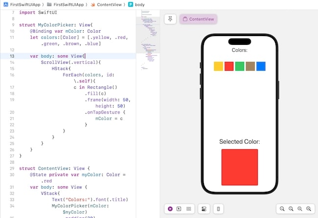
In SwiftUI, we are allowed to create our custom color picker. So for that, we create a structure that conforms to the View protocol and then implement the custom color picker in the body property. Now we call this function in the ContentView to display the custom color picker.
import SwiftUI

struct MyColorPicker: View{
   @Binding var mColor: Color
   let colors:[Color] = [.yellow, .red, .green, .brown, .blue]

   var body: some View{
      ScrollView(.vertical){
         HStack{
            ForEach(colors, id: \.self){
               c in Rectangle()
                  .fill(c)
                  .frame(width: 50, height: 50)
                  .onTapGesture {
                     mColor = c
               }
            }
         }
      }
   }
}
struct ContentView: View {
   @State private var myColor: Color = .red
   var body: some View {
      VStack{
         Text("Colors:").font(.title)
         MyColorPicker(mColor: $myColor)
            .padding(30)
         Text("Selected Color:").font(.largeTitle)
         RoundedRectangle(cornerRadius: 5)
            .fill(myColor)
            .frame(width: 200, height: 200)

      }
   }
}

#Preview {
   ContentView()
}
Output