- SwiftUI - Home
- SwiftUI - Overview
- SwiftUI vs UIkit
- SwiftUI Environment
- SwiftUI - Environment Setup
- SwiftUI - Basic Components
- SwiftUI - Building First Application
- SwiftUI Views
- SwiftUI - Views
- SwiftUI - Customize Text View
- SwiftUI - Custom Image View
- SwiftUI - Stacks
- SwiftUI Drawing Shapes
- SwiftUI - Shapes
- SwiftUI - Drawing line
- SwiftUI - Drawing Rectangle
- SwiftUI - Drawing Rounded Rectangle
- SwiftUI - Drawing Triangle
- SwiftUI - Drawing Circle
- SwiftUI - Drawing Star
- SwiftUI - Drawing Polygon
- SwiftUI - Drawing Pie chart
- SwiftUI - Using built-in shapes
- SwiftUI - Text
- SwiftUI - Text View
- SwiftUI - Text Input and Output
- SwiftUI - Color
- SwiftUI - Color
- SwiftUI - Colorpicker
- SwiftUI - Gradients
- SwiftUI - Adjust Color
- SwiftUI - Effects
- SwiftUI - Effects
- SwiftUI - Blend Effect
- SwiftUI - BLur Effect
- SwiftUI - Shadow Effect
- SwiftUI - Hover Effect
- SwiftUI - Animations
- SwiftUI - Animations
- SwiftUI - Creating Animations
- SwiftUI - Creating an Explicit Animation
- SwiftUI - Multiple Animations
- SwiftUI - Transitions
- SwiftUI - Asymmetric Transition
- SwiftUI - Custom Transition
- SwiftUI - Image
- SwiftUI - Images
- SwiftUI - Image as Background
- SwiftUI - Rotating Image
- SwiftUI - Media
- SwiftUI - View Layout
- SwiftUI - View Layout
- SwiftUI - View Size
- SwiftUI - View Spacing
- SwiftUI - View Padding
- SwiftUI - UI Controls
- SwiftUI - UI Controls
- SwiftUI - Button
- SwiftUI - CheckBox
- SwiftUI - Menubar
- SwiftUI - Toolbar
- SwiftUI - Search Bar
- SwiftUI - TextField
- SwiftUI - Slider
- SwiftUI - Toggle
- SwiftUI - Pickers
- SwiftUI - Menus
- SwiftUI - List & Tables
- SwiftUI - Lists
- SwiftUI - Static List
- SwiftUI - Dynamic List
- SwiftUI - Customize List
- SwiftUI - Tables
- SwiftUI - Forms
- SwiftUI - Forms
- SwiftUI - Breaking Forms in Sections
- SwiftUI - Event Handling
- SwiftUI - Event Handling
- SwiftUI - Gesture
- SwiftUI - Clipboard
- SwiftUI - Drag and Drop
- SwiftUI - Focus
- SwiftUI - Alert
- SwiftUI - Miscellaneous
- SwiftUI - Containers
- SwiftUI - Navigation
- SwiftUI - Notifications
- SwiftUI - Cross-Platform UI
- SwiftUI - Data
- SwiftUI - Accessibility
- SwiftUI - Framework Integration
- SwiftUI - Framework Integration
- SwiftUI - Interfacing with UIKit
- SwiftUI - Creating macOS App
- SwiftUI Useful Resources
- SwiftUI - Useful Resources
- SwiftUI - Discussion
SwiftUI - Color
Color plays an important role in designing a user interface. It enhance the visual appearance of the views and their components. SwiftUI provides various type of predefined, system and custom colors in both light and darker shades.
Also we can modify them with the help of various modifiers such as opacity, gradient, etc. We can also get color from another color such as UIKit, AppKit Core Graphics, etc. In this chapter, we will learn how to use colors in the views or component, how to create custom colors and much more.
The Color Struct in SwiftUI
The Color structure in SwiftUI is used to create various color instances. These color instances can be modified by using RGB, HSL, gray-scale component values or standard color properties.
The instance of color structure can use as argument of background(), fill(), foregroundStyle(), etc., to change the color of the given shape or background. We can also adjust the opacity of all the colors with the help of opacity parameter. The value of this parameters can vary in between 0 to 1.
Syntax
Following is the syntax −
let color = Color()
Example
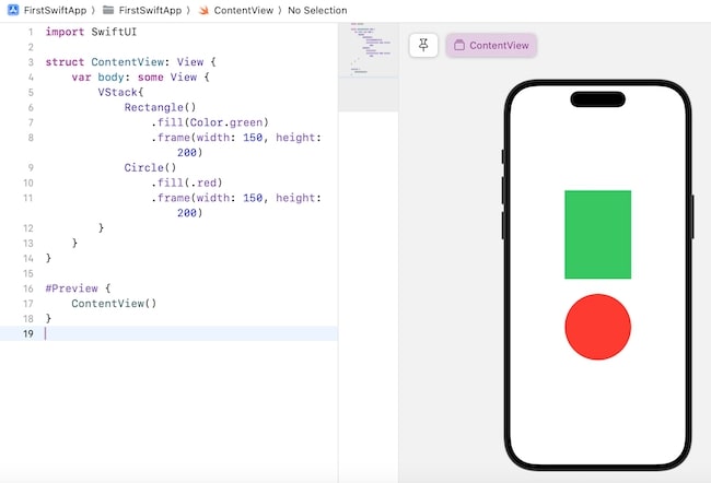
The Following SwiftUI program is add color in the given shapes.
import SwiftUI

struct ContentView: View {
   var body: some View {
      VStack{
         Rectangle()
            .fill(Color.green)
            .frame(width: 150, height: 200)
         Circle()
            .fill(.red)
            .frame(width: 150, height: 200)
      }
   }
}

#Preview {
   ContentView()
}
Output
System Colors in SwiftUI
SwiftUI support various types of default system colors. Using these colors we can change the appearance of user interfaces of macOS, tvOS, watchOS, etc.
These colors are generally defined in the Color struct and they are available in both lighter and darker context. These colors are dynamic they can automatically adjust in either lighter or darker contexts according to the requirement of the standard UI components.
SwiftUI supports the following type of system colors −
- Color.red
- Color.blue
- Color.green
- Color.yellow
- Color.orange
- Color.purple
- Color.pink
- Color.primary
- Color.accentColor
- Color.secondary
- Color.black
- Color.indigo
- Color.teal
- Color.cyan
- Color.mint
- Color.white
- Color.gray
- Color.clear
- Color(.systemRed)
- Color(.systemBlue)
- Color(.systemGreen)
- Color(.systemYellow)
- Color(.systemOrange)
- Color(.systemPink)
- Color(.systemPurple)
- Color(.systemTeal)
- Color(.systemGray)
Syntax
Following is the syntax −
.fill(Color.blue)
Example
The Following SwiftUI program is used to apply system colors to the given shapes.
import SwiftUI

struct ContentView: View {
   var body: some View {
      VStack{
         Capsule()
            .fill(.yellow)
            .frame(width: 150, height: 200)
            .overlay(Text("SwiftUI"))
         Capsule()
            .fill(.secondary)
            .frame(width: 140, height: 200)
            .overlay(Text("SwiftUI").foregroundStyle(.white))
      }
   }
}
#Preview {
   ContentView()
}
Output

Custom Colors in SwiftUI
Apart from pre-define colors SwiftUI allows us to create our own color using any of the following methods−
- Custom color
- Color sets
Custom colors
In SwiftUI, we can create our own color using various components such as RGB(red, green, blue), HSL(hue, saturation, brightness), or grayscale.
- RGB: It is used to create a color by specifying the amount of red, green and blue is used to create that color. Here the value of these can be vary in between 0 to 1. Here 0 represent the color with zero intensity and 1 represent the color with full intensity.
- HSB: It is used to create a color by specifying the amount of hue, saturation and lightness is used to create that color. Here the value of these parameters should be in between 0 to 1.
- Grayscale: Grayscale color are those colors that consists only the shades of gray, means they doesn't have any hue or saturation and vary from black to white. We can create grayscale colors by adjusting the value of white parameter in between 0 and 1.
Syntax
Following is the syntaxes of RGB, HSL, and grayscale −
let color1 = Color(red:Double, green:Double, blue:Double)
let color2 = Color(hue:Double, saturation:Double, brightness:Double)
let color3 = Color(white:Double)
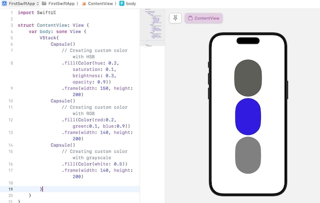
Example
The Following SwiftUI program is used to create custom colors using RGB, HSB, and grayscale.
import SwiftUI

struct ContentView: View {
   var body: some View {
      VStack{
         Capsule()
            // Creating custom color with HSB
            .fill(Color(hue: 0.2, saturation: 0.1, brightness: 0.3, opacity: 0.9))
            .frame(width: 150, height: 200)
         Capsule()
            // Creating custom color with RGB
            .fill(Color(red:0.2, green:0.1, blue:0.9))
            .frame(width: 140, height: 200)
         Capsule()
            // Creating custom color with grayscale
            .fill(Color(white: 0.5))
            .frame(width: 140, height: 200)
      }
   }
}
#Preview {
   ContentView()
}
Output
Color Set
We can also create a custom color by adding a color set in the Assets.xcassets. By adding color in the Assets.xcassets we can use that color in all the views present in that project.
Here we can also specify the light and dark mode of that color with help of RGB values, hex codes or system colors.
To add a color in the assets follow the following steps −
Step 1: Open Assets.
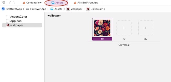
Step 2: Right click on the screen and select "New Color Set".
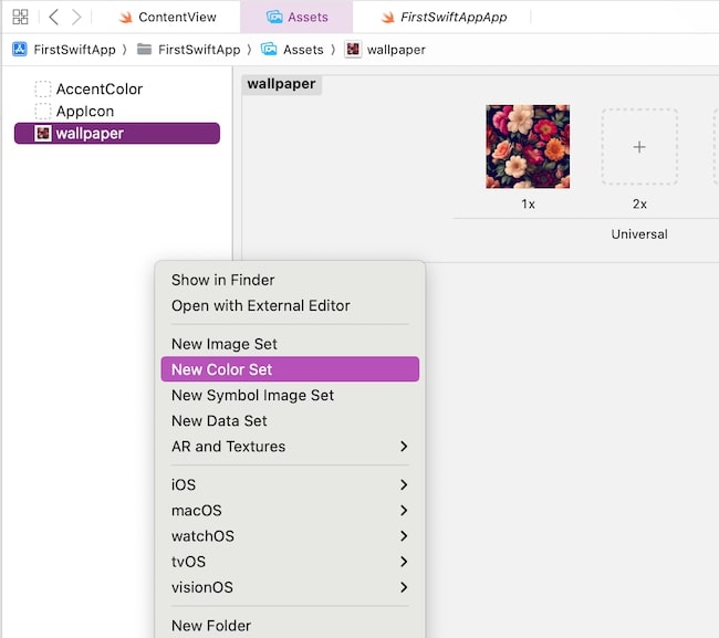
Step 3: Set the name of the color set and then add your new color by setting the RGB and opacity values.
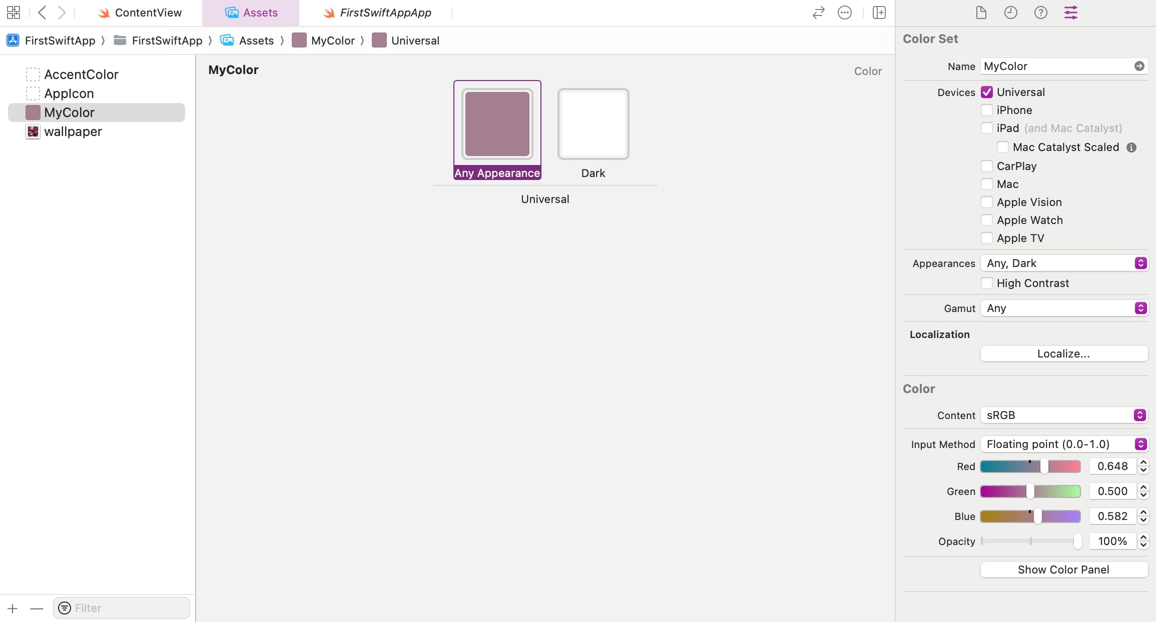
Step 4: Now you are ready to use this color in your project.
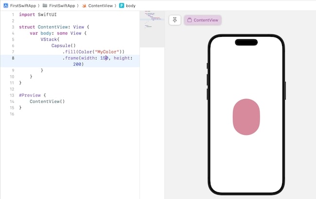
Color("ColorName")
Example
The Following SwiftUI program is used to create custom colors using color set.
import SwiftUI

struct ContentView: View {
   var body: some View {
      VStack{
         Capsule().fill(Color("MyColor")).frame(width: 150, height: 200)
      }
   }
}

#Preview {
   ContentView()
}
Output
Using Colors with Modifiers in SwiftUI
In SwiftUI, we can use colors with various modifiers to change the color of the specified component, text or view. Following are the modifiers that uses color−
- .backgound(.blue): This modifier use color to change the backgound color of the view.
- .foregroundStyle(.pink): It uses color to change the color of the foreground elements.
- .shadow(color:.pink): It is used to change the color of the shadow.
- .fill(.red): It is used to fill the shape with the given color.
- .stroke(Color.yellow): It is used to change the boundary color of the given shape.
