- Matplotlib Basics
- Matplotlib - Home
- Matplotlib - Introduction
- Matplotlib - Environment Setup
- Matplotlib - Anaconda distribution
- Matplotlib - Jupyter Notebook
- Matplotlib - Pyplot API
- Matplotlib - Simple Plot
- Matplotlib - Text
- Matplotlib - Images
- Matplotlib - Mathematical Expressions
- Matplotlib - Transforms
- Matplotlib - Ticks and Tick Labels
- Matplotlib - Axis Ranges
- Matplotlib - Axis Scales
- Matplotlib - Axis Ticks
- Matplotlib - Formatting Axes
- Matplotlib - Axes Class
- Matplotlib - Twin Axes
- Matplotlib - Figure Class
- Matplotlib - Multiplots
- Matplotlib - Grids
- Matplotlib - Object-oriented Interface
- Matplotlib - PyLab module
- Matplotlib - Subplots() Function
- Matplotlib - Subplot2grid() Function
- Matplotlib - Anchored Artists
- Matplotlib - Manual Contour
- Matplotlib - Coords Report
- Matplotlib - AGG filter
- Matplotlib - Ribbon Box
- Matplotlib - Fill Spiral
- Matplotlib - Findobj Demo
- Matplotlib - Hyperlinks
- Matplotlib - Image Thumbnail
- Matplotlib - Plotting with Keywords
- Matplotlib - Create Logo
- Matplotlib - Multipage PDF
- Matplotlib - Multiprocessing
- Matplotlib - Print Stdout
- Matplotlib - Compound Path
- Matplotlib - Sankey Class
- Matplotlib - MRI with EEG
- Matplotlib - Stylesheets
- Matplotlib - Background Colors
- Matplotlib - Basemap -->
- Matplotlib Widgets
- Matplotlib - Cursor Widget
- Matplotlib - Annotated Cursor
- Matplotlib - Buttons Widget
- Matplotlib - Check Buttons
- Matplotlib - Lasso Selector
- Matplotlib - Menu Widget
- Matplotlib - Mouse Cursor
- Matplotlib - Multicursor
- Matplotlib - Polygon Selector
- Matplotlib - Radio Buttons
- Matplotlib - RangeSlider
- Matplotlib - Rectangle Selector
- Matplotlib - Ellipse Selector
- Matplotlib - Slider Widget
- Matplotlib - Span Selector
- Matplotlib - Textbox
- Matplotlib Plotting
- Matplotlib - Bar Graphs
- Matplotlib - Histogram
- Matplotlib - Pie Chart
- Matplotlib - Scatter Plot
- Matplotlib - Box Plot
- Matplotlib - Violin Plot
- Matplotlib - Contour Plot
- Matplotlib - 3D Plotting
- Matplotlib - 3D Contours
- Matplotlib - 3D Wireframe Plot
- Matplotlib - 3D Surface Plot
- Matplotlib - Quiver Plot
- Matplotlib Useful Resources
- Matplotlib - Quick Guide
- Matplotlib - Useful Resources
- Matplotlib - Discussion
Matplotlib - Coords Report
A coords report, short for "coordinates report," is a document or data file that contains information about different locations or points on a map. These locations are described using coordinates, which are like a set of directions that pinpoint exactly where something is on the Earth's surface.
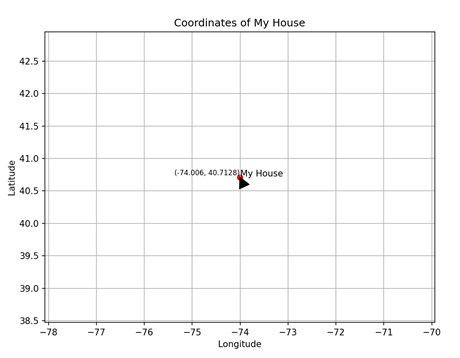
Imagine you have a big map of your neighborhood, and you want to tell someone exactly where your house is. You can give them the coordinates, which are like the map's secret code for your house's exact location. This code might look something like this: Latitude 40.7128° N, Longitude 74.0060° W −
Coords Report in Matplotlib
In Matplotlib, a coordinates report provides information about the position of points or objects within a plot. This report includes details such as the x-coordinate and y-coordinate of each point, as well as any additional properties like size, color, or label.
You create a coord report or any other type of plot that involves coordinates in Matplotlib using the scatter() function. This function takes two arguments: x and y, which represent the coordinates of the points to be plotted.
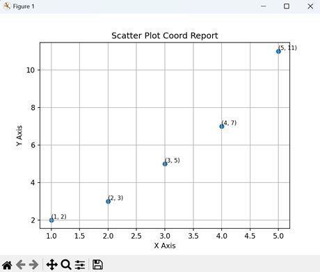
Scatter Plot Coord Report
In Matplotlib, a scatter plot coordinate report provides detailed information about the individual data points displayed in a scatter plot. This report includes the x and y coordinates of each point, allowing you to precisely identify your positions on the plot. Additionally, it may contain other properties such as the size, color, or label associated with each data point.
Example
In the following example, we are creating a scatter plot with two sets of data: x and y, where x represents the values on the x-axis and y represents the corresponding values on the y-axis. Additionally, we iterate through each pair of coordinates in x and y using a for loop, and for each point, we use the text() function to display the coordinates as text on the plot. This provides a visual representation of the coordinates for each point on the scatter plot −
import matplotlib.pyplot as plt

x = [1, 2, 3, 4, 5]
y = [2, 3, 5, 7, 11]

plt.scatter(x, y)
plt.xlabel('X Axis')
plt.ylabel('Y Axis')
plt.title('Scatter Plot Coord Report')
plt.grid(True)

# Displaying coordinates
for i in range(len(x)):
   plt.text(x[i], y[i], f'({x[i]}, {y[i]})', fontsize=8, verticalalignment='bottom')

plt.show()
Output
Following is the output of the above code −
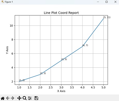
Line Plot Coord Report
In Matplotlib, a line plot coordinate report provides detailed information about the points plotted along a line in a line plot. This report includes the x and y coordinates of each point, indicating their positions on the plot. Additionally, it may contain other attributes such as markers, colors, or labels associated with each point.
Example
In here, we are creating a line plot using two sets of data: x and y, where x represents the values on the x-axis and y represents the corresponding values on the y-axis −
import matplotlib.pyplot as plt

x = [1, 2, 3, 4, 5]
y = [2, 3, 5, 7, 11]

plt.plot(x, y)
plt.xlabel('X Axis')
plt.ylabel('Y Axis')
plt.title('Line Plot Coord Report')
plt.grid(True)

# Display coordinates
for i in range(len(x)):
   plt.text(x[i], y[i], f'({x[i]}, {y[i]})', fontsize=8, verticalalignment='bottom')
plt.show()
Output
On executing the above code we will get the following output −
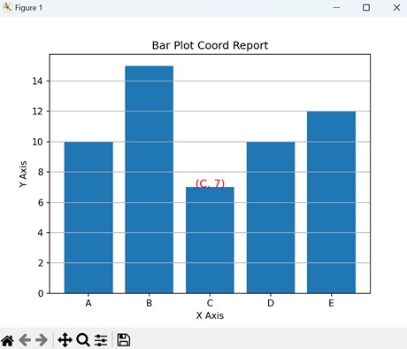
Bar Plot Coord Report
In Matplotlib, a bar plot coordinate report provides detailed information about the bars displayed in a bar plot. This report includes the x and y coordinates of each bar, indicating their positions on the plot. Additionally, it may contain other attributes such as the width, height, or color of each bar.
Example
In the example below, we create a bar plot by first defining two sets of data: 'x' and 'y'. Then, we place a coordinate report on the plot using the text() function. This function specifies the coordinates (2, 7) with the label of the third data point 'C' and its corresponding value '7', formatted in red color and centered horizontally −
import matplotlib.pyplot as plt

# Sample data
x = ['A', 'B', 'C', 'D', 'E']
y = [10, 15, 7, 10, 12]

plt.bar(x, y)
plt.xlabel('X Axis')
plt.ylabel('Y Axis')
plt.title('Bar Plot Coord Report')
plt.grid(axis='y')

# Coordinate report
plt.text(2, 7, f'({x[2]}, {y[2]})', fontsize=12, color='red', ha='center')

plt.show()
Output
After executing the above code, we get the following output −
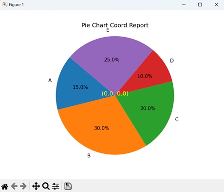
Pie Chart Coord Report
In Matplotlib, a pie chart coordinate report provides detailed information about the segments displayed in a pie chart. This report includes the position and size of each segment, represented as a fraction of the whole pie. Additionally, it may contain other attributes such as labels or colors associated with each segment.
Example
Now, we are creating a pie chart pie chart with labels and corresponding sizes. The "autopct" parameter formats the percentage values displayed on the chart. Additionally, we are placing a coordinate report at the center of the chart with coordinates (0, 0) −
import matplotlib.pyplot as plt

# Sample data
labels = ['A', 'B', 'C', 'D', 'E']
sizes = [15, 30, 20, 10, 25]

plt.pie(sizes, labels=labels, autopct='%1.1f%%', startangle=140)
plt.axis('equal')
plt.title('Pie Chart Coord Report')

# Coordinate report
plt.text(0, 0, f'(0.0, 0.0)', fontsize=12, color='yellow', ha='center')

plt.show()
Output
On executing the above code we will get the following output −
To Continue Learning Please Login