- Matplotlib Tutorial
- Matplotlib - Home
- Matplotlib - Introduction
- Matplotlib - Environment Setup
- Matplotlib - Anaconda distribution
- Matplotlib - Jupyter Notebook
- Matplotlib - Pyplot API
- Matplotlib - Simple Plot
- Matplotlib - PyLab module
- Object-oriented Interface
- Matplotlib - Figure Class
- Matplotlib - Axes Class
- Matplotlib - Multiplots
- Matplotlib - Subplots() Function
- Matplotlib - Subplot2grid() Function
- Matplotlib - Grids
- Matplotlib - Formatting Axes
- Matplotlib - Setting Limits
- Setting Ticks and Tick Labels
- Matplotlib - Twin Axes
- Matplotlib - Bar Plot
- Matplotlib - Histogram
- Matplotlib - Pie Chart
- Matplotlib - Scatter Plot
- Matplotlib - Contour Plot
- Matplotlib - Quiver Plot
- Matplotlib - Box Plot
- Matplotlib - Violin Plot
- Three-dimensional Plotting
- Matplotlib - 3D Contour Plot
- Matplotlib - 3D Wireframe plot
- Matplotlib - 3D Surface plot
- Matplotlib - Working With Text
- Mathematical Expressions
- Matplotlib - Working with Images
- Matplotlib - Transforms
- Matplotlib Useful Resources
- Matplotlib - Quick Guide
- Matplotlib - Useful Resources
- Matplotlib - Discussion
Matplotlib - Simple Plot
In this chapter, we will learn how to create a simple plot with Matplotlib.
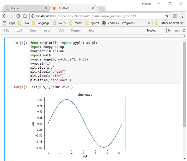
We shall now display a simple line plot of angle in radians vs. its sine value in Matplotlib. To begin with, the Pyplot module from Matplotlib package is imported, with an alias plt as a matter of convention.
import matplotlib.pyplot as plt
Next we need an array of numbers to plot. Various array functions are defined in the NumPy library which is imported with the np alias.
import numpy as np
We now obtain the ndarray object of angles between 0 and 2π using the arange() function from the NumPy library.
x = np.arange(0, math.pi*2, 0.05)
The ndarray object serves as values on x axis of the graph. The corresponding sine values of angles in x to be displayed on y axis are obtained by the following statement −
y = np.sin(x)
The values from two arrays are plotted using the plot() function.
plt.plot(x,y)
You can set the plot title, and labels for x and y axes.
You can set the plot title, and labels for x and y axes.
plt.xlabel("angle")
plt.ylabel("sine")
plt.title('sine wave')
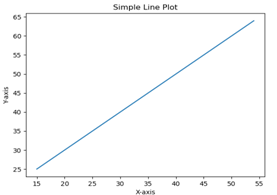
The Plot viewer window is invoked by the show() function −
plt.show()
The complete program is as follows −
from matplotlib import pyplot as plt
import numpy as np
import math #needed for definition of pi
x = np.arange(0, math.pi*2, 0.05)
y = np.sin(x)
plt.plot(x,y)
plt.xlabel("angle")
plt.ylabel("sine")
plt.title('sine wave')
plt.show()
When the above line of code is executed, the following graph is displayed −
Now, use the Jupyter notebook with Matplotlib.
Launch the Jupyter notebook from Anaconda navigator or command line as described earlier. In the input cell, enter import statements for Pyplot and NumPy −
from matplotlib import pyplot as plt
import numpy as np
To display plot outputs inside the notebook itself (and not in the separate viewer), enter the following magic statement −
%matplotlib inline
Obtain x as the ndarray object containing angles in radians between 0 to 2π, and y as sine value of each angle −
import math
x = np.arange(0, math.pi*2, 0.05)
y = np.sin(x)
Set labels for x and y axes as well as the plot title −
plt.xlabel("angle")
plt.ylabel("sine")
plt.title('sine wave')
Finally execute the plot() function to generate the sine wave display in the notebook (no need to run the show() function) −
plt.plot(x,y)
After the execution of the final line of code, the following output is displayed −