- Matplotlib Basics
- Matplotlib - Home
- Matplotlib - Introduction
- Matplotlib - Environment Setup
- Matplotlib - Anaconda distribution
- Matplotlib - Jupyter Notebook
- Matplotlib - Pyplot API
- Matplotlib - Simple Plot
- Matplotlib - Text
- Matplotlib - Images
- Matplotlib - Mathematical Expressions
- Matplotlib - Transforms
- Matplotlib - Ticks and Tick Labels
- Matplotlib - Axis Ranges
- Matplotlib - Axis Scales
- Matplotlib - Axis Ticks
- Matplotlib - Formatting Axes
- Matplotlib - Axes Class
- Matplotlib - Twin Axes
- Matplotlib - Figure Class
- Matplotlib - Multiplots
- Matplotlib - Grids
- Matplotlib - Object-oriented Interface
- Matplotlib - PyLab module
- Matplotlib - Subplots() Function
- Matplotlib - Subplot2grid() Function
- Matplotlib - Anchored Artists
- Matplotlib - Manual Contour
- Matplotlib - Coords Report
- Matplotlib - AGG filter
- Matplotlib - Ribbon Box
- Matplotlib - Fill Spiral
- Matplotlib - Findobj Demo
- Matplotlib - Hyperlinks
- Matplotlib - Image Thumbnail
- Matplotlib - Plotting with Keywords
- Matplotlib - Create Logo
- Matplotlib - Multipage PDF
- Matplotlib - Multiprocessing
- Matplotlib - Print Stdout
- Matplotlib - Compound Path
- Matplotlib - Sankey Class
- Matplotlib - MRI with EEG
- Matplotlib - Stylesheets
- Matplotlib - Background Colors
- Matplotlib - Basemap -->
- Matplotlib Widgets
- Matplotlib - Cursor Widget
- Matplotlib - Annotated Cursor
- Matplotlib - Buttons Widget
- Matplotlib - Check Buttons
- Matplotlib - Lasso Selector
- Matplotlib - Menu Widget
- Matplotlib - Mouse Cursor
- Matplotlib - Multicursor
- Matplotlib - Polygon Selector
- Matplotlib - Radio Buttons
- Matplotlib - RangeSlider
- Matplotlib - Rectangle Selector
- Matplotlib - Ellipse Selector
- Matplotlib - Slider Widget
- Matplotlib - Span Selector
- Matplotlib - Textbox
- Matplotlib Plotting
- Matplotlib - Bar Graphs
- Matplotlib - Histogram
- Matplotlib - Pie Chart
- Matplotlib - Scatter Plot
- Matplotlib - Box Plot
- Matplotlib - Violin Plot
- Matplotlib - Contour Plot
- Matplotlib - 3D Plotting
- Matplotlib - 3D Contours
- Matplotlib - 3D Wireframe Plot
- Matplotlib - 3D Surface Plot
- Matplotlib - Quiver Plot
- Matplotlib Useful Resources
- Matplotlib - Quick Guide
- Matplotlib - Useful Resources
- Matplotlib - Discussion
Matplotlib - Axis Ranges
What is Axis Range?
Axis range in Matplotlib refers to the span of values displayed along the x-axis and y-axis in a plot. These ranges determine the visible data within the plot area and are defined by the minimum and maximum values displayed on each axis.
Customizing axis ranges in Matplotlib allows for better control over the visible data within the plot by enabling the emphasis of specific ranges or patterns to enhance the visualization.
The Key Points about Axis Ranges
X-axis and Y-axis Ranges − Axis ranges can be adjusted independently for the x-axis and y-axis to display specific portions of the data.
Setting Ranges − We can manually set the axis ranges using functions like plt.xlim() and plt.ylim() or their equivalent methods when working with an axis object ax.set_xlim() and ax.set_ylim().
Automatic Ranges − By default the Matplotlib library automatically calculates and sets the axis ranges based on the data provided. However manual adjustment allows focusing on specific data ranges or enhancing visualization.
Use Cases for Axis Ranges
Zooming In or Out − Adjusting axis ranges to focus on specific parts of the data by zooming in or out within the plot.
Data Emphasis − Highlighting specific ranges of the data to emphasize patterns or trends.
Avoiding Clutter − We can adjust the ranges of the plot axis, to prevent the overlapping of data point to improve the visualization of certain sections of the plot.
Key Concepts in Axis Range
The following are the key concepts of the axis range of the plot. Let’s see each of them in detail.
X-Axis Range
The x-range in axis range refers to the span of values displayed along the x-axis in a plot. It determines the minimum and maximum values visible on the horizontal axis by defining the range of data shown in that dimension.
In Matplotlib library we can set the x-axis range using plt.xlim() or ax.set_xlim() to specify the limits for the x-axis. This allows us to control the displayed range of data along the x-axis.
Controlling the x-range in axis ranges provides flexibility in visualizing specific segments of data along the x-axis by enabling better interpretation and analysis of the plotted information.
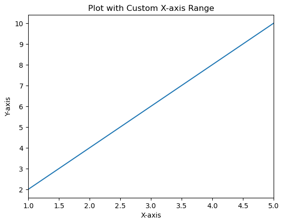
Example using plt.xlim()
In this example plt.xlim(1, 5) sets the x-axis limits from 1 to 5 by defining the x-range visible in the plot to cover data points between 1 and 5 along the x-axis.
import matplotlib.pyplot as plt
# Sample data
x = [1, 2, 3, 4, 5]
y = [2, 4, 6, 8, 10]
# Creating a plot
plt.plot(x, y)
# Setting x-axis limits (x-range)
plt.xlim(1, 5)  # Set x-axis limits from 1 to 5
plt.xlabel('X-axis')
plt.ylabel('Y-axis')
plt.title('Plot with Custom X-axis Range')
plt.show()
Output
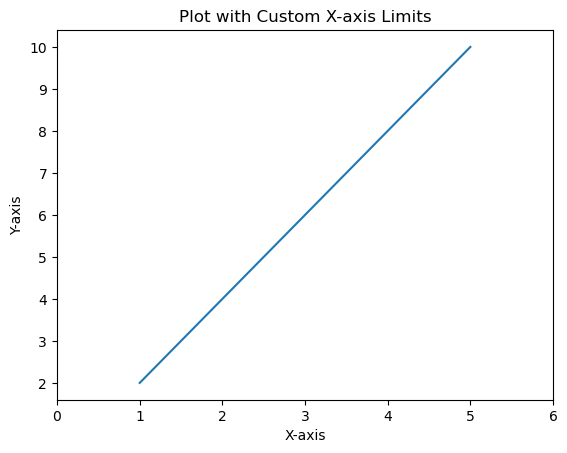
Example using the ax.set_xlim()
Here's an example demonstrating the use of ax.set_xlim() to set the x-axis limits when working with an axis object ax.
import matplotlib.pyplot as plt
# Sample data
x = [1, 2, 3, 4, 5]
y = [2, 4, 6, 8, 10]
# Creating a figure and axis
fig, ax = plt.subplots()
# Plotting on the axis
ax.plot(x, y)
# Setting x-axis limits using axis object
ax.set_xlim(0, 6)  # Set x-axis limits from 0 to 6
# Labeling axes and adding title
ax.set_xlabel('X-axis')
ax.set_ylabel('Y-axis')
ax.set_title('Plot with Custom X-axis Limits')
plt.show()
Output
Y-Axis Range
Setting the y-axis range or limits in Matplotlib allows us to specify the range of values displayed along the vertical y-axis of a plot. We can control the minimum and maximum values shown on the y-axis to focus on specific data ranges or patterns. The setting of range or limits of the y-axis in Matplotlib can be done using the plt.ylim() function or ax.set_ylim() method when working with an axis object ax. The range of values displayed along the vertical y-axis.
Setting y-axis range is beneficial for focusing on specific data ranges, highlighting trends and ensuring the visualization emphasizes the relevant parts of the data along the y-axis.
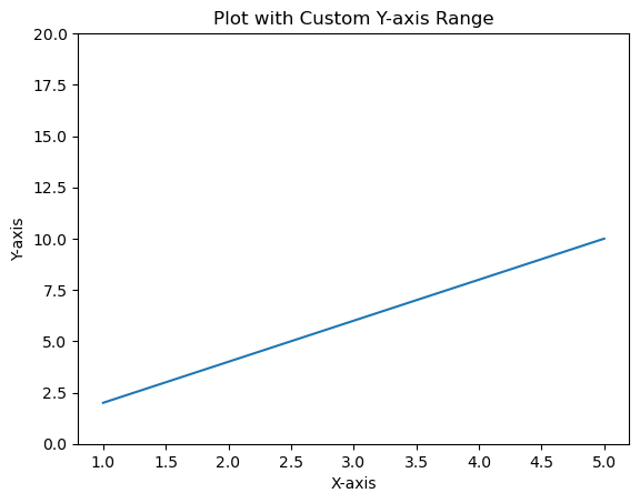
Example using plt.ylim() for Y-axis Range
In this example the plt.ylim(0, 12) function sets the y-axis limits from 0 to 12 by specifying the range of values displayed on the y-axis.
import matplotlib.pyplot as plt
# Sample data
x = [1, 2, 3, 4, 5]
y = [2, 4, 6, 8, 10]
# Creating a plot
plt.plot(x, y)
# Setting y-axis limits
plt.ylim(0, 12)  # Set y-axis limits from 0 to 12
plt.xlabel('X-axis')
plt.ylabel('Y-axis')
plt.title('Plot with Custom Y-axis Range')
plt.show()
Output
Example using ax.set_ylim() for Y-axis Range in Subplots
When working with an axis object ax we can set the y-axis limits for a specific subplot as per our requirement.
In this example ax.set_ylim(0, 20) sets the y-axis limits from 0 to 20 specifically for the subplot or axis ax.
import matplotlib.pyplot as plt
# Sample data
x = [1, 2, 3, 4, 5]
y = [2, 4, 6, 8, 10]
# Creating subplots
fig, ax = plt.subplots()
# Plotting on the axis
ax.plot(x, y)
# Setting y-axis limits using axis object
ax.set_ylim(0, 20)  # Set y-axis limits from 0 to 12
ax.set_xlabel('X-axis')
ax.set_ylabel('Y-axis')
ax.set_title('Plot with Custom Y-axis Range')
plt.show()
Output
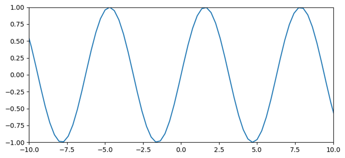
Change the range of the X-axis and Y-axis
This example changes the range of X and Y axes, we can use xlim() and ylim() methods.
Example
import numpy as np
import matplotlib.pyplot as plt
plt.rcParams["figure.figsize"] = [7.50, 3.50]
plt.rcParams["figure.autolayout"] = True
x = np.linspace(-15, 15, 100)
y = np.sin(x)
plt.plot(x, y)
plt.xlim(-10, 10)
plt.ylim(-1, 1)
plt.show()
Output
To Continue Learning Please Login