- Matplotlib Tutorial
- Matplotlib - Home
- Matplotlib - Introduction
- Matplotlib - Environment Setup
- Matplotlib - Anaconda distribution
- Matplotlib - Jupyter Notebook
- Matplotlib - Pyplot API
- Matplotlib - Simple Plot
- Matplotlib - PyLab module
- Object-oriented Interface
- Matplotlib - Figure Class
- Matplotlib - Axes Class
- Matplotlib - Multiplots
- Matplotlib - Subplots() Function
- Matplotlib - Subplot2grid() Function
- Matplotlib - Grids
- Matplotlib - Formatting Axes
- Matplotlib - Setting Limits
- Setting Ticks and Tick Labels
- Matplotlib - Twin Axes
- Matplotlib - Bar Plot
- Matplotlib - Histogram
- Matplotlib - Pie Chart
- Matplotlib - Scatter Plot
- Matplotlib - Contour Plot
- Matplotlib - Quiver Plot
- Matplotlib - Box Plot
- Matplotlib - Violin Plot
- Three-dimensional Plotting
- Matplotlib - 3D Contour Plot
- Matplotlib - 3D Wireframe plot
- Matplotlib - 3D Surface plot
- Matplotlib - Working With Text
- Mathematical Expressions
- Matplotlib - Working with Images
- Matplotlib - Transforms
- Matplotlib Useful Resources
- Matplotlib - Quick Guide
- Matplotlib - Useful Resources
- Matplotlib - Discussion
Matplotlib - Grids
In general data visualization and plotting, grids refer to the set of horizontal and vertical lines over the plot area. Gridlines are useful for a better understanding of the data on the plots. Typically, these lines are aligned with the major tick marks on both the x-axis and the y-axis. They can enhance the readability of the plot and make it easier to estimate values.
See the below image for reference −
There are two main types of gridlines −
Major Gridlines − These are the primary gridlines that align with the major tick marks on the axes.
Minor Gridlines − These are additional gridlines between the major gridlines and align with the minor tick marks on the axes.
Introduction to Grids in Matplotlib
Enabling gridlines is a straightforward process in Matplotlib. The pyplot.grid() method adds major gridlines to the plot with additional customization options including adjusting the linestyle, linewidth, color, and transparency.
Let's explore different approaches to adding gridlines to plots.
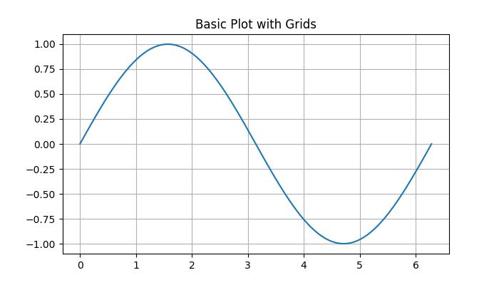
Basic Plot with Grids
In Matplotlib, the default grid is a set of major gridlines that align with the major tick marks on both the x-axis and the y-axis.
Example
In this example, we create a basic sine wave plot and add the default grid.
import matplotlib.pyplot as plt
import numpy as np

# Create some data
x = np.linspace(0, 2 * np.pi, 100)
y = np.sin(x)

# create a plot
fig, ax = plt.subplots(figsize=(7,4))

# Plot the data
plt.plot(x, y)

# Add grid
ax.grid(True)

# set the title
ax.set_title('Basic Plot with Grids')

# Show the plot
plt.show()
Output
On executing the above code we will get the following output −
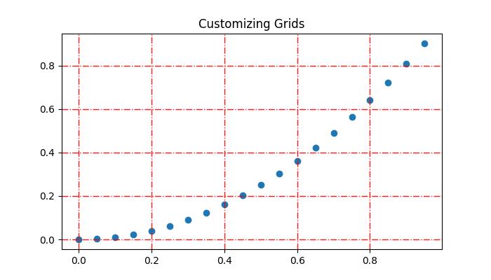
Customizing Grid
Customizing gridlines includes linestyle, linewidth, color, and transparency.
Example
This example demonstrates how to customize the gridline by changing its linestyle, linewidth, color, and transparency.
import matplotlib.pyplot as plt
import numpy as np

# Create some data
x = np.arange(0, 1, 0.05)
y = x**2

# Create the plot
fig, ax = plt.subplots(figsize=(7,4))

# Plot the data
plt.scatter(x, y)

# Customize grid
ax.grid(True, linestyle='-.', linewidth=1, color='red', alpha=0.9)

# set the title
ax.set_title('Customizing Grids')

# Show the plot
plt.show()
Output
On executing the above code we will get the following output −
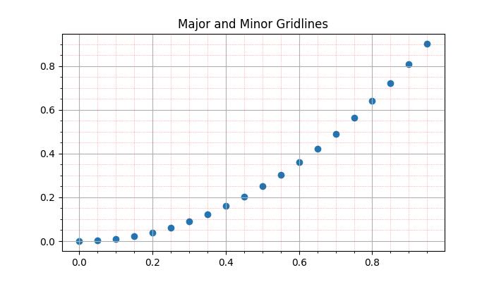
Adding Minor Gridlines
In addition to major gridlines, Matplotlib supports the inclusion of minor gridlines. These are the lines positioned between the major gridlines and aligning with the minor tick marks on both the x-axis and the y-axis. You can use the pyplot.minorticks_on() and plt.grid(which='minor') to add gridlines corresponding to the minor ticks.Example
This example demonstrates how to add both the major and minor gridlines to a plot.
import matplotlib.pyplot as plt
import numpy as np

# Create some data
x = np.arange(0, 1, 0.05)
y = x**2

# Create the plot
fig, ax = plt.subplots(figsize=(7,4))

# Plot the data
plt.scatter(x, y)

# Add major grid
ax.grid(True)

# Add minor grid
ax.minorticks_on()
ax.grid(which='minor', linestyle=':', linewidth=0.5, color='red', alpha=0.5)

# set the title
ax.set_title('Major and Minor Gridlines')

# Show the plot
plt.show()
Output
On executing the above code we will get the following output −
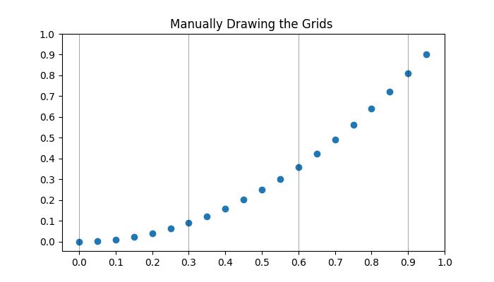
Manually adding the grids
This approach involves explicitly specifying the positions of vertical and horizontal lines. By iterating through specific intervals or values, users can draw gridlines at desired locations. This involves using functions like pyplot.axvline() and pyplot.axhline() to draw vertical and horizontal lines, respectively.
Example
Here is an example that manually draws vertical grid lines at every third point on the x-axis.
import matplotlib.pyplot as plt
import numpy as np

# Create some data
x = np.arange(0, 1, 0.05)
y = x**2

# Create the plot
plt.subplots(figsize=(7,4))

# Plot the data
plt.scatter(x, y)

# Set x and y tick locations
plt.xticks(np.arange(0, 1.01, 0.1))
plt.yticks(np.arange(0, 1.01, 0.1))
plt.title('Manually Drawing the Grids ')

# Draw grid lines for every third point on the x-axis
for pt in np.arange(0, 1.01, 0.3):
   plt.axvline(pt, lw=0.5, color='black', alpha=0.5)

# Show the plot
plt.show()
Output
On executing the above code we will get the following output −
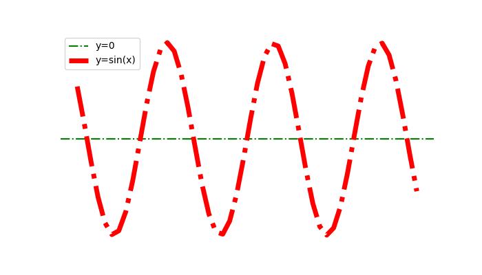
Hiding the gridlines
Hiding or removing the gridlines in a plot can be achieved by specifying the boolean value False to the grid() function.
Example
Here is an example that hide gridlines and axes (X and Y axis) of a plot.
import numpy as np
import matplotlib.pyplot as plt

#  Create a figure
fig = plt.figure(figsize=(7, 4))

# Generate data
x = np.linspace(-10, 10, 50)
y = np.sin(x)

# Plot horizontal line
plt.axhline(y=0, c="green", linestyle="dashdot", label="y=0")

# Plot sine curve
plt.plot(x, y, c="red", lw=5, linestyle="dashdot", label="y=sin(x)")

# Hide gridlines
plt.grid(False)

# Hide axes
plt.axis('off')

# Add legend
plt.legend()

# Show plot
plt.show()
Output
On executing the above code you will get the following output −
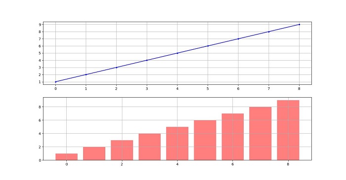
Gridlines Across The Subplots
When comparing data across multiple subplots, it's useful to have gridlines across all subplots to maintain visual comparisons between plots.
Example
Here is an example that demonstrates how to plot grids across subplots.
import matplotlib.pyplot as plt

# Data
d = [1, 2, 3, 4, 5, 6, 7, 8, 9]
f = [0, 1, 0, 0, 1, 0, 1, 1, 0]

# Create figure and subplots
fig = plt.figure(figsize=(7,4))
fig.set_size_inches(30, 10)
ax1 = fig.add_subplot(211)
ax2 = fig.add_subplot(212)

# Plot data on subplots
ax1.plot(d, marker='.', color='b', label="1 row")

# Draw grid lines behind bar graph
ax2.bar(range(len(d)), d, color='red', alpha=0.5)

# Enable grids on both subplots
ax1.grid()
ax2.grid()

# Display the plot
plt.show()
Output
On executing the above code you will get the following output −