- Matplotlib Basics
- Matplotlib - Home
- Matplotlib - Introduction
- Matplotlib - Environment Setup
- Matplotlib - Anaconda distribution
- Matplotlib - Jupyter Notebook
- Matplotlib - Pyplot API
- Matplotlib - Simple Plot
- Matplotlib - Text
- Matplotlib - Images
- Matplotlib - Mathematical Expressions
- Matplotlib - Transforms
- Matplotlib - Ticks and Tick Labels
- Matplotlib - Axis Ranges
- Matplotlib - Axis Scales
- Matplotlib - Axis Ticks
- Matplotlib - Formatting Axes
- Matplotlib - Axes Class
- Matplotlib - Twin Axes
- Matplotlib - Figure Class
- Matplotlib - Multiplots
- Matplotlib - Grids
- Matplotlib - Object-oriented Interface
- Matplotlib - PyLab module
- Matplotlib - Subplots() Function
- Matplotlib - Subplot2grid() Function
- Matplotlib - Anchored Artists
- Matplotlib - Manual Contour
- Matplotlib - Coords Report
- Matplotlib - AGG filter
- Matplotlib - Ribbon Box
- Matplotlib - Fill Spiral
- Matplotlib - Findobj Demo
- Matplotlib - Hyperlinks
- Matplotlib - Image Thumbnail
- Matplotlib - Plotting with Keywords
- Matplotlib - Create Logo
- Matplotlib - Multipage PDF
- Matplotlib - Multiprocessing
- Matplotlib - Print Stdout
- Matplotlib - Compound Path
- Matplotlib - Sankey Class
- Matplotlib - MRI with EEG
- Matplotlib - Stylesheets
- Matplotlib - Background Colors
- Matplotlib - Basemap -->
- Matplotlib Widgets
- Matplotlib - Cursor Widget
- Matplotlib - Annotated Cursor
- Matplotlib - Buttons Widget
- Matplotlib - Check Buttons
- Matplotlib - Lasso Selector
- Matplotlib - Menu Widget
- Matplotlib - Mouse Cursor
- Matplotlib - Multicursor
- Matplotlib - Polygon Selector
- Matplotlib - Radio Buttons
- Matplotlib - RangeSlider
- Matplotlib - Rectangle Selector
- Matplotlib - Ellipse Selector
- Matplotlib - Slider Widget
- Matplotlib - Span Selector
- Matplotlib - Textbox
- Matplotlib Plotting
- Matplotlib - Bar Graphs
- Matplotlib - Histogram
- Matplotlib - Pie Chart
- Matplotlib - Scatter Plot
- Matplotlib - Box Plot
- Matplotlib - Violin Plot
- Matplotlib - Contour Plot
- Matplotlib - 3D Plotting
- Matplotlib - 3D Contours
- Matplotlib - 3D Wireframe Plot
- Matplotlib - 3D Surface Plot
- Matplotlib - Quiver Plot
- Matplotlib Useful Resources
- Matplotlib - Quick Guide
- Matplotlib - Useful Resources
- Matplotlib - Discussion
Matplotlib - Background Colors
What are Background Colors in Matplotlib?
Matplotlib provides extensive options to control background colors enabling users to customize the visual appearance of plots and figures. The background color plays a crucial role in enhancing the aesthetics and readability of visualizations, setting the tone and mood for the displayed data.
The following are the different features available in the Background colors of Matplotlib library. Let’s see each one in detailed view.
Figure and Plot Background Color
The figure's background color encompasses the entire area where plots are rendered. By default it's often white but it can be changed using plt.figure(facecolor='color_name') or plt.gcf().set_facecolor('color_name'). This affects the area around the plots.
The plot background color on the other hand refers to the area within the plot's axes. It can be altered with plt.gca().set_facecolor('color_name') by providing a different background color within the actual plot.
Changing Figure Bacground color
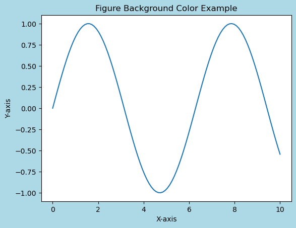
In this example demonstrating how to set the background color for the figure using Matplotlib library.
Example
import matplotlib.pyplot as plt
import numpy as np
# Generating data
x = np.linspace(0, 10, 100)
y = np.sin(x)
# Changing Figure Background Color
plt.figure(facecolor='lightblue')  # Set figure background color
plt.plot(x, y)
plt.title('Figure Background Color Example')
plt.xlabel('X-axis')
plt.ylabel('Y-axis')
plt.show()
Output
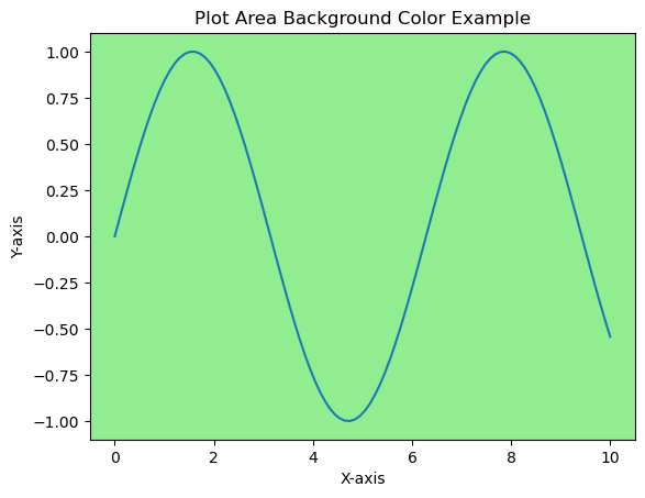
Changing Plot Area Background Color
In this example we use plt.gca().set_facecolor('lightgreen') to set the background color for the plot area specifically.
Example
import matplotlib.pyplot as plt
import numpy as np
# Generating data
x = np.linspace(0, 10, 100)
y = np.sin(x)
# Changing plot area Background Color
plt.plot(x, y)
plt.gca().set_facecolor('lightgreen')  # Set plot area background color
plt.title('Plot Area Background Color Example')
plt.xlabel('X-axis')
plt.ylabel('Y-axis')
plt.show()
Output
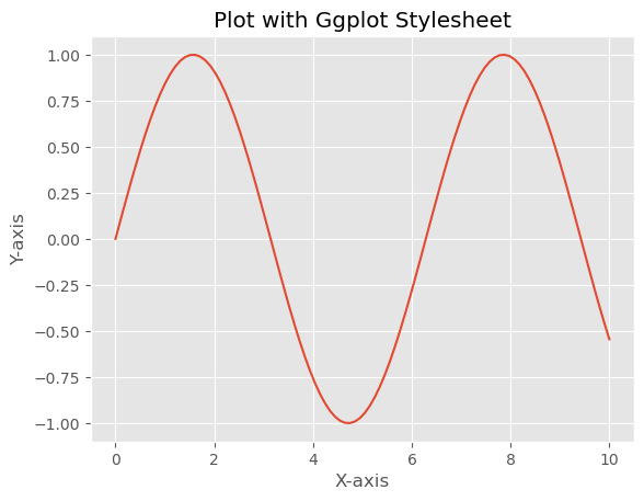
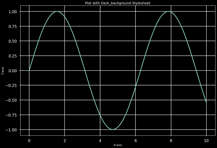
Stylesheets for Background Colors
Matplotlib offers stylesheets that provide predefined configurations including background colors. Stylesheets like 'dark_background', 'ggplot' or 'seaborn' have distinctive color schemes that affect the background color of plots, figures and other elements.
Stylesheets not only modify the background colors but also encompass various other stylistic elements such as line colors, text sizes and grid styles. Experimenting with different stylesheets allows us to quickly explore and visualize how different styles affect the appearance of our plots.
Example
Here's an example showcasing how stylesheets in Matplotlib can be used to modify
import matplotlib.pyplot as plt
import numpy as np
# Generating data
x = np.linspace(0, 10, 100)
y = np.sin(x)
# Plot using different stylesheets
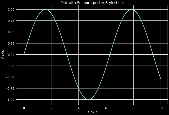
stylesheets = ['ggplot', 'dark_background', 'seaborn-poster']
for style in stylesheets:
plt.style.use(style) # Apply the selected stylesheet
plt.plot(x, y)
plt.title(f'Plot with {style.capitalize()} Stylesheet')
plt.xlabel('X-axis')
plt.ylabel('Y-axis')
plt.show()
Output
Impact on Visualization
Background colors influence the visual perception of data. Dark backgrounds might emphasize bright or contrasting data while light backgrounds often offer a clean and conventional look suitable for most contexts. Background colors should be chosen carefully to ensure readability and accessibility for viewers.
Customization and Color Representation
We can customize background colors using various representations such as color names ('blue', 'red'), hexadecimal strings ('#RRGGBB'), RGB tuples ((0.1, 0.2, 0.5)), or RGBA tuples with alpha transparency ((0.1, 0.2, 0.5, 0.3)).
These color string representations offer flexibility in specifying colors for various elements within the plot by allowing us to precisely control the visual appearance of our visualizations. We can use named colors, hexadecimal strings, RGB tuples or RGBA values to customize colors for different elements in Matplotlib plots.
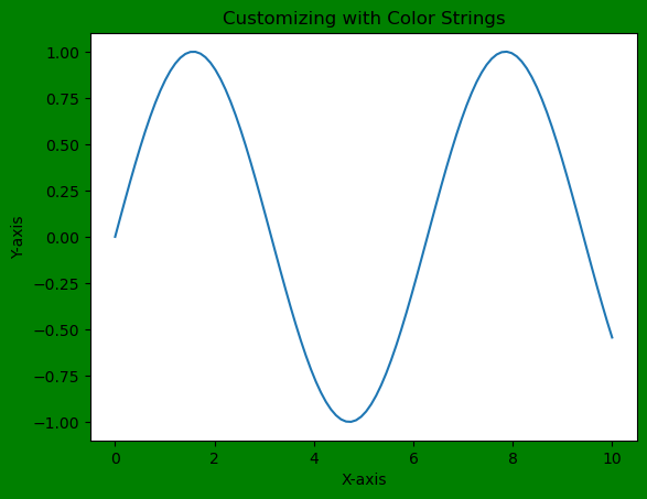
Customizing with Color Strings
We can directly use color names or hexadecimal strings to set the background color.
Example
import matplotlib.pyplot as plt
import numpy as np
# Generating data
x = np.linspace(0, 10, 100)
y = np.sin(x)
# Customizing with color strings
plt.figure(facecolor='green')  # Set figure background color using color name
plt.plot(x, y)
plt.title('Customizing with Color Strings')
plt.xlabel('X-axis')
plt.ylabel('Y-axis')
plt.show()
Output
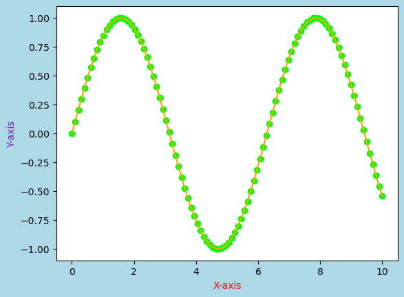
Customization Options
We can also customize other elements using color strings or RGB values such as line colors, marker colors or even modifying the color of specific text elements in the plot.
Example
import matplotlib.pyplot as plt
import numpy as np
# Generating data
x = np.linspace(0, 10, 100)
y = np.sin(x)
# Customizing with color strings
plt.figure(facecolor='lightblue')  # Set figure background color using color name
plt.plot(x, y, color='orange')  # Set line color using a color name
plt.scatter(x, y, color='#00FF00')  # Set marker color using hexadecimal color string
plt.xlabel('X-axis', color='red')  # Set x-axis label color using a color name
plt.ylabel('Y-axis', color=(0.5, 0.1, 0.7))  # Set y-axis label color using RGB tuple
plt.show()
Output
Importance of Background Colors
The choice of background color significantly impacts the aesthetics and interpretation of visualizations. It can affect readability, visual contrast and the overall impression of the displayed data. Context, audience and the specific purpose of the visualization should guide the selection of background colors.
Use Cases
Contrast and Visibility − Contrast between data elements and the background can be adjusted to highlight or de-emphasize certain information.
Themes and Branding − Background colors can align with branding or thematic considerations by ensuring consistency across multiple visualizations.
Accessibility − Selecting appropriate background color is very crucial for ensuring accessibility, especially for individuals with visual impairments.
Matplotlib offers diverse options for controlling background colors in plots and figures. These choices have a substantial impact on the aesthetics, readability and interpretation of visualization by making them a fundamental aspect of creating effective and engaging plots. Properly chosen background colors enhance the overall appeal and communication of data representations.
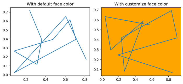
Change the default background color
In this example we will change the default background color for Matplotlib plots.
Example
import numpy as np
import matplotlib.pyplot as plt
plt.rcParams["figure.figsize"] = [7.50, 3.50]
plt.rcParams["figure.autolayout"] = True
ax = plt.gca()
print("Default face color is: ", ax.get_facecolor())
plt.subplot(121)
plt.plot(np.random.rand(10), np.random.rand(10))
plt.title("With default face color")
plt.subplot(122)
ax = plt.gca()
ax.set_facecolor("orange")
plt.plot(np.random.rand(10), np.random.rand(10))
plt.title("With customize face color")
plt.show()
Output
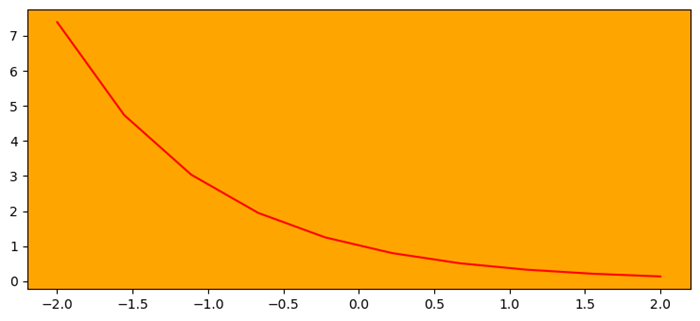
Change axes background color
Here in this example we change the axes background color by using the set_facecolor() method.
Example
import numpy as np
import matplotlib.pyplot as plt
plt.rcParams["figure.figsize"] = [7.50, 3.50]
plt.rcParams["figure.autolayout"] = True
ax = plt.gca()
ax.set_facecolor("orange")
x = np.linspace(-2, 2, 10)
y = np.exp(-x)
plt.plot(x, y, color='red')
plt.show()
Output
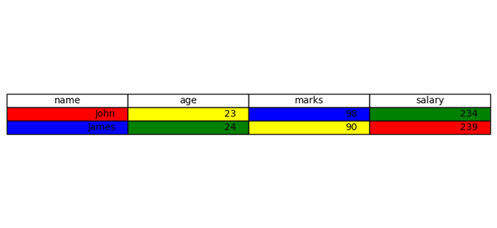
Set the background color of a column in a matplotlib table
This is the reference example for setting the background color of a column in a matplotlib table.
Example
import matplotlib.pyplot as plt
plt.rcParams["figure.figsize"] = [7.50, 3.50]
plt.rcParams["figure.autolayout"] = True
columns = ('name', 'age', 'marks', 'salary')
cell_text = [["John", "23", "98", "234"], ["James", "24", "90", "239"]]
colors = [["red", "yellow", "blue", "green"], ["blue", "green", "yellow", "red"]]
fig, ax = plt.subplots()
the_table = ax.table(cellText=cell_text, cellColours=colors, colLabels=columns, loc='center')
ax.axis('off')
plt.show()
Output
To Continue Learning Please Login