- Bokeh - Home
- Bokeh - Introduction
- Bokeh - Environment Setup
- Bokeh - Getting Started
- Bokeh - Jupyter Notebook
- Bokeh - Basic Concepts
- Bokeh - Plots with Glyphs
- Bokeh - Area Plots
- Bokeh - Circle Glyphs
- Bokeh - Rectangle, Oval and Polygon
- Bokeh - Wedges and Arcs
- Bokeh - Specialized Curves
- Bokeh - Setting Ranges
- Bokeh - Axes
- Bokeh - Annotations and Legends
- Bokeh - Pandas
- Bokeh - ColumnDataSource
- Bokeh - Filtering Data
- Bokeh - Layouts
- Bokeh - Plot Tools
- Bokeh - Styling Visual Attributes
- Bokeh - Customising legends
- Bokeh - Adding Widgets
- Bokeh - Server
- Bokeh - Using Bokeh Subcommands
- Bokeh - Exporting Plots
- Bokeh - Embedding Plots and Apps
- Bokeh - Extending Bokeh
- Bokeh - WebGL
- Bokeh - Developing with JavaScript
Bokeh Resources
Bokeh - Quick Guide
Bokeh - Introduction
Bokeh is a data visualization library for Python. Unlike Matplotlib and Seaborn, they are also Python packages for data visualization, Bokeh renders its plots using HTML and JavaScript. Hence, it proves to be extremely useful for developing web based dashboards.
The Bokeh project is sponsored by NumFocus https://numfocus.org/. NumFocus also supports PyData, an educational program, involved in development of other important tools such as NumPy, Pandas and more. Bokeh can easily connect with these tools and produce interactive plots, dashboards and data applications.
Features
Bokeh primarily converts the data source into a JSON file which is used as input for BokehJS, a JavaScript library, which in turn is written in TypeScript and renders the visualizations in modern browsers.
Some of the important features of Bokeh are as follows −
Flexibility
Bokeh is useful for common plotting requirements as well as custom and complex use-cases.
Productivity
Bokeh can easily interact with other popular Pydata tools such as Pandas and Jupyter notebook.
Interactivity
This is an important advantage of Bokeh over Matplotlib and Seaborn, both produce static plots. Bokeh creates interactive plots that change when the user interacts with them. You can give your audience a wide range of options and tools for inferring and looking at data from various angles so that user can perform what if analysis.
Powerful
By adding custom JavaScript, it is possible to generate visualizations for specialised use-cases.
Sharable
Plots can be embedded in output of Flask or Django enabled web applications. They can also be rendered in
Jupyter
notebooks.Open source
Bokeh is an open source project. It is distributed under Berkeley Source Distribution (BSD) license. Its source code is available on https://github.com/bokeh/bokeh.
Bokeh - Environment Setup
Bokeh can be installed on CPython versions 3.10+ only both with Standard distribution and Anaconda distribution. Current version of Bokeh at the time of writing this tutorial is ver. 3.8.1.
Bokeh can be installed using Pythons built-in Package manager PIP as shown below −
pip3 install bokeh
If you are using Anaconda distribution, use conda package manager as follows −
conda install bokeh
In addition to the above dependencies, you may require additional packages such as pandas, psutil, etc., for specific purposes.
Install Bokeh
Bokeh package is not a part of Python's standard library, hence it must be installed. Before installing the latest version, let us create a virtual environment, as per Python's recommended method.
A virtual environment allows us to create an isolated working copy of python for a specific project without affecting the outside setup.
We shall use venv module in Python's standard library to create virtual environment. PIP is included by default in Python version 3.4 or later.
Use the following command to create virtual environment in Windows
D:\bokeh>py -m venv myenv
On Ubuntu Linux, update the APT repo and install venv if required before creating virtual environment
mvl@GNVBGL3:~ $ sudo apt update && sudo apt upgrade -y
mvl@GNVBGL3:~ $ sudo apt install python3-venv
Then use the following command to create a virtual environment
mvl@GNVBGL3:~ $ sudo python3 -m venv myenv
You need to activate the virtual environment. On Windows use the command
D:\bokeh>cd myenv
D:\bokeh\myenv>scripts\activate
(myenv) D:\bokeh\myenv>
On Ubuntu Linux, use following command to activate the virtual environment
mvl@GNVBGL3:~$ cd myenv
mvl@GNVBGL3:~/myenv$ source bin/activate
(myenv) mvl@GNVBGL3:~/myenv$
Name of the virtual environment appears in the parenthesis. Now that it is activated, we can now install bokeh in it.
(myenv) D:\bokeh\myenv> pip3 install bokeh
     Collecting bokeh
  Obtaining dependency information for bokeh from https://files.pythonhosted.org/packages/5d/e7/b18bee0772d49c0f78d57f15a68e85257abf7224d9b910706abe8bd1dc0f/bokeh-3.8.1-py3-none-any.whl.metadata
  Downloading bokeh-3.8.1-py3-none-any.whl.metadata (10 kB)
  ...
  Installing collected packages: pytz, xyzservices, tzdata, tornado, six, PyYAML, pillow, packaging, numpy, narwhals, MarkupSafe, python-dateutil, Jinja2, contourpy, pandas, bokeh
Successfully installed Jinja2-3.1.6 MarkupSafe-3.0.3 PyYAML-6.0.3 bokeh-3.8.1 contourpy-1.3.3 narwhals-2.14.0 numpy-2.3.5 packaging-25.0 pandas-2.3.3 pillow-12.0.0 python-dateutil-2.9.0.post0 pytz-2025.2 six-1.17.0 tornado-6.5.4 tzdata-2025.3 xyzservices-2025.11.0
Verify Installation
To verify if Bokeh has been successfully installed, import bokeh package in Python terminal and check its version −
(myenv) D:\bokeh\myenv>py
Python 3.12.1 (tags/v3.12.1:2305ca5, Dec  7 2023, 22:03:25) [MSC v.1937 64 bit (AMD64)] on win32
Type "help", "copyright", "credits" or "license" for more information.
>>> import bokeh
>>> bokeh.__version__
'3.8.1'
>>>
Bokeh - Getting Started
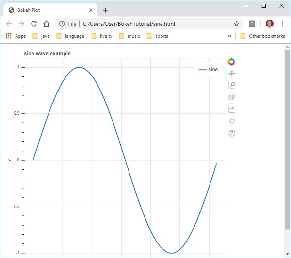
Creating a simple line plot between two numpy arrays is very simple. To begin with, import following functions from bokeh.plotting modules −
from bokeh.plotting import figure, output_file, show
The figure() function creates a new figure for plotting.
The output_file() function is used to specify a HTML file to store output.
The show() function displays the Bokeh figure in browser or in notebook.
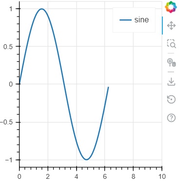
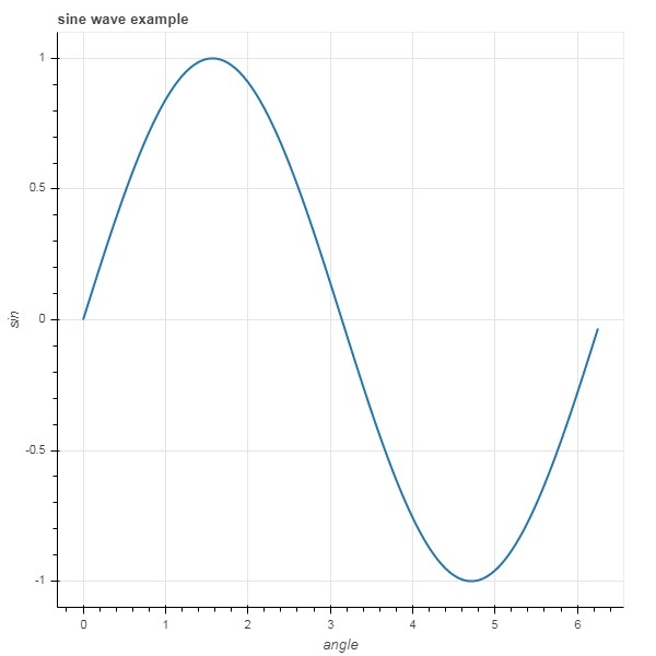
Next, set up two numpy arrays where second array is sine value of first.
import numpy as np
import math
x = np.arange(0, math.pi*2, 0.05)
y = np.sin(x)
To obtain a Bokeh Figure object, specify the title and x and y axis labels as below −
p = figure(title = "sine wave example", x_axis_label = 'x', y_axis_label = 'y')
The Figure object contains a line() method that adds a line glyph to the figure. It needs data series for x and y axes.
p.line(x, y, legend_label = "sine", line_width = 2)
Finally, set the output file and call show() function.
output_file("sine.html")
show(p)
This will render the line plot in sine.html and will be displayed in browser.
Example - Usage of Bokeh to render a Line
main.py
from bokeh.plotting import figure, output_file, show
import numpy as np
import math

x = np.arange(0, math.pi*2, 0.05)
y = np.sin(x)

output_file("sine.html")

p = figure(title = "sine wave example", x_axis_label = 'x', y_axis_label = 'y')
p.line(x, y, legend_label = "sine", line_width = 2)

show(p)
Output
Run the code and verify the output
(myenv) D:\bokeh\myenv>py main.py
Bokeh - Jupyter Notebook
Displaying Bokeh figure in Jupyter notebook is very similar to the one created in Bokeh - Getting Started Chapter. The only change you need to make is to import output_notebook instead of output_file from bokeh.plotting module.
from bokeh.plotting import figure, output_notebook, show
The figure() function creates a new figure for plotting.
The output_notebook() function is used to specify a Jupyter Notebook to store output.
The show() function displays the Bokeh figure in notebook.
Next, set up two numpy arrays where second array is sine value of first.
import numpy as np
import math
x = np.arange(0, math.pi*2, 0.05)
y = np.sin(x)
To obtain a Bokeh Figure object, specify the title and x and y axis labels as below −
p = figure(title = "sine wave example", x_axis_label = 'x', y_axis_label = 'y')
The Figure object contains a line() method that adds a line glyph to the figure. It needs data series for x and y axes.
p.line(x, y, legend_label = "sine", line_width = 2)
Finally, Call to output_notebook() function sets Jupyter notebooks output cell as the destination for show() function as shown below −
output_notebook()
show(p)
This will render the line plot and will be displayed in the jupyter Notebook.
Example - Usage of Bokeh to render a Line
main.py
from bokeh.plotting import figure, output_notebook, show
import numpy as np
import math

x = np.arange(0, math.pi*2, 0.05)
y = np.sin(x)

output_notebook()

p = figure(title = "sine wave example", x_axis_label = 'x', y_axis_label = 'y')
p.line(x, y, legend_label = "sine", line_width = 2)

show(p)
Output
Run the code and verify the output in the jupyter notebook.
(myenv) D:\bokeh\myenv>py main.py
Bokeh - Basic Concepts
Bokeh package offers two interfaces using which various plotting operations can be performed.
bokeh.models
This module is a low level interface. It provides great deal of flexibility to the application developer in developing visualizations. A Bokeh plot results in an object containing visual and data aspects of a scene which is used by BokehJS library. The low-level objects that comprise a Bokeh scene graph are called Models.
bokeh.plotting
This is a higher level interface that has functionality for composing visual glyphs. This module contains definition of Figure class. It actually is a subclass of plot class defined in bokeh.models module.
Figure class simplifies plot creation. It contains various methods to draw different vectorized graphical glyphs. Glyphs are the building blocks of Bokeh plot such as lines, circles, rectangles, and other shapes.
bokeh.application
Bokeh package Application class which is a lightweight factory for creating Bokeh Documents. A Document is a container for Bokeh Models to be reflected to the client side BokehJS library.
bokeh.server
It provides customizable Bokeh Server Tornadocore application. Server is used to share and publish interactive plots and apps to an audience of your choice.
Bokeh - Plots with Glyphs
Any plot is usually made up of one or many geometrical shapes such as line, circle, rectangle, etc. These shapes have visual information about the corresponding set of data. In Bokeh terminology, these geometrical shapes are called gylphs. Bokeh plots constructed using bokeh.plotting interface use a default set of tools and styles. However, it is possible to customize the styles using available plotting tools.
Types of Plots
Different types of plots created using glyphs are as given below −
Line plot
This type of plot is useful for visualizing the movements of points along the x-and y-axes in the form of a line. It is used to perform time series analytics.
Bar plot
This is typically useful for indicating the count of each category of a particular column or field in your dataset.
Patch plot
This plot indicates a region of points in a particular shade of color. This type of plot is used to distinguish different groups within the same dataset.
Scatter plot
This type of plot is used to visualize relationship between two variables and to indicate the strength of correlation between them.
Different glyph plots are formed by calling appropriate method of Figure class. The Figure object is obtained by following constructor −
from bokeh.plotting import figure
figure(**kwargs)
The Figure object can be customised by various keyword arguments.
| Sr.No | Title | Set the title for the plot |
|---|---|---|
| 1 | x_axis_label | Set title of x axis |
| 2 | y_axis_label | Set title for y axis |
| 3 | plot_width | Set width of figure |
| 4 | plot_height | Set height of figure |
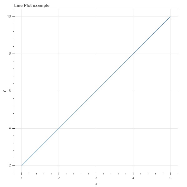
Line plot
The line() method of Figure object adds a line glyph to the Bokeh figure. It needs x and y parameters as data arrays for showing their linear relationship.
from bokeh.plotting import figure, show
fig = figure()
fig.line(x,y)
show(fig)
Following code renders a simple line plot between two sets of values in the form Python list objects −
main.py
from bokeh.plotting import figure, output_file, show

x = [1,2,3,4,5]
y = [2,4,6,8,10]

output_file('line.html')

fig = figure(title = 'Line Plot example', x_axis_label = 'x', y_axis_label = 'y')
fig.line(x,y)

show(fig)
Output
Run the code and verify the output in the browser.
(myenv) D:\bokeh\myenv>py main.py
Bar plot
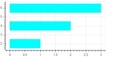
The figure object has two different methods for constructing bar plot
hbar()
The bars are shown horizontally across plot width. The hbar() method has the following parameters −
| Sr.No | y | The y coordinates of the centers of the horizontal bars. |
|---|---|---|
| 1 | height | The heights of the vertical bars. |
| 2 | right | The x coordinates of the right edges. |
| 3 | left | The x coordinates of the left edges. |
Following code is an example of horizontal bar using Bokeh.
main.py
from bokeh.plotting import figure, output_file, show

fig = figure(width = 400, height = 200)
fig.hbar(y = [2,4,6], height = 1, left = 0, right = [1,2,3], color = "Cyan")

output_file('bar.html')

show(fig)
Output
Run the code and verify the output in the browser.
(myenv) D:\bokeh\myenv>py main.py
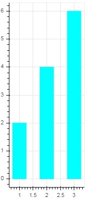
vbar()
The bars are shown vertically across plot height. The vbar() method has following parameters −
| Sr.No | x | The x-coordinates of the centers of the vertical bars. |
|---|---|---|
| 1 | width | The widths of the vertical bars. |
| 2 | top | The y-coordinates of the top edges. |
| 3 | bottom | The y-coordinates of the bottom edges. |
Following code displays vertical bar plot −
main.py
from bokeh.plotting import figure, output_file, show

fig = figure(width = 200, height = 400)
fig.vbar(x = [1,2,3], width = 0.5, bottom = 0, top = [2,4,6], color = "Cyan")

output_file('bar.html')

show(fig)
Output
Run the code and verify the output in the browser.
(myenv) D:\bokeh\myenv>py main.py
Patch plot
A plot which shades a region of space in a specific color to show a region or a group having similar properties is termed as a patch plot in Bokeh. Figure object has patch() and patches() methods for this purpose.
patch()
This method adds patch glyph to given figure. The method has the following arguments −
| 1 | x | The x-coordinates for the points of the patch. |
| 2 | y | The y-coordinates for the points of the patch. |
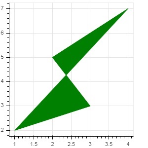
A simple patch plot is obtained by the following Python code −
main.py
from bokeh.plotting import figure, output_file, show

p = figure(width = 300, height = 300)
p.patch(x = [1, 3,2,4], y = [2,3,5,7], color = "green")

output_file('patch.html')

show(p)
Output
Run the code and verify the output in the browser.
(myenv) D:\bokeh\myenv>py main.py
patches()
This method is used to draw multiple polygonal patches. It needs following arguments −
| 1 | xs | The x-coordinates for all the patches, given as a list of lists. |
| 2 | ys | The y-coordinates for all the patches, given as a list of lists. |
As an example of patches() method, run the following code −
main.py
from bokeh.plotting import figure, output_file, show

xs = [[5,3,4], [2,4,3], [2,3,5,4]]
ys = [[6,4,2], [3,6,7], [2,4,7,8]]

fig = figure()
fig.patches(xs, ys, fill_color = ['red', 'blue', 'black'], line_color = 'white')

output_file('patch_plot.html')

show(fig)
Output
Run the code and verify the output in the browser.
(myenv) D:\bokeh\myenv>py main.py
Scatter Markers
Scatter plots are very commonly used to determine the bi-variate relationship between two variables. The enhanced interactivity is added to them using Bokeh. Scatter plot is obtained by calling scatter() method of Figure object. It uses the following parameters −
| 1 | x | values or field names of center x coordinates |
| 2 | y | values or field names of center y coordinates |
| 3 | size | values or field names of sizes in screen units |
| 4 | marker | values or field names of marker types |
| 5 | color | set fill and line color |
Following marker type constants are defined in Bokeh: −
- Asterisk
- Circle
- CircleCross
- CircleX
- Cross
- Dash
- Diamond
- DiamondCross
- Hex
- InvertedTriangle
- Square
- SquareCross
- SquareX
- Triangle
- X
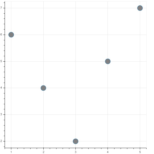
Following Python code generates scatter plot with circle marks.
main.py
from bokeh.plotting import figure, output_file, show

fig = figure()
fig.scatter([1, 4, 3, 2, 5], [6, 5, 2, 4, 7], marker = "circle", size = 20, fill_color = "grey")

output_file('scatter.html')

show(fig)
Output
Run the code and verify the output in the browser.
(myenv) D:\bokeh\myenv>py main.py

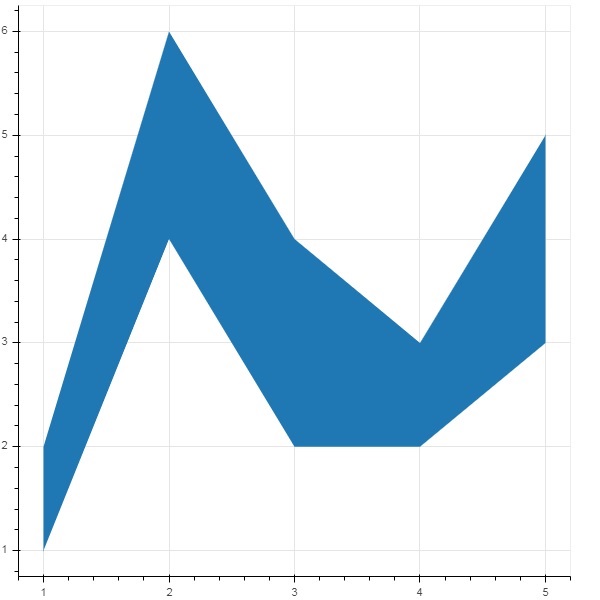
Bokeh - Area Plots
Area plots are filled regions between two series that share a common index. Bokeh's Figure class has two methods as follows −
varea()
Output of the varea() method is a vertical directed area that has one x coordinate array, and two y coordinate arrays, y1 and y2, which will be filled between.
| 1 | x | The x-coordinates for the points of the area. |
| 2 | y1 | The y-coordinates for the points of one side of the area. |
| 3 | y2 | The y-coordinates for the points of the other side of the area. |
Example - Vertical Directed Area Plot
main.py
from bokeh.plotting import figure, output_file, show

fig = figure()
x = [1, 2, 3, 4, 5]
y1 = [2, 6, 4, 3, 5]
y2 = [1, 4, 2, 2, 3]
fig.varea(x = x,y1 = y1,y2 = y2)

output_file('area.html')
show(fig)
Output
Run the code and verify the output in the browser.
(myenv) D:\bokeh\myenv>py main.py
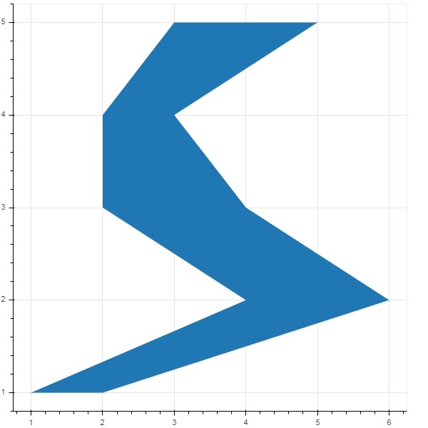
harea()
The harea() method on the other hand needs x1, x2 and y parameters.
| 1 | x1 | The x-coordinates for the points of one side of the area. |
| 2 | x2 | The x-coordinates for the points of the other side of the area. |
| 3 | y | The y-coordinates for the points of the area. |
Example - Horizontal Directed Area Plot
main.py
from bokeh.plotting import figure, output_file, show

fig = figure()
y = [1, 2, 3, 4, 5]
x1 = [2, 6, 4, 3, 5]
x2 = [1, 4, 2, 2, 3]
fig.harea(x1 = x1,x2 = x2,y = y)

output_file('area.html')
show(fig)
Output
Run the code and verify the output in the browser.
(myenv) D:\bokeh\myenv>py main.py
Bokeh - Circle Glyphs
The figure object has many methods using which vectorised glyphs of different shapes such as circle, rectangle, polygon, etc. can, be drawn.
Following methods are available for drawing circle glyphs −
scatter()
The scatter() method adds a circle glyph to the figure and needs x and y coordinates of its center. Additionally, it can be configured with the help of parameters such as fill_color, line-color, line_width etc.
scatter(marker='circle_cross')
The scatter() method with marker as 'circle_cross' adds circle glyph with a + cross through the center.
scatter(marker='circle_x')
The scatter() method with marker as 'circle_x' adds circle with an X cross through the center.
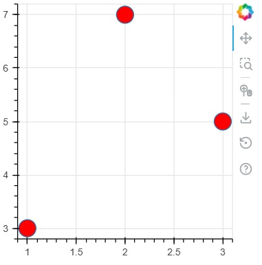
Example - Usage of circle glyph
main.py
from bokeh.plotting import figure, output_file, show

plot = figure(width = 300, height = 300)

plot.scatter(x = [1, 2, 3], y = [3,7,5], size = 20, fill_color = 'red')

show(plot)
Output
Run the code and verify the output in the browser.
(myenv) D:\bokeh\myenv>py main.py
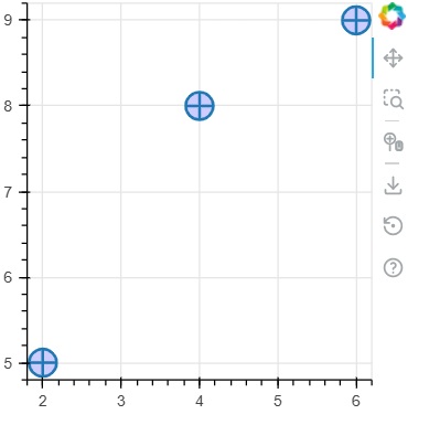
Example - Usage of circle_cross glyph
main.py
from bokeh.plotting import figure, output_file, show

plot = figure(width = 300, height = 300)
plot.scatter(marker='circle_cross', x = [2,4,6], y = [5,8,9], size = 20, fill_color = 'blue',fill_alpha = 0.2, line_width = 2)

show(plot)
Output
Run the code and verify the output in the browser.
(myenv) D:\bokeh\myenv>py main.py
Example - Usage of circle_x glyph
main.py
from bokeh.plotting import figure, output_file, show

plot = figure(width = 300, height = 300)
plot.scatter(marker='circle_x', x = [5,7,2], y = [2,4,9], size = 20, fill_color = 'green',fill_alpha = 0.6, line_width = 2)

show(plot)
Output
Run the code and verify the output in the browser.
(myenv) D:\bokeh\myenv>py main.py

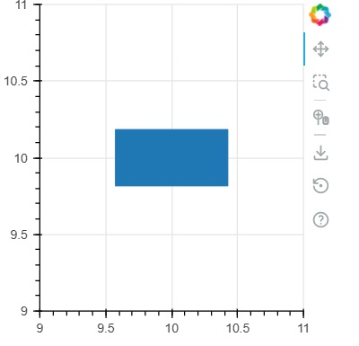
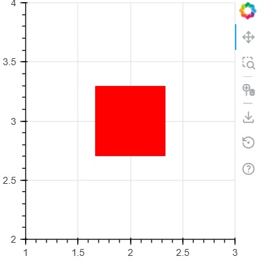
Bokeh - Rectangle, Ellipse and Polygon
It is possible to render rectangle, ellipse and polygons in a Bokeh figure. The rect() method of Figure class adds a rectangle glyph based on x and y coordinates of center, width and height. The scatter(marker="square") method on the other hand has size parameter to decide dimensions.
The ellipse() method adds an ellipse glyph. They use similar signature to that of rect() having x, y,w and h parameters. Additionally, angle parameter determines rotation from horizontal.
Example - Usage of rect glyph
main.py
from bokeh.plotting import figure, output_file, show

fig = figure(width = 300, height = 300)
fig.rect(x = 10,y = 10,width = 100, height = 50, width_units = 'screen', height_units = 'screen')

show(fig)
Output
Run the code and verify the output in the browser.
(myenv) D:\bokeh\myenv>py main.py
Example - Usage of square glyph
main.py
from bokeh.plotting import figure, output_file, show

fig = figure(width = 300, height = 300)
fig.scatter(marker='square',x = 2,y = 3,size = 80, color = 'red')

show(fig)
Output
Run the code and verify the output in the browser.
(myenv) D:\bokeh\myenv>py main.py
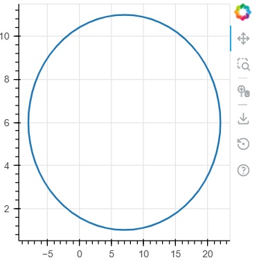
Example - Usage of ellipse glyph
main.py
from bokeh.plotting import figure, output_file, show

fig = figure(width = 300, height = 300)
fig.ellipse(x = 7,y = 6, width = 30, height = 10, fill_color = None, line_width = 2)

show(fig)
Output
Run the code and verify the output in the browser.
(myenv) D:\bokeh\myenv>py main.py
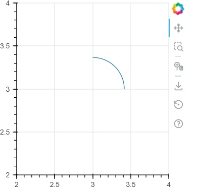
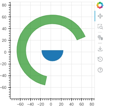
Bokeh - Wedges and Arcs
The arc() method draws a simple line arc based on x and y coordinates, start and end angles and radius. Angles are given in radians whereas radius may be in screen units or data units. The wedge is a filled arc.
The wedge() method has same properties as arc() method. Both methods have provision of optional direction property which may be clock or anticlock that determines the direction of arc/wedge rendering. The annular_wedge() function renders a filled area between to arcs of inner and outer radius.
Example - Usage of arc glyph
main.py
from bokeh.plotting import figure, output_file, show
import math

fig = figure(width = 300, height = 300)
fig.arc(x = 3, y = 3, radius = 50, radius_units = 'screen', start_angle = 0.0, end_angle = math.pi/2)

show(fig)
Output
Run the code and verify the output in the browser.
(myenv) D:\bokeh\myenv>py main.py
Example - Usage of wedges glyph
main.py
from bokeh.plotting import figure, output_file, show
import math

fig = figure(width = 300, height = 300)
fig.wedge(x = 3, y = 3, radius = 30, radius_units = 'screen',start_angle = 0, end_angle = math.pi, direction = 'clock')
fig.annular_wedge(x = 3,y = 3, inner_radius = 100, outer_radius = 75,outer_radius_units = 'screen',
inner_radius_units = 'screen',start_angle = 0.4, end_angle = 4.5,color = "green", alpha = 0.6)
show(fig)
Output
Run the code and verify the output in the browser.
(myenv) D:\bokeh\myenv>py main.py
Bokeh - Specialized Curves
The bokeh.plotting API supports methods for rendering following specialised curves −
beizer()
This method adds a Bzier curve to the figure object. A Bzier curve is a parametric curve used in computer graphics. Other uses include the design of computer fonts and animation, user interface design and for smoothing cursor trajectory.
In vector graphics, Bzier curves are used to model smooth curves that can be scaled indefinitely. A "Path" is combination of linked Bzier curves.
The beizer() method has following parameters which are defined −
| 1 | x0 | The x-coordinates of the starting points. |
| 2 | y0 | The y-coordinates of the starting points.. |
| 3 | x1 | The x-coordinates of the ending points. |
| 4 | y1 | The y-coordinates of the ending points. |
| 5 | cx0 | The x-coordinates of first control points. |
| 6 | cy0 | The y-coordinates of first control points. |
| 7 | cx1 | The x-coordinates of second control points. |
| 8 | cy1 | The y-coordinates of second control points. |
Default value for all parameters is None.
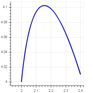
Example - Plotting of Bezier Curve (main.py)
Following code generates a HTML page showing a Bzier curve and parabola in Bokeh plot −
from bokeh.plotting import figure, output_file, show

x = 2
y = 4
xp02 = x+0.4
xp01 = x+0.1
xm01 = x-0.1
yp01 = y+0.2
ym01 = y-0.2
fig = figure(width = 300, height = 300)
fig.bezier(x0 = x, y0 = y, x1 = xp02, y1 = y, cx0 = xp01, cy0 = yp01,
cx1 = xm01, cy1 = ym01, line_color = "red", line_width = 2)

show(fig)
Output
Run the code and verify the output in the browser.
(myenv) D:\bokeh\myenv>py main.py
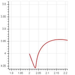
quadratic()
This method adds a parabola glyph to bokeh figure. The function has same parameters as beizer(), except cx0 and cx1.
Example - Plotting of quadratic curve (main.py)
The code given below generates a quadratic curve.
from bokeh.plotting import figure, output_file, show

x = 2
y = 4
xp01 = x + 0.4
yp01 = y + 0.01
cx01 = x + 0.1
cy01 = y + 0.2

fig = figure(width = 300, height = 300)
fig.quadratic(x0 = x, y0 = y, x1 = xp01, y1 = yp01, cx = cx01,
cy = cy01, line_color = "blue", line_width = 3)

show(fig)
Output
Run the code and verify the output in the browser.
(myenv) D:\bokeh\myenv>py main.py
Bokeh - Setting Ranges
Numeric ranges of data axes of a plot are automatically set by Bokeh taking into consideration the dataset under process. However, sometimes you may want to define the range of values on x and y axis explicitly. This is done by assigning x_range and y_range properties to a figure() function.
These ranges are defined with the help of range1d() function.
Example
xrange = Range1d(0,10)
To use this range object as x_range property, use the below code −
fig = figure(x,y,x_range = xrange)
Example - Usage of Range1d
main.py
from bokeh.plotting import figure, output_file, show
import numpy as np
import math
from bokeh.models import Range1d

x = np.arange(0, math.pi*2, 0.05)
y = np.sin(x)

output_file("sine.html")

xrange = Range1d(0,10)
fig = figure(width = 300, height = 300, x_range = xrange)
fig.line(x, y, legend_label = "sine", line_width = 2)

show(fig)
Output
Run the code and verify the output
(myenv) D:\bokeh\myenv>py main.py
Bokeh - Axes
In this chapter, we shall discuss about various types of axes.
| Sr.No | Axes | Description |
|---|---|---|
| 1 | Categorical Axes | The bokeh plots show numerical data along both x and y axes. In order to use categorical data along either of axes, we need to specify a FactorRange to specify categorical dimensions for one of them. |
| 2 | Log Scale Axes | If there exists a power law relationship between x and y data series, it is desirable to use log scales on both axes. |
| 3 | Twin Axes | It may be needed to show multiple axes representing varying ranges on a single plot figure. The figure object can be so configured by defining extra_x_range and extra_y_range properties |
Categorical Axes
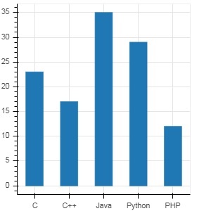
In the examples so far, the Bokeh plots show numerical data along both x and y axes. In order to use categorical data along either of axes, we need to specify a FactorRange to specify categorical dimensions for one of them. For example, to use strings in the given list for x axis −
langs = ['C', 'C++', 'Java', 'Python', 'PHP']
fig = figure(x_range = langs, plot_width = 300, plot_height = 300)
Example - Plotting a simple bar plot (main.py)
With following example, a simple bar plot is displayed showing number of students enrolled for various courses offered.
from bokeh.plotting import figure, output_file, show

langs = ['C', 'C++', 'Java', 'Python', 'PHP']
students = [23,17,35,29,12]
fig = figure(x_range = langs, width = 300, height = 300)
fig.vbar(x = langs, top = students, width = 0.5)

show(fig)
Output
Run the code and verify the output in the browser.
(myenv) D:\bokeh\myenv>py main.py
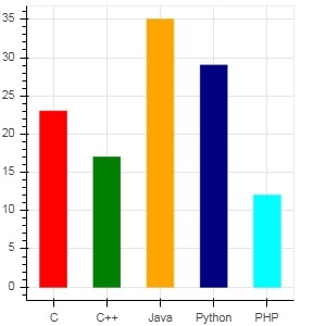
To show each bar in different colour, set color property of vbar() function to list of color values.
main.py
from bokeh.plotting import figure, output_file, show

langs = ['C', 'C++', 'Java', 'Python', 'PHP']
students = [23,17,35,29,12]
fig = figure(x_range = langs, width = 300, height = 300)

cols = ['red','green','orange','navy', 'cyan']
fig.vbar(x = langs, top = students, color = cols,width=0.5)

show(fig)
Output
Run the code and verify the output in the browser.
(myenv) D:\bokeh\myenv>py main.py
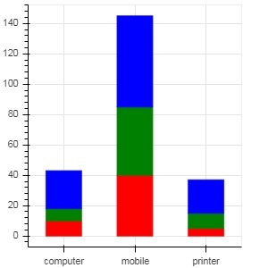
To render a vertical (or horizontal) stacked bar using vbar_stack() or hbar_stack() function, set stackers property to list of fields to stack successively and source property to a dict object containing values corresponding to each field.
In following example, sales is a dictionary showing sales figures of three products in three months.
main.py
from bokeh.plotting import figure, output_file, show

products = ['computer','mobile','printer']
months = ['Jan','Feb','Mar']
sales = {'products':products,
   'Jan':[10,40,5],
   'Feb':[8,45,10],
   'Mar':[25,60,22]}
cols = ['red','green','blue']#,'navy', 'cyan']
fig = figure(x_range = products, width = 300, height = 300)
fig.vbar_stack(months, x = 'products', source = sales, color = cols,width = 0.5)

show(fig)
Output
Run the code and verify the output in the browser.
(myenv) D:\bokeh\myenv>py main.py
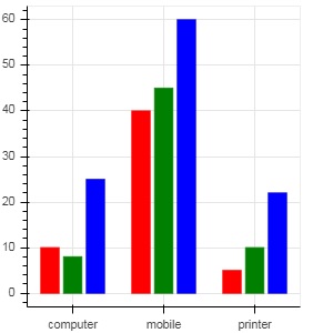
A grouped bar plot is obtained by specifying a visual displacement for the bars with the help of dodge() function in bokeh.transform module.
The dodge() function introduces a relative offset for each bar plot thereby achieving a visual impression of group. In following example, vbar() glyph is separated by an offset of 0.25 for each group of bars for a particular month.
main.py
from bokeh.plotting import figure, output_file, show
from bokeh.transform import dodge

products = ['computer','mobile','printer']
months = ['Jan','Feb','Mar']
sales = {'products':products,
   'Jan':[10,40,5],
   'Feb':[8,45,10],
   'Mar':[25,60,22]}
fig = figure(x_range = products, width = 300, height = 300)
fig.vbar(x = dodge('products', -0.25, range = fig.x_range), top = 'Jan',
   width = 0.2,source = sales, color = "red")
fig.vbar(x = dodge('products', 0.0, range = fig.x_range), top = 'Feb',
   width = 0.2, source = sales,color = "green")
fig.vbar(x = dodge('products', 0.25, range = fig.x_range), top = 'Mar',
   width = 0.2,source = sales,color = "blue")

show(fig)
Output
Run the code and verify the output in the browser.
(myenv) D:\bokeh\myenv>py main.py
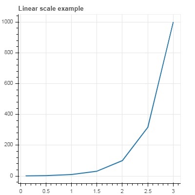
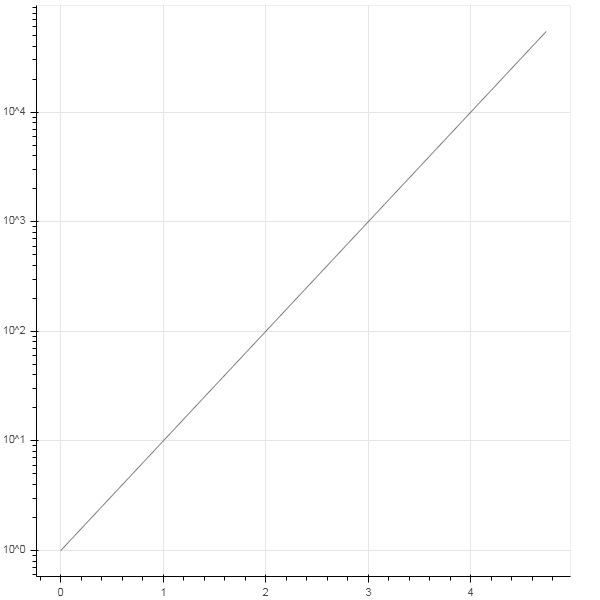
Log Scale Axes
When values on one of the axes of a plot grow exponentially with linearly increasing values of another, it is often necessary to have the data on former axis be displayed on a log scale. For example, if there exists a power law relationship between x and y data series, it is desirable to use log scales on both axes.
Bokeh.plotting API's figure() function accepts x_axis_type and y_axis_type as arguments which may be specified as log axis by passing "log" for the value of either of these parameters.
First figure shows plot between x and 10x on a linear scale. In second figure y_axis_type is set to 'log'
main.py
from bokeh.plotting import figure, output_file, show

x = [0.1, 0.5, 1.0, 1.5, 2.0, 2.5, 3.0]
y = [10**i for i in x]
fig = figure(title = 'Linear scale example',width = 400, height = 400)
fig.line(x, y, line_width = 2)

show(fig)
Output
Run the code and verify the output in the browser.
(myenv) D:\bokeh\myenv>py main.py
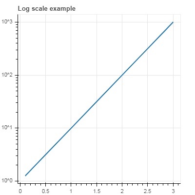
Now change figure() function to configure y_axis_type=log
main.py
from bokeh.plotting import figure, output_file, show

x = [0.1, 0.5, 1.0, 1.5, 2.0, 2.5, 3.0]
y = [10**i for i in x]
fig = figure(title = 'Linear scale example',width = 400, height = 400, y_axis_type = "log")
fig.line(x, y, line_width = 2)

show(fig)
Output
Run the code and verify the output in the browser.
(myenv) D:\bokeh\myenv>py main.py
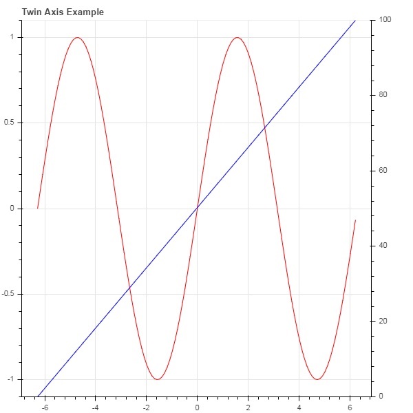
Twin Axes
In certain situations, it may be needed to show multiple axes representing varying ranges on a single plot figure. The figure object can be so configured by defining extra_x_range and extra_y_range properties. While adding new glyph to the figure, these named ranges are used.
We try to display a sine curve and a straight line in same plot. Both glyphs have y axes with different ranges. The x and y data series for sine curve and line are obtained by the following −
from numpy import pi, arange, sin, linspace
x = arange(-2*pi, 2*pi, 0.1)
y = sin(x)
y2 = linspace(0, 100, len(y))
Here, plot between x and y represents sine relation and plot between x and y2 is a straight line. The Figure object is defined with explicit y_range and a line glyph representing sine curve is added as follows −
fig = figure(title = 'Twin Axis Example', y_range = (-1.1, 1.1))
fig.line(x, y, color = "red")
We need an extra y range. It is defined as −
fig.extra_y_ranges = {"y2": Range1d(start = 0, end = 100)}
To add additional y axis on right side, use add_layout() method. Add a new line glyph representing x and y2 to the figure.
fig.add_layout(LinearAxis(y_range_name = "y2"), 'right')
fig.line(x, y2, color = "blue", y_range_name = "y2")
This will result in a plot with twin y axes. Complete code and the output is as follows −
from numpy import pi, arange, sin, linspace
x = arange(-2*pi, 2*pi, 0.1)
y = sin(x)
y2 = linspace(0, 100, len(y))
from bokeh.plotting import output_file, figure, show
from bokeh.models import LinearAxis, Range1d
fig = figure(title='Twin Axis Example', y_range = (-1.1, 1.1))
fig.line(x, y, color = "red")
fig.extra_y_ranges = {"y2": Range1d(start = 0, end = 100)}
fig.add_layout(LinearAxis(y_range_name = "y2"), 'right')
fig.line(x, y2, color = "blue", y_range_name = "y2")
show(fig)
Output
Run the code and verify the output in the browser.
(myenv) D:\bokeh\myenv>py main.py
Bokeh - Annotations and Legends
Annotations are pieces of explanatory text added to the diagram. Bokeh plot can be annotated by way of specifying plot title, labels for x and y axes as well as inserting text labels anywhere in the plot area.
Example - Adding Title and Labels
Plot title as well as x and y axis labels can be provided in the Figure constructor itself.
fig = figure(title, x_axis_label, y_axis_label)
In the following plot, these properties are set as shown below −
main.py
from bokeh.plotting import figure, output_file, show

import numpy as np
import math
x = np.arange(0, math.pi*2, 0.05)
y = np.sin(x)
fig = figure(title = "sine wave example", x_axis_label = 'angle', y_axis_label = 'sin')
fig.line(x, y,line_width = 2)

show(fig)
Output
Run the code and verify the output in the browser.
(myenv) D:\bokeh\myenv>py main.py
Adding Multiple Properties
The title text and axis labels can also be specified by assigning appropriate string values to corresponding properties of figure object.
fig.title.text = "sine wave example"
fig.xaxis.axis_label = 'angle'
fig.yaxis.axis_label = 'sin'
It is also possible to specify location, alignment, font and color of title.
fig.title.align = "right"
fig.title.text_color = "orange"
fig.title.text_font_size = "25px"
fig.title.background_fill_color = "blue"
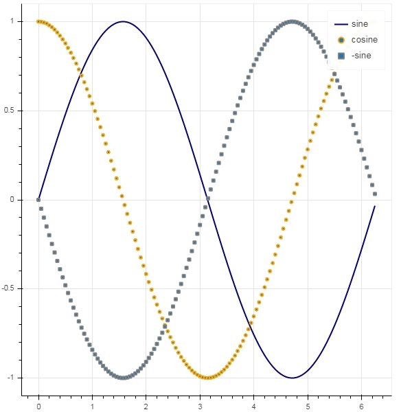
Adding legends to the plot figure is very easy. We have to use legend property of any glyph method.
Below we have three glyph curves in the plot with three different legends −
main.py
from bokeh.plotting import figure, output_file, show

import numpy as np
import math
x = np.arange(0, math.pi*2, 0.05)
y = np.sin(x)
fig = figure(title = "sine wave example", x_axis_label = 'angle', y_axis_label = 'sin')
fig.title.align = "right"
fig.title.text_color = "orange"
fig.title.text_font_size = "25px"
fig.title.background_fill_color = "blue"
fig.line(x, y,line_width = 2, line_color = 'navy', legend_label = 'sine')

show(fig)
Output
Run the code and verify the output in the browser.
(myenv) D:\bokeh\myenv>py main.py
Bokeh - Pandas
In all the examples earlier, the data to be plotted has been provided in the form of Python lists or numpy arrays. It is also possible to provide the data source in the form of pandas DataFrame object.
DataFrame is a two-dimensional data structure. Columns in the dataframe can be of different data types. The Pandas library has functions to create dataframe from various sources such as CSV file, Excel worksheet, SQL table, etc.
For the purpose of following example, we are using a CSV file consisting of two columns representing a number x and 10x. The test.csv file is as below −
test.csv
x,pow
0.0,1.0
0.5263157894736842,3.3598182862837818
1.0526315789473684,11.28837891684689
1.5789473684210527,37.926901907322495
2.1052631578947367,127.42749857031335
2.631578947368421,428.1332398719391
3.1578947368421053,1438.449888287663
3.6842105263157894,4832.930238571752
4.2105263157894735,16237.76739188721
4.7368421052631575,54555.947811685146
We shall read this file in a dataframe object using read_csv() function in pandas.
Example - Reading CSV using Pandas
main.py
import pandas as pd

df = pd.read_csv('test.csv')
print (df)
Output
Run the code and verify the output in the browser.
(myenv) D:\bokeh\myenv>py main.py
The dataframe appears as below −
          x           pow
0  0.000000      1.000000
1  0.526316      3.359818
2  1.052632     11.288379
3  1.578947     37.926902
4  2.105263    127.427499
5  2.631579    428.133240
6  3.157895   1438.449888
7  3.684211   4832.930239
8  4.210526  16237.767392
9  4.736842  54555.947812
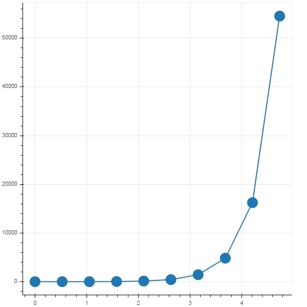
Example - Plotting Panda Data Series
The x and pow columns are used as data series for line glyph in bokeh plot figure.
main.py
import pandas as pd
from bokeh.plotting import figure, output_file, show

df = pd.read_csv('test.csv')

p = figure()
x = df['x']
y = df['pow']
p.line(x,y,line_width = 2)
p.circle(x, y,size = 20)
show(p)
Output
Run the code and verify the output in the browser.
(myenv) D:\bokeh\myenv>py main.py
Bokeh - ColumnDataSource
Most of the plotting methods in Bokeh API are able to receive data source parameters through ColumnDatasource object. It makes sharing data between plots and DataTables.
A ColumnDatasource can be considered as a mapping between column name and list of data. A Python dict object with one or more string keys and lists or numpy arrays as values is passed to ColumnDataSource constructor.
Example - Creating a ColumnDataSource
Syntax
from bokeh.models import ColumnDataSource

data = {'x':[1, 4, 3, 2, 5],
   'y':[6, 5, 2, 4, 7]}
cds = ColumnDataSource(data = data)
This object is then used as value of source property in a glyph method. Following code generates a scatter plot using ColumnDataSource.
main.py
from bokeh.plotting import figure, output_file, show
from bokeh.models import ColumnDataSource

data = {'x':[1, 4, 3, 2, 5],
   'y':[6, 5, 2, 4, 7]}

cds = ColumnDataSource(data = data)

fig = figure()
fig.scatter(x = 'x', y = 'y',source = cds, marker = "circle", size = 20, fill_color = "grey")

show(fig)
Output
Run the code and verify the output in the browser.
(myenv) D:\bokeh\myenv>py main.py
Using Panda DataFrame to create a ColumnDataSource
Instead of assigning a Python dictionary to ColumnDataSource, we can use a Pandas DataFrame for it.
Let us use test.csv (used earlier in this section) to obtain a DataFrame and use it for getting ColumnDataSource and rendering line plot.
main.csv
from bokeh.plotting import figure, output_file, show
import pandas as pd
from bokeh.models import ColumnDataSource

df = pd.read_csv('test.csv')
cds = ColumnDataSource(df)
fig = figure(y_axis_type = 'log')
fig.line(x = 'x', y = 'pow',source = cds, line_color = "grey")

show(fig)
Output
Run the code and verify the output in the browser.
(myenv) D:\bokeh\myenv>py main.py
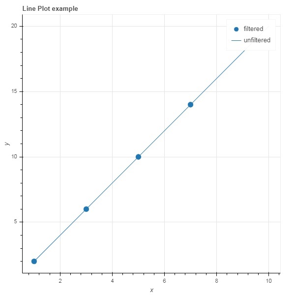
Bokeh - Filtering Data
Often, you may want to obtain a plot pertaining to a part of data that satisfies certain conditions instead of the entire dataset. Object of the CDSView class defined in bokeh.models module returns a subset of ColumnDatasource under consideration by applying one or more filters over it.
IndexFilter is the simplest type of filter. You have to specify indices of only those rows from the dataset that you want to use while plotting the figure.
Following example demonstrates use of IndexFilter to set up a CDSView. The resultant figure shows a line glyph between x and y data series of the ColumnDataSource. A view object is obtained by applying index filter over it. The view is used to plot circle glyph as a result of IndexFilter.
Example - Usage of IndexFilter
main.py
from bokeh.models import ColumnDataSource, CDSView, IndexFilter
from bokeh.plotting import figure, output_file, show

source = ColumnDataSource(data = dict(x = list(range(1,11)), y = list(range(2,22,2))))
view = CDSView(filter = IndexFilter([0, 2, 4,6]))
fig = figure(title = 'Line Plot example', x_axis_label = 'x', y_axis_label = 'y')
fig.scatter(x = "x", y = "y", size = 10, source = source, view = view, legend_label = 'filtered')
fig.line(source.data['x'],source.data['y'], legend_label = 'unfiltered')
show(fig)
Output
Run the code and verify the output in the browser.
(myenv) D:\bokeh\myenv>py main.py
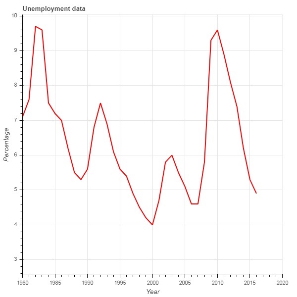
Example - Usage of BooleanFilter
To choose only those rows from the data source, that satisfy a certain Boolean condition, apply a BooleanFilter.
A typical Bokeh installation consists of a number of sample data sets in sampledata directory. For following example, we use unemployment1948 dataset provided in the form of unemployment1948.csv. It stores year wise percentage of unemployment in USA since 1948. We want to generate a plot only for year 1980 onwards. For that purpose, a CDSView object is obtained by applying BooleanFilter over the given data source.
main.py
from bokeh.models import ColumnDataSource, CDSView, BooleanFilter
from bokeh.plotting import figure, show
from bokeh.sampledata.unemployment1948 import data

source = ColumnDataSource(data)
booleans = [True if int(year) >= 1980 else False for year in source.data['Year']]
print (booleans)
view1 = CDSView(filter=BooleanFilter(booleans))
p = figure(title = "Unemployment data", x_range = (1980,2020), x_axis_label = 'Year', y_axis_label='Percentage')
p.line(x = 'Year', y = 'Annual', source = source, view = view1, color = 'red', line_width = 2)
show(p)
Output
Run the code and verify the output in the browser.
(myenv) D:\bokeh\myenv>py main.py
Example - Usage of CustomJSFilter
To add more flexibility in applying filter, Bokeh provides a CustomJSFilter class with the help of which the data source can be filtered with a user defined JavaScript function.
The example given below uses the same USA unemployment data. Defining a CustomJSFilter to plot unemployment figures of year 1980 and after.
main.py
from bokeh.models import ColumnDataSource, CDSView, CustomJSFilter
from bokeh.plotting import figure, show
from bokeh.sampledata.unemployment1948 import data

source = ColumnDataSource(data)
custom_filter = CustomJSFilter(code = '''
   var indices = [];

   for (var i = 0; i < source.get_length(); i++){
      if (parseInt(source.data['Year'][i]) > = 1980){
         indices.push(true);
      } else {
         indices.push(false);
      }
   }
   return indices;
''')
view1 = CDSView(filter = custom_filter)
p = figure(title = "Unemployment data", x_range = (1980,2020), x_axis_label = 'Year', y_axis_label = 'Percentage')
p.line(x = 'Year', y = 'Annual', source = source, view = view1, color = 'red', line_width = 2)
show(p)
Output
Run the code and verify the output in the browser.
(myenv) D:\bokeh\myenv>py main.py
Bokeh - Layouts
Bokeh visualizations can be suitably arranged in different layout options. These layouts as well as sizing modes result in plots and widgets resizing automatically as per the size of browser window. For consistent appearance, all items in a layout must have same sizing mode. The widgets (buttons, menus, etc.) are kept in a separate widget box and not in plot figure.
First type of layout is Column layout which displays plot figures vertically. The column() function is defined in bokeh.layouts module and takes following signature −
from bokeh.layouts import column
col = column(children, sizing_mode)
children − List of plots and/or widgets.
sizing_mode − determines how items in the layout resize. Possible values are "fixed", "stretch_both", "scale_width", "scale_height", "scale_both". Default is fixed.
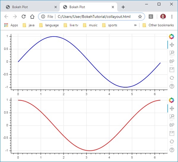
Example - Displaying Figures Vertically
Following code produces two Bokeh figures and places them in a column layout so that they are displayed vertically. Line glyphs representing sine and cos relationship between x and y data series is displayed in Each figure.
main.py
from bokeh.plotting import figure, output_file, show
from bokeh.layouts import column
import numpy as np
import math

x = np.arange(0, math.pi*2, 0.05)
y1 = np.sin(x)
y2 = np.cos(x)
fig1 = figure(width = 200, height = 200)
fig1.line(x, y1,line_width = 2, line_color = 'blue')
fig2 = figure(width = 200, height = 200)
fig2.line(x, y2,line_width = 2, line_color = 'red')

c = column(children = [fig1, fig2], sizing_mode = 'stretch_both')
show(c)
Output
Run the code and verify the output in the browser.
(myenv) D:\bokeh\myenv>py main.py
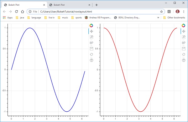
Example - Displaying Figures horizontally
Similarly, Row layout arranges plots horizontally, for which row() function as defined in bokeh.layouts module is used. As you would think, it also takes two arguments (similar to column() function) children and sizing_mode.
The sine and cos curves as shown vertically in above diagram are now displayed horizontally in row layout with following code
main.py
from bokeh.plotting import figure, output_file, show
from bokeh.layouts import row
import numpy as np
import math

x = np.arange(0, math.pi*2, 0.05)
y1 = np.sin(x)
y2 = np.cos(x)
fig1 = figure(width = 200, height = 200)
fig1.line(x, y1,line_width = 2, line_color = 'blue')
fig2 = figure(width = 200, height = 200)
fig2.line(x, y2,line_width = 2, line_color = 'red')
r = row(children = [fig1, fig2], sizing_mode = 'stretch_both')
show(r)
Output
Run the code and verify the output in the browser.
(myenv) D:\bokeh\myenv>py main.py
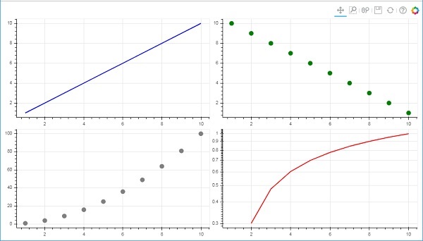
Example - Grid Layout
The Bokeh package also has grid layout. It holds multiple plot figures (as well as widgets) in a two dimensional grid of rows and columns. The gridplot() function in bokeh.layouts module returns a grid and a single unified toolbar which may be positioned with the help of toolbar_location property.
This is unlike row or column layout where each plot shows its own toolbar. The grid() function too uses children and sizing_mode parameters where children is a list of lists. Ensure that each sublist is of same dimensions.
In the following code, four different relationships between x and y data series are plotted in a grid of two rows and two columns.
main.py
from bokeh.plotting import figure, output_file, show
from bokeh.layouts import gridplot
import math
x = list(range(1,11))

y1 = x
y2 =[11-i for i in x]
y3 = [i*i for i in x]
y4 = [math.log10(i) for i in x]

fig1 = figure(width = 200, height = 200)
fig1.line(x, y1,line_width = 2, line_color = 'blue')
fig2 = figure(width = 200, height = 200)
fig2.scatter(x, y2,size = 10, color = 'green')
fig3 = figure(width = 200, height = 200)
fig3.scatter(x,y3, size = 10, color = 'grey')
fig4 = figure(width = 200, height = 200, y_axis_type = 'log')
fig4.line(x,y4, line_width = 2, line_color = 'red')
grid = gridplot(children = [[fig1, fig2], [fig3,fig4]], sizing_mode = 'stretch_both')
show(grid)
Output
Run the code and verify the output in the browser.
(myenv) D:\bokeh\myenv>py main.py
Bokeh - Plot Tools
When a Bokeh plot is rendered, normally a tool bar appears on the right side of the figure. It contains a default set of tools. First of all, the position of toolbar can be configured by toolbar_location property in figure() function. This property can take one of the following values −
- "above"
- "below"
- "left"
- "right"
- "None"
For example, following statement will cause toolbar to be displayed below the plot −
Fig = figure(toolbar_location = "below")
This toolbar can be configured according to the requirement by adding required from various tools defined in bokeh.models module. For example −
Fig.add_tools(WheelZoomTool())
The tools can be classified under following categories −
- Pan/Drag Tools
- Click/Tap Tools
- Scroll/Pinch Tools
Tools
| Tool | Description | Icon |
|---|---|---|
|
BoxSelectTool Name : 'box_select' |
allows the user to define a rectangular selection region by left-dragging a mouse |  |
|
LassoSelectTool name: 'lasso_select |
allows the user to define an arbitrary region for selection by left-dragging a mouse |  |
|
PanTool name: 'pan', 'xpan', 'ypan', |
allows the user to pan the plot by left-dragging a mouse |  |
|
TapTool name: 'tap |
allows the user to select at single points by clicking a left mouse button |  |
|
WheelZoomTool name: 'wheel_zoom', 'xwheel_zoom', 'ywheel_zoom' |
zoom the plot in and out, centered on the current mouse location. |  |
|
WheelPanTool name: 'xwheel_pan', 'ywheel_pan' |
translate the plot window along the specified dimension without changing the windows aspect ratio. |  |
|
ResetTool name: 'reset' |
restores the plot ranges to their original values. |  |
|
SaveTool name: 'save' |
allows the user to save a PNG image of the plot. |  |
|
ZoomInTool name: 'zoom_in', 'xzoom_in', 'yzoom_in' |
The zoom-in tool will increase the zoom of the plot in x, y or both coordinates |  |
|
ZoomOutTool name: 'zoom_out', 'xzoom_out', 'yzoom_out' |
The zoom-out tool will decrease the zoom of the plot in x, y or both coordinates |  |
|
CrosshairTool name: 'crosshair' |
draws a crosshair annotation over the plot, centered on the current mouse position. |  |
Bokeh - Styling Visual Attributes
The default appearance of a Bokeh plot can be customised by setting various properties to desired value. These properties are mainly of three types −
Line properties
Following table lists various properties related to line glyph.
| 1 | line_color | color is used to stroke lines with |
| 2 | line_width | This is used in units of pixels as line stroke width |
| 3 | line_alpha | Between 0 (transparent) and 1 (opaque) this acts as a floating point |
| 4 | line_join | how to join together the path segments. Defined values are: 'miter' (miter_join), 'round' (round_join), 'bevel' (bevel_join) |
| 5 | line_cap | how to terminate the path segments. Defined values are: 'butt' (butt_cap), 'round' (round_cap), 'square' (square_cap) |
| 6 | line_dash | BThis is used for a line style. Defined values are: 'solid', 'dashed', 'dotted', 'dotdash', 'dashdot' |
| 7 | line_dash_offset | The distance into the line_dash in pixels that the pattern should start from |
Fill properties
Various fill properties are listed below −
| 1 | fill_color | This is used to fill paths with |
| 2 | fill_alpha | Between 0 (transparent) and 1 (opaque), this acts as a floating point |
Text properties
There are many text related properties as listed in the following table −
| 1 | text_font | font name, e.g., 'times', 'helvetica' |
| 2 | text_font_size | font size in px, em, or pt, e.g., '12pt', '1.5em' |
| 3 | text_font_style | font style to use 'normal' 'italic' 'bold' |
| 4 | text_color | This is used to render text with |
| 5 | text_alpha | Between 0 (transparent) and 1 (opaque), this is a floating point |
| 6 | text_align | horizontal anchor point for text - 'left', 'right', 'center' |
| 7 | text_baseline | vertical anchor point for text 'top', 'middle', 'bottom', 'alphabetic', 'hanging' |
Bokeh - Customising legends
Various glyphs in a plot can be identified by legend property appear as a label by default at top-right position of the plot area. This legend can be customised by following attributes −
| 1 | legend.label_text_font | change default label font to specified font name | |
| 2 | legend.label_text_font_size | font size in points | |
| 3 | legend.location | set the label at specified location. | |
| 4 | legend.title | set title for legend label | |
| 5 | legend.orientation | set to horizontal (default) or vertical | |
| 6 | legend.clicking_policy | specify what should happen when legend is clicked hide: hides the glyph corresponding to legend mute: mutes the glyph corresponding to legendtd> |
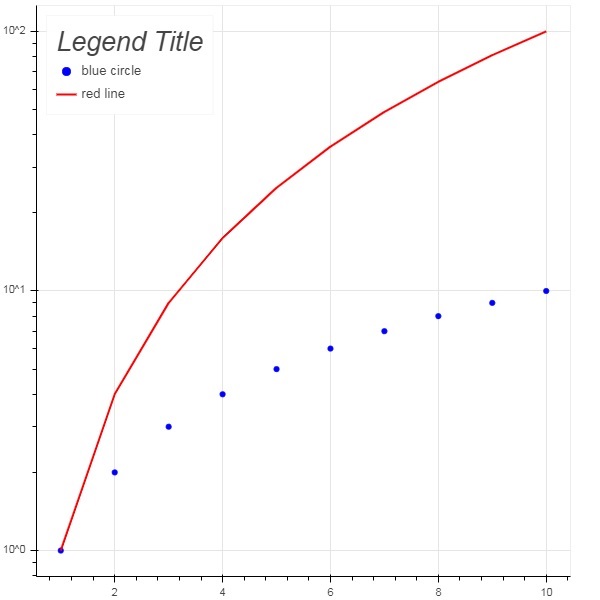
Example - Customizing Legend
Example code for legend customisation is as follows −
main.py
from bokeh.plotting import figure, output_file, show
import math

x2 = list(range(1,11))
y4 = [math.pow(i,2) for i in x2]
y2 = [math.log10(pow(10,i)) for i in x2]
fig = figure(y_axis_type = 'log')
fig.scatter(x2, y2,size = 5, color = 'blue', legend_label = 'blue circle')
fig.line(x2,y4, line_width = 2, line_color = 'red', legend_label = 'red line')
fig.legend.location = 'top_left'
fig.legend.title = 'Legend Title'
fig.legend.title_text_font = 'Arial'
fig.legend.title_text_font_size = '20pt'
show(fig)
Output
Run the code and verify the output in the browser.
(myenv) D:\bokeh\myenv>py main.py
Bokeh - Adding Widgets
The bokeh.models.widgets module contains definitions of GUI objects similar to HTML form elements, such as button, slider, checkbox, radio button, etc. These controls provide interactive interface to a plot. Invoking processing such as modifying plot data, changing plot parameters, etc., can be performed by custom JavaScript functions executed on corresponding events.
Bokeh allows call back functionality to be defined with two methods −
Use the CustomJS callback so that the interactivity will work in standalone HTML documents.
Use Bokeh server and set up event handlers.
In this section, we shall see how to add Bokeh widgets and assign JavaScript callbacks.
Button
This widget is a clickable button generally used to invoke a user defined call back handler. The constructor takes following parameters −
Button(label, icon, callback)
The label parameter is a string used as buttons caption and callback is the custom JavaScript function to be called when clicked.
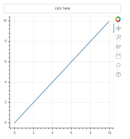
In the following example, a plot and Button widget are displayed in Column layout. The plot itself renders a line glyph between x and y data series.
A custom JavaScript function named callback has been defined using CutomJS() function. It receives reference to the object that triggered callback (in this case the button) in the form variable cb_obj.
This function alters the source ColumnDataSource data and finally emits this update in source data.
main.py
from bokeh.layouts import column
from bokeh.models import CustomJS, ColumnDataSource
from bokeh.plotting import figure, output_file, show
from bokeh.models.widgets import Button
from bokeh import events

x = [x*0.05 for x in range(0, 200)]
y = x

source = ColumnDataSource(data=dict(x=x, y=y))
plot = figure(width=400, height=400)
plot.line('x', 'y', source=source, line_width=3, line_alpha=0.6)

def display_event(source):
   return CustomJS(args=dict(source=source), code="""
   var data = source.data;
   var x = data['x']
   var y = data['y']
   for (var i = 0; i < x.length; i++) {
      y[i] = Math.pow(x[i], 4)
   }
   source.change.emit()
""")

btn = Button(label="click here", name="1")

btn.js_on_event(events.ButtonClick, display_event(source))

layout = column(btn , plot)
show(layout)
Output
Run the code and verify the output in the browser.
(myenv) D:\bokeh\myenv>py main.py
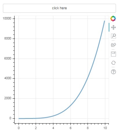
Click on the button on top of the plot and see the updated plot figure which looks as follows −
Output (after click)
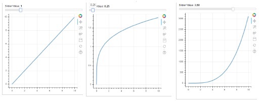
Slider
With the help of a slider control it is possible to select a number between start and end properties assigned to it.
Slider(start, end, step, value)
In the following example, we register a callback function on sliders on_change event. Sliders instantaneous numeric value is available to the handler in the form of cb_obj.value which is used to modify the ColumnDatasource data. The plot figure continuously updates as you slide the position.
main.py
from bokeh.layouts import column
from bokeh.models import CustomJS, ColumnDataSource
from bokeh.plotting import Figure, output_file, show
from bokeh.models.widgets import Slider

x = [x*0.05 for x in range(0, 200)]
y = x

source = ColumnDataSource(data=dict(x=x, y=y))
plot = Figure(width=400, height=400)
plot.line('x', 'y', source=source, line_width=3, line_alpha=0.6)

handler = CustomJS(args=dict(source=source), code="""
   var data = source.data;
   var f = cb_obj.value
   var x = data['x']
   var y = data['y']
   for (var i = 0; i < x.length; i++) {
      y[i] = Math.pow(x[i], f)
   }
   source.change.emit();
""")

slider = Slider(start=0.0, end=5, value=1, step=.25, title="Slider Value")

slider.js_on_change('value', handler)
layout = column(slider, plot)
show(layout)
Output
Run the code and verify the output in the browser.
(myenv) D:\bokeh\myenv>py main.py
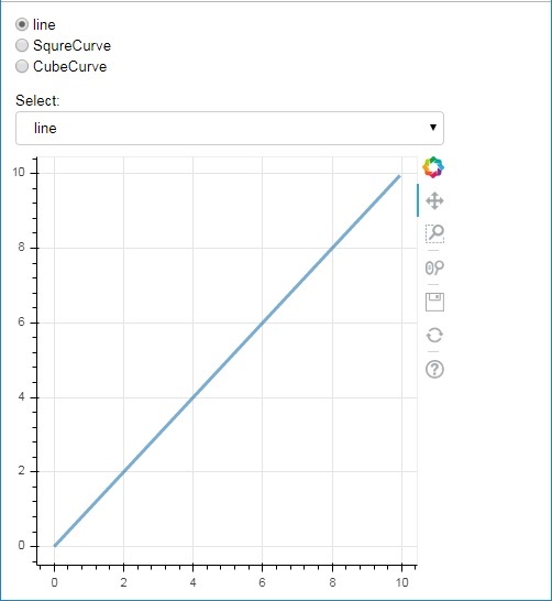
RadioGroup
This widget presents a collection of mutually exclusive toggle buttons showing circular buttons to the left of caption.
RadioGroup(labels, active)
Where, labels is a list of captions and active is the index of selected option.
Select
This widget is a simple dropdown list of string items, one of which can be selected. Selected string appears at the top window and it is the value parameter.
Select(options, value)
The list of string elements in the dropdown is given in the form of options list object.
Following is a combined example of radio button and select widgets, both providing three different relationships between x and y data series. The RadioGroup and Select widgets are registered with respective handlers through on_change() method.
main.py
from bokeh.layouts import column
from bokeh.models import CustomJS, ColumnDataSource
from bokeh.plotting import figure, output_file, show
from bokeh.models.widgets import RadioGroup, Select
x = [x*0.05 for x in range(0, 200)]
y = x
source = ColumnDataSource(data=dict(x=x, y=y))
plot = figure(width=400, height=400)
plot.line('x', 'y', source=source, line_width=3, line_alpha=0.6)
radiohandler = CustomJS(args=dict(source=source), code="""
var data = source.data;
console.log('Tap event occurred at x-position: ' + cb_obj.active);
//plot.title.text=cb_obj.value;
var x = data['x']
var y = data['y']
if (cb_obj.active==0){
for (var i = 0; i < x.length; i++) {
y[i] = x[i];
}
}
if (cb_obj.active==1){
for (var i = 0; i < x.length; i++) {
y[i] = Math.pow(x[i], 2)
}
}
if (cb_obj.active==2){
for (var i = 0; i < x.length; i++) {
y[i] = Math.pow(x[i], 4)
}
}
source.change.emit();
""")
selecthandler = CustomJS(args=dict(source=source), code="""
var data = source.data;
console.log('Tap event occurred at x-position: ' + cb_obj.value);
//plot.title.text=cb_obj.value;
var x = data['x']
var y = data['y']
if (cb_obj.value=="line"){
for (var i = 0; i < x.length; i++) {
y[i] = x[i];
}
}
if (cb_obj.value=="SquareCurve"){
for (var i = 0; i < x.length; i++) {
y[i] = Math.pow(x[i], 2)
}
}
if (cb_obj.value=="CubeCurve"){
for (var i = 0; i < x.length; i++) {
y[i] = Math.pow(x[i], 4)
}
}
source.change.emit();
""")
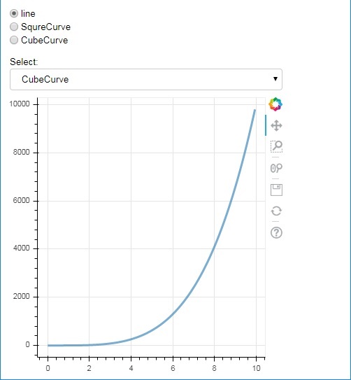
radio = RadioGroup(labels=["line", "SqureCurve", "CubeCurve"], active=0)
radio.js_on_change('active', radiohandler)
select = Select(title="Select:", value='line', options=["line", "SquareCurve", "CubeCurve"])
select.js_on_change('value', selecthandler)
layout = column(radio, select, plot)
show(layout)
Output
Run the code and verify the output in the browser.
(myenv) D:\bokeh\myenv>py main.py
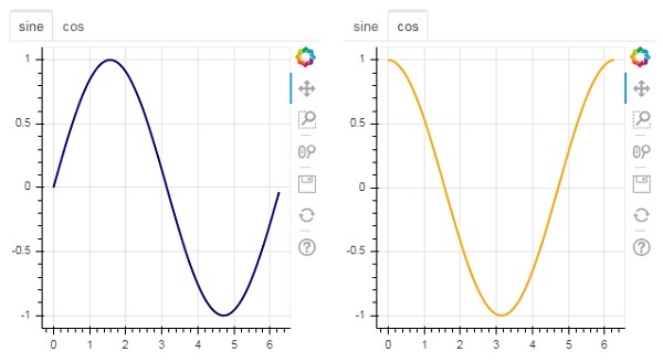
Tab widget
Just as in a browser, each tab can show different web page, the Tab widget is Bokeh model providing different view to each figure. In the following example, two plot figures of sine and cosine curves are rendered in two different tabs −
main.py
from bokeh.plotting import figure, output_file, show
from bokeh.models import TabPanel, Tabs
import numpy as np
import math

x=np.arange(0, math.pi*2, 0.05)
fig1=figure(width=300, height=300)

fig1.line(x, np.sin(x),line_width=2, line_color='navy')

tab1 = TabPanel(child=fig1, title="sine")
fig2=figure(width=300, height=300)
fig2.line(x,np.cos(x), line_width=2, line_color='orange')
tab2 = TabPanel(child=fig2, title="cos")

tabs = Tabs(tabs=[ tab1, tab2 ])

show(tabs)
Output
Run the code and verify the output in the browser.
(myenv) D:\bokeh\myenv>py main.py
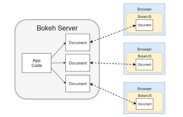
Bokeh - Server
Bokeh architecture has a decouple design in which objects such as plots and glyphs are created using Python and converted in JSON to be consumed by BokehJS client library.
However, it is possible to keep the objects in python and in the browser in sync with one another with the help of Bokeh Server. It enables response to User Interface (UI) events generated in a browser with the full power of python. It also helps automatically push server-side updates to the widgets or plots in a browser.
A Bokeh server uses Application code written in Python to create Bokeh Documents. Every new connection from a client browser results in the Bokeh server creating a new document, just for that session.
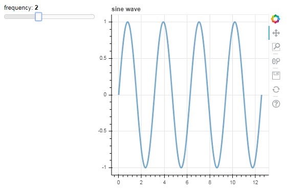
Example - Creating a Server Application
First, we have to develop an application code to be served to client browser. Following code renders a sine wave line glyph. Along with the plot, a slider control is also rendered to control the frequency of sine wave. The callback function update_data() updates ColumnDataSource data taking the instantaneous value of slider as current frequency.
main.py
import numpy as np

from bokeh.io import curdoc
from bokeh.layouts import row, column
from bokeh.models import ColumnDataSource
from bokeh.models.widgets import Slider, TextInput
from bokeh.plotting import figure

N = 200
x = np.linspace(0, 4*np.pi, N)
y = np.sin(x)
source = ColumnDataSource(data = dict(x = x, y = y))
plot = figure(height = 400, width = 400, title = "sine wave")
plot.line('x', 'y', source = source, line_width = 3, line_alpha = 0.6)
freq = Slider(title = "frequency", value = 1.0, start = 0.1, end = 5.1, step = 0.1)
def update_data(attrname, old, new):
   a = 1
   b = 0
   w = 0
   k = freq.value
   x = np.linspace(0, 4*np.pi, N)
   y = a*np.sin(k*x + w) + b
   source.data = dict(x = x, y = y)
freq.on_change('value', update_data)
curdoc().add_root(row(freq, plot, width = 500))
curdoc().title = "Sliders"
Output
Next, start Bokeh server by following command line −
bokeh serve --show main.py
Bokeh server starts running and serving the application at localhost:5006/sliders. The console log shows the following display −
(myenv) D:\bokeh\myenv>bokeh serve --show main.py
2025-12-18 19:50:34,896 Starting Bokeh server version 3.8.1 (running on Tornado 6.5.4)
2025-12-18 19:50:34,896 User authentication hooks NOT provided (default user enabled)
2025-12-18 19:50:34,906 Bokeh app running at: http://localhost:5006/main
2025-12-18 19:50:34,906 Starting Bokeh server with process id: 20600
2025-12-18 19:50:35,945 WebSocket connection opened
2025-12-18 19:50:35,945 ServerConnection created
2025-12-18 19:50:36,732 WebSocket connection opened
2025-12-18 19:50:36,775 ServerConnection created
BokehUserWarning: reference already known 'p1115'
2025-12-18 19:50:46,098 WebSocket connection closed: code=1001, reason=None
2025-12-18 19:50:47,897 WebSocket connection closed: code=1001, reason=None
Open your favourite browser and enter above address. The Sine wave plot is displayed as follows −
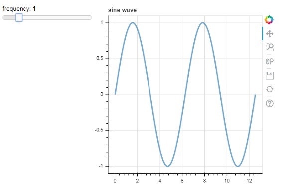
You can try and change the frequency to 2 by rolling the slider.
Bokeh - Exporting Plots
In addition to subcommands described above, Bokeh plots can be exported to PNG and SVG file format using export() function. For that purpose, local Python installation should have following dependency libraries.
PhantomJS
PhantomJS is a JavaScript API that enables automated navigation, screenshots, user behavior and assertions. It is used to run browser-based unit tests. PhantomJS is based on WebKit providing a similar browsing environment for different browsers and provides fast and native support for various web standards: DOM handling, CSS selector, JSON, Canvas, and SVG. In other words, PhantomJS is a web browser without a graphical user interface.
Pillow
Pillow, a Python Imaging Library (earlier known as PIL) is a free library for the Python programming language that provides support for opening, manipulating, and saving many different image file formats. (including PPM, PNG, JPEG, GIF, TIFF, and BMP.) Some of its features are per-pixel manipulations, masking and transparency handling, image filtering, image enhancing, etc.
The export_png() function generates RGBA-format PNG image from layout. This function uses Webkit headless browser to render the layout in memory and then capture a screenshot. The generated image will be of the same dimensions as the source layout. Make sure that the Plot.background_fill_color and Plot.border_fill_color are properties to None.
from bokeh.io import export_png
export_png(plot, filename = "file.png")
It is possible that HTML5 Canvas plot output with a SVG element that can be edited using programs such as Adobe Illustrator. The SVG objects can also be converted to PDFs. Here, canvas2svg, a JavaScript library is used to mock the normal Canvas element and its methods with an SVG element. Like PNGs, in order to create a SVG with a transparent background,the Plot.background_fill_color and Plot.border_fill_color properties should be to None.
The SVG backend is first activated by setting the Plot.output_backend attribute to "svg".
plot.output_backend = "svg"
For headless export, Bokeh has a utility function, export_svgs(). This function will download all of SVG-enabled plots within a layout as distinct SVG files.
from bokeh.io import export_svgs
plot.output_backend = "svg"
export_svgs(plot, filename = "plot.svg")
Bokeh - Embedding Plots and Apps
Plots and data in the form of standalone documents as well as Bokeh applications can be embedded in HTML documents.
Standalone document is a Bokeh plot or document not backed by Bokeh server. The interactions in such a plot is purely in the form of custom JS and not Pure Python callbacks.
Bokeh plots and documents backed by Bokeh server can also be embedded. Such documents contain Python callbacks that run on the server.
In case of standalone documents, a raw HTML code representing a Bokeh plot is obtained by file_html() function.
from bokeh.plotting import figure
from bokeh.resources import CDN
from bokeh.embed import file_html
fig = figure()
fig.line([1,2,3,4,5], [3,4,5,2,3])
string = file_html(plot, CDN, "my plot")
Return value of file_html() function may be saved as HTML file or may be used to render through URL routes in Flask app.
In case of standalone document, its JSON representation can be obtained by json_item() function.
from bokeh.plotting import figure
from bokeh.embed import file_html
import json
fig = figure()
fig.line([1,2,3,4,5], [3,4,5,2,3])
item_text = json.dumps(json_item(fig, "myplot"))
This output can be used by the Bokeh.embed.embed_item function on a webpage −
item = JSON.parse(item_text);
Bokeh.embed.embed_item(item);
Bokeh applications on Bokeh Server may also be embedded so that a new session and Document is created on every page load so that a specific, existing session is loaded. This can be accomplished with the server_document() function. It accepts the URL to a Bokeh server application, and returns a script that will embed new sessions from that server any time the script is executed.
The server_document() function accepts URL parameter. If it is set to default, the default URL http://localhost:5006/ will be used.
from bokeh.embed import server_document
script = server_document("http://localhost:5006/sliders")
The server_document() function returns a script tag as follows −
<script
   src="http://localhost:5006/sliders/autoload.js?bokeh-autoload-element=1000&bokeh-app-path=/sliders&bokeh-absolute-url=https://localhost:5006/sliders"
   id="1000">
</script>
Bokeh - Extending Bokeh
Bokeh integrates well with a wide variety of other libraries, allowing you to use the most appropriate tool for each task. The fact that Bokeh generates JavaScript, makes it possible to combine Bokeh output with a wide variety of JavaScript libraries, such as PhosphorJS.
Datashader (https://github.com/bokeh/datashader) is another library with which Bokeh output can be extended. It is a Python library that pre-renders large datasets as a large-sized raster image. This ability overcomes limitation of browser when it comes to very large data. Datashader includes tools to build interactive Bokeh plots that dynamically re-render these images when zooming and panning in Bokeh, making it practical to work with arbitrarily large datasets in a web browser.
Another library is Holoviews ((http://holoviews.org/) that provides a concise declarative interface for building Bokeh plots, especially in Jupyter notebook. It facilitates quick prototyping of figures for data analysis.
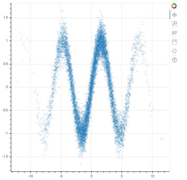
Bokeh - Extending WebGL
When one has to use large datasets for creating visualizations with the help of Bokeh, the interaction can be very slow. For that purpose, one can enable Web Graphics Library (WebGL) support.
WebGL is a JavaScript API that renders content in the browser using GPU (graphics processing unit). This standardized plugin is available in all modern browsers.
To enable WebGL, all you have to do is set output_backend property of Bokeh Figure object to webgl.
fig = figure(output_backend="webgl")
Example - Using WebGL
In the following example, we plot a scatter glyph consisting of 10,000 points with the help of WebGL support.
main.py
import numpy as np
from bokeh.plotting import figure, show, output_file

N = 10000
x = np.random.normal(0, np.pi, N)
y = np.sin(x) + np.random.normal(0, 0.2, N)
output_file("scatterWebGL.html")
p = figure(output_backend="webgl")
p.scatter(x, y, alpha=0.1)

show(p)
Output
Run the code and verify the output in the browser.
(myenv) D:\bokeh\myenv>py main.py
Bokeh - Developing with JavaScript
When one has to use large datasets for creating visualizations with the help of Bokeh, the interaction can be very slow. For that purpose, one can enable Web Graphics Library (WebGL) support.
WebGL is a JavaScript API that renders content in the browser using GPU (graphics processing unit). This standardized plugin is available in all modern browsers.
To enable WebGL, all you have to do is set output_backend property of Bokeh Figure object to webgl.
fig = figure(output_backend="webgl")
Example - Using WebGL
In the following example, we plot a scatter glyph consisting of 10,000 points with the help of WebGL support.
main.py
import numpy as np
from bokeh.plotting import figure, show, output_file

N = 10000
x = np.random.normal(0, np.pi, N)
y = np.sin(x) + np.random.normal(0, 0.2, N)
output_file("scatterWebGL.html")
p = figure(output_backend="webgl")
p.scatter(x, y, alpha=0.1)

show(p)
Output
Run the code and verify the output in the browser.
(myenv) D:\bokeh\myenv>py main.py
