- Bokeh - Home
- Bokeh - Introduction
- Bokeh - Environment Setup
- Bokeh - Getting Started
- Bokeh - Jupyter Notebook
- Bokeh - Basic Concepts
- Bokeh - Plots with Glyphs
- Bokeh - Area Plots
- Bokeh - Circle Glyphs
- Bokeh - Rectangle, Oval and Polygon
- Bokeh - Wedges and Arcs
- Bokeh - Specialized Curves
- Bokeh - Setting Ranges
- Bokeh - Axes
- Bokeh - Annotations and Legends
- Bokeh - Pandas
- Bokeh - ColumnDataSource
- Bokeh - Filtering Data
- Bokeh - Layouts
- Bokeh - Plot Tools
- Bokeh - Styling Visual Attributes
- Bokeh - Customising legends
- Bokeh - Adding Widgets
- Bokeh - Server
- Bokeh - Using Bokeh Subcommands
- Bokeh - Exporting Plots
- Bokeh - Embedding Plots and Apps
- Bokeh - Extending Bokeh
- Bokeh - WebGL
- Bokeh - Developing with JavaScript
Bokeh Resources
Bokeh - Plots with Glyphs
Any plot is usually made up of one or many geometrical shapes such as line, circle, rectangle, etc. These shapes have visual information about the corresponding set of data. In Bokeh terminology, these geometrical shapes are called gylphs. Bokeh plots constructed using bokeh.plotting interface use a default set of tools and styles. However, it is possible to customize the styles using available plotting tools.
Types of Plots
Different types of plots created using glyphs are as given below −
Line plot
This type of plot is useful for visualizing the movements of points along the x-and y-axes in the form of a line. It is used to perform time series analytics.
Bar plot
This is typically useful for indicating the count of each category of a particular column or field in your dataset.
Patch plot
This plot indicates a region of points in a particular shade of color. This type of plot is used to distinguish different groups within the same dataset.
Scatter plot
This type of plot is used to visualize relationship between two variables and to indicate the strength of correlation between them.
Different glyph plots are formed by calling appropriate method of Figure class. The Figure object is obtained by following constructor −
from bokeh.plotting import figure
figure(**kwargs)
The Figure object can be customised by various keyword arguments.
| Sr.No | Title | Set the title for the plot |
|---|---|---|
| 1 | x_axis_label | Set title of x axis |
| 2 | y_axis_label | Set title for y axis |
| 3 | plot_width | Set width of figure |
| 4 | plot_height | Set height of figure |
Line plot
The line() method of Figure object adds a line glyph to the Bokeh figure. It needs x and y parameters as data arrays for showing their linear relationship.
from bokeh.plotting import figure, show
fig = figure()
fig.line(x,y)
show(fig)
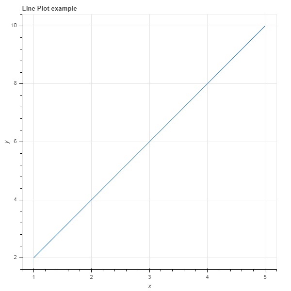
Following code renders a simple line plot between two sets of values in the form Python list objects −
main.py
from bokeh.plotting import figure, output_file, show

x = [1,2,3,4,5]
y = [2,4,6,8,10]

output_file('line.html')

fig = figure(title = 'Line Plot example', x_axis_label = 'x', y_axis_label = 'y')
fig.line(x,y)

show(fig)
Output
Run the code and verify the output in the browser.
(myenv) D:\bokeh\myenv>py main.py
Bar plot
The figure object has two different methods for constructing bar plot
hbar()
The bars are shown horizontally across plot width. The hbar() method has the following parameters −
| Sr.No | y | The y coordinates of the centers of the horizontal bars. |
|---|---|---|
| 1 | height | The heights of the vertical bars. |
| 2 | right | The x coordinates of the right edges. |
| 3 | left | The x coordinates of the left edges. |
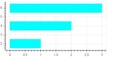
Following code is an example of horizontal bar using Bokeh.
main.py
from bokeh.plotting import figure, output_file, show

fig = figure(width = 400, height = 200)
fig.hbar(y = [2,4,6], height = 1, left = 0, right = [1,2,3], color = "Cyan")

output_file('bar.html')

show(fig)
Output
Run the code and verify the output in the browser.
(myenv) D:\bokeh\myenv>py main.py
vbar()
The bars are shown vertically across plot height. The vbar() method has following parameters −
| Sr.No | x | The x-coordinates of the centers of the vertical bars. |
|---|---|---|
| 1 | width | The widths of the vertical bars. |
| 2 | top | The y-coordinates of the top edges. |
| 3 | bottom | The y-coordinates of the bottom edges. |
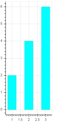
Following code displays vertical bar plot −
main.py
from bokeh.plotting import figure, output_file, show

fig = figure(width = 200, height = 400)
fig.vbar(x = [1,2,3], width = 0.5, bottom = 0, top = [2,4,6], color = "Cyan")

output_file('bar.html')

show(fig)
Output
Run the code and verify the output in the browser.
(myenv) D:\bokeh\myenv>py main.py
Patch plot
A plot which shades a region of space in a specific color to show a region or a group having similar properties is termed as a patch plot in Bokeh. Figure object has patch() and patches() methods for this purpose.
patch()
This method adds patch glyph to given figure. The method has the following arguments −
| 1 | x | The x-coordinates for the points of the patch. |
| 2 | y | The y-coordinates for the points of the patch. |
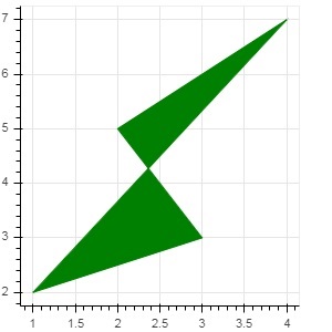
A simple patch plot is obtained by the following Python code −
main.py
from bokeh.plotting import figure, output_file, show

p = figure(width = 300, height = 300)
p.patch(x = [1, 3,2,4], y = [2,3,5,7], color = "green")

output_file('patch.html')

show(p)
Output
Run the code and verify the output in the browser.
(myenv) D:\bokeh\myenv>py main.py
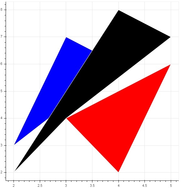
patches()
This method is used to draw multiple polygonal patches. It needs following arguments −
| 1 | xs | The x-coordinates for all the patches, given as a list of lists. |
| 2 | ys | The y-coordinates for all the patches, given as a list of lists. |
As an example of patches() method, run the following code −
main.py
from bokeh.plotting import figure, output_file, show

xs = [[5,3,4], [2,4,3], [2,3,5,4]]
ys = [[6,4,2], [3,6,7], [2,4,7,8]]

fig = figure()
fig.patches(xs, ys, fill_color = ['red', 'blue', 'black'], line_color = 'white')

output_file('patch_plot.html')

show(fig)
Output
Run the code and verify the output in the browser.
(myenv) D:\bokeh\myenv>py main.py
Scatter Markers
Scatter plots are very commonly used to determine the bi-variate relationship between two variables. The enhanced interactivity is added to them using Bokeh. Scatter plot is obtained by calling scatter() method of Figure object. It uses the following parameters −
| 1 | x | values or field names of center x coordinates |
| 2 | y | values or field names of center y coordinates |
| 3 | size | values or field names of sizes in screen units |
| 4 | marker | values or field names of marker types |
| 5 | color | set fill and line color |
Following marker type constants are defined in Bokeh: −
- Asterisk
- Circle
- CircleCross
- CircleX
- Cross
- Dash
- Diamond
- DiamondCross
- Hex
- InvertedTriangle
- Square
- SquareCross
- SquareX
- Triangle
- X
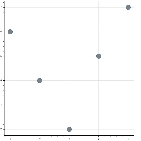
Following Python code generates scatter plot with circle marks.
main.py
from bokeh.plotting import figure, output_file, show

fig = figure()
fig.scatter([1, 4, 3, 2, 5], [6, 5, 2, 4, 7], marker = "circle", size = 20, fill_color = "grey")

output_file('scatter.html')

show(fig)
Output
Run the code and verify the output in the browser.
(myenv) D:\bokeh\myenv>py main.py