- Excel Data Analysis Tutorial
- Excel Data Analysis - Home
- Data Analysis - Overview
- Data Analysis - Process
- Excel Data Analysis - Overview
- Working with Range Names
- Tables
- Cleaning Data with Text Functions
- Cleaning Data Contains Date Values
- Working with Time Values
- Conditional Formatting
- Sorting
- Filtering
- Subtotals with Ranges
- Quick Analysis
- Lookup Functions
- PivotTables
- Data Visualization
- Data Validation
- Financial Analysis
- Working with Multiple Sheets
- Formula Auditing
- Inquire
- Advanced Data Analysis
- Advanced Data Analysis - Overview
- Data Consolidation
- What-If Analysis
- What-If Analysis with Data Tables
- What-If Analysis Scenario Manager
- What-If Analysis with Goal Seek
- Optimization with Excel Solver
- Importing Data into Excel
- Data Model
- Exploring Data with PivotTables
- Exploring Data with Powerpivot
- Exploring Data with Power View
- Exploring Data Power View Charts
- Exploring Data Power View Maps
- Exploring Data PowerView Multiples
- Exploring Data Power View Tiles
- Exploring Data with Hierarchies
- Aesthetic Power View Reports
- Key Performance Indicators
- Excel Data Analysis Resources
- Excel Data Analysis - Quick Guide
- Excel Data Analysis - Resources
- Excel Data Analysis - Discussion
Exploring Data with Power View Tiles
Suppose you have lot of data to display with significant data points at varied places. In such a case, you might have to scroll very often in your Power View visualizations to find the data you are looking for. This would be tedious and also might not be smooth when you are presenting the results.
You can overcome this drudgery, using the tile feature in Power View. With tiles, you can gain insights from your data much more quickly. Tiles act as navigation strips, with a single tile for each possible field value. When you click on a tile, only data related to that field value is displayed. As it is easy to scroll the values in the navigation strip that dynamically changes the corresponding values in the visualization, tiles become an easy to use tool for you.
You can have Tiles in a Table, Matrix, Card or Chart visualization. You can have a combination of these in Power View and get them filtered with Tiles. A Tile can be simple text or an image.
Table with Tiles
Start with a Table Visualization as follows −
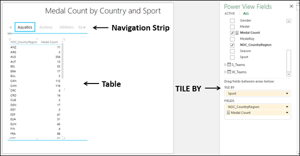
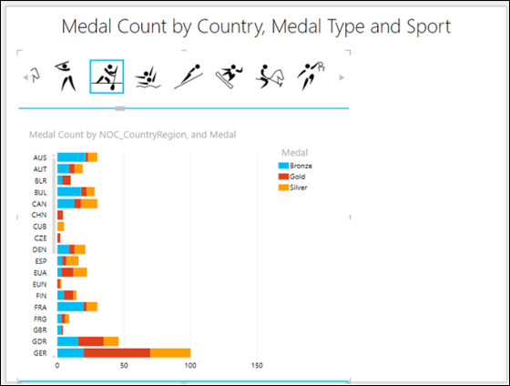
Drag the fields NOC_CountryRegion, Sport and Medal Count to Power View. As you observe, as the number of rows is large, it is difficult to scroll up and down to highlight values.
Drag the field Sport from FIELDS area to TILE BY area in the Power View Fields list.
Navigation Strip appears at the top of the Table.
You can observe the following −
By default, the first Tile in the Navigation Strip is selected.
In the Table, the values are filtered to that of the Tile selected. In this case, the Sport that is selected.
There are arrow buttons at the left and right edges of the Navigation strip to enable scrolling.
You can select a different Tile as follows −
Scroll the Navigation Strip to display the Tile representing the Sport you are looking for, for e.g. Badminton.
Click the Tile – Badminton. The values in the Table are filtered to those of Badminton.
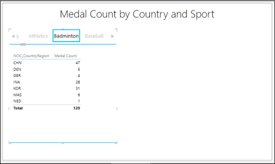
You can observe the medal count Total is also displayed. You have an option to turn Totals on or off from the Ribbon. You also can make the Tiles more appealing and meaningful by having images in place of Text.
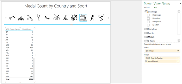
Include a column that has hyperlinks to the image files corresponding to each of the Sports.
Include that field, for e.g. Discimage in TILE BY. You will get the Tiles as images, portraying each sport.
Tile Navigation Strip - Tab Strip
There are two types of navigation strips in Excel - Tile Flow and Tab Strip.
In a Tab strip, you can observe the following −
Tab strip displays the navigation strip across the top of the Visualization.
By default, the first Tile in the navigation strip that is the leftmost is selected.
There are arrow buttons at the left and right edges of the navigation strip to enable scrolling.
You can scroll to the left or right to display the Tiles.
The highlighted Tile moves to the left or right as you scroll the tab strip. It can also go out of view, while scrolling.
You can click on a Tile to select it. The Tile gets highlighted at the same position as it was before.
In the Table, the values are filtered to that of the Tile selected. In this case, the Sport that is selected.
Tile Navigation Strip - Tile Flow
You can covert the navigation strip from tab strip to tile flow as follows −
- Click a Tile on the navigation strip.
- Click the DESIGN tab on the Ribbon.
- Click Tile Type in the Tiles group.
- Click Tile Flow in the dropdown list.
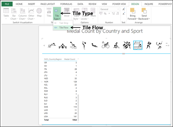
The navigation strip shifts to the bottom of the Table.
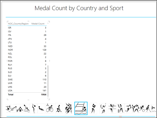
In a Tile Flow, you can observe the following −
Tile flow displays the navigation strip across the bottom of the Visualization.
By default, the first Tile in the navigation strip is selected. It will be displayed at the center of the tile flow.
There are no arrow buttons for scrolling.
You can scroll to the left or right by clicking on any of the Tiles to the left or right of the center Tile.
The Tiles flow to the left or right and the center Tile will always get highlighted.
You can click on a Tile to select it. The Tile gets highlighted and moves to the center of the Tile flow.
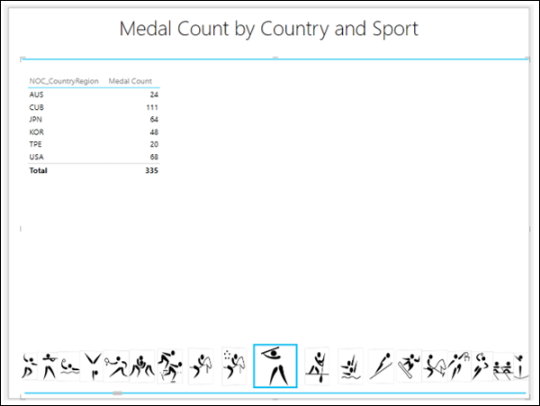
As the selected Tile is always the center Tile, the following happens −
Selected Tile does not go out of view.
When you scroll to the left or right, the Tile that comes to the center position gets automatically selected and highlighted.
The original selection disappears.
The Visualization, Table in this case, automatically is updated to the Tile in the center of the Tile flow.
In the Table, the values are filtered to that of the Tile selected. In this case, the Sport that is selected.
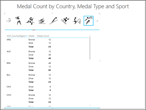
Matrix with Tiles
Suppose you want the medal count by medal type – Gold, Silver and Bronze and also the total medal count, by country for a selected sport, you can display the results in a Matrix Tile visualization.
- Switch Visualization to Matrix.
- Add the field Medal to Matrix.
You will get the desired results as follows −
Stacked Bar Chart with Tiles
You can make your explored results more conspicuous by switching your visualization to Stacked Bar Chart Tile Visualization −
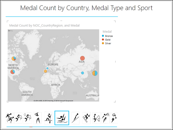
Maps with Tiles
As your data contains geographic locations, you can also switch over to Map Tile Visualization −