- Excel Data Analysis Tutorial
- Excel Data Analysis - Home
- Data Analysis - Overview
- Data Analysis - Process
- Excel Data Analysis - Overview
- Working with Range Names
- Tables
- Cleaning Data with Text Functions
- Cleaning Data Contains Date Values
- Working with Time Values
- Conditional Formatting
- Sorting
- Filtering
- Subtotals with Ranges
- Quick Analysis
- Lookup Functions
- PivotTables
- Data Visualization
- Data Validation
- Financial Analysis
- Working with Multiple Sheets
- Formula Auditing
- Inquire
- Advanced Data Analysis
- Advanced Data Analysis - Overview
- Data Consolidation
- What-If Analysis
- What-If Analysis with Data Tables
- What-If Analysis Scenario Manager
- What-If Analysis with Goal Seek
- Optimization with Excel Solver
- Importing Data into Excel
- Data Model
- Exploring Data with PivotTables
- Exploring Data with Powerpivot
- Exploring Data with Power View
- Exploring Data Power View Charts
- Exploring Data Power View Maps
- Exploring Data PowerView Multiples
- Exploring Data Power View Tiles
- Exploring Data with Hierarchies
- Aesthetic Power View Reports
- Key Performance Indicators
- Excel Data Analysis Resources
- Excel Data Analysis - Quick Guide
- Excel Data Analysis - Resources
- Excel Data Analysis - Discussion
Exploring Data with Power View
Power View enables interactive data exploration, visualization and presentation that encourages intuitive ad-hoc reporting. Large data sets can be analyzed on the fly using the versatile visualizations. The data visualizations can also be made dynamic facilitating ease of presentation of the data with a single Power View report.
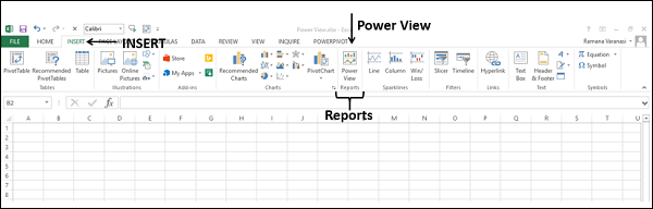
Power View is introduced in Microsoft Excel 2013. Before you start your data analysis with Power View, make sure that the Power View add-in enabled and available on the Ribbon.
Click the INSERT tab on the Ribbon. Power View should be visible in the Reports group.
Creating a Power View Report
You can create a Power View report from the tables in the Data Model.
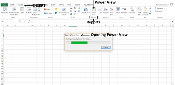
- Click the INSERT tab on the Ribbon.
- Click Power View in the Reports group.
Opening Power View message box appears with a horizontal scrolling green status bar. This might take a little while.
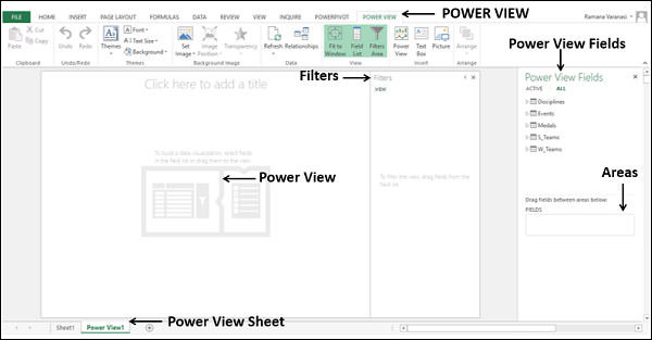
Power View sheet is created as a worksheet in your Excel workbook. It contains an empty Power View report, Filters space holder and the Power View Fields list displaying the tables in the Data Model. Power View appears as a tab on the Ribbon in the Power View sheet.
Power View with Calculated Fields
In the Data Model of your workbook, you have the following data tables −
- Disciplines
- Events
- Medals
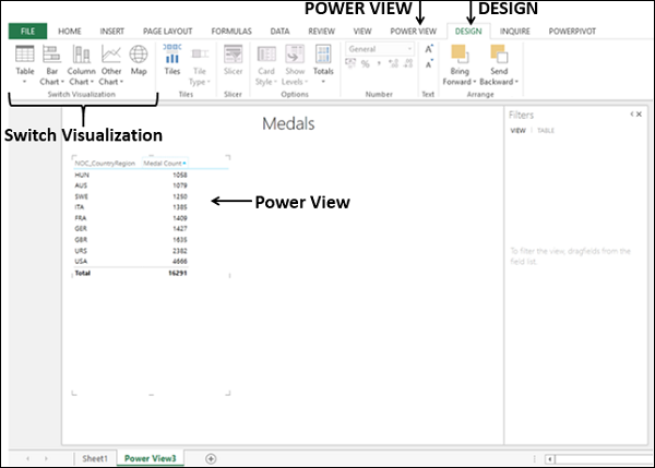
Suppose you want to display the number of medals that each country has won.
- Select the fields NOC_CountryRegion and Medal in the table Medals.
These two fields appear under FIELDS in the Areas. Power View will be displayed as a table with the two selected fields as columns.
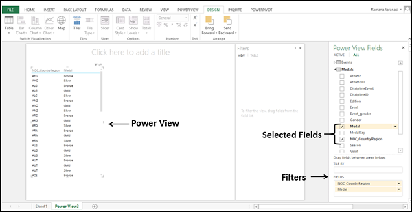
The Power View is displaying what medals each country has won. To display the number of medals won by each country, the medals need to be counted. To get the medal count field, you need to do a calculation in the Data Model.
Click PowerPivot tab on the Ribbon.
Click Manage in the Data Model group. The tables in the Data Model will be displayed.
Click the Medals tab.
In the Medals table, in the calculation area, in the cell below the Medal column, type the following DAX formula
Medal Count:=COUNTA([Medal])
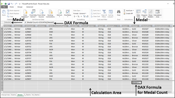
You can observe that the medal count formula appears in the formula bar and to the left of the formula bar, the column name Medal is displayed.
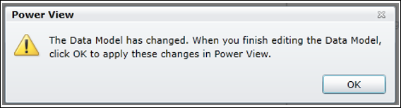
You will get a Power View message that the Data Model is changed and if you click OK, the changes will be reflected in your Power View. Click OK.
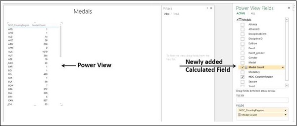
In the Power View Sheet, in the Power View Fields list, you can observe the following −
A new field Medal Count is added in the Medals table.
A calculator icon appears adjacent to the field Medal Count, indicating that it is a calculated field.
Deselect the Medal field and select the Medal Count field.
Your Power View table displays the medal count country wise.
Filtering Power View
You can filter the values displayed in Power View by defining the filter criteria.
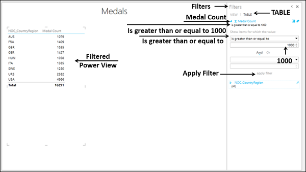
Click the TABLE tab in the Filters.
Click Medal Count.
Click the icon Range file mode that is to the right of Medal Count.
Select is greater than or equal to from the drop-down list in the box below Show items for which the value.
Type 1000 in the box below that.
Click apply filter.
Below the field name – Medal Count, is greater than or equal to 1000 appears. Power View will display only those records with Medal Count >= 1000.
Power View Visualizations
In the Power View sheet, two tabs – POWER VIEW and DESIGN appear on the Ribbon.
Click the DESIGN tab.You will find several visualization commands in the Switch Visualization group on the Ribbon.
You can quickly create a number of different data visualizations that suit your data using Power View. The visualizations possible are Table, Matrix, Card, Map, Chart types such as Bar, Column, Scatter, Line, Pie and Bubble Charts, and sets of multiple charts (charts with same axis).
To explore the data using these visualizations, you can start on the Power View sheet by creating a table, which is the default visualization and then easily convert it to other visualizations, to find the one that best illustrates your Data. You can convert one Power View visualization to another, by selecting a visualization from the Switch Visualization group on the Ribbon.
It is also possible to have multiple visualizations on the same Power View sheet, so that you can highlight the significant fields.
In the sections below, you will understand how you can explore data in two visualizations – Matrix and Card. You will get to know about exploring data with other Power View visualizations in later chapters.
Exploring Data with Matrix Visualization
Matrix Visualization is similar to a Table Visualization in that it also contains rows and columns of data. However, a matrix has additional features −
- It can be collapsed and expanded by rows and/or columns.
- If it contains a hierarchy, you can drill down/drill up.
- It can display totals and subtotals by columns and/or rows.
- It can display the data without repeating values.
You can see these the differences in the views by having a Table Visualization and a Matrix Visualization of the same data side by side in the Power View.
Choose the fields – Sport, Discipline and Event. A Table representing these fields appears in Power View.
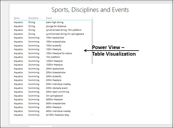
As you observe, there are multiple disciplines for every sport and multiple events for every discipline. Now, create another Power View visualization on the right side of this Table visualization as follows −
- Click the Power View sheet in the space to the right of the Table.
- Choose the fields – Sport, Discipline and Event.
Another Table representing these fields appears in Power View, to the right of the earlier Table.
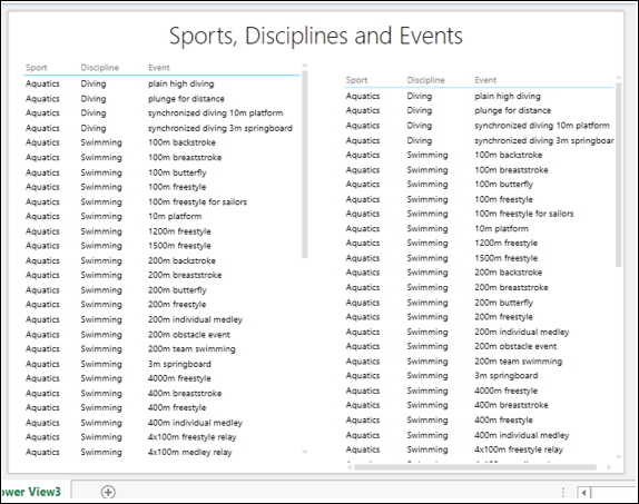
- Click the right Table.
- Click the DESIGN tab on the Ribbon.
- Click Table in the Switch Visualization group.
- Select Matrix from the drop-down list.
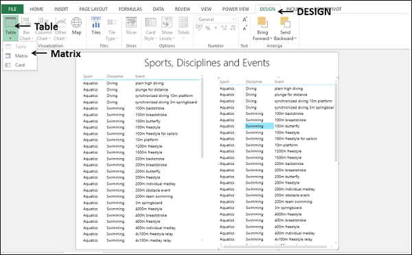
The Table on the right in Power View gets converted to Matrix.
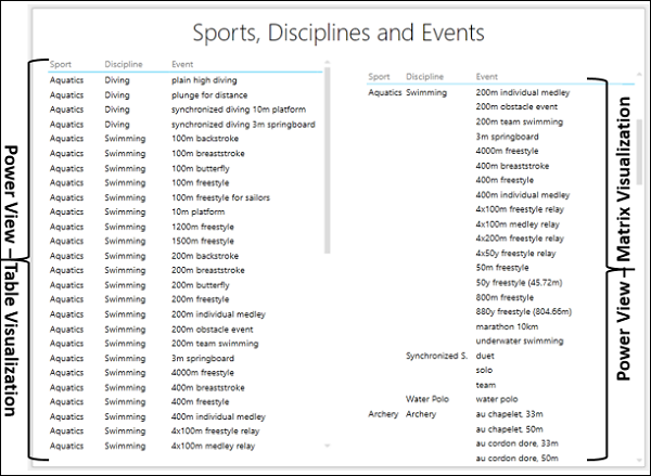
The table on the left lists the sport and discipline for each and every event, whereas the matrix on the right lists each sport and discipline only once. So, in this case, Matrix visualization gives you a comprehensive, compact and readable format for your data.
Now, you can explore the data to find the countries that scored more than 300 medals. You can also find the corresponding sports and have subtotals.
Select the fields NOC_CountryRegion, Sport and Medal Count in both the Table and Matrix Visualizations.
In the Filters, select the filter for the Table and set the filtering criteria as is greater than or equal to 300.
Click apply filter.
Set the same filter to Matrix also. Click apply filter.
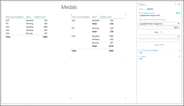
Once again, you can observe that in the Matrix view, the results are legible.
Exploring Data with Card Visualization
In a card visualization, you will have a series of snapshots that display the data from each row in the table, laid out like an index card.
- Click the Matrix Visualization that is on the right side in the Power view.
- Click Table in the Switch Visualization group.
- Select Card from the drop-down list.
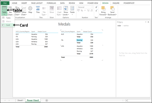
The Matrix Visualization gets converted to Card Visualization.
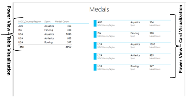
You can use the Card view for presenting the highlighted data in a comprehensive way.
Data Model and Power View
A workbook can contain the following combinations of Data Model and Power View.
An internal Data Model in your workbook that you can modify in Excel, in PowerPivot, and even in a Power View sheet.
Only one internal Data Model in your workbook, on which you can base a Power View sheet.
Multiple Power View sheets in your workbook, with each sheet based on a different Data Model.
If you have multiple Power View sheets in your workbook, you can copy visualizations from one to another only if both the sheets are based on the same Data Model.
Creating Data Model from Power View Sheet
You can create and/or modify the Data Model in your workbook from the Power View sheet as follows −
Start with a new workbook that contains Salesperson data and Sales data in two worksheets.
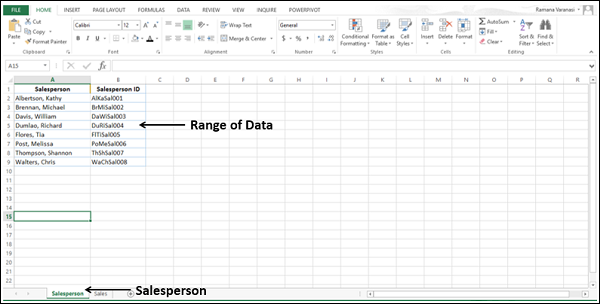
Create a table from the range of data in the Salesperson worksheet and name it Salesperson.
Create a table from the range of data in the Sales worksheet and name it Sales.
You have two tables – Salesperson and Sales in your workbook.
- Click the Sales table in the Sales worksheet.
- Click the INSERT tab on the Ribbon.
- Click Power View in the Reports group.
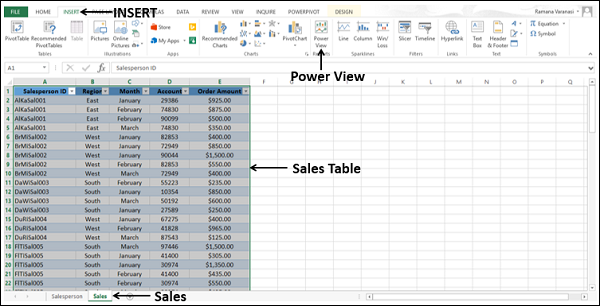
Power View Sheet will be created in your workbook.
You can observe that in the Power View Fields list, both the tables that are in the workbook are displayed. However, in the Power View, only the active table (Sales) fields are displayed since only the active data table fields are selected in the Fields list.
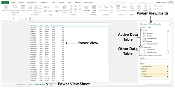
You can observe that in the Power View, Salesperson ID is displayed. Suppose you want to display the Salesperson name instead.
In the Power View Fields list, make the following changes.
- Deselect the field Salesperson ID in the Salesperson table.
- Select the field Salesperson in the Salesperson table.
As you do not have a Data Model in the workbook, no relationship exists between the two tables. No data is displayed in Power View. Excel displays messages directing you what to do.
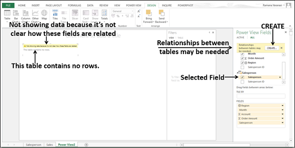
A CREATE button also will be displayed. Click the CREATE button.
The Create Relationship dialog box opens in the Power View Sheet itself.
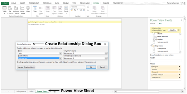
- Create a relationship between the two tables using the Salesperson ID field.
Without leaving the Power View sheet, you have successfully created the following −
- The internal Data Model with the two tables, and
- The relationship between the two tables.
The field Salesperson appears in Power View along with the Sales data.
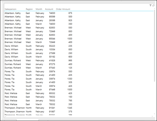
Retain the fields Region, Salesperson and ∑ Order Amount in that order in the area FIELDS.
Convert the Power View to Matrix Visualization.
Drag the field Month to the area TILE BY. Matrix Visualization appears as follows −
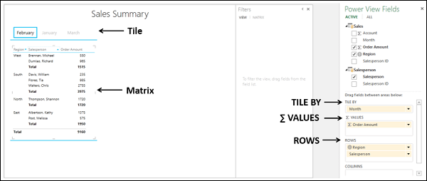
As you observe, for each of the regions, the Salespersons of that region and sum of Order Amount are displayed. Subtotals are displayed for each region. The display is month wise as selected in the tile above the view. As you select the month in the tile, the data of that month will be displayed.