- WPF - Home
- WPF - Overview
- WPF - Environment Setup
- WPF - Hello World
- WPF - XAML Overview
- WPF - Elements Tree
- WPF - Dependency Properties
- WPF - Routed Events
- WPF - Controls
- WPF - Layouts
- WPF - Nesting Of Layout
- WPF - Input
- WPF - Command Line
- WPF - Data Binding
- WPF - Resources
- WPF - Templates
- WPF - Styles
- WPF - Triggers
- WPF - Debugging
- WPF - Custom Controls
- WPF - Exception Handling
- WPF - Localization
- WPF - Interaction
- WPF - 2D Graphics
- WPF - 3D Graphics
- WPF - Multimedia
WPF - Quick Guide
WPF - Overview
WPF stands for Windows Presentation Foundation. It is a powerful framework for building Windows applications. This tutorial explains the features that you need to understand to build WPF applications and how it brings a fundamental change in Windows applications.
WPF was first introduces in .NET framework 3.0 version, and then so many other features were added in the subsequent .NET framework versions.
WPF Architecture
Before WPF, the other user interface frameworks offered by Microsoft such as MFC and Windows forms, were just wrappers around User32 and GDI32 DLLs, but WPF makes only minimal use of User32. So,
- WPF is more than just a wrapper.
- It is a part of the .NET framework.
- It contains a mixture of managed and unmanaged code.
The major components of WPF architecture are as shown in the figure below. The most important code part of WPF are −
- Presentation Framework
- Presentation Core
- Milcore
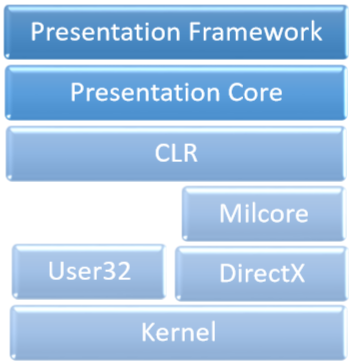
The presentation framework and the presentation core have been written in managed code. Milcore is a part of unmanaged code which allows tight integration with DirectX (responsible for display and rendering). CLR makes the development process more productive by offering many features such as memory management, error handling, etc.
WPF Advantages
In the earlier GUI frameworks, there was no real separation between how an application looks like and how it behaved. Both GUI and behavior was created in the same language, e.g. C# or VB.Net which would require more effort from the developer to implement both UI and behavior associated with it.
In WPF, UI elements are designed in XAML while behaviors can be implemented in procedural languages such C# and VB.Net. So it very easy to separate behavior from the designer code.
With XAML, the programmers can work in parallel with the designers. The separation between a GUI and its behavior can allow us to easily change the look of a control by using styles and templates.
WPF Features
WPF is a powerful framework to create Windows application. It supports many great features, some of which have been listed below −
| Feature | Description |
|---|---|
| Control inside a Control | Allows to define a control inside another control as a content. |
| Data binding | Mechanism to display and interact with data between UI elements and data object on user interface. |
| Media services | Provides an integrated system for building user interfaces with common media elements like images, audio, and video. |
| Templates | In WPF you can define the look of an element directly with a Template |
| Animations | Building interactivity and movement on user Interface |
| Alternative input | Supports multi-touch input on Windows 7 and above. |
| Direct3D | Allows to display more complex graphics and custom themes |
WPF - Environment Setup
Microsoft provides two important tools for WPF application development.
- Visual Studio
- Expression Blend
Both the tools can create WPF projects, but the fact is that Visual Studio is used more by developers, while Blend is used more often by designers. For this tutorial, we will mostly be using Visual Studio.
Installation
Microsoft provides a free version of Visual Studio which can be downloaded from VisualStudio.
Download the files and follow the steps given below to set up WPF application development environment on your system.
After the download is complete, run the installer. The following dialog will be displayed.
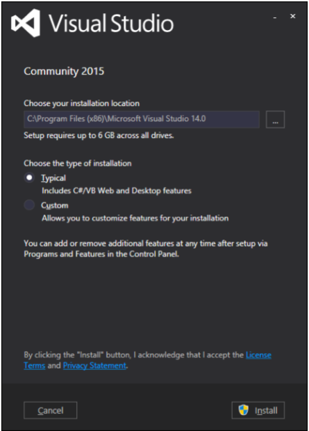
Click the Install button and it will start the installation process.
Once the installation process is completed successfully, you will get to see the following dialog box.
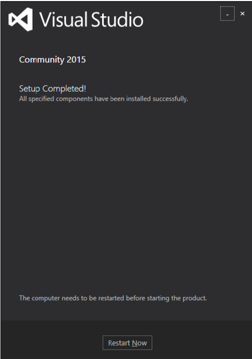
Close this dialog box and restart your computer if required.
Now open Visual Studio from the Start Menu which will open the following dialog box.
- Once all is done, you will see the main window of Visual Studio.
You are now ready to build your first WPF application.
WPF - Hello World
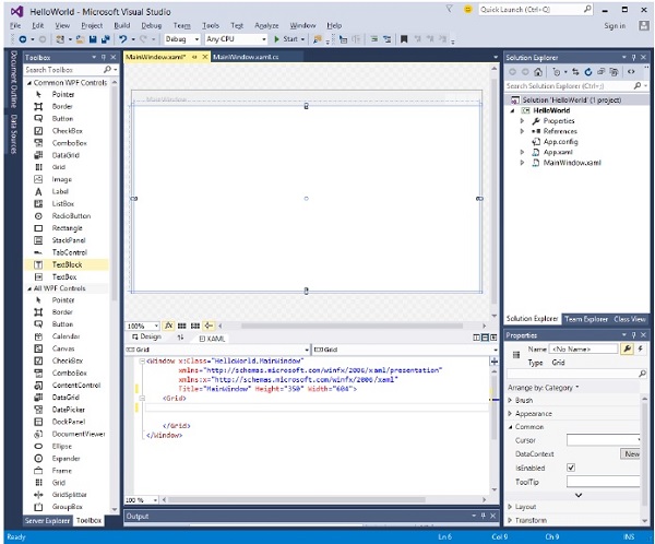
In this chapter, we will develop a simple Hello World WPF application. So lets start the simple implementation by following the steps given below.
- Click on File > New > Project menu option.
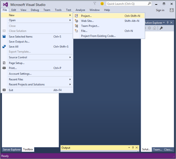
- The following dialog box will be displayed.
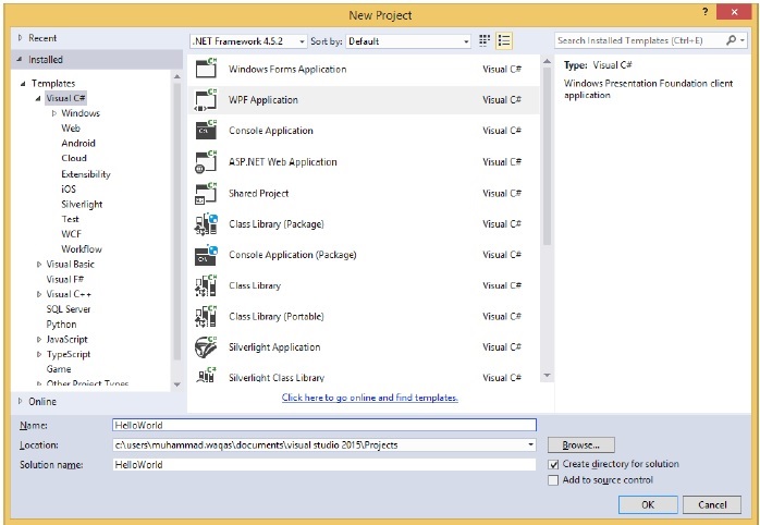
Under Templates, select Visual C# and in the middle panel, select WPF Application.
Give the project a name. Type HelloWorld in the name field and click the OK button.
By default, two files are created, one is the XAML file (mainwindow.xaml) and the other one is the CS file (mainwindow.cs)
On mainwindow.xaml, you will see two sub-windows, one is the design window and the other one is the source (XAML) window.
In WPF application, there are two ways to design an UI for your application. One is to simply drag and drop UI elements from the toolbox to the Design Window. The second way is to design your UI by writing XAML tags for UI elements. Visual Studio handles XAML tags when drag and drop feature is used for UI designing.
In mainwindow.xaml file, the following XAML tags are written by default.
<Window x:Class = "HelloWorld.MainWindow"
   xmlns = "http://schemas.microsoft.com/winfx/2006/xaml/presentation"
   xmlns:x = "http://schemas.microsoft.com/winfx/2006/xaml"
   Title = "MainWindow" Height = "350" Width = "604">

   <Grid>
   </Grid>

</Window>
- By default, a Grid is set as the first element after page.
- Lets go to the toolbox and drag a TextBlock to the design window.
- You will see the TextBlock on the design window.
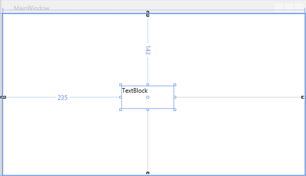
When you look at the source window, you will see that Visual Studio has generated the XAML code of the TextBlock for you.
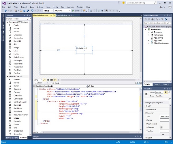
Lets change the Text property of TextBlock in XAML code from TextBlock to Hello World.
<Window x:Class = "HelloWorld.MainWindow"
   xmlns = "http://schemas.microsoft.com/winfx/2006/xaml/presentation"
   xmlns:x = "http://schemas.microsoft.com/winfx/2006/xaml"
   Title = "MainWindow" Height = "350" Width = "604">

   <Grid>
      <TextBlock x:Name = "textBlock" HorizontalAlignment = "Left"
         Margin = "235,143,0,0" TextWrapping = "Wrap" Text = "Hello World!"
         VerticalAlignment = "Top" Height = "44" Width = "102" />
   </Grid>

</Window>
- Now, you will see the change on the Design Window as well.
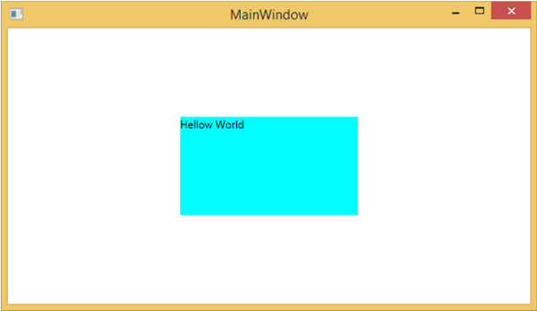
When the above code is compiled and executed, you will see the following window.
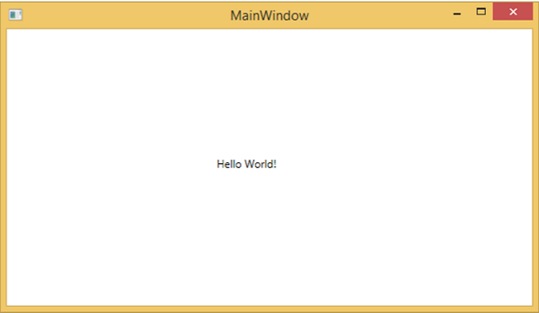
Congratulations! You have designed and created your first WPF application.
WPF - XAML Overview
One of the first things you will encounter while working with WPF is XAML. XAML stands for Extensible Application Markup Language. Its a simple and declarative language based on XML.
In XAML, it very easy to create, initialize, and set properties of objects with hierarchical relations.
It is mainly used for designing GUIs, however it can be used for other purposes as well, e.g., to declare workflow in Workflow Foundation.
Basic Syntax
When you create your new WPF project, you will encounter some of the XAML code by default in MainWindow.xaml as shown below.
<Window x:Class = "Resources.MainWindow"
   xmlns = "http://schemas.microsoft.com/winfx/2006/xaml/presentation"
   xmlns:x = "http://schemas.microsoft.com/winfx/2006/xaml"
   Title = "MainWindow" Height = "350" Width = "525">

   <Grid>

   </Grid>

</Window>
The above XAML file contains different kinds of information. The following table briefly explains the role of each information.
| Information | Description |
|---|---|
| <Window | It is the opening object element or container of the root. |
| x:Class = "Resources.MainWindow" | It is a partial class declaration which connects the markup to the partial class code defined behind. |
| xmlns = "http://schemas.microsoft.com/win fx/2006/xaml/presentation" | Maps the default XAML namespace for WPF client/framework |
| xmlns:x = "http://schemas.microsoft.com/w infx/2006/xaml" | XAML namespace for XAML language which maps it to x: prefix |
| > | End of object element of the root |
<Grid> </Grid> |
It is starting and closing tags of an empty grid object. |
| </Window> | Closing the object element |
The syntax rules for XAML is almost similar to XML. If you look at an XAML document, then you will notice that it is actually a valid XML file, but an XML file is not necessarily an XAML file. It is because in XML, the value of the attributes must be a string while in XAML, it can be a different object which is known as Property element syntax.
The syntax of an Object element starts with a left angle bracket (<) followed by the name of an object, e.g. Button.
Define some Properties and attributes of that object element.
The Object element must be closed by a forward slash (/) followed immediately by a right angle bracket (>).
Example of simple object with no child element
<Button/>
Example of object element with some attributes
<Button Content = "Click Me" Height = "30" Width = "60" />
Example of an alternate syntax do define properties (Property element syntax)
<Button>
   <Button.Content>Click Me</Button.Content>
   <Button.Height>30</Button.Height>
   <Button.Width>60</Button.Width>
</Button>
Example of Object with Child Element: StackPanel contains Textblock as child element
<StackPanel Orientation = "Horizontal">
   <TextBlock Text = "Hello"/>
</StackPanel>
Why XAML in WPF
XAML is not only the most widely known feature of WPF, but it's also one of the most misunderstood features. If you have exposure to WPF, then you must have heard of XAML; but take a note of the following two less known facts about XAML −
- WPF doesn't need XAML
- XAML doesn't need WPF
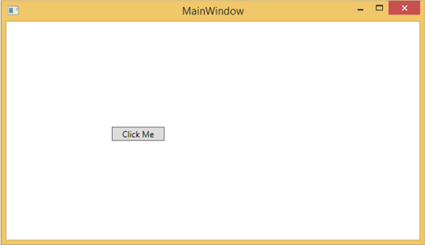
They are in fact separable pieces of technology. To understand how that can be, let's look at a simple example in which a button is created with some properties in XAML.
<Window x:Class = "WPFXAMLOverview.MainWindow"
   xmlns = "http://schemas.microsoft.com/winfx/2006/xaml/presentation"
   xmlns:x = "http://schemas.microsoft.com/winfx/2006/xaml"
   Title = "MainWindow" Height = "350" Width = "604">

   <StackPanel>
      <Button x:Name = "button" Content = "Click Me" HorizontalAlignment = "Left"
         Margin = "150" VerticalAlignment = "Top" Width = "75" />
   </StackPanel>

</Window>
In case you choose not to use XAML in WPF, then you can achieve the same GUI result with procedural language as well. Lets have a look at the same example, but this time, we will create a button in C#.
using System.Windows;
using System.Windows.Controls;

namespace WPFXAMLOverview {
   /// <summary>
      /// Interaction logic for MainWindow.xaml
   /// </summary>

   public partial class MainWindow : Window {

      public MainWindow() {
         InitializeComponent();

         // Create the StackPanel
         StackPanel stackPanel = new StackPanel();
         this.Content = stackPanel;

         // Create the Button
         Button button = new Button();
         button.Content = "Click Me";
         button.HorizontalAlignment = HorizontalAlignment.Left;
         button.Margin = new Thickness(150);
         button.VerticalAlignment = VerticalAlignment.Top;
         button.Width = 75;
         stackPanel.Children.Add(button);
      }
   }
}
When you compile and execute either the XAML code or the C# code, you will see the same output as shown below.
From the above example, it is clear that what you can do in XAML to create, initialize, and set properties of objects, the same tasks can also be done using code.
XAML is just another simple and easy way to design UI elements.
With XAML, it doesnt mean that what you can do to design UI elements is the only way. You can either declare the objects in XAML or define them using code.
XAML is optional, but despite this, it is at the heart of WPF design.
The goal of XAML is to enable visual designers to create user interface elements directly.
WPF aims to make it possible to control all visual aspects of the user interface from mark-up.
WPF - Elements Tree
There are many technologies where the elements and components are ordered in a tree structure so that the programmers can easily handle the object and change the behavior of an application. Windows Presentation Foundation (WPF) has a comprehensive tree structure in the form of objects. In WPF, there are two ways that a complete object tree is conceptualized −
- Logical Tree Structure
- Visual Tree Structure
With the help of these tree structures, you can easily create and identify the relationship between UI elements. Mostly, WPF developers and designers either use procedural language to create an application or design the UI part of the application in XAML keeping in mind the object tree structure.
Logical Tree Structure
In WPF applications, the structure of the UI elements in XAML represents the logical tree structure. In XAML, the basic elements of UI are declared by the developer. The logical tree in WPF defines the following −
- Dependency properties
- Static and dynamic resources
- Binding the elements on its name etc.
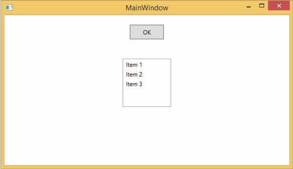
Lets have a look at the following example in which a button and a list box are created.
<Window x:Class = "WPFElementsTree.MainWindow"
   xmlns = "http://schemas.microsoft.com/winfx/2006/xaml/presentation"
   xmlns:x = "http://schemas.microsoft.com/winfx/2006/xaml"
   Title = "MainWindow" Height = "350" Width = "604">

   <StackPanel>
      <Button x:Name = "button" Height = "30" Width = "70" Content = "OK" Margin = "20" />

      <ListBox x:Name = "listBox" Height = "100" Width = "100" Margin = "20">
         <ListBoxItem Content = "Item 1" />
         <ListBoxItem Content = "Item 2" />
         <ListBoxItem Content = "Item 3" />
      </ListBox>

   </StackPanel>

</Window>
If you look at the XAML code, you will observe a tree structure, i.e. the root node is the Window and inside the root node, there is only one child, that is StackPanel. But StackPanel contains two child elements, button and list box. List box has three more child list box items.
Visual Tree Structure
In WPF, the concept of the visual tree describes the structure of visual objects, as represented by the Visual Base Class. It signifies all the UI elements which are rendered to the output screen.
When a programmer wants to create a template for a particular control, he is actually rendering the visual tree of that control. The visual tree is also very useful for those who want to draw lower level controls for performance and optimization reasons.
In WPF applications, visual tree is used for −
- Rendering the visual objects.
- Rendering the layouts.
- The routed events mostly travel along the visual tree, not the logical tree.
To see the visual tree of the above simple application which contains a button and a list box, lets compile and execute the XAML code and you will see the following window.
When the application is running, you can see the visual tree of the running application in Live Visual Tree window which shows the complete hierarchy of this application, as shown below.
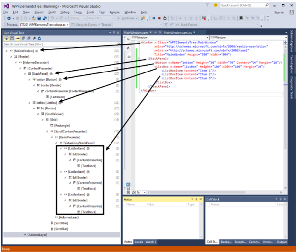
The visual tree is typically a superset of the logical tree. You can see here that all the logical elements are also present in the visual tree. So these two trees are really just two different views of the same set of objects that make up the UI.
The logical tree leaves out a lot of detail enabling you to focus on the core structure of the user interface and to ignore the details of exactly how it has been presented.
The logical tree is what you use to create the basic structure of the user interface.
The visual tree will be of interest if you're focusing on the presentation. For example, if you wish to customize the appearance of any UI element, you will need to use the visual tree.
WPF - Dependency Properties
In WPF applications, dependency property is a specific type of property which extends the CLR property. It takes the advantage of specific functionalities available in the WPF property system.
A class which defines a dependency property must be inherited from the DependencyObject class. Many of the UI controls class which are used in XAML are derived from the DependencyObject class and they support dependency properties, e.g. Button class supports the IsMouseOver dependency property.
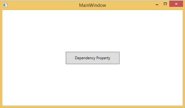
The following XAML code creates a button with some properties.
<Window x:Class = "WPFDependencyProperty.MainWindow"
   xmlns = "http://schemas.microsoft.com/winfx/2006/xaml/presentation"
   xmlns:x = "http://schemas.microsoft.com/winfx/2006/xaml"
   xmlns:local = "clr-namespace:WPFDependencyProperty"
   Title = "MainWindow" Height = "350" Width = "604">

   <Grid>
      <Button  Height = "40" Width = "175" Margin = "10" Content = "Dependency Property">
         <Button.Style>
            <Style TargetType = "{x:Type Button}">
               <Style.Triggers>

                  <Trigger Property = "IsMouseOver" Value = "True">
                     <Setter Property = "Foreground" Value = "Red" />
                  </Trigger>

               </Style.Triggers>
            </Style>
         </Button.Style>
      </Button>
   </Grid>

</Window>
The x:Type markup extension in XAML has a similar functionality like typeof() in C#. It is used when attributes are specified which take the type of the object such as <Style TargetType = "{x:Type Button}">
When the above code is compiled and executed, you would get the following MainWindow. When the mouse is over the button, it will change the foreground color of a button. When the mouse leaves the button, it changes back to its original color.
Why We Need Dependency Properties
Dependency property gives you all kinds of benefits when you use it in your application. Dependency Property can used over a CLR property in the following scenarios −
- If you want to set the style
- If you want data binding
- If you want to set with a resource (a static or a dynamic resource)
- If you want to support animation
Basically, Dependency Properties offer a lot of functionalities that you wont get by using a CLR property.
The main difference between dependency properties and other CLR properties are listed below −
CLR properties can directly read/write from the private member of a class by using getter and setter. In contrast, dependency properties are not stored in local object.
Dependency properties are stored in a dictionary of key/value pairs which is provided by the DependencyObject class. It also saves a lot of memory because it stores the property when changed. It can be bound in XAML as well.
Custom Dependency Properties
In .NET framework, custom dependency properties can also be defined. Follow the steps given below to define custom dependency property in C#.
Declare and register your dependency property with system call register.
Provide the setter and getter for the property.
Define a static handler which will handle any changes that occur globally
Define an instance handler which will handle any changes that occur to that particular instance.
The following C# code defines a dependency property to set the SetText property of the user control.
using System;
using System.Collections.Generic;
using System.Linq;
using System.Text;
using System.Threading.Tasks;

using System.Windows;
using System.Windows.Controls;
using System.Windows.Data;
using System.Windows.Documents;
using System.Windows.Input;
using System.Windows.Media;
using System.Windows.Media.Imaging;
using System.Windows.Navigation;
using System.Windows.Shapes;

namespace WpfApplication3 {
   /// <summary>
      /// Interaction logic for UserControl1.xaml
   /// </summary>

   public partial class UserControl1 : UserControl {

      public UserControl1() {
         InitializeComponent();
      }

      public static readonly DependencyProperty SetTextProperty =
         DependencyProperty.Register("SetText", typeof(string), typeof(UserControl1), new
            PropertyMetadata("", new PropertyChangedCallback(OnSetTextChanged)));

      public string SetText {
         get { return (string)GetValue(SetTextProperty); }
         set { SetValue(SetTextProperty, value); }
      }

      private static void OnSetTextChanged(DependencyObject d,
         DependencyPropertyChangedEventArgs e) {
         UserControl1 UserControl1Control = d as UserControl1;
         UserControl1Control.OnSetTextChanged(e);
      }

      private void OnSetTextChanged(DependencyPropertyChangedEventArgs e) {
         tbTest.Text = e.NewValue.ToString();
      }
   }
}
Here is the XAML file in which the TextBlock is defined as a user control and the Text property will be assigned to it by the SetText dependency property.
The following XAML code creates a user control and initializes its SetText dependency property.
<Window x:Class = "WpfApplication3.MainWindow"
   xmlns = "http://schemas.microsoft.com/winfx/2006/xaml/presentation"
   xmlns:x = "http://schemas.microsoft.com/winfx/2006/xaml"
   xmlns:views = "clr-namespace:WpfApplication3"
   Title = "MainWindow" Height = "350" Width = "604">

   <Grid>
      <views:UserControl1 SetText = "Hellow World"/>
   </Grid>

</Window>
Let's run this application. You can immediately observe that in our MainWindow, the dependency property for user control has been successfully used as a Text.
WPF - Routed Events
A routed event is a type of event that can invoke handlers on multiple listeners in an element tree rather than just the object that raised the event. It is basically a CLR event that is supported by an instance of the Routed Event class. It is registered with the WPF event system. RoutedEvents have three main routing strategies which are as follows −
- Direct Event
- Bubbling Event
- Tunnel Event
Direct Event
A direct event is similar to events in Windows forms which are raised by the element in which the event is originated.
Unlike a standard CLR event, direct routed events support class handling and they can be used in Event Setters and Event Triggers within your style of your Custom Control.
A good example of a direct event would be the MouseEnter event.
Bubbling Event
A bubbling event begins with the element where the event is originated. Then it travels up the visual tree to the topmost element in the visual tree. So, in WPF, the topmost element is most likely a window.
Tunnel Event
Event handlers on the element tree root are invoked and then the event travels down the visual tree to all the children nodes until it reaches the element in which the event originated.
The difference between a bubbling and a tunneling event is that a tunneling event will always start with a preview.
In a WPF application, events are often implemented as a tunneling/bubbling pair. So, you'll have a preview MouseDown and then a MouseDown event.
Given below is a simple example of a Routed event in which a button and three text blocks are created with some properties and events.
<Window x:Class = "WPFRoutedEvents.MainWindow"
   xmlns = "http://schemas.microsoft.com/winfx/2006/xaml/presentation"
   xmlns:x = "http://schemas.microsoft.com/winfx/2006/xaml"
   Title = "MainWindow" Height = "450" Width = "604" ButtonBase.Click  = "Window_Click" >

   <Grid>
      <StackPanel Margin = "20" ButtonBase.Click = "StackPanel_Click">

         <StackPanel Margin = "10">
            <TextBlock Name = "txt1" FontSize = "18" Margin = "5" Text = "This is a TextBlock 1" />
            <TextBlock Name = "txt2" FontSize = "18" Margin = "5" Text = "This is a TextBlock 2" />
            <TextBlock Name = "txt3" FontSize = "18" Margin = "5" Text = "This is a TextBlock 3" />
         </StackPanel>

         <Button Margin = "10" Content = "Click me" Click = "Button_Click" Width = "80"/>
      </StackPanel>
   </Grid>

</Window>
Here is the C# code for the Click events implementation for Button, StackPanel, and Window.
using System.Windows;

namespace WPFRoutedEvents {
   /// <summary>
      /// Interaction logic for MainWindow.xaml
   /// </summary>

   public partial class MainWindow : Window {

      public MainWindow() {
         InitializeComponent();
      }

      private void Button_Click(object sender, RoutedEventArgs e) {
         txt1.Text = "Button is Clicked";
      }

      private void StackPanel_Click(object sender, RoutedEventArgs e) {
         txt2.Text = "Click event is bubbled to Stack Panel";
      }

      private void Window_Click(object sender, RoutedEventArgs e) {
         txt3.Text = "Click event is bubbled to Window";
      }

   }
}
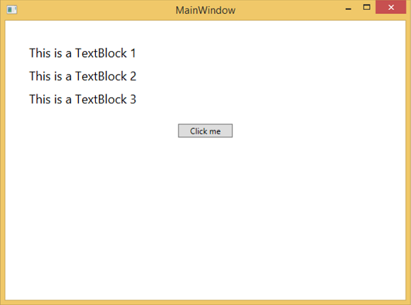
When you compile and execute the above code, it will produce the following window −
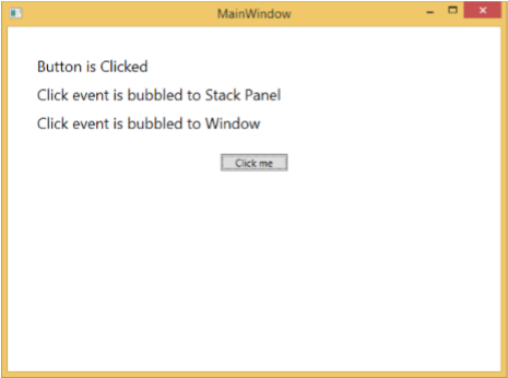
When you click on the button, the text blocks will get updated, as shown below.
If you want to stop the routed event at any particular level, then you will need to set the e.Handled = true;
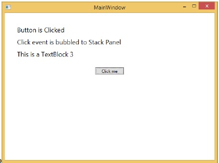
Lets change the StackPanel_Click event as shown below −
private void StackPanel_Click(object sender, RoutedEventArgs e) {
   txt2.Text = "Click event is bubbled to Stack Panel";
   e.Handled = true;
}
When you click on the button, you will observe that the click event will not be routed to the window and will stop at the stackpanel and the 3rd text block will not be updated.
Custom Routed Events
In .NET framework, custom routed event can also be defined. You need to follow the steps given below to define a custom routed event in C#.
Declare and register your routed event with system call RegisterRoutedEvent.
Specify the Routing Strategy, i.e. Bubble, Tunnel, or Direct.
Provide the event handler.
Lets take an example to understand more about custom routed events. Follow the steps given below −
Create a new WPF project with WPFCustomRoutedEvent
Right click on your solution and select Add > New Item...
The following dialog will open, now select Custom Control (WPF) and name it MyCustomControl.
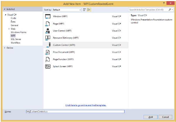
Click the Add button and you will see that two new files (Themes/Generic.xaml and MyCustomControl.cs) will be added in your solution.
The following XAML code sets the style for the custom control in Generic.xaml file.
<ResourceDictionary
   xmlns = "http://schemas.microsoft.com/winfx/2006/xaml/presentation"
   xmlns:x = "http://schemas.microsoft.com/winfx/2006/xaml"
   xmlns:local = "clr-namespace:WPFCustomRoutedEvent">

   <Style TargetType = "{x:Type local:MyCustomControl}">
      <Setter Property = "Margin" Value = "50"/>
      <Setter Property = "Template">
         <Setter.Value>
            <ControlTemplate TargetType = "{x:Type local:MyCustomControl}">

               <Border Background = "{TemplateBinding Background}"
                  BorderBrush = "{TemplateBinding BorderBrush}"
                  BorderThickness = "{TemplateBinding BorderThickness}">
                  <Button x:Name = "PART_Button" Content = "Click Me" />
               </Border>

            </ControlTemplate>
         </Setter.Value>
      </Setter>
   </Style>

</ResourceDictionary>
Given below is the C# code for the MyCustomControl class which inherits from the Control class in which a custom routed event Click is created for the custom control.
using System.Windows;
using System.Windows.Controls;

namespace WPFCustomRoutedEvent {

   public class MyCustomControl : Control {

      static MyCustomControl() {
         DefaultStyleKeyProperty.OverrideMetadata(typeof(MyCustomControl),
            new FrameworkPropertyMetadata(typeof(MyCustomControl)));
      }

      public override void OnApplyTemplate() {
         base.OnApplyTemplate();

         //demo purpose only, check for previous instances and remove the handler first
         var button  =  GetTemplateChild("PART_Button") as Button;
         if (button ! =  null)
         button.Click + =  Button_Click;
      }

      void Button_Click(object sender, RoutedEventArgs e) {
         RaiseClickEvent();
      }

      public static readonly RoutedEvent ClickEvent  =
         EventManager.RegisterRoutedEvent("Click", RoutingStrategy.Bubble,
         typeof(RoutedEventHandler), typeof(MyCustomControl));

      public event RoutedEventHandler Click {
         add { AddHandler(ClickEvent, value); }
         remove { RemoveHandler(ClickEvent, value); }
      }

      protected virtual void RaiseClickEvent() {
         RoutedEventArgs args = new RoutedEventArgs(MyCustomControl.ClickEvent);
         RaiseEvent(args);
      }

   }
}
Here is the custom routed event implementation in C# which will display a message box when the user clicks it.
using System.Windows;

namespace WPFCustomRoutedEvent {
   // <summary>
      // Interaction logic for MainWindow.xaml
   // </summary>

   public partial class MainWindow : Window {

      public MainWindow() {
         InitializeComponent();
      }

      private void MyCustomControl_Click(object sender, RoutedEventArgs e) {
         MessageBox.Show("It is the custom routed event of your custom control");
      }

   }
}
Here is the implementation in MainWindow.xaml to add the custom control with a routed event Click.
<Window x:Class = "WPFCustomRoutedEvent.MainWindow"
   xmlns = "http://schemas.microsoft.com/winfx/2006/xaml/presentation"
   xmlns:x = "http://schemas.microsoft.com/winfx/2006/xaml"
   xmlns:local = "clr-namespace:WPFCustomRoutedEvent"
   Title = "MainWindow" Height = "350" Width = "604">

   <Grid>
      <local:MyCustomControl Click = "MyCustomControl_Click" />
   </Grid>

</Window>
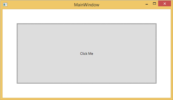
When the above code is compiled and executed, it will produce the following window which contains a custom control.
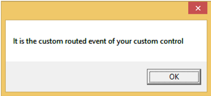
When you click on the custom control, it will produce the following message.
WPF - Controls
Windows Presentation Foundation (WPF) allows developers to easily build and create visually enriched UI based applications.
The classical UI elements or controls in other UI frameworks are also enhanced in WPF applications.
All of the standard WPF controls can be found in the Toolbox which is a part of the System.Windows.Controls.
These controls can also be created in XAML markup language.
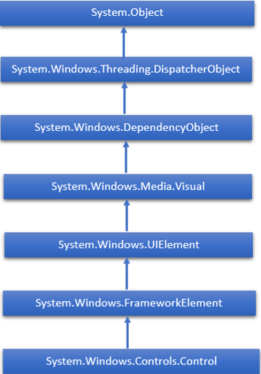
The complete inheritance hierarchy of WPF controls are as follows −
The following table contains a list of controls which we will discuss in the subsequent chapters.
| Sr. No. | Controls & Description |
|---|---|
| 1 | Button
A control that responds to user input |
| 2 | Calendar
Represents a control that enables a user to select a date by using a visual calendar display. |
| 3 | CheckBox
A control that a user can select or clear. |
| 4 | ComboBox
A drop-down list of items a user can select from. |
| 5 | ContextMenu
Gets or sets the context menu element that should appear whenever the context menu is requested through user interface (UI) from within this element. |
| 6 | DataGrid
Represents a control that displays data in a customizable grid. |
| 7 | DatePicker
A control that lets a user select a date. |
| 8 | Dialogs
An application may also display additional windows to help the user gather or display important information. |
| 9 | GridView
A control that presents a collection of items in rows and columns that can scroll horizontally. |
| 10 | Image
A control that presents an image. |
| 11 | Label
Displays text on a form. Provides support for access keys. |
| 12 | ListBox
A control that presents an inline list of items that the user can select from. |
| 13 | Menus
Represents a Windows menu control that enables you to hierarchically organize elements associated with commands and event handlers. |
| 14 | PasswordBox
A control for entering passwords. |
| 15 | Popup
Displays content on top of existing content, within the bounds of the application window. |
| 16 | ProgressBar
A control that indicates progress by displaying a bar. |
| 17 | RadioButton
A control that allows a user to select a single option from a group of options. |
| 18 | ScrollViewer
A container control that lets the user pan and zoom its content. |
| 19 | Slider
A control that lets the user select from a range of values by moving a Thumb control along a track. |
| 20 | TextBlock
A control that displays text. |
| 21 | ToggleButton
A button that can be toggled between 2 states. |
| 22 | ToolTip
A pop-up window that displays information for an element. |
| 23 | Window
The root window which provides minimize/maximize option, Title bar, border and close button |
| 24 | 3rd Party Controls
Use third-party controls in your WPF applications. |
We will discuss all these controls one by one with their implementation.
WPF - Layouts
The layout of controls is very important and critical for application usability. It is used to arrange a group of GUI elements in your application. There are certain important things to consider while selecting layout panels −
- Positions of the child elements
- Sizes of the child elements
- Layering of overlapping child elements on top of each other
Fixed pixel arrangement of controls doesnt work when the application is to be sed on different screen resolutions. XAML provides a rich set of built-in layout panels to arrange GUI elements in an appropriate way. Some of the most commonly used and popular layout panels are as follows −
| Sr. No. | Panels & Description |
|---|---|
| 1 | Stack Panel
Stack panel is a simple and useful layout panel in XAML. In stack panel, child elements can be arranged in a single line, either horizontally or vertically, based on the orientation property. |
| 2 | Wrap Panel
In WrapPanel, child elements are positioned in sequential order, from left to right or from top to bottom based on the orientation property. |
| 3 | Dock Panel
DockPanel defines an area to arrange child elements relative to each other, either horizontally or vertically. With DockPanel you can easily dock child elements to top, bottom, right, left and center using the Dock property. |
| 4 | Canvas Panel
Canvas panel is the basic layout panel in which the child elements can be positioned explicitly using coordinates that are relative to the Canvas any side such as left, right, top and bottom. |
| 5 | Grid Panel
A Grid Panel provides a flexible area which consists of rows and columns. In a Grid, child elements can be arranged in tabular form. |
WPF - Nesting of Layout
Nesting of layout means the use layout panel inside another layout, e.g. define stack panels inside a grid. This concept is widely used to take the advantages of multiple layouts in an application. In the following example, we will be using stack panels inside a grid.
Lets have a look at the following XAML code.
<Window x:Class = "WPFNestingLayouts.MainWindow"
xmlns = "http://schemas.microsoft.com/winfx/2006/xaml/presentation"
xmlns:x = "http://schemas.microsoft.com/winfx/2006/xaml"
xmlns:d = "http://schemas.microsoft.com/expression/blend/2008"
xmlns:mc = "http://schemas.openxmlformats.org/markup-compatibility/2006"
xmlns:local = "clr-namespace:WPFNestingLayouts"
mc:Ignorable = "d" Title = "MainWindow" Height = "350" Width = "604">
<Grid Background = "AntiqueWhite">
<Grid.RowDefinitions>
<RowDefinition Height = "*" />
<RowDefinition Height = "*" />
<RowDefinition Height = "*" />
<RowDefinition Height = "*" />
<RowDefinition Height = "*" />
</Grid.RowDefinitions>
<Grid.ColumnDefinitions>
<ColumnDefinition Width = "*" />
</Grid.ColumnDefinitions>
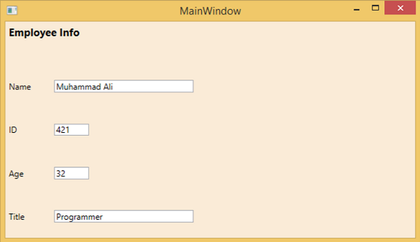
<Label Content = "Employee Info" FontSize = "15"
FontWeight = "Bold" Grid.Column = "0" Grid.Row = "0"/>
<StackPanel Grid.Column = "0" Grid.Row = "1" Orientation = "Horizontal">
<Label Content = "Name" VerticalAlignment = "Center" Width = "70"/>
<TextBox Name = "txtName" Text = "Muhammad Ali" VerticalAlignment = "Center"
Width = "200">
</TextBox>
</StackPanel>
<StackPanel Grid.Column = "0" Grid.Row = "2" Orientation = "Horizontal">
<Label Content = "ID" VerticalAlignment = "Center" Width = "70"/>
<TextBox Name = "txtCity" Text = "421" VerticalAlignment = "Center"
Width = "50">
</TextBox>
</StackPanel>
<StackPanel Grid.Column = "0" Grid.Row = "3" Orientation = "Horizontal">
<Label Content = "Age" VerticalAlignment = "Center" Width = "70"/>
<TextBox Name = "txtState" Text = "32" VerticalAlignment = "Center"
Width = "50"></TextBox>
</StackPanel>
<StackPanel Grid.Column = "0" Grid.Row = "4" Orientation = "Horizontal">
<Label Content = "Title" VerticalAlignment = "Center" Width = "70"/>
<TextBox Name = "txtCountry" Text = "Programmer" VerticalAlignment = "Center"
Width = "200"></TextBox>
</StackPanel>
</Grid>
</Window>
When you compile and execute the above code, it will produce the following window.
We recommend that you execute the above example code and try other nesting layouts.
WPF - Input
Windows Presentation Foundation (WPF) provides a powerful API with the help of which applications can get input from various devices such as mouse, keyboard, and touch panels. In this chapter, we will discuss the following types of input which can be handled in WPF applications −
| Sr. No. | Inputs & Description |
|---|---|
| 1 | Mouse
There are different types of mouse inputs such as MouseDown, MouseEnter, MouseLeave, etc. |
| 2 | Keyboard
There are many types of keyboard inputs such as KeyDown, KeyUp, TextInput, etc. |
| 3 | ContextMenu or RoutedCommands
RoutedCommands enable input handling at a more semantic level. These are actually simple instructions as New, Open, Copy, Cut, and Save. |
| 4 | Multi Touch
Windows 7 and its higher versions have the ability to receive input from multiple touchsensitive devices. WPF applications can also handle touch input as other input, such as the mouse or keyboard, by raising events when a touch occurs. |
WPF - Command Line
Command line argument is a mechanism where a user can pass a set of parameters or values to a WPF application when it is executed. These arguments are very important to control an application from outside, for example, if you want to open a Word document from the command prompt, then you can use this command C:\> start winword word1.docx and it will open word1.docx document.
Command line arguments are handled in Startup function. Following is a simple example which shows how to pass command line arguments to a WPF application. Lets create a new WPF application with the name WPFCommandLine.
Drag one textbox from the toolbox to the design window.
In this example, we will pass a txt file path to our application as command line parameter.
The program will read the txt file and then write all the text on the text box.
The following XAML code creates a textbox and initializes it with some properties.
<Window x:Class = "WPFCommandLine.MainWindow"
   xmlns = "http://schemas.microsoft.com/winfx/2006/xaml/presentation"
   xmlns:x = "http://schemas.microsoft.com/winfx/2006/xaml"
   xmlns:d = "http://schemas.microsoft.com/expression/blend/2008"
   xmlns:mc = "http://schemas.openxmlformats.org/markup-compatibility/2006"
   xmlns:local = "clr-namespace:WPFCommandLine"
   mc:Ignorable = "d" Title = "MainWindow" Height = "350" Width = "525">

   <Grid>
      <TextBox x:Name = "textBox" HorizontalAlignment = "Left"
         Height = "180" Margin = "100" TextWrapping = "Wrap"
         VerticalAlignment = "Top" Width = "300"/>
   </Grid>

</Window>
- Now subscribe the Startup event in App.xaml file as shown below.
<Application x:Class = "WPFCommandLine.App"
   xmlns = "http://schemas.microsoft.com/winfx/2006/xaml/presentation"
   xmlns:x = "http://schemas.microsoft.com/winfx/2006/xaml"
   xmlns:local = "clr-namespace:WPFCommandLine"
   StartupUri = "MainWindow.xaml" Startup = "app_Startup">

   <Application.Resources>

   </Application.Resources>

</Application>
Given below is the implementation of the app_Startup event in App.xaml.cs which will get the command line arguments.
using System.Windows;

namespace WPFCommandLine {
   /// <summary>
      /// Interaction logic for App.xaml
   /// </summary>

   public partial class App : Application {
      public static string[] Args;

      void app_Startup(object sender, StartupEventArgs e) {
         // If no command line arguments were provided, don't process them
         if (e.Args.Length == 0) return;

         if (e.Args.Length > 0) {
            Args = e.Args;
         }
      }
   }
}
Now, in the MainWindow class, the program will open the txt file and write all the text on textbox.
If there is some error found, then the program will display an error message on textbox.
using System;
using System.IO;
using System.Windows;

namespace WPFCommandLine {

   public partial class MainWindow : Window {

      public MainWindow() {
         InitializeComponent();
         String[] args = App.Args;

         try {
            // Open the text file using a stream reader.
            using (StreamReader sr = new StreamReader(args[0])) {
               // Read the stream to a string, and write
               // the string to the text box
               String line = sr.ReadToEnd();
               textBox.AppendText(line.ToString());
               textBox.AppendText("\n");
            }
         }
         catch (Exception e) {
            textBox.AppendText("The file could not be read:");
            textBox.AppendText("\n");
            textBox.AppendText(e.Message);
         }
      }
   }
}
When the above code is compiled and executed, it will produce a blank window with a textbox because this program needs a command line argument. So Visual Studio provides an easy way to execute your application with command line parameters.
Right click on your WPF project in the solution explorer and select properties, it will display the following window.
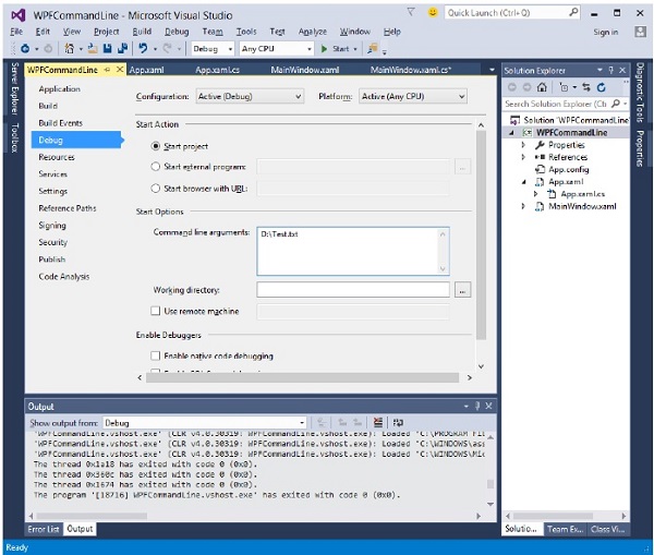
Select Debug option and write the file path in the Command line argument.
Create a txt file with Test.txt and write some text in that file and save it on any location. In this case, the txt file is saved on D:\ hard drive.
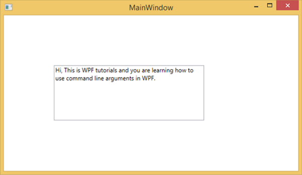
Save the changes in your project and compile and execute your application now. You will see the text in TextBox which the program reads from the Text.txt file.
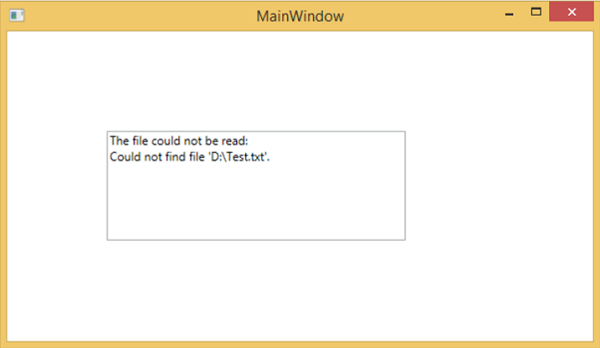
Now lets try and change the file name on your machine from Test.txt to Test1.txt and execute your program again, then you will see that error message in the text box.
We recommend that you execute the above code and follow all the steps to execute your application successfully.
WPF - Data Binding
Data binding is a mechanism in WPF applications that provides a simple and easy way for Windows Runtime apps to display and interact with data. In this mechanism, the management of data is entirely separated from the way data.
Data binding allows the flow of data between UI elements and data object on user interface. When a binding is established and the data or your business model changes, then it reflects the updates automatically to the UI elements and vice versa. It is also possible to bind, not to a standard data source, but to another element on the page.
Data binding is of two types − one-way data binding and two-way data binding.
One-Way Data Binding
In one-way binding, data is bound from its source (that is the object that holds the data) to its target (that is the object that displays the data)
Lets take a simple example to understand one-way data binding in detail. First of all, create a new WPF project with the name WPFDataBinding.
The following XAML code creates two labels, two textboxes, and one button and initializes them with some properties.
<Window x:Class = "WPFDataBinding.MainWindow"
   xmlns = "http://schemas.microsoft.com/winfx/2006/xaml/presentation"
   xmlns:x = "http://schemas.microsoft.com/winfx/2006/xaml"
   xmlns:d = "http://schemas.microsoft.com/expression/blend/2008"
   xmlns:mc = "http://schemas.openxmlformats.org/markup-compatibility/2006"
   xmlns:local = "clr-namespace:WPFDataBinding"
   mc:Ignorable = "d" Title = "MainWindow" Height = "350" Width = "604">

   <Grid>

      <Grid.RowDefinitions>
         <RowDefinition Height = "Auto" />
         <RowDefinition Height = "Auto" />
         <RowDefinition Height = "*" />
      </Grid.RowDefinitions>

      <Grid.ColumnDefinitions>
         <ColumnDefinition Width = "Auto" />
         <ColumnDefinition Width = "200" />
      </Grid.ColumnDefinitions>

      <Label Name = "nameLabel" Margin = "2">_Name:</Label>

      <TextBox Name = "nameText" Grid.Column = "1" Margin = "2"
         Text = "{Binding Name, Mode = OneWay}"/>

      <Label Name = "ageLabel" Margin = "2" Grid.Row = "1">_Age:</Label>

      <TextBox Name = "ageText" Grid.Column = "1" Grid.Row = "1" Margin = "2"
         Text = "{Binding Age, Mode = OneWay}"/>

      <StackPanel Grid.Row = "2" Grid.ColumnSpan = "2">
         <Button Content = "_Show..." Click="Button_Click" />
      </StackPanel>

   </Grid>
</Window>
The text properties of both the textboxes bind to Name and Age which are class variables of Person class which is shown below.
In Person class, we have just two variables Name and Age, and its object is initialized in MainWindow class.
In XAML code, we are binding to a property Name and Age, but we have not selected what object that property belongs to.
The easier way is to assign an object to DataContext whose properties we are binding in the following C# code in MainWindowconstructor.
using System.Windows;
namespace WPFDataBinding {
public partial class MainWindow : Window {
Person person = new Person { Name = "Salman", Age = 26 };
public MainWindow() {
InitializeComponent();
this.DataContext = person;
}
private void Button_Click(object sender, RoutedEventArgs e) {
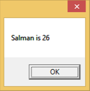
string message = person.Name + " is " + person.Age;
MessageBox.Show(message);
}
}
public class Person {
private string nameValue;
public string Name {
get { return nameValue; }
set { nameValue = value; }
}
private double ageValue;
public double Age {
get { return ageValue; }
set {
if (value != ageValue) {
ageValue = value;
}
}
}
}
}
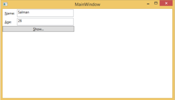
Let's run this application and you can see immediately in our MainWindow that we have successfully bound to the Name and Age of that Person object.
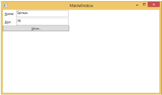
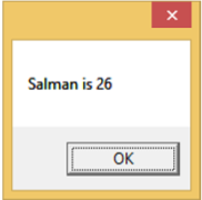
When you press the Show button, it will display the name and age on the message box.
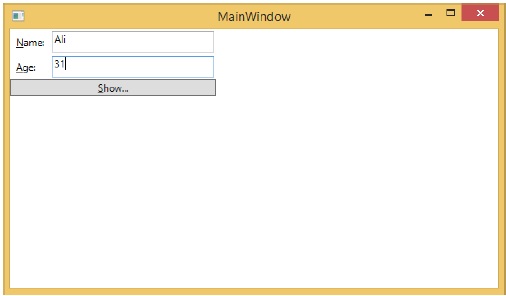
Lets change the Name and Age in the dialog box.
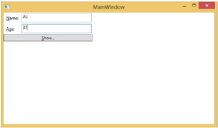
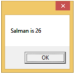
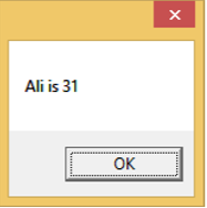
If you now click the Show button, it will again display the same message.
This because data binding mode is set to one-way in the XAML code. To show the updated data, you will need to understand two-way data binding.
Two-Way Data Binding
In two-way binding, the user can modify the data through the user interface and have that data updated in the source. If the source changes while the user is looking at the view, you want the view to be updated.
Lets take the same example but here, we will change the binding mode from One Way to Two Way in the XAML code.
<Window x:Class = "WPFDataBinding.MainWindow"
   xmlns = "http://schemas.microsoft.com/winfx/2006/xaml/presentation"
   xmlns:x = "http://schemas.microsoft.com/winfx/2006/xaml"
   xmlns:d = "http://schemas.microsoft.com/expression/blend/2008"
   xmlns:mc = "http://schemas.openxmlformats.org/markup-compatibility/2006"
   xmlns:local = "clr-namespace:WPFDataBinding"
   mc:Ignorable = "d" Title = "MainWindow" Height = "350" Width = "604">

   <Grid>

      <Grid.RowDefinitions>
         <RowDefinition Height = "Auto" />
         <RowDefinition Height = "Auto" />
         <RowDefinition Height = "*" />
      </Grid.RowDefinitions>

      <Grid.ColumnDefinitions>
         <ColumnDefinition Width = "Auto" />
         <ColumnDefinition Width = "200" />
      </Grid.ColumnDefinitions>

      <Label Name = "nameLabel" Margin = "2">_Name:</Label>
      <TextBox Name = "nameText" Grid.Column = "1" Margin = "2"
         Text = "{Binding Name, Mode = TwoWay}"/>
      <Label Name = "ageLabel" Margin = "2" Grid.Row = "1">_Age:</Label>
      <TextBox Name = "ageText" Grid.Column = "1" Grid.Row = "1" Margin = "2"
         Text = "{Binding Age, Mode = TwoWay}"/>

      <StackPanel Grid.Row = "2" Grid.ColumnSpan = "2">
         <Button Content = "_Show..." Click = "Button_Click" />
      </StackPanel>

   </Grid>

</Window>
Let's run this application again.
It will produce the same output −
Lets now change the Name and Age values −
If you click the Show button now, it will display the updated message.
We recommend that you execute the above code with both the cases for a better understanding of the concept.
WPF - Resources
Resources are normally definitions connected with some object that you just anticipate to use more often than once. It is the ability to store data locally for controls or for the current window or globally for the entire applications.
Defining an object as a resource allows us to access it from another place. What it means is that the object can be reused. Resources are defined in resource dictionaries and any object can be defined as a resource effectively making it a shareable asset. A unique key is specified to an XAML resource and with that key, it can be referenced by using a StaticResource markup extension.
Resources can be of two types −
- StaticResource
- DynamicResource
A StaticResource is a onetime lookup, whereas a DynamicResource works more like a data binding. It remembers that a property is associated with a particular resource key. If the object associated with that key changes, dynamic resource will update the target property.
Example
Here's a simple application for the SolidColorBrush resource.
Lets create a new WPF project with the name WPFResouces.
Drag two Rectangles and set their properties as shown in the following XAML code.
<Window x:Class = "WPFResources.MainWindow"
   xmlns = "http://schemas.microsoft.com/winfx/2006/xaml/presentation"
   xmlns:x = "http://schemas.microsoft.com/winfx/2006/xaml"
   xmlns:d = "http://schemas.microsoft.com/expression/blend/2008"
   xmlns:mc = "http://schemas.openxmlformats.org/markup-compatibility/2006"
   xmlns:local = "clr-namespace:WPFResources"
   mc:Ignorable = "d" Title = "MainWindow" Height = "350" Width = "525">

   <Window.Resources>
      <SolidColorBrush x:Key = "brushResource" Color = "Blue" />
   </Window.Resources>

   <StackPanel>
      <Rectangle Height = "50" Margin = "20" Fill = "{StaticResource brushResource}" />
      <Rectangle Height = "50" Margin = "20" Fill = "{DynamicResource brushResource}" />
      <Button x:Name = "changeResourceButton"
         Content = "_Change Resource" Click = "changeResourceButton_Click" />
   </StackPanel>

</Window>
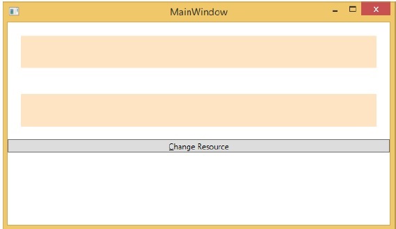
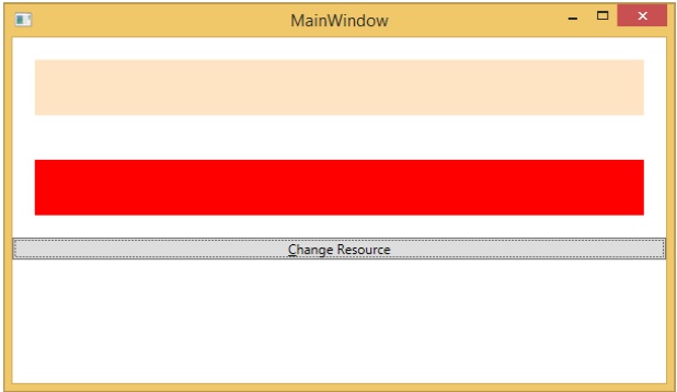
In the above XAML code, you can see that one rectangle has StaticResource and the other one has DynamicResource and the color of brushResource is Bisque.
When you compile and execute the code, it will produce the following MainWindow.
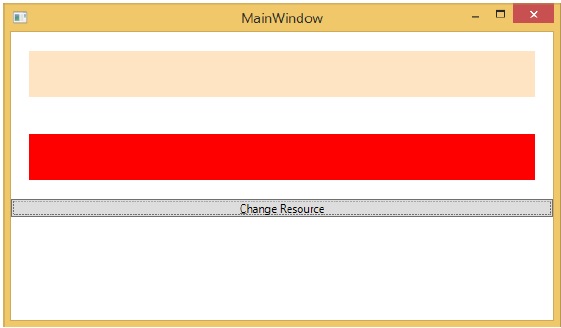
When you click the "Change Resource" button, you will see that the rectangle with DynamicResource will change its color to Red.
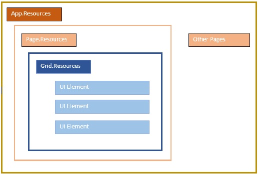
Resource Scope
Resources are defined in resource dictionaries, but there are numerous places where a resource dictionary can be defined. In the above example, a resource dictionary is defined on Window/page level. In what dictionary a resource is defined immediately limits the scope of that resource. So the scope, i.e. where you can use the resource, depends on where you've defined it.
Define the resource in the resource dictionary of a grid and it's accessible by that grid and by its child elements only.
Define it on a window/page and it's accessible by all elements on that window/page.
The app root can be found in App.xaml resources dictionary. It's the root of our application, so the resources defined here are scoped to the entire application.
As far as the scope of the resource is concerned, the most often are application level, page level, and a specific element level like a Grid, StackPanel, etc.
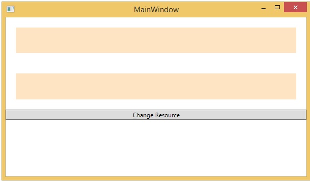
The above application has resources in its Window/page level.
Resource Dictionaries
Resource dictionaries in XAML apps imply that the resource dictionaries are kept in separate files. It is followed in almost all XAML apps. Defining resources in separate files can have the following advantages −
Separation between defining resources in the resource dictionary and UI related code.
Defining all the resources in a separate file such as App.xaml would make them available across the app.
So, how do we define our resources in a resource dictionary in a separate file? Well, it is very easy, just add a new resource dictionary through Visual Studio by following steps given below −
In your solution, add a new folder and name it ResourceDictionaries.
Right-click on this folder and select Resource Dictionary from Add submenu item and name it DictionaryWithBrush.xaml
Example
Lets now take the same example, but here, we will define the resource dictionary in app level. The XAML code for MainWindow.xaml is as follows −
<Window x:Class = "WPFResources.MainWindow"
   xmlns = "http://schemas.microsoft.com/winfx/2006/xaml/presentation"
   xmlns:x = "http://schemas.microsoft.com/winfx/2006/xaml"
   xmlns:d = "http://schemas.microsoft.com/expression/blend/2008"
   xmlns:mc = "http://schemas.openxmlformats.org/markup-compatibility/2006"
   xmlns:local = "clr-namespace:WPFResources"
   mc:Ignorable = "d" Title = "MainWindow" Height = "350" Width = "525">

   <StackPanel>
      <Rectangle Height = "50" Margin = "20" Fill = "{StaticResource brushResource}" />
      <Rectangle Height = "50" Margin = "20" Fill = "{DynamicResource brushResource}" />
      <Button x:Name = "changeResourceButton"
         Content = "_Change Resource" Click = "changeResourceButton_Click" />
   </StackPanel>

</Window>
Here is the implementation in DictionaryWithBrush.xaml −
<ResourceDictionary xmlns = "http://schemas.microsoft.com/winfx/2006/xaml/presentation"
   xmlns:x = "http://schemas.microsoft.com/winfx/2006/xaml">
   <SolidColorBrush x:Key = "brushResource" Color = "Blue" />
</ResourceDictionary>
Here is the implementation in app.xaml −
<Application x:Class="WPFResources.App"
   xmlns = "http://schemas.microsoft.com/winfx/2006/xaml/presentation"
   xmlns:x = "http://schemas.microsoft.com/winfx/2006/xaml"
   StartupUri = "MainWindow.xaml">

   <Application.Resources>
      <ResourceDictionary Source = " XAMLResources\ResourceDictionaries\DictionaryWithBrush.xaml"/>
   </Application.Resources>

</Application>
When the above code is compiled and executed, it will produce the following output −
When you click the Change Resource button, the rectangle will change its color to Red.
We recommend that you execute the above code and try some more resources (for example, background color).
WPF - Templates
A template describes the overall look and visual appearance of a control. For each control, there is a default template associated with it which gives the control its appearance. In WPF applications, you can easily create your own templates when you want to customize the visual behavior and visual appearance of a control.
Connectivity between the logic and the template can be achieved by data binding. The main difference between styles and templates are listed below −
Styles can only change the appearance of your control with default properties of that control.
With templates, you can access more parts of a control than in styles. You can also specify both existing and new behavior of a control.
There are two types of templates which are most commonly used −
- Control Template
- Data Template
Control Template
The Control Template defines the visual appearance of a control. All of the UI elements have some kind of appearance as well as behavior, e.g., Button has an appearance and behavior. Click event or mouse hover event are the behaviors which are fired in response to a click and hover and there is also a default appearance of button which can be changed by the Control template.
Example
Lets take a simple example. We will create two buttons (one is with template and the other one is the default button) and initialize them with some properties.
<Window x:Class = "TemplateDemo.MainWindow"
   xmlns = "http://schemas.microsoft.com/winfx/2006/xaml/presentation"
   xmlns:x = "http://schemas.microsoft.com/winfx/2006/xaml"
   Title = "MainWindow" Height = "350" Width = "604">

   <Window.Resources>
      <ControlTemplate x:Key = "ButtonTemplate" TargetType = "Button">

         <Grid>
            <Ellipse x:Name = "ButtonEllipse" Height = "100" Width = "150" >
               <Ellipse.Fill>
                  <LinearGradientBrush StartPoint = "0,0.2" EndPoint = "0.2,1.4">
                     <GradientStop Offset = "0" Color = "Red" />
                     <GradientStop Offset = "1" Color = "Orange" />
                  </LinearGradientBrush>
               </Ellipse.Fill>
            </Ellipse>

            <ContentPresenter Content = "{TemplateBinding Content}"
               HorizontalAlignment = "Center" VerticalAlignment = "Center" />
         </Grid>

         <ControlTemplate.Triggers>

            <Trigger Property = "IsMouseOver" Value = "True">
               <Setter TargetName = "ButtonEllipse" Property = "Fill" >
                  <Setter.Value>
                     <LinearGradientBrush StartPoint = "0,0.2" EndPoint = "0.2,1.4">
                        <GradientStop Offset = "0" Color = "YellowGreen" />
                        <GradientStop Offset = "1" Color = "Gold" />
                     </LinearGradientBrush>
                  </Setter.Value>
               </Setter>
            </Trigger>

            <Trigger Property = "IsPressed" Value = "True">
               <Setter Property = "RenderTransform">
                  <Setter.Value>
                     <ScaleTransform ScaleX = "0.8" ScaleY = "0.8"
                        CenterX = "0" CenterY = "0"  />
                  </Setter.Value>
               </Setter>
               <Setter Property = "RenderTransformOrigin" Value = "0.5,0.5" />
            </Trigger>

         </ControlTemplate.Triggers>

      </ControlTemplate>
   </Window.Resources>

   <StackPanel>
      <Button Content = "Round Button!"
         Template = "{StaticResource ButtonTemplate}"
         Width = "150" Margin = "50" />
      <Button Content = "Default Button!" Height = "40"
         Width = "150" Margin = "5" />
   </StackPanel>

</Window>
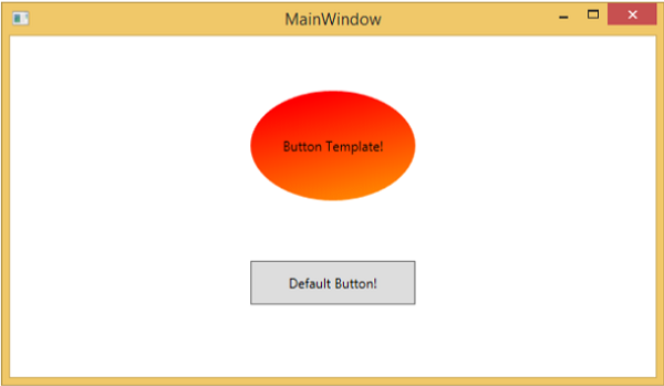
When you compile and execute the above code, it will display the following MainWindow.
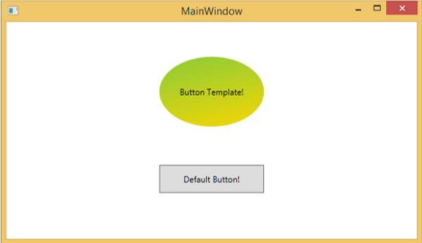
When you move the mouse over the button with custom template, it will change its color as shown below.
Data Template
A Data Template defines and specifies the appearance and structure of a collection of data. It provides the flexibility to format and define the presentation of the data on any UI element. It is mostly used on data related Item controls such as ComboBox, ListBox, etc.
Example
Lets take a simple example to understand the concept of data template. Create a new WPF project with the name WPFDataTemplates.
In the following XAML code, we will create a Data Template as resource to hold labels and textboxes. There is a button and a list box as well which to display the data.
<Window x:Class = "WPFDataTemplates.MainWindow"
   xmlns = "http://schemas.microsoft.com/winfx/2006/xaml/presentation"
   xmlns:x = "http://schemas.microsoft.com/winfx/2006/xaml"
   xmlns:d = "http://schemas.microsoft.com/expression/blend/2008"
   xmlns:mc = "http://schemas.openxmlformats.org/markup-compatibility/2006"
   xmlns:local = "clr-namespace:WPFDataTemplates"
   xmlns:loc = "clr-namespace:WPFDataTemplates"
   mc:Ignorable = "d" Title = "MainWindow" Height = "350" Width = "525">

   <Window.Resources>
      <DataTemplate DataType = "{x:Type loc:Person}">

         <Grid>
            <Grid.RowDefinitions>
               <RowDefinition Height = "Auto" />
               <RowDefinition Height = "Auto" />
            </Grid.RowDefinitions>

            <Grid.ColumnDefinitions>
               <ColumnDefinition Width = "Auto" />
               <ColumnDefinition Width = "200" />
            </Grid.ColumnDefinitions>

            <Label Name = "nameLabel" Margin = "10"/>
            <TextBox Name = "nameText" Grid.Column = "1" Margin = "10"
               Text = "{Binding Name}"/>
            <Label Name = "ageLabel" Margin = "10" Grid.Row = "1"/>
            <TextBox Name = "ageText" Grid.Column = "1" Grid.Row = "1" Margin = "10"
               Text = "{Binding Age}"/>
         </Grid>

      </DataTemplate>
   </Window.Resources>

   <Grid>
      <Grid.RowDefinitions>
         <RowDefinition Height = "Auto" />
         <RowDefinition Height = "*" />
      </Grid.RowDefinitions>

      <ListBox ItemsSource = "{Binding}" />
      <StackPanel Grid.Row = "1" >
         <Button Content = "_Show..." Click = "Button_Click" Width = "80" HorizontalAlignment = "Left" Margin = "10"/>
      </StackPanel>

   </Grid>

</Window>
Here is implementation in C# in which a list of Person objects are assigned to DataContext, implementation of Person class and button click event.
using System.Collections.Generic;
using System.Windows;

namespace WPFDataTemplates {

   public partial class MainWindow : Window {

      Person src = new Person { Name = "Ali", Age = 27 };
      List<Person> people = new List<Person>();

      public MainWindow() {
         InitializeComponent();
         people.Add(src);
         people.Add(new Person { Name = "Mike", Age = 62 });
         people.Add(new Person { Name = "Brian", Age = 12 });
         this.DataContext = people;
      }

      private void Button_Click(object sender, RoutedEventArgs e) {
         string message = src.Name + " is " + src.Age;
         MessageBox.Show(message);
      }
   }

   public class Person {
      private string nameValue;

      public string Name {
         get { return nameValue; }
         set { nameValue = value; }
      }

      private double ageValue;

      public double Age {
         get { return ageValue; }
         set {
            if (value != ageValue) {
            ageValue = value;
            }
         }
      }
   }

}
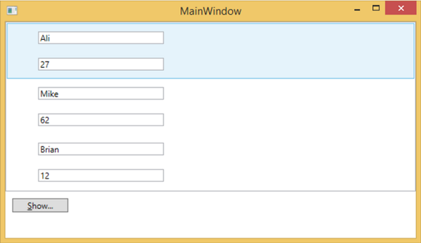
When you compile and execute the above code, it will produce the following window. It contains one list and inside the list box, each list box item contains the Person class object data which are displayed on Labels and Text boxes.
WPF - Styles
The .NET framework provides several strategies to personalize and customize the appearance of an application. Styles provide us the flexibility to set some properties of an object and reuse these specific settings across multiple objects for a consistent look.
In styles, you can set only the existing properties of an object such as Height, Width, Font size, etc.
Only default behavior of a control can be specified.
Multiple properties can be added into a single style.
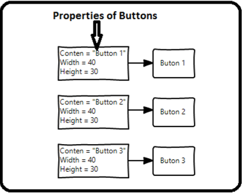
Styles are used to give a uniform look or appearance to a set of controls. Implicit styles are used to apply an appearance to all the controls of a given type and simplify the application. Imagine three buttons, all of them have to look the same, same width and height, same font size, same foreground color, etc. We can set all those properties on the button elements themselves and that's still quite okay for all of the buttons. Take a look at the following diagram.
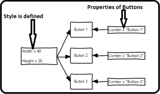
But in a real-life applications, you'll typically have a lot more of these that need to look exactly the same. And not only buttons of course, you'll typically want your text blocks, text boxes, and combo boxes etc. to look the same across your application. Surely, there must be a better way to achieve this and it is known as styling. You can think of a style as a convenient way to apply a set of property values to more than one element. Take a look at the following diagram.
Example
Lets take a simple example to understand this concept. Start by creating a new WPF project.
Drag three buttons from the toolbox to the design window.
The following XAML code creates three buttons and initializes them with some properties.
<Window x:Class = "WPFStyle.MainWindow"
   xmlns = "http://schemas.microsoft.com/winfx/2006/xaml/presentation"
   xmlns:x = "http://schemas.microsoft.com/winfx/2006/xaml"
   xmlns:d = "http://schemas.microsoft.com/expression/blend/2008"
   xmlns:mc = "http://schemas.openxmlformats.org/markup-compatibility/2006"
   xmlns:local = "clr-namespace: WPFStyle"
   mc:Ignorable = "d" Title = "MainWindow" Height = "350" Width = "604">

   <StackPanel>
      <Button Content = "Button1" Height = "30" Width = "80"
         Foreground = "Blue" FontSize = "12" Margin = "10"/>
      <Button Content = "Button2" Height = "30" Width = "80"
         Foreground = "Blue" FontSize = "12" Margin = "10"/>
      <Button Content = "Button3" Height = "30" Width = "80"
         Foreground = "Blue" FontSize = "12" Margin = "10"/>
   </StackPanel>

</Window>
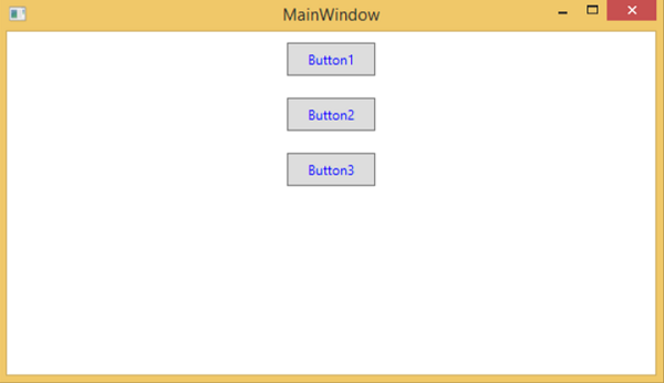
When you look at the above code, you will see that for all the buttons height, width, foreground color, font size and margin properties are same. Now when the above code is compiled and executed the following window will be displayed.
Now lets have a look at the same example, but this time, we will be using style.
<Window x:Class = "XAMLStyle.MainWindow"
   xmlns = "http://schemas.microsoft.com/winfx/2006/xaml/presentation"
   xmlns:x = "http://schemas.microsoft.com/winfx/2006/xaml"
   xmlns:d = "http://schemas.microsoft.com/expression/blend/2008"
   xmlns:mc = "http://schemas.openxmlformats.org/markup-compatibility/2006"
   xmlns:local = "clr-namespace:XAMLStyle"
   mc:Ignorable = "d" Title = "MainWindow" Height = "350" Width = "604">

   <Window.Resources>
      <Style x:Key = "myButtonStyle" TargetType = "Button">
         <Setter Property = "Height" Value = "30" />
         <Setter Property = "Width" Value = "80" />
         <Setter Property = "Foreground" Value = "Blue" />
         <Setter Property = "FontSize" Value = "12" />
         <Setter Property = "Margin" Value = "10" />
      </Style>
   </Window.Resources>

   <StackPanel>
      <Button Content = "Button1" Style = "{StaticResource myButtonStyle}" />
      <Button Content = "Button2" Style = "{StaticResource myButtonStyle}" />
      <Button Content = "Button3" Style="{StaticResource myButtonStyle}" />
   </StackPanel>

</Window>
Styles are defined in the resource dictionary and each style has a unique key identifier and a target type. Inside <style> you can see that multiple setter tags are defined for each property which will be included in the style.
In the above example, all of the common properties of each button are now defined in style and then the style are assigned to each button with a unique key by setting the style property through the StaticResource markup extension.
When you compile and execute the above code, it will display the following window (the same output).
The advantage of doing it like this is immediately obvious, we can reuse that style anywhere in its scope; and if we need to change it, we simply change it once in the style definition instead of on each element.
In what level a style is defined instantaneously limits the scope of that style. So the scope, i.e. where you can use the style, depends on where you've defined it. Styles can be defined on the following levels −
| Sr.No | Levels & Description |
|---|---|
| 1 | Control Level
Defining a style on control level can only be applied to that particular control. Given below is an example of a control level where the button and TextBlock have their own style. |
| 2 | Layout Level
Defining a style on any layout level will make it accessible by that layout and its child elements only. |
| 3 | Window Level
Defining a style on a window level can make it accessible by all the elements on that window. |
| 4 | Application Level
Defining a style on app level can make it accessible throughout the entire application. Lets take the same example, but here, we will put the styles in app.xaml file to make it accessible throughout application. |
WPF - Triggers
A trigger basically enables you to change property values or take actions based on the value of a property. So, it allows you to dynamically change the appearance and/or behavior of your control without having to create a new one.
Triggers are used to change the value of any given property, when certain conditions are satisfied. Triggers are usually defined in a style or in the root of a document which are applied to that specific control. There are three types of triggers −
- Property Triggers
- Data Triggers
- Event Triggers
Property Triggers
In property triggers, when a change occurs in one property, it will bring either an immediate or an animated change in another property. For example, you can use a property trigger to change the appearance of a button when the mouse hovers over the button.
The following example code shows how to change the foreground color of a button when mouse hovers over the button.
<Window x:Class = "WPFPropertyTriggers.MainWindow"
   xmlns = "http://schemas.microsoft.com/winfx/2006/xaml/presentation"
   xmlns:x = "http://schemas.microsoft.com/winfx/2006/xaml"
   Title = "MainWindow" Height = "350" Width = "604">

   <Window.Resources>
      <Style x:Key = "TriggerStyle" TargetType = "Button">
         <Setter Property = "Foreground" Value = "Blue" />
         <Style.Triggers>
            <Trigger Property = "IsMouseOver" Value = "True">
               <Setter Property = "Foreground" Value = "Green" />
            </Trigger>
         </Style.Triggers>
      </Style>
   </Window.Resources>

   <Grid>
      <Button Width = "100" Height = "70"
         Style = "{StaticResource TriggerStyle}" Content = "Trigger"/>
   </Grid>

</Window>
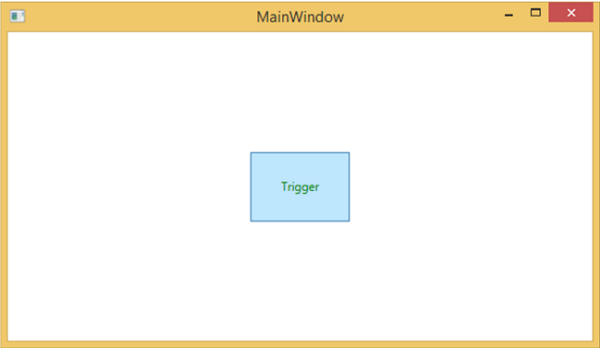
When you compile and execute the above code, it will produce the following window −
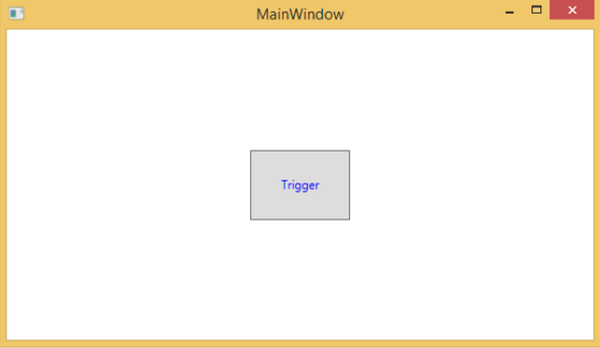
When the mouse hovers over the button, its foreground color will change to green.
Data Triggers
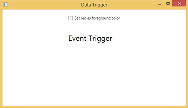
A data trigger performs some actions when the bound data satisfies some conditions. Lets have a look at the following XAML code in which a checkbox and a text block are created with some properties. When the checkbox is checked, it will change its foreground color to red.
<Window x:Class = "WPFDataTrigger.MainWindow"
   xmlns = "http://schemas.microsoft.com/winfx/2006/xaml/presentation"
   xmlns:x = "http://schemas.microsoft.com/winfx/2006/xaml"
   Title = "Data Trigger" Height = "350" Width = "604">

   <StackPanel HorizontalAlignment = "Center">
      <CheckBox x:Name = "redColorCheckBox"
         Content = "Set red as foreground color" Margin = "20"/>

      <TextBlock Name = "txtblock" VerticalAlignment = "Center"
         Text = "Event Trigger" FontSize = "24" Margin = "20">
         <TextBlock.Style>
            <Style>
               <Style.Triggers>
                  <DataTrigger Binding = "{Binding ElementName = redColorCheckBox, Path = IsChecked}"
                     Value = "true">
                     <Setter Property = "TextBlock.Foreground" Value = "Red"/>
                     <Setter Property = "TextBlock.Cursor" Value = "Hand" />
                  </DataTrigger>
               </Style.Triggers>
            </Style>
         </TextBlock.Style>
      </TextBlock>

   </StackPanel>

</Window>
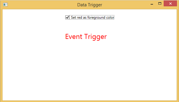
When the above code is compiled and executed, it will produce the following output −
When you tick the checkbox, the text block will change its foreground color to red.
Event Triggers
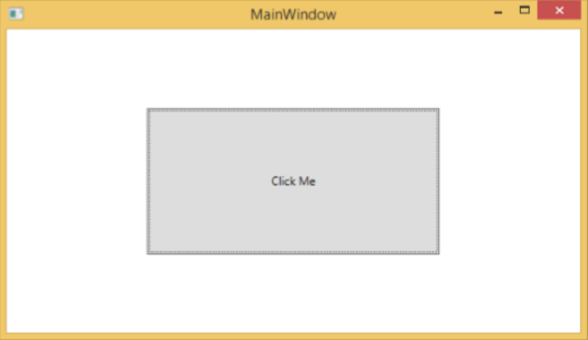
An event trigger performs some actions when a specific event is fired. It is usually used to accomplish some animation on control such DoubleAnumatio, ColorAnimation, etc. In the following example, we will create a simple button. When the click event is fired, it will expand the button width and height.
<Window x:Class = "WPFEventTrigger.MainWindow"
   xmlns = "http://schemas.microsoft.com/winfx/2006/xaml/presentation"
   xmlns:x = "http://schemas.microsoft.com/winfx/2006/xaml"
   Title = "MainWindow" Height = "350" Width = "604">

   <Grid>
      <Button Content = "Click Me" Width = "60" Height = "30">

         <Button.Triggers>
            <EventTrigger RoutedEvent = "Button.Click">
               <EventTrigger.Actions>
                  <BeginStoryboard>
                     <Storyboard>

                        <DoubleAnimationUsingKeyFrames Storyboard.TargetProperty =
                           "Width" Duration = "0:0:4">
                           <LinearDoubleKeyFrame Value = "60" KeyTime = "0:0:0"/>
                           <LinearDoubleKeyFrame Value = "120" KeyTime = "0:0:1"/>
                           <LinearDoubleKeyFrame Value = "200" KeyTime = "0:0:2"/>
                           <LinearDoubleKeyFrame Value = "300" KeyTime = "0:0:3"/>
                        </DoubleAnimationUsingKeyFrames>

                        <DoubleAnimationUsingKeyFrames Storyboard.TargetProperty = "Height"
                           Duration = "0:0:4">
                           <LinearDoubleKeyFrame Value = "30" KeyTime = "0:0:0"/>
                           <LinearDoubleKeyFrame Value = "40" KeyTime = "0:0:1"/>
                           <LinearDoubleKeyFrame Value = "80" KeyTime = "0:0:2"/>
                           <LinearDoubleKeyFrame Value = "150" KeyTime = "0:0:3"/>
                        </DoubleAnimationUsingKeyFrames>

                     </Storyboard>
                  </BeginStoryboard>
               </EventTrigger.Actions>
            </EventTrigger>
         </Button.Triggers>

      </Button>
   </Grid>

</Window>
When you compile and execute the above code, it will produce the following window −

Upon clicking the button, you will observe that it will start expanding in both dimensions.
We recommend that you compile and execute the above examples and apply the triggers to other properties as well.
WPF - Debugging
It is a systematic mechanism of identifying and fixing the bugs or defects in a piece of code which are not behaving the same as you are expecting. Debugging a complex application where the subsystems are tightly coupled are not that easy, because fixing bugs in one subsystem can create bugs in another subsystem.
Debugging in C#
In WPF applications, programmers deal with two languages such as C# and XAML. If you are familiar with debugging in any procedural language such as C# or C/C++ and you also know the usage of break points, then you can debug the C# part of your application easily.
Lets take a simple example to demonstrate how to debug a C# code. Create a new WPF project with the name WPFDebuggingDemo. Drag four labels, three textboxes, and one button from the toolbox. Take a look at the following XAML code.
<Window x:Class = "WPFDebuggingDemo.Window1"
   xmlns = "http://schemas.microsoft.com/winfx/2006/xaml/presentation"
   xmlns:x = "http://schemas.microsoft.com/winfx/2006/xaml"
   Title = "Window1" Height = "400" Width = "604">

   <Grid>
      <TextBox Height = "23" Margin = "0,44,169,0" Name = "textBox1"
         VerticalAlignment = "Top" HorizontalAlignment = "Right" Width = "120" />

      <TextBox Height = "23" Margin = "0,99,169,0" Name = "textBox2"
         VerticalAlignment = "Top" HorizontalAlignment = "Right" Width = "120" />

      <TextBox HorizontalAlignment = "Right" Margin = "0,153,169,0"
         Name = "textBox3" Width = "120" Height = "23" VerticalAlignment = "Top" />

      <Label Height = "28" Margin = "117,42,0,0" Name = "label1"
         VerticalAlignment = "Top" HorizontalAlignment = "Left" Width = "120">
         Item 1</Label>

      <Label Height = "28" HorizontalAlignment = "Left"
         Margin = "117,99,0,0" Name = "label2" VerticalAlignment = "Top" Width = "120">
         Item 2</Label>

      <Label HorizontalAlignment = "Left" Margin = "117,153,0,181"
         Name = "label3" Width = "120">Item 3</Label>

      <Button Height = "23" HorizontalAlignment = "Right" Margin = "0,0,214,127"
         Name = "button1" VerticalAlignment = "Bottom" Width = "75"
         Click = "button1_Click">Total</Button>

      <Label Height = "28" HorizontalAlignment = "Right"
         Margin = "0,0,169,66" Name = "label4" VerticalAlignment = "Bottom" Width = "120"/>

   </Grid>

</Window>
Given below is the C# code in which a button click event is implemented.
using System;
using System.Collections.Generic;
using System.Linq;
using System.Text;
using System.Windows;
using System.Windows.Controls;
using System.Windows.Data;
using System.Windows.Documents;
using System.Windows.Input;
using System.Windows.Media;
using System.Windows.Media.Imaging;
using System.Windows.Navigation;
using System.Windows.Shapes;
namespace WPFDebuggingDemo {
/// <summary>
/// Interaction logic for Window1.xaml
/// </summary>
public partial class Window1 : Window {
public Window1() {
InitializeComponent();
}
private void button1_Click(object sender, RoutedEventArgs e) {
if (textBox1.Text.Length > 0 && textBox2.Text.Length > 0 && textBox2.Text.Length > 0) {
double total = Convert.ToDouble(textBox1.Text) +
Convert.ToDouble(textBox2.Text) + Convert.ToDouble(textBox3.Text);
label4.Content = total.ToString();
}
else {
MessageBox.Show("Enter the value in all field.");
}
}
}
}
When you compile and execute the above code, it will produce the following window. Now enter values in the textboxes and press the Total button. You will get the total value after summation of all the values entered in the textboxes.
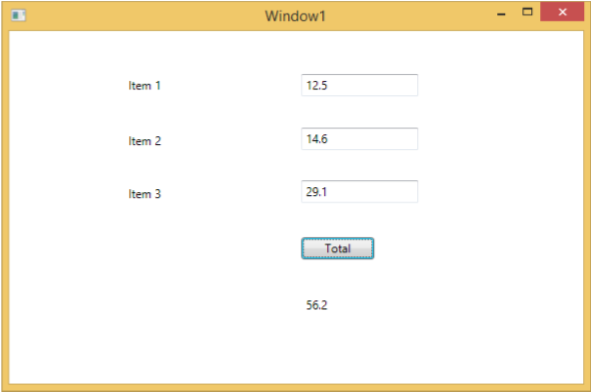
If you try to enter values other than real values, then the above application will crash. To find and resolve the issue (why it is crashing), you can insert break points in the button click event.
Lets write "abc" in item 1 as shown below.
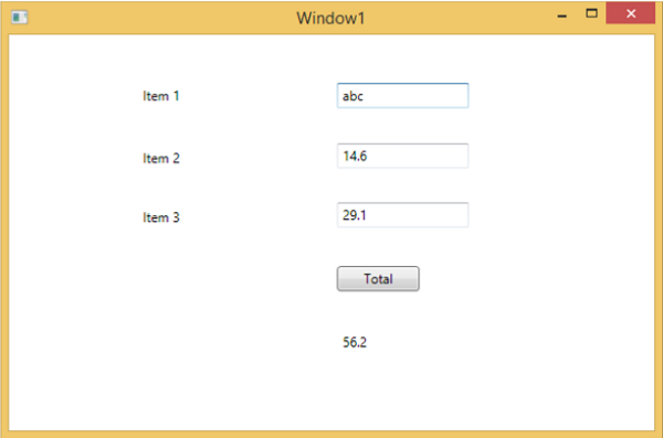
Upon clicking the Total button, you will see that the program stops at the break point
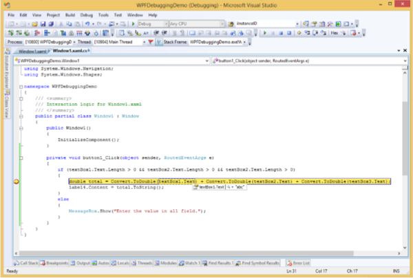
Now move the cursor towards the textbox1.Text and you will see that the program is trying to add abc value with the other values which is why the program is crashing.
Debugging in XAML
If you are expecting the same kind of debugging in XAML, then you will be surprised to know that it is not possible yet to debug the XAML code like debugging any other procedural language code. When you hear the term debugging in XAML code, it means try and find an error.
In data binding, your data doesn't show up on screen and you don't know why
Or an issue is related to complex layouts.
Or an alignment issue or issues in margin color, overlays, etc. with some extensive templates like ListBox and combo box.
Debugging an XAML program is something you typically do to check if your bindings work; and if it is not working, then to check what's wrong. Unfortunately setting breakpoints in XAML bindings isn't possible except in Silverlight, but we can use the Output window to check for data binding errors. Let's take a look at the following XAML code to find the error in data binding.
<Window x:Class = "DataBindingOneWay.MainWindow"
   xmlns = "http://schemas.microsoft.com/winfx/2006/xaml/presentation"
   xmlns:x = "http://schemas.microsoft.com/winfx/2006/xaml"
   Title = "MainWindow" Height = "350" Width = "604">

   <Grid>
      <StackPanel Name = "Display">
         <StackPanel Orientation = "Horizontal" Margin = "50, 50, 0, 0">
            <TextBlock Text = "Name: " Margin = "10" Width = "100"/>
            <TextBlock Margin = "10" Width = "100" Text = "{Binding FirstName}"/>
         </StackPanel>

         <StackPanel Orientation = "Horizontal" Margin = "50,0,50,0">
            <TextBlock Text = "Title: " Margin = "10" Width = "100"/>
            <TextBlock Margin = "10" Width = "100" Text = "{Binding Title}" />
         </StackPanel>

      </StackPanel>
   </Grid>

</Window>
Text properties of two text blocks are set to Name and Title statically, while other two text blocks Text properties are bind to FirstName and Title but class variables are Name and Title in Employee class which is shown below.
We have intentionally written an incorrect variable name so as to understand where can we find this type of a mistake when the desired output is not shown.
using System;
using System.Collections.Generic;
using System.Linq;
using System.Text;
using System.Threading.Tasks;

namespace DataBindingOneWay {

   public class Employee {
      public string Name { get; set; }
      public string Title { get; set; }

      public static Employee GetEmployee() {

         var emp = new Employee() {
            Name = "Ali Ahmed", Title = "Developer"
         };

         return emp;
      }
   }
}
Here is the implementation of MainWindow class in C# code.
using System;
using System.Windows;
using System.Windows.Controls;

namespace DataBindingOneWay {
   /// <summary>
      /// Interaction logic for MainWindow.xaml
   /// </summary>

   public partial class MainWindow : Window {

      public MainWindow() {
         InitializeComponent();
         DataContext = Employee.GetEmployee();
      }
   }
}
Let's run this application and you can see immediately in our MainWindow that we have successfully bound to the Title of that Employee object but the name is not bound.
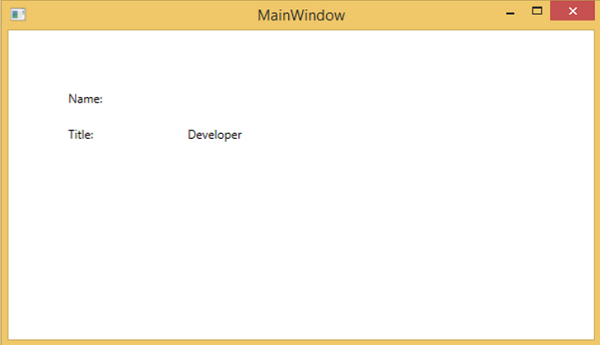
To check what happened with the name, lets look into the output window where a lot of log is generated.
The easy to find an error is just to search for the error and you will find the following error which says BindingExpression path error: 'FirstName' property not found on 'object' ''Employe
System.Windows.Data Error: 40 : BindingExpression path error: 'FirstName'
   property not found on 'object' ''Employee' (HashCode=11611730)'.
   BindingExpression:Path = FirstName; DataItem = 'Employee' (HashCode = 11611730);
   target element is 'TextBlock' (Name=''); target property is 'Text' (type 'String')
Which clearly indicate that FirstName is not a member of Employee class, so it helps to fix this type of issues in your application.
When you change the FirstName to Name again, then you will see the desired output.
UI Debugging Tools for XAML
UI debugging tools were introduced for XAML with Visual Studio 2015 to inspect the XAML code at runtime. With the help of these tools, XAML code is presented in the form of a visual tree of your running WPF application and also the different UI element properties in the tree. To enable these tools, follow the steps given below.
- Go to the Tools menu and select Options from the Tools menu.
- It will open the following dialog box.
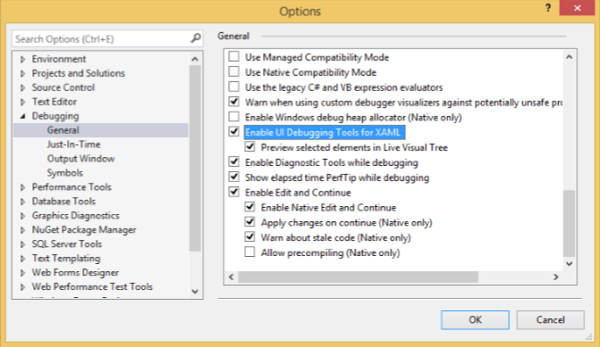
- Go to the General Options under Debugging item on the left side.
- Tick the highlighted option, i.e., Enable UI Debugging Tools for XAML and click the OK button.
Now run any XAML application or use the following XAML code.
<Window x:Class = "XAMLTestBinding.MainWindow"
   xmlns = "http://schemas.microsoft.com/winfx/2006/xaml/presentation"
   xmlns:x = "http://schemas.microsoft.com/winfx/2006/xaml"
   Title = "MainWindow" Height = "350" Width = "604">

   <StackPanel>
      <ComboBox Name = "comboBox"  Margin = "50" Width = "100">
         <ComboBoxItem Content = "Green" />
         <ComboBoxItem  Content = "Yellow" IsSelected = "True" />
         <ComboBoxItem Content = "Orange" />
      </ComboBox>

      <TextBox  Name = "textBox" Margin = "50" Width = "100" Height = "23"
         VerticalAlignment = "Top" Text  =
         "{Binding ElementName = comboBox, Path = SelectedItem.Content, Mode = TwoWay, UpdateSourceTrigger = PropertyChanged}"
         Background = "{Binding ElementName = comboBox, Path = SelectedItem.Content}">
      </TextBox>

   </StackPanel>

</Window>
When you execute the application, it will show the Live Visual Tree where all the elements are shown in a tree.
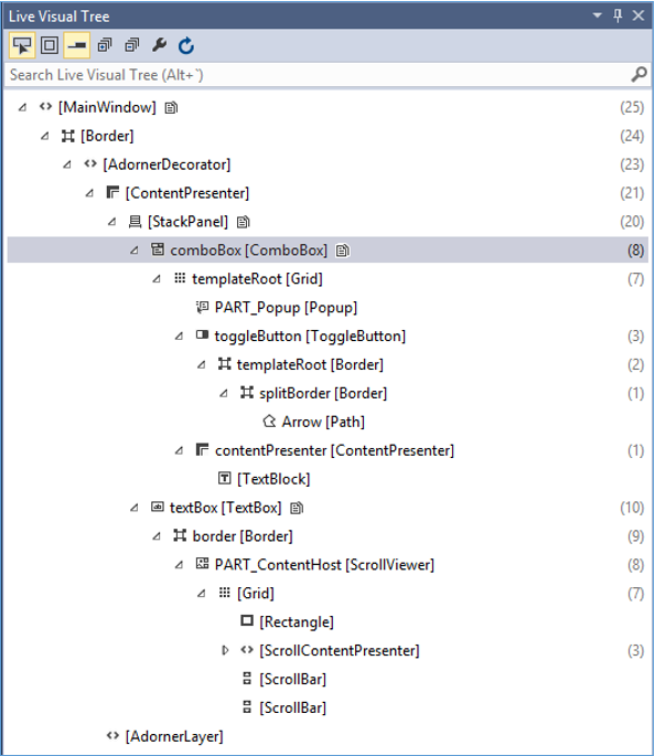
This Live Visual Tree shows the complete layout structure to understand where the UI elements are located. But this option is only available in Visual Studio 2015. If you are using an older option of Visual Studio, then you cant use this tool, however there is another tool which can be integrated with Visual Studio such as XAML Spy for Visual Studio. You can download it from xamlspy
WPF - Custom Controls
WPF applications allows to create custom controls which makes it very easy to create feature-rich and customizable controls. Custom controls are used when all the built-in controls provided by Microsoft are not fulfilling your criteria or you dont want to pay for third-party controls.
In this chapter, you will learn how to create custom controls. Before we start taking a look at Custom Controls, let's take a quick look at a User Control first.
User Control
User Controls provide a way to collect and combine different built-in controls together and package them into re-usable XAML. User controls are used in following scenarios −
If the control consists of existing controls, i.e., you can create a single control of multiple, already existing controls.
If the control doesn't need support for theming. User Controls do not support complex customization, control templates, and difficult to style.
If a developer prefers to write controls using the code-behind model where a view and then a direct code behind for event handlers.
You won't be sharing your control across applications.
Example
Lets go to an example of User control and follow the steps given below.
Create a new WPF project and then right-click on your solution and select Add > New Item...
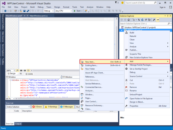
The following window will open. Now select User Control (WPF) and name it MyUserControl.
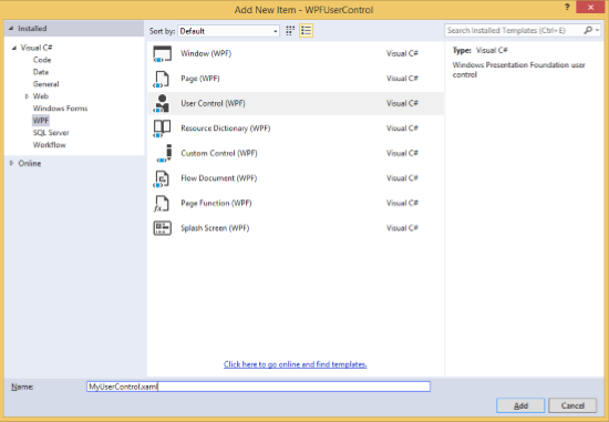
Click the Add button and you will see that two new files (MyUserControl.xaml and MyUserControl.cs) will be added in your solution.
Here is the XAML code in which a button and a text box is created with some properties in MyUserControl.xaml file.
<UserControl x:Class = "WPFUserControl.MyUserControl"
   xmlns = "http://schemas.microsoft.com/winfx/2006/xaml/presentation"
   xmlns:x = "http://schemas.microsoft.com/winfx/2006/xaml"
   xmlns:mc = "http://schemas.openxmlformats.org/markup-compatibility/2006"
   xmlns:d = "http://schemas.microsoft.com/expression/blend/2008"
   mc:Ignorable = "d" d:DesignHeight = "300" d:DesignWidth = "300">

   <Grid>
      <TextBox Height = "23"
         HorizontalAlignment = "Left"
         Margin = "80,49,0,0" Name = "txtBox"
         VerticalAlignment = "Top" Width = "200" />

      <Button Content = "Click Me"
         Height = "23" HorizontalAlignment = "Left"
         Margin = "96,88,0,0" Name = "button"
         VerticalAlignment = "Top" Click = "button_Click" />
   </Grid>

</UserControl>
Given below is the C# code for button click event in MyUserControl.cs file which updates the text box.
using System;
using System.Windows;
using System.Windows.Controls;

namespace WPFUserControl {
   /// <summary>
      /// Interaction logic for MyUserControl.xaml
   /// </summary>

   public partial class MyUserControl : UserControl {

      public MyUserControl() {
         InitializeComponent();
      }

      private void button_Click(object sender, RoutedEventArgs e) {
         txtBox.Text = "You have just clicked the button";
      }
   }
}
Here is the implementation in MainWindow.xaml to add the user control.
<Window x:Class = "XAMLUserControl.MainWindow"
   xmlns = "http://schemas.microsoft.com/winfx/2006/xaml/presentation"
   xmlns:x = "http://schemas.microsoft.com/winfx/2006/xaml"
   xmlns:control = "clr-namespace:WPFUserControl"
   Title = "MainWindow" Height = "350" Width = "525">

   <Grid>
      <control:MyUserControl/>
   </Grid>

</Window>
When you compile and execute the above code, it will produce the following window.
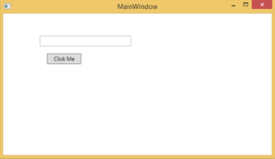
Upon clicking the "Click Me" button, you will notice that the text inside the textbox is updated.
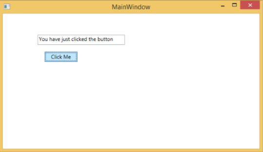
Custom Controls
A custom control is a class which offers its own style and template which are normally defined in generic.xaml. Custom controls are used in the following scenarios −
If the control doesn't exist and you have to create it from scratch.
If you want to extend or add functionality to a preexisting control by adding an extra property or an extra functionality to fit your specific scenario.
If your controls need to support theming and styling.
If you want to share your control across applications.
Example
Lets take an example to understand how custom controls work. Create a new WPF project and then right-click on your solution and select Add > New Item...
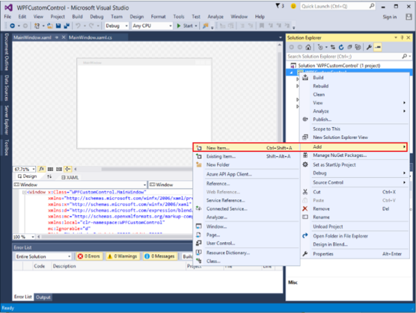
It will open the following window. Now select Custom Control (WPF) and name it MyCustomControl.
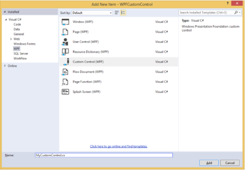
Click the Add button and you will see that two new files (Themes/Generic.xaml and MyCustomControl.cs) will be added in your solution.
Here is the XAML code in which style is set for the custom control in Generic.xaml file.
<ResourceDictionary
   xmlns = "http://schemas.microsoft.com/winfx/2006/xaml/presentation"
   xmlns:x = "http://schemas.microsoft.com/winfx/2006/xaml"
   xmlns:local = "clr-namespace:WPFCustomControls">

   <Style TargetType = "{x:Type local:MyCustomControl}"
      BasedOn = "{StaticResource {x:Type Button}}">
      <Setter Property = "Background" Value = "LightSalmon" />
      <Setter Property = "Foreground" Value = "Blue"/>
   </Style>

</ResourceDictionary>
Here is the C# code for MyCustomControl class which is inherited from the button class and in constructor it overrides the metadata.
using System;
using System.Windows;
using System.Windows.Controls;

namespace WPFCustomControls {

   public class MyCustomControl : Button {

      static MyCustomControl() {
         DefaultStyleKeyProperty.OverrideMetadata(typeof(MyCustomControl), new
            FrameworkPropertyMetadata(typeof(MyCustomControl)));
      }

   }
}
Here is the custom control click event implementation in C# which updates the text of the text block.
using System;
using System.Windows;
using System.Windows.Controls;

namespace WPFCustomControls {
   /// <summary>
      /// Interaction logic for MainWindow.xaml
   /// </summary>

   public partial class MainWindow : Window {

      public MainWindow() {
         InitializeComponent();
      }

      private void customControl_Click(object sender, RoutedEventArgs e) {
         txtBlock.Text = "You have just click your custom control";
      }

   }
}
Here is implementation in MainWindow.xaml to add the custom control and a TextBlock.
<Window x:Class = "WPFCustomControls.MainWindow"
   xmlns = "http://schemas.microsoft.com/winfx/2006/xaml/presentation"
   xmlns:x = "http://schemas.microsoft.com/winfx/2006/xaml"
   xmlns:control = "clr-namespace:WPFCustomControls"
   Title = "MainWindow" Height = "350" Width = "604">

   <StackPanel>
      <control:MyCustomControl x:Name = "customControl"
         Content = "Click Me" Width = "70"
         Margin = "10" Click = "customControl_Click"/>

      <TextBlock Name = "txtBlock"
         Width = "250" Height = "30"/>
   </StackPanel>

</Window>
When you compile and execute the above code, it will produce the following window with a custom control which is a customized button.
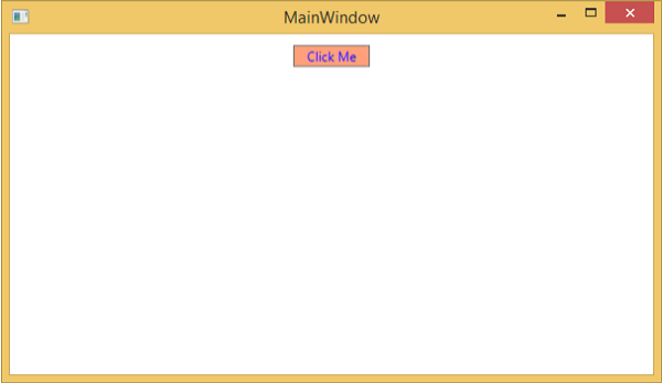
Upon clicking the customized button, you will see that the text inside text block is updated.
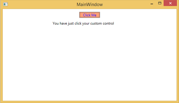
WPF - Exception Handling
An exception is any error condition or an unexpected behavior that is encountered during the execution of a program. Exceptions can be raised due to many reasons, some of them are as follows −
Fault in your code or in code that you call (such as a shared library),
Unavailable operating system resources,
Unexpected conditions that a common language runtime encounters (such as code that cannot be verified)
Syntax
Exceptions have the ability to transfer the flow of a program from one part to another. In .NET framework, exception handling has the following four keywords −
try − In this block, the program identifies a certain condition which raises some exception.
catch − The catch keyword indicates the catching of an exception. A try block is followed by one or more catch blocks to catch an exception with an exception handler at the place in a program where you want to handle the problem.
finally − The finally block is used to execute a given set of statements, whether an exception is thrown or not thrown. For example, if you open a file, it must be closed whether an exception is raised or not.
throw − A program throws an exception when a problem shows up. This is done using a throw keyword.
The syntax to use these four keywords goes as follows −
try {
   ///This will still trigger the exception
}
catch (ExceptionClassName e) {
   // error handling code
}
catch (ExceptionClassName e) {
   // error handling code
}
catch (ExceptionClassName e) {
   // error handling code
}
finally {
   // statements to be executed
}
Multiple catch statements are used in those cases where a try block can raise more than one exception depending on the situation of a program flow.
Hierarchy
Almost all the exception classes in the .NET framework are directly or indirectly derived from the Exception class. The most important exception classes derived from the Exception class are −
ApplicationException class − It supports exceptions which are generated by programs. When developer want to define exception then class should be derived from this class.
SystemException class − It is the base class for all predefined runtime system exceptions. The following hierarchy shows the standard exceptions provided by the runtime.
The following table lists the standard exceptions provided by the runtime and the conditions under which you should create a derived class.
| Exception type | Base type | Description |
|---|---|---|
| Exception | Object | Base class for all exceptions. |
| SystemException | Exception | Base class for all runtime-generated errors. |
| IndexOutOfRangeException | SystemException | Thrown by the runtime only when an array is indexed improperly. |
| NullReferenceException | SystemException | Thrown by the runtime only when a null object is referenced. |
| AccessViolationException | SystemException | Thrown by the runtime only when invalid memory is accessed. |
| InvalidOperationException | SystemException | Thrown by methods when in an invalid state. |
| ArgumentException | SystemException | Base class for all argument exceptions. |
| ArgumentNullException | ArgumentException | Thrown by methods that do not allow an argument to be null. |
| ArgumentOutOfRangeException | ArgumentException | Thrown by methods that verify that arguments are in a given range. |
| ExternalException | SystemException | Base class for exceptions that occur or are targeted at environments outside the runtime. |
| SEHException | ExternalException | Exception encapsulating Win32 structured exception handling information. |
Example
Lets take a simple example to understand the concept better. Start by creating a new WPF project with the name WPFExceptionHandling.
Drag one textbox from the toolbox to the design window. The following XAML code creates a textbox and initializes it with some properties.
<Window x:Class = "WPFExceptionHandling.MainWindow"
   xmlns = "http://schemas.microsoft.com/winfx/2006/xaml/presentation"
   xmlns:x = "http://schemas.microsoft.com/winfx/2006/xaml"
   xmlns:d = "http://schemas.microsoft.com/expression/blend/2008"
   xmlns:mc = "http://schemas.openxmlformats.org/markup-compatibility/2006"
   xmlns:local = "clr-namespace:WPFExceptionHandling"
   mc:Ignorable = "d"
   Title = "MainWindow" Height = "350" Width = "604">

   <Grid>
      <TextBox x:Name = "textBox" HorizontalAlignment = "Left"
         Height = "241" Margin = "70,39,0,0" TextWrapping = "Wrap"
         VerticalAlignment = "Top" Width = "453"/>
   </Grid>

</Window>
Here is the file reading with exception handling in C#.
using System;
using System.IO;
using System.Windows;

namespace WPFExceptionHandling {

   public partial class MainWindow : Window {

      public MainWindow() {
         InitializeComponent();
         ReadFile(0);
      }

      void ReadFile(int index) {
         string path = @"D:\Test.txt";
         StreamReader file = new StreamReader(path);
         char[] buffer = new char[80];

         try {
            file.ReadBlock(buffer, index, buffer.Length);
            string str = new string(buffer);
            str.Trim();
            textBox.Text = str;
         }
         catch (Exception e) {
            MessageBox.Show("Error reading from "+ path + "\nMessage = "+ e.Message);
         }
         finally {
            if (file != null) {
               file.Close();
            }
         }
      }
   }
}
When you compile and execute the above code, it will produce the following window in which a text is displayed inside the textbox.
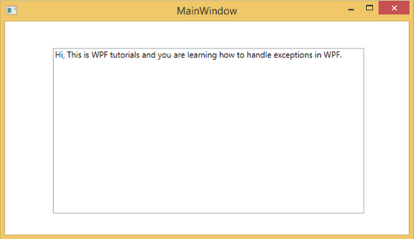
When there is an exception raised or you throw it manually (as in the following code), then it will show a message box with error.
using System;
using System.IO;
using System.Windows;

namespace WPFExceptionHandling {

   public partial class MainWindow : Window {

      public MainWindow() {
         InitializeComponent();
         ReadFile(0);
      }

      void ReadFile(int index) {
         string path = @"D:\Test.txt";
         StreamReader file = new StreamReader(path);
         char[] buffer = new char[80];

         try {
            file.ReadBlock(buffer, index, buffer.Length);
            string str = new string(buffer);
            throw new Exception();
            str.Trim();
            textBox.Text = str;
         }
         catch (Exception e) {
            MessageBox.Show("Error reading from "+ path + "\nMessage = "+ e.Message);
         }
         finally {
            if (file != null) {
               file.Close();
            }
         }
      }
   }
}
When an exception is raised while executing the above code, it will display the following message.
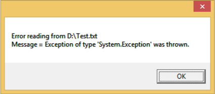
We recommend that you execute the above code and experiment with its features.
WPF - Localization
Localization is the translation of application resources into localized versions for the specific cultures that the application supports.
When you develop your application and your application is available in only one language, then you are limiting the number of your customers and the size of your business. If you want to increase your customer base which will also increase your business, then your product must be available and reachable to a global audience. Cost-effective localization of your product is one of the best and most economical ways to reach out to more customers.
In WPF, localizable applications are very easy to create with resx file which is the simplest solution for localization. Lets take a simple example to understand how it works −
Create a new WPF project with the name WPFLocalization.
In your solution explorer, you will see the Resources.resx file under Properties folder.
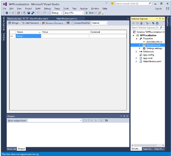
Change the access modifier from internal to public so that it can be accessible in XAML file.
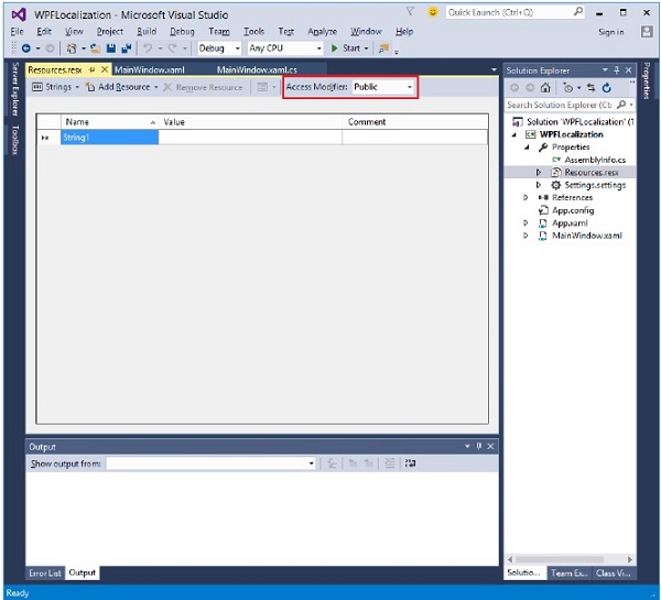
Now add the following strings name and values which we will be using in our application.
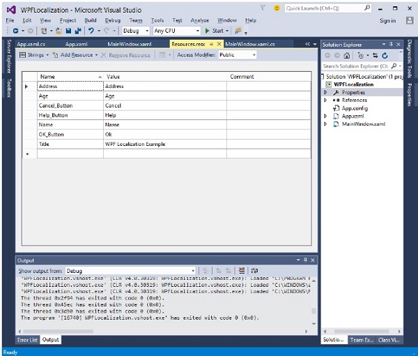
Make two copies of Resources.resx file with the names Resources.en.resx and Resources.ru-RU.resx. These are naming conventions specific to language and country/region name, and it can be found on National Language Support (NLS) API Reference ( https://msdn.microsoft.com/en-us/goglobal/bb896001.aspx ) page.
Change the values in Resources.ru-RU.resx to Russian words, as shown below.
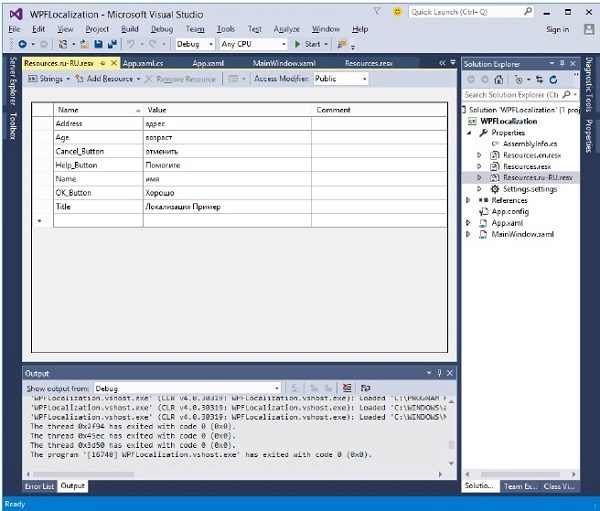
Lets go to the design window and drag three textboxes, three labels, and three buttons.
In the XAML file, first add the namespace declaration to use localize resources xmlns:p = "clr-namespace:WPFLocalization.Properties"
Set the properties of all the controls as shown below. In this example, we will not use hardcoded strings for the content of labels, buttons, and Title of the window in XAML file. We will be using the strings which are defined in *.resx files. For example, for the Title of window, we use the Title string which is defined in *.resx file like this Title = "{x:Static p:Resources.Title}"
Here is the XAML file in which controls are created and initialized with different properties.
<Window x:Class = "WPFLocalization.MainWindow"
   xmlns = "http://schemas.microsoft.com/winfx/2006/xaml/presentation"
   xmlns:x = "http://schemas.microsoft.com/winfx/2006/xaml"
   xmlns:local = "clr-namespace:WPFLocalization"
   xmlns:p = "clr-namespace:WPFLocalization.Properties"
   Title = "{x:Static p:Resources.Title}" Height = "350" Width = "604">

   <Grid>
      <TextBox x:Name = "textBox" HorizontalAlignment = "Left" Height = "23"
         Margin = "128,45,0,0" TextWrapping = "Wrap" VerticalAlignment = "Top" Width = "304"/>

      <Label x:Name = "label" Content = "{x:Static p:Resources.Name}"
          HorizontalAlignment = "Left" Margin = "52,45,0,0" VerticalAlignment = "Top" Width = "86"/>

      <TextBox x:Name = "textBox1" HorizontalAlignment = "Left" Height = "23"
         Margin = "128,102,0,0" TextWrapping = "Wrap" VerticalAlignment = "Top" Width = "304"/>

      <Label x:Name = "label1" Content = "{x:Static p:Resources.Address}"
         HorizontalAlignment = "Left" Margin = "52,102,0,0" VerticalAlignment = "Top" Width = "86"/>

      <TextBox x:Name = "textBox2" HorizontalAlignment = "Left" Height = "23"
         Margin = "128,157,0,0" TextWrapping = "Wrap" VerticalAlignment = "Top" Width = "80"/>

      <Label x:Name = "label2" Content = "{x:Static p:Resources.Age}"
         HorizontalAlignment = "Left" Margin = "52,157,0,0" VerticalAlignment = "Top" Width = "86"/>

      <Button x:Name = "button" Content = "{x:Static p:Resources.OK_Button}"
         HorizontalAlignment = "Left" Margin = "163,241,0,0" VerticalAlignment = "Top" Width = "75"/>

      <Button x:Name = "button1" Content = "{x:Static p:Resources.Cancel_Button}"
         HorizontalAlignment = "Left" Margin = "282,241,0,0" VerticalAlignment = "Top" Width = "75"/>

      <Button x:Name = "button2" Content = "{x:Static p:Resources.Help_Button}"
         HorizontalAlignment = "Left" Margin = "392,241,0,0" VerticalAlignment = "Top" Width = "75"/>
   </Grid>

 </Window>
When the above code is compiled and executed you will see the following window which contains different controls.
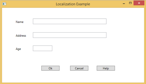
By default, the program uses the default Resources.resx. If you want to show the text in Russian language which are defined in Resources.ru-RU.resx file, then you will need to set the culture explicitly when the program starts in App.xaml file as shown below.
using System.Windows;

namespace WPFLocalization {
   /// <summary>
      /// Interaction logic for App.xaml
   /// </summary>

   public partial class App : Application {

      App() {
         System.Threading.Thread.CurrentThread.CurrentUICulture = new System.Globalization.CultureInfo("ru-RU");
         //System.Threading.Thread.CurrentThread.CurrentUICulture = new System.Globalization.CultureInfo("en");
      }
   }
}
When you run your application, you will see all the text in Russian language.
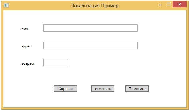
We recommend that you execute the above code and create resx files for other cultures as well.
WPF - Interaction
In WPF, an interaction shows how a view interacts with controls located in that view. The most commonly known interactions are of two types −
- Behaviors
- Drag and Drop
Behaviors
Behaviors were introduced with Expression Blend 3 which can encapsulate some of the functionality into a reusable component. To add additional behaviors, you can attach these components to the controls. Behaviors provide more flexibility to design complex user interactions easily.
Lets take a look at a simple example in which a ControlStoryBoardAction behavior is attached to controls.
Create a new WPF project with the name WPFBehavior.
The following XAML code creates an ellipse and two buttons to control the movement of the ellipse.
<Window
   xmlns = "http://schemas.microsoft.com/winfx/2006/xaml/presentation"
   xmlns:x = "http://schemas.microsoft.com/winfx/2006/xaml"
   xmlns:d = "http://schemas.microsoft.com/expression/blend/2008"
   xmlns:mc = "http://schemas.openxmlformats.org/markup-compatibility/2006"
   xmlns:local = "clr-namespace:WPFBehaviors"
   xmlns:i = "http://schemas.microsoft.com/expression/2010/interactivity"
   xmlns:ei = "http://schemas.microsoft.com/expression/2010/interactions"
   x:Class = "WPFBehaviors.MainWindow"
   mc:Ignorable = "d" Title = "MainWindow" Height = "350" Width = "604">

   <Window.Resources>
      <Storyboard x:Key = "Storyboard1" RepeatBehavior = "Forever" AutoReverse = "True">

         <DoubleAnimationUsingKeyFrames Storyboard.TargetProperty =
            "(UIElement.RenderTransform).(TransformGroup.Children )[3].(TranslateTransform.X)"
            Storyboard.TargetName = "ellipse">
            <EasingDoubleKeyFrame KeyTime = "0:0:1" Value = "301.524"/>
            <EasingDoubleKeyFrame KeyTime = "0:0:2" Value = "2.909"/>
         </DoubleAnimationUsingKeyFrames>

         <DoubleAnimationUsingKeyFrames Storyboard.TargetProperty =
            "(UIElement.RenderTransform).(TransformGroup.Children )[3].(TranslateTransform.Y)"
            Storyboard.TargetName = "ellipse">
            <EasingDoubleKeyFrame KeyTime = "0:0:1" Value = "-0.485"/>
            <EasingDoubleKeyFrame KeyTime = "0:0:2" Value = "0"/>
         </DoubleAnimationUsingKeyFrames>

         <ObjectAnimationUsingKeyFrames Storyboard.TargetProperty = "(ContentControl.Content)"
            Storyboard.TargetName = "button">
            <DiscreteObjectKeyFrame KeyTime = "0" Value = "Play"/>
         </ObjectAnimationUsingKeyFrames>

         <ObjectAnimationUsingKeyFrames Storyboard.TargetProperty = "(ContentControl.Content)"
            Storyboard.TargetName = "button1">
            <DiscreteObjectKeyFrame KeyTime = "0" Value = "Stop"/>
            <DiscreteObjectKeyFrame KeyTime = "0:0:2" Value = "Stop"/>
         </ObjectAnimationUsingKeyFrames>
      </Storyboard>
   </Window.Resources>

   <Window.Triggers>
      <EventTrigger RoutedEvent = "FrameworkElement.Loaded">
         <BeginStoryboard Storyboard = "{StaticResource Storyboard1}"/>
      </EventTrigger>
   </Window.Triggers>

   <Grid>
      <Ellipse x:Name = "ellipse" Fill = "#FFAAAAC5" HorizontalAlignment = "Left"
         Height = "50.901" Margin = "49.324,70.922,0,0" Stroke = "Black"
         VerticalAlignment = "Top" Width = "73.684" RenderTransformOrigin = "0.5,0.5">
         <Ellipse.RenderTransform>
            <TransformGroup>
               <ScaleTransform/>
               <SkewTransform/>
               <RotateTransform/>
               <TranslateTransform/>
            </TransformGroup>
         </Ellipse.RenderTransform>
      </Ellipse>

      <Button x:Name = "button" Content = "Play" HorizontalAlignment = "Left" Height = "24.238"
         Margin = "63.867,0,0,92.953" VerticalAlignment = "Bottom" Width = "74.654">
         <i:Interaction.Triggers>
            <i:EventTrigger EventName = "Click">
               <ei:ControlStoryboardAction Storyboard = "{StaticResource Storyboard1}"/>
            </i:EventTrigger>
         </i:Interaction.Triggers>
      </Button>

      <Button x:Name = "button1" Content = "Stop" HorizontalAlignment = "Left" Height = "24.239"
         Margin = "160.82,0,0,93.922" VerticalAlignment = "Bottom" Width = "75.138">
         <i:Interaction.Triggers>
            <i:EventTrigger EventName = "Click">
               <ei:ControlStoryboardAction ControlStoryboardOption = "Stop"
                  Storyboard = "{StaticResource Storyboard1}"/>
            </i:EventTrigger>
         </i:Interaction.Triggers>
      </Button>

   </Grid>
</Window>
When you compile and execute the above code, it will produce the following window which contains an ellipse and two buttons.
When you press the play button, it will start moving from left to right and then will return to its original position. The stop button will stop the movement the ellipse.
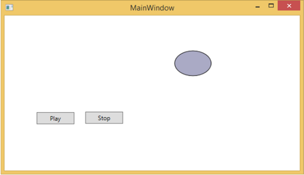
Drag and Drop
Drag and Drop on user interface can significantly advance the efficiency and productivity of the application. There are very few applications in which drag and drop features are used because people think it is difficult to implement. To an extent, it is difficult to handle a drag and drop feature, but in WPF, you can handle it quite easily.
Lets take a simple example to understand how it works. We will create an application wherein you can drag and drop color from one rectangle to another.
Create a new WPF project with the name WPFDragAndDrop.
Drag five rectangles to the design window and set the properties as shown in the following XAML file.
<Window x:Class = "WPFDragAndDrop.MainWindow"
   xmlns = "http://schemas.microsoft.com/winfx/2006/xaml/presentation"
   xmlns:x = "http://schemas.microsoft.com/winfx/2006/xaml"
   xmlns:d = "http://schemas.microsoft.com/expression/blend/2008"
   xmlns:mc = "http://schemas.openxmlformats.org/markup-compatibility/2006"
   xmlns:local = "clr-namespace:WPFDragAndDrop"
   mc:Ignorable = "d" Title = "MainWindow" Height = "402.551" Width = "604">

   <Grid>
      <Rectangle Name = "Target" Fill = "AliceBlue" HorizontalAlignment = "Left"
         Height = "345" Margin = "10,10,0,0" Stroke = "Black"
         VerticalAlignment = "Top" Width = "387" AllowDrop = "True" Drop = "Target_Drop"/>

      <Rectangle Fill = "Beige" HorizontalAlignment = "Left" Height = "65"
         Margin = "402,10,0,0" Stroke = "Black" VerticalAlignment = "Top"
         Width = "184" MouseLeftButtonDown = "Rect_MLButtonDown"/>

      <Rectangle Fill = "LightBlue" HorizontalAlignment = "Left" Height = "65"
         Margin = "402,80,0,0" Stroke = "Black" VerticalAlignment = "Top"
         Width = "184" MouseLeftButtonDown = "Rect_MLButtonDown"/>

      <Rectangle Fill = "LightCoral" HorizontalAlignment = "Left" Height = "65"
         Margin = "402,150,0,0" Stroke = "Black" VerticalAlignment = "Top"
         Width = "184" MouseLeftButtonDown = "Rect_MLButtonDown"/>

      <Rectangle Fill = "LightGray" HorizontalAlignment = "Left" Height = "65"
         Margin = "402,220,0,0" Stroke = "Black" VerticalAlignment = "Top"
         Width = "184" MouseLeftButtonDown = "Rect_MLButtonDown"/>

      <Rectangle Fill = "OliveDrab" HorizontalAlignment = "Left" Height = "65"
         Margin = "402,290,0,-7" Stroke = "Black" VerticalAlignment = "Top"
         Width = "184" MouseLeftButtonDown = "Rect_MLButtonDown"/>
   </Grid>

</Window>
The first rectangle is the target rectangle, so the user can drag the color from the other rectangle to the target rectangle.
Given below are the events implementation in C# for drag and drop.
using System.Windows;
using System.Windows.Input;
using System.Windows.Media;
using System.Windows.Shapes;

namespace WPFDragAndDrop {
   /// <summary>
      /// Interaction logic for MainWindow.xaml
   /// </summary>

   public partial class MainWindow : Window {

      public MainWindow() {
         InitializeComponent();
      }

      private void Rect_MLButtonDown(object sender, MouseButtonEventArgs e) {
         Rectangle rc = sender as Rectangle;
         DataObject data = new DataObject(rc.Fill);
         DragDrop.DoDragDrop(rc, data,DragDropEffects.Move);
      }

      private void Target_Drop(object sender, DragEventArgs e) {
         SolidColorBrush scb = (SolidColorBrush)e.Data.GetData(typeof(SolidColorBrush));
         Target.Fill = scb;
      }
   }
}
When you run your application, it will produce the following window.
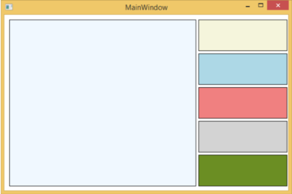
If you drag a color from the rectangle on the right side and drop it on the large rectangle to the left, you will see its effect immediately.
Lets drag the 4th one from the right side.
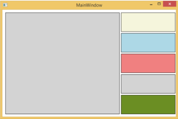
You can see that the color of the target rectangle has changed. We recommend that you execute the above code and experiment with its features.
WPF - 2D Graphics
WPF provides a wide range of 2D graphics which can be enhanced as per your application requirements. WPF supports both Drawing and Shape objects that are used for drawing graphical content.
Shapes and Drawing
Shape class is derived from the FrameworkElement class, Shape objects can be used inside panels and most controls.
WPF provides some basic shape objects which are derived from the Shape class such as Ellipse, Line, Path, Polygon, Polyline, and Rectangle.
Drawing objects, on the other hand, do not derive from the FrameworkElement class and provide a lighter-weight implementation.
Drawing objects are simpler as compared to Shape objects. They have better performance characteristics as well.
Example
Lets take a simple example to understand how to use different shapes object.
Create a new WPF project with the name WPF2DGraphics.
The following code creates different types of shapes.
<Window x:Class = "WPF2DGraphics.MainWindow"
   xmlns = "http://schemas.microsoft.com/winfx/2006/xaml/presentation"
   xmlns:x = "http://schemas.microsoft.com/winfx/2006/xaml"
   xmlns:d = "http://schemas.microsoft.com/expression/blend/2008"
   xmlns:mc = "http://schemas.openxmlformats.org/markup-compatibility/2006"
   xmlns:local = "clr-namespace:WPF2DGraphics"
   xmlns:PresentationOptions = "http://schemas.microsoft.com/winfx/2006/xaml/present ation/options"
   mc:Ignorable = "PresentationOptions" Title = "MainWindow" Height = "400" Width = "604">

   <StackPanel>
      <Ellipse Width = "100" Height = "60" Name = "sample" Margin = "10">
         <Ellipse.Fill>
            <RadialGradientBrush>
               <GradientStop Offset = "0" Color = "AliceBlue"/>
               <GradientStop Offset = "1" Color = "Gray"/>
               <GradientStop Offset = "2" Color = "Red"/>
            </RadialGradientBrush>
         </Ellipse.Fill>
      </Ellipse>

      <Path Stroke = "Red" StrokeThickness = "5" Data = "M 10,70 L 200,70"
         Height = "42.085" Stretch = "Fill" Margin = "140.598,0,146.581,0" />
      <Path Stroke = "BlueViolet" StrokeThickness = "5" Data = "M 20,100 A 100,56 42 1 0 200,10"
         Height = "81.316" Stretch = "Fill" Margin = "236.325,0,211.396,0" />

      <Path Fill = "LightCoral" Margin = "201.424,0,236.325,0"
         Stretch = "Fill" Height = "124.929">
         <Path.Data>
            <PathGeometry>
               <PathFigure StartPoint = "50,0" IsClosed = "True">
                  <LineSegment Point = "100,50"/>
                  <LineSegment Point = "50,100"/>
                  <LineSegment Point = "0,50"/>
               </PathFigure>
            </PathGeometry>
         </Path.Data>
      </Path>

   </StackPanel>

</Window>
When you compile and execute the above code, it will produce an ellipse, a straight line, an arc, and a polygon.
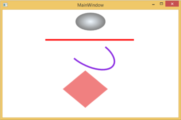
Example
Lets have a look at another example that shows how to paint an area with a drawing.
Create a new WPF project with the name WPF2DGraphics1.
The following XAML code shows how to paint different with image drawing.
<Window x:Class = "WPF2DGraphics1.MainWindow"
   xmlns = "http://schemas.microsoft.com/winfx/2006/xaml/presentation"
   xmlns:x = "http://schemas.microsoft.com/winfx/2006/xaml"
   xmlns:d = "http://schemas.microsoft.com/expression/blend/2008"
   xmlns:PresentationOptions = "http://schemas.microsoft.com/winfx/2006/xaml/present ation/options"
   xmlns:mc = "http://schemas.openxmlformats.org/markup-compatibility/2006"
   mc:Ignorable = "PresentationOptions"
   xmlns:local = "clr-namespace:WPF2DGraphics1" Title = "MainWindow" Height = "350" Width = "604">

   <Grid>
      <Border BorderBrush = "Gray" BorderThickness = "1"
         HorizontalAlignment = "Left" VerticalAlignment = "Top"
         Margin = "20">

         <Image Stretch = "None">
            <Image.Source>
               <DrawingImage PresentationOptions:Freeze = "True">

                  <DrawingImage.Drawing>
                     <DrawingGroup>
                        <ImageDrawing Rect = "300,100,300,180" ImageSource = "Images\DSC_0104.JPG"/>
                        <ImageDrawing Rect = "0,100,250,100" ImageSource = "Images\DSC_0104.JPG"/>
                        <ImageDrawing Rect = "150,0,25,25" ImageSource = "Images\DSC_0104.JPG"/>
                        <ImageDrawing Rect = "0,0,75,75" ImageSource = "Images\DSC_0104.JPG"/>
                     </DrawingGroup>
                  </DrawingImage.Drawing>

               </DrawingImage>
            </Image.Source>
         </Image>

      </Border>
   </Grid>

</Window>
When you run your application, it will produce the following output −
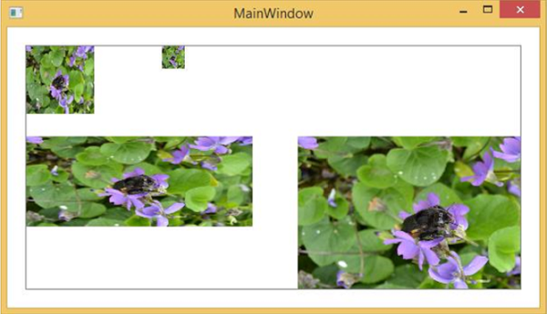
We recommend that you execute the above code and try more 2D shapes and drawings.
WPF - 3D Graphics
Windows Presentation Foundation (WPF) provides a functionality to draw, transform, and animate 3D graphics as per your application requirement. It doesnt support full fledge 3D game development, but to some level, you can create 3D graphics.
By combining 2D and 3D graphics, you can also create rich controls, provide complex illustrations of data, or enhance the user experience of an application's interface. The Viewport3D element hosts a 3D model into our WPF application.
Example
Lets take a simple example to understand how to use 3D graphics.
Create a new WPF project with the name WPF3DGraphics.
The following XAML code shows how to create a 2D object using in 3D geometry.
<Window x:Class = "WPF3DGraphics.MainWindow"
   xmlns = "http://schemas.microsoft.com/winfx/2006/xaml/presentation"
   xmlns:x = "http://schemas.microsoft.com/winfx/2006/xaml"
   xmlns:mc = "http://schemas.openxmlformats.org/markup-compatibility/2006"
   xmlns:local = "clr-namespace:WPF3DGraphics"
   mc:Ignorable = "d" Title = "MainWindow" Height = "500" Width = "604">

   <Grid>
      <Viewport3D>

         <Viewport3D.Camera>
            <PerspectiveCamera Position = "2,0,10" LookDirection = "0.2,0.4,-1"
               FieldOfView = "65" UpDirection = "0,1,0" />
         </Viewport3D.Camera>

         <ModelVisual3D>
            <ModelVisual3D.Content>
               <Model3DGroup>
                  <AmbientLight Color = "Bisque" />

                  <GeometryModel3D>
                     <GeometryModel3D.Geometry>
                        <MeshGeometry3D Positions = "0,0,0 0,8,0 10,0,0 8,8,0"
                           Normals = "0,0,1 0,0,1 0,0,1 0,0,1" TriangleIndices = "0,2,1 1,2,3"/>
                     </GeometryModel3D.Geometry>

                     <GeometryModel3D.Material>
                        <DiffuseMaterial Brush = "Bisque" />
                     </GeometryModel3D.Material>
                  </GeometryModel3D>

               </Model3DGroup>
            </ModelVisual3D.Content>
         </ModelVisual3D>

      </Viewport3D>
   </Grid>

</Window>
When you compile and execute the above code, it will produce a 2D object in 3D.
Example
Lets have a look at another example which shows a 3D object.
Create a new WPF project with the name WPF3DGraphics1
The following XAML code creates a 3D object and a slider. With the help of the slider, you can rotate this 3D object.
<Window x:Class = "WPF3DGraphics1.MainWindow"
   xmlns = "http://schemas.microsoft.com/winfx/2006/xaml/presentation"
   xmlns:x = "http://schemas.microsoft.com/winfx/2006/xaml"
   xmlns:d = "http://schemas.microsoft.com/expression/blend/2008"
   xmlns:mc = "http://schemas.openxmlformats.org/markup-compatibility/2006"
   xmlns:local = "clr-namespace:WPF3DGraphics1"
   mc:Ignorable = "d" Title = "MainWindow" Height = "350" Width = "525">

   <Grid>
      <Viewport3D Name="viewport3D1">

         <Viewport3D.Camera>
            <PerspectiveCamera x:Name = "camMain" Position = "6 5 4" LookDirection = "-6 -5 -4">
            </PerspectiveCamera>
         </Viewport3D.Camera>

         <ModelVisual3D>
            <ModelVisual3D.Content>
               <DirectionalLight x:Name = "dirLightMain" Direction = "-1,-1,-1">
               </DirectionalLight>
            </ModelVisual3D.Content>
         </ModelVisual3D>

         <ModelVisual3D x:Name = "MyModel">
            <ModelVisual3D.Content>
               <GeometryModel3D>

                  <GeometryModel3D.Geometry>
                     <MeshGeometry3D x:Name = "meshMain"
                        Positions = "0 0 0  1 0 0  0 1 0  1 1 0  0 0 1  1 0 1  0 1 1  0 1 1"
                        TriangleIndices = "2 3 1  3 1 0  7 1 3  7 5 1  6 5 7  6 4 5  6 2 0
                        2 0 4  2 7 3  2 6 7  0 1 5  0 5 4">
                     </MeshGeometry3D>
                  </GeometryModel3D.Geometry>

                  <GeometryModel3D.Material>
                     <DiffuseMaterial x:Name = "matDiffuseMain">
                        <DiffuseMaterial.Brush>
                           <SolidColorBrush Color = "Bisque"/>
                        </DiffuseMaterial.Brush>
                     </DiffuseMaterial>
                  </GeometryModel3D.Material>

               </GeometryModel3D>
            </ModelVisual3D.Content>

            <ModelVisual3D.Transform>
               <RotateTransform3D>
                  <RotateTransform3D.Rotation>
                     <AxisAngleRotation3D x:Name = "rotate" Axis = "1 2 1"/>
                  </RotateTransform3D.Rotation>
               </RotateTransform3D>
            </ModelVisual3D.Transform>

         </ModelVisual3D>
      </Viewport3D>

      <Slider Height = "23" HorizontalAlignment = "Left"
         Margin = "145,271,0,0" Name = "slider1"
         VerticalAlignment = "Top" Width = "269"
         Maximum = "360"
         Value = "{Binding ElementName = rotate, Path=Angle}" />

   </Grid>

</Window>
When you run your application, it will produce a 3D object and a slider on your window.
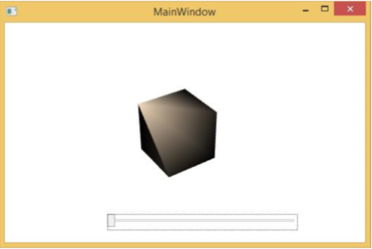
When you slide the slider, the object on your window will also rotate.
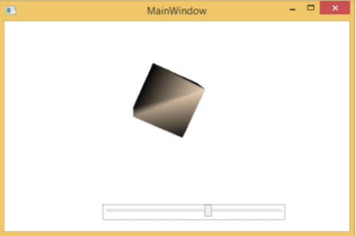
We recommend that you execute the above code and try more 3D geometry.
WPF - Multimedia
WPF applications support video and audio using MediaElement. It allows you to integrate audio and video into an application. The MediaElement class works in a similar way as Image class. You just point it at the media and it renders it. The main difference is that it will be a moving image, but if you point it to the file that contains just audio and no video such as an MP3, it will play that without showing anything on the screen.
WPF supports all types of video/audio format depending on the machine configuration. If a media file plays a Media Player, it will also work in WPF on the same machine.
Example
Lets take an example to understand how to integrate multimedia in your application.
Create a new WPF project with the name WPFMultimedia.
The following XAML code creates a media element and three buttons, and initializes them with some properties.
<Window x:Class = "WPFMultimedia.MainWindow"
   xmlns = "http://schemas.microsoft.com/winfx/2006/xaml/presentation"
   xmlns:x = "http://schemas.microsoft.com/winfx/2006/xaml"
   xmlns:d = "http://schemas.microsoft.com/expression/blend/2008"
   xmlns:mc = "http://schemas.openxmlformats.org/markup-compatibility/2006"
   xmlns:local = "clr-namespace:WPFMultimedia"
   mc:Ignorable = "d" Title = "MainWindow" Height = "350" Width = "604">

   <Grid>
      <StackPanel HorizontalAlignment = "Center" VerticalAlignment = "Center">
         <MediaElement Name = "myMedia" Source = "D:\MicrosoftMVA.mp4"
            LoadedBehavior = "Manual" Width = "591" Height = "274" />
         <StackPanel Orientation = "Horizontal" Margin = "0,10,0,0">
            <Button Content = "Play" Margin = "0,0,10,0" Padding = "5" Click = "mediaPlay" />
            <Button Content = "Pause" Margin = "0,0,10,0" Padding = "5" Click = "mediaPause" />
            <Button x:Name = "muteButt" Content = "Mute" Padding = "5" Click = "mediaMute" />
         </StackPanel>
      </StackPanel>
   </Grid>

</Window>
Here is the Click events implementation in C# for different buttons.
using System;
using System.Windows;

namespace WPFMultimedia {

   public partial class MainWindow : Window {

      public MainWindow() {
         InitializeComponent();
         myMedia.Volume = 100;
         myMedia.Play();
      }

      void mediaPlay(Object sender, EventArgs e) {
         myMedia.Play();
      }

      void mediaPause(Object sender, EventArgs e) {
         myMedia.Pause();
      }

      void mediaMute(Object sender, EventArgs e) {

         if (myMedia.Volume == 100) {
            myMedia.Volume = 0;
            muteButt.Content = "Listen";
         }
         else {
            myMedia.Volume = 100;
            muteButt.Content = "Mute";
         }
      }
   }
}
When you compile and execute the above code, it will produce the following window. You can play the video and control its playback with the three buttons.
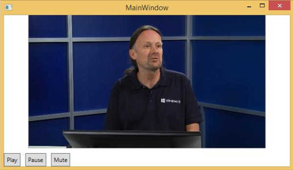
With the buttons you can pause, mute, and play the video.
Speech Synthesizer
WPF has features to convert text to speech. This API is included in System.Speech namespace. SpeechSynthesizer class transforms text into spoken words.
Example
Lets have a look at a simple example.
Create a new WPF project with the name WPFTextToSpeech.
We will need System.Speech assembly to add as reference for SpeechSynthesizer class to work.
Right click on References and Select Add Reference.
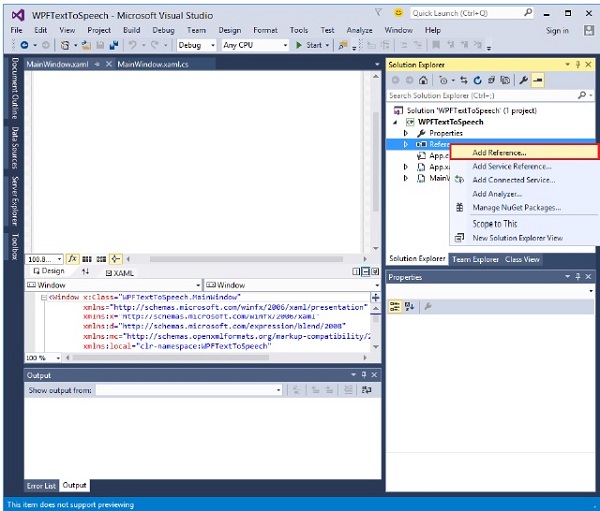
Reference Manager dialog will open. Now check the System.Speech check box
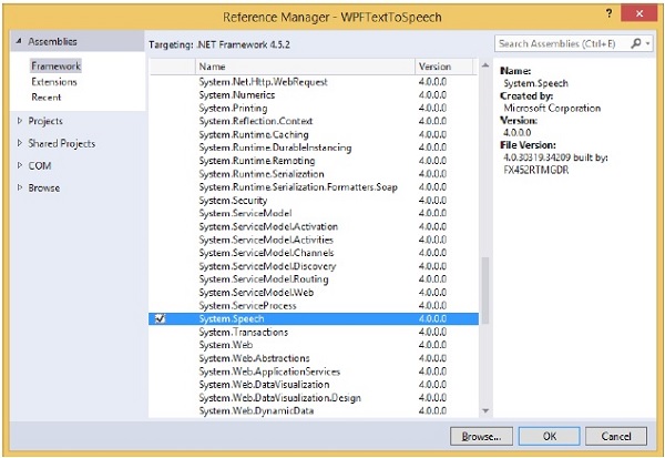
Click the Ok button. You can see the System.Speech assembly in your References.
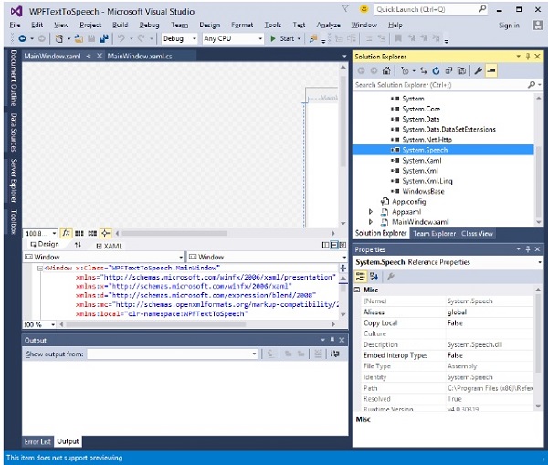
Now drag a button and a textbox into the design window from the toolbox.
The following XAML code creates a button and a textbox, and initializes them with some properties.
<Window x:Class = "WPFTextToSpeech.MainWindow"
   xmlns = "http://schemas.microsoft.com/winfx/2006/xaml/presentation"
   xmlns:x = "http://schemas.microsoft.com/winfx/2006/xaml"
   xmlns:d = "http://schemas.microsoft.com/expression/blend/2008"
   xmlns:mc = "http://schemas.openxmlformats.org/markup-compatibility/2006"
   xmlns:local = "clr-namespace:WPFTextToSpeech"
   mc:Ignorable = "d" Title = "MainWindow" Height = "350" Width = "604">

   <Grid>
      <Button x:Name = "button" Content = "Speak"
         HorizontalAlignment = "Left" Margin = "218,176,0,0"
         VerticalAlignment = "Top" Width = "75"/>

      <TextBox x:Name = "textBox" HorizontalAlignment = "Left"
         Height = "23" Margin = "60,104,0,0" TextWrapping = "Wrap"
         VerticalAlignment = "Top" Width = "418"/>
   </Grid>

</Window>
Here is the simple implementation in C# which will convert the Text inside the textbox into spoken words.
using System.Speech.Synthesis;
using System.Windows;

namespace WPFTextToSpeech {
   /// <summary>
      /// Interaction logic for MainWindow.xaml
   /// </summary>

   public partial class MainWindow : Window {

      public MainWindow() {
         InitializeComponent();
      }

      private void button_Click(object sender, RoutedEventArgs e) {

         if (textBox.Text != "") {
            SpeechSynthesizer speechSynthesizer = new SpeechSynthesizer();
            speechSynthesizer.Speak(textBox.Text);
         }
         else {
            MessageBox.Show("Write some thing in the textbox!");
         }
      }
   }
}
When you compile and execute the above code, it will produce the following window. Now, type Hello World inside the textbox and click the Speak button.
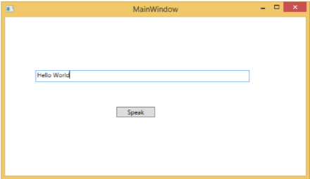
It will produce the sound "Hello World". If you dont type anything in the textbox, then it will flash the following message.
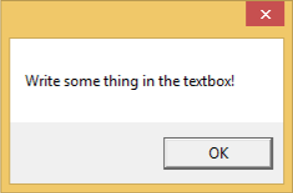
We recommend that you execute the above examples.
