- WPF - Home
- WPF - Overview
- WPF - Environment Setup
- WPF - Hello World
- WPF - XAML Overview
- WPF - Elements Tree
- WPF - Dependency Properties
- WPF - Routed Events
- WPF - Controls
- WPF - Layouts
- WPF - Nesting Of Layout
- WPF - Input
- WPF - Command Line
- WPF - Data Binding
- WPF - Resources
- WPF - Templates
- WPF - Styles
- WPF - Triggers
- WPF - Debugging
- WPF - Custom Controls
- WPF - Exception Handling
- WPF - Localization
- WPF - Interaction
- WPF - 2D Graphics
- WPF - 3D Graphics
- WPF - Multimedia
WPF - Styles
The .NET framework provides several strategies to personalize and customize the appearance of an application. Styles provide us the flexibility to set some properties of an object and reuse these specific settings across multiple objects for a consistent look.
In styles, you can set only the existing properties of an object such as Height, Width, Font size, etc.
Only default behavior of a control can be specified.
Multiple properties can be added into a single style.
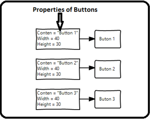
Styles are used to give a uniform look or appearance to a set of controls. Implicit styles are used to apply an appearance to all the controls of a given type and simplify the application. Imagine three buttons, all of them have to look the same, same width and height, same font size, same foreground color, etc. We can set all those properties on the button elements themselves and that's still quite okay for all of the buttons. Take a look at the following diagram.
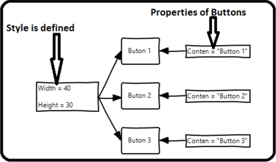
But in a real-life applications, you'll typically have a lot more of these that need to look exactly the same. And not only buttons of course, you'll typically want your text blocks, text boxes, and combo boxes etc. to look the same across your application. Surely, there must be a better way to achieve this and it is known as styling. You can think of a style as a convenient way to apply a set of property values to more than one element. Take a look at the following diagram.
Example
Lets take a simple example to understand this concept. Start by creating a new WPF project.
Drag three buttons from the toolbox to the design window.
The following XAML code creates three buttons and initializes them with some properties.
<Window x:Class = "WPFStyle.MainWindow"
   xmlns = "http://schemas.microsoft.com/winfx/2006/xaml/presentation"
   xmlns:x = "http://schemas.microsoft.com/winfx/2006/xaml"
   xmlns:d = "http://schemas.microsoft.com/expression/blend/2008"
   xmlns:mc = "http://schemas.openxmlformats.org/markup-compatibility/2006"
   xmlns:local = "clr-namespace: WPFStyle"
   mc:Ignorable = "d" Title = "MainWindow" Height = "350" Width = "604">

   <StackPanel>
      <Button Content = "Button1" Height = "30" Width = "80"
         Foreground = "Blue" FontSize = "12" Margin = "10"/>
      <Button Content = "Button2" Height = "30" Width = "80"
         Foreground = "Blue" FontSize = "12" Margin = "10"/>
      <Button Content = "Button3" Height = "30" Width = "80"
         Foreground = "Blue" FontSize = "12" Margin = "10"/>
   </StackPanel>

</Window>
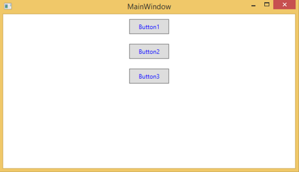
When you look at the above code, you will see that for all the buttons height, width, foreground color, font size and margin properties are same. Now when the above code is compiled and executed the following window will be displayed.
Now lets have a look at the same example, but this time, we will be using style.
<Window x:Class = "XAMLStyle.MainWindow"
   xmlns = "http://schemas.microsoft.com/winfx/2006/xaml/presentation"
   xmlns:x = "http://schemas.microsoft.com/winfx/2006/xaml"
   xmlns:d = "http://schemas.microsoft.com/expression/blend/2008"
   xmlns:mc = "http://schemas.openxmlformats.org/markup-compatibility/2006"
   xmlns:local = "clr-namespace:XAMLStyle"
   mc:Ignorable = "d" Title = "MainWindow" Height = "350" Width = "604">

   <Window.Resources>
      <Style x:Key = "myButtonStyle" TargetType = "Button">
         <Setter Property = "Height" Value = "30" />
         <Setter Property = "Width" Value = "80" />
         <Setter Property = "Foreground" Value = "Blue" />
         <Setter Property = "FontSize" Value = "12" />
         <Setter Property = "Margin" Value = "10" />
      </Style>
   </Window.Resources>

   <StackPanel>
      <Button Content = "Button1" Style = "{StaticResource myButtonStyle}" />
      <Button Content = "Button2" Style = "{StaticResource myButtonStyle}" />
      <Button Content = "Button3" Style="{StaticResource myButtonStyle}" />
   </StackPanel>

</Window>
Styles are defined in the resource dictionary and each style has a unique key identifier and a target type. Inside <style> you can see that multiple setter tags are defined for each property which will be included in the style.
In the above example, all of the common properties of each button are now defined in style and then the style are assigned to each button with a unique key by setting the style property through the StaticResource markup extension.
When you compile and execute the above code, it will display the following window (the same output).
The advantage of doing it like this is immediately obvious, we can reuse that style anywhere in its scope; and if we need to change it, we simply change it once in the style definition instead of on each element.
In what level a style is defined instantaneously limits the scope of that style. So the scope, i.e. where you can use the style, depends on where you've defined it. Styles can be defined on the following levels −
| Sr.No | Levels & Description |
|---|---|
| 1 | Control Level
Defining a style on control level can only be applied to that particular control. Given below is an example of a control level where the button and TextBlock have their own style. |
| 2 | Layout Level
Defining a style on any layout level will make it accessible by that layout and its child elements only. |
| 3 | Window Level
Defining a style on a window level can make it accessible by all the elements on that window. |
| 4 | Application Level
Defining a style on app level can make it accessible throughout the entire application. Lets take the same example, but here, we will put the styles in app.xaml file to make it accessible throughout application. |
