- WPF - Home
- WPF - Overview
- WPF - Environment Setup
- WPF - Hello World
- WPF - XAML Overview
- WPF - Elements Tree
- WPF - Dependency Properties
- WPF - Routed Events
- WPF - Controls
- WPF - Layouts
- WPF - Nesting Of Layout
- WPF - Input
- WPF - Command Line
- WPF - Data Binding
- WPF - Resources
- WPF - Templates
- WPF - Styles
- WPF - Triggers
- WPF - Debugging
- WPF - Custom Controls
- WPF - Exception Handling
- WPF - Localization
- WPF - Interaction
- WPF - 2D Graphics
- WPF - 3D Graphics
- WPF - Multimedia
WPF - Tooltip
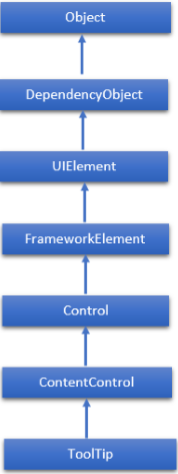
A tooltip is a control that creates a pop-up window that displays information for an element in the GUI. The hierarchical inheritance of ToolTip class is as follows −
Commonly Used Properties of ToolTip Class
| Sr. No. | Property & Description |
|---|---|
| 1 | IsOpen Gets or sets a value that indicates whether the ToolTip is visible. |
| 2 | IsOpenProperty Identifies the IsOpen dependency property. |
| 3 | Placement Gets or sets how a ToolTip is positioned in relation to the placement target element. |
| 4 | PlacementProperty Identifies the Placement dependency property. |
| 5 | PlacementTarget Gets or sets the visual element or control that the tool tip should be positioned in relation to when opened by the ToolTipService. |
| 6 | PlacementTargetProperty Identifies the PlacementTarget dependency property. |
| 7 | TemplateSettings Gets an object that provides calculated values that can be referenced as TemplateBinding sources when defining templates for a ToolTip. |
Commonly Used Events of ToolTip Class
| Sr. No. | Events & Description |
|---|---|
| 1 | Closed Occurs when a ToolTip is closed and is no longer visible. |
| 2 | Opened Occurs when a ToolTip becomes visible. |
Example
Lets create a new WPF project with the name WPFToolTipControl.
Drag two text blocks, two text boxes, and one button from the Toolbox.
The following example shows how to use a ToolTip in a WPF application.
The following XAML code creates a ToolTip with some properties to display ToolTips on Button and Text boxes.
<Window x:Class = "WPFToolTipControl.MainWindow"
   xmlns = "http://schemas.microsoft.com/winfx/2006/xaml/presentation"
   xmlns:x = "http://schemas.microsoft.com/winfx/2006/xaml"
   xmlns:d = "http://schemas.microsoft.com/expression/blend/2008"
   xmlns:mc = "http://schemas.openxmlformats.org/markup-compatibility/2006"
   xmlns:local = "clr-namespace:WPFToolTipControl"
   mc:Ignorable = "d" Title = "MainWindow" Height = "350" Width = "604">

   <Grid>
      <TextBlock x:Name = "textBlock" HorizontalAlignment = "Left"
         Margin = "101,75,0,0" TextWrapping = "Wrap"
         Text = "User Name" VerticalAlignment = "Top" />

      <TextBlock x:Name = "textBlock1" HorizontalAlignment = "Left"
         Margin = "101,125,0,0" TextWrapping = "Wrap"
         Text = "Password" VerticalAlignment = "Top" />

      <TextBox x:Name = "textBox" HorizontalAlignment = "Left"
         Height = "24" Margin = "199,75,0,0" TextWrapping = "Wrap"
         VerticalAlignment = "Top" Width = "219"
         ToolTipService.ToolTip  =  "Enter User Name" />

      <PasswordBox x:Name = "passwordBox" HorizontalAlignment = "Left"
         Margin = "199,125,0,0" VerticalAlignment = "Top" Width = "219"
         Height = "24" ToolTipService.ToolTip  =  "Enter Password" />

      <Button x:Name = "button" Content = "Log in" HorizontalAlignment = "Left"
         Margin = "199,189,0,0" VerticalAlignment = "Top" Width = "75"
         ToolTipService.ToolTip = "Log in" />

   </Grid>

</Window>
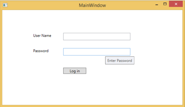
When you compile and execute the above code, it will produce the following output. When the mouse enters the region of the Button or the Text boxes, it will show a tool tip.
We recommend that you execute the above example code and try the other properties and events of ToolTip class.
