- WPF - Home
- WPF - Overview
- WPF - Environment Setup
- WPF - Hello World
- WPF - XAML Overview
- WPF - Elements Tree
- WPF - Dependency Properties
- WPF - Routed Events
- WPF - Controls
- WPF - Layouts
- WPF - Nesting Of Layout
- WPF - Input
- WPF - Command Line
- WPF - Data Binding
- WPF - Resources
- WPF - Templates
- WPF - Styles
- WPF - Triggers
- WPF - Debugging
- WPF - Custom Controls
- WPF - Exception Handling
- WPF - Localization
- WPF - Interaction
- WPF - 2D Graphics
- WPF - 3D Graphics
- WPF - Multimedia
WPF - Progressbar
ProgressBar is a control that indicates the progress of an operation, where the typical visual appearance is a bar that animates a filled area as the progress continues. It can show the progress in one of the two following styles −
- A bar that displays a repeating pattern, or
- A bar that fills based on a value.
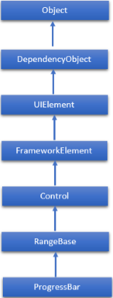
The hierarchical inheritance of ProgressBar class is as follows −
Commonly Used Properties of ProgressBar
| Sr.No. | Property & Description |
|---|---|
| 1 | IsIndeterminate Gets or sets a value that indicates whether the progress bar reports generic progress with a repeating pattern or reports progress based on the Value property. |
| 2 | IsIndeterminateProperty Identifies the IsIndeterminate dependency property. |
| 3 | ShowError Gets or sets a value that indicates whether the progress bar should use visual states that communicate an Error state to the user. |
| 4 | ShowErrorProperty Identifies the ShowError dependency property. |
| 5 | ShowPaused Gets or sets a value that indicates whether the progress bar should use visual states that communicate a Paused state to the user. |
| 6 | ShowPausedProperty Identifies the ShowPaused dependency property. |
| 7 | TemplateSettings Gets an object that provides calculated values that can be referenced as TemplateBinding sources when defining templates for a ProgressBar control. |
Commonly Used Events in ProgressBar Class
| Sr.No. | Event & Description |
|---|---|
| 1 | ManipulationCompleted Occurs when a manipulation on the UIElement is complete. (Inherited from UIElement) |
| 2 | ManipulationDelta Occurs when the input device changes position during a manipulation. (Inherited from UIElement) |
| 3 | ManipulationInertiaStarting Occurs when the input device loses contact with the UIElement object during a manipulation and inertia begins. (Inherited from UIElement) |
| 4 | ManipulationStarted Occurs when an input device begins a manipulation on the UIElement. (Inherited from UIElement) |
| 5 | ManipulationStarting Occurs when the manipulation processor is first created. (Inherited from UIElement) |
| 6 | ValueChanged Occurs when the range value changes. (Inherited from RangeBase) |
Commonly Used Methods in ProgressBar Class
| Sr.No. | Method & Description |
|---|---|
| 1 | OnManipulationCompleted Called before the ManipulationCompleted event occurs. (Inherited from Control) |
| 2 | OnManipulationDelta Called before the ManipulationDelta event occurs. (Inherited from Control) |
| 3 | OnManipulationInertiaStarting Called before the ManipulationInertiaStarting event occurs. (Inherited from Control) |
| 4 | OnManipulationStarted Called before the ManipulationStarted event occurs. (Inherited from Control) |
| 5 | OnManipulationStarting Called before the ManipulationStarting event occurs. (Inherited from Control) |
| 6 | OnMaximumChanged Called when the Maximum property changes. (Inherited from RangeBase) |
| 7 | OnMinimumChanged Called when the Minimum property changes. (Inherited from RangeBase) |
| 8 | OnValueChanged Fires the ValueChanged routed event. (Inherited from RangeBase) |
| 9 | SetBinding Attaches a binding to a FrameworkElement, using the provided binding object. (Inherited from FrameworkElement) |
| 10 | SetValue Sets the local value of a dependency property on a DependencyObject. (Inherited from DependencyObject) |
Example
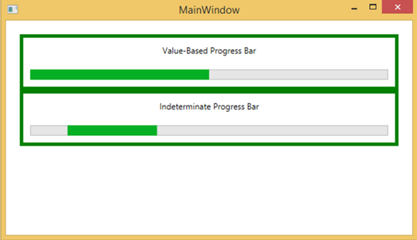
Lets create a new WPF project with the name WPFProgressBarControl.
The following example shows how to use the ProgressBar control. Here is the XAML code in which two ProgressBar controls are created and initialized.
<Window x:Class = "WPFProgressBarControl.MainWindow"
   xmlns = "http://schemas.microsoft.com/winfx/2006/xaml/presentation"
   xmlns:x = "http://schemas.microsoft.com/winfx/2006/xaml"
   xmlns:d = "http://schemas.microsoft.com/expression/blend/2008"
   xmlns:mc = "http://schemas.openxmlformats.org/markup-compatibility/2006"
   xmlns:local = "clr-namespace:WPFProgressBarControl"
   mc:Ignorable = "d" Title = "MainWindow" Height = "350" Width = "604">

   <Grid>
      <StackPanel x:Name = "LayoutRoot" Margin = "20">

         <Border BorderThickness = "5" BorderBrush = "Green">
            <StackPanel Background = "White">
               <TextBlock HorizontalAlignment = "Center" Margin = "10"
                  Text = "Value-Based Progress Bar" />
               <ProgressBar x:Name = "pg1" Value = "100"  Margin = "10" Maximum = "200"
                  Height = "15" IsIndeterminate = "False" />
            </StackPanel>
         </Border>

         <Border BorderThickness = "5" BorderBrush = "Green">
            <StackPanel Background = "White">
               <TextBlock HorizontalAlignment = "Center"
                  Margin = "10" Text = "Indeterminate Progress Bar" />
               <ProgressBar x:Name = "pg2" Margin = "10" Height = "15"
                  IsIndeterminate = "True" />
            </StackPanel>
         </Border>

      </StackPanel>
   </Grid>

</Window>
When you compile and execute the above code, it will produce the following window.
We recommend that you execute the above example code and try the other properties and events of the ProgressBar class.
